Culture: October 2009 Archives

Urs_Fisher_Ix_and_David.jpg
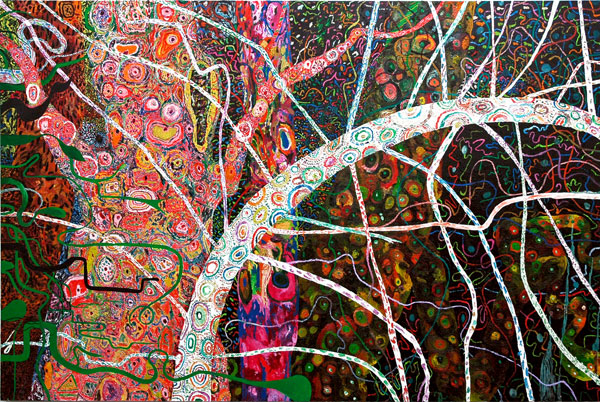
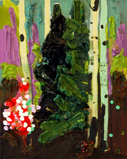
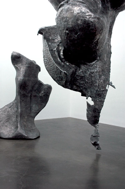
details of Urs Fischer's "Ix" and "David"


Urs_Fisher_EXIT_EXIT.jpg
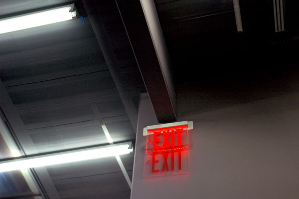
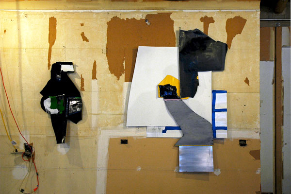
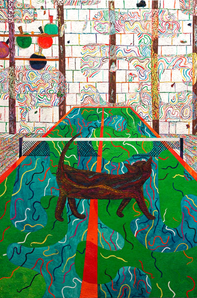
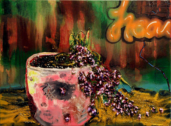
detail of Urs Fischer's "Last Call Lascaux" (other than the fluorescents, and one "exit", everything is wallpaper)


Urs_Fischer_Jarlsberg_Reverend.jpg
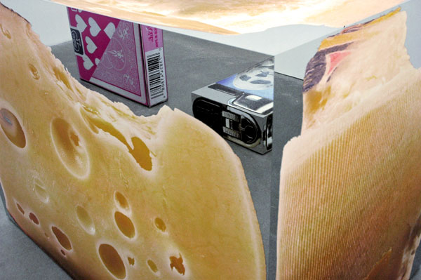
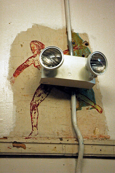
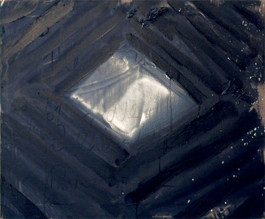
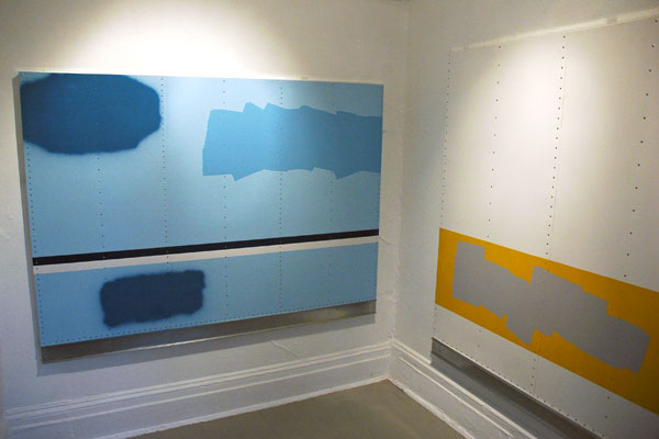
large detail of Urs Fischer's "Yarlsberg (Reverend)" reflecting two other mirrored blocks


I had forced myself to get up much earlier than I ever really want to, which normally would have been a drag, but I was actually looking forward to yesterday's press preview of "Urs Fischer: Marguerite de Ponty", excited to learn what all the fuss was about, and wanting to be amazed and excited.

There had been a lot of advance press, not all of it entirely auspicious, about the big deal show being installed down on the Bowery but I had decided I wasn't going to let talk about big money, cronyism, and way-too-"interested" patrons and curators affect what I thought of the artist's work itself.

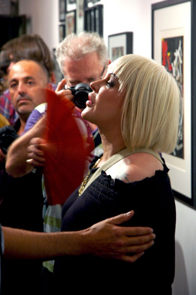
But while I was still listening to the short introduction by Massimiliano Gioni, who may or may not be formally employed by the Museum but who is described in NuMu's press release as having "organized" this exhibition, I started to feel a grumpy coming on. Then, soon after alighting from the elevator on the fourth floor where we were confronted by enormous and weighty cast-aluminum abstract sculptures, one of them hanging from the ceiling, that spoke to me more of hubris than any kind of original aesthetic or penetrating intellectual breakthrough, but I'm not equipped to argue with the thousands of pages written in praise of Fisher's work, these five contracted pieces made in China probably not excepted.

The third floor space is where the magic happens. You've probably already read about it: Fischer has essentially created an enormous trompe l'oeil box. Every square inch of the walls and ceiling (which is actually a faux ceiling, including beams, constructed two feet below the real one) was lined with wallpaper which had been printed with photographic reproductions of the areas it covered, including images of the lighting, vents, door handles and exit signs, as it all appeared after the previous show had been taken down (the purplish color of the walls, while deliberate, relates to a photographic idiosyncrasy). There are four small-to-medium-size sculptures installed in various parts of the room. On my visit they elicited almost as much interest as the wallpaper, but if I were to be asked, I'd come down on the side of the room itself. While I didn't miss the details, like the photographed scuff marks and small nails from the last exhibition, I was charmed by both the idea and the reality of the room as a whole, its evocation of so many historical forms of visual illusion in art. I felt like a bumpkin in seventeenth-century Rome or eighteenth-century Bavaria, and I volunteered as much to anyone who looked like they would listen.

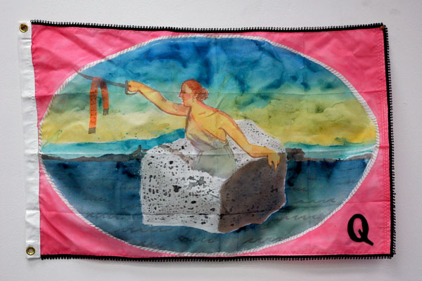
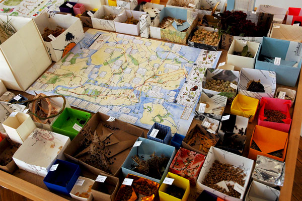
The Second floor is also a piece by itself (although no one seems to know whether it will be offered to collectors or museums only as a whole), and it may be the most successful part of the entire exhibition. "Service à la française" is an installation of dozens of mirrored chrome boxes each imprinted with a photographic image of some ordinary item which seems to have struck the fancy of the artist. The four sides and top of each box display precisely-documented sides, front, back and top of separate objects in the shape and volume scale of their original subjects, but not in one scale shared by all (a red public telephone box is approximately the size of a frosted Fruit Loops bar cookie).

I lingered for some time, walking around inside this orchestrated array of "monuments", perfectly-engineered and finished. I felt the impact of the work gradually alter from surprise and amusement to sweetness and, well . . . , coziness. If the piece is autobiographical, it's probably equally biographical, for everyone else, even if the visitor has never played cards, used a phone box, eaten a frosted cream puff, opened a lipstick, or touched a porcelain obelisk.

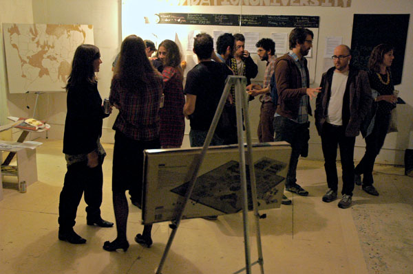
And then I was back on the first floor, where I already knew a different artist had an installation in the Glass Gallery opening the same day. Barry and I had known nothing about Nikhil Chopra until then, but we took a look at the materials which were thinly spread out in what looked like separate attractive and intriguing installations. A sign on the wall to the right described something of the artist's work and announced that he would be in residence in that gallery for five days next week, beginning Wednesday. We almost left (it was 12:30 and neither of us had had a breakfast) but decided to take another look at the the long narrow space and, in spite of the fact that we saw the note on the screen describing a three-hour performance we were quickly and irreversibly drawn into one of the video monitors on the floor.

It was an edited version of a 2007 performance by the artist, "Yog Raj Chitrakar visits Lal Chowk"*, and we watched it to the end, when we found we were both feeling better about the world than when we had arrived.

The Mumbai-based artist's work is described on the Brussels Kunstenfestivaldesarts site as "located in the border region between theatre, performance, painting, photography and sculpture."

Employing extremely modest means, and unassisted by any treatise or critique (at least none we had seen), the artist was able to touch both of us in a way nothing else had all morning. The impact of the literally awesome funding, resources, coordination and engineering required by the structures and objects installed in the three floors above us couldn't hold a candle to that delivered by this brief excerpt/detail of Chopra's work, a looped video monitored within an unpeopled set. I had forgotten what it feels like to be truly "amazed and excited".

I don't know what all this means, but I went out the door smiling, even though the rain had not let up.


Nikhil_Chopra_Yog_Raj_Chitrakar_Memory_Drawing_IX.jpg
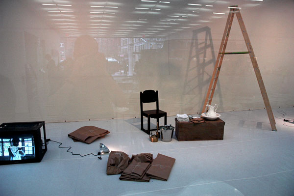
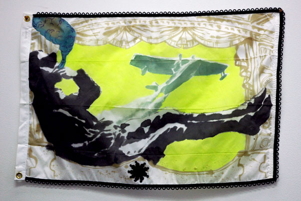
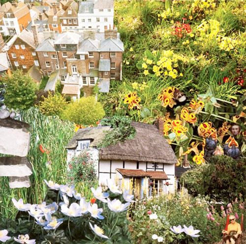
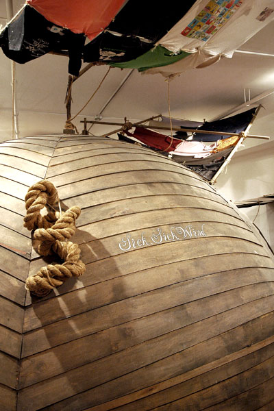
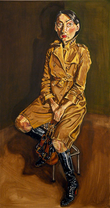
detail of Nikhil Chopra's "Yog Raj Chitrakar visits Lal Chowk" in the Glass Gallery


*
in the city of Srinagar, the capital of the disputed, but India-administered state of Jammu and Kashmir

Paddy_Johnson_I_Can_Burn_Your_Face.jpg
Paddy Johnson Jill Magid I Can Burn Your Face 2009 custom pillow 18" x 18" x 5"
and Iliyan Ivanov, Apocalyptic Unicorn 2009 stoneware pet food bowl 2.5" x 6" x 6"
each edition 1 of 3 [installation view]


Ouch. Late again. "Scarlet Fever", an oddly-intimate group show at Hogar (little more than a handful of artists who studied and worked on their MFA's at Rutgers around 2000-2001), closed on Monday, and I had fully intended to do this post well before it disappeared.

I decided to spotlight this shrewd piece by Paddy Johnson not because it shows she is any more closely identified with the school's mascot, the "Scarlet Knight", than her colleagues in the show but because in a modest and wry way it seems to pull together (or finish off) so much of what has been described as the leading edge in the art world over the past decade, in art both material and conceptual.

Johnson's public visibility is very much a function of her popularity as an arts blogger, so when we learn that she called in her art for this exhibition it seems perfectly natural. Working off the only thread which held together the group of artists represented in the show, she did an on-line search using the term "Rutgers MFA" and found a Jill Magid neon image, "I can burn your face", and Iliyan Ivanov's "Apocalyptic Unicorn" triptych. Still on line, she then placed an order with Cafe Press, an internet site that prints images on all sorts of things (cups t-shirts, etc.), for a pillow and a pet food bowl, and asked them to be shipped to the gallery. Johnson calls the pair, mounted here on a white wooden shelf, a couple of "unlikely alumni gifts".

The other artists in the show were Saul Chernick, Michelle Forsyth, JJ Garfinkel, Andrew Guenther, Matthew Day Jackson, Michael Maxwell and Clifford Owens. I was only able to salvage the few images which follow. Even then, because of the reflection on the plexiglas I had to be satisfied with a detail of one of them, and, unusually, even a closeup shot hardly begins to suggest the depth and complexity of that piece (check out the description of the medium).


Matthew_Day_Jackson_LEM_Interior_2.jpg
Matthew Day Jackson LEM Interior 2 2009 laser-engraved burned wood and plastic 48" x 36" [installation view]


Andrew_Guenther_Plate_Face_5.jpg
Andrew Guenther Plate Face #5 2009 acrylic on canvas 45" x 35"


Michael_Maxwell_Self_portrait_in_another_dimension-.jpg
Michael Maxwell Self-portrait in another dimension 2009 saffron, poppy, indigo, lapis and other natural pigments, crushed quartz crystal, silver leaf and crylic on giclee print 67" x 45" framed [detail]

Marc_Schubert.jpg
Marc Schubert [installation view]


Matthew_Hansel_Coronation.jpg
Matthew Hansel Coronation 2008 oil, acrylic and ink on canvas 96" x 94"

Matthew_Hansel_Coronation_detail.jpg
[detail]


Matthew_Hansel_Flag_7.jpg
Matthew Hansel Flag 7 ink and acrylic on nylon flag 2' x 3' [installation view]


Matthew_Hansel_Flag_2.jpg
Mark Hansel Flag 2 2009 ink and acrylic on nylon flag 2' x 3' [installation view]


A dynamic five-month-long exhibition project in downtown Brooklyn includes a number of street-level art installations under the umbrella, "395 Flatbush Avenue Ext.". Two of the galleries, "space E" and "Space F", display a mix of paintings, works on paper, installations and sculpture, much of it created specifically for these rooms.

The images of prime work by Marc Schubert and Matthew Hansel shown above are only a tease.


Kadar_Brock_big_diptych.jpg
Kadar Brock [installation view]


Daniel_Heidkamp_shaggy_dog.jpg
Daniel Heidkamp [installation view]


Possibly the best show title of the year, "Too Big To Fail: Big Paintings", described another room, "Space C", filled with works which, in both their size and quality, seek to demonstrate the validity in the visual arts of that newly-immortalized national mantra.

Kadar Brock's diptych, seen in the first image above these two paragraphs, was definitely big, and didn't fail to please. The painting of the very big fenced-in shaggy yellow dog is by the curator of this particular space, Daniel Heidkamp.


"395 Flatbush Avenue Ext." is a collaboration between New Art Dealers Alliance (NADA), Your Art Here and Downtown Brooklyn Partnership. Five or six empty shops along 395 Flatbush Avenue Extension have been filled with exceptionally fresh art worth a detour, even a trip from the far reaches of the City's sleepier boroughs (Brooklyn's growing cultural importance makes me increasingly confident in including Manhattan in that description).

Although it may not be so important in an enterprise projected to continue for months, there seems to be some confusion, at least for me, about official opening dates of this temporary cultural station set up near the Fulton Street Mall. There was a preview the evening of October 6th, and then the very public mashup of the County Affair [Kings, that is] this past Sunday, but there will also be a reception for "Too Big to Fail" tomorrow, Friday from 6 to 8, and I assume all of the other spaces will be open as well.

Otherwise the public hours are Fridays, Saturdays and Sundays from noon until 7 over the next five months.

The structure of the whole project has some of the aspects of "let's put on a show", but the art is not improvised (okay, maybe the County Affair was, and to its credit!). The commitment of both artists and organizers to openness, accessibility, and connection with the community where it is settling in for the next five months appears to be completely genuine. It works for me and I hope it works for everyone.


Joshua_Smith_dollar_portraits.jpg
An extraordinarily-generous Joshua Smith was kept very busy at the Affair all day Sunday delivering on his offer of $1 water-color portraits.


Offset_Projects_window.jpg
Offset Projects is a group show of inexpensive artist-designed posters produced by the non-profit founded by artist Matthew Spiegelman.


Volunteer_Lawyers_for_the_Arts.jpg
The awesome staff of Volunteer Lawyers for the Arts has set up an office within one of the storefronts adjacent to all the fun. It's over to the left, near the local Applebee's at the south corner of the block.

Michael_Williams_Bon_Voyage_2.jpg
Michael Williams Bon Voyage 2008 oil on canvas 60" x 40"

Michael_Williams_Bon_Voyage_detail.jpg
[detail]


Michael_Williams_In_the_Woods.jpg
Michael Williams In the Woods 2009 acrylic on canvas 64" x 96"


Michael_Williams_Peanut_3.jpg
Michael Williams Peanut 2009 oil on canvas 96" x 64"

Michael_Williams_Peanut_detail_2.jpg
[detail]


I've already said that I love this guy's painting, beginning with "At Mr. McCooks". As for Michael Williams' current show of new paintings at CANADA, "Mr. Big", I'll only add that he certainly doesn't disappoint, and that he definitely hasn't held back.

Have I already said that this is one of my favorite galleries ever?

Nancy_Spero_LGBT_Center_lights.jpg
a part of Nancy Spero's 1989 installation on the wall of the main room of the Lesbian, Gay, Bisexual & Transgender Community Center on West 13th Street


Nancy Spero died on Sunday. We miss her already. But while the world is made so much poorer with our loss, her great spirit and her phenomenal work will always brighten our lives - and strengthen our resolve to be almost worthy of her courage.

Light those lights!


Related: a note on Spero's partner, Leon Golub, with a link to his 2004 NYTimes obituary

The only way I'm going to be able to show images of even a portion of the more interesting shows I've already seen this season is to go over them in a short series of entries, each combining a handful of exhibitions, and to include only a picture or two, the identity of the the artists and the venues, and a very few words.

I'll proceed, roughly, in the chronological order of my visits.


Genesis Breyer P-Orridge

Genesis_Breyer_P_Orridge_theefracturedgarden.jpg
Genesis Breyer P-Orridge Thee Fracture Garden 1995 mixed media 12" x 12" (on 20" x 16" Arches paper)


Invisible Exports's show of work by the legendary and heroic artist and performer Genesis Breyer P-Orridge, "30 Years of Being Cut Up", closes on Sunday (October 18th). I took this shot of the radiant artist during the opening reception last month:


Genesis_at_opening.jpg


[first image from Invisible Exports]


The Bruce High Quality Foundation University

BHQFU_desk_chairs.jpg
awaiting creation


Flush with the accolades of the academy which it critiques, the creative, enterprising and inspired Bruce High Quality Foundation is expanding its role and operations into pedagogy itself. On September 11th the art collaborative's latest (and perhaps inevitable) creation, the Bruce High Quality Foundation University (BHQFU), opened the West Broadway doors of its new operation, hosting a reception for its fans and any number of potential matriculates, both learning-thirsty and insurgent.

BHQFU_reception.jpg
engaged


Jade Townsend

Jade_Townsend_Sick_Sick_Wind.jpg
Jade Townsend Sick, Sick Wind 2009 installation, variable dimensions [detail of installation]


I'm showing an image of Jade Townsend's pig-shaped battleship, the centerpiece of his show, "Sick Sick Wind", at Priska Juschka. It closed today but I'm sharing it now not just because it was an extraordinary construction, but because it gives me an excuse to delight in the memory of Duke Riley's Naumachia, of which it was a particularly dramatic part.


"Heartbreak Hotel" at Freight & Volume

Kadar_Brock_Impossibility_of_Love_in_the_Fourth_Dimension.jpg
Kadar Brock The Impossibility of Love in the Fourth Dimension 2009 oil, marker and spray paint on canvas 20" x 24"


Kim_Dorland_Untitled.jpg
Kim Dorland Untitled 2009 oil on panel 20" x 16"


Lucas_Moran_Neon_&_Lilacs.jpg
Lucas Moran Neon & Lilacs 2009 oil, gorilla glue and acorn tops


This group show actually closed on August 12, just before the fall season opened in earnest, and that was the day I visited it. As a late summer show, it was pretty much below the radar for most gallery visitors; I thought it deserved much more notice than it must have gotten, so I'm posting a few images. "Heartbreak Hotel", at Freight & Volume, included new work by Fanny Allié, Erik den Breejen, Kadar Brock, Kim Dorland, Andrew Guenther, Jonathan Hartshorn, Annamarie Ho, Peter Hutchinson, Min Hyung, Misaki Kawai, Peik Larsen, Jim Lee, Lucas Moran, Danial Nord, Daniel Ranalli, Max Razdow, Michael Scoggins, Russell Tyler, Tabitha Vevers, Eric White and John Yau.


"The Female Gaze" at Cheim & Read

Anh_Duong_The_Lure_of_Disillusion.jpg
Anh Duong The Lure of Disillusion 2008 oil on canvas 85" x 45" [a self-portrait]


The Cheim & Read exhibition, "The Female Gaze: Women Look at Women", also closed in (late) September, but it had settled into the gallery for a blessed three months, encouraging return trips. Barry and I went only twice; it wasn't enough.

The artists included were Berenice Abbott, Marina Abramovic, Ghada Amer, Diane Arbus, Vanessa Beecroft, Lynda Benglis, Louise Bourgeois, Kathe Burkhart, Julia Margaret Cameron, Victoria Civera, Rineke Dijkstra, Marlene Dumas, Anh Duong, Judith Eisler, Tracey Emin, Ellen Gallagher, Nan Goldin, Katy Grannan, Jenny Holzer, Roni Horn, Chantal Joffe, Deborah Kass, Maria Lassnig, Zoe Leonard, Sally Mann, Marilyn Minter, Joan Mitchell, Alice Neel, Shirin Neshat, Collier Schorr, Joan Semmel, Cindy Sherman, Mickalene Thomas, Hannah van Bart, Hellen van Meene, Kara Walker, Francesca Woodman and Lisa Yuskavage.

It occurred to me just now that, since the gallery's partners, John Cheim and Howard Read, do not mention the name of the curator in their press release, this awesome show was itself almost certainly the product of a male gaze: Maybe there's hope for us all.


[image from Cheim & Read]

KIDS_and_Secret_School_Network_of_Secret_Gardens.jpg
we must cultivate our garden


NURTUREart is just about the smartest, most generous and most completely rewarding non-profit around for both supporting and showing the unfamiliar and the unexpected, not least because its mission is not only about emerging artists, but about emerging curators as well*.

This remarkable institution's 2009 benefit will be tomorrow night, October 12, at Claire Oliver in Chelsea. There's more information here.


The image at the top is from the current show in NURTUREart's Bushwick gallery space, titled "Plan B", a group exhibition curated by Krista Saunders. It's a detail of work by The K.I.D.S. and Secret School, "Growing a Network of Secret Gardens", a site-specific mixed-media installation which inhabits, in the phrasing of the installation label, "the entire neighborhood where they work and play".


*
At least 50% of the artists included in their Gallery Program shows must be from the NURTUREarts registry of artists who do not have representation, and each year curators are invited to submit proposals to their Emerging Curators Program for review by a rotating panel of experienced curators, arts professionals, and members of the board.

Derek_Stroup_Blue_Panel_White_Panel.jpg
installation view of Derek Stroup's "Blue Panel", on the left , and a large detail of the slightly larger "White Panel" on the right (each completed in 2009, of enamel paint on sheet metal, with an aluminum stud below, and measuring approximately 5' x 6')


Derek_Stroup_Shell_1.jpg
Derek Stroup Shell 1 2008 digital C-print


Derek Stroup's show, "Station Pieces", in the front rooms of Williamsburg's A. M. Richard gallery closes tomorrow, Sunday. Barry and saw it this afternoon and we immediately designated it a top pick on ArtCat.

In this elegant, and very eloquent small show the artist presents conceptual work attached to imagery stubbornly-familiar to all of us. Stroup also deals with a number of the contemporary art world's current recognized preoccupations: He incorporates or tackles the subjects of street art, economic devastation, the endangered planet, sculpture assembled from existing materials, hand-made versions of machine-made products, digitally-altered images, realism, abstraction, the new minimalism, text (or its effacement), the recording of built landscapes, and architectural fragments. He pulls it all together with amazing skill, to totally original, and gorgeous, effect, but when we leave its presence Stroup's art rewards us with questions whose answers will continue to elude us.

The installation may ostensibly be devoted to commonplace proprietary gas stations, but, to begin with, all logos have been completely erased. This was accomplished digitally on the one photograph included, and with thick strokes of paint (much as tags or graffiti are routinely removed by the owners of the property on which they are inscribed) on the three "paintings", whose surfaces or mountings have been co-opted for use as minimalist, abstract panels - sculptures in fact, since they are rendered on large sheets of riveted steel attached to other elements.

The commercial signs and the apparatuses, having now been rendered entirely anonymous, appear to have lost their purpose, and the world which created them - and was fed by them - may have entirely lost its validity. Or not.

The largest, most ambitious and most complex piece in the show is "Red, White, Grey 2 (Station Exterior)" which, except for its essential conceptual element, might suggest the practice of any number of younger sculptors today, except that the materials Stroup uses are not exactly "found"; instead, designed to assume a specific form, the components were pulled from the racks of suppliers of new construction materials.

I tried to get an image of "Red, White, Grey", whose nine feet by nine feet dimensions ensure that it fully occupies the larger of the two rooms, but I couldn't come up with anything which even suggested the awesome impact of the piece I stared at this afternoon.

You have to be there. Really. So this thumbnail can only be a rough approximation:


Derek_Stroup_Red_White_Grey.jpg


[second image from artnet]

Michael_Mandiberg_Google.jpg
Michael Mandiberg GOOGLE 2009 shrinkwrapped laser cut Brooklyn yellow pages


Michael_Mandiberg_We_have_never_had_a_year_of_peace.jpg
Michael Mandiberg We have never had a year of peace 2009 (in progress) laser cut 3 volume edition of the Encyclopedia of the Third World

Michael_Mandiberg_We_have_never_had_a_year_of_peace_detail.jpg
[detail]


Michael_Mandiberg_FDIC_Insured.jpg
Michael Mandiberg FDIC Insured 2009


Michael Mandiberg has just finished assembling a handsome installation of his work at Eyebeam. It apparently represents only some of the work he has been doing over the past six months.

Barry and I had a preview of the installation on Monday. Although not currently open to the public except by making arrangements with the artist (see below), this work, along with that of Eyebeam artists In residence, student residents, and other senior fellows can be seen during Open Studios: Fall 2009, scheduled for the afternoons of October 23 and 24, between 3 and 6 each day.

Mandiberg's one dozen separate pieces consist primarily of old, found books cut with a laser, handsomely shown individually or assembled in groups of two or more and placed on the artist's own constructions.

Mandiberg goes where no laser cutter has ever gone before. Some of the work physically and dramatically distinguishes important newly-established contemporary technologies from their aging or defunct antecedents (many of which could once have been described as cutting edge themselves), The result is a visual dialogue charged with the passage of time and composed in the empty spaces we see "written" in and on various kinds of reference books.

One piece, a work in progress (surprisingly, lasers take their time), is titled "We have never had a year of peace". When finished it will comprise the three volumes of the "Encyclopedia of the Third World", lying on their spines next to each other, open at a random page in the middle where the artist has deeply burned the name and year of every war fought by this peace-loving republic since 1890.

Another body of work consists of a wall display of cast-off volumes describing how to make money. Mandiberg has "whittled" with a laser into their hard front covers to describe the logos of, according to the artist, "all of the failed banks of the Great Recession".

Not directly related to the re-worked dictionaries, encyclopedias, phone directories, or investment monographs are some breathtaking laser-cut drawings of the security patterns ordinarily found printed inside those familiar small mailing envelopes used by banks and similar institutions.

Those interested in seeing more images, or in visiting the space where these exquisite, yet powerfully-resonant pieces are installed, should go to the dedicated page on the artist's own site, where he advises:

Eyebeam is currently closed to the public, but if you would like to see this installation you have two options. Contact me ([email protected]) to set up a time to meet, or come by the Eyebeam Open Studios, which will be October 23rd and 24th from 3-6PM.

This page is an archive of entries in the Culture category from October 2009.

previous archive: Culture: September 2009

next archiveCulture: November 2009