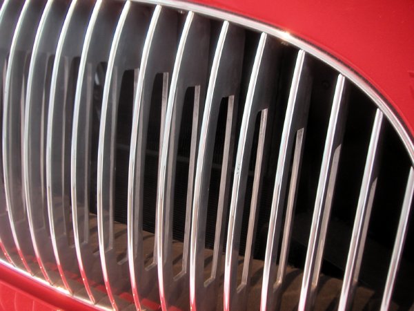
Pinin Farina Cisitalia 202 GT Car 1946 aluminum body 49" x 57 5/8" x 13' 2" [detail of installation]
I didn't expect to look for the Cisitalia again when I casually wandered into MoMA's Architecture and Design galleries earlier this week. I'd seen it many times before and in spite of my obsession with interesting automobiles I didn't think it could mean much to me any more.
Uh-uh.
I was particularly sensitive to industrial design that day because we recently decided we needed a new land phone and I had just been looking at the lamentable, no, painful choices available. This beautiful car was imagined and put together almost 60 years ago. Have we learned nothing since?
I'm not even going to dwell on the ugliness and gigantism of the SUVs, Town Cars and Ford taxis which confronted me as I left an art museum which has tried since 1932 to honor good, simple design in everyday objects created over the last 150 years or so.
I'm sticking my neck out a bit by bringing up the subject of this Museum collection in the first place. Many people still think a design gallery in an art museum is inappropriate in the first place, but I'm happy with the idea that we shouldn't be content with a world where art is only found hanging on walls or standing in public spaces.
There's also the subject of the [ethics?] of any kind of enthusiasm for the private automobile, especially in the twenty-first century, even if Americans don't have any real alternatives at the moment. In any event, when this car was built General Motors and the oil companies had barely begun their campaign to destroy public transportation, so the idea of a private pleasure vehicle did not carry the baggage it does today.
Incidently, this little Cisitalia has an engine smaller than that in my 1962 VW Beetle, but with more power, and it weighs about the same (1600 pounds). Hey, those power and weight figures are pretty much the same as those of a basic Smart. Now there's an original and almost perfect design for modern industry, and it too is now a part of the Collection. But, and no surprise here, we're not allowed to have it on our streets. Too pretty and too sensible, and it doesn't have a brutal line in its body.
But back to the old car and the new phone. The color of the sleek Italian antique on MoMA's third floor is a luscious red which could never be forgotten, much less ignored if you're anywhere near it. When I'm through with this post I'm going to plug in my new phone system. it's in a busy combination of a dull black and a grey pseudo-aluminum, and it looks like it will be almost too painfull to live with. Maybe I can cover it with a doily. But, really, it's not about color. The colors are only symptoms.