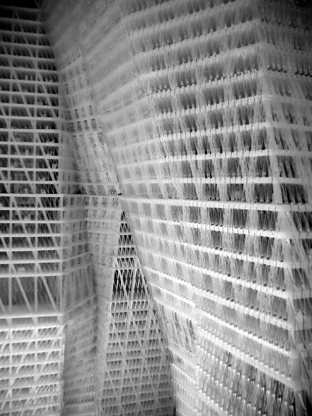
United Architects World Trade Center Proposal Project 2002 Plexiglas [detail of installation]
It was my favorite when I saw it in a magnificent exhibition organized by and presented at Max Protetch now more than three years ago. It may have been the only proposal which looked like a work of art as much as it looked like it would actually work. I think that suggests great architecture. Apparently MoMA now agrees, since the model of the United Architects study for the site of the World Trade Center has entered the collection. [see the architects' site for more]
Yes, I know that in recent years, because of the stupidity and the chaos which has accompanied discussions since this structural model was first shown, and the banal or junky designs which have been advanced in its stead, I have argued for a big green lawn or, more recently, a grand pedestrian plaza.
But if build we must (this is still New York) my heart would still be with this gorgeous proposal, in spite of its size. It somehow remains the least monstrous, on account of its elegance and its irregularity. It may be the safest structure, because of its structural connectors and its multiple exits; and, oddly, it comes off as the most humanist, for its anthropomorphic shapes and the suggestion of an organic community within.
Every one of the extras which have been suggested or promised for the site since this model was built could fit within its mass. At this point I'm even willing to do without those two holy holes, although the United Architects design actually does contemplate keeping those areas clear and the combined segments of the building actually embrace them.
Also because this is New York however, this great proposal is likely to stay just where it is - a work of art.