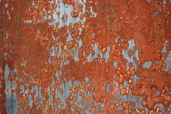
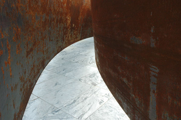
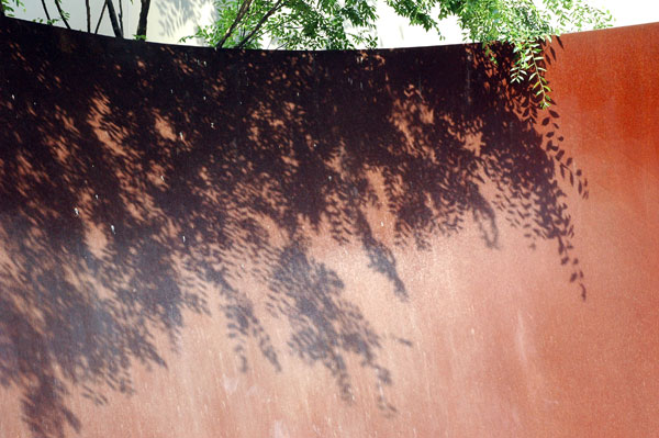
 Richard Serra Intersection II 1992 [detail of installation]
 Richard Serra Intersection II 1992 [detail of installation]
 Richard Serra Torqued Ellipse IV 1998 [detail of installation]
This isn't really a review of Richard Serra's show, which tomorrow opens to the public at the Museum of Modern Art. He's been around long enough to be familiar to anyone reading this blog, and the work doesn't change enough to provoke eyes which normally delight in emerging art.
Unfortunately, because of MoMA's photography prohibitions on work the museum does not own, I can't show images of the large installations inside, on the second and sixth floors. I was only able to to take shots of these two pieces installed in the sculpture garden. They're details only, because in still photography that's how this stuff looks best; Serra's sculpture is essentially about the experience of moving through it.
A few thoughts on the show:
- It's about sculpture alone, so it doesn't seem to be a true retrospective (I think my first Serra love object was a black paint stick drawing).
- Oddly, the exhibition doesn't include still or moving images of important work missing here, and this is an artist who makes much of the importance of specific sites for his sculpture.
- There's not much really new; Serra is doing what he knows and what the public has finally come to like.
- Don't miss looking straight up when you first enter the gallery rooms on the sixth floor.
- I haven't decided whether the bird mess [white flecks on the third image above] on the pieces outside is a net plus or minus.
- The latest work, installed on the second floor, is very, very big. I worry about filling our flat files, and we can't afford to rotate work hanging on our walls; don't I covet just a corner of his storage space!
- This sculpture is very photogenic; I would love to be let loose with my camera in the interior galleries: minimal sculpture for minimal photography.
- Favorites? "Sequence", from 2006 is great fun, because the course through its inside circuit seems endless (the piece looks great in the overhead shot printed in the show's brochure), but I really love the lead pieces from 1969-1970, and then there's the mid-70's "Delineator", which almost makes me swoon.