February 2009 Archives

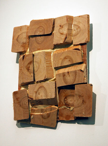
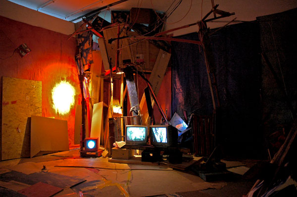
Tehching_Hsieh_cell.jpg
the artist's life becoming a concept [the wooden cell]
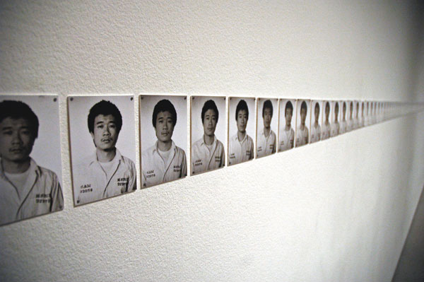

Tehching_Hsieh_photos.jpg
documented in time [the photographs taken daily]


I was ashamed that I hadn't immediately recognized who Tehching Hsieh was. That is, I had not only forgotten about his 1978-1979 "Cage Piece" but I had also, for the moment at least, not remembered the "time clock piece", "the outdoor piece" or "the rope piece", even though just the idea of these had thrilled me at the time, as I read about them in ordinary newspapers while living in Rhode Island before moving to New York.

After having breezed through Hsieh's exhibition at MoMA last Tuesday on our way to Klara Liden's piece in the next room (a first priority, because her piece had not yet been opened to the public), Barry and I were returning to check out his own, more sober installation, located just off Kippenberger's "Kafka's 'Amerika'" piece in the atrium. Museum Director Glenn Lowry had left the Liden room just before us, where I had heard him congratulating the curator for introducing such a terrific piece into the museum. He stopped to look at the Hsieh materials and documents and turned toward us as we entered the room apparently wanting to his clear enthusiasm for the work. [I love to see the guy at the top running around the big "shop" and sharing his excitement with visitors.] We agreed that it was an incredibly impressive and even astonishing project. I said that on registering it for the first time my second thought, and first question, had been, what does such a long experience of isolation from any outside stimulus do to your mind? I wondered aloud, what do you do after being alone with your mind for a year? I asked Lowry, do we know what he did later? He answered, "Apparently he didn't do much".

Which is both true and not quite so true, as I started to learn almost immediately after asking the question. Hsieh went on to commit himself to several more long-term performances equally as challenging, although not nearly so isolating as the first. But no, apparently until very recently no art was ever formally exhibited or sold. The last (latest?) two projects, the first a one-year assignment to "go in life", not seeing, making or talking about art, and a "13-years plan" to make art but not show it publicly, would each appear to have been a relative piece of cake, but together they seem to have meant the end of his art, at least by his own account, as documented inside a long and fascinating piece. "A caged Man Breaks Out at Last", by Deborah Sontag appearing in tomorrow's New York Times [slide show].

Tehching Hsieh tells us he is no longer an artist, but I think we can't take him at his word, and we must not, as I'll try to explain.

The work haunts me as I sit here trying to express something about the inexpressible. Alexandra Munroe, the senior curator of Asian art at the Guggenheim Museum, is quoted in Sontag's article, referring to Hsieh, "He is deeply philosophical". It seems to me he is something else: Hsieh is not a conceptual artist; rather, he has reduced his entire life to a concept. The work he has given to us seems to have come out of nowhere. It is so pure and sublime that it doesn't seem we could possibly deserve to be its legatees, especially since we've virtually ignored it for thirty years.
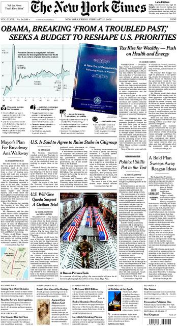
NYT_real_Feb_27_09.jpeg
real


The front page of this morning's real New York Times looks an awful lot like the fake New York Times published by the Yes Men with the help of many others last November 12. My own hard copy of today's Late [City] Edition differs only slightly from the one shown above. It adds a story which suggests the feds are getting closer to nationalizing the banks.

Probably the most significant element missing from the February 27, 2009, paper is the banner headline on the July 4, 2009, edition shown below: "IRAQ WAR ENDS" - but then we still have more than four months to get that one right.


NYT_fake_July_4_09.jpg
fake New York Times


[first image from the real NYT site; second from the faux NYT site]

Martin_Kippenberger_Birch_Wood.jpg
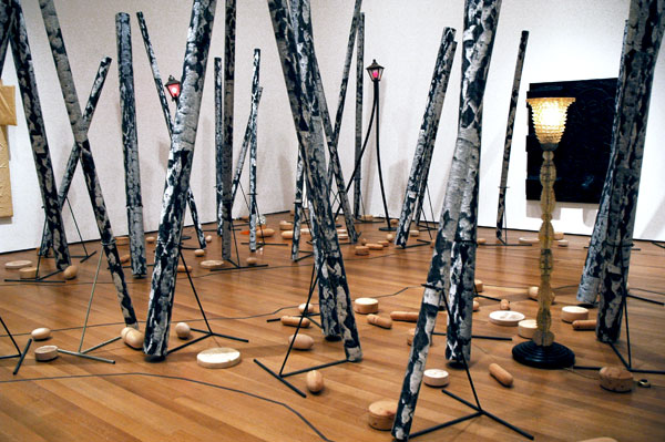
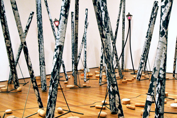
Martin Kippenberger Now I'm Going Into the Big Birch Wood, My Pills Will Soon Start Doing Me Good 1990 twenty-nine artificial birch trees (rolls of cardboard and plastic and black-and-white offset prints), metal stands and wood pills - dimension variable [large detail of installation, including "Kippenblinky", "Street Lamp for Drunks", "Untitled" (street lamp), "Disco Bomb", and parts of two rubber on canvas works hanging on walls to the right and left]

Martin_Kippenberger_Big_Birch_Wood.jpg
[cropped version of photo above]


I didn't include this image in my Kippenberger show post of two days ago because it seemed to me somehow adulterated for including works that were not actually part of "Big Birch Wood" itself, but which the curator, Ann Goldstein, had intermingled with the larger piece.

And yet, since I published Tuesday's entry, I've scrolled several times through the many images I took home with me, always finding myself being drawn back to the oddly-calming picture of these trees and oversize pills. I decided to try cropping the document to eliminate most traces of the other works. Then I wanted to share what I came up with, and that suggested this follow-up post.

But then something unexpected happened, barely two minutes before I started writing this paragraph. I had already decided I had to know more about why the installation had been given this shape so I did a little research on line, in the press materials, and in the George Baker's article on the Kippenberger show in the February Artforum, "Out of Position" [unfortunately not available on line]. As a result of what I learned, I made the decision to add a thumbnail of the original image below the full-size representation of my large detail.

By this time I had apparently arrived at a sufficient degree of enlightenment to see something that has escaped me earlier, because when I took another look at the un-cropped picture I couldn't understand why if had not satisfied me before. I reversed the arrangement I had just determined upon, so that now my preferred image is at the top. I left the cropped photo as a thumbnail mostly to show what I've been talking about here.

Ain't art wonderful?

I still don't know enough about this extraordinary artist's life and work to critique the curator's decision to meld several different disparate [?] pieces in this part of the gallery. I'm convinced however that Kippenberger's "Now I'm Going Into the Big Birch Wood, My Pills Will Soon Start Doing Me Good", largely because of its title, and its relationship to the artist's personal circumstances, is one of the saddest, sweetest, and yet grandest poetic expressions of Kippenberger's pain and his creative genius.


I've one more thing to share about Kippenberger right now, this quote from Ronal Jones, writing in Artforum in 1997 [I found it on Douglas Kelly's site] which captures his remarkable fecundity:

Someone was always mistaking Martin's solo exhibitions for a cattle-call group show. That pleased him no end.


Klara_Liden_MoMA_stuff.jpg


Klara_Liden_MoMA_cube.jpg


Klara_Liden_MoMA_video_near.jpg


This kind of project is one of the things that we have not been seeing often enough at MoMA, and that was the case even before the opening of the new building. Since there's now more space, there's less of an excuse then ever to keep "emerging artists and new art"* out of our premier modern mouseion, founded and endowed as the premier "seat of the (here, visual) muses".

Maybe some people understand "modern" in a way that does not include the "contemporary", and MoMA's decision not to engage in the regular deaccession of works in its collection which reach a certain age might explain what seems to be the museum's frequent uneasiness with art being created in real time. I hope the appearance of Klara Liden on the second floor gallery signals a new openness on 53rd Street.

I've been one of the many champions of this artist's work since first encountering it inside the storefront of the old Reena Spaulings four years ago, and yesterday during a press preview Barry and I were both charmed to see her working again with cardboard, this time inside a very different space.

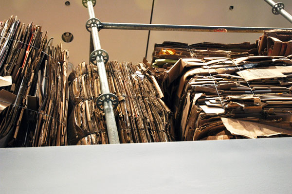
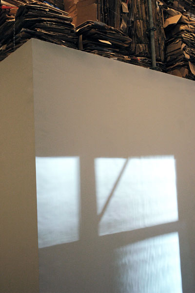
Not everyone might agree with us, at least at first, as I learned when we were about to leave the room. A smartly-dressed woman all in black, of a certain age, who, along with several other women, also in black, had been in conversation with the curator, Eva Respini, asked us if we liked the work. I immediately volunteered, "yes", with a little giddy enthusiasm. She asked me why, and I first described Liden's earlier work. Turning to this installation, I mentioned the re-cycling element, the ransacking of the museum's bowels, the white cube, the reference to consumerism (even in a museum context) and waste, the careful ordering of materials, and such. She looked up at the rows of cardboard boxes, broken down and tied, lined up high above the pure white walls, and she nodded, apparently unpersuaded of its virtues. She thanked me, and as she turned to leave, while she passed by I distinctly heard her give a very soft sigh.

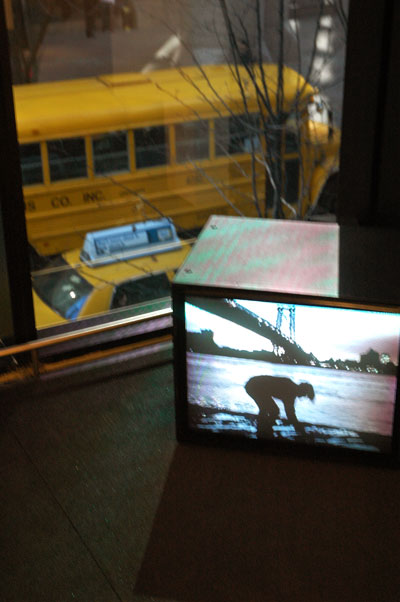
Respini told us that the accompanying video of the artist casting stones into the water had only been finished last weekend. It has a more casual air, than the structure behind it, which almost fills the room. At the time I took this picture the huge window behind the heavily-tinted glass (which turned daylight into something like the twilight East River scene on the screen, and also cast a blue light on the cube) was partly filled by a New York cab and a parked school bus, painted an identical yellow. It reminded me of the fact that MoMA routinely hosts visits of young school children on the days it is closed to the public, and we encountered one such very fortunate group, probably a kindergarden class, minutes later on our way out.

Now that's even more than contemporary. May the gods save this kind of temple forever.

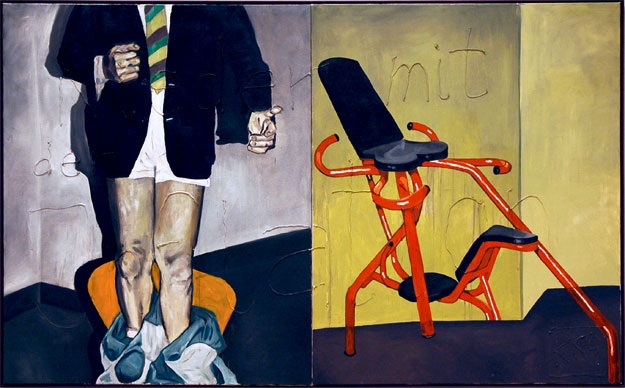
Martin_Kippenberger_Down_With_Inflation.jpg
Martin Kippenberger Down with inflation 1984 oil and silicone on canvas (2 parts) 63" x 104.75" each


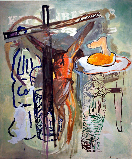
Martin_Kippenberger_Fred_the_Frog.jpg
Martin Kippenberger Untitled, from the series Fred the Frog 1990 oil on canvas 94.5" x 78.75"


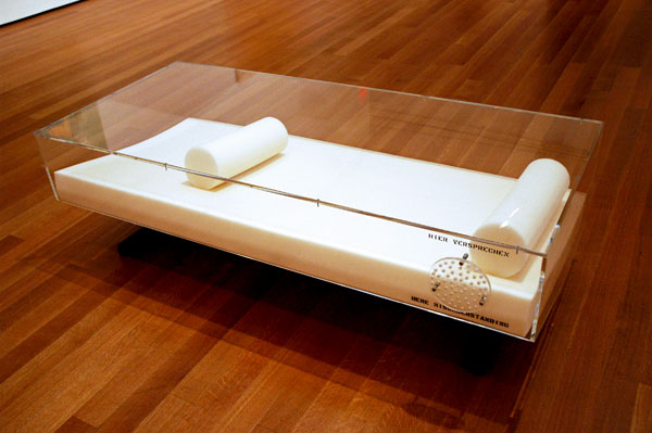
Martin_Kippenberger_Schneewittchen_Sarg.jpg
Martin Kippenberger Snow White's Coffin* 1989 Plexiglas, synthetic foam and metal 15.75" x 33.5" x 71"


Martin_Kippenberger_Swastika.jpg
Martin Kippenberger With the Best Will in the World I Can't see a Swastika 1984 oil and silicone on canvas 63" x 52.75"


Martin_Kippenberger_Stammheim.jpg
Martin Kippenberger "Stammhelm"** from Three Houses with Slits (betty Ford Clinic, Stammheim, Jewish ELementary School) 1985 oil and lacquer on canvas 49.5" x 59" each


This one really is for us. I mean the glorious, rich show, "Martin Kippenberger: The Problem Perspective", which will open on Sunday (March 1) at MoMA. And I mean that it's especially appealing to us art junkies: artists, fans and whatnots, zealots who regularly traipse through some of our meaner streets, searching out, and even haunting the more adventurous galleries and grittier rooms in this city and the incredible world beyond it, looking for the real thing, art which both reflects and challenges a world unlike that of even the most recent past. An anomalous rabble, we're notorious (or more often ignored) for being sustained by under-known art not yet "elevated", even made sacred, by the respectable museums we're just not visiting so much any more (and not only because admission to the pantheon can set us back twenty bucks a pop).

But today I feel much better about the Museum of Modern Art than I have for some time.

Because of our interest in the subject of the retrospective, and our relative ignorance of it, Barry and I were eager to go to the press preview on West 53rd Street even though it was scheduled for something like our dawn this morning. I'm delighted to see that this month our local cabinet of early-modern curiosities is bringing us both Klara Liden (opening tomorrow, February 25), and the Kippenberger show, although I have to point out that the Kippenberger was put together by The Museum of Contemporary Art, Los Angeles [MOCA], Ann Goldstein, curator.

It's a great show.

This is a collection of work which passes back and forth (sometimes doubling and tripling up) in what seems to include just about every medium. Although it all really looks like today, some of the pieces being displayed have been around for three decades. A few of the articles installed in the museum's sixth-floor Special Exhibiton Galleries may be little more than the size of a hand, and the paintings are generally less than gigantic, but there are also room-size pieces, and one installation, "The Happy End of Franz Kafka's 'Amerika'", which totally fills the bottom of the huge atrium, leaving only a modest square path lining its sides for all the visitors it will delight.

In her remarks today Ann Goldstein shed some light on the title of the retrospective (still slightly obscure to me, since I haven't yet read all the material handed out at the presentation) when she described Kippenberger as a "profoundly productive problem maker". I was suddenly all ears - or, in this case, all eyes.

Because of its inherent strength, its enormous influence on other artists, and the fact that, as Goldstein also said, we've finally begun to catch up with Kippenberger, I think by now we would probably be seeing this body of work in these major, established settings in some form even if the artist had not died so young, in 1997, of cancer. He should be turning 56 tomorrow, February 25. I can't imagine what our world would look like if we were lucky enough to still find ourselves provoked, repeatedly, by the wisdom, the humor and the irreverence of this prolific virtuoso.

Now the work he has left us looks like it's here for the ages, whatever that may mean, but I have to hope "the ages" will always cultivate the liberality which Kippenberger's art seems to ask of us.

It's a totally delightful show, great fun and without a dull note. I will be visiting it as often as I can while it's still here in New York.


The choice of the images uploaded here [yes, they're mine; fortunately we were allowed to take photos, since the museum seems to have virtually nothing on their site yet] was necessarily impacted by my fast run through the galleries during a far-too-brief press preview this morning, and it therefore doesn't necessarily represent either a good overview of the installation itself or a list of my top favorites - if any arrangement of either were even possible.


*
the German text above the perforated opening translates literally as "here promise"; the English text below it reads "here misunderstanding"

**
Stammheim Prison, where the leading members of the Red Army Faction (Baader-Meinhof) were held and tried. It is also the site where four of them either committed suicide or were murdered - extrajudicially.

Lisa_Kirk_House_Cards_entrance.jpg
front yard


Lisa_Kirk_House_Cards_mingling.jpg
open house


Lisa_Kirk_House_Cards_sales.jpg
sales tour


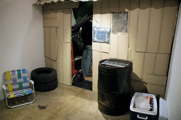
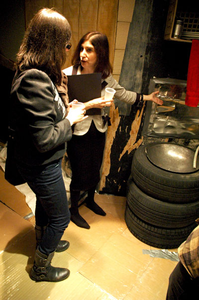
Lisa Kirk continues her provocative body of work (what she calls her "series of social occasions"), more recently investigating capitalism, terrorism and political violence, in a dramatic installation, "House of Cards", currently installed at the Lower East Side gallery Invisible-Exports. Although the show opened this past weekend and will continue there through most of March, after that it will take on the second life for which it was conceived.

This time Kirk has re-conceived the story of our contemporary real estate boom and bust in the form of a show model “shanty timeshare” whose structure and interior furnishings have been assembled, in classic (not "classical") style, from discarded materials found in the neighborhood.

An experienced sales staff will be present in the rear of the gallery throughout the run of "House of Cards", and visitors will have the opportunity to buy shares in this "private residence club" featuring all the conveniences which inhabit our current nightmares about home. Upon the show’s completion, the structure will be rebuilt inside a secure, honest-to-goodness gated community located on the edge of one of New York's scenic waterways, where we are told "shareholders will have the opportunity to experience shanty living. After 52 weeks, maison des cartes will be disassembled and distributed to the shareholders as 52 separate and unique artworks," thus promising a more upscale metamorphosis than that permitted most shanties when they are razed.

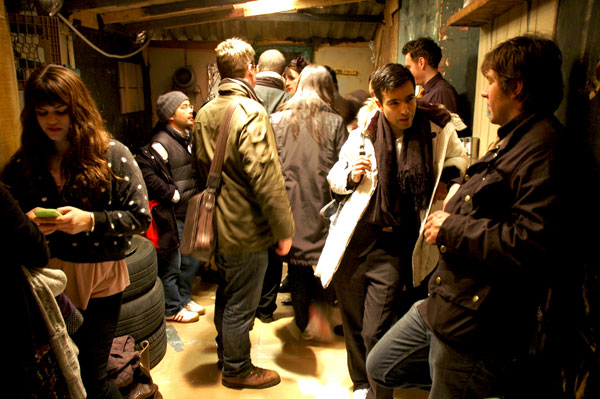
None of the serious satire (it's not a burlesque) I describe here made this show any less frightening when I visited it with Barry during a preview last week, although the images I'm including here, of happy guests mingling inside these digs, would seem to belie that assertion.

It's pretty scary; and it should be.

The press release announces a second installation, not related to the work on the main floor of the gallery:

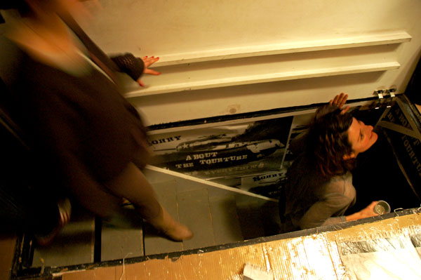
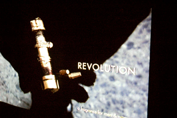
Kirk’s shanty will be coupled with an underground installation of her updated project, Revolution (06-09). Last exhibited at P.S.1 Contemporary Art Center, Revolution appeared as a fragrance lab and terrorist headquarters suspended upside-down from the museum’s ceiling.


Lisa_Kirk_Revolution_torture.jpg
"sorry about all the torture"


Lisa_Kirk_Revolution_fragrance.jpg
fragrance TV commercial


Lisa_Kirk_Revolution_bomb.jpg
continuing "Revolution"

Bushwick_Jefferson_stop_wall.jpg
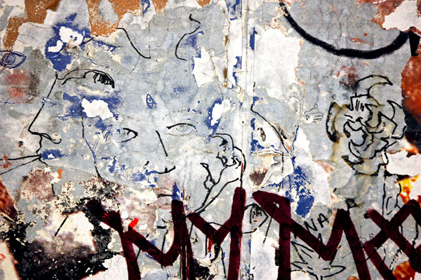
untitled (Cocteau heads) 2009


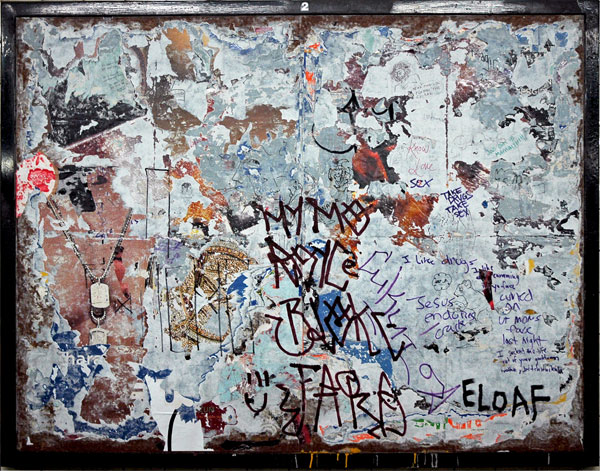
Of course I didn't do the drawing, but I want to share it. There's a lot going on here, most of it by chance. I saw these faces drawn on a very busy ground on an unused advertising board inside the Jefferson Avenue L stop over a week ago and the image I shot then still thrilled me when I rolled through my recent stash today.

This is what the entire board looked like:


Bushwick_Jefferson_stop_wall_sign.jpg

messa_di_voce.jpg
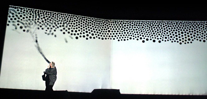
if "hearing is another form of seeing"*, then seeing is another form of hearing (Jaap Blonk and his "noise", visualized graphically here, in a scene from "Messa di Voce")


I know I run the risk of overplaying this description, but the folks who have put together three compelling concerts next week described under the heading, "The Human Voice in a New World", make music as it might sound had neither language nor musical instruments yet been invented.

Actually, these masters (composers, poets, artists, performers, writers and interactive technology engineers) could hardly ignore the existence of sophisticated language or highly-evolved musical instruments; They obviously have been informed by both. It's just that they have found a way of introducing us to musical sound in ways that make it seem we were fundamentally innocent of its pleasures until now.

They would also have us see the music, both literally and figuratively. Even without conspicuous visual elements (the most dramatic representation is included in Monday evening's performance of "Messe di Voce"), these programs appear to be something which could be enjoyed by anyone interested in the experimentation, innovation and originality of emerging work in the visual arts - and the reverse seems equally valid. I know I'm not the only one who thrives on an immersion in the output of the freshest, most creative genius which can be found in both these arts, and I have no academic background in either.

I'm still hoping to speak with just a little authority on the subject since I've been listening to a number of these sound artists for decades. Most have been around for years and some of them may be as old as I am, but what they will be doing next week would be very new to almost anyone anywhere. For the tiny few who will make it to any of these performances it will look and sound like tomorrow, because almost none of us has been listening to and thinking about today as closely as Joan La Barbara, Jaap Blonk, Golan Levin, Zachery Lieberman, Trevor Wishart, Joel Chadabe, Richard Kostelanetz and David Moss.

I'll be there each night; I wouldn't miss one of these concerts for just about any temptation. They are being presented by the Electronic Music Foundation [EMF]. Monday's performance, at NYU's Frederick Lowe Theater, is produced in collaboration with the NYU Interactive Arts Series and is free. On Friday and Saturday, at Judson Church, you'll be asked to pay all of $15 ($10 for students and seniors).

A generous amount of information, including sound samples and all the details on the performances, can be found on this page of the Electronic Music Foundation site.

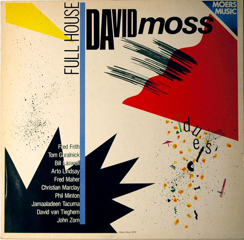
The image I'm including below is a shot of the cover of one of my 25-year-old LPs of David Moss, one of the two featured artists on Saturday evening. Look at the list of his collaborators at the bottom of the cover.


David_Moss_Full_House_1.jpg
his noise is music to my ears


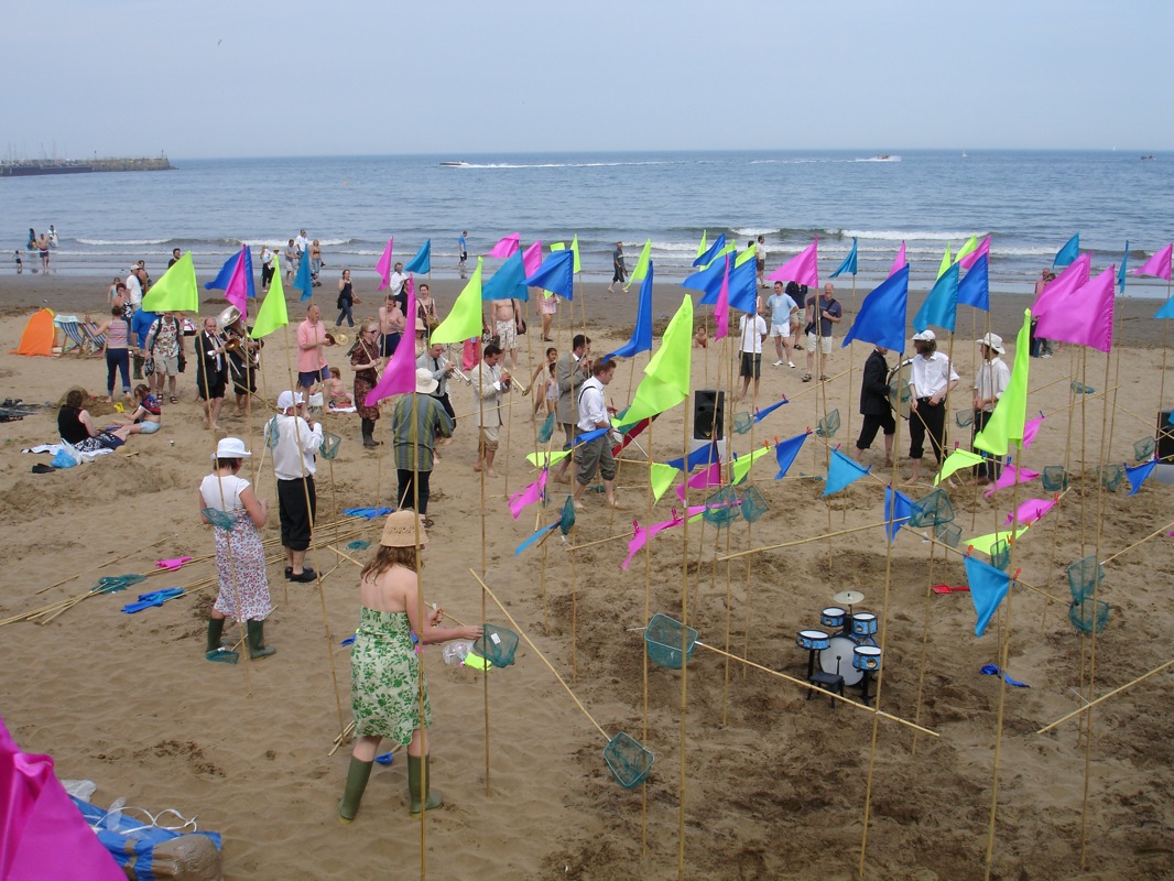
ADDENDUM: It's the next morning and I'm feeling weird about not including some kind of image related to Trevor Wishart's concert. He will be collaborating with Joel Chadabe and Richard Kostelanetz on Friday. In the middle of last night I went hunting for Wishart's name and found an image which had been uploaded onto flickr by Sonic Arts Network. It's of a revival at the group's 2005 Expo festival in Scarborough, on the Isle of WIght, of the British artist and public sound activist's 1977 piece, "Beach Singularity". A video documenting a part of the day-long performance can be seen here.


Trevor_Wishart_beach.jpeg
although it would have been fun, this Wishart piece is not the one coming to New York


Note: "The Human Voice in a New World" (subtitled: "A series of live performances exploring the crossroads of the human voice and technology") is not a particularly catchy tag. Even after several days going back and forth to look at the program information I still couldn't remember the name of the series I'm so excited about; the programs are bound to be much sexier than the billing might suggest.


*
quoted from composer William Hellermann, founder of The Sound Art Foundation in 1982


["Messe di Voce" is produced in collaboration with the NYU Interactive Arts Series; image at the top from tmema; image at the bottom from flickr]

Paul_Gabrielli_Dark_Movie.jpg
Paul Gabrielli Dark Movie 2008 single-channel video [large detail still from installation]


Paul_Gabrielli_Stage.jpg
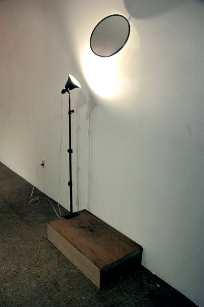
Paul Gabrielli Untitled (Stage) 2008 wood, aluminum, glass mirror, steel, light extension pole, clamp-light, light bulb, enamel 78.5" x 32" x 18" [installation view]


Paul_Gabrielli_Rental.jpg
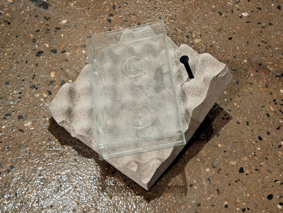
Paul Gabrielli Untitled (See Through Rental) 2008 glass, Ultra-cal, foam, acrylic paint, nail, enamel [installation view]


Barry and I weren't able to get to Paul Gabrielli's exhibition, "Closer Than That", at Invisible-Exports until the last weekend of the show. It was a Top Pick on ArtCal for just two days but it would have been there throughout its run had we seen it earlier. My posting some images now of this [elegant and sexy, conceptual, posterior-minimalist, multi-media including a bunch of may-look-like-but-aren't-readymades] installation is therefore something of an apology. It's also meant as a head's up, intended both for those of us who saw it and those who didn't, to be on the lookout for his work next time he comes around.

This excerpt from the gallery press release ends with a provocative question which follows the description of Gabrielli's work as:

. . . experiments in form designed to encapsulate the physical manifestation of a single thought, with all its lyricism and paradox. His pieces represent both interior visions and the very real destruction of the well-defined and corporeal. They stand on the anxious fulcrum of categorization; when distinctions between forms and material disappear, or are made to disappear, what is left standing?

For more information on the artist and on the program of this smart new Lower East Side space, see this interview on the newsletter ARTLURKER with Invisible-Exports owners Benjamin Tischer and Risa Needleman.

Mapplethorpe_self-portrait.jpg
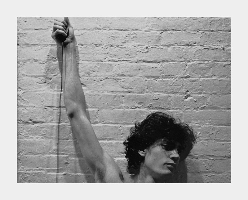
Maybe hold the Speed Stick. [Robert Mapplethorpe Untitled (self-portrait) 1973-1975 Polaroid photograph]


Scientists have very recently discovered that when men become aroused there's a verifiable shift in their body odor, and that women can tell the difference between sexual sweat and workaday smells by processing the odors in different parts of the brain, although they don't consciously realize it.

The headline in the New York Times article reads: "Varying Sweat Scents Are Noted by Women [my emphasis]". The new scientific study which announced this, as reported in the January issue of The Journal of Neuroscience", was made exclusively with a group of heterosexual men and heterosexual women, but I think that the results would be duplicated were the test conducted among homosexual men.

We're all communicating with smell, even though we don't consciously know it.

Before eager queers jump up and down with optimistic hopes, I have to add that it seems neither "gaydar" nor any of our other talents would help at all in advancing the usefulness of this newly-confirmed tool in our sophisticated evolutionary mating kit: One psychologist who was not involved with the study, Adam K. Anderson, an assistant professor at the University of Toronto, has cautioned that in spite of the conclusions of the report we shouldn't conclude that men now know what it is that pleases women [or homosexual men, I would add]. "[the scientists] didn't find activations of typical reward centers or regions associated with pleasure," Anderson said. "It's just as likely that [these women's] brains are picking up a man in heat that they are not particularly attracted to."

Oh.

So we can't know if we appear to the beloved as anything other than smelly. The latest scientific news doesn't offer any scientific shortcut to mating. Whether we're het or homo, it seems that our guy-pheromones can't do it all for us; we're still going to remain pretty dependent on our more culturally-developed contrivances, like conversation and social graces, if we want to know what square we're on when we're thinking of hitting on an an unfamiliar her or him.


[image from "Mapplethorpe: Polaroids", via The Morning News]

en_plein_air_23_street.jpg
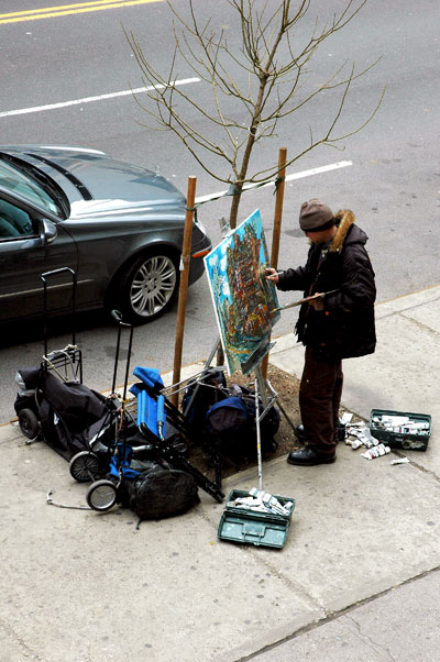
concentration


The story is that when I looked out of my window last Thursday afternoon, on the coldest, windiest day of the winter, I saw this painter and his rig. I had often seen him planted elsewhere on the block, often, as here, painting the Chelsea Hotel across the street, but on those occasions I would have been too respectful of his privacy, or maybe just to self-conscious, to intrude on his concentration with my camera.

This time it was different, since it was unlikely I could disturb him and equally unlikely I or my machine would draw anyone's attention. I took this picture and later returned to the window (without the camera) to see if he would still be there. He was, but I now saw that a young woman was standing at the driver's side of the car seen in this picture, looking a little puzzled, and a somewhat older man was standing in the street ahead of it pointing to something in the area of the left front fender. Then I saw a smile of recognition come to the woman's face and she stepped forward to pull and gather up what turned out to be a large, bunched-up clear plastic bag. It had probably become stuck somewhere on the car. She thanked the helpful stranger, walked over to the curb and plopped it in the midst of the painter's bags, each of them strapped to luggage carriers. She returned to the other side of the car, slipped into the driver's seat and drove off.

She had apparently remained throughout totally unaware of the artist's presence, and of his equipment as well. Probably she was only sufficiently aware of her environment to see some vaguely trash-bag shape already sitting on the curb, and that was where her own offending litter would be deposited.

I can't end the story without allowing that the artist appeared to be no more aware of his environment than she was: He didn't seem to notice any of what had just transpired, including his bags being mistaken for trash. In fact, he never looked away from his canvas. Ah, the singular concentration of the artist can apparently be sustained even in the open air.


UPDATE: All thanks to the folks at "Living With Legends: Hotel Chelsea Blog", I've learned that the artist is David Combs, who used to live in the Chelsea, and may now have returned.

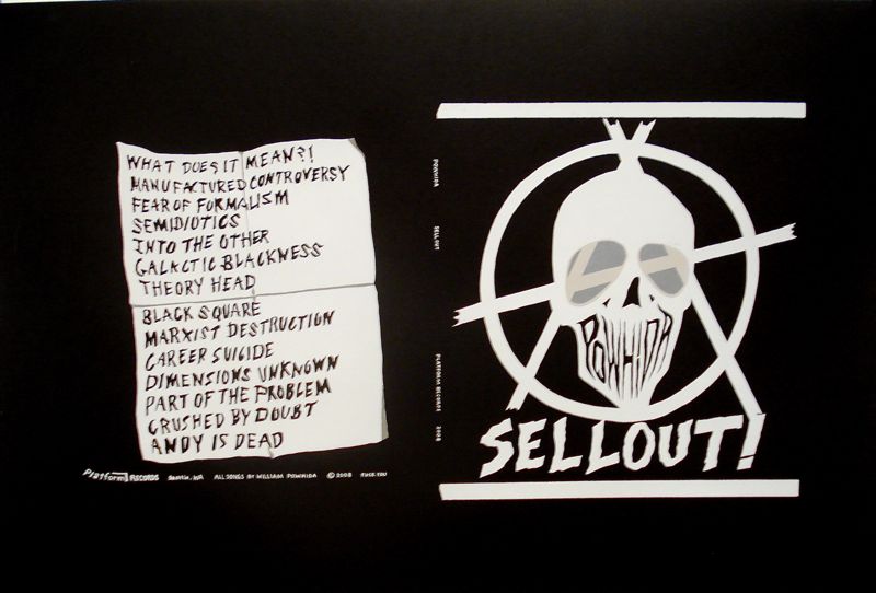
sellout_print.jpg
William Powhida Sellout [item #76]


One sign of the almost proximate arrival of spring is the announcement of the annual WAGMAG benefit. Once again it's again time to help out our indispensable guide to Brooklyn galleries (it now covers all of Brooklyn!), by purchasing tickets for the artwork drawing tonight at The Front Room Gallery.

Some really great art, including the William Powhida piece shown above, have been donated by artists and galleries who know how much this publication does for the community, and want to give a bit back.

The rest of us have a chance to help by showing up and purchasing an opportunity to select from the bounty shown here. If you and your valentine are already committed elsewhere tonight, you can also buy one or more tickets on line (they are only $200 each) and indicate your choice with a WAGMAG proxy. All tickets guarantee a work of art, and entry to the party is free.

As I wrote last year, I can't say enough about Daniel Aycock, the generous artist host.

For details, see this post on the ArtCal zine.

Taylor_Davis_Swordfight.jpg
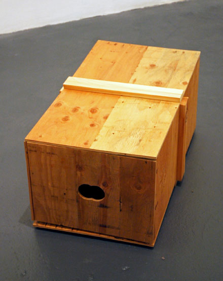
Taylor Davis Swordfight 2006 plywood and pine 16" x 19" x 33" [installation view]


Katherine_Streeter.jpg
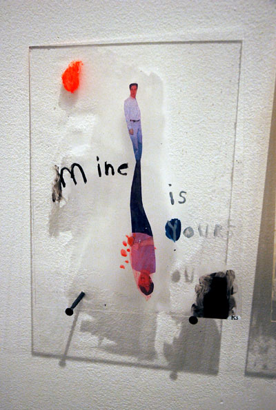
one of nine panels included, mixed media on plexiglass, 8" x 10" each, from a series by Katherine Streeter


Mark_Barrow_Bric.jpg
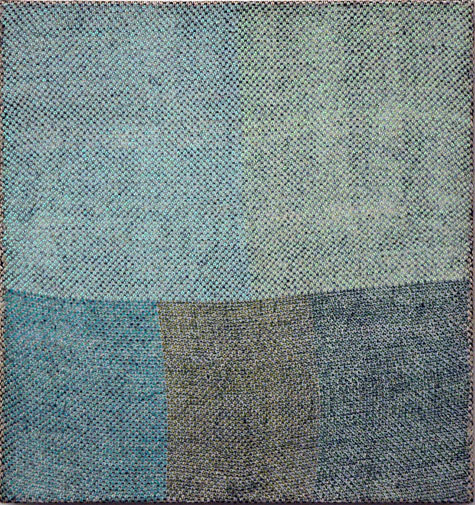
Mark Barrow Bric a Brac 2008 acrylic on hand-loomed linen textile by Sarah Parke 15" x 14" [one of two parts, the first part 16" x 14", installed to its left


ANthony_Pearson_solar.jpg
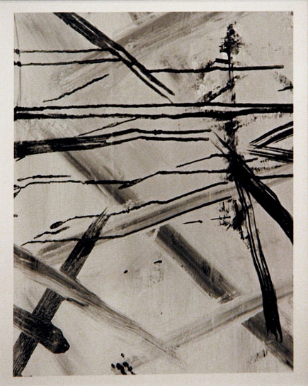
Anthony Pearson Untitled (solarization) 2008 framed solarized silver gelatin photograph 19.5" x 16" unique [view of installation, not including mat]


Michael_Mahalchick_Ham_Ray_Nay.jpg
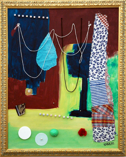
Michael Mahalchick Ham Ray Nay 2008 mixed media 33.25" x 27" x 2"


Erik_Lindman_Twilight.jpg
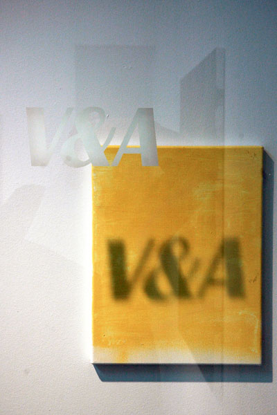
Erik Lindman Twilight 22 Electric Kingdom 2008 oil on canvas 14" x 11" [installation view, including site-specific shadow cast by etching on glass door]


This look at some shows on the Lower East Side is the fourth and last of the current series of visits to gallery neighborhoods.

The current show at Cuchifritos, "A Relationship Left For Dead on the Lower East Side" is my nod to tomorrow's holiday, but the curator, Bill Previdi beat me to it, probably many months ago. It's a compact and very smart installation about relationships inspired by a photo album given to him by a friend who had found it somewhere in the neighborhood served by/serving this gallery, a non-profit space described on its web site as having a focus "on contemporary art as it relates to community, social issues, and public space." When we saw the show on the day it opened Previte told us that he knows nothing about the two men who appear in the pages of this album left on a curb nearby, but if they should happen to see the show and recognize the photos it would be returned. I haven't heard if either or both have turned up, but Previdi is closing the show with a reception from 4 until 6 - on Valentine's day.

Lisa Cooley is showing the first of a series of three-person shows, in the words of the gallery statement, "juxtaposing a canonical artist with both an established and an emerging figure". Not surprising for this gallery, this is an exquisite installation which places Binky Palermo on the wall opposite the entrance, with works by Anthony Pearson (b. 1969) and Mark Barrow (b. 1982) trading places and dancing on walls to the right and left.

CANADA is showing Michael Mahalchick in "For What It's Worth", and its pleasures are definitely worth a lot, beginning with the image on the invitation and the website. How can everyday leavings be made so wacky and beautiful at the same time? My favorite line in the press release: "“For What It’s Worth” is a celebration and ritual offering to the collective ewwwwww."

Barry and I both decided we had to get to Mott Street for the current show at V&A, if only on the basis of a piece we had seen last month in a group show at BUIA by the Chinatown gallery's featured artist, Erik Lindman. Lindman's piece in that show was called "Zac Efron in Highschool Musical 3 with my iPhone – Magic Johnson Theatre". His solo show on the Lower East Side, "House Wine, House Music" includes four paintings, one shadow and a photograph, all of which are described as an attempt to make art that is anonymous. In the oils he may have to actively create what he is able to find ready-made with his camera, but when he erases pigment and representational shapes to describe negative spaces on his canvases he is seeking the same end, what the gallery notes describe as "A conscious lack of intention through attention to negative spaces."

Peter_Fox_Big_Self_Portrait.jpg
Peter Fox Big Self Portrait 2009 acrylic on canvas 73" x 73"


Peter_Fox_small.jpg
small acrylic by Fox for which I don't have the information


Aron_Namenwirth_Party_City.jpg
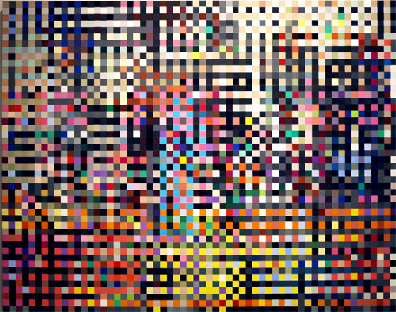
Aron Namenwirth Party City 2006-2008 48" x 60" x 3"


John_Bjerklie_When_A_River.jpg
installation view of John Bjerklie's "When A River Changes Its Course"

John_Bjerklie_When_A_River_detail.jpg
[a more detailed view]


The "tour" which began in Soho continues into a third day with a look at some shows in Williamsburg galleries.

Peter Fox has shifted from abstractions to representational and text works with the colorful and gently-risible show, "Moving Target", currently hosted by The Hogar Collection, but his trademark relief technique, which uses countless multicolored blobs ("blobilism"?), survives unaltered. Curiously I've just noticed that the image I first thought would be the only one I'd use to illustrate the show happens to be the only black and white painting. Also, while I really like the new direction, I've now decided to add an image of a recently-completed piece I saw hanging in the gallery's office. It's only about ten inches high, but it shows that Fox abstractions haven't yet run out of things to say.

Aron Namenwirth's dynamite show at VertexList has been extended through February 28, but by appointment only. No sweat, that, and it's definitely worth the phone call. For access to the Bayard Street space call Namenwirth at 917-301-6680 or 917-301-0306. This beautiful body of work at first suggests little more that simple blown-up pixilated photographic imagery perfectly rendered in paint, but this elegant, precisely-drawn simplicity is deceptive. The artist starts with small JPEGS which frequently depict political or spiritual figures. I don't pretend to understand how he has done it, but some readers may get further with the help of excerpts from an interview the artist had last December with Erika Knerr. Namenwirth is describing what's going on in the painting shown above. He had just said that another piece (which appears to be just as abstract) has four images in it, and that each one occupies a different grid, meaning there are four grids in the final work. He goes on to say that "Party City" also has four images, and that they compete with one another, in the end becoming the brilliant blur you see:

Aron Namenwirth: Basically the images all occupy one of these four pixels so there are four images sitting next to each other on four separate grids and they just obliterate each other.

“Party City” is [composed of] four images, a Chinese stockbroker, guys with suits with golden shovels breaking ground for the Chinese version of the NASDAQ, the building is designed by Rem Koolhaus, and a group of soldiers from Darfur with shovels and guns. All these images are off the internet. The fourth image is a group of people, friends of my mom, Cynthia Bloom, at her memorial service. I planted all these flowers in the sand, so all these people where around the flowers in the sand thinking about her.

I don't know what to say here about John Bjerklie's installation at Parker's Box, "When A River Changes Its Course", especially since you're probably going to want to visit it - and I say "visit" advisably. Most of us may have seen the inside of a gallery turned into something of a dump more than once before, but this show, with the distinction of its being littered with old TV sets, both working and clearly defunct, will probably hook you if you manage to come in while our host, Bjerklie, and [insert name here] are engaged in a quite shrewdly-mad conversation about art while inserted inside two separate screens. Meaty stuff, but lots of fun.

Derek_Jarman_Shadow.jpg
Derek Jarman In the Shadow of the Sun 1974 Super-8 (transfer to DVD) color 54 minutes [still from installation]


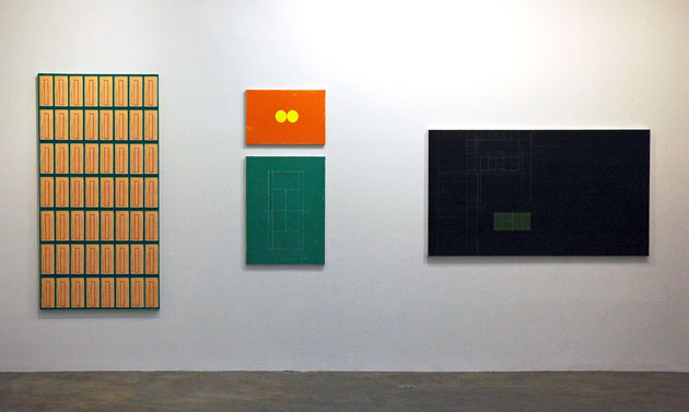
David_Diao_wall.jpg
detail of David Diao's installation, "I lived there until I was 6…"


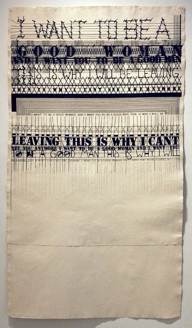
Alyssa_Phoebus_Good_Woman.jpg
Alyssa Phoebus Good Woman 2008 graphite on cotton rag paper 96" x 53" [installation view]


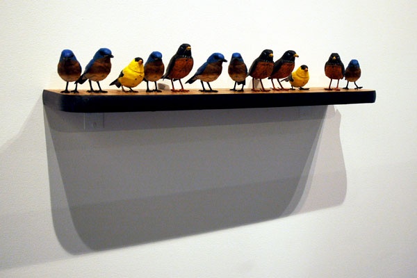
Vlatka_Horvat_Birds_Shelf.jpg
Vlatka Horvat Birds Shelf 2009 modified wood table-top, 13 photo-sensitive bird figurines [installation view]


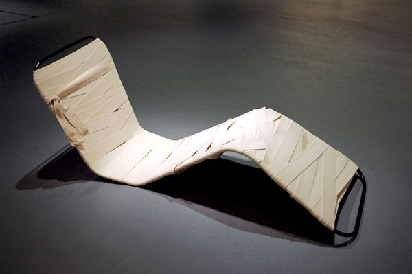
Sarah_Greenberger_Rafferty_Strapped.jpg
Sarah Greenberger Rafferty Strapped (Sanitorium Chair) 2009 painted galvanized steel and bandages [installation view]


Continuing the neighborhood tour started yesterday I'm uploading images, and little else, of some shows I've thought worth sharing.

Elizabeth Dee is showing four early, amazingly-innovative and almost painfully-beautiful Derek Jarman films. They are accompanied by an installation-specific sound design by the artist's friend and collaborator, Simon Fisher Turner. It's a great treat, but Jenny Moore, the gallery's director, told me there's more to come: Beginning March 7 and continuing for three months an exhibition of 18 rarely-screened Jarman films will be installed two blocks north of her gallery, at X, a new nonprofit space which will occupy the old Dia Art Foundation quarters on West 22nd Street. Beyond my immediate pleasure in learning about the Jarman show, the arrival of X sounds to me like very welcome news for everyone. I know I'm not the only one who misses the ambitious large-scale projects which were installed for months at a time on that building's five spare, elegant levels. Dia's tenure of that old garage began in 1987, the year I moved into Chelsea. The foundation moved out early in 2004 and I'm still mourning the loss of a fascinating neighbor.

I've learned quite a bit about David Diao in the last few days because of my visit to his solo show at Postmasters, "I lived there until I was 6…". I had lots of catching up to do (let's say my ignorance was embarrassing), but I'm now appreciating the strength and beauty of his art and the weight of his personal history. I've also learned that we share what some might call an immoderate interest in architecture, the abstraction and reality of "home", and the urge to look back at one's beginnings, the sort of thing which often comes with a certain maturity in years. The show, or project, at Postmasters is an aesthetic and psychological reconstruction of his family's compound in Beijing, from which he and his parents and relatives were forced to flee in 1949 with only 24 hours notice. The paintings are inspired necessarily by very imperfect memories (the house is gone and there are no pictures), those of the 6-year-old Diao and a few surviving members of his family.
The title of Alyssa Phoebus's show at Bellwether, "Lay in the Reins", appears to be something of an exhortation, and the titles of individual works expand on the theme: "Rough Sex With a Big Man", "Harder Harder", "You Ain't a Beauty", and "The Cruelties That Attend the Rites of Love" among others. These dramatic graphite drawings of lines and text on gorgeous handmade ivory rag paper are pulled from popular songs and expressions, but in the artist's hands the words take on a musical life of their own. Just don't expect a sentimental ballad.

The Kitchen has two shows curated by Matthew Lyons, Sara Greenberger Rafferty's "Bananas" and Vlatka Horvat's "Or Some Other Time", each with work in a number of very different mediums. [For a short video of Horvat's singing "Birds" see bloggy.] I liked some of what I saw but was somewhat nonplussed about much of the work. I said "nonplussed", not indifferent or displeased. I have to admit that I went into the space cold and I couldn't get much out of the press release. Because The Kitchen's web site is almost impossible to use, I see I won't be learning any more unless I go back. Because I respect Lyons, and have enjoyed following Rachel Uffner's program for several years now (both artists have shown in her gallery), I intend to do just that.


Davis_Rhodes_front.jpg
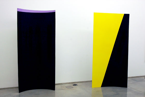
Davis Rhodes Untitled 2008 enamel on foamboard 96" x 44" x 8" (each) [installation view of two separate works, each described identically]


Stephen_Sprouse_Iggy_On_the_Cross.jpg
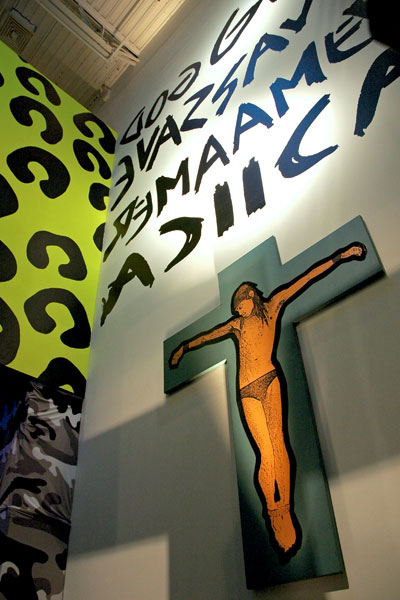
a detail of the Stephen Sprouse show [installation view including "Iggy On the Cross"]


Ben_Jones_entrance.jpg
Ben Jones [detail of entrance to installation, "The New Dark Age"]


I didn't want to lose another race with time, so I've decided that before they close I'd do a few posts pointing to shows I think worth a detour. I'll be grouping them more or less by neighborhood, but including only the most abbreviated description. I hope not to make a habit of this, but lately I've seen so much I liked that I'd never have time to talk about it all.

The first stop is Soho.

I felt almost physically provoked by the painting/sculptures of Davis Rhodes in a three-person show at Team Gallery which also includes work by Gardar Eide Einarsson and Stanley Whitney. Rhodes's medium is enamel on foamboard, in various thicknesses. Except for one diptych propped against a wall, painted on a thicker board than the others, they stand by themselves, with the help of the artist's horizontal arches.

Stephen Sprouse is making another comeback. This one is being launched from Deitch Projects Wooster Street, but Sprouse isn't here to enjoy it. Because of his early death in 2004 we have no idea what he would think about this look backward. "Rock on Mars" is a retrospective of the body of work created by the designer and artist during an erratic rocket of a career which both fired up and was fired on by a mix of and pop and punk culture which never totally disappeared; I think it just moved to Brooklyn. And now hard times are back: If he were still with us, Sprouse might feel more at home today than he had since he started out.

Ben Jones really is at home in 2009. His show at Deitch on Grand, "The New Dark Age", is both totally of and way beyond whatever we mean by "today" - both the culture and its systems. Jones, who is part of the collective Paper Rad, is enjoying (I hope as much as we are) his first solo run at the gallery, where the work, described in the press release as "between-media video sculpture, light painting, and 'drawing in the digital age'", is also a mesmerizing amalgram of comedy and terror. Pay attention to that show title.

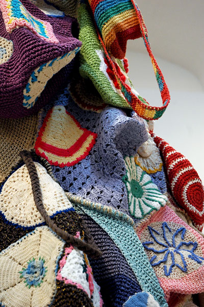
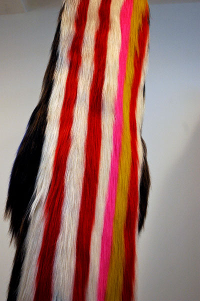
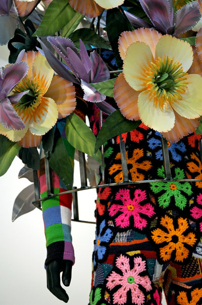
Nick_Cave_2.jpg


Nick_Cave_1.jpg


Nick_Cave_3.jpg


Nick_Cave_4.jpg


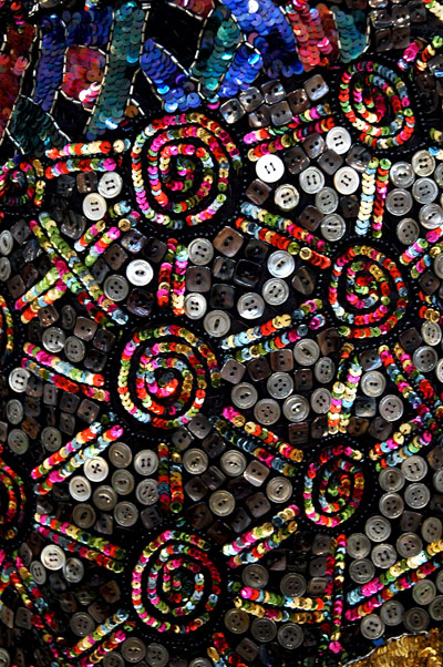
You've already heard it from everyone, so I'm not going to bore you with another encomium. You can and probably have seen full images in many publications and on many sites, so I'm only showing details here, plus one mid-distance shot, of some of the works in Nick Cave's recent show at Jack Shainman, "Recent Soundsuits".

I'll only add that it was an incredible show. Nothing which we had seen or heard, in any medium, would have been sufficient preparation for experiencing these sculptures at first hand. My only complaint was the surprisingly static installation, but the quality of Cave's work would have transcended any platform.


For a look at his appearance in an earlier, group show, scroll down on this link.

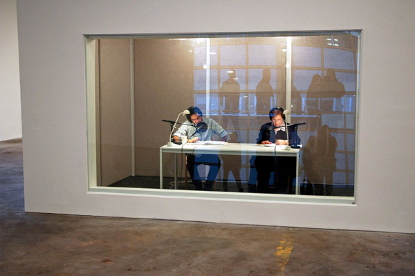
On_Kawara_One_Million_Years.jpg
the long count continues


Figuratively, I've probably been walking around his neighborhood for several decades, because I've been encountering single examples of and groupings of On Kawara's "The Today Paintings" since at least the early 80's. Until I walked into "One Million Years" however, his current show at David Zwirner [closing this Saturday] I confess I never knew what was actually going on inside the vast, minimalism/maximalism of this artist's cerebral precinct. Although I still can't claim a complete understanding of it, since I snapped this image inside the gallery last week I think I can say I'm now on the same planet - and in the same century.

For me it all came together for the first time when I saw and heard these two volunteers taking turns reading off (performing and recording) the successive dates which compose this awsome work's simple, descriptive title while seated inside a temporary studio, a sound technician posted outside.

Did I mention that when I walked out onto 19th Street I felt like I had just left a great temple? And I haven't a spiritual bone in my body, or at least that's what I've always thought. I highly recommend the experience. Go, if you can, and stay a few minutes. If you're with a friend, and you say something while you're there, you're certain to be whispering.

A million years? We're none of us there yet (I'm guessing the "readers" are only somewhere around the 40th millennium right now, even though these readings have been going on, and off, at different sites all over the world since 1993). Also, none of us will live to see this conceptual (and also very real) performance completed, but I'm thinking what an extraordinary privilege it is to be a part of it - although I have to live with the thought that, even if it weren't a question of money, this audiophile would never be able to listen to the entire CD set.

I'll just have to be content with the more miniature epic song projects of Kawara's rivals, like Wagner, Feldman, Stockhausen and La Monte Young.

Zwirner's notes provide a background for the continuing audio project currently visiting the gallery in this description of the original, printed work:

One Million Years is a monumental 20-volume collection, comprised of One Million Years [Past], created in 1969 and containing the years 998,031 B.C. through 1969 A.D., and One Million Years [Future], created in 1981 and containing the years 1996 A.D. to 1,001,995 A.D. Together these volumes make up 2,000,000 years. The subtitle for One Million Years [Past] is "For all those who have lived and died." The subtitle for One Million Years [Future] is "For the last one."

ADDENDUM: It's a few minutes since I wrote the above. I've just read Jerry Saltz's piece in New York magazine. I had already decided to write about "One Million Years" when I saw it but I wouldn't let myself read it until I had finished my own brief account. I was afraid I'd be scared off by his erudition and charm.

As it turns out, I certainly would have been; this blog slot would have used for something else: For this particular task, Jerry had, among his many other advantages, his brilliance as a critic and writer, and the nobility - and the guts - to actually volunteer to read a section of the text - to be an integral part of the piece itself. It's really great, and great fun. It's titled "Reeling In the Years" and you can find it here.

p.s. While looking for the article on line I discovered Jerry's homage to Steely Dan, and this.

blue_2.jpg
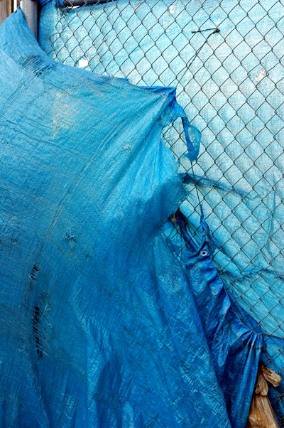
untitled (blue threads) 2009


Yesterday I spotted this section of a sad, somewhat unsound wall which had been assembled around a large vacant lot on Grand Street in Williamsburg. These bright blue tarps, blowing in the wind and buoyed by the February sun, would hardly present any barrier to the curiosity of even the most casual passerby, but as a brilliantly-lit, flapping bauble they managed to relieve the drabness of the dull flat plywood boards they interrupted with their play.

Will their gambolling last until the day the sober speculators return with their cranes?

Richard_Oliver_Wilson_mirror_ball.jpg


Richard_Oliver_Wilson_transporter_room_painting.jpg


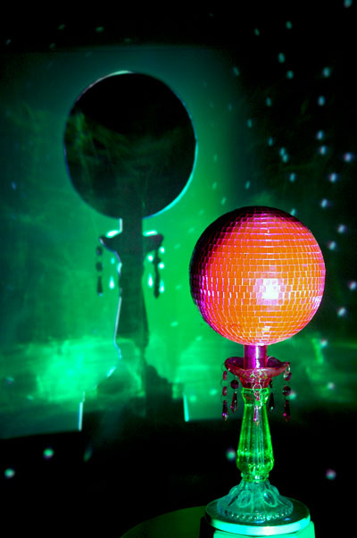
The current exhibition at Jack the Pelican, "Mr. Benn's Spare-time Continuum" will close tomorrow, Sunday, at 6. This means that there are only two days left for a chance to enter into the squirmy/cozy comforts of what is described here in the gallery press release:

The timely anachronism of Richard Wilson's mechanistic renderings of super-tech ideas points to Britain in an era when unassuming people lived in modest circumstances [my emphasis, since I love that phrase].

Wilson's introduction of Mr. Benn to New York gallery goers might have been a risky proposition, since the popular early-1970's BBC show, based on a popular children's book published a few years earlier, never made it to our shores, but the installation resonates with our own island's 21st-century fantasies, sentimentalities and anxieties.

The exhibition may be one of the strangest scenes to be found in an area gallery right now, but I've found myself going back to it in my mind since I left it one week ago, no small thing for this crowded ADD head.

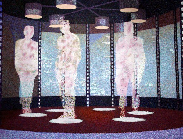
The mirrored ball may suggest the iconic 1964/1965 New York World's Fair Unisphere, and the transporter room painting appears to be a riff on Seurat's pointillist "A Sunday Afternoon on the Island of La Grande Jatte" [surely what all "trekkies" were thinking each time that set showed up in Star Trek].

If you go, enjoy the soft, tufted Chesterfield sofa and take advantage of the hot water urn and tea makings.


[second image provided by the artist; my own was corrupted by the very low light, but it otherwise had the advantage of including a number of pink points of light thrown from the disco ball across the room]

Wooster_door.jpg


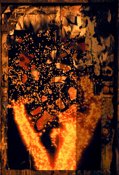
The picture may be a bit colorless and slightly shaky, since there was almost no light off the corner of Wooster Street near Grand at 6:30 tonight, and no tripod in sight, but I still wanted to try to capture the mystery of this doorway. It's on the side of a building which has attracted (almost literally) tons of street art over the years.
I had heard some time ago that it was slated for demolition, but who knows what's going to happen to it now?

The image I got makes me think of one of those spooky shadow boxes crafted variously out of feathers, seeds, shells, hair and cut paper that were so popular with the Victorians. When I lived there I used to see them all over New England in shop windows and at barn and estate sales, preserved inside framed glass boxes or cabinets, but now I can't find a single pictorial relic of their weird vogue on line.
Matt_Mullican_9_at_Drawing_Center.jpg
installation view* of nine drawings included in Mullican's exhibition at the Drawing Center


Matt Mullican
's just-closed show at the Drawing Center, "A Drawing Translates the Way of Thinking", was a treat. And what a perfect venue for this extraordinary artist!

When I first walked in and saw its extravagance, knowing even the little I did about the breadth of his sources, the bottomless well of his imagination and the complexity of his sytems, I told myself I was just going to walk around and enjoy myself in that huge room, where central, museum-like vitrines were surrounded by works hung tightly together until virtually no wall space was left uncovered. I stayed much longer than I expected to, but of course not long enough to give even a half-assed account of this extraordinarily beautiful show.

Here is a large excerpt from the press release prepared by the curator, João Ribas:

For over three decades, Matt Mullican has created a complex body of work concerned with systems of knowledge, meaning, language, and signification. Ranging from schematic diagrams and arcane symbols to explicit text-based drawings, installations, and self-created cosmologies, Mullican’s work classifies, orders, describes, maps, and represents an understanding of the world, using drawing to collapse the division between subject and object.

Since the 1970s, Mullican has conducted performances and created drawings under hypnosis to investigate the nature of the subjectivity and identity. Mullican’s practice ultimately confronts the nature of subjective understanding, rationality, perception, and cognition –proposing a “picture” of the world articulated through the medium of drawing.


*
The shapes which look like reflections? They are not.


Nayland_Blake_Companion.jpg
Nayland Blake Companion 2006 t-shirt, bubble wrap, trunk 48" x 50" x 9.5" [installation view]


Just about as inscrutable as Matt Mullican, but different. Very different.

Soho's Location One is hosting what the gallery describes as a 25-year survey of Nayland Blake's work in almost every medium. Curated by Maura Reilly, the show is titled "Behavior". Even for a visitor familiar, even comfortable with the transgressive, it seems Blake doesn't really care whether you get much of what he's doing. But then he's something of a virtuoso in this field. You can get lost in this installation, but you won't get out unaffected by some of the images.

Oh, the printed text on the soiled shirt in the image above reads, "GNOME FONDLER".


Nayland_Blake_Bunnyhole_II.jpg
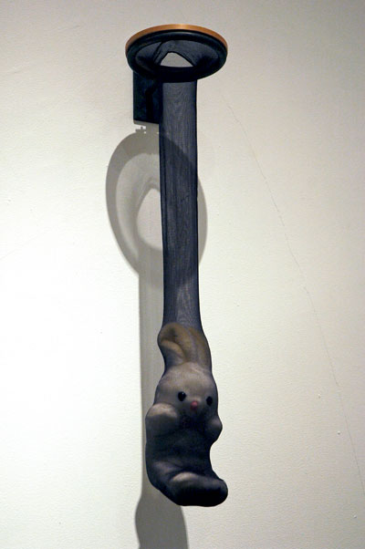
Nayland Blake Bunnyhole II 1997 steel, nylon, wood and stuffed animal 40" x 7" x 8.5" [installation view]

ELLIS_G_traffic_sign.jpg

ELLIS_G_including_pole.jpg


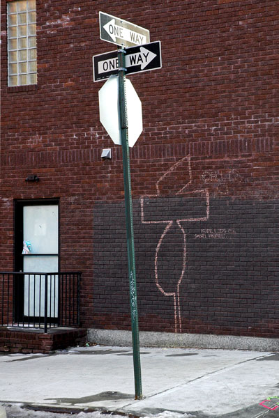
This ©ELLIS G. intervention in Williamsburg included the artist's signature plus the additional note, "STILL HERE", a possible reference to the arrest of Poster Boy on Saturday.


ADDENDUM: Wooster Collective has a video documentary on the artist.

Cordy_Ryman_Coil.jpg
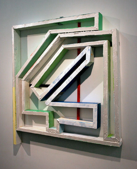
Cordy Ryman Coil 2 2008 acrylic & enamel on wood and metal 47" x 43.5" x 3.5" [installation view]


Cordy_Ryman_Third_Wave.jpg
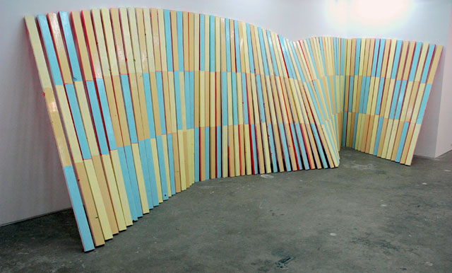
Cordy Ryman Third Wave 2008 acrylic on wood 96" x 274" x 79" (dimensions variable, up to 480 linear inches) [installation view]


Cordy_Ryman_Yellow_Spine.jpg
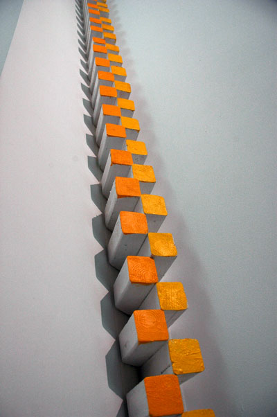
Cordy Ryman Yellow Spine 2008 acrylic on wood 130" x 3" x 5" as installed (dimensions variable, up to 144" x 3" x 8" overall) [large detail of installation]


Cordy_Ryman_Raw_Chips.jpg
Cordy Ryman Raw Chips 2008 gorilla glue and wood 12" x 10" x 1.5" [installation view]


It's an appearance which I've been anxiously anticipating for months, or even longer: DCKT is currently exhibiting paintings, sculptures and installations by Cordy Ryman, the artist's first solo show in the gallery.

Ryman regularly wields hammer and nail, glue, staplers velcro strips and much more for what promises to be an infinite supply of solid forms and colored shadows in every size and shape. The work is composed of found pieces of (mostly) wood, finished (usually) with paint applied from a brilliant pallet with the confidence of a first-class AbEx. He balances drama and humor in the result, seemingly effortlessly.

My only quibble? The fact that, unlike some of his earlier outings, their were no droll surprises this time in the form of almost-hidden little pieces hiding about in the gallery's nooks and crannies. But it may be one of the best things the artist leaves with us: We're likely to keep looking for art - everywhere - even where we're not supposed to expect it.

LINK: conversation between Phong Bui and Ryman in the wonderful Brooklyn Rail

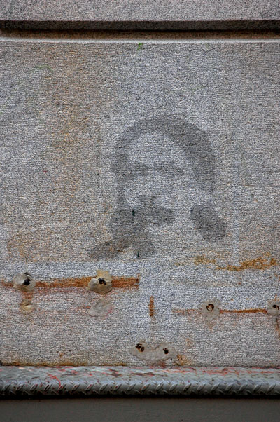
face_on_Wooster_Street.jpg


I have no idea who did this quiet piece, or who the image represents.

  • home

This page is an archive of entries from February 2009 listed from newest to oldest.

previous archive: January 2009

next archive: March 2009