Culture: October 2006 Archives

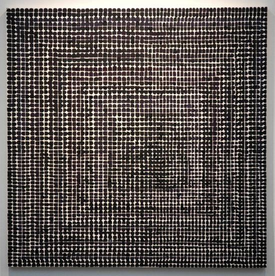
JaneXylorRuin.jpg
Xylor Janes Ruin [installation view]
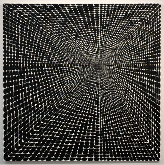

XylorJaneSoLong.jpg
Xylor Jane So Long [installation view]


Xylor Jane's second solo show at CANADA is a knockout, and the more I learn (well, "learn" may be too presumptious; "read" or "hear" would be more appropriate) about the artist and her art the more I'm pulled into its beauty and its mystery. I feel a similar connection to Chris Martin's work, but it would take someone with far better creds than I to explain what that's all about, or in fact what's going on inside the work of either artist.

Even my camera seemed possessed when it had to deal with Jane's paintings yesterday: The smaller images on the camera back and on the computer screen clearly revealed colors and shapes which were barely apparent to my naked eye when I stood in front of these two seemingly monochromatic paintings, and they are barely visible even in these uploaded shots. Incidentally, two of the three other paintings in the exhibition are more obviously colorful than the pair I've chosen to include here.

The works are each approximately three or four feet square.

Check the paragraphs from the press release included on the ArtCal event page. I've also included below the artist's notes [punctuation and capitalization as found] for the two paintings represented by the images above, and after that, some of Jane's general notes for all of the paintings.


Ruin
The strokes face either in or out, changing with each year along with the hue
584 weeks
11.22 years
Art Career in Black and Velvet
Failure misery demise
Time prison, blocks of years


So Long
structured on a 16-sided polygon that squares itself at the edge
8x16x32 it has a stutter that allows the seven hues to be in order (on the vertical and horizontal-) in both directions
it has 4096 strokes facing out
Strokes radiate from skewed center, growing larger.
Black rainbow waves an Infinite good bye


General info for all paintings
Brush is reloaded for each stroke
Each stroke represents one day
All begin at a center - clockwise moving
Each painting should be turned a quarter turn clockwise at each solstice or equinox marked on the side of the canvas so that the right side will indicate the season for that hanging direction

Monday = yellow
Tuesday = Green
Wednesday = blue
Thursday = indigo
Friday = violet
Saturday = red
Sunday = orange
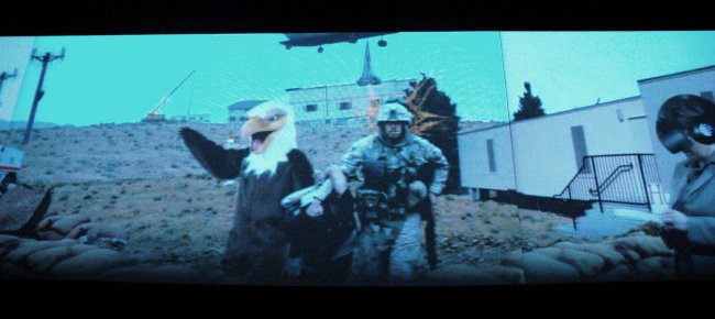
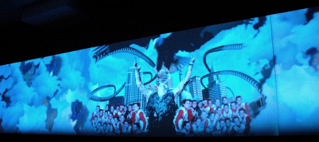
evanseagle.jpg
evanscheerleader.jpg
evansprefabs.jpg
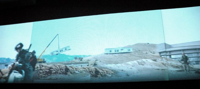
Cliff Evans The Road to Mount Weather 2006 three-channel video [three stills from the installation]


Cliff Evans's extraordinary three-channel video installation, "The Road to Mount Weather", is at Location One until November 4. This ambitious and very impressive work, curated by Pieranna Cavalchini, Curator of Contemporary Art at the Isabella Stewart Gardner Museum, was painstakingly collaged from images downloaded from the internet. For me it was like watching a vintage 3-strip Cinerama spectacle documenting the continuing dream-become-nightmare which is likely to be remembered as the culmination of the American imperium.

The sound design is, not incidentally, terrific.

This SoHo space devoted to exciting New Media work is always worth a visit, but because of the distractions of our current curating adventure Barry and I might have missed the very impressive current installation had it not been for a strong recommendation, and at least one subsequent reminder, from Jacques Vidal, one of the artists included in our Williamsburg show. I now appreciate both the reason for his enthusiasm and the connection between Evans's work and his own.

From the gallery's press release:

The Road to Mount Weather is an open animation, susceptible to hugely varied critical perspectives and interpretations. It shakes us out of our complacency. In a mock epic journey through capitalist Hell, Evans creates a baffling cascade of imagery coded in complex syntax. The large swath of information is presented in a loop shown at a slow and melodious pace. With each repeated viewing, the viewer becomes more intrigued, less complacent, finding new associations and symbols, and questioning the final meaning of the narrative.

Evans is one of a number of artists who have mined the form and content of appropriation and photomontage in their work. Among his notable predecessors are Georges Braque and the Dadaists. Images are treated almost like found objects, obtained from the vast reference library that is today's Internet. They are cut up and scrambled, scene after scene, with deliberate order and disquieting disorder ultimately finding a perfect fit in the puzzle.

Evans reflects on America's complex geopolitical situation and its impact on mainstream news where fear is a constant. [His] ever-expansive investigation is matched by an eye for detail as well as an ability to find humorous prank subtexts.

ArcangelLucier.jpg
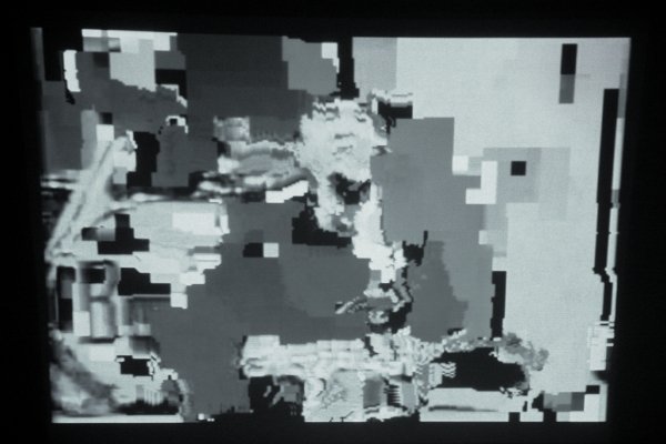
Cory Arcangel Untitled (After Lucier) 2006 Mini-Mac [still from installation]


Cory Arcangel left Oberlin six years ago with a degree in Technology in Music and the Related Arts and his visual art has almost always incorporated disparate musical elements. His current show at Team however would look and sound absolutely right installed inside any one of the city's more serious schools of music. That is, if any one of these institutions was adventurous enough to encourage and present the kind of vibrant New Media work which could attract new and larger audiences to an endangered art form.

Actually, the piece represented in the image at the top of this post is totally silent, something of an exception in the exhibition which currently fills the gallery on Grand Street. Its subject however is very much the concept of musical performance and its structure relates to the work of one of our most revolutionary composers of "serious" music. Fellow blogger Joshua Johnson explains:

Untitled (After Lucier), 2006, confronts that specific issue [the dilletante's ignorance of the technical devices of much of today's art] head-on; Arcangel appropriates the strategy of avant-garde composer Alvin Lucier's 1970 piece I am Sitting in a Room, in which Lucier continued to re-record a recording of himself reading "I am sitting in a room..." until the recording became an abstract sonic portrait of the space he was recording in. Untitled (After Lucier) examines the implications of compression, by continuously digitally re-compressing a video of the Beatles famous Ed Sullivan appearance. As the video compresses it becomes more and more abstract-- a visual representation of the process of compression. Essentially, Arcangel asks us to question how the experience of culture is transformed by the container it is presented in. When a video is uploaded to Youtube it is modified by the technology, and thus takes on the characteristics of the "room" in which the viewer experiences it.
Ah, music to our eyes.


RELATED POST: "Cory Arcangel opens Team's new SoHo digs"

CorriePeterMoralitymotto.jpg
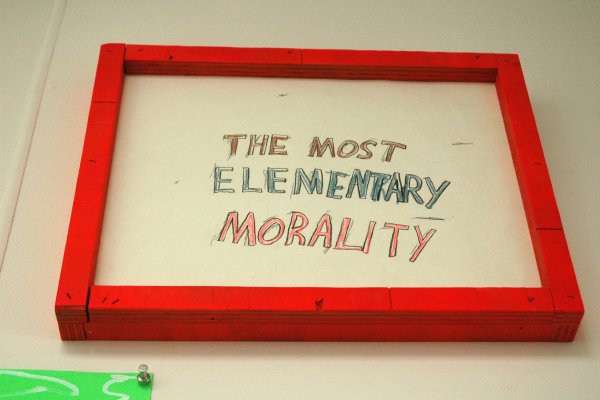
Peter Corrie Untitled 2006 one of a suite of drawings, some with artist's frame, from "No Time Swan", mixed media, various sizes [installation view]


"Dangling Between The Real Thing And The Sign In The Window", the group exhibition which Barry and I curated this month, continues at Dam, Stuhltrager through November 13. The latest news is that the show now has a dedicated website with images (via flickr) of all the works included and information on all of the artists.

Older news, which should be welcome to adventurous and impecunious art fans but still only familiar to those who have already visited the gallery and looked at the checklist, includes the fact that there are unique pieces available for as little as sixty dollars - "UNKNOWN ARTISTS AT UNHEARD PRICES"


Note: We've just added to the site some additional, detailed images of some of the works.

SepuyaPaulDifference.jpg
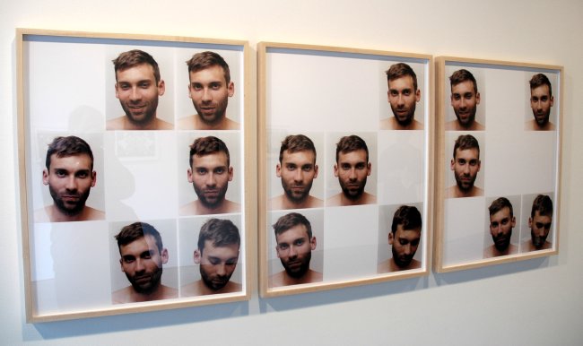
Paul Mpagi Sepuya The Difference Between a Memory, a Portrait, a Resolution parts 1, 2 and 3, three separate digital prints, each 30" x 40" [installation view]


KjaerLiseBreathe.jpg
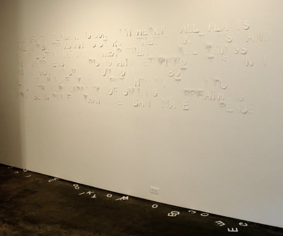
Lise Kjaer Untitled, Breathe cutout paper letters, dimensions variable [installation view]


Hey, although I can't make much of the press release (I think it's something about giving us leave to complete the artist's work by making of it what we wish), most of the pieces in this show are pretty striking. "When Fathers Fail" at Daniel Reich is worth a visit even if you're academically defenseless.

The show has been extended until November 1.

OppenheimerSarahtube.jpg


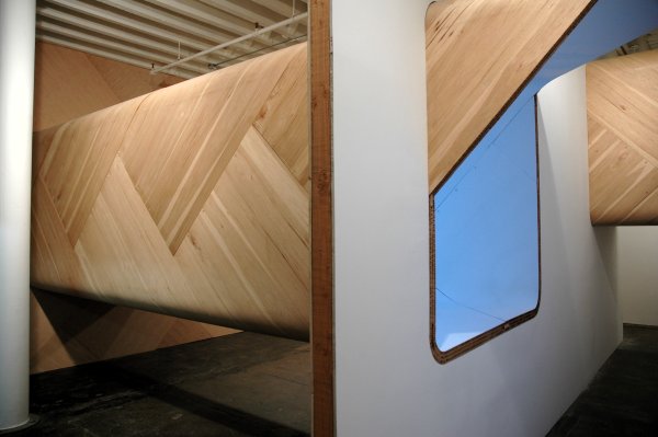
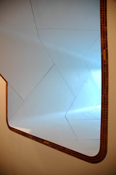
Sarah Oppenheimer's construction, "554-5251" completely transformed the main gallery space at P.P.O.W. last month. We had first seen her handsome work in March, 2005, when it represented this gallery at ARTROCK.

From the press release:

In her upcoming exhibition at P·P·O·W, Sarah Oppenheimer continues to explore the malleability of the constructed environment. Oppenheimer engages with the problem of ‘mutable architecture’ as explored by the work of architects such as Yona Friedman, Peter Cook/Archigram, and Cedric Price. Rather than create utopian prescribed spaces, Oppenheimer considers the building material as a socially engaged starting point. She begins with the typical 4 x 8 foot sheet of plywood and by using CNC routing to bend it, she transforms the once contractor cladding into a stable structural support.


OppenheimerSarahopening.jpg

ShimonLindemannBarry.jpg
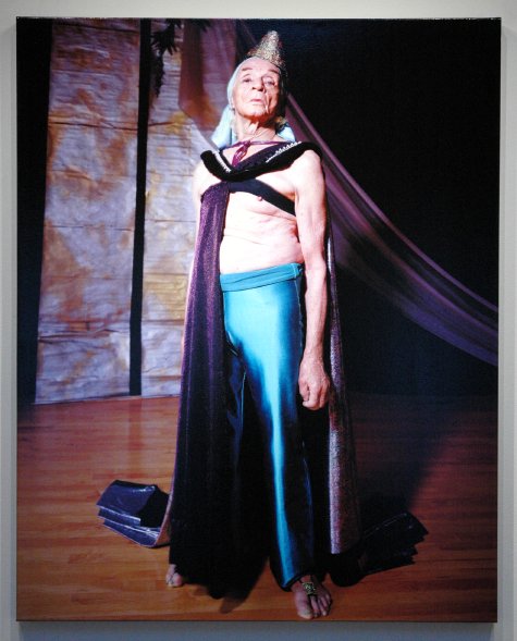
John Shimon & Julie Lindemann Barry (in Ghostly Prince Costume), Ladysmith, Wisconsin 2003 pigment print on canvas (from 8 x 10 transparency) 50" x40" [installation view]


Although John Shimon and Julie Lindemann's show at Sarah Bowen closes tomorrow, I'm sure they'll be back.

The work is very strong on its own, but what distinguishes these artists' accomplishment from so many other documentary or pseudo-documentary projects are the substantial clues located in the press release. In the end however it may be the sensitive, multi-media installation itself which reveals the most about what the separate images may only imply.

Excerpt from the press release:

Sarah Bowen Gallery opens the fall season with an exhibit of photographs and projections titled “It Takes One to Know One” by Manitowoc, Wisconsin artists John Shimon and Julie Lindemann. As a collaborative team, their work elegantly captures the flavor of the landscape and the quiet, melancholy realities of American rural and small town life. Their highly stylized photographs simultaneously evaluate and elevate their subjects as portraits of obscure Midwestern denizens, unnervingly comfortable with their small town identity, are rendered in inappropriately substantial platinum.

As photographers, the artists establish a subjective historical view; they become involved in situations, and respond to them. Their early captivation with Depression-era FSA photos, Edward Steichen’s masterful gum prints, anonymous snapshots, and Robert Frank—who gave them the impulse to photograph everything in their path—has led them to a “new timelessness” in contemporary imagery and themes. Prints from large-format negatives rendered in gum-bichromate and platinum-palladium will be shown with tintypes, film shorts and full-color inkjet prints. The installation outlines the artists’ exploitation of and preoccupation with process to unfold an anomalous narrative, swollen with experience.
Shows like this are the best kind of advertisement for the importance of the outer-borough gallery scene and for the fertility of creative communities beyond what we think of as our cultural capitals. Who knew what treasures were hiding in Manitowac or Sheboygan County, Wisconsin? This area in the northeast of the state is the American Heimat for both of my parents' huge extended German families; although I believe none of them have made a splash or a ripple in the visual arts, maybe I should have stayed in better touch with my 95 first cousins - or at least their progeny.

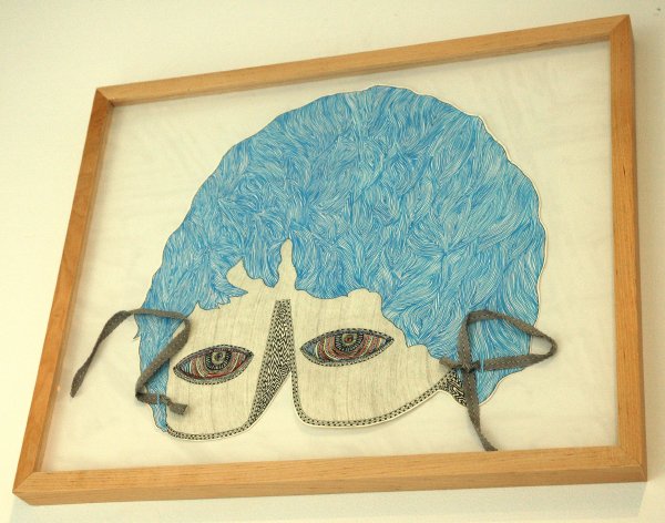
HullTimothyMask.jpg
Timothy Marvel Hull The Mask of Katherine 2006 gouache, graphite, ink and ribbon 15" x 19" [installation view]


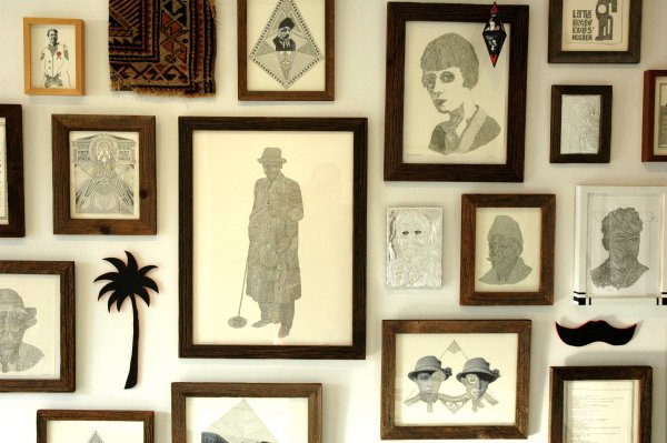
The world which surrounded the early twentieth-century mystic G.I Gurdjieff is only the starting point for a beautiful multi-media installation by Timothy Marvel Hull at Klaus von Nichtssagend. This wonderful Williamsburg show closes this Sunday, but for those who won't be able to get to Union Avenue there are some great images on the gallery website.


HullTimothyMarvelwall.jpg
Timothy Marvel Hull [detail view of installation on north wall]

HugandLyonbenefit.jpg
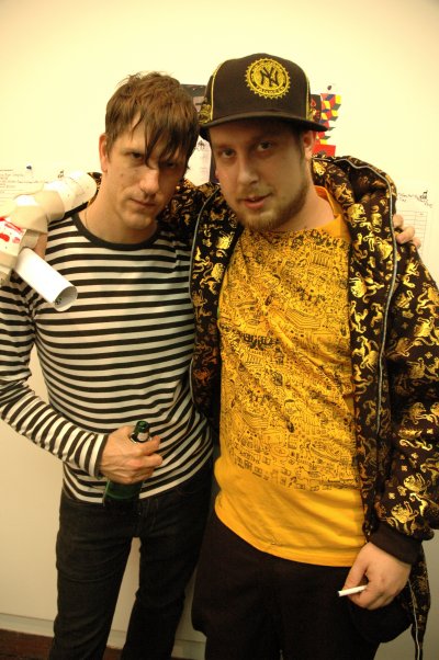
Scott and Noah


We stopped by the very informal K48 benefit held at John Connelly Presents last night, just in time to catch these two provocateurs blocking some of the hot merchandise lining the walls. Shoulda taken more pix, but another, temperature kind of hot got to me.

Lyon is camped-out, literally, inside a gallery space on Bond Street until October 24. He's making stuff while we watch; he loves visitors. We haven't gotten down there yet ourselves, but hope to visit soon.

Who are all these people?

[if you have trouble seeing the images above go here]


The slide show images are of Friday's opening reception for "Dangling Between The Real Thing And The Sign In The Window". They were all shot before or after the happy crowd grew too dense for me to be able to pull my bulky camera up to eye level.

Those determined enough to make it through the pack found the work shown below.

Except for the night shot of Dessel's work, which was taken the evening before, these images [documenting the installation but not the individual pieces] were captured very early yesterday afternoon and include most of the work in the show. Because of the configuration of the rooms I've had to add two thumbnails at the bottom, the first showing a still from Ina Archer's very animated "Ants" titles video and the second a bad representation of Jacques Vidal's intense ink and graphite drawings.

The show continues at Dam, Stuhltrager until November 13 with an amazing show of Loren Munk's work in the front room (which we did not curate). Barry and I will be putting together a dedicated website for "Dangling Between" in the near future.


Abichandaniwall.jpg
Jaishri Abichandani


Archerwall2eye.jpg
Ina Diane Archer


Corriewall.jpg
Peter Corrie


Desselopening.jpg
Susan C. Dessel


Garaitinstalled.jpg
Nicolas Garait


Garnettwall2.jpg
Joy Garnett


VidalHolyArt.jpg
Jacques Louis Vidal


ArcherAntsArchie.jpg
[Archer]


Vidaldrawings.jpg
[Vidal]


hoggard_back_400x592.gif

Some of you may already be tired of seeing this image, but as I'm one of a very select number given the responsibility for publicizing this show please humor me. Genuine pictures of the installation will have to wait until the installing has been done.

"Dangling Between The Real Thing And The Sign In The Window" finally opens on Friday [see the link to the left for the press release]. I expect so many gazillions of creative, smart, cute people to head for Dam, Stuhltrager that night that Barry and I will have to retreat to the garden for some air, where Susan Dessel's installation will remain through the run of the show inside. Loren Munk's work will be installed in the front room during the same month. If you can't make it on Friday, please stop in later in the weekend, or on any of the next four. The show closes on the 13th of November. After the opening reception the gallery will be open on Fridays from 3 until 8 and Saturdays and Sundays from noon until 6. You can also make an appointment.

Come and say hi. We're going to try to amaze you.

RushtonSkulls.jpg
Dan Rushton Skulls, Branches, Forms and landscape 2006 acrylic on panel 81" x 108" [large detail of installation]


RushtonShape.jpg
Dan Rushton Shape, Branches, Flowers 2006 acrylic onpanel 22" x 30"


RushtonShapes.jpg
Dan Rushton Shapes, Branches, Skulls, Forms 2006 acrylic on panel 36" x 48" [installation view]


I saw these three Dan Rushton paintings at ART (212). I know the fair is long gone, but these images aren't, and the artist responsible for them is expected to have a solo show this year at Moti Hasson. They will grace that gallery's new large, ground-floor space in Chelsea.

If you have been somewhat familiar with Rushton's painting up to now, you'll have to agree this new work is clearly on a "hole nuba lebel"*.


*
thanks, Eugene

Biewald.jpg
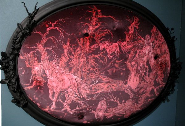
Amelia Biewald Sergeant Bayberries in the Bayou Moss 2006 bleach on velvet, upholstery materials, acrylic, resin and wood 36" x 46" x 6" [large detail of installation]


I haven't seen Amelia Biewald's current show at the gallery, but I found this piece and a much smaller, related work which Magnan Projects showed at ART (212) both very fair lures for a visit to 10th Avenue.

Zalopanylineup.jpg
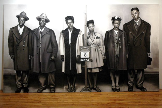
Michele Zalopany Line Up 2006 pastel on canvas (triptych) 88" x 156" [installation view]

ZalopanyLineUpdetail.jpg
[detail of above]


ZalopanyJimmyHoffabar.jpg
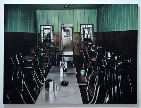
Michele Zalopany Jimmy Hoffa Bar 2006 pastel on canvas 30" x 40" [installation view]


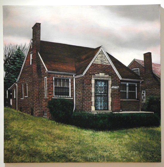
Zalopany5774Coplin.jpg
Michele Zalopany 5774 Coplin 2006 pastel on canvas 30" x 30" [installation view]


Michele Zalopany was born in Detroit in 1955, in one of the last years of that city's unprecedented period of prosperity, one whose height would soon be matched by the depth of its descent into economic and social disintegration. Most of the people and things she captures in the beautiful, sad pastels currently being shown at Esso had either disappeared or been transformed into the mythic even before she found them. For someone who grew up in the city half a generation before the artist did, and who left for good around 1962, coming across these paintings was like opening a trunk in the attic which had belonged to a favorite uncle or aunt.

Excerpts from the gallery's press release describe the artist's inspirations:

Through her labor intensive pastel paintings, Michele Zalopany speaks of mysterious objects as a keen observer of the seemingly irresolvable problematic of the racial divide. Born and raised in Detroit, Michigan, she bears witness to the disintegration of what was once the fulcrum of the American economy, as a result of the historic dilemma of institutional racism.

Her paintings' photographic realism uses a fictitious model, closer to an excuse to raise a question rather than make a statement, although many of the places, people and things are, or were, real.

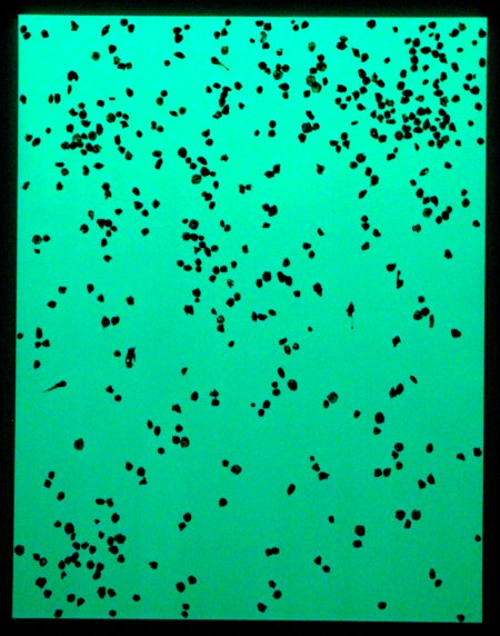
McEwenDresdenPhosphor2.jpg
Adam McEwen Dresden (Phosphorbrandbombe) 2006 phosphorescent paint and chewing gum on canvas 90" x 70" [installation view]


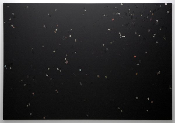
McEwenDresden.jpg
Adam McEwen Dresden 2006 acrylic and chewing gum on canvas 90" x 130" [installation view]

McEwenAdamDresdendetail.jpg
[detail of above]

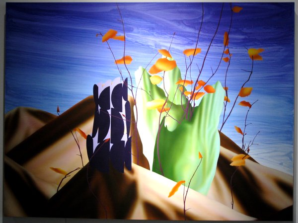
I'm not even going to start addressing this show in writing myself. I could go on forever about the subjects which inspired Adam McEwen's "8:00 for 8:30", installed at Niclole Klagsbrun this month, historical crimes of necessity with which I am probably too much engaged. I'm going to turn the task over to João Ribas, writing in The New York Sun because he pulls together their different strings with intelligence and sensitivilty while never losing sight of the art which holds them together in this very smart exhibition. An excerpt:

The ability to deal out inhumanity with equanimity is at the core of British-born artist Adam McEwen's second solo show,"8 for 8:30," at Nicole Klagsbrun Gallery. A timely meditation on the cold rationality of the military-industrial complex, Mr. McEwen's shrewdly political show asks more questions than it tries to answer.

Yet by looking at the horror of the Allied bombings of Nazi Germany, and the post-war American boom that was its euphoric aftermath, the show makes the case that the link between profit and obliteration applies today more than ever. First raze, then rebuild, and as Kurt Vonnegut likes to say, so it goes.

LigoranoReeseMemory.jpg
Ligorano/Reese Memory of Truth 2006 digital print on Duratrans 96" × 113" [large detail of installation as seen from inside the gallery]


Where our nightmare began, five years ago.

Jim Kempner has just taken down one of the most political shows of the season, an exhibition of editions in every price range, curated by Marshall Reese. Yes, it was also art. Ligorno/Reese were also responsible for "The State of Things", a disappearing ice sculpture which spelled the word, "democracy" . It was installed in the gallery garden last April.


Barry and I now have both post cards and a press release for our show in Williamsburg. The release includes information on each artist, even if we can't give too much away before the opening. We're having a great time with our first outing as curators. We hope to see some of you there on the 13th.


[the images above, details of work in the show, are arranged alphabetically by artist]

  • home

This page is an archive of entries in the Culture category from October 2006.

previous archive: Culture: September 2006

next archiveCulture: November 2006