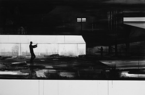
Culture: April 2008 Archives

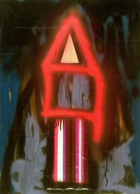
Saul_Becker_Beginning_Story.jpg
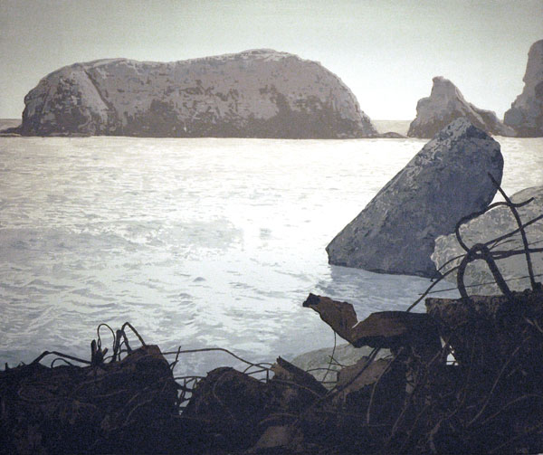
Saul Becker The Beginning of Every Story Seems Ridiculous at First 2008 oil on panel 29" x 35"


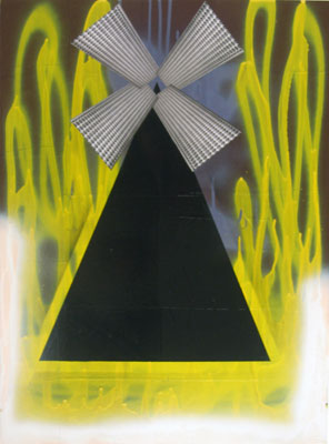
Saul_Becker_Tender.jpg
Saul Becker Tender in Every Joint 2008 oil on linen 29" x 35"


Although I'm now embarrassed to say I found them a bit underwhelming when I first saw them, the paintings of Saul Becker which Sean Horton showed at Volta very quickly managed to give themselves real presence. Maybe I was suspicious of the subdued earthy colors (my favorites) in these foggy landscapes, but my eyes quickly opened when I started to notice here and there oddly-natural elements of grafitti, industrial fencing and even more heavy-duty detritus. I then learned that the artist, currently represented with a solo show of large-scale ink and gouache drawings at the Lower East Side [L.E.S.] gallery which I have not yet seen, works just somewhat outside en plein air landscape practice. These scenes don't exist except in Becker's eye. The show's press release tells us, as a matter of fact, that the works, "best described as composite landscapes, combine fragments from different places and sources to create new, invented locations."

Adam_Dant_Liberty.jpg
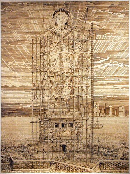
Adam Dant Liberty 2008 ink on paper 95" x 72" [installation view, including the entire drawing, but cropped just inside the edges of the folio]

Adam_Dant_Liberty_detail.jpg
[detail, shot from an angle below]


Adam Dant was the artist London's Hales Gallery chose to show at Volta last month. Although the artist showed work drawn entirely from iconic sites of New York City, William Hogarth, his home town's genius hovered over these large ink drawings on paper.

Barry and I also saw a portfolio of a handsome print edition which was a version of this image, but run without including the Watteau Pierrot inside the construction scaffolding, in fact without including any figure. Dant had instead added a different character, in contrasting red ink, as a unique drawing on each print. Every one of them is a distinctly different monument substituting for the familiar "Liberty", something of an extended commentary on a subject dear to this engaged, lampooning artist.

Dant is perhaps still best known in England as the the creator of "Donald Parsnips' Daily Journal" [sample], a quirky broadsheet he wrote and drew, photocopied and handed out to fellow Londoners (and Parisians, Berliners, New Yorkers and Cairenes) every day for four years beginning in 1995.

Gagliostro_Reagan.jpg
Gagliostro_youth_window_2.jpg
Gagliostro_torso_BW.jpg
Gagliostro_youth.jpg
Gagliostro_chat_room.jpg
Gagliostro_crane.jpg
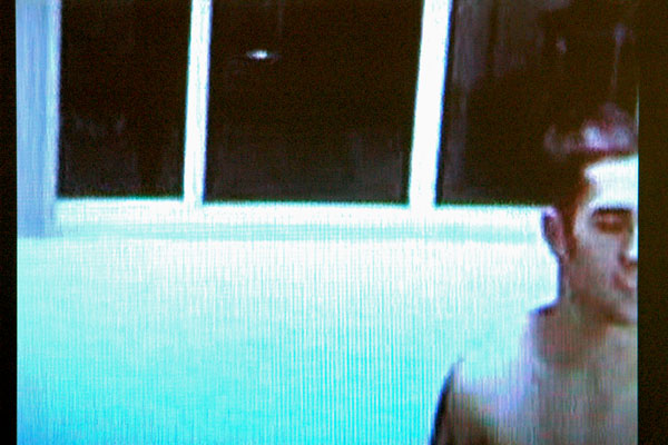
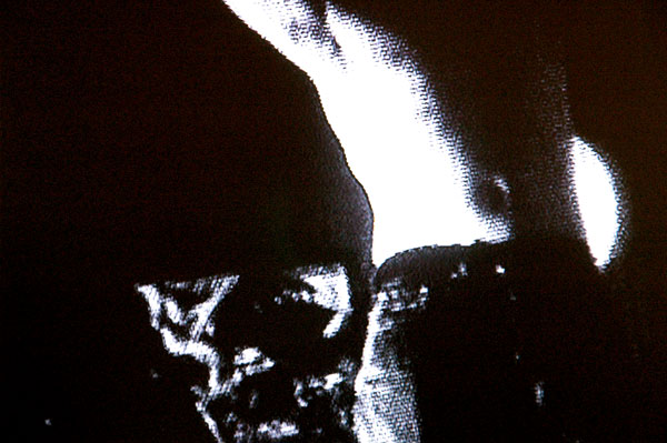
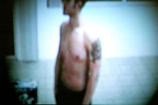
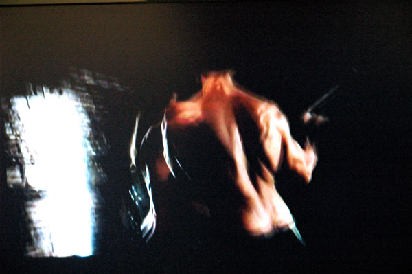
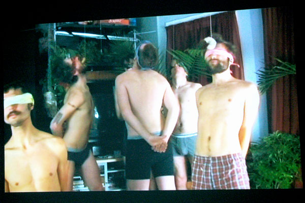
Vincent Gagliostro After Louie, an excerpt video [stills, and large details of stills, from installation]


Margaret Thatcher showed a video by Vincent Gagliostro at Pulse. I'd like to describe it as an art trailer for a full-length film not yet produced, but even in its current form it's certainly a complete work of art. There's not a single ugly or unnecessary frame in this piece. I snapped only five images while standing in front of the video screen last month; five images appear here.

Gagliostro describes the work as:

. . . a political love story set against the backdrop of a time when the gay movement mattered, when lovers were not looking for their rights within mainstream structures and when activism existed in its rightful home: the streets.

The artist is a friend and an activist colleague of mine.

Although I'm also no stranger to the world which inspired Gagliostro in creating this film, I prefer to let the gallery press release set the scene with the help of the director's own input:

"After Louie" hits you like a time bomb . . . was there really ever a New York like that where adventure and discovery and sexual tension were still palpable and possible on the skinny island of Manhattan? Was there a meatpacking district before Pastis? When you watch GagliostroÂ’s video, you actually remember, for a moment, the streets and the clubs and the boys with nice abs.

In the visual and audio collage of Gagliostro's piece you recall that New York City from the not-so-distant end of the last century like it was yesterday. You remember it all not with nostalgia, but, quoting Gagliostro, "with relief that this New York actually existed and actually happened before it was too late; that despite the tragedy and loss and pain of that era there was still the nourishment of real off-line experience and the comforts of heart and sex and art and strangers and bodies and life, and soul growth before everything was already discovered, developed, trained, tracked, exploited, done, over."


There's a clip of the video here, on the artist's very beautiful site.


PSJM_video.jpg
the advertising video

PSJM_shop.jpg
the shop corner


I was delighted with the quality of the installations at Pulse of Espacio Líquido, a new Spanish gallery located in Gijón on the central Asturian coast. They look like they'll be worth watching.

The images above can't begin to describe the project of just one element of the gallery's presence in New York last month. My few words can't do much more but I can say that PSJM is a Madrid-based collaborative formed by Pablo San José and Cynthia Viera. Tricked out as a shiny, sexy commercial brand itself, PSJM offers a critique of both global capitalism and market-based art. "Made by Slaves for Free People" - so went the title of the pair's show at London's Riflemaker earlier this year.

Sean_M_Johnson_Donut_Eating.jpg
Paul M. Johnson Donut Eating Contest 2008 video [still from installation]


Video takes time, and frankly Barry and I didn't have much left when we finally found the video room at Pulse, "Sameness, Difference and Desire", curated by Bill Arning. I have to admit this work by Sean M. Johnson was the only one we managed to see while we there, but on the basis of Arning's track record over the years and the merits of this piece alone, I'd have vouched for every other one in the lineup. Those included videos by Ann Carlson and Mary Ellen Strom, Maria Friberg, Allen Grubesic, Danny Hobart and Gabriel Martinez.

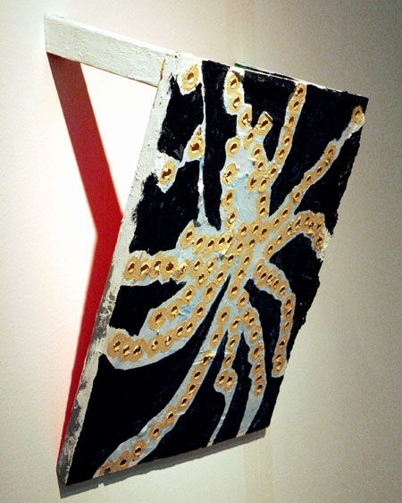
Cordy_Ryman_Silent_Echo.jpg
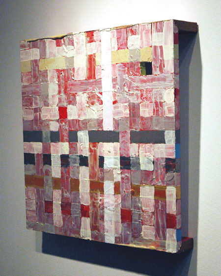
Cordy Ryman Silent Echo 2008 mixed media on wood 18" x 15.5" x 3.5" [installation view]


Cordy_Ryman_Octopus_2.jpg
Cordy Ryman Octopus 2008 mixed media on wood 18" x 15.5" x 7.25" [installation view]


DCKT showed work by Cordy Ryman at Pulse. The color and surface magic of the first piece in particular was dazzling. I'm looking forward to the artist's first show with the gallery.

Trying to find a link just now I realized, to my shame and surprise, that I've never posted images of Ryman's work before, and this after tracking, enjoying and photographing his smartly-whimsical sculptures for years. There are more images here on the west coast.

Ofri_Cnaani_two.jpg


Sure, I admit I seem to be a sucker for Mylar, but I really liked these and the other Ofri Cnaani drawings shown by Andrea Meislin at Pulse.

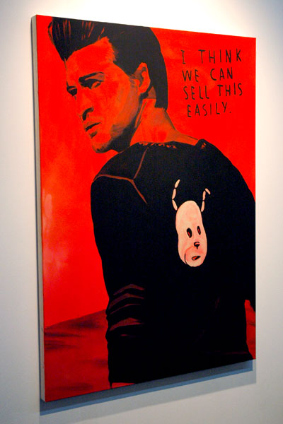
Andreas_Leikauf_Sell_This_easily.jpg
Andreas Leikauf i think we can sell this easily 2008 acrylic on canvas 55" x 33.5" [installation view]


I'm inclined to agree with the artist's text. This gorgeous canvas by Andreas Leikauf was shown by Galerie Ernst Hilger at Pulse.

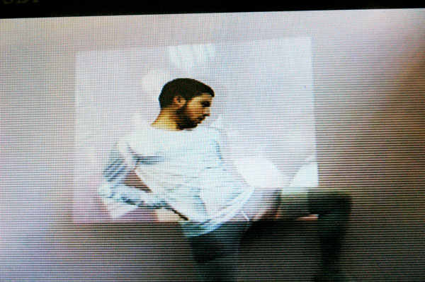
Parsons_Pulse_video_1.jpg

Parson_Pulse_video_2.jpg


The Pulse people set aside a booth for Parsons MFA Fine Arts students to create a "reading room" for the fair located on Pier 40. Called "PULSE PAUSE", the installation was curated by Jeffrey Walkowiak and included work by a number of artists who managed to make it one of the most interesting stops of the afternoon.

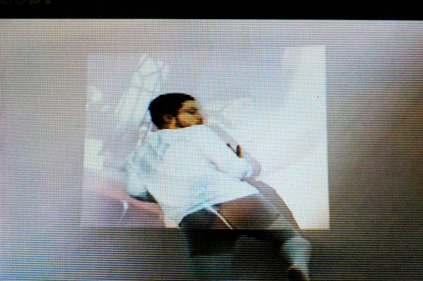
Even though, or perhaps because, it was almost fully camouflaged I was especially taken with the installation by one participant. The video stills shown above are from a small portable DVD player which the artist had completely painted over in yellow paint. Sadly, and uncharacteristically, I do hot have his name or the work's title. Maybe one of my readers will be able to enlighten us.

Until I sat down to do this entry I was certain I had written it down somewhere after Brandon Nastanski had enlightened me. I do remember he said the artist was surprisingly only a first-year student. Nastanski had created the one-person "speakeasy" which attracted most of the media attention for the entry.

I can at least begin to describe what you are looking at: A young man, perhaps the artist himself, is seen standing directly in front of a fuzzy projection of a male-female couple having sex. The young man tries over and over to duplicate the various positions being enjoyed by the woman on the screen. The video is looped. It's beguiling.


UPDATE: Jeffrey Walkowiak, the curator of the installation, tells me that the name of the artist is Matthew De Leon. It's now included in the headline of this entry, but I've made no other editorial changes]


FURTHER UPDATE: Looking for something else in a search on my own site I just today [February 16, 2009] came across this web site of the artist.

Jana_Gunstheimer_Reservat.jpg
Jana Gunstheimer Reservat 2003 acrylic on linen 46.5" x 69.75" [work not at Scope]


I'm not sure that it should be necessary to mention it, even if it may be germane (no pun intended), but Jana Gunstheimer, described by her Swiss gallery Römerapotheke as an artist and ethnologist, was born in Zwickau, in what was then known as East Germany, or the Deutsche Demokratische Republik. In the years immediately following the precipitous disappearance of that communist state she studied painting in Leipzig. Today she lives in Jena, near Weimar. She's known in Europe [and in Philadelphia {scroll down}] mostly for her beautiful black and white expressionist painting. We haven't had nearly enough opportunity to see it on this side of the Atlantic.
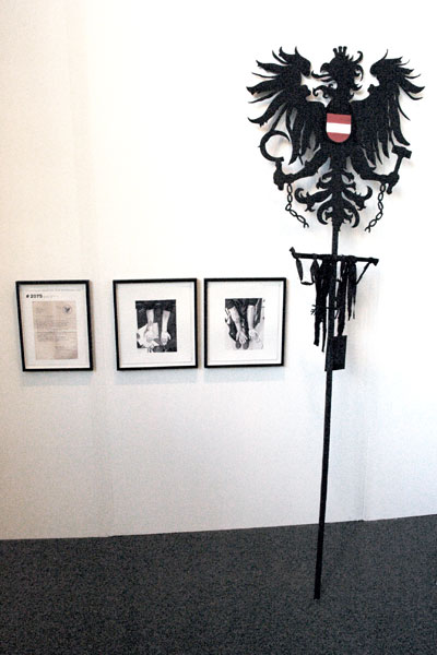

Jana_Gunstheimer_Canonization.jpg
Jana Gunstheimer [large detail of installation at Scope]


The image just above is of items from the artist's physically very different body of work, "Heiligsprechung" [Canonization], a part of which was brought to Scope New York this year by Römerapotheke. No, the two framed watercolors don't represent attempts to display divine stigmata, but are merely protestations of the negative, "ich tu dir nichts" [I did nothing to you] or "Ich pass auf dich auf" [I leave it to you]. Gunstheimer's general conceit is described just below in a large excerpt from the press release for her current show at Filiale in Berlin. Note that "SBK" is the German-language acronym for her fictive Austrian department of government, "State Authority for National Heroes".

SBK

State Authority for National Heroes

In 1976 Austria's federal government was planning to set up a "canonization" authority as part of the celebration of 1000 years of the country's existence (the process is known as "beatification" in the Roman Catholic church). After due examination, exceptional people would be granted access to high public esteem and entry in the annals of popular or national heroes.

However, the real reason for setting up such an authority was the prospect of high revenue in the form of voluntary payments by citizens. In fact the minimum costs of thorough examination of each application, expert appraisal, reimbursement of witness expenses, production of documentation, printing, decoration during the ceremonies and multiple fees and taxes were calculated at 80 000 shillings.

In the first year alone, the Authority received well in excess of 1000 applications. In many places, associations were formed to sponsor candidates of slender financial means and give the member of their community a chance of becoming an official popular hero.

As it happened, none of the applicants in the first year was deemed worthy of elevation to this rank. Indeed, in the next five years of the authority's existence, only three candidates made the grade. Instead, the Authority's examination revealed not only that applicants were not popular heroes, but that most had committed major or minor offences. Faithful to their obligation of disclosure, they had allowed the Authority access to all spheres of their lives.

Establishing the Authority was an ideal ploy for a government. Citizens pay large voluntary sums into government coffers and actually turn themselves in.

Last year she came to Chicago for her first show in the U.S.

She is known for her observation of and creative satire of the weaknesses within both German and Austrian society and culture, but at the Chicago Institute of Arts she made a very successful incursion into the frailties of our own. The Chicago Reader's review described her project with a headline which reads like it might have been inspired by New York's Daily News: "The upper classes take a dive in Jana Gunstheimer's clever disaster scenario.".

THE CENTRAL WALL in Jana Gunstheimer's installation at the Art Institute features a large cutout of the Tribune's logo accompanied by a giant, delicately executed silhouette of a dilapidated high-rise. The ominous headline is "Status L Phenomenon" -- also the title of the exhibit. A stack of newspapers, which visitors may take with them, announces "Members of upper class affected by inexplicable phenomenon of lost status." A smaller headline reads "Lake Point Tower plus two luxury villas suddenly replaced by affordable homes -- Occupants seem different."
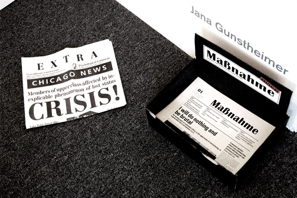

Jana_Gunstheimer_Massnahme.jpg
Jana Gunstheimer [view of installation at Scope]


The image shown just above is of a stack of two editions of the artist's newspaper, Massnahme. She plans a series of eight editions, each related to issues of unemployment. There will be an interval of two years between each, corresponding to the duration of the German government's current program for people unable to find work. The Issue on the left was created for the Chicago show, and may in fact be an "extra". The stack on the right is of copies of issue #1; its headlines describe, along with other stories, an experiment inside a "containment camp".

I want to see more of Gunstheimer. If she can be so disturbed by, and address so well, the dark side of what we often perceive as the remarkable success stories of Germany and Austria I can't begin to imagine what she could accomplish here in our benighted American homeland.


[image at the top from Galerie im Kunsthaus Essen]


UPDATE: D-L Alvarez has a review of Gunstheimer's current Berlin show in the ArtCal Zine, and in his blog "Modern Art Notes" Tyler Green discusses the artist's show at the Art Institute of Chicago, both items posted today, April 18.
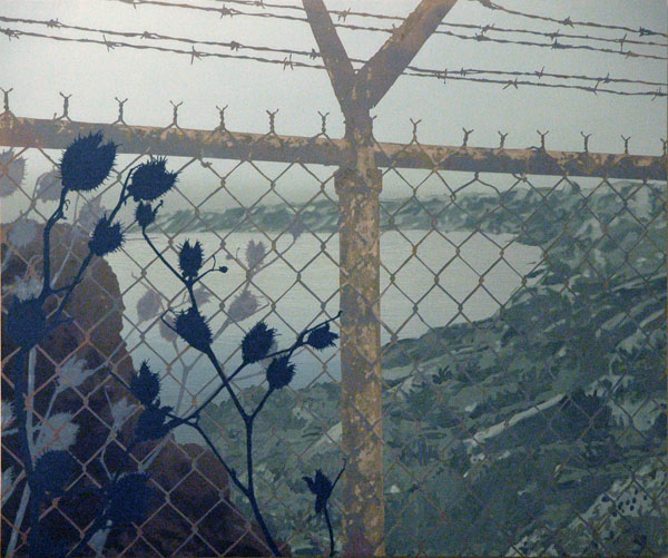
Antti_Laitinen_island.jpg
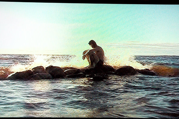
Antti Laitinen It's My Island 2007 video [large detail of still from installation]

Antti_Laitinen_Horn.jpg
[edited sequence of video stills from the gallery site]


On the other side of the cultural Finland we know (or perhaps that of almost any other modern nation) there may be just a guy and his wilderness.

Over a period of three months Antti Laitinen filled and dragged one sandbag after another into the sea to make his own little island - and then he dragged them back. "It's My Island", the documentation of the 2007 construction project, was displayed at Scope by the London gallery Nettie Horn and shown in three video monitors, each actuated at a different moment.

The gallery describes the source of the artist's remarkably engaging creativity

Antti LaitinenÂ’s work shares some of the absurd seriousness of [the 1957 "Manila Rope" by the Finnish novelist Veijo Meri, a literary performance of body art]. Just as in MeriÂ’s story, so in LaitinenÂ’s works incongruity between an individualÂ’s performance and circumstances grow into a cultural metaphor. Many of Antti LaitinenÂ’s work [sic] deal directly with fundamental issues of Finnish identity and cultural imagery, they are pictures of masculinity set in a context of nature and culture.
As I watched the video and later searched for more of this work and its contexts, I was reminded of the Sisyphean works of Brooklyn artist Dexter Buell.


[second, thumbnail image from nettiehorn.com]

Marcel_Gaehler_house.jpg
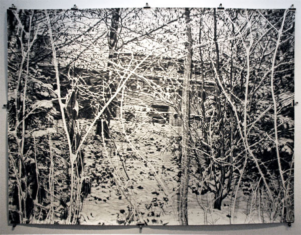
Marcel Gähler untitled 2008 watercolor on paper 60" x 80.25" [installation view]


Marcel_Gaehler_snow.jpg
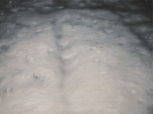
Marcel Gähler untitled 2003 oil on wood 8" x 10.25"


Marcel_Gaehler_group2.jpg
[installation view of six small oils]


Zurich's Römerapotheke showed these and other paintings and drawings by Marcel Gähler inside its camp at Scope. They were among the most beautiful and terrifying things I say among all the paintings I encountered that week.

This excellent gallery's own text includes the note:

His painting drives us towards the limits of our perception. It makes it disconcertingly clear that seeing nothing does not imply that nothing is there.

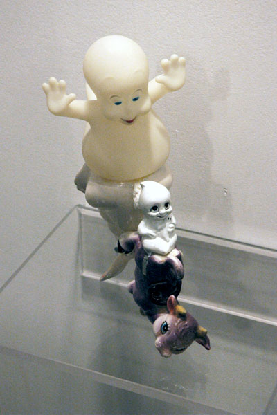
Jared_Lindsay_Clark_Casper.jpg
Jared Lindsay Clark Nursery Rhyme Proposal ceramic cow, easterbunny, ghosts, plastic Casper, epoxies


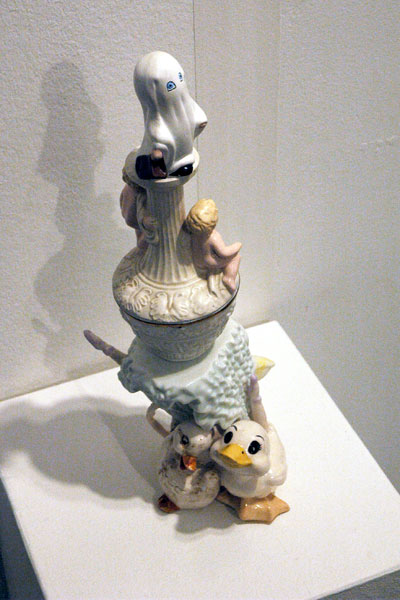
Jared_Lindsay_Clark_ducks.jpg
Jared Lindsay Clark Ballerina ceramic ballerina, ducks, pelican, trick-or-treater ghost, cupids, epoxies


I love these little pieces. Jared Lindsay Clark's small ceramic collage sculptures were a very special part of the booth of Richmond's ADA Gallery at Scope. I can't say enough however, no, literally, since the artist's site uses flash and the gallery's link to Clark just isn't working. But I did find this blog which seems to belong to Clark. It has some more views of these pieces, images of more work from this series, and a lot more stuff from the artist and his friends.

I love Richmond. I haven't been there in ages, but it's getting harder to stay away.

Ernesto_Burgos_Another_Heart.jpg
Ernesto Burgos Another Heart is Torn 2007 mixed media on paper 30" x 22"


Ernesto_Burgos_CrossEyed1.jpg
Ernesto Burgos Cross Eyed 2007 mixed media on paper 30" x 22"


I somehow missed the show of work by Ernesto Burgos which Cynthia Broan showed in the project room this winter. Fortunately I was able to see a few drawings at Broan's booth at Scope, but their quality only underscores my lost opportunity.

The three shows which ended January 19th were the last in her current, New York space. I already miss it.


[images from CynthiaBroan]


Paco_Pomet_Tiempo_Muerto.jpg
Paco Pomet Tiempo Muerto 2007 oil on canvas 27.5" x 39.5"

Paco_Pomet_Tiempo_detail.jpg
[detail]


The Valencia and Madrid gallery My Name is Lolita showed some handsome monochromatic oils by Paco Pomet at Scope.

Vinogradov_Dubossarsky.boyjpg
Alexander Vinogradov and Vladimir Dubossarsky Summer 1 2001 oil on canvas 57.75" x 77.5" [photo taken of installation, evincing uneven ambient lighting]


Now that I've checked out the artists, and know something about what they're up to, my on-sight seduction at the Armory by this cutesy, sexy, pretty, porny, realisty, fairie and quite funny painting by Russians Alexander Vinogradov and Vladimir Dubossarsky makes better sense to me. I love the fat flying penguins and the quite-thick-around-the-middle youth with the four rosy cheeks. Deitch Projects showed the painting.

I also noticed the title, and the date of the painting's completion. Was it before or after that beautiful summer day "when our world changed forever"?

Jenny_Scobel_chihuahua--.jpg


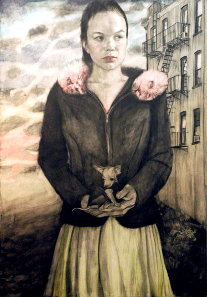
Antwerp's Zeno X Gallery showed work by Jenny Scobel at the Armory this year, including this large piece not accompanied by a descriptive label. The graphite, watercolor and wax painting showed more color than many of her works.

Matt_Mullican_Learning.jpg
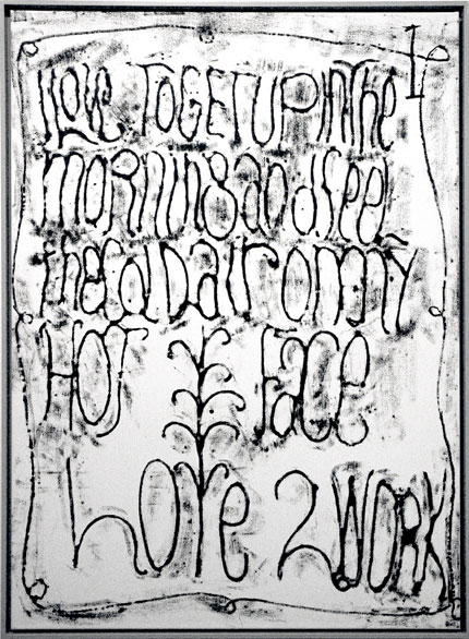
Matt Mullican Untitled (Learning from that Person's work: I) 2007 acrylic and oilstick on canvas 48" x 36"


Zürich's excellent Mai 36 Galerie showed a beautiful, rhythmic black and white language work by the indefatigable Matt Mullican at Armory.

John_Finneran_Trash_Cans.jpg
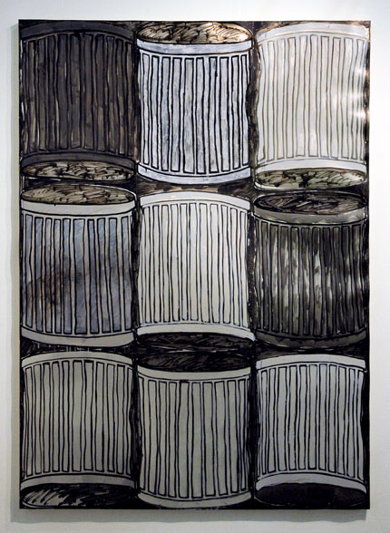
John Finneran 9 Trash Cans 2007 oil on aluminum, rivets 57" x 40" [installation view]


John_Finneran_Mouths.jpg
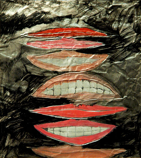
John Finneran 7 Mouths 2008 oil and pen on aluminum 7" x 5.5" [cut showing full image found in installation, where it was surrounded by a mat and frame]


I now realize I'm loving everything [scroll down] I see by this artist, even as I'm also realizing how diverse John Finneran's work really is. Two weeks ago I came across two more works on aluminum in the Rivington Arms booth at Armory.

Cathy_Wilkes_Alone.jpg
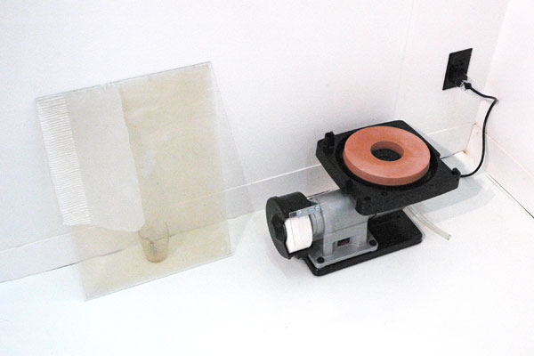
Cathy Wilkes Alone 2004 broken glass, glass pane, battery, grinding machine, dimensions variable [installation view]


I was stopped in my tracks by this piece at the Armory stand occupied by Glasgow's The Modern Institute and I haven't been able to forget it. It looked like someone might have been casually pitched these things into the corner after some emergency repair, and I'm not sure that the rather casual installation of the work wasn't totally appropriate to the artist's purpose.

That artist is Cathy Wilkes.

I regret not asking about it at the time and I've found nothing about "Alone" on line, but I did find a copy of a 2004 Sunday Herald review by Jack Mottram of a Cathy Wilkes show, mounted in a "decaying Dennistoun hairdresserÂ’s [salon]", from which I've excerpted this:

Her prosaic collection of unremarkable items, matched with made objects that donÂ’t exactly dazzle in isolation, are combined and placed in such a way that the relationships between them seems almost tangible, as if you could reach out and twang taut wires connecting each component part of the installation to its neighbour, and the surrounding space. This evocation of a tensile physical connection goes further still, seeming to engender a dumb complicity between inanimate objects and the space in which they find themselves.
I still don't know enough, but I know I wish I had been there, especially now as I remember how I excited I was by the awesome show installed in a similar environment in Brooklyn by Jonathan VanDyke last June.

Youssef_Nabil_Red_Nightgown.jpg
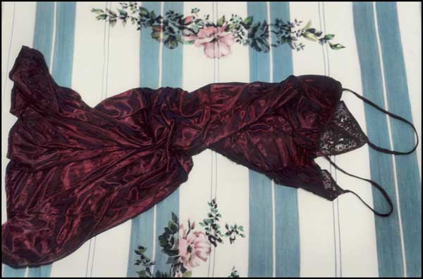
Youssef Nabil Red Egyptian Nightgown 2007 hand-colored silver gelatin print 15.75" x 10.75"


Youssef_Nabil_Amir.jpg
Youssef Nabil Amir, New York 2006 hand-colored silver gelatin print 15.75" x 10.75"


I just thought I had to think about these images a bit more, maybe look around on line and get some context before I could make any public judgments. during the press and VIP opening of Armory.

I'd seen work by Youssef Nabil at least once before. I was probably even more suspicious of my attraction to it then. When I saw these and several other photographs in the display of the Cape Town gallery Michael Stevenson the week before last I thought, maybe it was time to give them a chance. Even though it was early in our visit to Pier 94 Barry and I were already performing gallery triage and I ended up just taking a snapshot of one of the photographs shown above before we slipped past whatever they might end up to be offering.

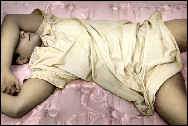
Besides, I supposed my job that day was to look for the new and the fringe. Most of the work which I had seen by Nabil was softly illuminated by hand-colored images of beautiful young men, sometimes including their costumes and their bedclothes. This is a hook to whose appeal I cannot claim immunity, but I'm automatically suspicious of easy seductions when it comes to the claims of art.

I'm now willing to say that Nabil's best work seems to be the real thing. It may just be a hangup of mine, but I think I still have some problem with his more straightforward portraits. I will admit however that in the context of the awesome world which describes this artist's youth and his continued inspiration even what I would describe as the less anomalous images survive their more obvious lures.

Nabil is Egyptian. In fact he's a Cairene, and therefore a citizen of one of* the world's oldest and most sophisticated cities. It's the vitality of early Egyptian cinema and his nation's barely-expired tradition of the hand-colored photograph (portraits, streetscapes and landscapes) that inspire his own live narratives: Each of these photographs is very much a story to be shared with an audience disposed to watch, and read.

For more discussion of the work, see these essays which appear on the gallery's own site.

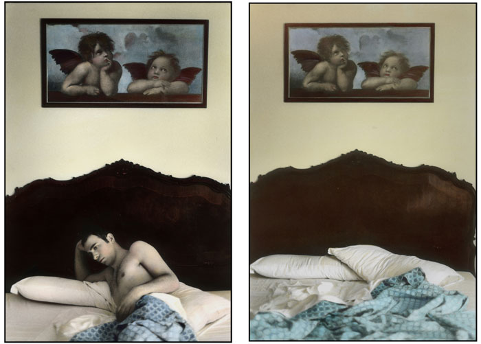
I didn't see this diptych at the fair, but I thought it was worth sharing here:

Youssef_Nabil_My_Time_To_Go.jpg
Youssef Nabil My time to go, self-portrait, Venice 2007 hand-colored silver gelatin prints (diptych) 15.75" x 10.75" each


*
Egypt is pretty old, but its cosmopolitan capitol was founded barely a thousand years ago


[all images from MichaelStevenson]

Scott_Treleaven_forest_pair.jpg
Scott Treleaven [installation shot of a small framed collaged drawing]


Now that's an interesting headline, even if it is inadvertently misleading.

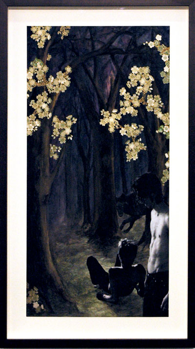
Scott Treleaven just opened a show at John Connelly here in New York. I haven't made it over yet, although it is just down the street and there are any number of reasons why I have to call it a must-see. I've been under some weather until now, so I've had to be content with this unidentified drawing I saw at the Armory late last month, in the booth of the Athens gallery, The Breeder.

Rob_Churm_two_drawings.jpg
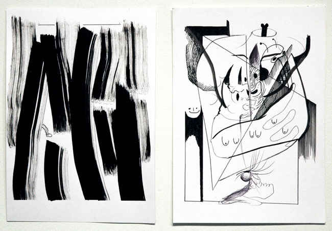
Rob Churm's "Endless Hair" (Indian ink, biro and felt-tip pen on paper) on the left and "Untitled" (biro and felt-tipped pen on paper) on the right, each from 2007, the first 8.25" x 6" and the second 8.25" x 6.25" [installation view]

Rob_Churm_Harry.jpg
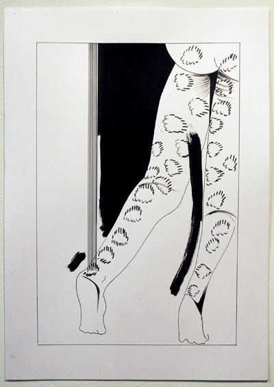
"Harry" from 2007 (Indian ink, biro and felt-tipped pen on paper) 16.5" x 11.75" [installation view]


The Glasgow gallery Sorcha Dallas displayed some terrific drawings by Rob Churm in their booth at Armory. There was never any doubt some of them would show up on this blog. The only question might have been which, but they were all so good I decided it didn't matter.

Joyce_Pensato_Blue_Mickey.jpg


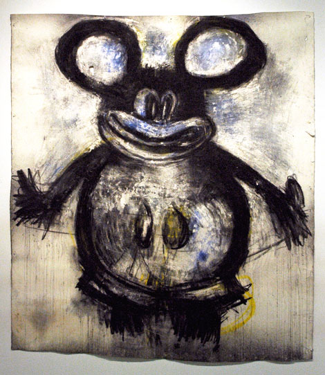
Friedrich Petzel showed this wonderful/awful "Blue Mickey" by Joyce Pensato at Armory. The charcoal and pastel drawing measured 67 by 60 inches.

pause.jpg


Yeah, this site's been mighty quiet for over a week, and to me the pause button seems like it's been pressed for twice that long.

Right after the art fairs I was first feeling pretty burned out, but I had begun to post entries describing some of the work I had liked most when I found myself distracted by things totally unrelated to the visual arts, including preparing a special dinner for friends early this week. The next day I came down with some general malady which developed into a full ague. It may suffice to say that my head swam, my skin ached, and I found it painful even to think of touching the keyboard with my fingertips.

I'm feeling much better today, even after seeing Caryl Churchill's not-so-upbeat "Drunk Enough To Say I Love You" just two hours ago. Starting tonight or tomorrow I'll resume where I left off on March 29th, with some more quick notes drawn from my camera. These will probably continue until I become bored doing the same series, or until I'm distracted by some new baubles.


[image from tiresias.org]

  • home

This page is an archive of entries in the Culture category from April 2008.
previous archive: Culture: March 2008

next archiveCulture: May 2008