June 2008 Archives

Pace_wildenstein_photography_ban.jpg
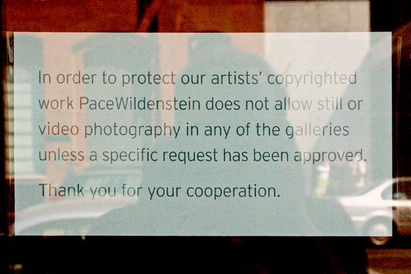
sign inside the window immediately adjacent to the front door of the gallery on 25th Street


They have no idea what they're talking about. Once one of the most important galleries in the country, sadly Pace Wildenstein doesn't seem to know the first thing about the usage of photography in the twenty-first century, or the issue of copyright.

Because of the gallery's photo ban, Pace shows are not posted or reviewed on ArtCal, and they do not appear on this site or on Bloggy.

Joseph_Hart_Fragments_constellations.jpg
Joseph Hart Vija No. 9 2007 acrylic on paper 22" x 30"


Some time ago I wrote about a show of Forth Estate prints at Klaus von Nichtssagend, and I included an image of a work by Joseph Hart. Of course I did an on-line search at the time for more of the artist's work and really liked what I found. This was no surprise, considering my respect for the Williamsburg gallery, and the company the print shared.

I missed the solo show of collage work which Hart had in the Freight + Volume project space last year, so I was doubly happy to come across an announcement of the publication of "Fragments", a beautiful new limited edition book of his work, some of which appears to have been in that show. I decided to include one of the images here. I chose it for its breathtaking beauty, even if it seems to be in a style and form a bit different from most of the work I've seen.

Hart appears to be interested in systems and the way all the stuff we're surrounded by is presented to us. This includes our historical and cultural values, science and art no less than all the rest. Investigating the simplest or most complex given or invented artifact, on virtually any scale, he ends up creating living, organic "museums" with his own diagrams and maps, every one of an astounding beauty.

The publisher is San Francisco's Seems Books, and more pages can be seen on their site.

Wow, I just noticed they also have a book of Mike Paré work!

Christopher_Brooks_black_snowman.jpg

Christopher_Brooks_black_and.jpg

Christopher_Brooks_black_bar.jpg

Christopher_Brooks_busy.jpg

Christopher_Brooks_white_exclamation.jpg

Christopher_Brooks_pretty_white.jpg


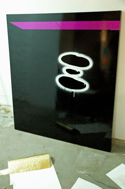
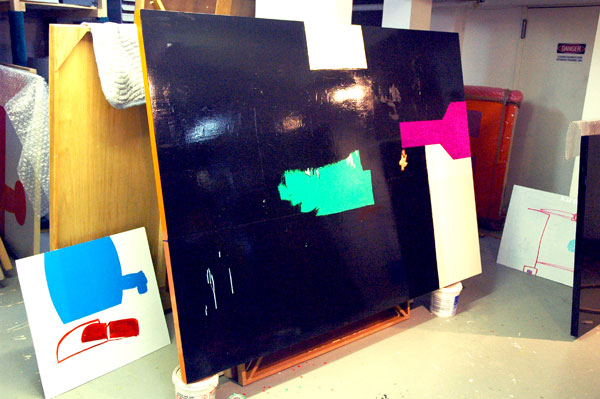
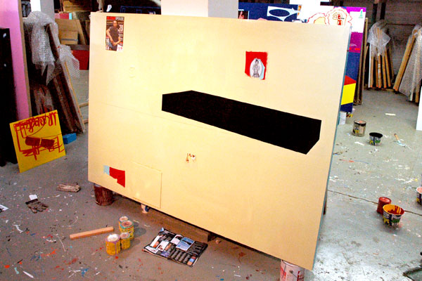
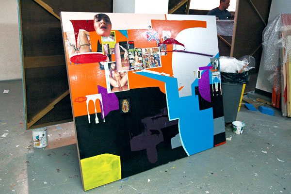
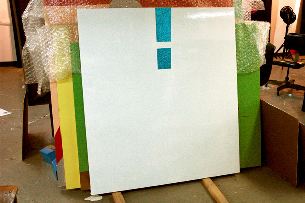
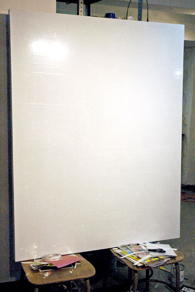
Barry and I were in Christopher Brooks's studio last week. Unfortunately the images I've uploaded here can only begin to describe the work we saw. They start with a black enamel panel which is related to the two pieces we saw at Audiello one month ago and they finish with a very recent work, a shiny panel which is (almost) completely white - at least for now, since the artist is probably not finished with it yet.

You will get an indication from these pictures that we saw a large range of work, stretching even in these shots from extraordinarily minimal painted panels to some whose compositions were almost shockingly busy (for Brooks) with both applied and painted figures and shapes, as well as his characteristic broken or layered surfaces. I think everything we saw had that subtle element of collage that I've associated with Brooks's paintings all along. Some of the pieces we saw had been completed years ago, but a seductive line running through all of the work showed it was all clearly the creation of an independent artist who knows what he wants to do and does it very well.

The images on Brooks's own site represent a creative period of twelve years and they are very good. Because of that I first hesitated to put up any of the shots I came home with from our visit, but even a professional jpeg isn't always enough to describe a painting or a sculpture. I think that sometimes an informal installation or studio shot can add a lot to reproducing the image of a painting or sculpture, although there's no substitute for being able to stand in front of it. There's also the additional dimension which any kind of editing can bring to the work, and if the photographer is excited about the art images captured more or less impulsively may sometimes do it better service than formal, abstracted shots which present it only straight on, an approach we don't even use when we're able to actually be there.

I've also noticed that the straight images on both Brooks's site and my own can represent almost nothing of the excitement of the three-dimensional quality of the surfaces of these particular paintings, and because of the deliberate, rich reflective qualities many of them exhibit, they may just look wrong given conventional studio treatment. In the end I suppose I just wanted an excuse to show more of them, and my computer skills are too modest to work with the images on his Flash site. I was excited, and I hope some visitors to this blog will be as well.


Andrew_Piedilato_studio_horse.jpg

Andrew_Piedilato_studio_horse_detail.jpg
[detail]


Andrew_Piedilato_studio_chimney.jpg


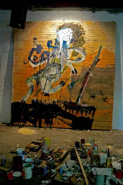
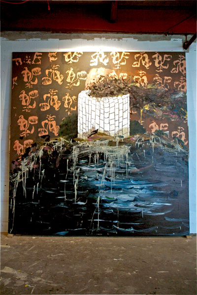
It was a great studio visit. Along with the pleasure of some fine work, there was the pleasure of conversation with an animated artist (actually two or three) and some other good people (some familiar, some not), even if the ambient lighting turned out to be a problem for decent pictures.

These are the views with which I left Bushwick. They show two of the very large canvases Barry and I saw in situ at Piedilato's shared studio during a visit to this former ground-floor factory space. I believe these two were both completed works, but in my enthusiasm with their impact I neglected to ask. We met the artist for the first time that afternoon. His own site has much better images of more work from this series, and earlier ones. They shouldn't be missed; If you take a look you'll understand why I'm so excited.

I liked Piedilato's painting the moment I first saw one seventeen months ago. It's a little strange, but until going back today to my earlier post I hadn't remembered that work as being particularly large, even though I had actually included its generous dimensions in my text. So I was pretty surprised to see the latest pieces. They were all pretty "awesome", but not just because of their monumental size. Piedilato continues to combine exuberance and discipline in his new work, now being registered on an even larger scale: Everything we saw the afternoon we were there was roughly twelve feet square.

I love the strength and repetition of the various kinds of blocks, boards, and wallpaper 'prints', and then Piedilato always introduces some mad explosion or delightfully messy thing to take it much further than you'd imagine it could go. Not every exhibition space can handle 12-foot canvases, but with work of this quality, I can't believe this guy doesn't have serious gallery representation right now.

Brent_Green_3b.jpgBrent_Green_5.jpgBrent_Green_1.jpg
Brent_Green_2.jpg

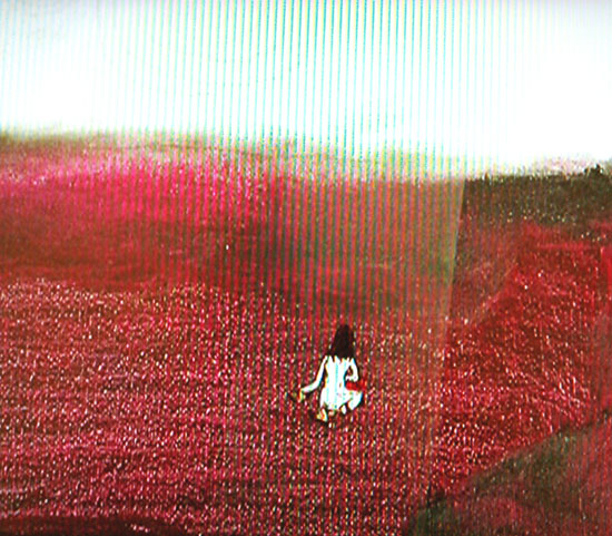
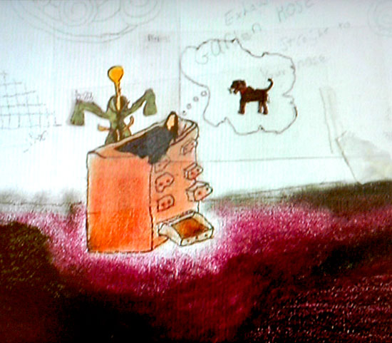
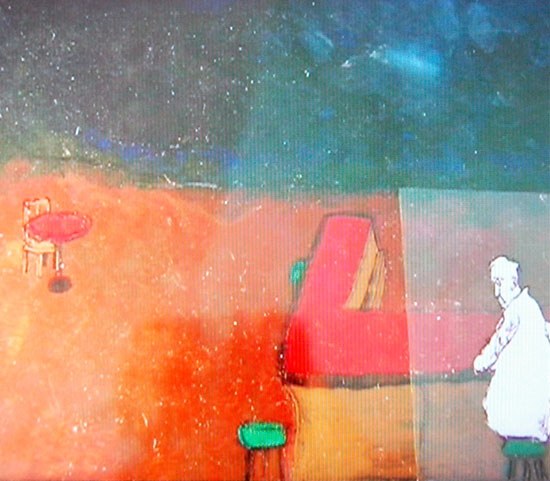
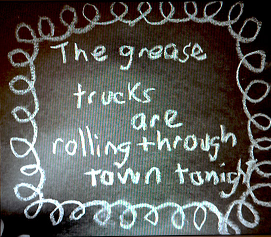
four large-detail stills from "Susan's Red Ears" (2002), Brent Green's 6-minute, 16mm transfer to DVD


SUNDAY has a must-see group show, "Tenderly", which includes work by twelve artists: Erik Bluhm, Martha Colburn, Carl D'Alvia, Edward del Rosario, Echo Eggebrecht, Joel Gibb, Brent Green, Kirk Hayes, Asuka Ohsawa, Ruby Osorio, Hills Snyder and Rachell Sumpter (and almost as many mediums).

The exhibition press release talks about their use of humor, childlike forms and other devices "to soften some of life's more dramatic, and often tragic, moments". It worked for me: A perfect mix for a hot summer day perched in the midst of particularly perilous times.

They're all worth seeing, and I want to go back, but I was totally taken with the video by Brent Green, a young artist not entirely unknown in avant film circles, but whose work I don't think I've come across before. Every frame of this little hand-assembled video is a painting by itself, so it was no problem capturing a few to show here.

Six of his films, including "Susan's Red Ears", are available on YouTube, through links shown on the artist's site.

Green's doing a live show at the Hammer Museum in Los Angeles next month, screening all of his films with live narrations and improvised soundtracks by himself and four other artists on July 22. It sounds just too good to pass up, if you're anywhere in the area.

subway_billboard.jpg
untitled (subway frame) 2008


Chihiro_IIto_poppy.jpg
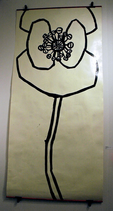
Chihiro Ito's 2006 poppy drawing at Shion Art (New York, Nagoya)

Ross_Bleckner_print.jpg
2007 Ross Bleckner print at Hal Katzen (New York)

Atsuko_Ishii_etching.jpg

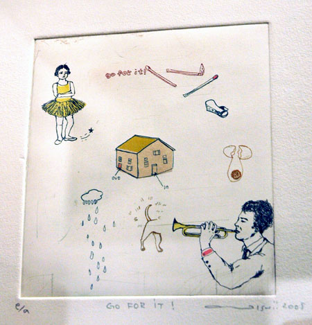
small Atsuko Ishii etching from 2008 at Envie d'Art (Paris)

Julian_Schnabel_etching.jpg
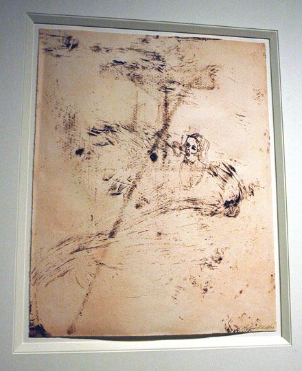
1983 Julian Schnabel etching at Peter Gant Fine Art (Carlton, Australia)


I went to the 2008 Affordable Art Fair [AAF] preview last night thinking, on the basis of previous incarnations, that the slim hour I had allotted for a visit might be enough. It wasn't, by a long shot. I was very pleasantly surprised that even after overstaying into a good part of another hour I had probably only seen about a third of the exhibitors, and I promise I was hardly schmoozing at all.

There's some very good stuff to be seen on West 18th Street this weekend, and some of it really is affordable. I think I'm using the adjective judiciously, because with prices which start at $100 or $150 much of this art will find a home with folks who may have only very modest incomes.

I'm not being patronizing about the quality of some of what is available; there are works I wouldn't be surprised to see in fairs with much higher visibility - and pretensions.

With that reference I should say that on my way down the aisles and past the bar areas I had to slip through dense throngs of well-dressed and well-lubricated bargain-hunters last night, many of whom were doing more than just schmoozing themselves: The rich love a good bargain as much as the rest of us; they'll compete even with impecunious collectors so long as the packaging looks good, and the organizers have done a very good job with this package.

Prices seemed to be pretty visible, either on the labels or lists set out. The works shown at the top of this post ranged from $150 to $6000. The Fair says the works start at $100 and go to $10,000 (well, "affordable" is always what you think is affordable).

As usual there were still a huge number of gallery names (they came from all over the world) I didn't recognize. The organizers and the galleries have done a great job this year, but if only to emphasize the idea that money is not the standard by which good art should be judged, it might be nice to see the AAF attract galleries from all levels of "respectability". Last night I saw some gallery owners walking about who weren't exhibiting at the fair. They may have just been socializing, or they may have been there for r&d, a professional investment analogous to that of galleries haunting art school studios and graduate shows. But I'm thinking that surely even a blue chip space can find work from its existing shelves or files which it could position for entry-level art patrons. Or perhaps even better, how about "big-deal galleries" exhibiting work at AAF by artists they're currently only considering representing? Of course it would mean they'd actually have to go out and look at some new art.

AAF continues through this Sunday at 135 West 18th Street.

corrugated.jpg
untitled (corrugated) 2008

Clinton_goodbye_2.jpg
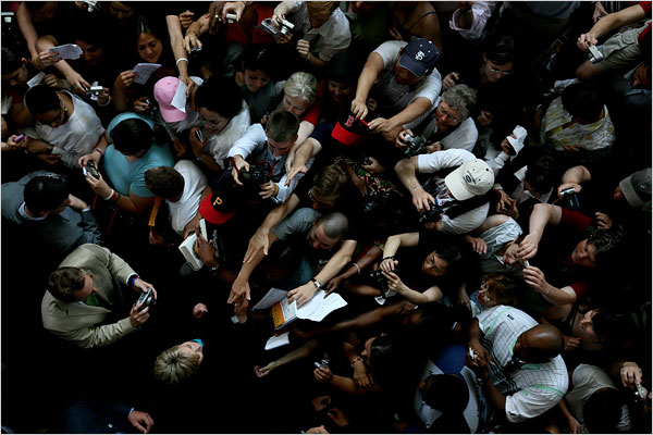
Clinton being greeted by supporters invited from across the country to attend her speech today


From the NYTimes on-line report on Hillary Rodham Clinton speaking this afternoon in Washington, only blocks from the White House:

"You can be so proud that, from now on, it will be unremarkable for a woman to win primary state victories, unremarkable to have a woman in a close race to be our nominee, unremarkable to think that a woman can be the president of the United States," she said. "To those who are disappointed that we couldn't go all of the way, especially the young people who put so much into this campaign, it would break my heart if, in falling short of my goal, I in any way discouraged any of you from pursuing yours."


At that point the cheers, mostly from women, swelled so loud that Mrs. Clinton's remaining words could not be heard.


[image by Todd Heisler for the NYTimes]

mobile-phone-with-camera.jpg
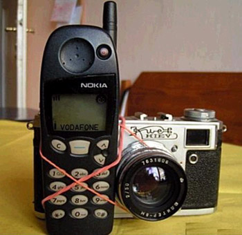
really scary


Why is everybody so afraid of my camera and your camera, even though they all own at least one themselves, and sometimes these same people are the ones spending fortunes installing security cameras to watch us?

I saw this Guardian piece in a Bloggy "linkage" post which appeared yesterday. The paper had published it the day before that. It's too good, and far too important not to share. And don't miss some of the links in the second paragraph.

It's written by Bruce Schneier, an internationally-known security expert and currently British Telecom's chief security technology officer.

Here's a tiny excerpt:

Given that real terrorists, and even wannabe terrorists, don't seem to photograph anything, why is it such pervasive conventional wisdom that terrorists photograph their targets? Why are our fears so great that we have no choice but to be suspicious of any photographer?

Because it's a movie-plot threat.


[delightful image created by bloganything]

Will someone please explain to me why it's going to take the better part of a week for someone to respond to their own colleague's selection as the candidate to oppose so monstrous an alternative as the man who represents the people who control the party which has virtually destroyed our polity?

Parsons_megaphone.jpg
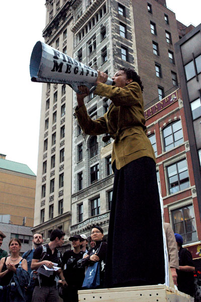
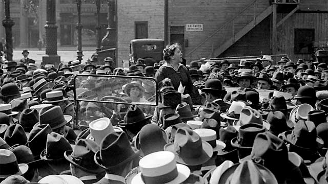
Lucy Parsons on a soapbox, defending the people's park


WHY WE CARE

Union Square absolutely must remain a place for public assembly and its park pavilion must remain open to everyone, as it always has been. Both must continue to serve the whole community, and for the pavilion that service must include its traditional and essential function as a podium for public speakers at gatherings which are not permitted anywhere else in this city.

The city came to Union Square instinctively immediately after September 11, 2001. We were there many times before and we've returned repeatedly since. There we shared and broadcast our feelings about war, threats to the Constitution and any number of other issues. But none were so important as the fundamental freedoms of assembly and movement and speech. The park was always there for us. Now it needs us. Today the site of so many rallies, visible and vocal expressions of unpopular popular opinion is barricaded behind a chain-link fence. If civic authorities and real estate interests have their way, we'll never get it back.

Central Park is already gone; it's been privatized and sanitized. No more rallies there: We've been told the lawn is just too precious for regular people. Bryant Park is a club. Union Square is all we have left.

Yesterday some of its defenders rallied inside the park, eventually taking their protest across the street onto the sidewalk in front of the large windows of the luxury W Hotel's street-level lounge. There civic and business planners were meeting to discuss the future of the park. They envision that future as one which includes the privatization of this classic people's "temple" (first constructed in the nineteenth century, rebuilt 75 years ago, and always intended as a public amenity), as well as additional appropriations of or incursions into the area below its steps which has served as a great open public forum for 150 years.

The rostrum of the park pavilion is in fact no longer available, since it's in the midst of the construction project already begun. Instead, General Washington, who had gathered his troops here in 1776, and who addressed the crowd first yesterday, stood on one of the half dozen sturdy soapboxes furnished by a crew of imaginative and industrious volunteers. The beautiful and indefatigable Lucy Parsons took it from there. Upon completing her own remarks she handed the baton to Emma Goldman, who was followed by Paul Robeson. Robeson ended his words raising his voice in song, before he turned to a very eloquent Norman Thomas. Dorothy Day completed the list of scheduled guest speakers. They were all pretty hot.

After a musical and tumbling interlude and some words from Rev Billy, a community leader from the 21st-century figure appeared. Rosie Mendez asked for and was given the rally's improvised podium and an electric bullhorn to read a statement to the crowd (our standards for public speaking have slipped). Mendez is the district's local Councilperson and just about the only local elected official who actually supports the current plans for the park. I had first thought that she had come to announce her conversion to the side of those opposing privatization, but her statement very quickly told us otherwise.

The commercial media doesn't seem to be interested in covering this rally, so I feel I have to at least mention that there were hundreds of people of all ages and sorts, some super graphics and props, young patriots wearing three-cornered hats, the Rude Mechanical Orchestra, a staged linked-arms-around-the-Park moment, and some really sweet anarchists with a great black sign.

Curiously, in so far as I could see, the police absolutely did not interfere at any time during the course of the rally.

I accumulated a stash of pictures from yesterday's very colorful rally. It began at 5pm with speeches from many of the heroes who once stood on this hallowed ground and the energy continued until just about 6:30.


UPDATE: I've added a Flickr set here with more photos of the rally.

Wooley_Armstrong_Mesch_0.jpg

Wooley_Armstrong_Mesch_1.jpg

Wolley_Armstrong_Mesch_2.jpg

Wooley_Armstrong_Mesch_3.jpg

Wooley_Armstrong_Mesch_4.jpg

Wooley_Armstrong_Mesch_5.jpg
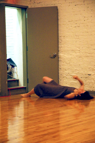
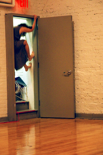
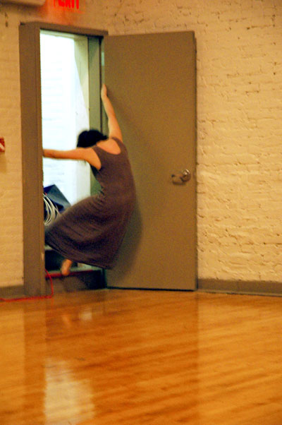
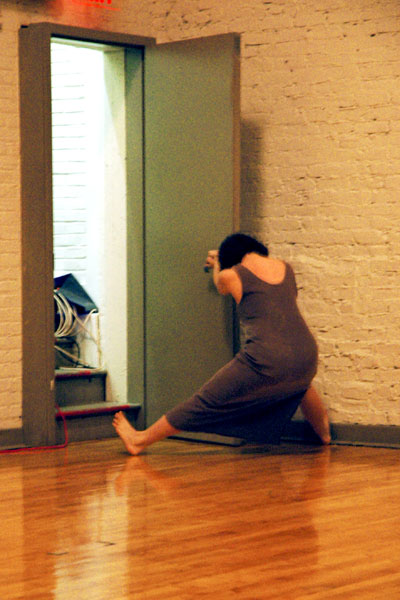
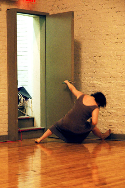
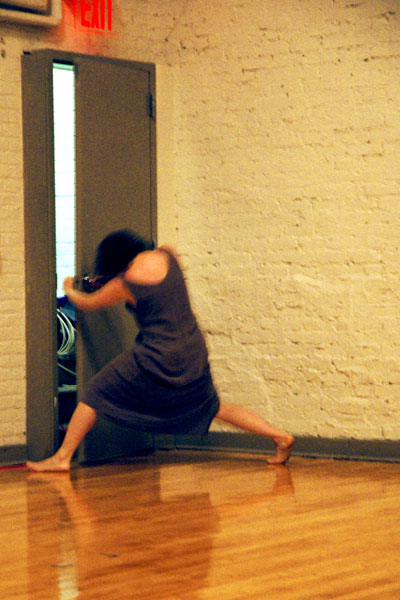
more than a door, and more than a sigh


We were seated (most of us) in a sometime basketball court in the basement of Judson Church. It was this past Tuesday, and it was another event of this spring's Movement Research Festival. This is what used to be called "experimental" performance. Once again there were no props and virtually no theater lights had been installed. There were no elaborate sound systems; instead, each of the three sets of composer/musicians brought whatever they might need. What we did have were some very-much-alive musical writers/performers and their very lively music, created for choreographers and dancers chosen by the artists responsible for the music. The conceit of the program itself was to be an experiment too, since it was a reversal of the conventional order in which the music is chosen by those who create the movement.

My favorite part of the evening was that which Nate Wooley and Newton Armstrong commissioned for the dancer Jennifer Mesch.

All the seats faced toward two unadorned white brick walls, and at their intersection on the far side of the gymnasium there was an unremarkable plain metal door. We had barely settled down after a short break and only some of us were looking in that direction when the door suddenly burst open with a loud and extended BLAAAAACK! - a fierce explosion of electrifying and other-worldly, animal-like "noise" At precisely that same moment Mesch was thrown/threw herself out of the opening onto the wooden floor.

The excitement almost never slackened during the five or ten minutes which followed, although it was quickly joined with our laughter. The terrific and terrifically-overwrought dancer was having a ferocious battle with that raucous door. It was never clear who was winning, or whether either might have come out on top, even after Mesch had returned through the opening for the last time and the door closed for good.

Only after the piece had ended and all three performers had emerged could we see that the wonderful monstrous sounds had been created by Wooley's trumpet and Armstrong's electronics, stationed on the stairs inside the landing. When it was all over I told Barry in my innocence that the work made me think of Pierre Henry's "Variations pour une porte et un soupir" [Variations for a Door and a Sigh]. At home last night we decided that in fact it was almost certainly intended as (less-than-concrète and solo) homage to Henry and Balanchine on the part of these three young artists. I'm playing our copy of the CD as I'm writing this today.

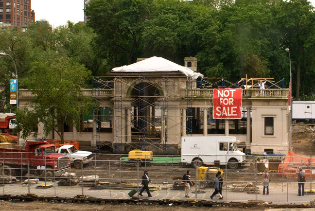
Union_Square_not_for_sale.jpg
Ceci n'est pas un restaurant privé


It looks like some proud park owners were pretty busy yesterday.

For the background story, see my previous post and still more on the Reverend Billy site. The next act begins at Union Square this afternoon at 5.

Note that the white figure waving from behind the balustrade is the Rev himself.


[John Quilty's image furnished by park gremlins]

Emma_Goldman_Union_Square.jpg
come back tomorrow and there'll be a lovely restaurant here instead
(Emma Goldman speaks to garment workers about birth control in Union Square, 1916)


Some folks have the strange idea that Union Square Park, historically (and continuingly) the site of social and political activism in New York, should remain the park of the people. Others have been trying for years to reduce or eliminate the "troublesome" more open public plaza areas to the north, west and south of the greener areas of the park. These same people also think some of its public space should be handed over to private business. These operatives include tin-pot mayors, tin-whistle police, certain tin-eared planners and a number of tin-horned businesses.

It's about Free Speech, as much as or more than anything else.

In the past it was basically only about controlling the rabble; the latest campaign to destroy the park appeals to "gentility" and comes supplied with the irresistible attraction of money as well.

New York's public parks have become Business Improvement Districts [BIDS], or at least that's true of those located wherever there's real money; the others are just left neglected and dangerous, since they are viewed by both public and private authorities as "unprofitable",

The City and the Union Square Partnership Business Improvement District plans a costly renovation plan for the north end of Union Square Park. The plan, currently being held up because of a lawsuit filed by the Union Square Community Coalition would take away thousands of square feet of potential playground, community and free assembly space to accommodate an exclusive year-round restaurant.

This amenity would be located only steps away from dozens of eateries of every description already serving the neighborhood. Union Square represents nothing like the isolation of much of Central Park - as if the hugely-embarrassing model of the ridiculous Tavern on the Green weren't disgusting enough to put a stop to this proposal long ago.

The mayor supports the BID plan, but the opposition doesn't come from Leftist heirs of the Emma Goldman, Paul Robeson and their like, the people who helped make the park what it stands for today. Opponents to the privatization plan include the familiar New York names of Carolyn Maloney, Tom Duane, Dick Gottfried, Jack Taylor, Sylvia Friedman, Deborah Glick, Carol Greitzer, Eadie Shanker and Scott Stringer. This is establishment.

So why is it still a live issue? Because there's so much money pushing it. The courts may still allow the alterations which the community opposes to proceed, but a greater visibility (I mean direct action and attendant media attention) will surely effect the resolution of the case.

There's a demonstration tomorrow, Thursday, at 5pm near the northwest corner of the park (17th Street and Broadway).

I expect it to be pretty colorful, and tuneful: The announcement I'm looking at asks us to:

Join George Washington, Dorothy Day, Emma Goldman, Paul Robeson, and Lucy Parsons. Join The Stop Shopping Gospel Choir and The Rude Mechanical Orchestra. Join Reverend Billy. Join your fellow citizens for a 90 minute festival of freedom at Union Square Park!
Save Union Square 2008 promises to be at this same location every Wednesday at 5, performing, recruiting support, and urging passersby to sign an online petition and to contact local Councilperson Rosie Mendez.


[image from historycooperative]
Christine_Elmo_youth.jpg
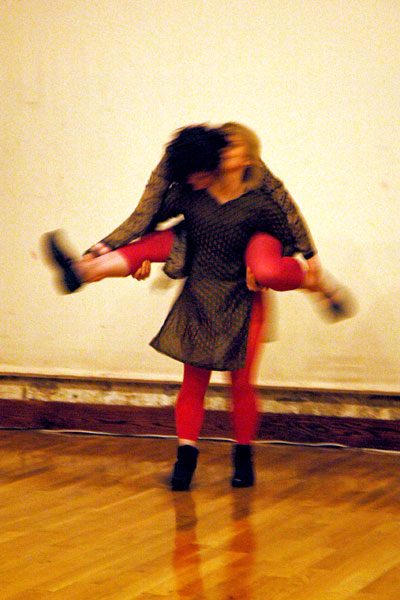
Christine Elmo [the totally amazing Peter Hanson dancing here]

Shogren_%26_McLaughlin_Rain_Thunder.jpg
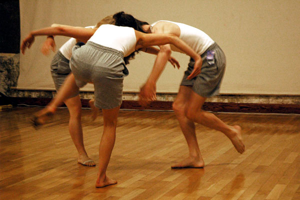
Anna Marie Shogren & Katie Rose McLaughlin


Pinheaded_Justin_Jones.jpg
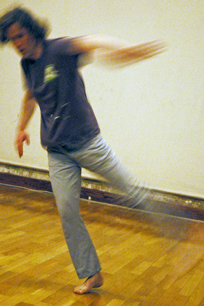
Justin Jones [Anna Marie Shogren, Sarah Baumert and Justin Jones dancing]


Justin_Jones_love_things.jpg
Chris Schlichting


Slap_Trap_Scott_Riehs_2.jpg
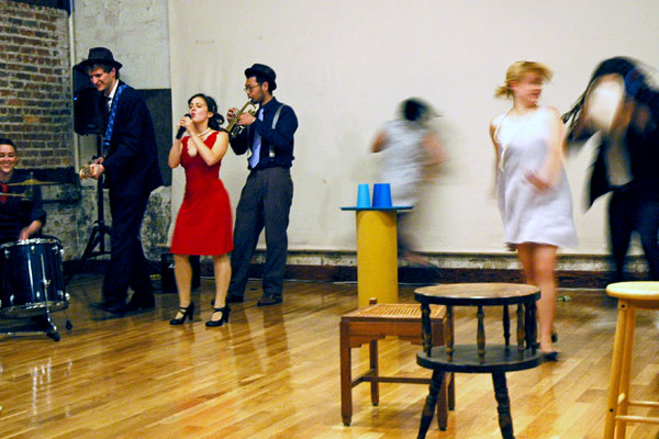
Scott Riehs [only part of the company of eleven]


These are images of five more short performances included in the Catch 30 night of the Movement Research Festival I wrote about in my previous post. The lighting was a challenge, and I didn't leave my seat, so my images are both compromised and few.

I think all of the ten pieces we saw were either excerpts, works in progress, or just tantalizing glimpses of more ambitious works. I wish we could be given strings attached to [most of] these artists, to be sure we'd be alerted to what comes next.

Sorting out the printed program was something of a challenge; this is the alphabetical list of the names of the choreographers alone, taken from the CATCH site:

Christine Elmo
JERK
HIJACK
Justin Jones
Myles Kane
Elliot Durko Lynch
Scott Riehs
Chris Schlichting
shitheads on dynamite/living lab
Anna Marie Shogren & Katie Rose McLaughlin
For a real reviewer, see the intrepid Claudia La Rocco, whose NYTimes piece I read just after finishing this post. La Rocco's also a blogger now.

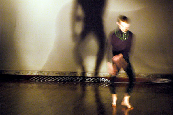
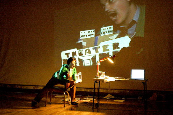
Elliott_Durko_Lynch_theater.jpg
"Everything's for sale!"


Barry and I were at Starr Space [their own site is down] on Friday night for Catch 30, part of the Movement Research Festival which continues through June 8 throughout the city.

Including the one straight video there were ten separate performances in all (if I'm counting correctly), by dancers and choreographers based in Brooklyn and Minneapolis. The evening was curated by Jeff Larson and Andrew Dinwiddie. It was all very fresh, and there was a huge variety of work. While I enjoyed each of them, I only broke my silence in the midst of one, "Bryant Lake Bowl Intermission #3", by Elliott Durko Lynch with the special assistance of Kristin Van Loon. Half way through it I whispered to Barry, "he's a genius!".

Lynch's piece is apparently only a snippet from an evening-length performance in progress, so we might find more structure and fewer loose ends if we are privileged to see the completed work, but I really hope that won't be the case and I really doubt that it will.

In the space of ten minutes, maybe less, Lynch managed to deconstruct the idea, the reality, the nonsense and the value of the twenty-first century American city and the rich life it has repelled and attracted. Most of all what it's about what it is now becoming. Beginning with an odd "presentation" while seated at a desk/table with projector, he raced through an extreme condensation of an impressive personal repertoire which on that night included tutoring or coaching, rapid-fire drawing and sculpting, a magic-lantern show presentation, photography and film projection, declamation, singing, stage directing, choreographing, dancing and, . . . snacking. He succeeded in weaving a story as sincere as it was mad, but this artist's satire is totally authentic. The title of the full work will be "The New York Historic Artists Lofts and Residences + Hotel!".

Shortly after the lights came back on for good we spoke to Lynch. I said that I thought he was a genius, and I told him how much we both had enjoyed the piece. He thanked me shyly and asked, "What is it you liked about it?". A good answer would have been as difficult as unraveling the performance itself. Maybe it's best that I didn't get a chance to explain, since I doubt that I could have. I just know that I was attracted to the energy, the weirdness, and the odd beauty of the images and the movement, and I wanted to keep going with it, even if I never succeeded in sorting it out any better- especially if I never did.

Barry really got it: See Bloggy and especially Barry's blog on the Movement Research site.


ADDENDA:

more photos after the jump

  • home

This page is an archive of entries from June 2008 listed from newest to oldest.

previous archive: May 2008

next archive: July 2008