Culture: June 2004 Archives

PS1tiredangel.JPG
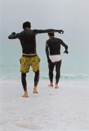
PS1 and the members of Young Architects Program, responsible for the beautiful courtyard installation, should be delighted to know that the visitor pictured above, relaxing in one of their outdoor spaces, had made the art very much his own for part of the day. (We remembered seeing him earlier inside, very intent upon the work in the Special Projects and Studio Program rooms, but he may have been inspired by the sandy images in Ugo Rondinone's beautiful installation, "Sleep.")


I nearly forgot to post something about our visit to PS1 on Sunday afternoon. We almost didn't make it at all, since neither Barry and I nor our friend Karen were anxious to get the early start our day's ambitions recommended. We started out with a pilgrimage to ATM Gallery in the East Village, hours before the current show was to be taken down. Half of the afternoon had evaporated before we squeezed into the crowd drawn to Long Island City for the Museum's summer show, "Hard Light."

It was a warm urban moment. Summer in the city. People were drawn by the art and maybe the music, but perhaps more than anything else, by each other.

We will have to return to get a good look at the work of some 40 or 50 artists and collaboratives installed in and around the rambling old school building, but judging from what we did manage to see, I'd say that anyone would have to be quite dead not to be delighted, surprised or challenged by much of what's there.

The weekends on Jackson Avenue are great fun, but the weekdays are probably better for serious arties.


PS1courtyard.JPG
arties and friends having fun in the main courtyard on Sunday


CorriePeter.JPG
Peter Corrie untitled (2004) 11" x 14"


Barry and I actually stopped by twice on Saturday at the Dumbo space of the TAG Projects show, "Death to the fascist insect that preys on the life of the people." We left in triumph with the piece shown above, by the young artist and curator of the show, Peter Corrie, and we still expect to add one or more small works by other artists to our cart once we can pin down the details.

There was a great deal to like about each of the dozen or so artists who had contributed work. While certainly and unapologetically politically-driven, this is art which can stand very strongly on its own both at this moment and in the eden for which these people are working.

My most-savored (or at this moment most-remembered) images are, in no particular order, the wall installations of Noah Lyon and Peter Corrie (who can't stay on paper alone). Corrie's provocative sculpture, "Dear W," is a small found suitcase filled with a simulated bomb assembled largely from art supplies. The infernal machine would be in our apartment at this moment except for the problem of space associated with most sculptural and installation art.

John Jodzio's imagination could make any neighborhood a legend, and his two large exciting works on paper (sharpie pen and watercolor) do a very good turn for Jersey City.

Leah Meyerhoff's (triptych-y?)video, "Packaged Goods," seems to offer one proposal for dealing with the fascist world of the show's title, and it's as painful as it is fascinating to witness. Great installation.

Alex Barry's 19 drawings, each assigned a title beginning with "I Wish I was . . . ," hold back as much as they deliver. I'm trying to say they're all keepers.

Drew Liverman presented a beguiling collage assembled with cut-outs from printed vinyl inflatable toys. As far as I could determine, the piece offered less menace or malice than any other in the show. So, is that something like a reversal of the kind of impulse which will sometimes contrive a deliberate mistake in an otherwise perfect work?

Jeff Swartz creates small, pretty, exquisitely-crafted melancholy images of military hardware.

Tim Kent has refashioned a child's doll (ok, it's actually G.I. Joe), and its labelling, and returned it to its bubble-wrap packaging. The figure is now costumed as the standing, black-hooded figure in Abu Ghraib Prison which will be etched in our brains forever.

Spy pins a home-made stuffed white rabbit to a column and in its "hand" are three useless playing cards. Just below the figure is another, separate work, a white marker image on black paper of the devil holding a rabbit upside down. The title of the piece with the stuffed rabbit? "He's Got Jack."

We're very sorry once again that we only managed to get to the gallery space on the last day of a one-week show run. We'll do better next time, and I certainly hope, and expect, there will be lots of nexts. We want to watch this good stuff happening.


LyonNoah.JPG
Noah Lyon drawings, installation detail


Corriebomb.JPG
Peter Corrie Dear W (2004) mixed media 3' x 2' x 4'


LivermanDrew.JPG
Drew Liverman untitled (2004) 6' x 4' printed vinyl & plastic sheeting


Spy.JPG
Spy, installation view, with He's Got Jack (2004) 2' x 1' fabric, stuffing and playing cards; and untitled (2003-2004) 14" x 11" marker on paper


One more note about both the people who are TAG Projects and the artists shown in this exhibition: Many if not most of them are as dedicated to and creative in music as they are in their visual work.

And if anyone's still wondering about the inspiration for the title of the show, copied in the first paragraph above, it's a quote from the Symbionese Liberation Army. For more of an immersion in extreme activism, and only slightly less extreme sex, check out Bruce LaBruce's new film, "Raspberry Reich," a brilliant film tool for seducing homos on behalf of the revolution.


A few quick shots of four shows enjoyed very recently, the first two in high Chelsea, the last two in lower Williamsburg:


HumphreyRyan.JPG
Ryan Humphrey installation view, including (top to bottom, left to right, BMX for Japanese Hipster (Aztec Orange), BMX for Japanese Hipster (cavern Pool Green), Remember, Narrate and See (all 2004)


At Caren Golden Fine Art Ryan Humphrey shows a very personal selection of already playfully-seductive commercial products which he has intensely, even obsessively, individualized. They end up as the things without which the rest of us simply cannot go on. It looks like he started working on this show when he was seven - and I mean that in the best way.

The show has been extended through July 16.


Freecell.JPG
Freecell, installation view


The collaborative Freecell is responsible for what may be both the most charming and most disturbing installation around this month. When you enter a small quiet room at Henry Urbach Architecture you are in a spaceship hovering among an unnatural miniature landscape where impossibly-high real skyscrapers are visible just outside the vessel's large window. The environment is both abstract and, quite literally, very earthy, er . . . mossy. The conceptual implications end up mucking up your head even after you've returned through the air and time lock and travelled back to where you began.

While you are there, don't miss the other side (in both senses) of this brilliant gallery, an elegant show of architectural photographs by Ezra Stoller.


jennings3.JPG
Susan Jennings installation view Wood Corner (2002) c-print, plexi 26-3/4" x 26-3/4" courtesy of Michael Steinberg Fine Art


Shaver.JPG
Nancy Shaver The Blue And The Gray (1989) antique frame with found clothing 37-1/4" x 23-1/2 x 3" courtesy of Feature Inc.


Coates.JPG
Jennifer Coates Adrift (2004) acrylic on canvas 30" x 24"


Champion Fine Art just took down their "Exhibition #14: Grass and Honey," curated by David Shaw, and it was up to the very high standards of an artist-curated series which began with #20 and which will end as it winds down to #11. The last ten exhibitions will be mounted in Los Angeles - our loss, the Angelenos gain. There were two fine works in this show by Susan Jennings, each photo-based. One jumped into the third dimension, all be it only one plane at a time.

Also within the space through yesterday, the Nancy Shaver and Jennifer Coates pieces were as striking as they are "photogenic" themselves.


Powida1.JPG
William Powhida installation detail

Powida2.JPG
William Powhida installation detail


You've probably seen him everywhere, and you've certainly read his work, now you get to see William Powhida's very personal art at Dam Stuhltrager gallery, on a small corner in Williamsburg, just west of the BQE. The title of the show, "Persona," doesn't begin to suggest how many of his roles you'll find there. The wonderful video in the special "back room" in the middle seems almost to hold it/them together - if only for its (eminently-repeatable) four-minute duration.


We dropped ourselves off inside the Drawing Center's "Playpen" Wednesday evening, where we bumped into some old playmates and made some new ones. We had a great time and left only after promising ourselves we'd be back another day - with others.

There are a dozen artists represented in the show, and fully half of the environments they have created are designed to be altered - by creative visitors or the artists themselves - so no return visit will be quite the same.

It's a perfect summer show, but that doesn't mean you'll have to shut down any heavy aesthetic sensors or sophisticated brain cells to enjoy it. They will all be rewarded. Besides, The Drawing Center has AC, so there's nothing to keep you away.

The artists included in the show (and, in one case, beyond) are David Brody, Voebe de Gruyter, Charles Goldman, Alina Viola Grumiller, Valerie Hegarty, Geoff Lupo, Edward Monovich, neuro Tranmitter, Red76, Gedi Sibony, Austin Thomas and Alex Villar.

Just a hint of what we saw on Wednesday:


Hegartycorner.JPG
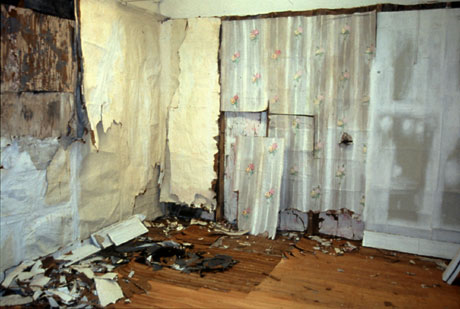
Valerie Hegarty's shedding bedroom, or at least much of it

ThomasLinder.JPG
Austin Thomas's art classroom, with Shoshana Dentz, Joan Linder and Charles Goldman

Sibonydetail.JPG
Gedi Sibony's assemblage (detail)

Monovichkids.JPG
Edward Monovich's images with purposed graffitti process well under way

Goldmancorner.JPG
Charles Goldman's corner (detail, and subject to continuous alteration)


Charles Goldman's installation was especially tempting that night. Even though I was already balancing a camera and a conversation I was compelled to move one of his drawings (his "dingers") from the table to the magnetic board on the wall. Below is an image of the table (the blur represents a kid who really got into the creative process) and then one of Barry, just after he announced, "these are too lined up; it's bugging me."


Goldmantableboy.JPG

GoldmanBarry.JPG


Finkcrowd.JPG
live "dancers, whores, merrymakers, and priests" outside powerHouse Books (the few "corpulent Weimar German types" to be seen last night were inside by the snacks and bubbly, but since they were there, they were obviously on the side of the republic)


Three years ago Larry Fink completed the film shoot, and the pictures were scheduled to run in the NYTimes Magazine in the Fall of 2001 as an arty fashion spread with a bit of frisson. There they would probably have attracted a modest amount of attention.

Then the world seemed to stop. September 11 may not have changed everything, but it certainly frightened the Times, and, as it turns out, apparently every other periodical market in both the U.S. and Europe.

The tableaux vivant produced in the summer of 2001, with their voluptuous, polychrome sculptural presence, have become forbidden pictures.

Fink has been unable to persuade any magazine to print these remarkable photographs. powerHouse Books is now publishing them and they are currently visible at their gallery on Charlton Street, where they will remain through the last day of the Republican Convention, September 2. The Gallery calls them, "a provocative political commentary" and "a satirical look at America’s current leaders."

The artist tells us a little more.

It was simple! I was shooting fashion, perhaps a compromise for me, but a trivial, jovial, stylish, learning theater. Why not use its public accessibility for subversion, satire, association, and education? An idea! One of my favorite periods in twentieth-century art was Weimar Germany, with Beckmann, Dix, and Grosz all melting down convention in an impassioned visionary way. Grosz was especially political, but all of the were hyper-aware of the decadence, the despair, the hysteria, and the lies. I suggested to The New York Times Magazine (whose rear end is sometimes gifted with fashion spreads) an idea to replicate the period but loosen it, update it, and tell it anew. There were fashion equivalents and certainlymoral and historical ones.

Oh the glee! They said yes. I suggested that rather than the corpulent Weimar German types, why not use our current fraudulent leaders, George W.and his cabinet. Oh the glee! They said yes. Political satire and critical acuity are something rarely if ever done in fashion. Yet another coup.

We searched for the cast of dancers, whores, merrymakers, and priests. We searched for the look-alikes of our own Mr. G. W. and his consortium. We found it all and went to work. Five paintings chosen from the period and three days shooting them, interpreting them, and creating aesthetic clarity and political bedlam.

The pictures were shot on 7/19/01 and were hypothetically scheduled to run in The Times in the fall. 9/11 gave birth to doom. The tragic inevitable moment, the rupture of providence, the rape of the external soul of America. And its aftermath. [excerpt from the Artist's Statement]

These are the pictures. But don't expect credits for the fashion.


TonySmith.JPG
Tony Smith The Elevens Are Up (1963) steel, painted black, two units, each 96" x 24" x 96" and overall 96" x 96" x 96"


This stuff thrilled me in the 60's, even before Kubrick, and it still does.

At Matthew Marks, in the space upstairs on 24th Street, there's a minimal installation of minimal Smith. It'll be there for two more weeks.


CORRECTION: I was wrong in my original posting; Tony Feher's show continues until Friday, July 2. Also, I've just added descriptions of the two works shown below which were not identified earlier


I was wrong. Tony Feher's really wonderful show at D'Amelo Terras didn't close on Saturday; It was always scheduled to be up through Friday, July 2. So, while I can still throw images of some of my favorites out into webland, those of you who can get to the neighborhood can go see the beauties for yourselves.

This stuff is magic, and not just because it makes absolutely everyone smile, a lovely art of which we can never have enough.


Feherjars.JPG
Tony Feher Untitled (2004) nine stacks: forty-six glass jars and lids; dimensions vary with installation - approx. 33" x 27" x 17"


Feherwires.JPG
Tony Feher Believe in the Way Things Are (2004) wire hangers, plastic straws, plastic wrap, candy wrappers, magnets, string; dimensions vary with installation - approx. 48" x 75"


Feherboxes.JPG
Tony Feher Mountain Home (2004) 140 green plastic fruit containers; approx. 26 3/4" x 30 1/2" x 20"


Sonnenschein.jpg
Eliezar Sonnenschein Emet (2003) acrylic on wood, 15.25" x 26.75"


Barry and I began the evening on Thursday [see the two posts below] with a stop at the opening of the invitational exhibition, "Sommer Show," at Lehman Maupin on this side of the East River.

We have eagerly visited the booth of this Israeli gallery, Sommer Contemporary Art, every year at the Armory Show, so we were very happy for the director, Irit Mayer-Sommer, when we saw the brilliance of what I believe is her first show in New York.

I thought Eliezer Sonnenschein's acrylic panels on wood were magnificent gems, but I'm certain that someone(s) with deeper pockets than mine will soon be carrying the three home. Sigh. They can't really be seen in something like the reproduction used above.

I also think a lot of Yehudit Sasportas's large ink marker drawings. Sharon Ya'ari's large black and white photgraphs of spaces vacated by the strange people they serve, inspired by minimalism, minimally presented, would stand out in any company. Rona Yefman's direct but sensitive color and black and white portraits are not easily forgotten.

All of it the work of excellent Israeli artists, this art would stand up in the crowd anywhere in our connected world, and its substance makes it especially clear that it wasn't created in a bell jar.

This beautifully-mounted show is extraordinarily welcome at this time in a city which really wants to believe in something other than the current, pervasive wave of fear and hatred incited by the small minds and empty hearts of the artless.


[image from Lehmann Maupin Gallery]

A number of the workspaces tempted us during our visit to Smack Mellon's Open Studios Thursday evening, in adition to that of Valerie Hegarty. We were especially intrigued by the work of Shin il Kim, Andrea Loefke and Austin Thomas.

We'd seen the amazing videos of Kim at Axel Raben's Paper Chase show last April, and Austin Thomas's constructing presence is difficult to avoid anywhere in New York these days. (But, damn, I still haven't seen the neat folding outfit she created for that fantastic Ford El Camino of hers!). Finally, while I think this was the first time I'd seen any of the elements of Loefke's delightful, exploding world, I'm sure it won't be the last.


hegarty4.jpg
Valerie Hegerty Renovation (2002) paper, cardboard, paste, paint, 8' x 14' x 14'


As soon as I walked into Valerie Hegarty's studio I thought I'd died and gone to heaven.

My reaction may have been rather singular, because even I was not surprised that some visitors to her part of Smack Mellon's Open Studios weekend decided her workspace was an empty room not quite swept up yet. This was one of the confidences she shared with Barry and I last night.

But I was immediately at home, or rather immediately taken back to a previous home. At the same time I had the impression that the two successive, long-term creative passions of my life had somehow been reconciled: the recovery of a domestic architectural and social past, and an immersion in the visual art of our time.

Hegarty builds new, lovingly-assembled, homely environments, out of paper, paste and paint, which uncanily evoke the decaying remnants of, well, old, neglected, homely environments.

The real stuff has a power over me because it appears to be both untouched and touched very much, even too much. There's wear, lots of wear, and it looks fantastic, very purposeful and above all very human. Hegerty's imaginary recreation of such (ephemera?) is obviously stimulated by a great love of and serious commitment to the spell of such (almost) spent human environments. The product of her art raises to a level just this side of the sublime what once could only be part of the real world.

I crept about the studio half holding my breath, but then, when we both introduced ourselves to the artist, we were soon even more intrigued than before. I'm afraid we ended up monopolizing her attentions unfairly.

I told her about my fascination with the unselfconscious physical dignity of old buildings and with their previous lives. My interest began when I moved to grad school in Rhode Island, and it quickly became something of an obsession. Feeding such a passion was easier in the period I was there, 1964-1985, since I was able to crawl into abandoned townhouses, mills, churches, warehouses, shops and farms still undisturbed by modern remodeling, "restoration" or arson. I was like entering long-abandoned Egyptian tombs.

In those days architectural artifacts were regularly tossed as trash, even in neighborhoods already being "discovered." During that time my partner and I were able to save one modest eighteenth-century house from disaster. Disguised in filfth and layers of paint, wallpaper, flooring and siding, sweat and imagination eventually made it look like it had only been heavily worn during its 250-year life. And then we each abandoned it, ultimately to owners who would love it but never know the joys of our own discoveries along the way.

Hegerty's creative response to that environment came much later, and from a very different direction. Also a New Englander, she grew up in Massachusetts, but her own parents' home, faux-colonial, could only sadly reference the integrity of its sturdy, hoary neighbors. Plastic ornament stood in for the kind of artifacts I saw thrown to the trash pickups.

But wonderful art followed.

One of the treats we were able to walk away with on Thursday was the revelation that she has been working with playfull storyboards to (perhaps) move, into the dimension of film, an aesthetic which even now is hardly limited in the way it provides enjoyment. Her art works as both realism and abstraction, both painting and sculpture. I stopped for a moment to imagine a delightful projection of flesh and blood people appearing in, disappearing into and altering her remarkable synthetic environments. More magic.

The Open Studios continues tomorrow, from noon to 6pm.

If you miss it, you have another chance to see her work very soon. Hegerty is one of twelve artists selected to create site-specific environments in the show, "Playpen," opening at the Drawing Center on Wednesday. I wouldn't miss it for the world, especially as the list of artists also includes Charles Goldman, Austin Thomas and Gedi Sibony.


[image, of an instalation not in the studio of course, from Smack Mellon]
walkonwater.jpg
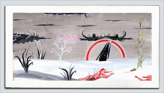
German visitor and Israeli tour guide meet the Dead sea


I'd say that Eyton Fox has now redeemed himself in the eyes of anyone who might have thought his last film, "Yossi and Jagger," operated in too much of a bell jar. The story of a love affair between two young Israeli officers in a remote army base on the Israeli-Lebanese border, "Y&J" does not really address the elephant in the barracks - the moral questions of occupation and violence.

The American-born Israeli fimmaker's third film, "Walk On Water," which premiered last night at New York's NEW FEST, is a much more mature film than the very well-received feature shown by the director last year, and it covers far more ethical ground without stretching the moralizing. The film's most profound voiced statement is brief. It's delivery is given to an Israeli Arab and it's directed at a Jewish Israeli who represents absolute power in their shared world. The young Arab, his family and his nation have just been deeply insulted in front of two visiting young Germans. His reply, painfully gentle under the circumstances, is directed into an open car window. It was something close to this: Maybe if you people could get over what happened to you a long time ago, you'd be able to see what you yourselves are doing now.

It's a wonderful, nuanced film. It's about all kinds of people doing both very bad and very good things, representing the relationships between one generation of Palestinians, two generations of Jewish Israelis and three generations of Germans. No one gets off easily.

Now what some of you will appreciate knowing before you decide to go: The actor playing the lead Israeli character, Lior Ashkenazi, is one of the most beautiful men ever touched by a camera.


[image from the film's website]

  • home

This page is an archive of entries in the Culture category from June 2004.

previous archive: Culture: May 2004

next archiveCulture: July 2004