there goes the neighborhood (single-family houses visit midtown)
How many more suburban mini-estates do we really need? How many more can we bear?
It was a long time ago, and the details are a bit hazy, but I'm sure that my first love was the art of architecture and all its wonderful works. I remember the shapes and structural details of every room and every back yard in which I found myself as a very young child, even those I knew when I was barely able to walk, and Frank Lloyd Wright was my first artistic hero (well, I did grow up in the plains of the Midwest).
To this day architecture is second to none among my passions, and it's a long list.
And so it was that on Tuesday I found myself getting up at the crack of dawn in order not to miss the press preview for the Museum of Modern Art's new architecture show, "Home Delivery: Fabricating the Modern Dwelling". In truth, Barry and I got there just after 11:30, but that's an exceptionally early hour for either of us to be abroad, and we were just in time to hear the group addressed by Barry Bergdoll, the museum's new Chief Curator of Architecture and Design. I had already noted his intriguing bio, and that was another incentive to make it up to 53rd Street that morning.
The show is fascinating, at least as much for a historical survey as for a review of the latest innovations. On Tuesday we were whisked out by one o'clock. There was hardly enough time to learn more than that I have to go back for more; this post isn't a review, by any means. I was also excited enough about the show to buy the catalog on my way out, and I already know that it's going to make me want to know more.
But I confess to one serious misgiving about the show.
In a world whose population is exploding, whose natural environment is threatened and whose resources are diminishing (including especially the resources which have supported cheap transportation of all forms), it would seem to me that if a modern museum's show about architecture is focused almost entirely on free-standing private dwelling units, regardless of all the sexy bits about computer design, pre- or modularly-fabricated structures, and revolutionary ecological breakthroughs, it is at least half-dead in the water already and unlikely to be remembered as a landmark achievement by any future generation.
The American model of single-family homes, occupying plots of land preferably as large and as isolated as possible, is an exception elsewhere in the world, and it is about to become obsolete here as well. This ideal could only have been realized on a rich underpopulated continent. This bountiful wilderness was "tamed" by people who had learned everything they would need to know to satisfy their remarkable misanthropic compulsions from the genius generated by the far more amalgamated civilizations, mostly of Europe and Asia, from which they had fled.
To this day the average American disdains apartment living and in fact virtually any kind of shared space. We don't really like each other very much. We don't like living near other people and we don't like traveling with them either. We must have our own houses and our own cars; except for those of us who already live with and thrive with them, we almost universally loathe the idea of apartment buildings and all forms of public transportation. Most of us don't even want to share a free-standing house (regardless of how large it is and how big the home spread) with relatives not part of our own nuclear family, and even within these families we insist on having our own separate rooms; we also want our own cars, beginning at age 16, and until now these vehicles had to be big (trucks, really) even if we didn't intend to take anyone else along for the ride. We basically want to be alone, and in both our hankering and the reality we've achieved, we really are alone.
We deserve to be by ourselves and we can afford it, or so most of us have been thinking until at least recently.
With its new architectural design show, "Home Delivery", MoMA seems to have received the wrong delivery, since in spite of the fascination of both its subject and the attractions of its installations, its fundamental focus on the single-family dwelling is the same as that identified with the mid-century modern age which produced many of the historical projects to which it gives homage. For New York it was an age dominated in popular projects by the problematic vision of Robert Moses, and we know now that the salad days of the profligate suburban American "ranch" (in whatever style or pastiche) are finally over, everywhere.
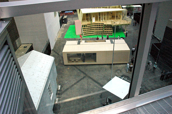
Five temporary, very different "model homes" have been erected on a vacant lot just west of the museum; while each of them is a delight to read about and explore, only a single structure (with the possibility of one other) has been designed so it could be a part of a multiple-dwelling structure.
Frank Lloyd Wright didn't have any use for apartment living either, but in fairness I would say that when he was born in 1867 there was still a real American frontier and both Europeans and Americans were marveling, even then sometimes in very different ways, at what seemed to be the unlimited possibilities of an industrial age. Also, in the mid-nineteenth century the world's population was only about one sixth that of today's figure of 6.7 billion, and the projection for 2050 is for close to ten billion. If we haven't learned to live in sophisticated multiple dwellings by then, those who have somehow managed to survive are likely to be sheltering inside mud huts.
ADDENDUM: I may be reading too much into its significance, but the architects involved in the design of the full-scale, free-standing houses are almost all Americans.
Except for the special case of the very cool "micro compact home" of Horden Cherry Lee Architects/ Haack + H�pfner Architects (U.K. and Germany), and the elegant and very flexible solution called System3 by Oskar Leo Kaufmann and Albert R�f (Austria), all of the projects in MoMA's vacant lot were by architects who appear to be based in the U.S.
The office of Kaufman and R�f is located in the pretty Voralberg town of Dornbirn, in the center of an Alpine province not known for population density.
Construction geeks of all kinds will want to watch the stop-time video I just came across on Treehugger showing the assembly of System3 inside MoMA's back yard. The "module" arrived on 54th Street in a single Hapag-LLoyd shipping container and was assembled in one long morning.
