May 2005 Archives

stemcellballot.jpg
respect


A gentle letter to the editor in today's New York City Newsday ends with this terse critique of the Republicans' evil politics of stem-cell research: "After all, we may differ as to when human life begins, but it certainly does not end at birth."

The full text follows.

President George W. Bush's antipathy to stem-cell research is a paradox wrapped in a conundrum. How can he have any respect for human life when his rush to war has resulted in the deaths of thousands of innocent people?

To say nothing of his role as governor of Texas, where he executed numerous people. If Bush was truly concerned with the dignity of human life, his policies would be 180 degrees different in almost every category. After all, we may differ as to when human life begins, but it certainly does not end at birth.

Max Podrecca

Manhattan

Is anybody listening?


[image from nature.com]

SimonJohnF.jpg
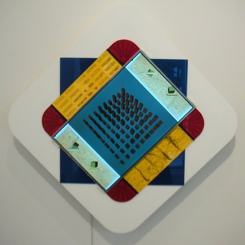
John F. Simon, Jr. Endless Victory 2005 software, Apple Powerbook G4, acrylic plastic 28" x 28" x 3.25" [detail/screen still]


Sandra Gering showed only two modest-sized works by John F. Simon, Jr. in the show which closed on Saturday. Either one however could stand in for an entire art collection, since each of the two computer screens mounted in exquisite cut and engraved Plexiglas frames presents an infinitely-changing image. The one shown above is Simon's take, in the words of the press release, "on the endless merging, dividing, overtaking, turning, starting and stopping motions" of the city which inspired Piet Mondrian's unfinished 1943/44 Victory Boogie-Woogie.

No image in either work will ever be repeated on the screen, so the pieces will be renewing themselves forever. You may not be able to afford one of these jewels, but if you could, you'd never have to buy another work of art for novelty alone.

The gallery installation showed four pieces from each of the two editions, only beginning to suggest the endless variations produced by the software.

There's really a lot going on here. The screen images are never entirely abstract, they regularly mimic three dimensions, and their inspirational sources are a balance of humanistic ideals and conceptual purity.

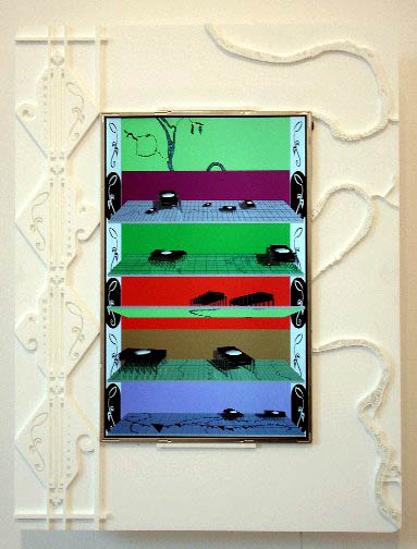
The second edition, Endless Bounty, emerges from the tension between Simon's urban lifestyle and his longing for nature. The software flips between the two ideals displaying maps, drawings, photographs and three-dimensional models in a continual effort to capture our gaze.
I'm really attracted to the intelligence and creativity of Simon's art, but he adds something most artists who work with computer code do not have: He knows how to draw, and it's always a part of his "machinery."


SimonBountyGering_2.jpg
John F. Simon, Jr. Endless Bounty 2005 software, Apple Powerbook G4, acrylic plastic 23" x 17.5" x 3.25" [detail/screen still]


[lower image from Sandra Gering Gallery]

They've made landfall and explored Roosevelt Island but in the end it's apparently not quite what they or any of us thought it would be.

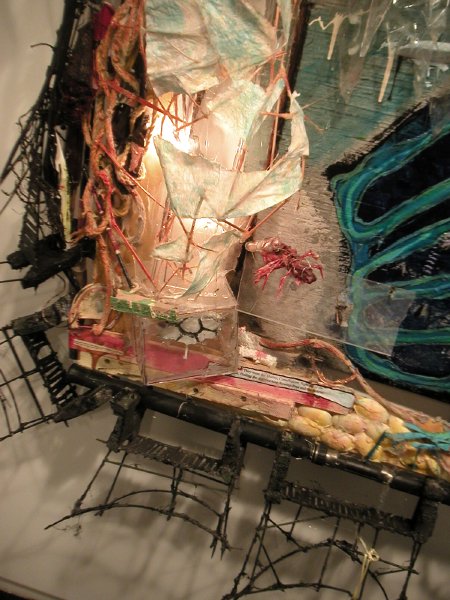
Jesse Bercowetz, Matt Bua and Carrie Dashow continue their investigation of the weird mythologies of a half-forgotten, long narrow island lodged in the middle of New York's East River with an installation at Jessica Murray. This is a project begun last year whose first forms "in which the artists assumed the role of underworld crypto-zoologists" were exhibited under the title Under Gone at PS1 in the fall.

In order to explore the island and its treacherous surrounding waters once known as “The Hell Gate” they [subsequently] launched a makeshift raft into the East River. In their new installation Pent-Up and Under Gone, Bercowetz, Bua, and Dashow explore their findings, as well as the Island’s oral and written histories, and are led to a new interpretation of the land as a growing monster of unpredictable powers, with a life of its own, undetermined by humans.
There's no way any image can prepare you for what they've installed, and as usual the work leaves me speechless (in a good way). Don't miss their huge "book."

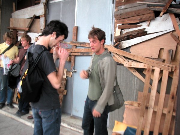
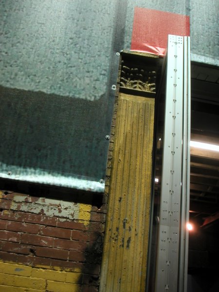
You're going to want to see it all, but you're going to have to find the gallery first: The huge 11th Avenue building was already partially veiled by a construction canopy, but the three artists have gone a step further. They've almost entirely covered the entrance to Jessica's neat minimalist rooms with boards and pallets which look much like the scrap wood you'd expect to find on parts of Roosevelt Island's muddy shore. Still, you should be able to just about make out the red lettering if you're on foot.


Murrayentrance.jpg
dust thrown up by gusty (West) river winds outside the gallery


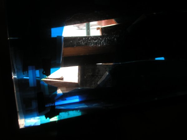
Murraywindow.jpg
one of the two "enhanced" gallery windows as seen from the inside


MurrayPentUpUndergone.jpg
Jesse Bercowetz/Matt Bua Pent-Up and Undergone (panel) 2005 mixed media 64" x 88" x 18" [detail]

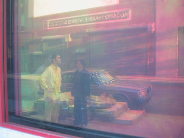
BarryKaren.jpg
untitled (taupe Volvo) 2005

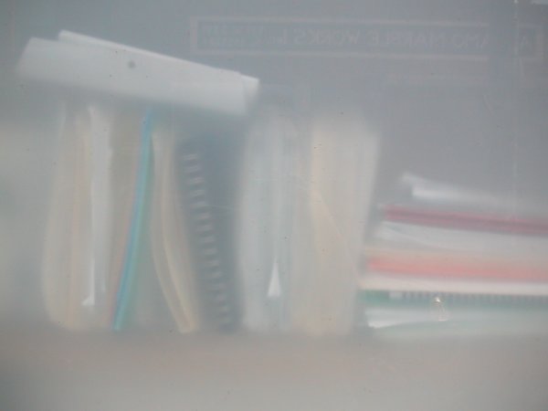
marbleworks2.jpg
untitled (marble works) 2005

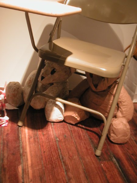
DavisDamieBear2.jpg
Damien Davis Bear and Cover 2004 paper bears, desk [installation view]


How do we address the horror of Hiroshima and Nagasaki today, sixty years after the fact? The artist Hiroshi Sunairi, a native of Hiroshima, asked his students at New York University this question when he taught a course one year ago entitled "Peace by Piece." Some of their answers are currently assembled downtown in Tribeca's Debrosses Gallery.

My own most profound memory of atomic war is not the initial report of my country's annihilation of these two great cities but rather the routine, regulary-scheduled school rehearsals for an imagined defense against the oh-so-likely employment of these same bombs by a former ally suddenly turned satanic enemy. Unlike the people of Hiroshima and Nagasaki, we were always able to come out from under our desks. To this day the people of the United States remain the only ones who have ever used these insane weapons against another.

Although he is far too young to have ever experienced the terror of The Bomb, or even the fear of its terror, Damien Davis manages to describe it in this simple, powerful installation. The small folded pieces of paper which appear at the bottom left in the picture are stray origami cranes folded by the students as part of the political mobilization of the project.

The exhibition will be accompanied by the artists and their professor on a flight to Hiroshima this summer, where it will be installed from August 13 through August 20 at the old Bank of Japan building, Hiroshima Branch, one of the few buildings which survived the 1945 bombing.

Burkeazaleas.jpg
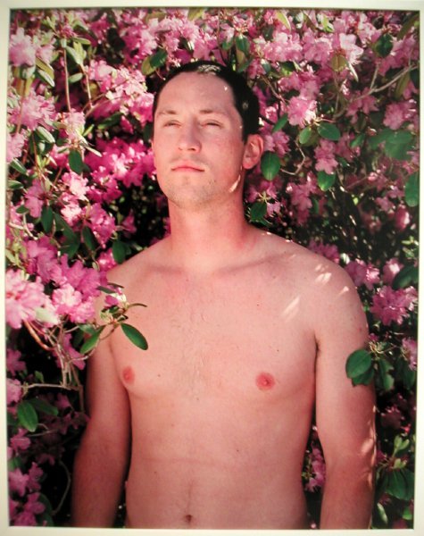
Jesse Burke Pink & Black 2005 C-prints detail view of installation


BurkeNils.jpg
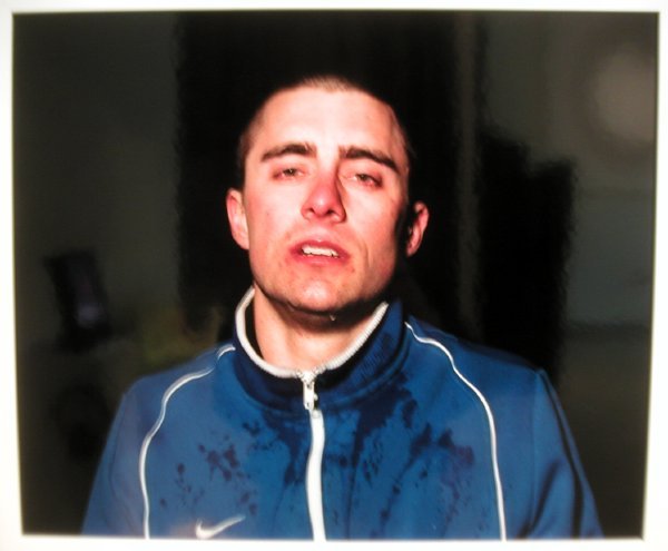
Jesse Burke Pink & Black 2005 C-prints detail view of installation


The two images above are elements of a larger work by Jesse Burke which we encountered while in Rhode Island last week.

While we were having dinner in Providence we met several young artists who were dining together at the next table. They all had some connection to the Rhode Island School of Design, and before we left the city we visited that school's installation of work by artists who had just completed its graduate program. There we encountered this piece by Jesse Burke, one of the people we had spoken to at the restaurant. We thought his Pink and Black was the strongest work in the entire show. I will be very surprised if he isn't adopted by a good New York gallery very soon.

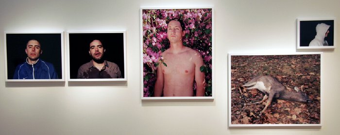
The complete work we saw at the RISD Museum is shown below.


Burkepinkandblack.jpg
Jesse Burke Pink & Black 2005 C-prints


The artist's statement:

The idea of masculinity is so incredibly fragile, so sought after, because of what it stands for, because of the history of men. A delicate balance exists between the heroic ideal of masculinity – strength, endurance, toughness – and the true, fragile reality of men as seen through my eyes. My work is an autobiographically driven investigation into the notions of masculine identity and the presence of vulnerability and sensitivity that acts as forces against the mythology of male dominance and power.

My notions of what it means to be a man are romantic. I believe an innate part of our psyche needs us to be the Iron John of Robert Bly, yet we are responding to that primal urge in a new way. We have grown into a new fragility. We identify and illuminate within ourselves what it means to be men through the examples we see in our families, in the media, and in our peers. We are bombarded by images defining what it means to be male, and we are helpless but to give in part way to these campaigns. We are fragile.

I photograph my life and the lives of the men in my social and family circles in an attempt to understand from where our ideas of masculinity originate. As the author I act as an interpreter of a specific culture and mythology. I am most drawn to the moments when we are vulnerable or emasculated; where there is a presence of a rupture or wound inflicted in some way, whether it be physical, emotional, or metaphorical. I employ concepts such as male bonding and peer influence, masculine rites and rituals, homosocial desire, physical exertion, and our connections to one another as well as the landscape that we interact within to expose these instances.


[image at the bottom from Jesse Burke]

ProvidenceHarbor2.jpg
untitled (eight with cockswain) 2005


I captured this view of the Providence harbor off India Point at dusk last week. The suggestion of a vaseline-covered lens is just that: The instability of a zoom in low light did all the dreamy work.

We're back from New England and trying to catch up on schedules interrupted for over a week. I took almost no photographs while we were gone, partly because we were serious about our roles as family tour guides. Also our internet connections were never very reliable so posting of any kind, especially from Rhode Island, was almost impossible.

racepoint2.jpg
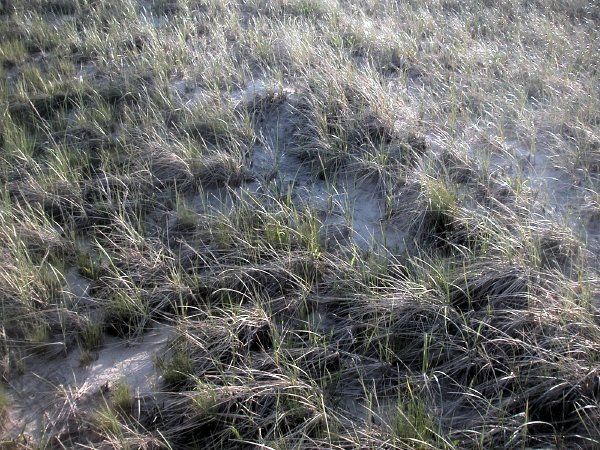
untitled (Race Point) 2005

St.Gaudens54thRegiment.jpg
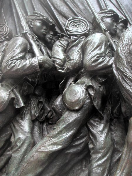
untitled (54th Regiment Memorial detail) 2005


From the Boston African-American National Historic site:

Denied equal pay, African American soldiers in the 54th Regiment refused pay for 18 months until Congress agreed, in 1864, to pay them the same rate as White soldiers. In the midst of intense opposition by the government and the public, Colonel Shaw and the men of the 54th Massachusetts Regiment struck a blow for American freedom and proved that racial unity ultimately triumphs over hatred. The high relief bronze statue, designed by renowned sculptor Augustus St. Gaudens, is a testament to this triumph. Financed primarily through a fund established by Joshua B. Smith - former slave, state representative, caterer, and former employee in the Shaw family household - the monument was dedicated in a ceremony on Boston Common in 1897. This ceremony was attended by Booker T. Washington, Sargent Carney, and Charles Elliott, then president of Harvard University. The engraving on the back of the monument is taken from Elliott's dedication speech. In 1982, 64 names of soldiers from the city of Boston who died at the Battle of Fort Wagner were inscribed at the bottom on the back of the monument.

Harvardlotterycart.jpg
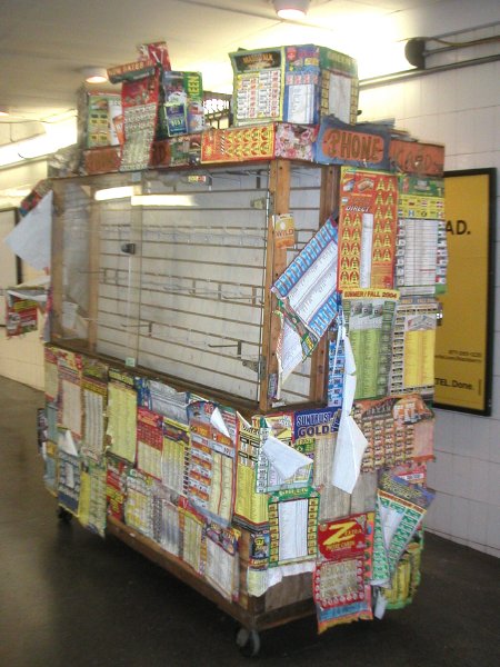
untitled (lottery cart) 2005

pansiesComAve.jpg
untitled (Commonwealth Avenue) 2005

Chardincanary.jpg
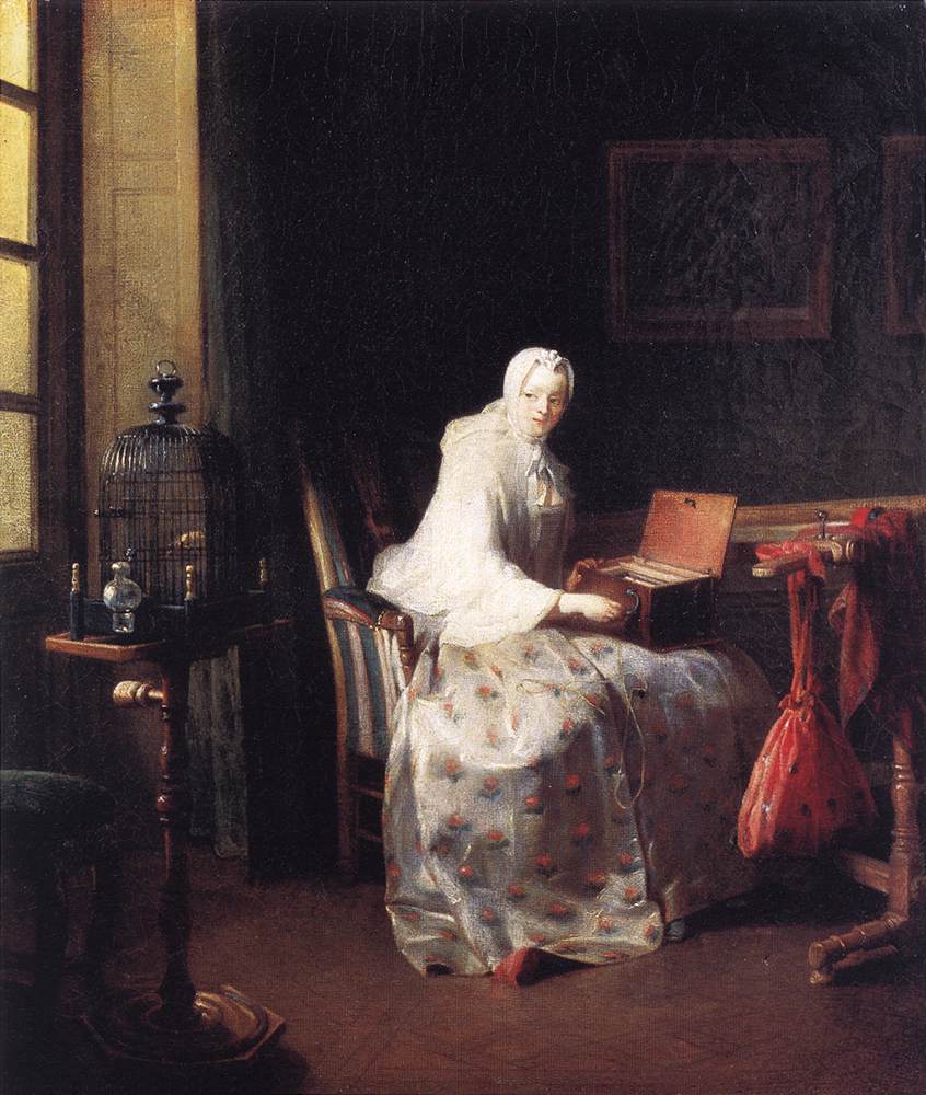
Jean-Baptiste-Siméon Chardin The Canary oil on canvas 19.75" x 17"


I'd love them even if they didn't sing, but they do, and now we're learning how much they want to, and why they want to.

Because of the beautiful garden which is enclosed by our two relatively-low-rise Manhattan apartment buildings lying along the great eastern flyway, we can easily imagine that we live inside an aviary. I recognize the sounds of sparrows, blue jays and mourning doves, and I'm proud and delighted to know the distinct call of the male cardinal who shares the courtyard with a mate who is almost as red as he is, and sometimes he comes to visit our own small garden annex one story up, but I have no idea who is producing the other delightful sounds which come from our wonderful arboretum/sanctuary.

The other afternoon, just after a guest had remarked upon the quiet of our apartment (at least the north side), I found myself resting on a bed near an open window trying to determine what I could detect of the machine sounds of the great city which surrounds our walls.    . . . nothing. Instead I found myself enchanted by what seemed to be an avian composition more exotic than usual, composed mostly of percussive clicks acccompanied by a gentle whistle (think Martin Denny's "exotica"). When it's the real thing, and you don't need mosquito netting, it's sheer ecstasy.

This morning while reading the papers I came across one of those odd news/feature reports which manage to overshadow everything else I may have read that day, the sort of find which makes reading hard copy news still worth its demands in time and forearm disturbance.

New York Newsday's staff writer Jamie Taylan (undoubtedly another bird lover, but then who isn't?) reports that birds raised in isolation can learn a complex tune not part of their heritage but will switch to their mating song once spring arrives, even if they've never heard it before.

Scientists at Rockefeller University in Manhattan found that young male canaries raised in the lab had no trouble learning a computer-generated song that had no resemblance to the song their father would normally teach them.

But one morning, the scientists arrived at the lab to discover that the birds, on the brink of adulthood, were chirping the song they were destined to sing - even though they had never heard it before. The research appears today in the journal Science.

. . .

Somehow, [former post-doctoral student at Rockefeller Timothy J.] Gardner said, they do their own editing, splicing and rearranging of the computer-generated song so that they are singing the song, speaking the language understood by songbirds.

. . .

Gardner and his colleagues, including Rockefeller neuroscientist Fernando Nottebohm, say that the mature birds in the experiment sing their species-specific song, yet every once in a while the old riff from their youth can be heard.

. . .

Nottebohm said that the ability of the songbirds to sing two distinct types of song "is reminiscent of people speaking two languages and being able to use both. Not a small feat for birds."

But, sitting next to a tiny animated parakeet by a window at the edge of a garden filled with his chattering distant relatives, at least the news about two languages doesn't surprise me at all.


[image from Web Gallery of Art]

MayerHJurgen.jpg
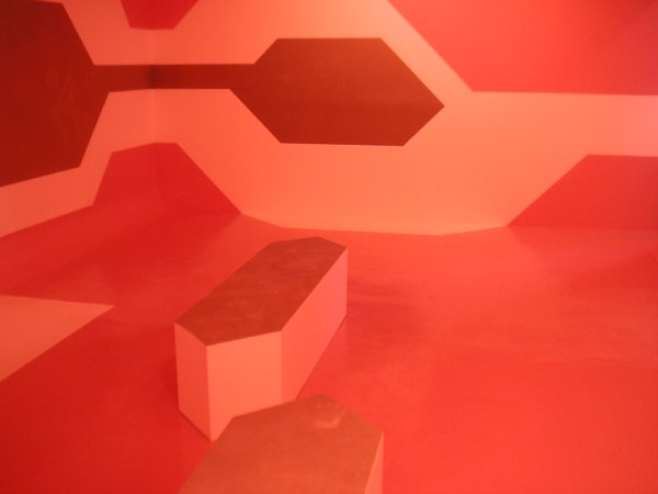
Jürgen Mayer H. In Heat detail of room-size installation/painting


SchwederAlex.jpg
Alex Schweder Lovesick Room detail of room-size installation


I'd want to do a post on this show even if the images weren't so spectacular, and I now have an additional reason to do so: Only tonight, as I read the press release while typing these lines, did I learn that this is the last exhibition for Henry Urbach Architecture in the current space (no further information, and the gallery site is "under construction"). Henry is a very special gallerist; I hope we will soon be pleasently surprised with the announcement of his next chapter.

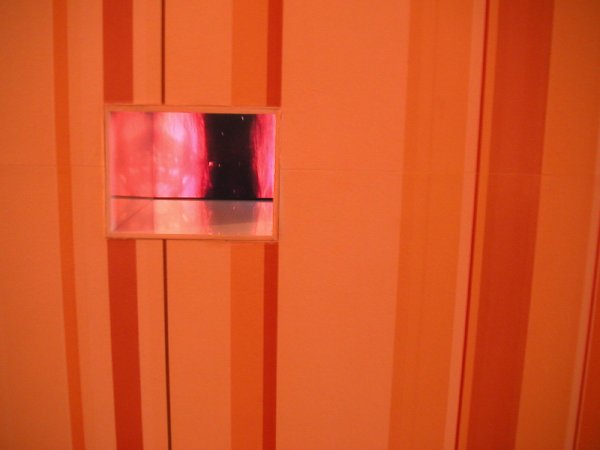
Both artists in the current show are architects who have worked both here and in Europe. On 26th Street this month Mayer H. has built a three-dimensional painting which incorporates all six planes of the gallery and which includes seating as well. Some of the surfaces lose color with body contact, however fleeting. Schweder has covered the walls of the adjacent gallery space with "striped wallpaper that emits a delicious, cake-like odor." In a recess on one wall a small monitor projects a moving endoscopic image, suggesting that the visitor is located both inside and outside of this fragrant architectural body.

RatcliffDavid.jpg
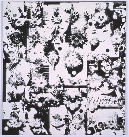
David Ratcliff Embroidery 2005 acrylic on canvas 72" x 66"


RatcliffDavidfloatation.jpg
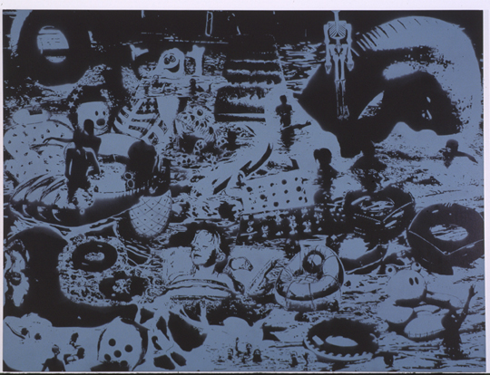
David Ratcliff Floatation 2005 acrylic on canvas 72" x 96"


The show was over even before we got home on Saturday after visiting it for the first time, so I can't blame my current indisposition for this belated encomium.

I thought David Ratcliff's recent show at team was absolutely beautiful, and I didn't even think of Warhol until someone else brought up the name.

I also had not yet had the advantage of information the gallery supplied about Ratcliff's inspirations and his process. From the press release:

David Ratcliff's first solo exhibition takes as its title a line from Bret Easton Ellis' novel American Psycho. Ratcliff's compendium paintings share with Ellis something of the elegant formal violence that seemed the only way to give voice to the decade that most relished acquisition for acquisition's sake. As a matter of fact, Walead Beshty, the artist and writer, has called Ratcliff's new works "1980's history paintings."

. . .

Ratcliff, like Ellis, is fond of lists, allowing the gathering together of signs to do the work of cultural critique. In a sense, the collecting together of material is as crucial as the manner in which it is deployed.

For his imagery Ratcliff builds his own stencil cartoons on his computer and then prints them onto paper which he cuts out and attaches to the surface of a black-painted canvas. He chooses a single vibrant color for each piece and sprays the surface. The wet paint destroys the stencil and leaves the edges of the images somewhat less than precise.


[images from team gallery]

Have I missed anything?

I've been neglecting the blog this week because I've been down with a wicked flu accompanied by an impressive body temperature. For a couple of days I could barely think, I ached everywhere, so that even moving my fingers around the keyboard seemed out of the question, and it even hurt to touch my skin.

We have to be ready to leave Saturday for a week in New England with family, regardless of how I'm feeling, so it's time to start getting myself together.

Maybe I can do a post later today.

tulipwhite.jpg

tulipredyellow.jpg

tulipyellow.jpg

tulipred.jpg


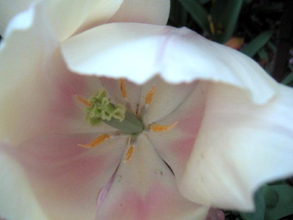
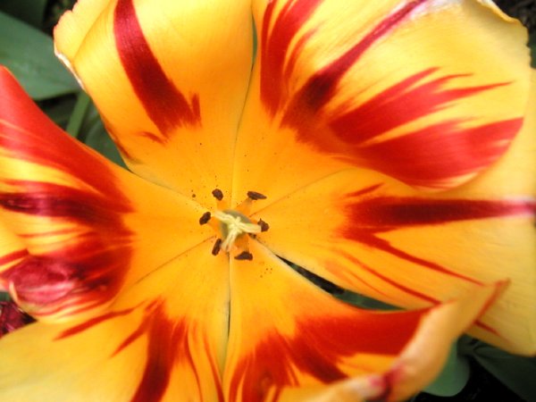
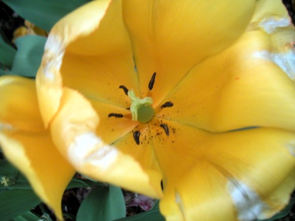
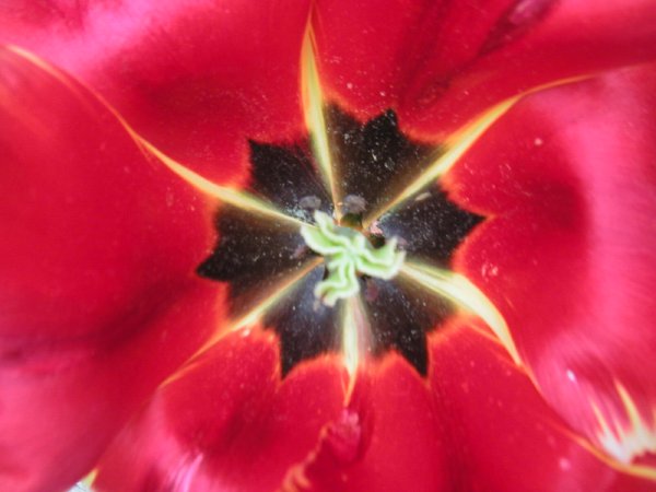
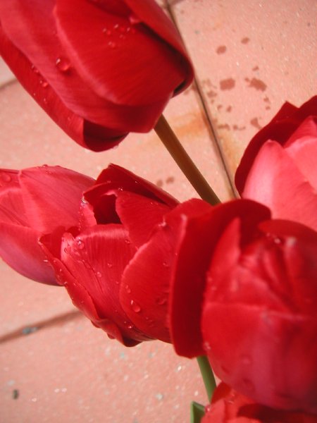
I'm very happy that I waited until this evening to capture these beauties in the center of our garden court. Now in the process of disappearing, they were never so deeply sensual, especially on close acquaintance.


no armor and no hairshirt


The Washington Post reported three weeks ago (in an article syndicated in excerpts today in New York Newsday) that DaimlerChrysler has finally decided to let us dumb Yankees have a chance to buy the company's brilliant design concept for the twenty-first century, the Smart two-seater, called the fourtwo.

For the last few years they had been planning to introduce a much larger SUV version [huh?] of the tiny car which endeared itself to [smart] Europeans from the moment it hit the road in 1998. Now it looks like Americans' affection for the SUV has begun to cool, at least partly because we are rapidly closing the gap between the cost of gasoline here and in Europe, and 50 to 70 mpg is beginning to look very attractive. Several months back the company cancelled its ill-conceived steroid-Smart project.

DaimlerChrylser was about to make a big mistake, Warren Brown argues in his piece:

The United States is a part of the world. In terms of consumption of the world's resources, especially fossil fuels, it is one of the greediest parts. We often have a hard time here distinguishing between water and gasoline, which is why we waste both.

At the moment, the United States is also the world's single largest automotive market, which means that it's the most lucrative. Big money seems to dance well with big cars and trucks, and we have developed an entire ritual, replete with mythological beliefs, to keep the rhythm going.

Big is better, ba-boom, ba-bang. Big is safer, ca-choom, ca-chang! Ain't nobody if you drivin' small; but you're ruling the world if you ridin' tall!

Given that nonsense, it was understandable that the people at DaimlerChrysler initially were suckered into the idea of bringing the first Smart to the United States as the Smart ForMore SUV. Americans understand SUVs, DaimlerChrysler reasoned. They don't understand micro-cars.

But a Smart SUV had no originality and couldn't possibly have stirred the imagination as the original concept has. Also it couldn't have competed on a cost basis with the crowded existing market of down-sized imitators of up-sized armored-personnel-carrier wannabees, and the burden on pricing imposed by shipping costs and an increasingly-unfavorable exchange rate would have sealed its fate even before it could show whatever stuff it might have.
It matters not that the City Coupe and its other two-seat iterations have not earned a penny since their introduction in 1998. What matters is that they have stirred consumer imagination, and that they are selling, albeit not yet at a profit. With a few fixes -- a slightly larger wheelbase, better automatic and/or manual transmissions and a tad more cargo room -- they could become as much of a hit as the now-famed Mini Cooper, or even bigger.

That is what DaimlerChrysler now plans to do with the Smart two-seater in the U.S. market. It is going to make the car a bit larger but do nothing to destroy its urban funkiness. It will meet all existing U.S. safety and tailpipe emissions rules, of course; and, yes, adhering to those tougher standards will mean an increase in price.

But the Smart City Coupe and its mini-two-seater siblings now have something going for them that they did not have before -- an American reality check on spending at the gas pump. Growing world oil demand and consumption mean we can say goodbye to the days of dirt-cheap gasoline here.

If that's not enough to attract our attention, it also comes as a convertible. Take that, Toyota! The Prius highbrid won't even offer a sunroof as an option, because Toyota says it would compromise its streamlined gasoline efficiency. But we shouldn't be required to wear hairshirts just because we want to be a little more green.


[image originally from the Brazilian site, carsale]

plazaMexico.jpg
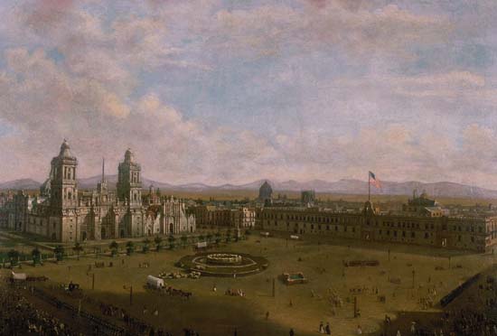
Pietro Gualdi Grand Plaza of Mexico City, Following the American Occupation of September 14, 1847 1847 oil on canvas [one of my all-time favorite public squares, for the richness of its life - once we left]


Over seventy years ago the Empire State Building was completed within thirteen months and yet we're still staring at a hole downtown.

As we approach the fourth anniversary of the attacks on the World Trade Center we have no idea what's going to be built on the still-empty site. Every intended purpose and every proposed design has ended up being compromised or rejected for one reason or another.

Except for the shopping mall.

The cultural spaces are out; people are apparently terrified of the idea of sitting at a desk high above "ground Zero," so no one is talking about building the tall office buildings first included in the proposals; and no one knows where the little Greek church is going to be. The only projects now left on the table are something called the "Freedom Tower," which has just been put on hold once again (because of the name, it's a not-so-surprising augury for Bush's America) and the even more tenebrous "Freedom Museum." The current state of plans for a memorial to the events of September 11 is a mess, and it was ill-conceived from the start.

And as far as real freedom is concerned, forget about it; gotta stay off the grass and stay off the streets. Maybe watch it on TV.

So I have a modest proposal to resolve the problem. Actually it's not modest in its implications or in the scale of its ambitions, only in the simplicity of its utility and its physical design.

New Yorkers have been told that they have no right to assemble in large numbers in Central Park to party or address political grievances, and they have seen how impossible it is to find any alternative in a city without great open public spaces. I suggest that the site of the old World Trade Center be made a true monument to freedom by reserving every acre of its surface as a public square devoted solely to the enjoyment of the people and to their right of expression, whether in joy or in anger.

It absolutely must not be a lawn however, even if there were any way to ensure that great assemblies of people would not damage it. We need a great plaza worthy of a great city. Plazas welcome free assembly. Downtown, in the new World Trade Center there will be trading in ideas and grass is not part of the kit.

We would be perfectly happy with cut stone or the happy-sounding, gravel-like surface used almost universally in the grand parks of European towns and cities. Trees, yes. Include trees perhaps, but only around the perimeter. London Plane trees would do just fine. Above all, let us have light and air. Freedom thrives on it.


ADDENDUM: A year and a half ago, Barry did a post describing a provocative, minimalist WTC proposal from Ellsworth Kelly, although his concept involved the grass thing.


[image from Louisiana State Museum]
BroanThyzel.jpg
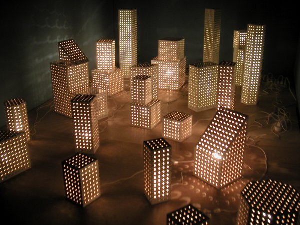
Tim Thyzel Dot Lights 2004-2005 26 pegboard and electrical light constructions, variable dimensions, installation view


BroanCynthiafront.jpg
LOT-EK Cynthia Broan Gallery 2005 billboard-style facade with retained elements, detail


Cynthia Broan returned to Chelsea tonight, with a bang, after a two years' absence. Her beautiful new gallery on West 29th Street is a former garage which has transformed by the architectural firm LOT-EK into what appears to be the perfect gallery instrument, an exhibition space with moving walls and a billboard-style facade. Tonight we saw a clean blue box. Yes, the walls were painted a medium blue to set off more than a dozen of Tim Thyzel's minimal, mostly-white sculptural forms, assembled from ordinary commercial display materials.

From the press release:

Slots & Dots, sculptor Tim Thyzel's third solo show with the gallery, utilizes the slotwall and pegboard commonly seen in low-end retail stores to create a series of sculptures which reflect on formal aspects of art and architecture as well as issues of merchandising and consumer appeal. Also known as MDF (medium density fiberboard), slotwall accommodates hardware such as hooks and shelving for interchangeable retail display. Several of the works shown include these hooks to add both texture and context to the work. The crisp white laminate, punctuated with lines and holes, transcends its usual application to construct a series of towers and stacks, which are both elegant and humorous.

Cherubiniglass04.jpg
multiplying light


Cherubinibed03.jpg

Cherubiniblueglass00.jpg

Cherubinidesk07.jpg

Cherubinigold05.jpg

Cherubinipiano02.jpg

Cherubinireddishes06.jpg

Cherubinitables01.jpg

Cherubinivanity08.jpg


We're planning a trip to Boston and southeastern New England this month. One of the things I'm most looking forward to is seeing Cape Cod for the first time since moving from Rhode Island twenty years ago, especially since this will be Barry's first visit. It may seem strange, but while looking at these photographs of old things in interior spaces, I'm thinking of the extraordinary fresh light I've always associated with that long, sandy peninsula surrounded by the sea. The old house which shelters this furniture, ceramic and glass stands at the very entrance to the Cape and even its darker corners somehow share in that light.

I first saw these gorgeous prints attached to the wall of Nicole Cherubini's pottery studio last week. I couldn't get them out of my mind, so I asked her if I could have some jpegs to go with a short post. Once I had them on the screen in front of me I decided I couldn't leave out any of them, so I've included thumbnails of each.

She sent this short note to accompany them:

These images are from an on-going project documenting my grandmother's house, both the interiors and insides. By cataloguing her surroundings, I am able to enter into this developed aesthetic and come to a more complete understanding of excess, abundance and at times, their subsidiary, decay. These intimate portraits function as both finished works as well as source material for other works.

The final pieces are 30"x40" highly saturated C-Prints mounted on
aluminum.

Wellll, . . . maybe I'll admit that at this moment the last image is my favorite.


[images from Nicole Cherubini]

FelixRoniPICT0029.jpg
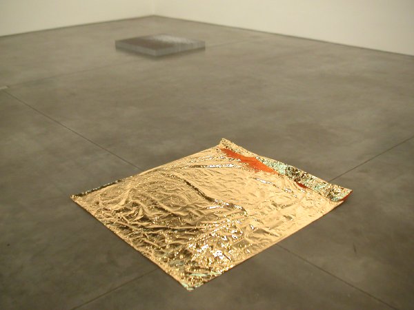
installation view of Roni Horn's Gold Field (1992) in the foreground and Felix Gonzalez-Torres's Untitled (1991) in the rear


The press release for the second in the Andrea Rosen Gallery's series of two-person exhibitions [closed last Saturday] exploring the affinities between Felix Gonzalez-Torres’ and other artists’ works included this excerpt of a 1990 text by Gonzalez-Torres read by Roni Horn at his memorial service:

L.A. 1990. Ross and I spent every Saturday afternoon visiting galleries, museums, thrift shops, and going on long, very long drives all around L.A., enjoying the “magic hour” when the light makes everything gold and magical in that city. It was the best and worst of times. Ross was dying right in front of my eyes. Leaving me. It was the first time in my life when I knew for sure where the money for rent was coming from. It was a time of desperation, yet of growth too.

1990, L.A. The Gold Field. How can I deal with the Gold Field? I don’t quite know. But the Gold Field was there. Ross and I entered the Museum of Contemporary Art, and without knowing the work of Roni Horn we were blown away by the heroic, gentle and horizontal presence of this gift. There it was, in a white room, all by itself, it didn’t need company, it didn’t need anything. Sitting on the floor, ever so lightly. A new landscape, a possible horizon, a place of rest and absolute beauty. Waiting for the right viewer willing and needing to be moved to a place of the imagination. This piece is nothing more than a thin layer of gold. It is everything a good poem by Wallace Steven is: precise, with no baggage, nothing extra. A poem that feels secure and dares to unravel itself, to become naked, to be enjoyed in a tactile manner, but beyond that, in an intellectual way too. Ross and I were lifted. That gesture was all we needed to rest, to think about the possibility of change. This showed the innate ability of an artist proposing to make this place a better place. How truly revolutionary.

This work was needed. This was an undiscovered ocean for us. It was impossible, yet it was real, we saw this landscape. Like no other landscape. We felt it. We traveled together to countless sunsets. But where did this object come from? Who produced this piece that risked itself by being so fragile, just laying on the floor, no base, no plexiglass box on top of it…. A place to dream, to regain energy, to dare. Ross and I always talked about this work, how much it affected us. After that any sunset became “The Gold Field.” Roni had named something that had always been there. Now we saw it through her eyes, her imagination.

The images on the stack of Gonzalez-Torres's take-one-with-you's are of a blue-grey horizonless ocean.

It was a breathtaking installation of seriously-wonderful work.

Taylor Steeddoll.jpg
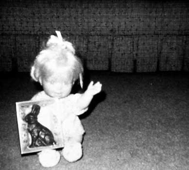
Steed Taylor Doll With Chocolate Bunny 1964 photograph 15" x 15"


Even my mother might have shown she was impressed this time, and it was never easy to get her to show enthusiasm with our little accomplishments (she let us think she just expected them): I'm the curator for this month's Visual AIDS web gallery.

There's lots more in the statement, where I probabaly overdid it.


[image from thebody.com]

smolka_NYT_INDYWEB.jpg
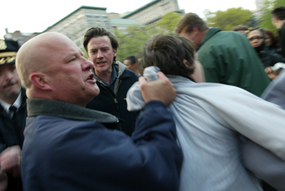
Chief Smolka doing his thing


UPDATE/FOLLOW UP: When I posted my April 30 story, "political police thuggery in New York," I wrote that I was unable to find the dramatic photograph which acccompanied the print edition of the NYTimes article. I've now located it on New York indymedia, thanks to the photographer, Antrim Caskey.

I've also changed my post's link for the Times news story to this indymedia site, reducing the chances that it will disappear very soon. There are some additional comments about the incident on this site, including a call for photographs and video from anyone who witnessed it.


[image by Antrim Caskey from nyc.indymedia]


heroes at large


We met these two extraordinary men for the first time this afternoon. Until then our knowledge and experience of the nobility and the courage of John Schenk and Robert Loyd had been limited to the incredible reports which regularly came to us from Barry's wonderful mother Earline, their good friend and neighbor.

John and Robert are visiting New York this week from Conway, Arkansas, because their story and that of their now thoroughly-notorious pink Victorian house is being told in a documentary which is part of the New York Independent Film and Video Festival.

Barry has already written more about the couple and the film, "Pink Houses." We will be seeing it tomorrow night, Tuesday, at 6 o'clock. He's included an article from the Arkansas Democrat-Gazette, a statewide paper.

While the film is presented from the viewpoint of these two men, it also includes comment from a representative of the Family Council — a Little Rock-based organization that promotes traditional family values — and television footage of Greenbrier farmer Wesley Bono talking about his decision to spread a dump-truck load of manure along streets around the Pink House on the day of last summer’s gay-pride parade.

"It didnÂ’t stop us," Schenck says in the film, while standing outdoors with Loyd. "It smelled horrible for a couple of days, but weÂ’re used to dealing with manure."

. . .

In their 19 years in the Pink House, the two say, people have driven by and shouted derogatory names, shot at their house, broken their car windows and destroyed holiday decorations.

"One year we had a 9-foot Energizer bunny," Loyd says. "It was decapitated Easter morning. I thought that was a little extreme."

And some of us once assumed that the big city queer owned the breed's style and courage.

Details: The 51-minute film will be screened at 6 o'clock on Tuesday, May 3rd, on screen 6 of the Village East Cinema, 181 2nd Avenue at 12th Street.


[image original source not available at this time]

delAmoYolanda.jpg
Yolanda del Amo (large detail of lightbox image)


SternOona.jpg
Oona Stern (detail of wall installation)


DumitEstevez.jpg
Nicolás Dumit Estévez (view of installation with still from video)


AmbeNoriko.jpg
Noriko Ambe (detail of cut paper sculpture)


On Thursday I wrote about Jesse Bercowetz and Matt Bua and what I saw in their temporary Lower Manhattan Cultural Council studio. Yolanda del Amo, Oona Stern, Nicolás Dumit Estévez and Noriko Ambe are just four other artists included in the recently-completed session of the "artists-in-residence" program at the LMCC, and since I managed to leave with some interesting images of their work I'm including them here.

I really regret not trying to pull one of Olalekan B. Jeyifous's exciting large-scale drawings/investigations of a future Manhattan, but I would be seriously wrong not to include him here. Unfortunately his site doesn't include current work and it only begins to describe the scale and brilliance of what he is doing today.

For notes on each of these artist's current work see the LMCC site.

tulipsred.jpg
untitled (Rote Fahnen) 2005


In the spirit of May Day, the spirit of the Left and, yes, the spirit of the flowers that bloom in the spring, tra la.

Humphreyturkeycone2.jpg
turkey cone


Hunphreyturkeyface.jpg
turkey face


Humphreyturkeyscene.jpg
turkey scene


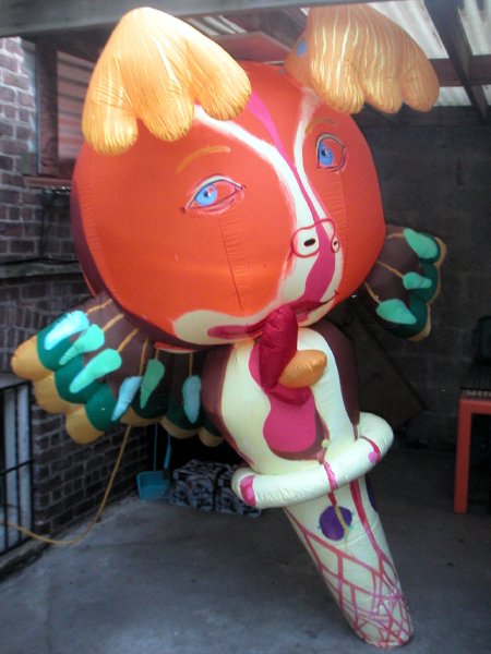
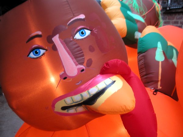
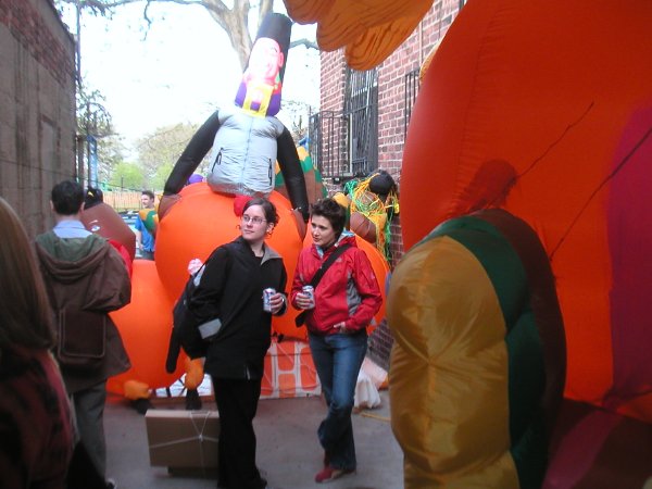
David Humphrey unveiled the delightful products of his latest trip into the fantastic on Friday evening. His "Oven Stuffer Roaster" installation is now, well, stuffed into the courtyard of the Morsel gallery in (rather) far eastern Williamsburg. The sculptures are essentially reconfigured giant (but still much smaller than Macy's) Thanksgiving turkey balloons here lit from within.

Barry has more.

wagonwheel.jpg
untitled (wagon wheel) 2005

  • home

This page is an archive of entries from May 2005 listed from newest to oldest.

previous archive: April 2005

next archive: June 2005