March 2005 Archives

karolWoj.jpg
(before)


I heard earlier today that Karol Wojtyla is receiving food via a feeding tube and that he has effectively expressed his will that he be kept alive by artificial means even if he were to fall into a coma or a persistent vegetative state. At this point, especially since he has hand-picked the members of the college of electors which would choose his successor, presumably a man pretty much in his own dark political image and likeness, it occurs to me that almost nothing could be healthier for the world than to be without a governing pope for as long as possible.

Although I would really enjoy the pageantry which would inevitably surround the placement of a new CEO, even in the twenty-first century (what kind of hat will he pick, and will they bring back the ostrich-feather fans?), were it up to me I would gladly forego those pleasures in the interest of bringing about a better world. It is thus with only the best graces that I extend to him, to his firm and to the entire planet my best wishes for years, and hopefully decades, of a successful relationship between the man called John Paul II and any unnatural life-sustaining mechanisms available.

Still, it does seem pretty weird to me that a man who has so often in the past condemned any artificial means of controlling birth (even if the extraordinarily-simple device also stops the transmission of a deadly AIDS virus) should be such a strong advocate against natural death. But surely the god has her reasons.


[scary image from GodBlogging]

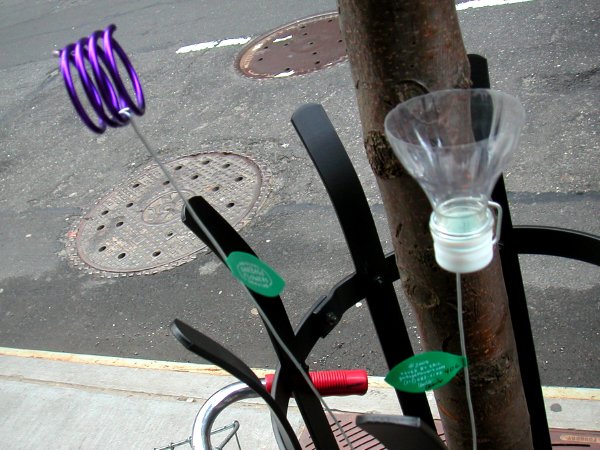
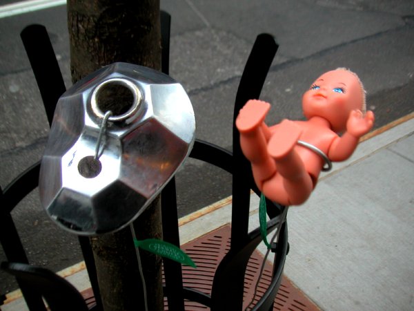
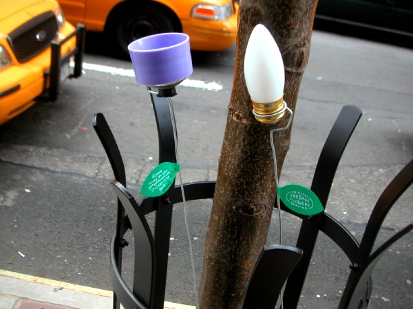
I spotted this garden planted just outside the long frontage of the Museum of Modern Art on West 53rd Street today. I was on my way to the American Folk Art Museum located next door.


garbageflowers1.jpg

garbageflowers3.jpg

garbageflowers2.jpg


Each "flower" bore one green leaf attached to its shiny metal stem. The individual pieces had been signed and numbered.


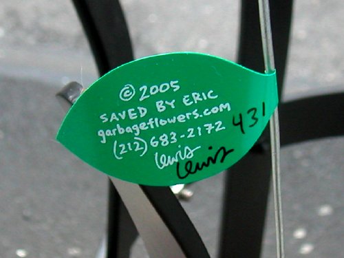
garbageflowerslabel.jpg


On the reverse of each leaf were the words, "Original - Garbage Flowers - Genuine," arranged in an oval gently suggesting a logo.

Oh yes, when I passed the site again two hours later I was astounded to find that no one had removed a single blossom, and none had wilted, not one wit.

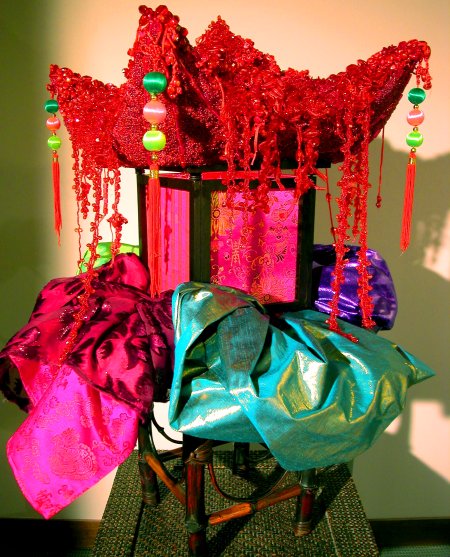
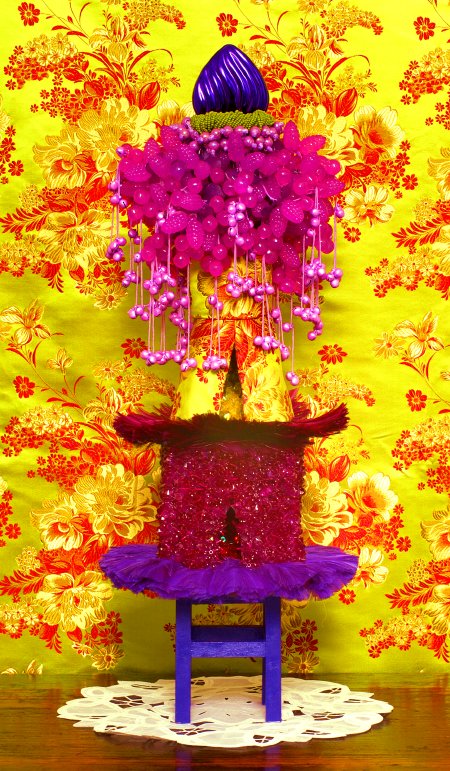
A while back I did a post which included a detail of one of the extravagant sculptures of Gae Savannah seen at the scope New York art fair. I now have more images, furnished by the artist, including a more complete view of Tai Rhi, shown only in detail on March 12.

There's not much more I feel I can add here. The work is so wonderfully over the top it tends to leave me speechless everytime I encounter it, but I have to say that no photograph comes close to making them as alive and assertive as they appear first hand.

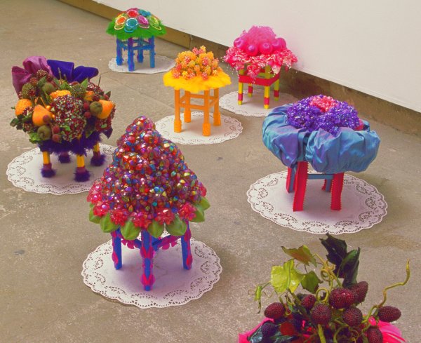
The artist offers a few words on the pieces shown in the bottom photograph, but fortunately they don't erase the magic:

Patisserie Chinoise (Chinese Bakery,) evolved after visiting Shanghai last summer and realizing that I was standing in the future. I bought the hair accessories, silk brocade, etc. for the pieces there and in Beijing. So China fabricates plastic-everything and innumerable other manufacturable products for America to buy. (We don't make anything any more, my father always reminds me.) Then China, now itself buying the pretty items, eventually wallops us economically and becomes the new America. Ironically, Capitalism comes down to: the one with the most plastic wins. (Incidentally, Walmart has just opened its first store in Beijing.) Moreover, with previously quaint Shanghai now looking identical to any towering megalopolis in the world, we have clear globalization of culture, loss of the charm and soul of folk culture. So a French Patisserie can be Chinese --it's all mixed up, East and West. Particularities are being sucked into the tornado of the dollar/yen consumer generic.

From another angle, in "Orientalism," Edward Said writes of the domestication of the exotic. He states: “the very power and scope of Orientalism produced a kind of second-order knowledge with a life of its own,” --in effect, Asia has become the West’s “collective daydream of the Orient.” Indeed, “the Orient then seems to be a theatrical stage affixed to Europe [the West.]” In fact, these refulgent refuges, petite pavilions of dream are but delusional hallucinations.

Savannah will be included in a group show, "Culture Vulture," at Jack the Pelican curated by David Gibson and opening this Friday.

Gaetairhi.jpg
Gae Savannah Tai Rhi 2005 hair accessories, beads, fabric, wood, light 34" x 18" x 18"


Gaeleitsu.jpg
Gae Savannah Lei-Tsu 2003 hair accessories, Christmas ornaments, beads, feathers, wire, wood 22” x 9” (diameter)


GaePatisserie 000.jpg
Gae Savannah Patisserie Chinoise installation view (of part or all of 7 of 8) wood, hair accessories and mixed media approx. 17” x 10” (diameter) each


[images from Gae Savannah]

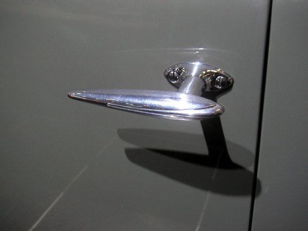
Zephyr1936lincoln.jpg
untitled (1936 Lincoln Zephyr door handle) 2005


I saw no vehicle which pleased me more at the New York auto show than this seventy-year-old prop for the introduction of one manufacturer's 2006 model.

I spent the entire afternoon at the show on Monday, but I don't know why I bother anymore. The cars being sold to Americans are, almost without exception, pure junk and an appalling assault on the planet. We get to choose between trucks and "sport utility vehicles" (with no real truck, sport or utility capability) and the occasional but equally-ugly sedan or lets-pretend "sports" car.

Virtually every one of these adult toys is intended to do little more than satisfy the fantasies of a 16-year-old with nothing other than his member or the implied violence of speed on his mind. I suppose if your waking life revolves around driving, as it seems to for most Americans, what else is there to guide your transportation decisions? The few exceptions to that infantile appeal of the guy-demographic which manage to squeeze through are condemned as chick cars and either discontinued or pumped with steroids and the carworld equivalent of graceless football padding.

Only if you've ever been outside the country would you be likely to realize that nothing is really small in the American automobile market. We have no sense of proportion, and I mean that here in every sense. Even if it starts out with a modest footprint when introduced, any relatively compact vehicle is inevitably designed and equipped as a cheap substitute for the heroic virtues of the real thing. If it isn't ignored and doesn't quickly disappear it begins its inexorable course on the path toward gigantism with the very next model change. Has anyone seen a Geo Metro or Ford Fiesta lately, or looked at what passes for a Honda Civic these days? Remember when a Civic was smaller than the original Mini? [thanks, David, for the reminder]

Some of us have noticed that this commercial exhibition is being staged in the middle of the most urban civilization in a country engaged in wars over access to the world's finite supply of oil. The NYTimes "Automobiles" section pointed out on Monday, there was not one city car in sight at the Javits Center.

In Europe, the "city car" is a well-understood concept, a vehicle whose dimensions and design are as ideally suited to its duties as the minivan's multiple seats and cup holders are to its role in American suburbs. A city car is one intended primarily for urban use. Its size makes it economical and easy to park and lets it slip between huge trucks clogging the narrow streets. And, yes, a city car is a bit sophisticated in style.

In New York, a city car is not a tiny car. "Every time I come here I'm struck by the scale of vehicles," Ed Welburn, vice president for global design at General Motors, said at the auto show last week. "It is unlike any other city in the world."

Anyone who has travelled to Europe knows that vehicles there, whether "city cars" or not, are for grown-ups who want and get intelligence, beauty and function regardless of their transportation choices. If nothing else will bring us to our senses over here, perhaps the thought of billions of newly-prosperous car fans in Asia shopping for their own SUVs - and the oil to propel them - will be able to do it through self-interest.

I don't believe I'm reading too much into the phenomenon if I say I really believe the design and scale of the cars we drive in the U.S. represents our increasing indifference to, hatred or fear of all the people on the outside ("the other"), however we define that.

Oh yeah, for what it's worth, I don't have a car of my own, and haven't since moving to New York. But while I firmly believe in public transportation I'm fascinated with small, efficient vehicles and the idea of sharing their use whenever they might be needed. All of this seems to make me very un-American.

Eostretower.jpg
untitled (piebald Met Life Building and van doppel) 2005


There can only be one explanation for the exuberance of this neighborhood display tonight: The fecundity feast of Eostre [sic]. Excerpts from the Wikipedia entry for Easter:

The English and German names, "Easter" and "Ostern", seem clearly unrelated to Pesach [that is, Passover, to which the name for this Christian feast is related in all other European languages] etymologically and likely derive either from Eostremonat, an old Germanic month name, or Eostre, a Germanic goddess associated with the springtime, who as the 8th century English historian Bede records was honored with a festival during Eostremonat. It has been suggested that many of modern Easter's symbols, such as colored eggs and the Easter Bunny, are cultural remnants of Eostre's springtime festival and that Eostre merged with the Christian Pesach celebrations after the Germanic heathens were Christianized (see Easter as a Germanic Heathen festival below.), even though giving of eggs at spring festivals was not restricted to Germanic peoples and could be found among the Persians, the Romans, and the Jews.

. . . .

According to the Bede, the word "Easter" is derived from the Old Norse Ostara or Eostre, a festival of spring at the vernal equinox, March 21, when nature is in resurrection after winter, hence, the symbolism of rabbits, notable for their fecundity, and the eggs, colored like rays of the returning sun and the aurora borealis. The Easter Bunny is a Western European tradition and has never been adopted by Orthodox Christians, showing as false the claim that the entire holiday is some sort of "Germanic Heathen" festival. Some historians assert that Bede falsely concluded the existence of goddess Eostre from the unquestionably real month name Eostremonat, as any references to such a goddess from other Germanic sources are missing. Children roll easter eggs in England and America but not in all traditionally Christian countries. They hunt the many-colored Easter eggs, brought by the Easter Bunny. Hidden in the play area, it has been argued, the vestiges of a fertility rite, the eggs and the rabbit both symbolizing fertility. (A rabbit, furthermore, was sometimes said to be the escort of the goddess, but there are no pre-19th century sources for this.) However, such claims ignore at least as ancient use of eggs as symbolic gifts among the Persians and Jews.

Anyway, in the spirit of this happy season, Barry and I have decided to share a great feast with friends tomorrow, built around an extremely pagan Agnello al forno.

doomed.jpg
Jor-El, father of Superman


I haven't posted much of a true politcal nature lately. Frankly, I've felt that the game is over as far as this benighted nation is concerned. We've failed as a society and as a republic. Except for my concern about this exceptional international republic called New York, I think I may have given up.

The damage is already too mortal. At this point I have no interest in incremental change. You're not likely to find me at meetings any more. The option of revolt, which would require a count of people and a kind of awareness and courage totally inconceivable in a country which thinks the Democratic Party is The Left, would seem to be out of the question as a viable means for rescuing this state - in spite of Jefferson's suggestion that we needed a revolution every twenty years. For the sensitive individual who mourns his country's death both as an idea and as a reality, I see no real alternative but emigration, even if it is only an internal emigration. For now, I'll be staying in New York City - and traveling abroad as much as possible. Like Tony Kushner's Homebody, I love the world!

I see no argument why a reasonable person should raise a hand, even a computer keyboard finger, to fight for something the rest of America clearly doesn't want. As hard as it has been to accept, I have finally come to the conclusion that most of my fellow citizens actually have the goverment they want right now. I don't know how else to explain George Bush or the complacence of the entire population in the face of the tyranny, and stupidity, of this administration.

I have no doubt that there is going to be hell to pay, and although it will continue to be paid for by others all around the world, in the end we will not escape the damages ourselves. We will disintegrate. We can only hope we will be quaint enough, and sufficiently nonviolent, to attract foreign tourism.

The forces of ignorance, superstition, hatred and greed have certainly prevailed nationally and, because the institutions which might have saved us seem to have been irreversibly corrupted, I don't see the country coming out of this in my lifetime. I hope I'm wrong, as I was when decades ago I assumed that the liberalism of the 60's would just continue to thrive and expand here and everywhere, but I doubt it.

Arthur Miller doesn't seem to have ever had any illusions about the triumph of goodness and light in this much-too-proud republic. A letter [by Barbara Allen Kenney] in the latest issue of The Nation reminds its readers of an article Miller wrote wrote in the NYTimes shortly before the 1972 election. He was addressing the reasons why George McGovern's candidacy had not attracted serious support.

What this tells about our inner attitudes, I think, is that we are far more apprehensive than we are confident of ourselves; and that what we want in a political leader is enough larceny, enough insensitivity to permit him to do our dirty work for us, to fight dirty in a dirty world.
Miller was writing in an era when all four American "estates" were like pillars of the Enlightenment compared to the miserable players we have today. More than thirty years later the goverment of the most powerful nation on earth is fighting very, very dirty.

We're all doomed.

If and when I begin to feel otherwise, it will show up here. Is that a qualification of everything I've written above? Maybe. After living with it all these years, how can I now let a mechanical George Bush doll take away my essentially pollyanna outlook?


[image from theages]

graffitiempathy.jpg


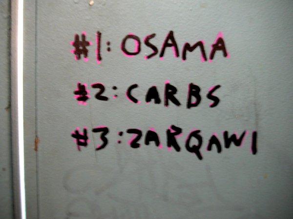
This graffiti piece was seen ten days ago on the plywood wall surrounding a construction site across the road from the Armory show. In there somewhere is what appears to be a message composed of both equations and text, but . . . .

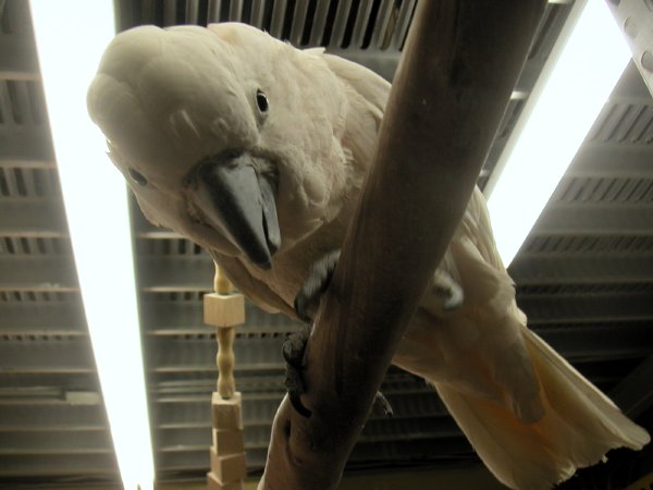
parrotwhite.jpg
Bernie, wanting still more


Yesterday I made one of my regular visits to the wonderful avian shop called 33rd & Bird to pick up supplies for the third member of the family. As usual, I hung out with their hundreds of birds for a good part of an hour.

Our own friend, Sweetpea, is a beautiful, tiny green parakeet who flew into our apartment out of the cold two and a half years ago. He sits near one or both of us much or most of the day, and he provides enormous good cheer and good company. We do our best to return it.

I've always loved birds, but this little creature has given me an enormous respect for all of their kind, and above all for the parrot species.

Each time I visit this shop (which raises many of the parrots itself) after checking out the young birds still in their homely pinfeathers, I look around for Bernie. In the picture above he had just gotten a good scratching on the back of his head, the only spot on his body he can't access with his remarkably-flexible neck. He was looking for still more, and I'm sure he soon got it. He bends his head down for anyone who comes near. He's gorgeous, and extraordinarily affectionate, as all Moluccan Cockattoos are said to be. He's not for sale: good for me and all the people who come to the shop, and probably very good for Bernie. He has a huge family exactly where he is.

Oh yes, for anyone thinking about living with a bird, while Barry and I got ours free, you'll need at least $9.95 to go home with a parakeet from most shops. I'd recommend 33rd and Bird, whatever they ask. They respect all of their tenants and the wishes of all of their customers equally, regardless of how much money is involved, but if you really want to spend more, possibly thousands more, and you're ready to commit to fully sharing your life and perhaps that of your heirs, you can adopt a larger bird. Just remember that you may never be alone again. There's a reason some people walk around everywhere with birds on their shoulders; they really, really need interaction. I mean that it's the birds who need the attention, although I admit I once thought it was the other way around.


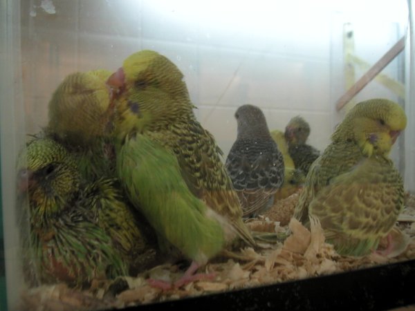
parakeetchicks.jpg
parakeet chicks, can't say they're pretty yet, but they sure are lovable

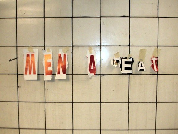
menformeat.jpg
spotted tonight in the 23rd Street 1/9 subway station


My first thought was, this is Chelsea, and some of our neighbors have interesting ways of showing affection, but then it occurred to me that the message could have been meant literally, a la Valerie Solanas. Gulp.

And oh yeah, for those who collect such details, or just for the record, the sign seems to have been re-constructed from one of the MTA's advisories about service disruptions.

Normally I don't do posts about shows of established galleries or established artists, since they are usually covered by so many others in the (established) media, but sometimes I find an excuse to make an exception. The current show at PaceWildenstein 25th Street, "Logical Conclusions: 40 Years of Rule-Based Art," provides one of those excuses. I am excited about it for the quality of the work, the quality of the installation and the quality of the curating. I think it would mean a lot to anyone, artist or fan, interested in the art emerging today, perhaps especially when that work seems to reject all rules.

But not surprisingly, in a contemporary art world which has rejected all schools, its youngest generation is also represented in this show.

I totally agree with Barry, who said it felt like a very good museum show. Maybe we should spring for the handsome catalog.

The press release describes the general idea, beginning:

A remarkable group exhibition featuring more than 50 fundamental works by key artists from the 20th century who use objective systems to explore the complex and chaotic realms of the subjective . . . .


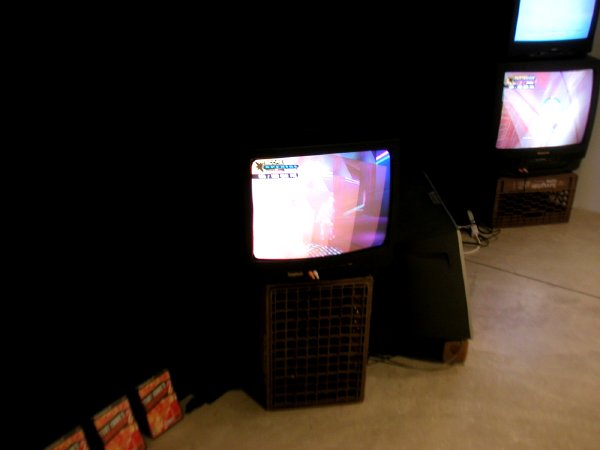
RSGprepplaysta.jpg
RSG Prepared Playstation (RSG-THUG2-1) 2005 large detail


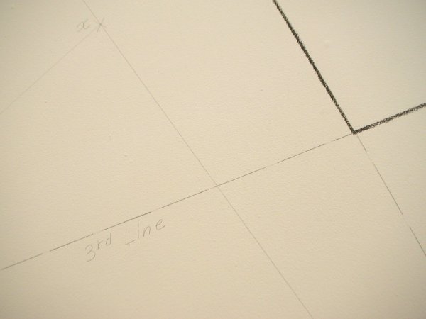
Lewittwalldrawing.jpg
Sol Lewitt Wall Painting #231 - The location of a quadrangle first drawn 1974 detail


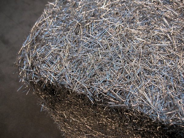
Donovanpins.jpg
Tara Donovan Untitled (Pins) 2004 37" x 37" x 37" detail

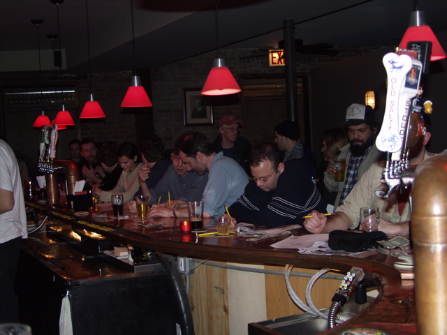
bard&d.jpg
intense bar scene from last year's competition


Dunno exactly why, but this sounds like a wonderful thing.

The promoters (yeah, that sounds so big-deal), M.River and T.Whid, have their explanation:

It might be interesting if an art idea conceived in a bar could use a bar as a site and context for said art idea and it's been a long hard winter.
But I like the sense of place and proportion provided by the description of the first prize:
Win a $100 bar tab [at the event's venue, Greenpoint's Bar Matchless]
This year Inka Essenhigh and Steve Mumford will be the judges.

For images from last year's event, go to MTAA.


[image from MTAA]

grafitti526bldg.jpg


This graffito was found inside the boy's room in one of the large Chelsea gallery/studio buildings today.

Ross2.jpg
Alexander Ross untitled 2004 oil paint on canvas 96" x 85" detail


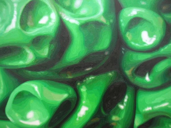
Alexander Ross is in the main gallery at Feature through most of April. My visit was unfairly short today, but I have to admit a gut attraction for the detail of his new grotesque, very sculptural paintings, especially the luscious green parts, which are built up like isobars.

The Feature Gallery site hasn't been updated for a while, so for images of Ross's work, see Miami's Kevin Bruk Gallery.

[overheard in one of the aisles at the Armory show the week before last]

Near a wall displaying some of the less extreme of Robert Mapplethorpe's photographs, an almost painfully-thin, elegantly-dressed Upper-East-Side matron of a certain age was explaining her aesthetic preferences to a friend:

I never liked any of his work, except for the really, really early photographs with the leather and penises.

pushbutton.jpg
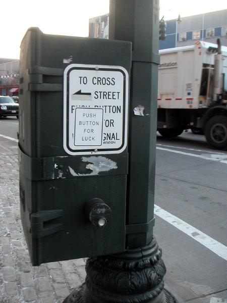
11th Avenue and 22nd Street, Saturday, March 19th


I'm gratified to see that someone has found an honest use for these dummy buttons which are found all over the city. The Department of Transportation installs them to make pedestrians feel that DOT cares, but I understand (based only partly on personal experience) that they actually aren't connected to anything.

Gober2005.jpg
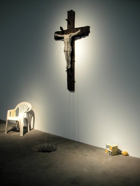
but not the Pope's scene at all (detail of Robert Gober installation at Matthew Marks)


Robert Gober's exhibition of several dozen new works at Matthew Marks (his first New York show in eleven years) is absolutely stunning. Even with the large room pretty crowded with visitors this afternoon (long lines waiting to peer into the two spaces behind doors left only slightly ajar) the atmosphere was very subdued, even reverent. As usual, his art is very much about our increasingly-damaged world, even though there's never any shouting.

Robert Gober has produced a large-scale installation of new sculpture exploring questions regarding sexuality, human relationships, nature, and religion, all informed by the current political climate. The artist conceived this new body of work over a three-year period, beginning shortly after the events of September 11, 2001, and culminating shortly after the recent presidential election.

Bueysisttot.jpg


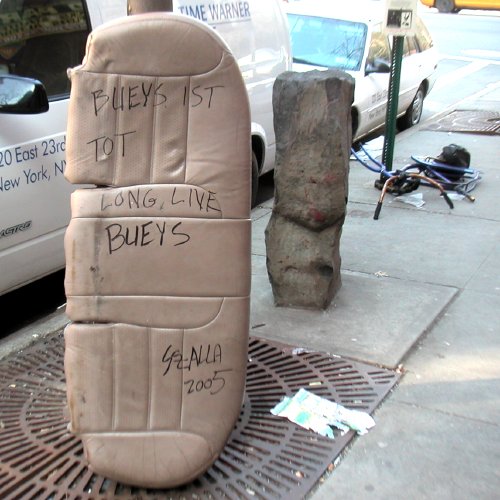
Whatever.

Spotted this afternoon on West 22nd Street, which is lined with a section of Josef Beuys's "7000 Eichen" [note basalt column and barely-visible trunk of young oak tree in photo; also, a very tot bicycle and a detail of a Paul Richard conceptual installation visible on a pole beyond].

FairmanCurtis.jpg


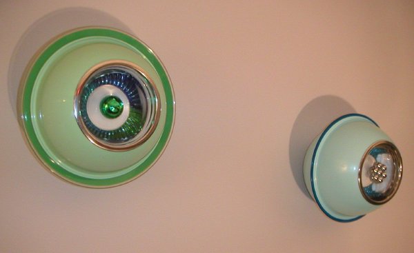
The Las Vegas contemporary art gallery Dust showed a number of small sculptures by Curtis Fairman at -scope New York last week. The piece on the left is titled Attar; that on the right, Ari. The work is made up of quite ordinary materials, assembled together as found or slightly altered, such as kitchen bowls, spiral wrist bands bicycle light lenses and fishing floats. They carry their clean, toy-like beauty modestly, but they aren't easily forgotten. So here they are, a week after I first saw the sculptures. I like them a lot.

I'm shocked that he hasn't shown work in New York before, but that will probably change now.

Fairman lives and works in Las Vegas, but to see additional work, look at the Rebecca Ibel Gallery in Columbus, or Google image search his name.

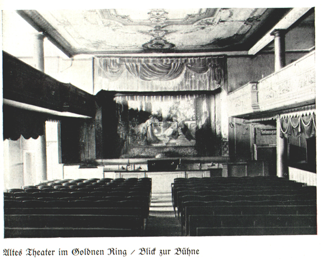
AltesTheater.JPG


I came across the link where I found this picture while looking for images of the "Dada Baroness," Elsa von Freytag-Loringhoven [she seems to have had an early and remote connection to the theatre shown above].

Wouldn't it be wonderful if everyone had access to such a performance space in their own community? I mean wonderful for both audiences and artists!

When I saw this century-old picture of a basic, but absolutely complete theatre inside a small hotel in the provincial German town of Cottbus I thought about opera, and what fun it would be to see small productions in a space like this. Well, okay, I was also thinking of a scene in Fellini's "Amarcord." In our own experience, New York at least never seems to run out of spaces for non-musical theatre, so I thought it was fair to talk specifically about an opera house, maybe one in the west 20's for instance. The hall shown above seems to have everything audiences and artists need, just a lot less of it. There's a stage, curtains, an orchestra pit, parquet seats, boxes to see and be seen, wings, possibly a backstage area, carved or painted decoration, and even something most larger theatres don't have, daylight when the large windows don't have to be darkened.

It seems so simple. If a modest inn located in a provincial central European town could have this little jewelbox of a theatre, why can't every town in America?

We know the answer, of course, because there was a time when every small town in America, and virtually every neighborhood, did have these stages, even if their productions might be high, low or anything in between. Then cinema appeared, and live entertainment began to disappear. Later, when television entered every home in America, if not every room and now most every SUV, the audiences stopped showing up altogether.

But today, for reasons discussed regularly in the cultural media, opera, especially new creations, and including work which would not be acknowedged as opera by the old guard, is once again hot and getting hotter. This is especially true in Europe, where there are still stages in every modest-sized town, most in appropriately-sized halls, and where there is serious public funding. But people everwhere seem to like what they are seeing and hearing - if they can find it. The boundaries between high and low are becoming blurred, with neither suffering diminishment. Once again, after almost a hundred years, whether grand or chamber/loft-sized, opera isn't just for the elite, even if usually we can no longer whistle its new melodies in the streets.

I say let the Metropolitan Opera go on doing its museum thing in its big colliseum for increasingly older and wealthier audiences, but let's create our own opera houses, and produce our own brand-new, unjustly-neglected or re-created operas, and let's do it everywhere.

Although even the small halls I am imagining would need money, in the U.S. we would need only a fraction of the private or public [hah!] patronage which is thrown at television. Decades ago our government handed over the airwaves, which belong to the people, to a very few huge corporations which profit from an infinite number of other corporations which in their turn profit from selling stuff to the people who have been robbed of the patrimony of the airwaves. It's an outrageous scam.

We need to get back what is ours, meaning the tools, both theatres and airwaves, with which we might build a culture beyond mere consumerism.

More opera, less soap.


[image from Klaus Martens (scroll down)]

PettyOpal.jpg
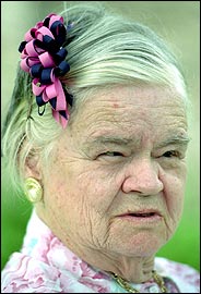
Opal Petty 1918-2005


She was 16 when her family had her committed to a mental hospital.

"Being fundamentalist Baptists her family didn't approve of her wanting to go out dancing and such things. A church exorcism didn't work, so the family made the decision to commit her."
The quote is from the director of the Texas Civil Rights Project, Jim Harrington, the man who fought successfully for Opal Petty's right to return to society after 51 years.

She died one week ago at the age of 86, damaged by an "institutional syndrome," but having lived nearly twenty years with people who loved and cared for her, and who were responsible for her resurrection.

Petty's story should strike a painful chord in the hearts of most girls and women, and certainly queers of any age, who as little children were chastised by their families, to any degree, for behaving inapproriately. Some of us make it through.


[1994 image by Larry Kolvoord/The Austin American-Statesman via the NYTimes]

gris.glass-lemon.jpg
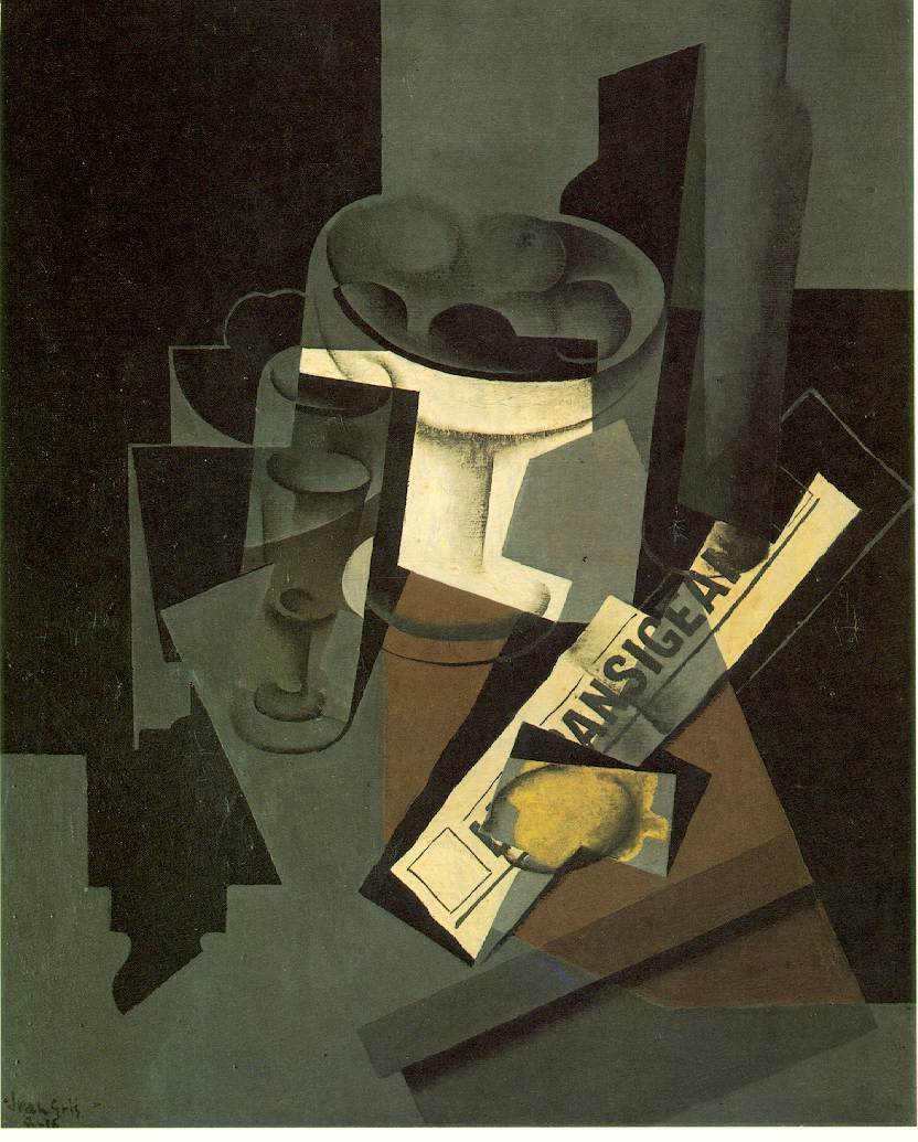
Juan Gris Fruit Dish, Glass, and Lemon (Still Life with Newspaper) 1916 oil on canvas 28.75" x 23.5"


I don't know anything about cooking, but I know what I like. No, that's not quite right. I do know something about cooking, and I know when it's right, but I'm not really a creative chef. When it comes to the things I love (including the arts) maybe I usually get by with only an intense curiosity about the new, a certain amount of taste and a good deal of almost-academic deliberateness.

I started cooking years ago while a graduate student at Brown. Perhaps imagining myself more impecunious than I really was, I convinced myself that learning to cook would be the most reliable way to be certain that I would eat very well - at least some of the time.

I can report right now that two nights ago Barry and I ate really well. No, it wasn't the first time, but I did get pretty excited about it, partly because it was so unexpected - and so easy. It's now Wednesday, and the immediate near-ecstasy of the moment has passed, but I told myself while clearing the table on Monday that I had to write about a meal which, although rather casually assembled, ended up an almost perfect little Italian table. I wish I could pull that off every night, and even more to the point, I wish we could share it with others more often than we do.

I had spent several final hours at the Armory show that afternoon while Barry stayed home to work, and when I returned home I wanted to go through mail and post a bit before dinner, so my early-evening Whole Foods trek for provisions was more perfunctory than usual. At the market I decided on squid (I know, it was don't-buy seafood-on-Monday, but they looked and smelled great) and some very fresh-looking broccoli rabe. While there I remembered I had a small net of golden fingerling potatoes hanging on a hook at home.

Altogether it was a pretty modest Italian meal, especially since only if I were to count our eager "seconds" could I begin to relate it to the three or four courses and dessert tradition:

Dressed Squid briefly roasted in the oven together with crumbled red chilies, dried oregano, a bit of olive oil and the juice of half a Meyer lemon;

potatoes on the same plate, also roasted in a baking dish in the oven, but for a full half hour, after being cut lengthwise into four pieces, mixed together in a bowl with chopped garlic, oregano leaves (the recipe had specified marjoram, but the larder showed only the fresh form of the dried herb called for with the squid), a little olive oil and this time two lemons, each cut into twelve wedges and squeezed with the rest of the ingredients;

the very green contorni, served in separate bowls, was the rabe, quickly boiled, drained and then sauteed in a pan which had first heated a few garlic slices in olive oil;

the wine was a simple bottle of Fiano Di Avellino from Campania.

The pleasures were of both the palate and the eye, as they must be with a good meal.

I was amazed at how fantastic the seafood and the potatoes both looked and tasted together, and the vegetable was as perfect a visual contrast as it was a gustatory one.

The cooking utensils, my old white-lined blue enamel NACCO baking pan for the squid, a red-brown terra cotta rectangular pan for the potatoes and a heavy, black Wagner iron frying pan for the greens, all eventually found a home on top of our high-legged dark green and cream deco 73-year-old range, but there never seems to be time for pictures at these moments. Sitting at the old maple turned-leg drop-leaf in the breakfast room we ate off sturdy cream and mushroom-colored Shenango restaurant ware, with small lightly-tinted ribbed-glass Duraflex kitchen bowls on the side for the greens. Once again we found this really good homey restaurant in the middle of Manhattan; we'll be going back.


The recipes I used for the squid and the potatoes are from the really excellent "Italian Easy: Recipes from the London River Cafe
by Rose Gray and Ruth Rogers, which is accurately summarized in Amazon's editorial review: "These are visually spectacular, remarkably simple recipes for those who love good food but have little time to prepare it."


[image from the Artchive]

DoeringerCatalan.jpg

DoeringerCattelan.jpg

DoeringerCattelan3.jpg


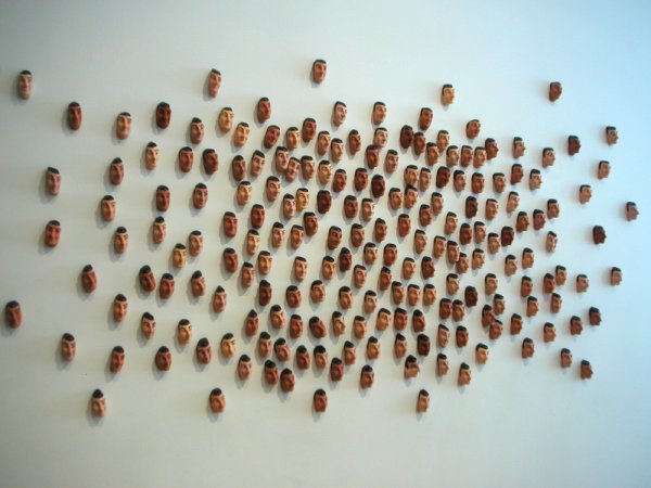
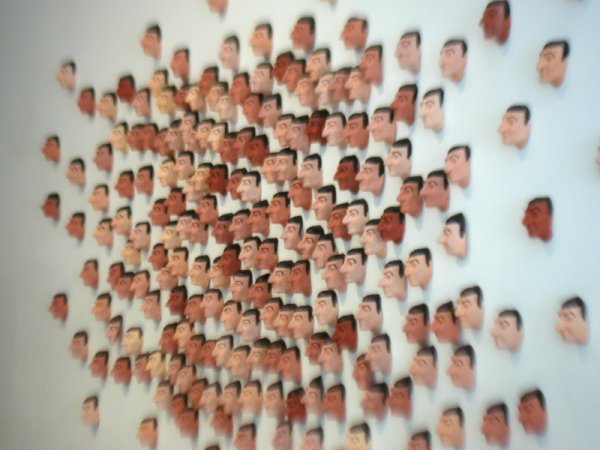
As far as I'm concerned there's never enough of Maurizio Cattelan to go around, but now Eric Doeringer is helping out - with a wonderful additional conceit.

As I understand it Cattelan had been invited by apexart to do something in their space. What they ended up with was "Maurizio Couldn't Be Here." This was a series of five Saturdays of performance-related events organized by five different people invited by Cattelan to curate shows in the Church Street space. For the final Saturday the curator Fernanda Arruda picked Doeringer, and Doeringer created a new unlimited edition for the occasion, a hand-painted latex mask (miniature, of course) of Cattelan's face. Behind a black curtain dividing the gallery on Saturday, in addition to pushing his earlier product range of "Bootlegs" of hot artists, he was offering a ziplock bag of five miniature masks for $100 (a price at or near the high end for his pieces).

No surprise, but I understand Cattelan himself is a Doeringer collector.

Sorry about all the images; I couldn't help myself. I just had to put up all three of my pictures of the front-room installation. And yes, we did buy a bag of Doeringer Cattelans while there.

KorpysLoeffler.jpg
Korpys/Löffler The Nuclear Football 2004 DVD still from video


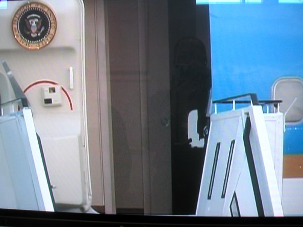
I almost couldn't tear myself away from a video by André Korpys and Markus Löffler shown by Karlsruhe's Meyer Riegger Galerie at the Armory show. And when I did, it was only to come back each time I passed near its images or heard the refrains of "Hail to the Chief" on its soundtrack.

A sexy male voiceover whisper accompanies a thirty-minute newscam-like documentary of Bush's lightening-fast 2002 visit to Berlin, framed by the arrival and departure of Air Force One. The visible security systems are the stars of the video. Barry and I think we heard something like "secret service men make me hot," but we could be wrong. The title refers to the leather bag which always closely accompanies an American president, the one which holds his special nuclear cellphone.

Dr. Sabine Maria Schmidt's press release for Korpys/Löffler's exhibition at the Wilhelm Lehmbruck Museum in Duisberg is slightly more helpful.

Generally speaking, political events such as the state visit by George W. Bush in 2002, provide the starting point for their investigative art, which places the strategy of artistic formal analysis in a new context. The artists weave fictional and biographical threads into their documentary analyses, which serve to further underline contradictions and revelations, and to construct new associations and opinions. Yet which associations have any meaning whatsoever for historical events, and which are to be given priority?
Whatever the magic, the piece is almost as funny as it is frightening, a little bit like our current "nukaler" chief himself.

EisenmannNicole.jpg
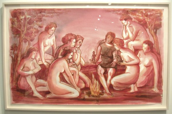
Nicole Eisenman untitled 2004 watercolor and pencil on paper 25.5" x 39.5"


I see this wonderful Nicole Eisenman drawing as the other school of Athens. The work was in Leo Koenig's exciting booth.

NeelAliceEka.jpg
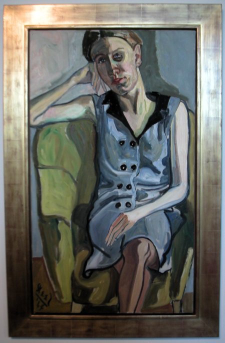
Alice Neel Eka 1964 oil on canvas


I turned the corner and there was this old master, except it was not old at all, even in the company of so much work by the truly young at Armory 05. This glorious portrait by Alice Neel was being shown by London's Victoria Miro Gallery.

SonhouseJeff.jpg
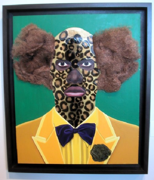
Jeff Sonhouse Green is For the Money, Gold is For the Honey, and Bronze is For the Bourgetto 2005 mixed media on wood 14" x 18"


This dazzling piece by Jeff Sonhouse was in Jack Tilton's booth.

finchspencer.jpg
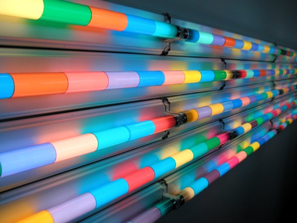
Spencer Finch Sunset (south Texas 6/20/03) 2003 fluorescent lights, filters 25" X 40'


When I got home from a second trip to the Armory fair last night I saw that Tyler had already written about Spencer Finch's piece in the Postmasters booth, but I found this great image on my trusty micro and I didn't want it to languish. Sorry I didn't get a real closeup, because the piece is dynamite whether the eye is on top of it or as far away as the next pier.

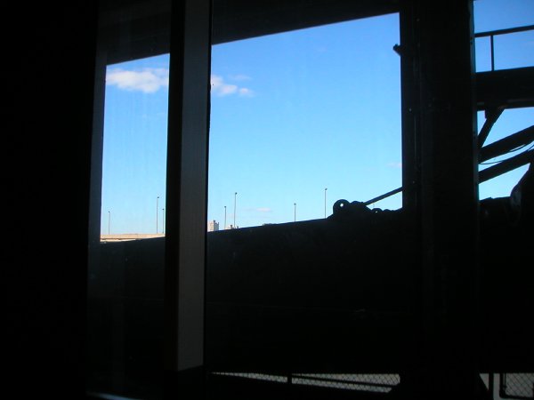
ArmoryPiernorth.jpg
today, the view north from the same pier

LutzKinowMatthew.jpg
Matthew Lutz Kinoy Mixtape 2004 2005 video still installation view


We spent much of the afternoon and early evening today at DIVA, the Digital & Video Art Fair ensconced in the the Embassy Suites Hotel this weekend, located just above the World Trade Center. Barry is also writing as I'm typing this mini-report, but I'm pretty certain he's saying something like what I am about its easy and seductive attractions.

Maybe it was the requirements of the medium but the experience was relatively serene. Unlike the traditional world of painting, sculpture and even photography, digital or video art demands darkness or at least a close substitute. At DIVA, even the process of repeatedly entering and leaving dozens of small spaces, almost every one liberally sprinkled with a number of animated screens in almost every possible size, and each with its own special claim to our visual and aural attention, seemed somehow far less stressful than my experience with the static displays of the Armory or Scope fairs.

That reminds me; today I really enjoyed the somewhat rare element of sound in the context of an art show, even if those sounds were so often so numerous and so insistent that they added unintended elements to some of the works.

At DIVA there was also the cool excitement of the exotic (finally, in a week which so far has seemed dominated by a New York aesthetic): According to the press pack, only thirteen of the exhibiting galleries were from the U.S. Most of the work shown by the remaining twenty-one seemed to be delightfully, singularly independent, even quirky.

At or near the top of a very rich selection, and regardless of considerations of nationality, I would put the work of Matthew Lutz-Kinoy. A still from one of his three videos being shown by the Paris-based curator Yukiko Kawase is shown above. The video consists of five post-teen U.S. college students in karaoke performance of music of their own choosing. The candy on a tray and the dishevelled bedding are part of the installation and are intended to perform as a welcome to visitors.

His drawings and modest sculptural interventions are scattered throughout the suite, in gestures designed to domesticate its transient hotel spaces.

Lutz-Kinoy lives and works in Brooklyn. He is a student at Cooper Union. He was born in 1984. He seems to be brilliant.


ADDENDUM: One more word about the location: While the "Executive Suites" venue remains just a shelf of hotel rooms, these quite ordinary, furnished environments do more than the walls of any white-space gallery to show how this spunky, even revolutionary art form can be displayed in an ordinary home. We really should get another monitor for our own ordinary, rather crowded rooms. How much are those little hand-helds now? Aha! They don't even need any wallspace!

SavannahGae.jpg
Gae Savannah Tai Rhi 2005 hair accessories, beads, fabric, wood, light 34" x 18" x 18" detail


The image is just a teaser. More later on Gae Savannah, shown by curcioprojects at SCOPE this week.

Scope was a lot of fun today, and the art was better than ever. But a word of warning: The FLATOTEL venue is very seriously vertically challenged. Forty-seven floors, three elevators, one assigned to the thousands of people coming to the fair this week - well, only sorta assigned. Anyway, it just doesn't work.

Tips: Go to the top (16th) floor and gradually make your way down to the lowest floor of the arts fair, the 10th (there's no 13th). Because of the huge wait, at that point even if you've been on your feet all day you may want to consider walking all the way down to the street. Also, do not expect to find a WC anywhere above the two hole-er on the ground floor, possibly a one-hour round trip from the Scope rooms, unless you can persuade a gallery to move the art in their hotel-bathroom and let you lock the door behind you.

But enough with the logistics you won't read about in the brochure. When I get some rest and find some spare minutes, I'll continue to post about what we've seen at Scope and at the other arts events which crowd this week.

ESPObakery.jpg
Steve Powers ESPO BAKERY detail of installation


"graffiti that looks like advertising since the early 90’s"

Steve Powers (ESPO) will almost certainly be a delectable hit on Pier 90 this weekend, especially since the food court is at the other end of the Pier. At the press preview yesterday he was still setting up his store/installation, "ESPO BAKERY," but beginning today this Deitch Projects booth will be selling ESPO-designed cookies and cakes. "The baked goods can be collected as art multiples or enjoyed on the spot," according to the press release.


[the headline quote is from the gallery site description of the work of Powers]

MullerDaveBoatride.jpg
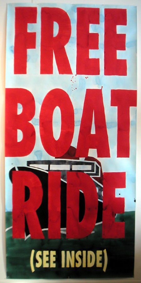
Dave Muller Looks Good from a Distance


And who doesn't want a boat ride? This wonderful large piece [gouache? and maybe eight feet tall?] by Dave Muller was installed on the side of Murray Guy's booth, adjacent to the large windows overlooking the walk and cartway of the pier [see the image in the post below].

ArmoryPier.jpg
yesterday, the Hudson River from this year's more opened-up exhibition spaces


The abstraction reflected in the glass is Dona Nelson's The Deep (1997) exhibited at Cheim & Read.

KiaerIan.jpg Ian Kiaer Paul Scheerart project/palm house 2005 mixed media installation dimensions variable [large detail of installation]
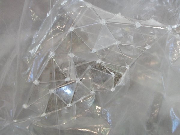
Kiaerdetail1.jpg
Scheerart project detail

Kiaerdetail2.jpg
Scheerart project detail


I know I can't be his only acolyte, but I must be among the newest. I did feel I was all alone in my excitement in the booth of London's Alison Jacques Gallery while trying to get a decent image of Ian Kiaer's really sublime sculptural assembly. The work includes the five separate parts seen in the photograph (the small rectangle on the upper right is the gallery's label). I imagined no one else had ever seen this wonderful thing, and that it would disappear moments after I walked away.

Kiaer is also represented by Tanya Bonakdar Gallery in New York, but I have not yet seen that exhibit at the piers.


UPDATE: I added two [small detail] images of Paul Scheerart project/palm house after a return to the show on Monday.

ConnorBruce.jpg
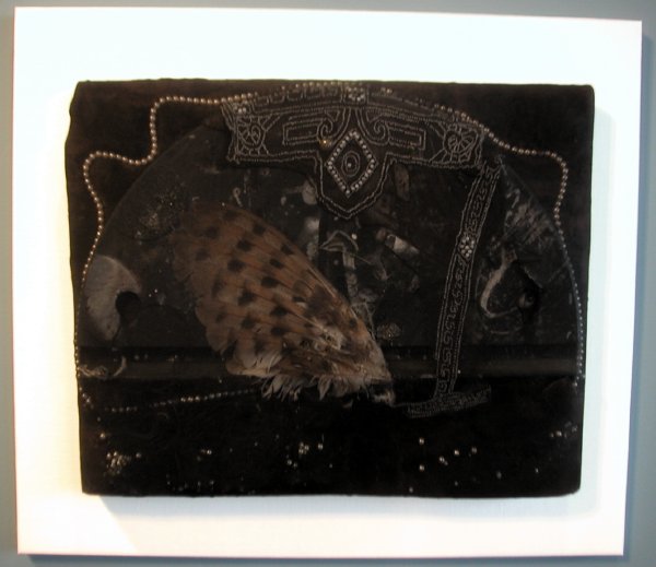
Bruce Conner Untitled 1960 mixed media, pearls, nylon, mesh, wire, etc. 20" x 24.5" x 2.5"


My first Armory image, and after all I said below, it's not emerging, not obscure, but this 45-year-old piece took my breath away this afternoon. I saw it at Los Angeles's Michael Kohn Gallery.


ConnorBrucedetail.jpg
Conner Untitled detail

coupleatArmory.jpg
taking a break at the Armory Show press and VIP preview this afternoon


Although we were there for four hours, we managed to make our way through only a little more than a third of the floor area of one of the two piers occupied by this year's pared-down roster of Armory Show exhibitors this afternoon. Well it hasn't even opened yet, so can still go back. We were there for the press preview [yes, the White House now isn't our only institution which gives press passes to bloggers], so much of the first hour was spent on the organizers' presentation.

We're pretty tired this evening, but then we never took a lunch break - or a break of any kind - and we didn't take advantage of most of this year's welcome innovations: more open space, open views of the Hudson River, the wonder of artist-designed lounge seating, and even mood lighting in the food concession area.

But we did enjoy ourselves a lot, not least because we found less of the big-name, big-ticket art whose pricey presence had seemed to dominate shows in recent years. There was a wealth of new sights and new names even for gallery-going veterans, and those weren't all in the booths of the foreign galleries. Also, is it my imagination, or does the work in those galleries look less "exotic" here than it used to? And if so, does that mean the New York art world, and that in the U.S. generally, has become less provincial, or is the rest of the world succumbing to our particular tastes?

Biggest news nugget (news at least for me) carried out of the press preview: Glenn Lowry, the Director of the Museum of Modern Art, reminded us that this year MoMA had coordinated the opening date of the next "Greater New York" show mounted by its more edgy farm team, P.S.1, to coincide with the period of the Armory Show, apparently in order to show the parent organization's appreciation of the new. Then he mentioned casually that this year the huge Queens show would be "presented jointly" by MoMA and P.S.1. Wow. Apparently MoMA's now got to be in the room when junior invites his wild and crazy friends over to the house.

By the way, the extraordinarily-wealthy beneficiary of the monies raised by tonight's tony Opening Night Preview Party on the Armory piers is MoMA, and specifically the exhibitions program, not even its new works acquisitions program. In any event, no arts scholarship or arts healthcare foundations need apply. Even the staid old-guard ADAA Art Show can think outside of its own institutional box when it comes to benefits.

That's enough at least for now about the venue and the arrangements. In the next few days I expect to post a number of images with brief descriptions, but one caution starting out: As usual on this blog site, the images will not necessarily represent the things I liked most. Rather they will be the best photographs I was able to get of those works seen which interested me most. And, also following precedent, preference will usually be given to the more obscure works, the least-known artists.

See Barry tonight, and watch both of our sites over the next few days at least, for more images and comments about the various art fairs dotting New York this week.

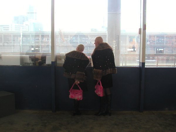
Oh yes, would somebody help me remember: Who are these two wonderful performance artists in the picture at the top of this post?

UPDATE: In his comment below Martin is kind enough to answer my question: The artists are Eva and Adele.

Schum.jpg
Christoph Schmidberger Yours Till the End of Time 2004


The stylish and merry crowd which braved a nor'easter to get to the opening tonight made any serious judgments, not to say almost any chance for decent photos, almost impossible, but there was more than enough opportunity to see that a return visit, or first pilgrimage, to Bergdorf Goodman before March 29th (when everything comes down) should be in order.

Fifty emerging artists represented by dozens of emerging galleries from around the country have found their way onto the designer floor walls of the Men's Store, through the good graces of the upscale clothing emporium itself, Giorgio Armani, the New Art Dealers Alliance (NADA) and the persuasive offices of Simon Watson's Scenic.

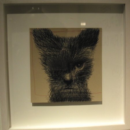
I loved the quirkiness of Bill Adams's one-eyed kitten, courtesy of KS Art. Although I just couldn't get a clear photo, for a number of reasons, here it is anyway to haunt us all:


Adamsoneeye.jpg
Bill Adams One Eye 2004


I had the same crowd and lighting problems with most of the other pieces, and a glass of wine in one hand was no small handicap. But without taking away anything from the other exhibitors I'll say that I thought the works in the display areas given to ATM Gallery, Foxy Production and Goff + Rosenthal (which represents Schmidberger, repsonsible for the drawing at the top) were especially impressive.

On our way home we looked at the store's 5th Avenue windows, where we stood in the 14 degree cold warmed by a wonderful Adam Cvijanovic mural featuring salvaged Vegas electrical signs strewn about a dry warm desert. Cvijanovic is shown by Bellwether gallery. On the other side of the entrance were several fine colorful Tyson Reeder works, which easily upstaged the clothes with which they shared the spotlight. Daniel Reich regularly shows Reeder in his more conventional space on 23rd Street (although it's still hard to associate the word "conventional" with Daniel Reich).

While it is certainly arguable whether this is a good way to show art, few of us would have a problem with the proposition that anyone who shops Bergdorf's and spends hundreds of dollars on one shirt should be told (reminded?) that some really good art can be carried home for about the same investment - and it will never wear out.

Pettersson2.GIF
Allan Pettersson


It begins in the middle, the sounds suggesting that you have been there listening all along. In a way, you have, since the symphony is Allan Pettersson's Eighth (1969), and it is only one section of a very long song. The symphony closes with the orchestra slowly dipping back into the dark pool from which it had emerged some fifty minutes earlier.

This 20th-century Swedish composer (1911-1980) completed fifteen symphonies and together they feel very much like a single, endless piece, the powerful introspective work of an entire lifetime. His song is one of great sadness, although it may also contain the faintest suggestion of hope, even if that hope may only be for the extension of a life of pain, or the rebirth of life - anticipated as one of pain as well.

"Jag är ingen tonsättare, jag är en ropande röst (något som ej får glömmas), som hotar att dränkas i tidsbullret."

"I am not a composer. I am a voice crying out, (something that should not be forgotten) that threatens to drown in the noise of the times."

In the early 20th century Sweden had not yet become the extraordinarily successful society it is today. Large numbers of Swedes were still leaving the country as emigrants. Pettersson's childhood reflected the distress of that society and his own immediate family, and its physical scars left him in pain for the rest of his life. He died in his late 60's after having been housebound for ten years.


The music is profoundly disturbing, but achingly beautiful, and it owes little to the fashions of its century. At the time of the composer's death I had barely begun to assemble my collection of his music. I concentrated on each of the symphonies (the epic form which almost-completely dominated his output) and in the end I managed to find all except the uncompleted First and Seventeenth. But while the record of the music survives, on my own LP and CD shelves, and surely on those of other admirers, I never hear of a public performance today. Has Pettersson become just too dark for our own new dark age?


comissiona-sergiu2.jpg
Sergiu Comissiona


My romance with the post-classical symphony form began in the 60's with Mahler, moved through Bruckner, Nielsen and Sibelius to Shostakovich, whose death in 1975 seemed to close the door to this extravagant world. But in Boston in 1980 I spotted a beautiful Deutsche Grammophon LP with a color photograph of a kindly-faced bearded man in profile on a rich apple-green ground. In those years the LP art certainly did sell music! But that's properly another story. Inside this particular sleeve was a recording of Petterson's Eighth Symphony by the Baltimore Symphony conducted by Sergiu Comissiona, then its music director.

I immediately fell in love with the composer's music. I did not hear of his death later in that year until much later. The performance on that recording is magnificent, and on its evidence alone I based my admiration for the conductor. Sergiu Comissiona died in his hotel room in Oklahoma City last Saturday, only hours before he was to perform as guest conductor of the Oklahoma Philharmonic.

Joel Levine, music director of the Oklahoma City Philharmonic and a longtime friend of Comissiona's, filled in for him Saturday night and led the orchestra through a powerfully emotional performance, said William Cleary, past president of the Oklahoma Philharmonic Society.

"It was like a concert unlike any I have been to, and I've been going for 40 years," Cleary said. "The orchestra got three standing ovations during the first number, and I've never seen that before."

And from this fan, a belated and very humble thank you, Maestro.


[image of Pettersson from Passagen Hemsidor, image of Comissiona from Asian Youth Orchestra, Pettersson quote from Paul Kenneth Cauthen]

The sun was out and the temperatures were milder than they've been in weeks, so Barry and I had an extra incentive for hurrying to Rockefeller Center this afternoon on the opening day of Art Rock.

This unprecedented mid-town public installation is only the first of at least half a dozen events scheduled in New York this week devoted specifically to showing the work of contemporary and emerging artists, but it's definitely the most public venue of all. Tourists and office workers alike will find it almost impossible to avoid the art, but judging from the curiosity and delight shown by the very diverse crowd seen today, they aren't going to be inclined to try.

Art Rock was the inspiration of Elizabeth Burke and Abby Messitte of Clementine Gallery, and while it's an excellent exhibition it also represents an extraordinarily impressive feat of persuasion and organization.

Barry has some great images on his site, and I managed to get a few more, but they still fill in only some of the blanks. In and around the orange-painted [the color only a coincidence - ed.] cargo boxes in front of the RCA (NBC) Building are works by ten artists represented by ten galleries, and there are no disappointments. If some are not included in this post it's probably because I wasn't able to bring home a decent image of every installation. The Art Rock link at the top of this post includes links to each gallery, with images of work by almost every artist represented - although they are not usually the pieces to be found west of 5th Avenue this week.


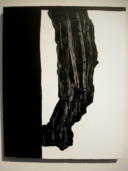
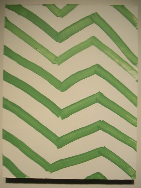
These are just two of the Richard Aldrich paintings hanging in the Oliver Kamm/5BE Gallery container:

RichardAldrich.jpg

RichardAldrichgreen.jpg


P.P.O.W. was represented by Sarah Oppenheimer's highly-appropriate cardboard container installation:

cardboard.jpg


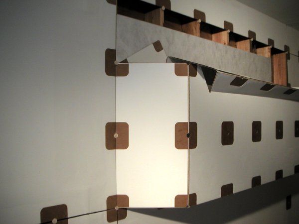
Los Angeles's Mary Goldman Gallery showed Rob Fischer's Mirrored House out in the open plaza [Barry poised center rear], where it attracted admirers of all ages:

RobFishermomkid.jpg


Clementine welcomed Tayor McKimens's installion of his hand-drawn paper cut-out, somewhat housekeeping-challenged house and yard inside their own big orange box:

TaylorMcKimenshouse.jpg

TaylorMcKimens.jpg

TaylorMcKimensAC.jpg


Art Rock will enjoy the hospitality of Rockefeller Plaza, and vice versa, through March 14. Oh yeah, there are two "Gateway Lobbies" (lounge boxes) decorated by Todd Oldham, for those who wish to rest from or contemplate their artfulness.


Goldkante.jpg
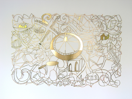
Stefan Saffer Goldkante [Gold Edge - ed.] 2004 marker, golden foil, cardboard, cut-out, shadow on the wall 81" x 120" (8 panels)


Saffergoldkante detail.jpg
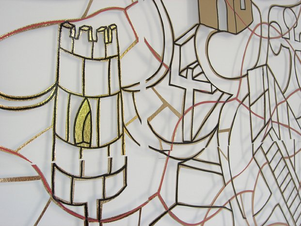
Goldkante detail

InstallationView.jpg
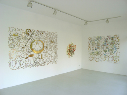
installation view with Goldkante on the left, Bohemia on the right, center piece not identified


We first saw the German artist Stefan Saffer's work last year at a studio show of the Whitney Independent Study Program (ISP). We really liked it at first sight, and our enthusiasm has built with every exposure since. We almost missed meeting the artist that first afternoon, but someone pointed him out to us as we were leaving and he became instantly unforgettable. Saffer is an articulate, and charming, intelligent and well-educated artist with an extraordinary familiarity with and curiosity about his world. His honest and open face is wonderfully distinctive, but perhaps the more remarkable considering the usual fine scale of his adopted medium he is also impressive for his heroic size (I checked, his hands alone seem to be larger than mine, and I have a span of nearly ten inches).

Saffer creates gorgeous, delicate-appearing paper (usually) cutouts which evoke entire literary (usually) worlds in wonderful graphic almost-narratives which will reveal their secrets to the patient viewer, but only reluctantly. Each of these truly sculptural pieces, whether worked from a sheet of thin cardboard only a few inches in length and resting on pins projecting from a wall or cut from heavy sheet metal and installed in a public square, boldly resists confinement to the two dimensions normally expected of its form. Because of its relationship to the wall or physical space outdoors, Saffer's work is always three-dimensional - at the very least.

The shadow which gives the paper works such dimension is probably seen to the best advantage in the image of the artist's Forest below.

Because of the richness of their sources and their materials, and the artist's creative imagination, these pieces never come close to repeating themselves. Lately Saffer has begun to experiment with using more than one layer of cut material, so it's clear we've only begun to see what he can do. Although his curriculum vitae is very impressive, he looks like he may still be in his twenties.

Saffer's galleries are müllerdechiara in Berlin and Kate MacGarry in London.

Additional works appear below as thumbnails which can be enlarged by clicking onto the images.


forrest.jpg
Stefan Saffer Forest 2005 gouache, lead pencil, cardboard, drawing cut-out, shadow on the wall 16" x 23"

RainerMaria.jpg
Stefan Saffer Rainer Maria 2004 the poem "the Panther" informs a small cut-out paper cage 10" x 2" x 6.25"

StagNation.jpg
Stefan Saffer StagNation 2004 gouache, cardboard, drawing cut-out, shadow on the wall 81" x 94.5"

TheMeeting.jpg
Stefan Saffer The Meeting 2004 gouache, color pencil, cloth tape on cardboard, cut-out, shadow on the wall 67" x 78.75" (4 panels)

bohemia.jpg
Stefan Saffer Bohemia 2004 color pencil, marker on colored cardboard, cut-out, shadow on the wall 45.25" x 25.5"


[images from Stefan Saffer]

DeBalincourtWatchtower3.jpg
Jules de Balincourt The Watchtower 2005 oil, enamel and spray paint on panel 31" x 39"


It's just a terrific show.

Jules de Balincourt's "This Is Our Town" opened at Zach Feuer's 24th Street gallery tonight. Barry and I have two pieces we purchased two years ago, before his first one-man show at what was then called LFL Gallery. I have no idea what it would cost to enlarge our modest holdings today, but it wouldn't surprise me if everything we saw there is already sold. That likelihood and especially our limited household budget mean that from now on I'm going to have to be content with visiting other spaces to see what this artist continues to do with a brush (and occasionally some spray paint or very-mixed media*).

But if it was both constructive and great fun being there early as excited collectors, there's still loads of excitement in the looking and I'd strongly encourage anyone interested in painting in this new Age of Terror not to miss the show. From the press release:

As suggested by the show's title, taken from the scoreboard overlooking Madison Square Garden, "This Is Our Town," explores a tension between leisure, survival, and the polarized paranoia between "us" and "them." Themes of surveillance, destruction, and looming breaches of privacy comprise this series of playfully sinister works.

Righteous social or political outrage has rarely gone down so gracefully - or so beautifully. The colors alone are worth writing home about, but you're going to have to be there to really see them.


DeBalincourtuntitled2.jpg
Jules de Balincourt Untitled 2005 oil and enamel on panel 13" x 15"


*
Don't miss the Personal Survival Doom Buggy. Well, actually there's not a chance you might.

BombayTalkie2.jpg
untitled (Talkie stair sculpture) 2005


Sorry, but I forgot to ask for specifics about the sculpture, since we were virtually closing the restaurant Wednesday night when I snapped this image and there was no one around at the time who might have been helpful.

We were leaving our new neigborhood "nouvelle" Indian restaurant, Bombay Talkie. This had been our third visit, a late supper with a friend following the new David Mamet play at the Atlantic Theater Company. Our little party gave mixed reviews for both the restaurant and the play, but in Chelsea, which sadly does not have a single really decent restaurant (okay, maybe one), the fact that the run of this convenient and at least slightly diverting eatery will be longer than the somewhat baffling "Romance" means that we will probably be back.

Solmirushtohospital.jpg
Federico Solmi Rush to Hospital II


Solmihospital.jpg
Federico Solmi Inside Hospital


Federico Solmi has this fantasy (fantasy fantasy?) about being Rocco Sifreddi,* super-celebrity, fellow-Italian porn star, and he has hand-drawn some 400 frames in order to assemble his own four-minute animated movie, "Rocco Never Dies." The gallery site offers an excerpt for viewing.

But although in the film Rocco actually does die (of a heart attack, after participating in a large-scale orgy strapped-down as an important cog in "The Fucking Machine"), judging from his own much more creative role in this exercise, Solmi should have a great (art) career ahead of him.

Now that I brought it up, I think I should include an image of that infernal machine, so here it is:


Solmifucking_machine.gif
Federico Solmi The Fucking Machine


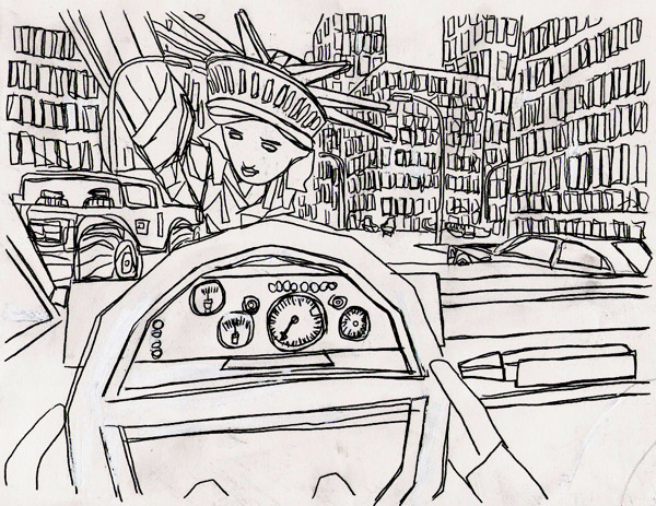
This neat little show, installed in the second gallery at Boreas, includes a large number of related drawings and several paintings. The paintings are executed on a stiff gauze medium, lightly prepared with a white base, before they receive the elegant line of his black marker. They are extremely attractive, as much as objects as for those beautiful black lines. New York, by the way, has rarely looked so exciting, with the tops of both the Statue of Liberty and the Chryler Building lodged akimbo in the middle of its busy avenues.

Full disclosure: I had seen several works by Solmi over the last year or two and I was intrigued. Late last year we were happy to bring home one of his small enigmatic paintings from the D.U.M.B.O Arts Center benefit, and it now hangs in our apartment. Here is the image, created originally as part of his "Safe Journey Exhibition" (2002-2004):


SolmiBMW.jpg
Federico Solmi Was a BMW oil marker on shaped gauze canvas 9.5" x 12"


*
I'd never heard of him until I read about this show, even though IMDb lists 252 films under his name. It must be the plots.


[top two images from Federico Solmi, where they are described as drawings; bottom two from Boreas, where the first is described as a still from the video]

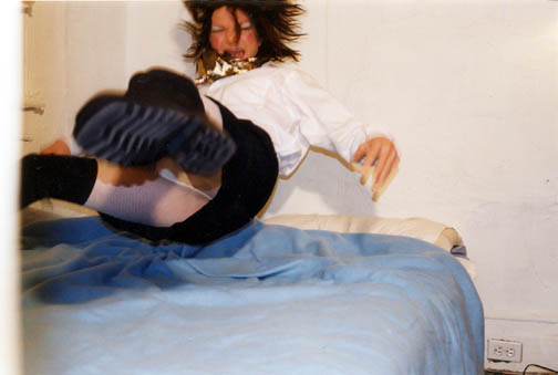
OvelmanJoeJump.jpeg
Joe Ovelman untitled (jump) 2002


Barry has a post which is a tribute to Joe Ovelman - and also to his D.C. gallery, Connor Contemporary, where his magnificent series, "Snow Queen" (or at least a large part of it) will be shown beginning this Friday.

The images above and below are earlier self-portraits, but Barry has included one of the Snow Queen images on his site. For five more, click onto the artist's name on Connor's site.


UPDATE:
Leigh Connor just sent me an email confirming that the entire series (18 works) will be shown in her gallery. She also refreshed my memory that Ovelman's modest epic was shot in the Cental Park Rambles. This serves as a timely reminder, during the week which sees $21 million of "The Gates" dismantled and hauled away, that art has never been a stranger in New York's noble greensward.


OvelmanJoeBlueStar.jpeg
Joe Ovelman untitled (blue star) 2002


[images from Joe Ovelman]

snow tree
early this morning outside the north bedroom window.


I know I've snapped a picture of this little tree and uploaded an image before, and yes, even prior to that at least a couple more times, but it's the only tree we have, and since I'm not sure it's going to come back this spring I wanted to give it one more chance to shine.

Pretty little Shadblow.

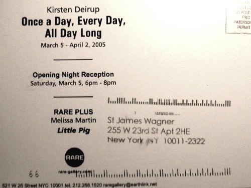
RareStJames6.jpg


Until this afternoon I was under the impression that you had to be dead before being addressed as a saint - unless you're an American president of course.

Whatever. But this is indeed a RARE treat.


  • home

This page is an archive of entries from March 2005 listed from newest to oldest.

previous archive: February 2005

next archive: April 2005