December 2006 Archives

HartleySustainedComedy1939.jpg
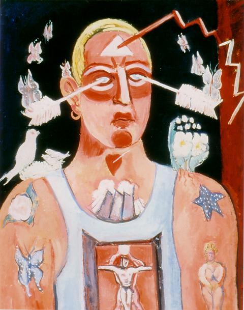
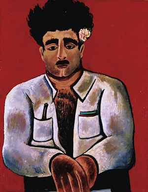
Marsden Hartely Sustained Comedy 1939 oil on academy board 28.5" x 22"


Marsden Hartley's vigorous expressionist art is clearly a part of today's world more than it was while he lived, and the man himself is today less a mystery* to the world than he was, perhaps even to his friends, while he was still alive. At the same time the largely pre-industrial world where, very late in his life, his painting flourished so robustly, and where we now know his capacity for love was generously requited, disappeared long ago, even in quiet coastal pockets populated by communities of honest and loving fishers.


Cleophas2.jpg
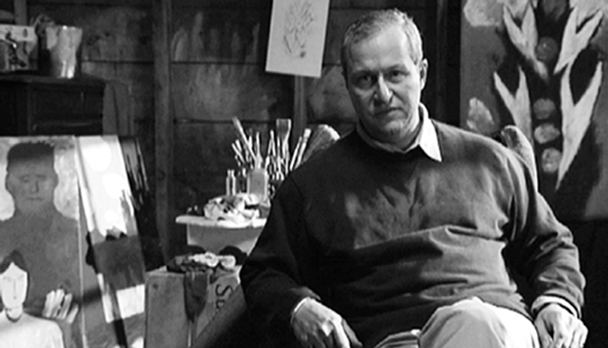
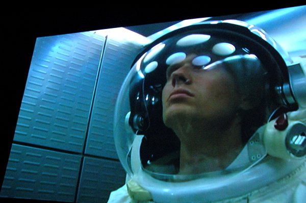
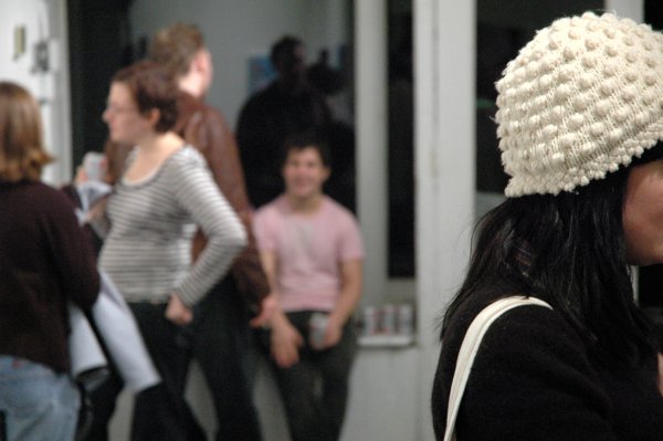
In the film, "Cleophas and His Own", Michael Maglaras plays Marsden Hartley while sitting inside a reconstruction of Hartley's 1943 studio


We try to experience the shape and the feel of lost worlds through our imagination and our art, and sometimes our success will seem to rival the actual experience of the dead. The filmmaker Michael Meglarus has resurrected Hartley's stay in isolated communities in Maine and Nova Scotia during the last seven or eight years of his life in his poetic film, "Cleophas and His Own". His creative tools are his rich, mesmerizing voice and his acting and directing skills, the beauty of the land itself (shown here only in crisp black and white), and the artist's paintings (their breathtaking color a magnificent contrast). Hartley's surprisingly-good and surprisingly-neglected poetry composes the actual episodic screenplay in a reading, also by the auteur, which recreates the rhythm and accents of early 20th-century Down East speech. Subtlely-introduced strands from Richard Strauss ("Death and Transfiguration"), Charles Ives, an old protestant hymn ("In the Sweet Bye and Bye"), and one exquisite song by Schubert enrich long, exquisite languors within the text and flow through white rooms, above the sea and along the rocks of the shore.

It's a very long film, and the luxury of its slow pace almost seems to mock the "movie" form itself. "Cleophas and His Own" will have limited popular appeal, but any single one of its bells would probably have been sufficient to draw me into its graces. Those tags, generally representing something specific in my own past beyond just an interest or curiosity, start with Marsden Hartley of course and continue through the idea of the solitary outsider, New England (and Nova Scotia), forbidden homosexual passion and love, homosexual passion and love embraced, language, the simple built aesthetic, the survival of ealier social forms, domestic arrangements, subsistence farming, beautiful people and good souls, history, anthropology vanished worlds, spoken poetry, the sea, and coastal New England.

"Cleophas and His Own" will be shown in New York at 7 pm on January 17 at Sunshine Cinema. The DVD is available from the film's generously complete website, www.two17films.com.


hartleyroses.gif
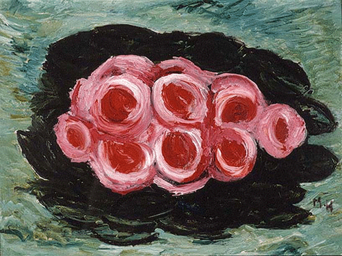
Marsden Hartley Roses circa 1936-1938 oil on board 12" x 16"


This image has been described as Hartley's represention of his beloved Mason family.

When Cleophas said 'Fine large morning,' it sounded as if a page of Blake had been blown open by the wind. - Marsden Hartley


*
The image at the top of this post is a remarkable self-portrait, described here on the Artcyclopedia site by Joseph Phelan:

"Sustained Comedy", a self-portrait that was never publicly identified as such, is the most astonishing [of Marsden's late likenesses]. This work transforms the aging, homely and shy Hartley into a young bleached blonde gay stud complete with earrings, butterfly tattoos and a pumped up torso bedecked with a tank top. Contemporary taste has finally caught up with Hartley's revelation of himself.
The image shown just below was painted at about the same time as the self-portrait. The subject is Hartly's last great love, Atly Mason, who was drowned together with his brother and his cousin during a hurricane in the summer of 1936.
Sunday morning. And the boys still not home. - Marsden Hartley

HartleyAdelard.jpg
Marsden Hartley Adelard the Drowned, Master of the "Phantom" circa 1938-1939 oil on academy board 28" x 22"


[image of "Sustained Comedy", belonging to the The Carnegie Museum of Art, from artcyclopedia; image of "Roses" from Barridoff Galleries; film still from 217 Films; image of Adelard, belonging to the Weisman Art Museum, from The Crocker Art Museum]

FischerNoahprojectedpeople.jpg
Noah Fischer Rhetoric Machine 2006 mixed media, dimensions variable [detail of installation in room two]


It's an awesome piece and an awesome engineering feat as well. It's also a beautiful work of art, but it wouldn't have been possible without more than half a century of the mendacity or pure villainy of Americans with great power and the laziness or stupidity of us lesser folk.

Remember when you couldn't find art with a political element if your life depended on it? Unfortunately for the sake of many lives it's already too late.

Noah Fischer's Rhetoric Machine, installed at Oliver Kamm through January 6, specifically addresses the language of a diseased political environment which even the "unpolitical" are now finding increasingly impossible to ignore. From the gallery's statement:

Rhetoric Machine is a two-room kinetic installation that appropriates the language of movies, television, radio, and speechmaking. Presidential speeches and emotionally laced pop songs serve as the soundtrack for a sculptural light show that marches through the last sixty years, what many would call the golden age of American history. American icons such as an eagle, a tank, and a television set react variously to the soundtrack, creating what Sergei Eisenstein called an "intellectual montage" where jarring associations between light and sound lead to new meaning constructions, often charged with emotion.

JooMichaelTaste.jpg
Michael Joo "the essence of taste . . . " 2006 MSG with mixed materials 112" x 70" x 16" [large detail of installation]


LarnerLizpipe.jpg
Liz Larner smile, this is a pipe 2006 cast and hand-built porcelain 8.5" x 15.5" x 4" [installation view]


In a delightful mix of good humor and good art, all in the good taste appropriate to the holiday season, Leslie Tonkonow is hosting an exhibition which flashes the provocative title, "THE BONG SHOW or This Is Not a Pipe".

The press release tells us that the curator, Beverly Semmes,

wondered what would happen when serious artists contemplated a culturally-marginal object (a bong, for example) and decided to invite a group of her peers to do just that. This show is about testing the limits of art and craft, public and private, high and low, and going with the flow.

The artists who accepted the challenge, providing a huge range of responses, are Ann Agee, Nicole Cherubini, Anne Chu, Maria Elena Gonzalez, David Herbert, Michael Joo, Byron Kim, Liz Larner, Charles Long, Rita McBride, Josiah McElheny, John Miller, Curtis Mitchell, Elaine Reichek, Jack Risley, Aura Rosenberg, Allen Ruppersberg, Beverly Semmes, Arlene Shechet, Brian Tolle, Ursula von Rydingsvard, Kara Walker, Betty Woodman, and Arnie Zimmerman.

WeissJessicahunt.jpg
Jessica Weiss Play 2006 acrylic on linen 72" x 68" [installation view]


I couldn't immediately find a happier image to post on the morning of December 25 than this one by Jessica Weiss. I found it yesterday afternoon when we headed out to Williamsburg and visited her show at A.M. Richard, a new gallery on Berrry Street, near South 4th. The three bright rooms are one flight up in a 150-year-old house; I think of it as an homage to the old Williamsburg gallery scene.

Weiss uses images found on not-quite-so-vintage wallpaper, the kind which covered the walls of our childhoods. She paints, she draws, she prints, she does collages and sometimes she does all these at once.

The show is titled "REPLAY". While in each case the original inspiration is totally removed from its original comfortable context, her inventions and her added abstractions look perfectly right. Although they have emerged as totally new images, they are somehow as familiar as they may once have been - and always very beautiful.

ReederScottBoring.jpg
Scott Reeder All of the Boring States 2006 oil on linen 38" x 47.5" [installation view]


ReederScottPaper.jpg
Scott Reeder Paper at Night 2006 oil on linen 60" x 44" [installation view]


ReederScottMoney2.jpg
Scott Reeder Money in Bed 2006 20" x 22" [installation view]

ReederScottMoneydetail.jpg
[detail]


Scott Reeder's work at Daniel Reich appeals on any number of levels; it just must be [going to be very important some day!], when we all can see ourselves more clearly.

We first experienced Reeder's current show during a holiday reception, when two small-ish floor sculptures had been removed and the gallery's normal lighting had been replaced with fairy lights, miniature lava lamp bulbs and a disco ball. Even then the work looked very good, although the mostly-subdued colors of the paintings and drawings barely emerged from the temporarily-darkened walls. A quick look at the checklist brought some big smiles. Reeder's work is about language as much as it is about the symbols normally assigned to the visual arts.

We vowed to return under more auspicious circumstances the very next day.

From the press release:

Vigorously dismantling the myths behind the most readily available aspects of our daily lives (Such as food, money, the human body, infrastructures) the artist plays on the literalness of their materiality while stripping them bear [sic] of symbolical value in a “matter of fact” fashion rooted in a play on words and absurdity.

I love these paintings, and not least for their being drawn so smartly, but gently, from the wealth of twentieth-century painting. And so the story continues.

fourthestateRosa-Ortizdetail.jpg
Milton Rosa-Ortiz All that we are is the result of what we have thought 2006 15-color screenprint with waterbsed UV and color shift pigment on Coventry Rag 25.25" x 33.5" [detail of installation]

FourthEstateRosa-Ortiz.jpg
[large detail]


Klaus von Nichtssagend is showing eight print editions by eight different artists. They were produced by a new Brooklyn shop called Forth Estate, founded by master printer Luther Davis and [master] artist Glen Baldridge. The show includes a huge range of styles or approaches and the works represent an equally diverse, and very ambitious, set of techniques and materials. Each piece is as terrific as an object as it is as an image.

The artists are Bjorn Copeland, Elise Ferguson, Joseph Hart, Andrew Kuo, Tim Lokiec, Carter Mull, Ian Pedigo and Milton Rosa-Ortiz.

The show continues through January 21. Here are three more images:


FourthEstateMull.jpg
Carter Mull Political Thinking 2006 4-color process screen print on imitation Pucci fabric, poster paint and canvas tacks 23.75" x 32" [large detail of installation]


FourthEstateHart.jpg
Joseph Hart A Symbolic Map of You and Me Together 2006 8-color screenprint on paper 30" x 22" [installation view]


FourthEstatePedigo.jpg
Ian Pedigo 2006 2006 6-color UV silkscreen on braille texture with garment pattern paper on bookboard 20" x 30" [large detail of installation]

Mattinglydigging.jpg
Mary Mattingly Fore Cast: An Environmental Disaster Opera 2006 installation and performance [an image from the performance of December 19]


Because of the ambience (shadows, respectful movement and low buzz) of dozens of my fellow acolytes at the opening reception on Tuesday, "Fore Cast", Mary Mattingly's ambitious "Environmental Disaster Opera" currently in engagement at White Box seemed to me to play almost as much as a recreation of a narrow historic scene as a prediction of a much larger and horrible future world. It was my birthday. I was in a very good mood, so I found myself thinking of the legendary (and much-lamented) "happenings" of the 1960's Cold War era as I was contemplating the artist's somewhat less happy theatrical representation of a world engaged in the details of survival during World War IV.

An extended excerpt from the press release provides a little more context:

Entering a water-filled and truncated landscape, viewers witness the land's predicted end-state, a reversion to its primeval condition and a topographical perspective of a sick new world. The marshy waterscape is the setting for the future of a civilization ensnared in an unceasing loop of WWIV, a war Albert Einstein foreshadowed as being fought with sticks and stones. With an unparalleled innate sense of intelligence, wit and craft, Mary Mattingly creates an installation explains the tragic outcomes of this hypothesized war in the not-so-distant future.

Multiple video projectors arranged in a semi-circle fill the walls of White Box and present a "Fore Cast" that will loop for six days and one hour. (A new week, according to Mary Mattingly's proprietary uniform time scale, derived from ancient Assyrian and Babylonian astronomical methodology and translated to a system for future use.) The videos play continuously in White Box's waterlogged space. The main screen portrays WWIV, fought by six groups of combatants ---The World Economic Forum, The Council on Foreign Relations, Bechtel, Nestlé, The United Nations, and B.R.I.C.--- colluding to capture and assert political and economic control over a shattered and borderless world. The belligerents' leaders plot together in a corporate conference rooms, ultimately degenerating into intercontinental world-scale conflict fought with the weapons of Cain and Abel, the war unfolding in disastrous environments everywhere.

Unlike the war itself, "Fore Cast" is going to have a very short run: When it closes at 1:00 am on Christmas morning it will have been open to the public for only six days and one hour (the doors opened the morning of December 19). There will be another live performance during the closing reception at Midnight, December 24.

11 Spring
this collage is probably mostly an accident, but stunning nevertheless

[for 41 more images go to my 11 Spring photo set]


Why is it called "street art"? And does art created in the street step out of character when it steps in off the street? Where does street art fit in the hierarchy? Can street art inform the mostly housebroken art which makes it into our galleries, our homes, our museums? Does street art disappear when the street moves on? What role does commerce play in the creation and the survival of art seen in the street - or the survival of the privileged art of the salon? Is street art necessarily more political than art which originates under a roof? Can just about anyone appreciate, can everyone learn to love, the best art found on the streets? Why does street art attract a special kind of excitement, even fanaticism and almost cultish devotion to its mysteries and beauties that is almost never shared by conventional art museums? Does an artist have to love a street before she or he can use it as a "canvas"? Is there a future for street art in an increasingly-sanitized Manhattan, and nearby Brooklyn, rapidly being customized for the pleasure of millionaires and their vastly richer new neighbors?

This past weekend New Yorkers had a rare and wonderful opportunity to be provoked by at least some of these questions, and probably a lot more I left out, so long as they were willing to stand in line (yes, in the street) for an hour and probably much longer in order to gain access to the cultural and real estate phenomenon of "Wooster on Spring". Well, admittedly the line was for a view of inside street art (inspiring some of the questions posed in the paragraph above), but the experience was almost like stepping inside the work itself. The fact that all of the art would soon be rendered invisible obviously added to the appeal of this temporary street-corner agora. 11 Spring Street is now closed and construction will soon begin on the five floors of this nineteenth-century brick and stone building in NoLIta. The grim but noble pile is slated for conversion into another representative of New York's still growing stash of "luxury condos".

Me, I really liked the art, but I couldn't also help thinking of the significance of this amazing phenomenon while trying to decode and enjoy the exciting work of the 45 artists who were invited and hosted over the last few months by a few other people who clearly like art - a whole lot.

And now it's all gone. Well, at least until the next New York renaisance, for while the outside of the building is to be cleaned and restored to something like its nineteenth-century appearance, the work inside 11 Spring is to be sealed up for the ages behind the new plasterboard walls deemed meet for the pampered sheltering of our newest professional class. If things work out better than they do in most apartment buildings, eventually there will at least be some good art showing up on those clean white walls, even if it will have to be store-bought.


I have not put captions on the Flickr images, largely because many are general or detail installation shots and because I'm not able to identify most of the artists. I'd be delighted if more knowledgeable visitors to the site could add attributions with their comments.

LeePaulfloorblack.jpg
Paul Lee Untitled 2006 mixed media 42" x 6" x 6" [installation view]


LeePaulgreen.jpg
Paul Lee Untitled 2006 mixed media 18" x 8" x 3" [installation view]


LeePaulfloor.jpg
Paul Lee Untitled 2006 mixed media 50" x 11" x 6" [installation view]


LeePaulpink.jpg
Paul Lee Untitled 2006 mixed media 10" x 11" x 7" [installation view]


If you've been looking at New York gallery reviews over the last few weeks you probably already know that Paul Lee's show at Massimo Audiello is a big hit, but you may not have seen enough good images to understand what all the fuss is about.

Here's an excerpt from Holland Cotter's review in the NYTimes:

Not to exaggerate the comparison, but it is possible to see the small assemblages in Paul Lee’s first New York solo show as heirs to Robert Rauschenberg’s early sculptural “combines” of the 1950s. The work of both artists takes debased found objects — junk — as primary material, and uses that material to create layered, enigmatic meanings. A big difference is that a homoerotic content suppressed in Mr. Rauschenberg’s assemblage is the primary content of Mr. Lee’s.

. . . .

Gay coding, through dress, language and behavior, has long been a protective necessity, a cultural binder and a source of pleasure, in art no less than in life. Mr. Lee, born in London and in his early 30s, explores such coding, and gently prods its mechanisms without fully exposing and demythologizing them. He gives us the props associated with certain erotically charged environments — back rooms, baths, parks — but also preserves a quality of hiddenness, of mystery.

The exhibition includes "washcloth paintings" and collages as well as more sculptures like those shown here, but it is the more three-dimensional work that seems most fully developed. Joshua Mack's earlier Time Out New York review is what actually impelled my visit to Audiello:
Cans printed with images of male faces are positioned so they seem to glimpse each other obliquely. The collages suggest the cultural taboo of men looking at men, with marbles in place of eyes and faces fractured into multiple planes.

Neither the collages nor the mutely colored towels are visually complex enough to surmount such conspicuous allusions to homoeroticism. The sculptures, however, have a formal lyricism that gives them a metaphoric impact. For example, a string that connects images of eyes and fingers implies the fragile intimacy of male interaction in societies that demonize desire.

These four shots taken during a November 25 visit to the gallery (I did write recently how far behind I've gotten) may help explain what we're talking about.

BradleySlater2001.jpg
Slater Bradley Dark Night of the Soul 2005-2006 video [still from installation]


Of the six new Slater Bradley videos being shown at Team right now, in a show titled "Abandonments", this was the work that totally got to me. In "Dark Night of the Soul", his homage to Stanley Kubrick's "2001", Bradley shows his familiar doppelganger wandering in awe through New York's Museum of Natural History in a space suit, apparently in a return to a world which is or has become a very different planet.

As always with this artist, music is fundamental to each of these videos and here its beauties assume as many forms as are represented by the works themselves; in this piece a slow transcription of Beethoven’s “Moonlight Sonata" replaces Ligeti and the romantic contributions of two very different Strausses identified with the 1968 film. The effect is breathtaking, and incredibly sad.

JohnsonJoshuabottles.jpg
Joshua Johnson Target Practice 2006 enamel on panel 16" x 24" [installation view]


JohnsonJoshuacalf.jpg
Joshua Johnson Fences Work With Thieves 2006 acrylic on panel 14" x 18" [installation view]

JohnsonJoshuacalfdetail.jpg
[detail]


Joshua Johnson is showing eight wonderful new paintings at Williamsburg's Riviera in a show which ends this Saturday (according to the card, but on their site the closing reads as Sunday). I almost hesitate to show any images here, because they barely begin to reveal the beauty and excitement of the work I saw in the storefront room on Metropolitan Avenue, and they suggest virtually nothing of their surface dynamic.

My shot of the monumental diptych looks particulary inadequate to me. I'm adding it below as a thumbnail image only to give an idea of Johnson's reach, and to drop just a clue to the impressiveness of his success.

Johnson was born and raised in Michigan. Today he lives in New York. He maintains an excellent blog in, well . . . , fortunately just about everywhere.


JohnsonJohuadiptych.jpg
Joshua Johnson Four Horses (diptych) 2006 oil, polyurethane, enamel and permanent marker on hollow-core door 80" x 36" each [installation view]


I can't leave this post without sharing a stylized impression of the bright young crowd at the opening December 1.


JohnsonJoshuaRivieracrowd3.jpg
clean white space

KathleenCullenRevolution.jpg
[installation view, showing a large piece by Joshua Smith in the center front and, from the left, works by Holt Quentel, Ofer Wolberger, Jamal Cyrus, Michael St. John, Alice Wheeler, and ALex McQuilkin]


It's a top pick on ArtCal, and for a very good reason. It's hot, and very cool. Kathleen Cullen is showing a provocative group show curated by Michael St. John this month.

Can we still use the word "provocative" in the 21st century when describing art? I think we can, and my argument would rest on the fact that somewhere in this country a people either frightened or complacent apparently chose twice in the last six years to install a government whose hideous record continues to mount for all the world to see. This is a people which can and must be provoked, but unfortunately they are not likely to visit a gallery on West 26th Street.

From the press release:

When the Revolution Comes is a heteroglossic meditation on the highly diffuse intertextuality of the moment, presenting works created on the stubborn premise that they are out of step, not versus hot, fashionably unfashionable, against all odds, and, of course, 'staying the course', though only in the immediacy of each artist's own creative evolution. Sincerely, the revolution will never come, and ironically, people still die waiting for its arrival.

The title of the show is "When The Revolution Comes", and its a doozy. The artists included are Nate Lowman, Holt Quentel, Ofer Wolberger, Nancy Grossman, Josh Smith, Alex McQuilkan, Joshua Weintraub, AJ Bocchino, Ellwyn Palmerton, Jon Boles, Michael St. John, and Jamal Cyrus.

ChristyKevinCarter.jpg
Kevin Christy Untitled 2006 gouache,ink, graphite and collage on paper 22" x 11" [installation view]


Monya Rowe is showing new mixed media collaged drawings by Kevin Christy in a show whose serious political imagery would seem to belie its sheer beauty, except that I for one refuse to recognize there is such a dichotomy. Christy reminds us what an artist can do.

cubicleright.jpg
untitled (chink) 2006

MartinChrisflagstones.jpg
Chris Martin Untitled 2006 acrylic gel, oil, newsprint, and banana peel on canvas 48.25" x 38" [installation view]


MartinChrisStar1.jpg
Chris Martin Seven Pointed Star 2006 oil and mixed media on masonite 20" x 16" [installation view]


MartinChrisHeld.jpg
Chris Martin In Memory of Al Held 2005 acrylic, acrylic gel, oil, and newsprint on canvas 43.25" x 30.25" [installation view]


MartinChrisoffice.jpg
Chris Martin [installation view of unidentified small painting in gallery office]


I'm unapologetically crazy about Chris Martin's paintings, so although the "Abstract" show currently installed at Mitchell-Innes & Nash, includes four other worthy painters, I'm not surprising myself when I take the liberty of only including images of Martin's work here (the only missing piece is on the ArtCal listing). I suspect no artists have been harmed, especially since the gallery's site has pictures of each of the pieces included in this very pleasing group show of very new paintings by Phillip Allen, Alison Fox, Alex Kwartler, Martin, and Rebecca Morris.

Even if you don't share the focus of my enthusiasm you may at least agree with one of my thoughts on the show as a whole that there's a lot of Johns and Rauschenberg on each of these gorgeous canvases and boards. Of course I mean that in a good way.

LidenKlaraBodies.jpg
Klara Liden Bodies of Society 2006 DVD 4:50 mins [still from installation]

StrauJoseflamps.jpg
Josef Strau [installation view, three sculptures]

Reading Lamp 2006 mixed media lamp 49" x 9" x 9"

The Dependent Lamp 2006 mixed media lamp 58.5" x 46" x 20"

J Lamp 2006 mixed media lamp 53" x 23" x 13"


Something new. And something old, or at least not straight off the rack. One of New York's most important non-profit spaces is inaugurating what the gallery describes as the "White Columns Annual", in a show which runs until December 20. This first visit to a re-contexualization of art shown elsewhere in New York during the previous year (and deemed worthy of a second look) was organized by Director and Chief Curator, Matthew Higgs. Future annuals, we are told, will be the responsibility of independent artists, curators and writers [including bloggers?].

As this show is fairly cerebral a second visit might be in order even if the visitor had seen each of these pieces in their earlier presentations. The artists are: Fia Backström, Thomas Bayrle, Walead Beshty, Jeff Burton, Lucile Desamory, Graham Durward, Siobhan Liddell, Klara Liden, Ari Marcopoulos, David Moreno, Ree Morton, Matt Mullican, Stuart Sherman, Josef Strau. My immediate favorites were Klara Liden's erotic video and the literary lamps of Josef Strau, all illustrated above.

[I've neglected my blogging duties lately because of holidays, homeywork, guests, sinuses, and the distraction of preparing for a presentation at NYU (more on that in another post), so for a while I'm going to try to make up for lost time by doing only brief art posts with a minimum of text; at least I stayed home and didn't head to Miami]


The Whitney at Altria program previewed its last full-size, two gallery installation last night, where I learned that future shows will not occupy the Sculpture Court (will the building change the name of the space?). Exhibitions will be limited to the confines of the smaller gallery starting next spring. The new show, with the catchy title, "Burgeoning Geometries: Constructed Abstractions", includes work by Phoebe Washburn, Charles Goldman, Jason Rogenes, Jane South, Tara Donovan and Diana Cooper.

I was reluctant to show only one or two images here, although I do have my favorites even in a show as strong as this one. I'm only going to include images of large or small portions of one piece by each artist. Between the problems presented by the crowd, the complexity of the spaces, and the scale of the work (some of the art is enormous) I found it impossible to get full shots of most things. The details you'll see here might do little more than even out an excellent playing field. Especially since for the most part three bold dimensions are involved in each of these pieces, for those who can make it, nothing will do but a physical visit to the site.


WashburnMinor.jpg
Phoebe Washburn Minor In-House Brain Storm 2006 mixed media, dimensions variable [interior detail of installation]

Washburnminordetail.jpg
[exterior detail, seen from the sidewalk outside the installation]


GoldmanScrapwooddetail.jpg
Charles Goldman Scrapwood Sculpture (110Gx8) 2006 55-gallon steel oil drum, 100 gallons of scrap wood, 2-way Plexiglas mirror and mixed media 100" x 60" x 60" [detail of installation]


RogenesLocusdetail.jpg
Jason Rogenes Locus found polystyrene, electrical elements, fluorescent lights and cardboard 456" x 48" x 48" [detail of installation]


SouthTracingdetail.jpg
Jane South Untitled (Tracing Parameters) 2006 hand-cut and folded paper, ink, acrylic graphite and balsa wood 108" x 144" x 20" [detail of installation]


DonovanPinsdetail.jpg
Tara Donovan Untitled (Pins) size #17 straight pins 40" x 40" x40" [detail of installation]


CooperEmergerdetail.jpg
Diana Cooper Emergency 2004-2006 paper, felt, vinyl, acrylic, ink, foamcore and map pins, dimensions variable [detail of installation]


[okay, not so brief after all; maybe the next time]

TargetFreeSpeech.jpg
who, or what, does have the right to "speak" in public, and how much does free speech cost?


Coming home from the opening at the Whitney at Altria last night, I spotted the graffiti comment on the poster shown in a detail above.

The Times Square terminus for the S train has been turned over entirely to Target corporate images. The eponymous red logo is prominently repeated on a white ground and it's wrapped around every column. Images of happy customers on huge shiny white posters cover almost every inch of every wall in sight.

It's finally absolutely impossible for a fare payer to avoid the assault of advertising even while running through the station to catch a train; if you have to wait a minute or more, the pain of overload becomes acute. [This observation comes from someone who is normally almost immune to the lure of advertising campaigns in any medium.]

New Yorkers have just paid a fortune to restore or re-build their MTA stations, and public art and concerns for a decent aesthetic were both a major part of the program; who decided to sell our heritage to the highest private bidder who then would be free to corrupt a very public facility? There's expensive new tile under those billboards, and in the image above it seems to be doing its damndest to overcome the rude advertising defacement.

CDEM.jpg
[the 67 year-old on the left, the replacement on the right]


Are they kidding?

Did they have to dumb-down one of the neatest and most recognizable logos* ever created? Is it too much of a stretch to argue that the corporate think and the poverty of imagination displayed by the new graphic reflects the incompetence of our public guardians?

In an emergency, brand recognition can save lives. We used to understand that.

There's more on this story in today's NYTimes. An excerpt, describing the origins and strengths of the original icon:

The CD insignia, which the association called “a relic from the cold war,” was eulogized by Richard Grefé, the executive director of the American Institute of Graphic Arts.

“The old mark fits in the same category of simplicity and impact occupied by the London Underground map,” Mr. Grefé said.

Tom Geismar, a principal in Chermayeff & Geismar Studio, a design firm, said the insignia was “authoritative and appropriate for the serious work” of civil defense.

The insignia was born in 1939, said Michael Bierut, a partner in the Pentagram design firm. Its father was Charles T. Coiner, the art director of the N. W. Ayer advertising agency, who also designed the National Recovery Administration’s blue eagle.

The CD insignia was called anachronistic in 1972 by the Defense Civil Preparedness Agency, successor to the Office of Civil Defense. “The image was World War II vintage,” the agency said.

. . . .

[Mr. Geismar however thought the stars and swooshes of the new logo seemed] “more appropriate to an upstart airline.”

The CD insignia is survived by countless metal drums, still languishing in school basements, with biscuits that have grown even staler.

“I will now go cry for Charles Coiner,” Mr. Bierut said.


*
CDoldcolor.gif
[color version]


[top images from NYTimes; thumbnail image from Wikipedia]

This page is an archive of entries from December 2006 listed from newest to oldest.

previous archive: November 2006

next archive: January 2007