Culture: September 2004 Archives

tub.jpg
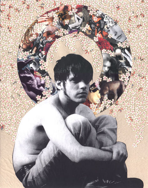
Evan Schwartz tub


I really like it when I come across a subject, any subject, for a second time and it's arrived from another direction altogether.

It was at least a number of months ago that I had read a story (I believe it appeared in the NYTimes, but I can't find it now) about a young student who was raising money in very imaginative ways to pay for gender reassignment surgery.

While visiting Williamsburg galleries this past Sunday I spotted a photograph which bowled me over at the time and which remains etched in my mind tonight. The image was a powerful and very beautiful self-portrait by Evan Schwartz, the young woman whose courageous story had impressed me earlier.

Evan is an artist; I don't remember that part, and maybe it wasn't even a part of the account I had read, but I'm not going to forget it now.

I saw Schwartz's image (it's the one which appears at the top of this post) hanging in the long hall at the Schroeder Romero Gallery and now I know that he will have his own show there in a few months. It opens January 7th. I don't remember ever before recommending, or even mentioning, a show on this blog months before it had been hung, but this is a good time to start.

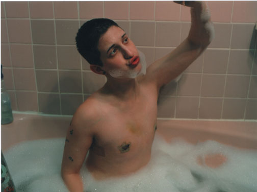
There is more work on Schwartz's own site, including this image, which is from the same series, “Reclaiming Puberty,” as the one above.


postcoital.JPG
Evan Schwartz post-coital


CORRECTION: The published story I referred to above was not in the Times, but rather in Time Out New York magazine. Unfortunately "TONY" still has no online archive; I guess it thinks of itself as just a weekly billboard (or a shopping and entertainment guide minus the coupons).
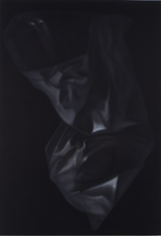
dan rushton10.jpg
Dan Rushton untitled 10 (2004) 40" x 30" gouache on panel


On Sunday, while visiting Dan Rushton's studio for the second time this year, Barry and I had been separately thinking that if we could find room for one of his newest large paintings on our walls we'd find a way to get it there. In the end size didn't seem to matter that much; while it's not the largest piece we saw that day, three days later I still haven't figured out how I'm going to clear space for "untitled 10." But it's now ours.

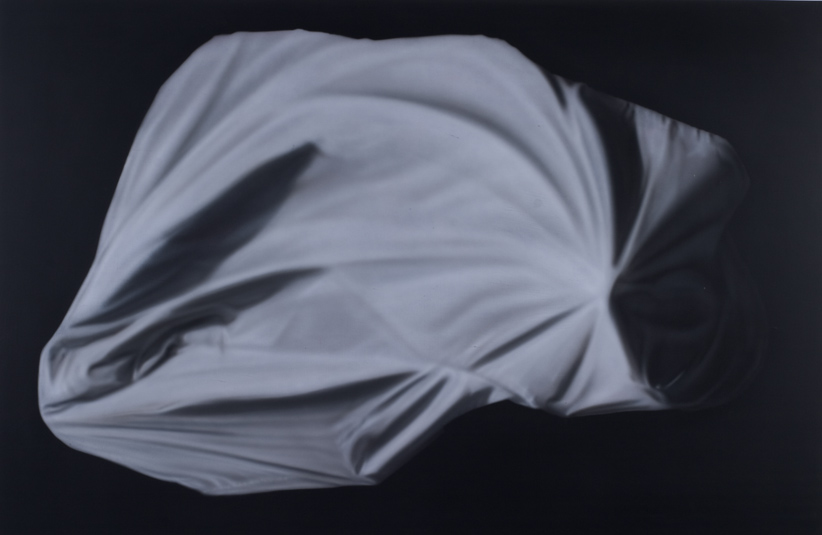
These images in an idiosyncratic marriage of realism and abstraction hardly begin to show what has excited us both about Rushton's work. Only standing in front of the panels themselves can you appreciate the subtle balance of brush and airbrush and the surprising colors which emerge so honestly from the basic monotone of each piece. I also really like the provocative way they tease the eye, drawing the body closer to the surface where the areas which had seemed unfocused because of distance remain unfocused still, and the highlights survive equally uncorrupted.


dan rushton1.jpg
Dan Rushton untitled 1 (2004) 48" x 72" gouache on panel

Whistler--symphony.jpg
James Abbott McNeill Whistler Symphony in Blue and Pink (ca. 1870)


Disclaimer: I'm posting this even though I didn't attend either of the two New York Philharmonic performances reviewed by Justin Davidson in today's Newsday. I should be a natural and enthusiastic patron of an institution which can bring alive an historical musical heritage which means a great deal to me and which continues to inspire exciting composers and performers in our present century. In fact however, for reasons described in Davidson's critique, I've stayed away for a while, and I don't expect to attend any Philharmonic performances this season.

While the orchestra and I have had a history together, the relationship has been suffering for years and now we may not share any future whatsoever.

I'm showing my frustration now because I've just discovered that someone has outdone the sometimes shockingly-outspoken critic from the NYTimes, Anthony Tommasini, in condemning what has become of our hometown orchestra.

Davidson's review of the orchestra's first two concert programs of the season includes phrases like, "doing business like it has always been done," "executing that chestnut," "arid mannerisms" and "a cannonade of defiant conservatism," but he finally just has to let it all out:

These comments have a ritualistic quality, I know, but if critics have been making them for decades, it's because the Philharmonic has consistently refused to embody the innovative, restless and constantly self-inventing spirit of its hometown. This might be a tolerable failing if the artistic leadership made up in traditionalist thrills what it lacks in enterprise. But Maazel is a taxidermist among conductors: In his hands, great pieces become lifelike rather than alive.
Although we know Tommasini has little love for Maazel, the orchestra's conservative programing and the neanderthals on its Board, in his own review of the opening night concert, compared to his Newsday colleague, he sounds almost like a votary, of both Maazel and the players who reportedly adore their music director. Has he finally been called on the carpet by representatives of an establishment he has offended?

Earlier this year the management team of the New York Philharmonic extended Maazel's contract until 2009, possibly sealing the fate of what has become little more that a dusty museum maintained for shrinking numbers of a musical Old Guard and the few members of a new monied class who seek annointment with "Culture" (but nothing not already hallowed, you understand).


Obviously the only relationship between the text of this post and the picture at the top is the painting's title, but it's beauty is also a palliative in this context. Whistler was once on the edge, but while we can still enjoy his art, here even patrons of the Philharmonic have moved on. Why is it so hard when it comes to the pleasures of Euterpe?


[image, in the collection of the Freer Gallery, from Simon Fraser University]

WrightSuzanne.JPG
Suzanne Wright Hoover (Empowerment Series) color pencil and graphite on paper, 6.25' x 7.75'


No, it's not about me. Rather it's the title of an extraordinarily intelligent group show which opened at Monya Rowe two weeks ago. The press release points to the origin of the phrase in a recent drawing by Kevin Christy, who is in this collection, but with other work. Christy had replaced the text of the infamous "HOLLYWOOD" sign in Los Angeles with the words, "I've Met Someone Else."

The imagery begins with sexuality,and how we talk about it, but then the real surprises begin.

The exquisite piece below only begins to describe the incredible world imagined by Larissa Bates and which is represented in two other pieces in the exhibition. This drawing (the word doesn't seem adequate) is now ours, and although it sounds really selfish, I wish we were able to bring them all home. Bates will have a solo show in the gallery later next month.


BatesLarissa.JPG
Larissa Bates Poas Volcano (2004) gouache, gold leaf and acrylic ink on paper, 10.25" x 7"


Scott Treleaven cara frater (2004) paper on board, 14" x 11"


Some artists are comfortable in just about any medium. It looks like Scott Treleaven is working on it.

When we first saw his work it was in the form of an amazing film, "THE SALiVATION ARMY," shown at the 2003 New Festival. Only after we acquired a copy of it and began communicating with him did we learn that some people might have first encountered Treleaven through a series of zines he had produced earlier bearing the same title. We now have copies of the zines, but our connection with the artist hasn't stopped there.

Lately the Toronto-based Treleaven has moved into another medium, creating a number of amazing collages assembled from found images, wrapping paper and his own gouache, crayon and watercolor interventions.

We managed to acquire one of the early pieces from a show at D'Amelio Terras in 2003, and last week we were fortunate to be able to see a preview of his latest work at a reception in Simon Watson's Scenic space, and it's pretty spectacular.

For some of the images shown on Simon's walls, see this gallery. Some of the titles will be less enigmatic for those who know their history. Google.


Treleaven's work will be shown in three galleries outside of New York over the next few months, but I'm certain we will be seeing more of him here very soon.

Kavi Gupta Gallery, Chicago (opens October 29)
Marc Selwyn Fine Arts, Los Angeles (opens November 6)
Conner Contemporary Art, Washington, DC. (opens January 15)

loefkeandreasculpture.JPG
Andrea Loefke, detail of installation, "Little Objects"


We first saw her work at S1 last November and when we wandered into her space at Smack Mellon open studios earlier this year I was pretty certain I'd see her again, soon. Now Andrea Loefke has a one-person show at PH Gallery on 27th Street, and if it's not quite so totally mad as the environment she had created in D.U.M.B.O., she's easily forgiven; after all, a commercial gallery has to think about access and safety issues.

The materials are wonderful, and the constructions are a mix of a perfect minimalism and a very imperfect assemblage of loose debris, everything invested with enough chuckles to support the show's title several times over: "when the green frog changed into a happy prince the nearby well - splish, splash - turned into sweetened lemonade."


LoefkeAndreapaper.JPG
Andrea Loefke untitled drawing (2003) 10" x 14"


wollardzachary.JPG
Zachary Wollard A Historic Evening (2004) oil and acrylic on canvas 48" x 64"


The most remarkable thing about the paintings and drawings of Zachary Wollard now being shown at Massimo Audiello? No, not the fact that the artist is self-taught (ok, his first career was poetry, and there was some school-learning involved, at Columbia), but the fact that the work is so magnificent, and so enchanting.

He's only about 30, this is his first one-man show at the gallery and by the time you read this all of the work may already have been sold. See, poetry does pay.


WOLLARDZACHARY2.JPG
Zachary Wollard Harbor Master (2004) graphite, watercolor, gouache and silver leaf on paper 22.5" x 30"


tezukaosamu.JPG
Osamu Tezuka, cell from "The Princess Knight"


M.Y. Art Prospects has launched a fascinating show, "Fantastic Landscapes from Japan," curated by Taro Chiezo, one of the eight artists in the exhibition. It's a trip, in several senses, and it certainly saves us bundles in travel costs.

In the 21st century the exotic no longer has much of a chance of maintaining its distance from the familiar. I'm not at all suggesting that the M.Y. Art show is difficult to approach, but the aesthetic merit of the work may stand out even more because it lets a European-dominated society share in the power of ancient cultural traditions very different from its own, if also woven into them at the same time. Ultimately this show provides the kind of jolt a visitor should expect in experiencing any good art, regardless of its source - only here maybe with a few more amps.

noonan-1current.gif noonan-3current.gif


John Waters said recently on Studio 360 that he only buys art that annoys him. It shouldn't surprise his audiences to hear that the outrageous creator of "Pink Flamingos" and "Female Trouble" doesn't want to be surrounded by comfortable work.

I only got the account of his NPR interview secondhand, but I think I understand what he means - or at least I can work with it. I don't buy pretty art myself, and I don't buy art which I pretend to understand or with which I'm totally comfortable.

This is all by way of an introduction to the current installation at Foxy Production. I don't mean to say that David Noonan's show actually annoys me, but I admit that even after seeing all kinds of individual pieces on previous occasions I remain more than a bit baffled by what he's doing. At the same time I'm fascinated. What you'll see on West 27th Street is gorgeous work, but I know there's stuff in there of which I am only dimly aware.

Wait, I think I'm talking about all of the gallery's work as much as I'm talking about the paintings in the current exhibition. It's not just the charm of the two principals which brings me back for every show; it's the heady feeling of not only being exposed to something quite new each time but also of encountering something which may never reveal itself entirely - even if it comes home with you. In a very real way, it always does.

Seriously one of the most interesting shows in Chelsea this month.


[images (paintings produced by diluted bleach applied to black saturated canvas) from Foxy Production]

Ahhh. The Underground Railroad has the dope on the wonderful little video I posted one month ago. This is from the director, Matt Lenski:

We're both native New Yorkers - I was born in Manhattan and lived on Eldridge and Houston when I was little - and of course we were all outraged that Republicans were coming here to use the 911 incident and twist it in their favor. They're coming to our home town and we felt like we did when we were sixteen years old and some bully was steppin to you on your block, talking shit. These Republicans are the ultimate punks. I'm a director and Sam Marks is a writer and a playwright so we said let's come up with something.

[thanks to bloggy]

I don't think there's one clinker in the group included in the new show at The Drawing Center (and actually I wouldn't mention it if I thought there was). Although some of the work is immediately seductive, some of it may have to wait a bit for the kind of recognition it's certainly going to find. I'm thinking right now of the powerful, disturbing drawings of Zoë Charlton.

You know it's a good group show when you find yourself wondering about the actual process of assembling a group of (in this case 14) artists you've seen little or nothing of before. I mean, how does it happen? And where have they been up to now?

In any event, the pictures included below offer barely a hint of the deptha nd breadth of the show, and they definitely don't describe all of my pleasure in what I found at tonight's opening. As usual, they are images which happened to come out the best in a few of my modest attempts to record things which attracted or provoked me. I certainly don't always get what I want.

Sometimes it's just the ambient light which won't cooperate, but the work itself can be the obstacle. I really liked the gorgeous assemblies of Jonathan Herder which I had first seen at Pierrogi 2000, but it's impossible to show them with a hand-held subminiature camera. Any reproduction of Nancy Jackson's extravagantly-imagined worlds probably shouldn't be attempted, and Jennie White's exquisite, pierced white paper samplers almost defy the eye even if you're standing in front of them.


tuckernichols.JPG
Tucker Nichols untitled (2004) installation detail


ricardolanzarini.JPG
Ricardo Lanzarini untitled books (2003-2004) installation detail


diazmarfa2.JPG
Alejandro Diaz detail from "works from ongoing series of cardboard signs" (2003-2004) marker on cardboard, dimensions variable


washburnentrance.JPG washburnmass.JPG washburnoppositeentrance.JPG washburnpeak.JPG washburncrowd.JPG washburnedge.JPG washburnend.JPG


LFL was also crowded Friday night, for two openings, work by Simone Shubuck and Phoebe Washburn, but in this case an overflow crowd only intensified the impact of Washburn's enormous and quite magical installation in the front of the gallery's newly-enlarged space.

Two years ago LFL's smaller, original location on 26th Street was the site of Washburn's overwhelming (literally) first appearance with the gallery. Or was it rather that her installation was the site of the gallery for a few weeks?


SimoneShubuck.jpg
Simone Shubuck, vitrine installation view


I'll definitely be coming back for a better look at Shubuck's gorgeous drawings in the inside room. There, because of the size and energy of the very interesting crowd, there wasn't even space to snap a picture, but there are some images of her work on the gallery's site. She and all of us are far better served by the room itself, so you should go if you can, and you'll probably want more than a quick look.

Two wonderful shows.


[image of Shubuck's work from LFL Gallery]

miniSUV.JPG


They're still bringing SUVs into the Chelsea streets lined with art galleries, but Friday night outside the Pipilotti Rist opening at Luhring Augustine we found that some of them are less monstrous than others.

Size definitely matters when it comes to parking on a busy street.


[because of the crowd inside that night we decided to go back another day to see the installation]

Reigakusha.jpg


New Music.

The sounds would have been new to almost everyone on the planet, even, perhaps, to most of the population of Japan, where the music originated - more than two millenia ago. Zankel Hall was the venue last night for a concert, "Reigaku and Gagaku: A Living Tradition," of traditional and modern music composed for ancient Japanese instruments. The ensemble was Reigakusha.

The entire program was spectacular, but in a very restrained, austere mode.

The visual beauties (faces, instruments, costumes, set, movement) were also compelling, and might actually have been enough of an attraction by themselves.

The performers were mostly quite young and there were more women than men. Two of the four composers represented were also very young, and two were women (amazingly, only a small portion of the evening's program was devoted to traditional pieces). If this musical tradition is timeless it's also become very, very new for reasons only partly dependent upon its exoticism.

Unfortunately this concert will not be repeated in New York (they were at the Kennedy Center in D.C. tonight and they'll be at UC Berkeley September 12), but I'll be back in line the day this company (or any similarly-inspired) announces a return engagement. Next time I'll try to give everone I know a heads-up.

Meanwhile, there are CDs (see their site linked above, or check Amazon for sound samples).


[image from Reigakusha, via the Institute of East Asian Studies]

alRadi.jpg
Nuha al-Radi, detail of a work in a 2002 exhibition in Amman


Writing in "Baghdad Diaries," about the first gulf war and its aftermath, the Iraqi artist and writer, Nuha al-Radi lamented:

The birds have taken the worst beating of all. They have sensitive souls, which cannot take all this hideous noise and vibration. All the caged lovebirds have died from the shock of the blasts, while birds in the wild fly upside down and do crazy somersaults. Hundreds, if not thousands, have died in the orchard. Lonely survivors fly about in a distracted fashion.
Ms. Radi died last week in Beirut. The birds, Iraq and the entire world will miss the wry wit of this great soul.

She seems to have belonged to no one party or culture, but rather to all humanity. The NYTimes obituary describes her as "not overtly political." Certainly no friend of Saddam Hussein's regime, at the same time she saw no great virtue in the destruction wrought by his nemesis:

She was somewhat less than enchanted with Iraq's latest overseers for failing to provide basic security and services, however, describing the new tenants of the presidential compound in an interview with The Times last year in her typically caustically droll manner:

"America is in its ivory tower palace," she said, "We are used to having coups and revolutions. But usually people who stage them take over the country
afterward."


[image from 4 Walls]

hearsttower.JPG
completing the Hearst Building


It's probably the most interesting building now going up in New York. That may not be much of a recommendation these days, but seriously, Sir Norman Foster's solution for completing a 75 year-old skyscraper is well worth a detour even as it's still going up.

I've been lucky to be able to visit 7th Avenue and 56-57th Street and watch this column grow all summer.

If you look at the familiar tower of the Empire State Building it rises in a similar fashion, set back from a base the width of a city block, even if in its case the same elegant style is continued throughout its height.

The Hearst Building was never completed after rising only six stories. Today it may finally making up for its deprived youth. Be sure to check out its interesting history on the link above.


  • home

This page is an archive of entries in the Culture category from September 2004.

previous archive: Culture: August 2004

next archiveCulture: October 2004