Culture: February 2007 Archives

Huon_Coralie_floating.gif
Coralie Huon Dunes Océanes 2006 video [still]


Several entries back I wrote something about noticing a "theme of homes and homelessness" during a visit to Yukiko Kawase at DIVA. The idea of home in the broader sense seemed then to be everywhere, but looking back now, I realize I was probably thinking mostly about the installations in the gallery's hotel suite bedroom space.

The French artist Coralie Huon showed a video of computer-generated images describing a utopian project for an elegant futuristic self-sustained floating community. I'm an architecture nut, especially when it comes to homes of any kind, but I wasn't very interested in this part of the room. It probably had nothing to do with it, but for someone who was entertained as a child by the fantasy covers of Popular Mechanics it all felt a bit retro (although thinking about it now, that may have been intentional). Huon probably survives day to day with her work as an interior architect, but even in her professional practice her imagination seems to be a bit more conceptual than is customary for the trade; does anyone expect her floating commune to be built?
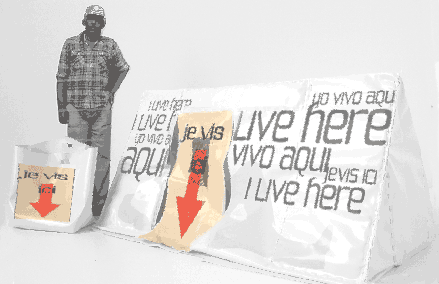

Huon_Coralie_homeless.gif
Coralie Huon Camping Urbain 2005 mixed media


"Camping Urbain", her second installation at DIVA shares a concern for satisfying social needs responsibly and with a fundamental concept of utility but here her design skills were only her tools; the work ends up on an entirely different plane, the product of a more purely artistic imagination.

The more obvious distinction is that here she chose to address the requirements of a very different, and already existing, "lifestyle" than that which would be sheltered by her maritime utopia. As potential design clients, the homeless of Paris and other cities of the world are considerably less hypothetical than the future-sleek residents of her "Dunes Océanes". I don't expect to be in the market for either kind of home in the foreseeable future, but it was the tiny, minimal house kit installation, and the unsettling message of the tape boundaries secured on the carpet, all of which were contained within the walls of a bedroom of this warm, dry and seriously-bourgeois hotel suite that really captured my imagination [unfortunately it was too far dark and crowded to capture an image with my camera].

The visitor can read about this innovative “extreme mobility” house in a press release whose tongue-in-cheek style is not unlike the mock language of marketing also used to "sell" her companion project for a floating community:

It is ingenious, stylish and compact. It can be taken away anywhere thanks to its carry-on bag matching. In a short moment of minutes, it unfolds and folds back again. It is mobile, but at the same time, it is [an approximately 20 sf] “pod” for the homeless, “my house”, and “my own place”.

In her 3 minutes video, she explains on up-beat rock music:

1. Definition of target: For whom?
2. Specifications and operations: How does it work?
3. Message: How does this communicate?
4. Demonstration: How one can live with it?

“Design for the homeless? This apparently non-sense idea would be a starter of discussions on the homeless issue. Here, the “design” can be recognized as a powerful tool. A tool to make this social issue visible, a tool to identify the homeless as a human being with dignity.

It is a multi-dimensional project complete with sound, visual, and a three-dimensional prototype. Audience will be participating and experiencing life condition of the homeless. Make them aware of the uncertainty of the existence.

“Camping Urbain”, playful and disturbing: not so fun, but not to be dramatized either.

Ms. Kawase, the gallery owner, told us that the artist had been surprised (amused, dismayed?) to find that visitors to the gallery's exhibition in New York showed little interest in "Camping Urbain" but were much taken by "Dunes Océanes". This was reportedly the opposite of her experience in Paris, where people are apparently truly disturbed by the increasing visibility of the homeless on the streets.

And why am I so interested in this anecdote? I doubt it's because I believe that Parisians are fundamentally more compassionate (empathetic?) than New Yorkers, and I don't think I want to believe they are. Or, if I do want to believe we're lacking something here, is it because I want to do something to help in a city where I think I could, or because I want to complain in a city where I think I have a right to complain?

Repeating the question of construction probability, does anyone expect her pods will be built, or will we come up with a better, more practical, an achieveable "utopian" solution for bringing the homeless home?


[images from Yukiko Kawase]
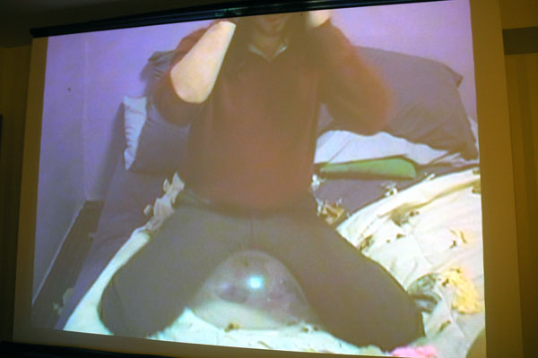
Laracuente_Andres_Dr_Popper.jpg

Laracuente_Andres_2.jpg
Andres Laracuente Dr. Popper 2006 video [video stills from installation]


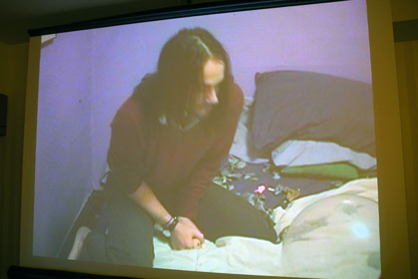
Andres Laracuente was another young American shown by the Parisian gallery Yukiko Kawase during last week's DIVA fair. In the voyeuristic video from which the two stills shown above were taken the good-humored and obliging artist is seen following the directives of an off-screen balloon-popping fetishist he had located on Craig's List.

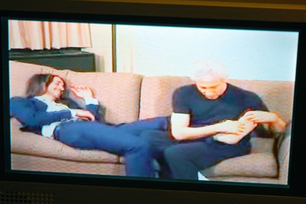
In another video of his seen on Sunday afternoon, "The In-crowd Tickle", a tickling-fetish top is seen interacting with the artist, this time in front of the camera.


Laracuente_Andres_Tickle.jpg
Andres Laracuente The In-Crowd Tickle 2006 video [video still from installation]

Lutz-Kinoy_If_I_die.jpg
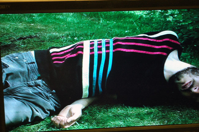
Matthew Lutz-Kinoy When I die this summer, what shirt will I be wearing? 2006 video [large detail of still from installation]


Lutz-Kinoy_Studio_Danse.jpg
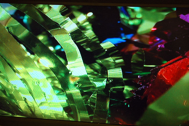
Matthew Lutz-Kinoy Studio Danse 2006 video [large detail of still from video installation]


After following myself being very much taken with work by a third and then a fourth artist represented in her DIVA suite, and while contemplating a rather pervasive gallery theme of homes and homelessness, I told Yukiko Kawase that were I living in Paris I'd want to live inside her Montparnasse gallery; her program is that good.

But once again, even more than the other inspired, largely performance-oriented work she was showing on Sunday, it was the extraordinary unbridled creativity of Matthew Lutz-Kinoy that totally did it for me.

In the video "When I die this summer, what shirt will I be wearing?" [still shown above] Lutz-Kinoy repeatedly fakes his death by lying motionless on the grass in a series of dramatic postures while clothed in an equal number of snappy tops.

"Studio Danse", takes advantage of the video camera's technical facility with movement. In this piece, according to the press release, "he explores how people are influenced by sound and colour, in the manner of subliminal messaging".

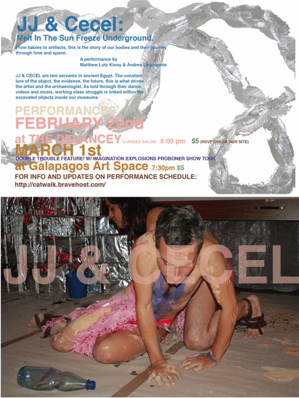
At 7:30 tomorrow night (Thursday) Lutz-Kinoy will be performing together with his charming, adventurous and inspired gallery stablemate, Andres Laracuente, in "JJ & Cecel: Melt In The Sun Freeze Underground" at Galapagos Art Space, in a double bill with with Imagination ExplosionÂ’s "PRO BONER SHOW TOUR". Lutz-Kinoy and Laracuente play Egyptian slaves and will be using large sculpture, video and live music to address issues of mental and physical enslavement - and dreams and magic too - all told through references to contemporary popular culture.

For more on Laracuente, see this entry.


JJCECELEMAIL2007.gif


[poster image at the bottom from JJ & Cecel]

Monovich_Edward_Pooh.jpg
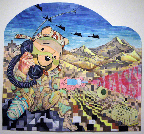
Edward Monovich Ampoohtee 2003 mixed media on paper 22" x 20.5" [installation view]

Monovich_Edward_Satellite_F.jpg
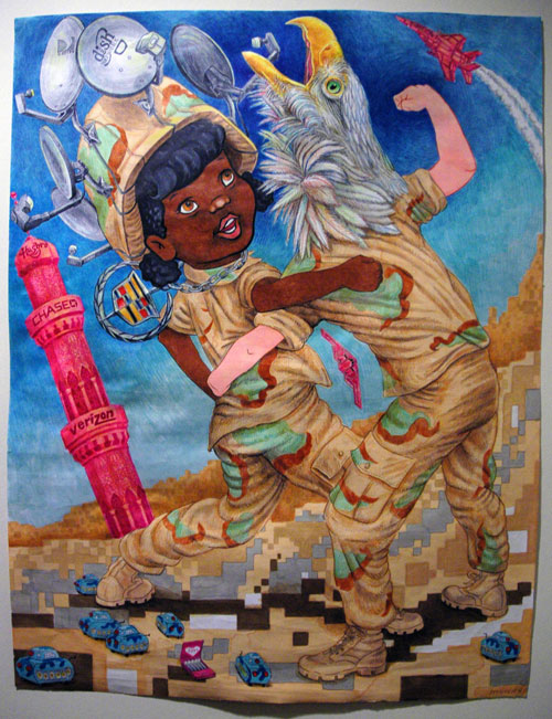
Edward Monovich Satellite Fist 2006 mixed media on paper 17" x 22" [installation view]


That other increasingly-legendary New York homeless institution, Eyewash, displayed about a half dozen examples of Edward Monovich's beautiful mixed media drawings on graph paper at the Red Dot fair this past week.

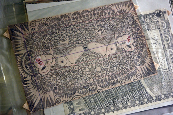
Monovich's work turns the hoary tradition of great battle art on its head: Here no prince has commissioned the work, and these compact paper murals depict not the glory and the spoils but the shame and the costs of war, specifically our very latest one.

Maybe it's just my perversity, but I had initially been so attracted to the delicate beauty and imagination of the drawing that it hadn't even occurred to me that they were "political". They were clearly art, and if there are narratives here, the narratives are clearly not false. Can they still be stamped as political, and to that extent simply unmarketable?

[as I was searching Google just looking for links, I was surprised to be reminded of this from almost three years ago]

Knoll_Philip_My_Favorite_Bible.jpg
Philip Knoll My Favorite Bible Story 2006 acrylic and graphite on gesso panel 20" x 10"


Knoll_Philip_Skinny_legs.jpg
Philip Knoll Skinny Legs and All [large detail of installation]


Morgan Lehman
was showing some eccentric, beautifully-crafted drawings by Philip Knoll in their room at Red Dot. Knoll will have a solo show at the gallery's New York location opening in late April.

[first image from Morgan Lehman]

Liebowitz_Roz_framed.jpg
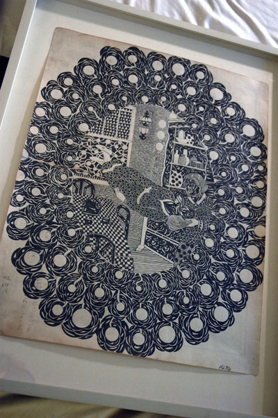
Roz Liebowitz The Night Kitchen 2006 graphite on vintage paper 18" x 13.75" (23" x 17.5" framed) [large detail of installation]


Leibowitz_Roz_stack.jpg
Roz Liebowitz The Mask 2001 graphite on paper 12" x 7" [installation view]


I ended up at Red Dot today after almost a full week of art fairs, and at least two special group shows. I ended up only missing out on L.A. Art, and I'm sorry for that. We just ran out of time, even if it was the exhibition located closest to our apartment. To see what I missed I turned to the intrepid Art Fag City.


Red Dot may not be alone among the fairs in the enormous range between its highs and its lows, but I think that if I can still get excited about new work after the sensory immersion of the past week it must say something for the artist. I don't report on bad art, so in this and I hope in a few other entries I will try to show something of the best things I saw this afternoon on 28th Street.

Sears-Peyton was showing a number of delicate pencil drawings by Roz Leibowitz. They are romantic, hermetic, symbolist, sometimes pseudo-scientific, but always profoundly weird, their imagery sliding somewhere between the natural and the paranormal, but each of them as delicate as fine lace but as indelible as a tatoo.

Once spotted, whether lying on top of a hotel bedstread or hanging on a wall, these drawings are almost impossible to ignore.

The artist's statement on the gallery website:

My work is influenced by the Victorian Romantic sensibility, and the idea of Victorian womanhood as expressed in the pseudo-sciences of that period. Phrenology, spiritualism, utopianism, mental healing, mesmerism, table-rapping, all of these flourished during the nineteenth century at a time when the industrial/scientific philosophy became the dominate world view. The fact that these so-called fringe movements were led by women is not lost on me; the women in my drawings act as conduits to this shadow world. I consider them characters playing out their roles in an alternative reality, a reality which is still available to all of us if we open our imaginations in the truest romantic sense.

My background is in history and literature; I worked for years as a librarian and am an avid collector of books and ephemera from the nineteenth century occult. Most of the paper in my drawings comes from ledgers or letters or diaries culled from my collections. I feel much more at home working on papers that contain traces of the past. In this current series, I use the simplest of media �a pencil� to create veils of intricate patterns and decoration. I also make use of simple formal devices such as borders and captions to mimic Victorian illustration. I consider my small drawings as pages loosed from a long, dreamy novel, and my hope is that the reader, or viewer, will catch glimpses of this odd narrative, and want to read on.

Hartung_Tommy_Canon.jpg
Tommy Hartung A Short History of the Canon video [still from installation]


Thinkers, breeders and slaves were assembled on 24th Street this past week inside one of the video projection containers set up by the Digital & Video Art Fair [DIVA], one of our favorite destinations since its first appearance in 2005. The fair itself has always been located further downtown, inside the Embassy Suites Hotel, just west of the World Trade Center.

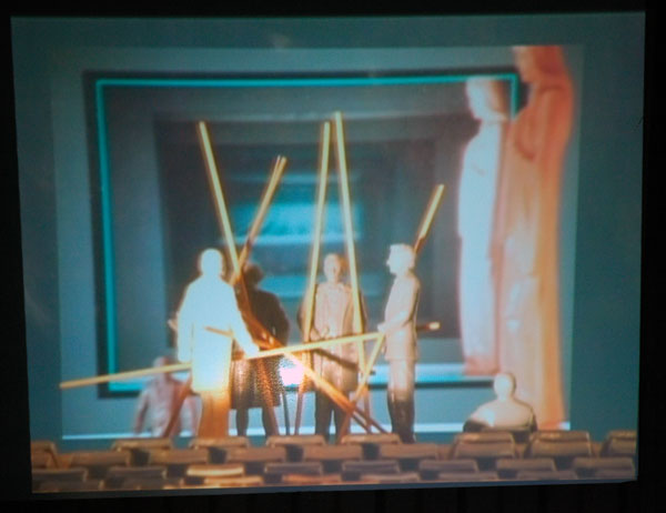
The class cast described above inhabits a video by Tommy Hartung who builds small sets from the detritus of a world either on the make or disintegrating as we breathe. His stunning and provocative six-minute work, "A Short History of the Canon", is a tour de force. The artist has recently been associated with an increasingly-impressive gallery Moti Hasson, and was represented by both a video and a large sculpture in the exciting show (just ended) which inaugurated the gallery's new space on 25th Street. That exhibition was curated by co-directors Candice Madey and Tairone Bastien.

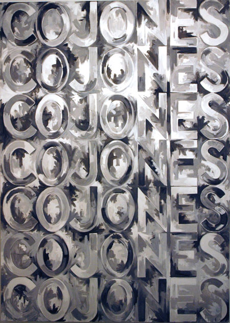
Kass_Deb_Cojones.jpg
Deborah Kass Painting with Balls 2003 oil on linen 84" x 60"


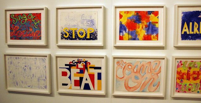
Paul Kasmin is devoting all of their space at the Armory Show to work by Deborah Kass.

See this post for more context.


Kass_Deborah_paper.jpg
[some smaller works on paper, in an installation view]

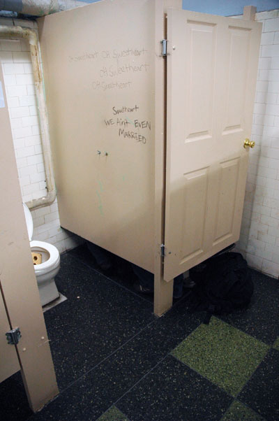
Townsend_Jade_stall.jpg
(one very popular stall)

Townsend_Jade_detail.jpg
[detail]

Townsend_Jade_detail_2.jpg
[detail]


Jade Towsend, who shows with Priska Juschka, has a wonderful installation (with sound) in the huge basement men's room of the 69th [sic] Regiment Armory, the site of the Pulse Fair. It's a winner, one of the best things I've seen this week, and worth a major detour regardless of which gender facility you tend to choose.

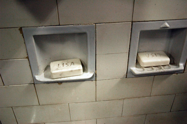
Guys being guys, most regular visitors just wanted to ignore that gold brick and the enthusiasts packed into the corner stall. Also, the carved bar soaps above the sinks were definitely getting some use.


Townsend_Jade_soaps.jpg
(props too subtle for some)


ADDENDUM: Barry recorded the sound on a short video. Go to "click to play" at the bottom of his post.

Lanigan_Schnidt_Thomas_plcm.jpg
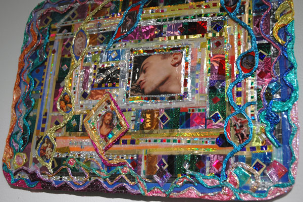
placemat-size collage by Thomas Lanigan-Schmidt


Gardiner_Ginnie.jpg

Gardiner_Ginnie_2.jpg
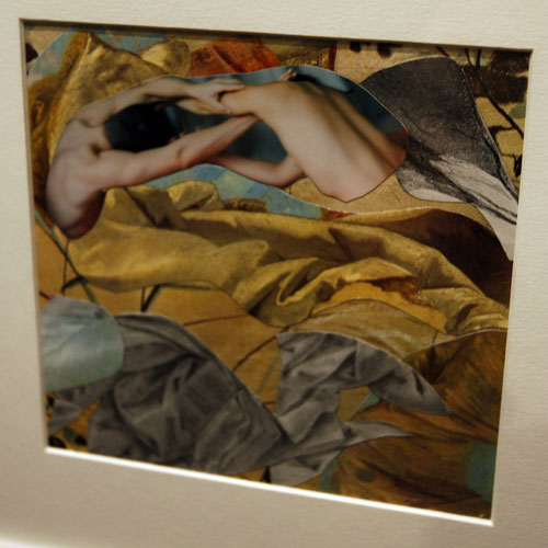
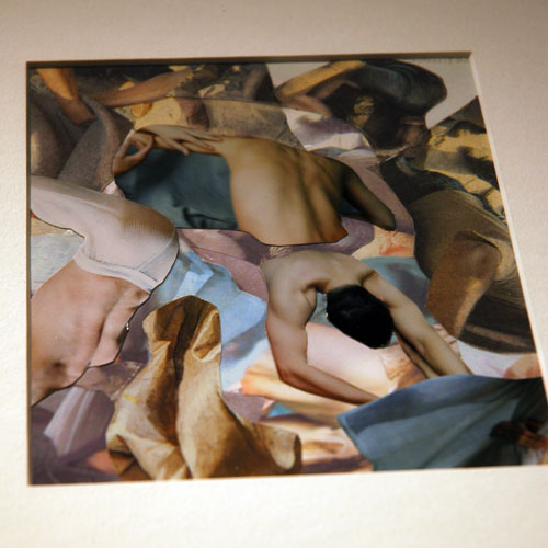
two small photo collages by Ginnie Gardiner


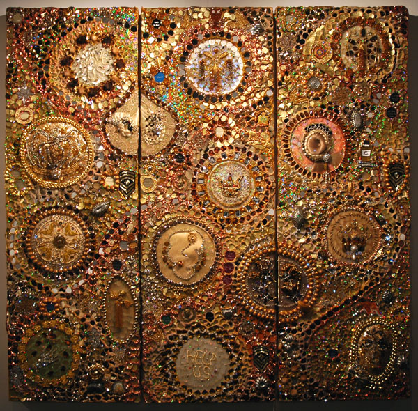
Thomas Lanigan-Schmidt and Ginnie Gardiner are two other artists whose work can be seen in the Pulse fair both of Pavel Zoubok.

I first met Gardiner twenty years ago through a mutual friend, John Blee, an excellent painter, as are both she and her husband, Jonathan Philips. John now lives in D.C. and some of us lost touch with each other over the years. Until I started doing this entry and did some Google searching I had no idea that yesterday I had been looking at work by this same artist, working in a very different medium. All three of them continue to paint, as far as I know.

[I'm not sure if or when I'll be able to do a general post on this week's art fairs, separately or together, so between our continuing visits to these vast spaces I've decided to squeeze in some short entries showing some of the images I've gathered already]


Tanner_Chris_For_Father.jpg
Chris Tanner For My Father 2007 mixed-media on wood 60" x 60" [installation view]

Tanner_Chris_For_Father_det.jpg
[detail]


Pavel Zoubok showed some terrific work by Chris Tanner and other gallery artists in a shiny, sparkling booth which had the presence of a quite wonderful curated show itself.

Williams_Michael_MrMcCook.jpg
Michael Williams At Mr. McCook's 2006 oil on canvas 24" x 36" [installation view]


I think we surprised ourselves today by actually buying something we'd seen in the oh-so-fabled Armory Show. It doesn't mean we had money to burn, but it does mean we decided we couldn't live without parting with cash we would only end up spending on something much less satisfying.

It may sound weird, but when we told ourselves we wanted this piece we knew almost nothing about the artist except that he seemed to have the confidence (the imprimatur?) of a gallery we really think a lot of. When we saw this work at CANADA yesterday we were both strictly in blogger mode, having been given access to the press and VIP preview as members of, yes, the press. Neither of us was thinking in terms of acquisitions and we had no idea what it might cost. We'd also slowed our buying activity almost to a halt, for a number of reasons, but last night I just couldn't get this one painting out of my head and today I called the gallery to see if we could afford to adopt "At Mr. McCook's". All I will say is that for a while we're going to have to eat at home more often, now joined by Mr. McCook, and that's fine with us.

Barry and I have gained the joy of living with a wonderful painting, and one of our favorite galleries and one of their newest artist friends gets some help with the rent, and not incidentally a bit of the means for giving others joy.

Hodges_Jim_What%27s_Left.jpg
Jim Hodges what's left 1992 white brass chain with clothing, dimensions variable [large detail of installation]


The Art Show of the Art Dealers's of America Association [ADAA] hosted a press reception early this afternoon in the Park Avenue Armory. I hadn't personally expected it to be the most exciting of the eight or more shows being held in Manhattan this week, if only because its concentration was definitely not on emerging art, but as it turned out, I was pretty impressed with the quality of the (mostly twentieth-century American) work displayed. Although it was all available for purchase by enthusiasts with deep pockets, for us lesser mortals it was like a good trip to a good museum, or perhaps 70 museums. I didn't even mind that because it's a collection of separate (and disparate) individual shops there isn't a hint of the kind of organization which would be expected in a museum or even a regular gallery show. This "armory show" has more than a little bit of the charm of a very good flea market, and I mean that in a good way.

Most of the exhibitors looked like they were just showing off their stuff rather than their curatorial restraint, but a few should be congratuated for presenting a concept rather than a catalog, and some should be praised for refusing to hold back on more edgy work just because of the spiffy profile of the event.

CRG Gallery gets laurels for its intelligence and courage on both scores. The Chelsea gallery showed only one artist, Jim Hodges, and a very limited number of his works, and each of them related to a form of vigorous, transgressive sexuality which is still able to frighten the horses.

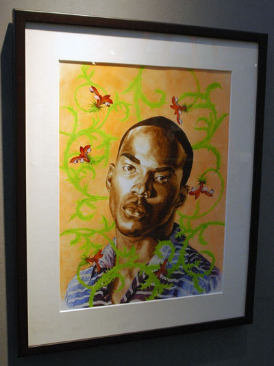
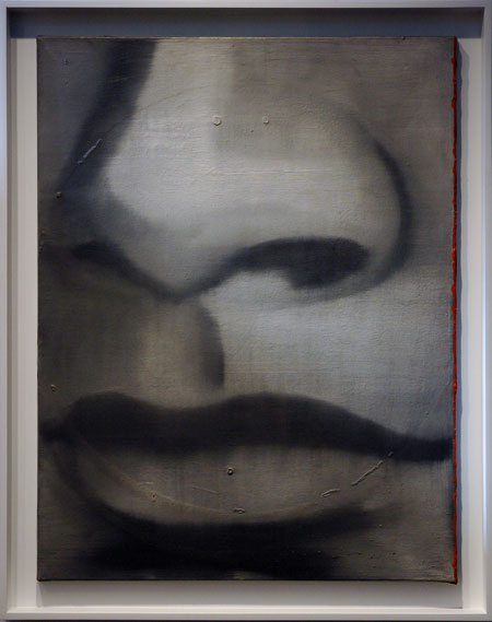
Of the other booths, some of my favorites, in a quick run-through and in no particular order, were those of Knoedler & Company (New York), Rhona Hoffman Gallery (Chicago), Peter Freeman (New York), Matthew Marks (New York), Adler & Conkright Fine Art (New York), Brooke Alexander (New York), Barbara Krakow (Boston), and Andrea Rosen Gallery (New York).


Wiley_Kehinde_Keyon_2.jpg
Kehinde Wiley Keyon II (study) 2002 oil wash on paper 30" x 23" paper size [installation view] {Rhona Hoffman}


Richter_Gerhard_Nase.jpg
Gerhard Richter Nase [Nose] 1962 oil on canvas 30.75" x 23.5" {Peter Freeman}

Kelly_Elsworth_Orange_Curve.jpg
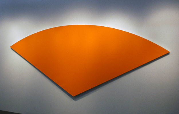
Ellsworth Kelly Orange Curve I 1982 64" x 150" [installation view] {Matthew Marks}


Holtzer_Jenny_It_Takes.jpg
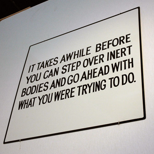
Jenny Holzer FROM THE LIVING SERIES: IT TAKES AWHILE 1981-1982 enamel on metal 21" x 23" [installation view] {Barbara Krakow}


Raphael_Joseph_Town_Crier.jpg
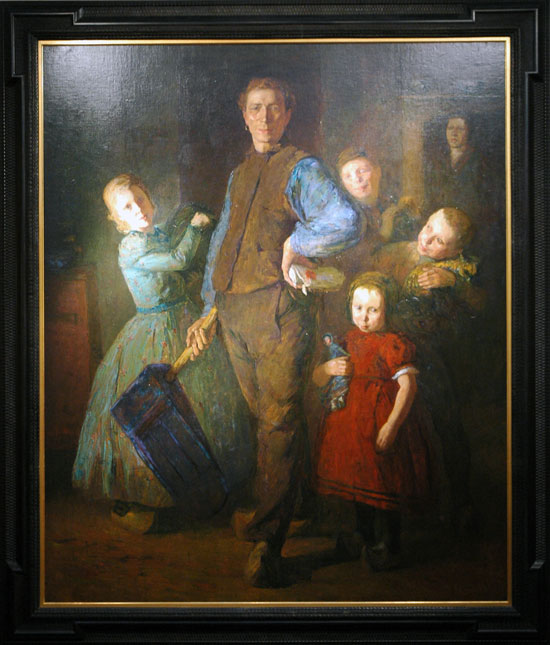
Joseph Raphael The Town Crier and his Family 1905 78" x 66" {Montgomery Gallery (San Francisco)}

Raphael_Joseph_Crier_detail.jpg
[detail]


See Bloggy for more.

Enright_Brock_mess.jpg
[I dunno either]

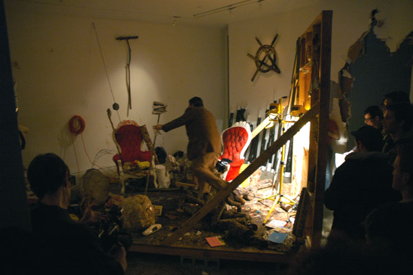
But I'll look into it, and I definitely want to do more on this later. For now I just want to get up this picture preview of Brock Enright's new show. It opened to a huge crowd at Perry Rubenstein tonight.

Oh yeah, this has to be a clue:

Enright_Brock_Anarchy.jpg

Koppel_Jonah_Guernsey.jpg
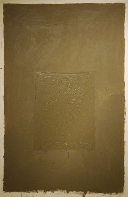
Jonah Koppel Guernsey 2007 synthetic polymer on canvas 61" x 40"


Koppel_Jonah_East_2.jpg
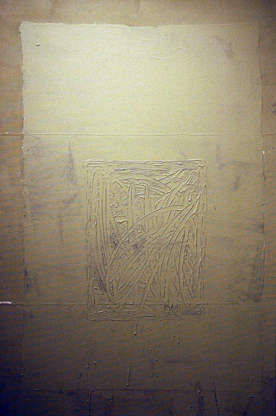
Jonah Koppel East 2007 synthetic polymer on canvas 48" x 32"

Kplleo_Jonah_East_detail2.jpg
[detail]


These paintings appear as magnificent, breathing monoliths inside the modest white box on Union Avenue. Jonah Koppel's four canvases hang, with their molded, elegant cartouches one alone on each wall of the Klaus von Nichtsagend's exhibition space, and they absolutely will not leave the viewer alone. A look at the description of his working method* is a part of the experience of the art, but the finished work commands respect without any knowledge of Koppel's process.

Caveat: The subtleties of these paintings' textures and color, and the difficulty of recording anything in a mixture of the gallery's natural twilight and electric lighting may have frustrated my attempt to do justice to the subtle tones of these two works.

Disclosure: I am very fond of a crisp Josef Albers silkscreen print (from the "Homage to the Square" series) we've had on our wall for fifteen years; it includes something very similar to these same four tones. I like it even more than that artist's paintings, so I may be predisposed to favor Koppel's chosen colors. But the Albers print has no texture whatsoever, and that is a very different thing.


*
From the press release:

"In my process of abstract painting there are ultimately two approaches that I believe impact my work the most significantly. One is to stretch canvas and begin to paint. The other is to pin the canvas to the wall, paint and then stretch the painting."

Using these two approaches, Koppel allows his process to play a prominant role. If the surface is stretched, he determines that the painting will exist only on the front of the canvas, a process that inclines him to end the painting before he reaches the extremities of the canvas. If the painting begins on an unstretched surface it will potentially transform with unpredictable consequences when it is ultimately put on stretchers.

In the center of each painting exists a finger-painted square. This forms the abstracted image element of the otherwise methodologically driven painting. The finger marks represent a gesture that records the physical movement of the artist's finger through wet paint, yet it lacks composition and is inevitably monochromatic. It thus forces the "image" to be discerned only by its surface, which might be understood to be the crux of Koppel's inquiry.

Saffer_Stefan_Brazil_2.jpg
Stefan Saffer Brazil 2007 gouache on cut and folded paper 60" x 32" [installation view]


Saffer_Stefan_Tilt.jpg
Stefan Saffer Tilt 2007 gouache on cut and folded paper 12" x 13" [installation view]


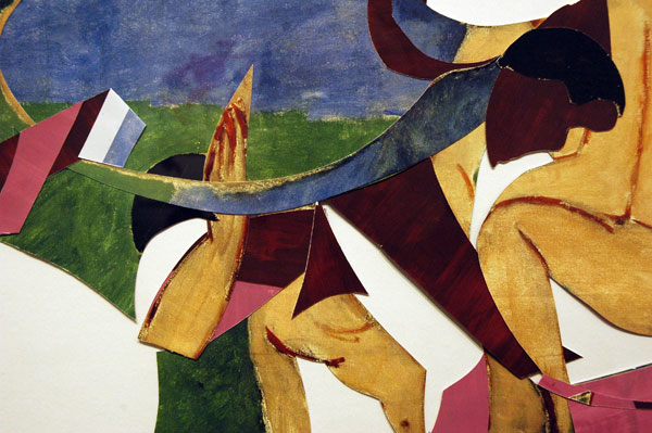
Stefan Saffer has a solo exhibition at Pavel Zoubok displaying compositions which continue to develop with the beauty and intelligence of the forms we first encountered in his work on paper three years ago.

Each of these newest works began as a sheet of paper which has been painted on both sides. They were then cut, but not into completely separate pieces, and the cut-out shapes have been folded into themselves and sparingly glued so they might remain relatively flat. Although their assembly is not likely to be undone in practice, theoretically (and in the head of a visitor inclined to do so) each composition could be unfolded and returned to its original square or rectangular plane.

But the original plain white paper now flashes a rich color, a subtle third dimension and any number of dramatic internal spaces, none of which were there before. There is also inside each of these pieces much of the history of twentieth-century art. The hand and the eye of this twenty-first-century artist is there as well, but equally important, Saffer insists, is the creative collaboration of the observer.

Three of the pieces in the show have been constructed of "found" museum or gallery exhibition posters, provoking still another dialog, one engaged between his own art and the icons marketed in these vintage images. Interestingly, these are the only works shown framed and behind plexiglas.


Saffer_Stefan_Matisse_detai.jpg
Stefan Saffer Matisse 2007 gouache on cut and folded poster 23" x 32" [detail of installation]

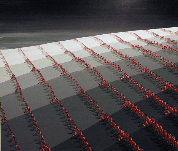
Davis_Ian_marchers.jpg
Ian Davis Strategy 2006 acrylica on canvas 60.25" x 70.25"

Davis_Ian_marchersdetail.jpg
[detail]


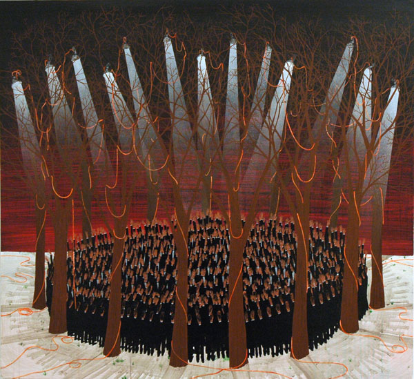
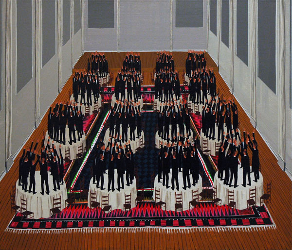
Ian Davis must definitely be enjoying his first one-person show at Leslie Tonkonow this month. I know I did, even if a visit to this intense exhibition of oddly faux-naive painting reveals work as extraordinarily beautiful in its mantric minimalism as it is disturbingly chilling for its "uniform" intensity. But for Davis, the thing is, he's already sold every painting there, in a show which still has three more weeks to run. It's a brilliant debut.


Davis_Ian_Contract.jpg
Ian Davis Contract 2006 acrylic and spray paint on linen 46" x 50"


Davis_Ian_banquet.jpg
Ian Davis Banquet 2006 acrylic on linen 36" x 42"

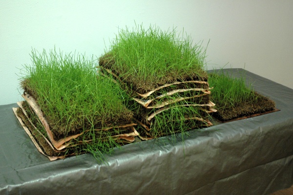
Kuri_Gabriel_Diario_Eco.jpg
Gabriel Kuri Diário Econômico 2004/2007 newspaper, sod, tarp, dimensions variable [large detail of installation]


Tuerlinckx_Joelle_Ca_la.jpg
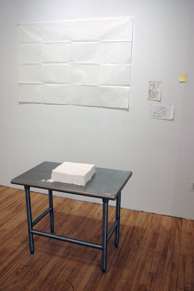
Joëlle Tuerlinckx Ça là (That's There) 2003 flour, drawings, dimensions variable [installation view]


In spite of any suspicions which might be aroused by the name of the show (the full title is "Let Everything Be Temporary, or When is the Exhibition?"), there is a lot going on in this apexart installation, curated by Elena Filipovic. There is also much to actually "see".

Like all gallery shows it will eventually close (in this case at the end of the week), but unlike most, this show is designed to fundmentally challenge the idea of permanence even when applied to individual works of art. While the conceit is certainly no longer a revelation, this beautiful group show of fairly-recent "pieces" (of which the oldest is dated 1991, although the artist specified that its physical form be continually renewed) bears new, simple and excellent witness to both the humor and the power of the idea of unstable art, expressed here in almost every medium, including two consisting of none at all.

An excerpt from the exhibition catalog describing the piece by Joëlle Tuerlinckx shown above gives one example of the precarious state of every one of the works represented in the show.

Ça là [That there] (1994) shuffles between original and copy, form and formless. As a perfect, rectangular cube of ordinary baker's flour, it sits monument-like on a table at the start of the exhibition. Held together by nothing except the invisible tension that allows the flour’s temporary and improbable replication of the mold that it was once in, Ça là could at any moment give way to being a collapsed heap of the minute and disparate particles of flour that compose it. A sketch of the model on which the piece was based hangs nearby, suggesting the necessary gap between the “original” and the three-dimensional form that it never manages to equal or permanently reproduce.
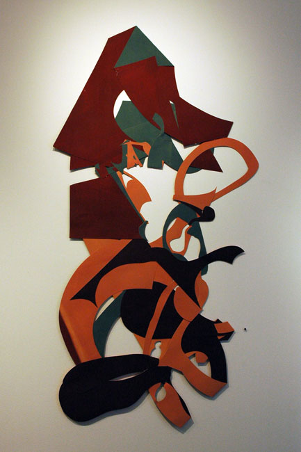
The work of Gabriel Kuri arises form a very different impulse, and is more closely tied to the very gradual passage of time. The catalog provides few clues about the piece shown above, which by the way is installed on the top of a very conventional institutional folding table:

Waiting, that banal quotidian act that perhaps better than any other reminds one of the inexorable passage of time, is a recurrent motif in Gabriel KuriÂ’swork. Tied to it is a complex relationship between leisure and production, expenditure and speculation, which finds expression in the prosaic items that populate KuriÂ’s oeuvre: cash register receipts, waiting stubs, daily newspapers, disposable shopping bags, and fruit labels, to name but a few.

Henderson_Douglas_spkrswater.jpg
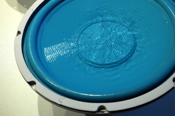
Douglas Henderson Untitled 2006 loudspeakers, wood, water, low frequency sound wave (CD, CD player, amplifier) 60" x 18" x 36" [detail of installation]

Dahlhausen_Graeve_Dialog.jpg
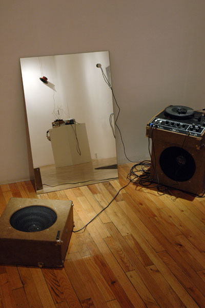
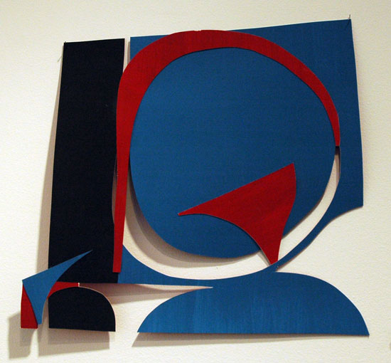
Christoph Dahlhausen and Michael Graeve Dialog 1.2.2 2007 mirror, contact microphone, record player, amplifier, loudspeaker, cables, dimensions variable [large detail of installation, the mirror reflecting details of works by Matthew Burtner and Stephen Vitiello]


Repetto_Irving_Douglas_puff.jpg
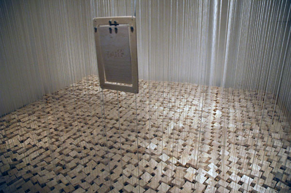
Douglas Irving Repetto puff bang reverb 2005 site specific installation: wood, string, motoers, wire, electronics, dimensions variable [large detail of installation]


Tribeca's Gigantic ArtSpace [GAS] is shutting down after three very interesting years. Whether just coincidental or with some deliberate, sad irony, the concept and title of the last show in this adventurous, not-so-gigantic gallery is "[Silence]". Anyone more than casually interested in the more radical but subtle visual and aural forms music can assume should make the pilgrimage to Franklin Street before February 24.

From the press release:

Gigantic ArtSpace [GAS] and free103point9 present [silence], an exhibition focused on artists' uses of and responses to silence - as manifested in sculpture, in installation, in composition, in works on paper, and in time-based practices. The works on view address the futility of the chase, the beauty of absence, and the rich potential of an empty signal. Works from: Matthew Burtner, Jeroen Diepenmaat, Michael Graeve & Christoph Dahlhausen, Pablo Helguera, < strong> Douglas Henderson, Pierre Huyghe, Tarikh Korula & Tianna Kennedy, David La Spina, LoVid, Juan Matos Capote, Lee Ranaldo, Douglas Repetto, Michelle Rosenberg, Stephen Vitiello, and James Woodfill. Curated by Dylan J. Gauthier and Galen Joseph-Hunter.

LyonNoah1.jpg

LyonNoah2.jpg

LyonNoah3a.jpg

Lyon_Noah_4.jpg

Lyons_Noah_5.jpg


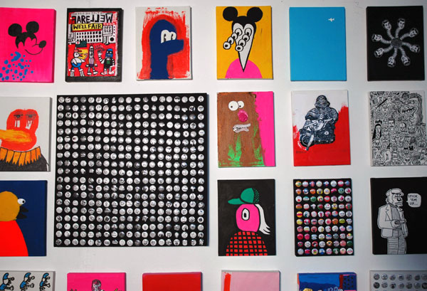
Noah Lyon's art (Retard Riot) has always been surprising, and that's no easy feat after more than a hundred years of modernism doing cartwheels and somersaults for our attention. Lyon has always worked differently from anyone else around, and the results were never predictable even within his own process. His art has also always been very much of the artist's own world, that is, very much alive and screaming inside the larger, dry and dysfunctional authoritarian husk which encloses all of our worlds; it remains what people who maintain they can compartmentalize their experience call "political", or "too political".

Lyon's latest work retains all of this good stuff, but two interesting new elements have been added: First, although he has begun to execute some very handsome prints after years of producing drawings and paintings, much of the recent, non-editioned work seems impatient with its confinement to only two dimensions (even examples from his continuing and almost ubiquitous button series are now often combined by Lyon as sculptures). Secondly, the art looks more beautiful than ever, even independent of the impact of what seems to be a keener interest in color and a more sophisticated treatment of it. Happily these development have only increased the volume of the raw intensity found in earlier work.

Barry and I paid a visit to Lyon's studio very recently and the images uploaded here suggest only a small section of two inside walls of his "workshop". They also fail to include anything from the box inside the box, a sort of magical, very densely-hung, animated "bear cave" the artist had constructed on an inside corner of his loft. I have no idea why I passed up the chance to record images of that space, but fortunately Slava did not.

For more information, and more images, go to "artists" on the site of Lyon's Stockholm gallery, Brändström & Stene.

Tinari-Leah_foot.jpg
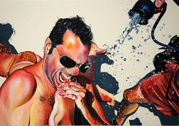
Leah Tinari Enjoying the Hose Down 2006 acrylic on canvas 48" x 68"


Tinari-Leah_cubes.jpg
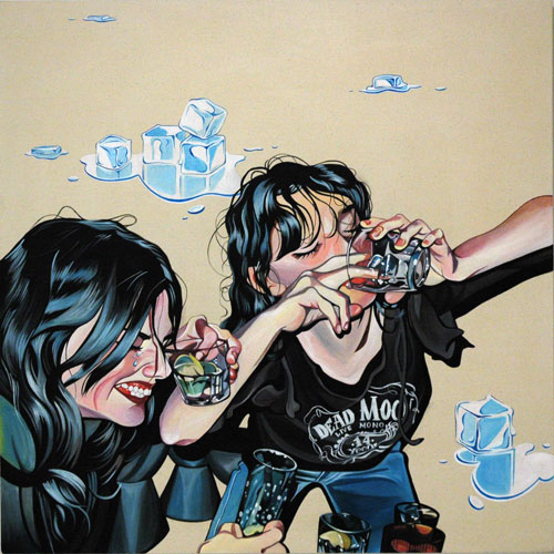
Leah Tinari Chug-a-Lug 2006 acrylic on canvas 40" x 40"


Tinari-Leahpinch.jpg
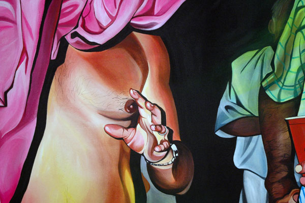
Leah Tinari Disappearing Act 2006 acrylic on canvas 48" x 68" [detail]


That's just hot.

Leah Tinari's show at Mixed Greens, "We Could Definitely Run for the Presidency", closes on Saturday, and that's a shame, because West 26th Street just won't be the same when it's gone. "Enjoying the Hose Down" is currently the hottest piece of art on the block, and it's visible outside the gallery or even from across the street. In fact the fresh crisp lines and shapes of Tinari's cartoon-like paintings, their backgrounds variously washed in white or black light, read as well from fifty feet as from fifty inches.

The most common subject of what I have to describe as her increasingly-mature work is the artist's own family and friends, gathered together mostly in lusty parties. Captured originally in snapshots, their merriment is transformed by an unlikely combination of paint strokes both lush and neat into hugely-seductive acrylic cartoons more colorful and alive than the work of either a camera or any ordinary brush.

This old dude is thinking he wants to be in there with the rest of the party, even if he's actually looking into the hysterical eye of a bridal shower or the beery scrum of a group of maturing frat-boys. Or maybe because.

Piedilato2.jpg
Andrew Piedilato Untitled 2006 oil on canvas 83" x 78" [installation view]


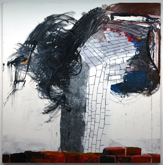
Sometimes in a group show there will be one piece that just jumps out at you. This is sometimes a totally subjective experience of a balanced show; on a return visit the work and the installation might look very different, but with 300+ galleries in Chelsea alone these days, the likeihood of a return may be only fantasy.

"The Sheltering Sky", the current show in Black and White's large 28th Street space, houses Andrew Piedilato's stunning, untitled 45-square-foot canvas. This very physical, semi-abstract painting is as beautiful as it is enigmatic. The semblance of an Escher-like brick wall/road suggests that while Piedilato might never let you into the space toward which it seems to be moving, he's also not going to leave you standing where you started out.

The work is part of a show of emerging artists whose title was borrowed from the novel by Paul Bowles.

Lorch-MillerWatchOut.jpg
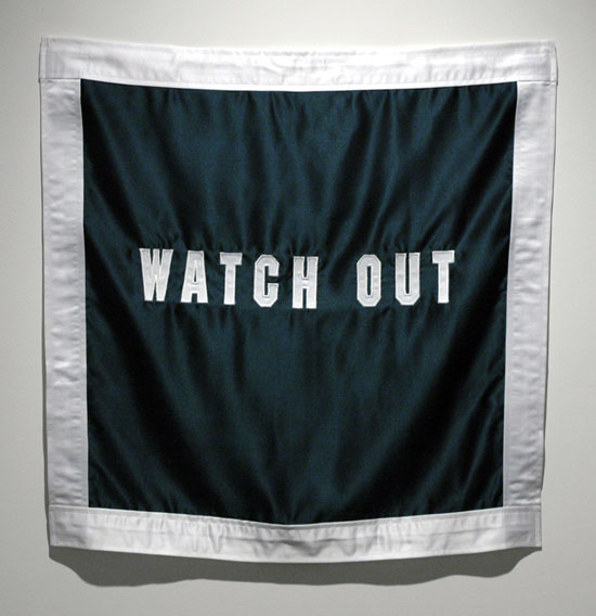
Ruben Lorch-Miller Watch Out 2006 satin and thread 30" x 30" [installation view]


As usual I'm way too far behind on posting everything I want to. I'm not about to stop seeing new stuff, so although it will still be only a futile gesture toward addressing the logjam I may for a while just blog images, accompanying them with very few words.

Schroeder Romero has a multi-media installation of work by Ruben Lorch-Miller, "Just the Other Side of Nowhere". The title may be the easiest part of this disturbing show, which should be apprehended as a whole (the artist's notes speak of basic themes of power, language and representation), but some of the individual images are stunning.

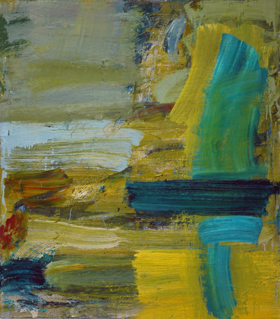
FishmanLouise1_22_07.jpg


Barry and I stopped by Cheim & Read recently with some firends, specifically in order to show them some of the latest work by our friend and neighbor Louise Fishman. We were joined there by the artist herself, and I had such a good time that I neglected to take notes on this painting. I can't provide the title or its measurements. While not the size of her largest canvases, I would say it's "life size" in every dimension.

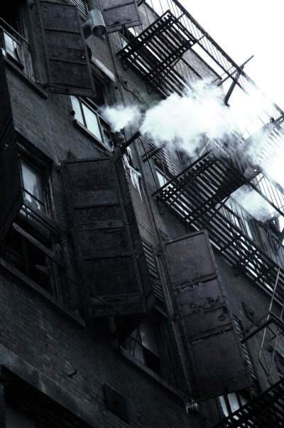
Tribeca-sweatshop.jpg
a steamy Cortlandt Alley, on a freezing Saturday afternoon


Not all of Tribeca has been turned into luxury lofts - yet.

HoMuNEWEST.jpg
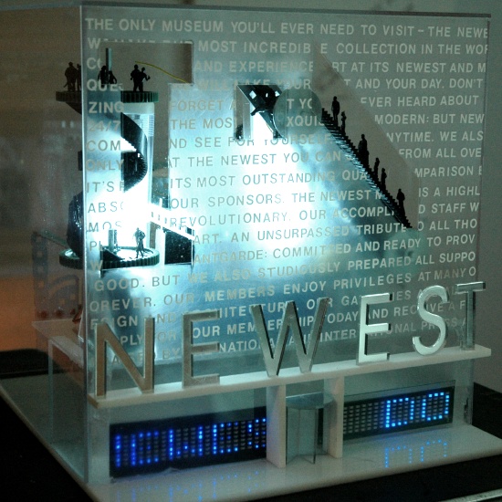
Filip Noterdaeme THE NEWEST™ 2006 model (plexiglass, LED screens, figurines, remote-controlled robotic system) [installation view]*


The Homeless Museum (affectionately referred to as HoMu by both adoring fans and its own creators) will be welcoming visitors once again this Sunday. I don't think anyone could describe this incredible institution as well as the creators themselves do on the museum's website, and I'm certainly not going to try:

A product of New York City's cultural decline, the Homeless Museum (HoMu) is a budget-and-staff-free, unaccredited arts organization that enables and engages cultural dialogue practiced at the intersection of the arts and homelessness.
Originally established mostly as a concept, two years ago the museum found a home in the fifth-floor walkup the founder shares with his partner Daniel Isengart. Once a month they open their doors to guests by invitation. Visitors are encouraged to email ([email protected]) or call (718-522-5683).

The NYTimes has found out about it and last month Dan Shaw wrote an excellent account of its mission and its work. The Believer has an extended article by Samantha Topol in the December/January issue.

I highly recommend a visit to the museum. Barry and I were there several weeks ago and we were charmed by the wit and sincerity of our hosts and delighted with the museum experience. We had first encountered what I'll call the creative humanism of Filip Noterdaeme's projects two years ago when we read about his campaign to shame the Museum of Modern Art (called MoMa by both supporters and critics, with little warmth from either) for its introduction of a compulsory $20 admission charge. Noterdaeme encouraged and inspired visitors to pay the entire amount in pennies, making it necessary for the museum to place buckets beside the station of each ticket clerk.

The admission at HoMu itself is determined on the basis weight (1¢/lb.), cash only. The Times article describes its membership policy:

The museum raises money for the homeless with a twist on the usual cultural memberships. ''We encourage visitors to become members,'' Mr. Isengart said. ''We tell them they can choose from any levels, from $5 to $125, and that they must give the money to a homeless person of their choice directly. We do it this way so that 100 percent of their donation goes to the homeless.''


NoterdaemeSpoon.jpg
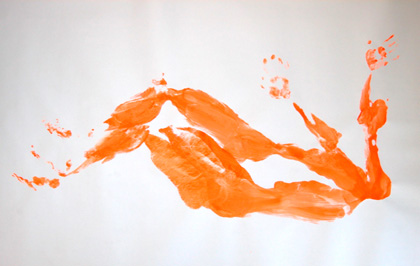
Filip Noterdaeme Spoon, 1/8 Iroquios drawing


"Spoon, 1/8 Iroquios" is in the museum's collection. It is part of a series which represents a kind of empathetic curating concern absent from any museum of my experience. From the HoMu website:

The One-on-One Collection is a deeply felt and authentic engagement with the grim and stultifying lives of countless homeless adults who yearn for love, but instead must settle for broken dreams, abuse, and danger.

What began as a fascination with the sex lives of homeless men and how they fulfill their sexual desires has inspired this collection of body prints that are reminiscent in style of Yves Klein's Anthropometries. Paintings on paper made by the imprint of naked bodies previously drenched in "Homeless Orange" provide a range of erotic connotations, addressing taboos such as homelessness, public sex, and homosexuality. For example, in "Spoon, 1/8 Iroquois", two silhouettes suggest a hurried sexual encounter between two men.


What's the tie-in between HoMu's championing of the homeless and its critique of the museum? I think it lies in a profound awareness of the contrast between the outlandish sums of money and attention devoted to the increasingly-elaborate (and increasingly-inaccessible) temples in which we house the high-end items branded as our official cultural idols, and an incredibly wealthy society's neglect or spurning of its own most-forsaken things and people, including its own material detritus but above all the homeless, the outsider, and the uncompromised artist. Noterdaeme and Isengart bring it all home with their phenomenal mix of minimalist panache and compassion.

The open house is Sunday from 1 to 6, on Clinton Street in Brooklyn Heights.


HoMuglycerinemuseum.jpg
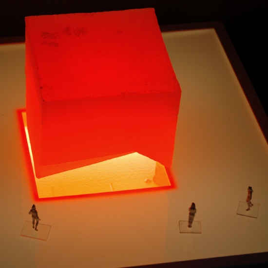
Filip Noterdaeme ISM (The Incredible Shrinking Museum) 2004-2006 model (glycerin soap) [installation view]*

*
descriptions of the two works shown in model form above, adapted from material furnished by the artist:

"The Newest™" presents itself as a new contemporary art museum. Viewed from the front, it appears to be a building that is inundated by visitors whose silhouettes can be seen moving about behind its see-through façade, outfitted with several slogan-flashing LED screens. But a look behind the scene reveals the effect to be a choreographed deception: The Newest™ is not a building but an oversized stage-set simulating a building front. The visitors turn out to be dummies circulating on conveyor belts and rotating platforms. The machinery is controlled from a computer operated by a single person, the museum director.

"ISM (The Incredible Shrinking Museum)" is a project for an interactive museum consisting of a sixteen-foot cube of glycerin soap. The cube is subject to constant change through exposure to the elements. In addition, visitors will be invited to exploit the structure like a mine until is it is used up, the goal being to reach out to a new audience and challenge visitors to think about their role as active participants in the shaping and destruction of culture through direct participation in the realization and, ultimately, the deconstruction of a museum.


[image of "Spoon" from HoMu]

AquaTeam.jpg
1/31 changed everything


I'm so embarassed for my friends in Boston. No, wait: Maybe our good neighbors are all actually onto something really, really big (I'm not talking about the suits and uniforms - or an impressively stupid Boston Globe editorial*): the growing role of the artist as the new and very visible hero of whatever pockets of progressive political life may still survive in locked-down America today. Fortunately the best of our twenty-first-century court jesters are not really part of the court, and they're not really just jesting.

This Aqua Team Hunger Force LED bomb scare thing sounds like the outrageous scenario for a summer movie, so why aren't Boston's mayor and police department laughing?

Go here for the press conference archtype for a new age. It's Dada!


*
the editorial, from this morning's edition, isn't available on line without a registration, so here are some excerpts of "PARALLYZED BY A GIMMICK":

. . . Turner's ad gimmick, undertaken in 10 cities from coast to coast, affected tens of thousands of people in the Greater Boston area. Businesses lost customers. Commuters lost time. Even more serious, first responders from local, state, and federal public safety agencies were called away from their legitimate duties.

One wouldn't expect the promoters of the TV program "Aqua Teen Hunger Force" to score high on a maturity index. But anyone older than 8 or 9 should be able to understand the dangers of staging such a stunt in the post-Sept. 11 world. Homeland Security experts will need to review the response of local law enforcement. Public safety personnel may have overreacted ; local bloggers apparently identified the guerrilla advertising campaign early on. But it's hardly surprising if others who weren't in on the gag were suspicious. As a rule, first responders are left little choice but to assume they are facing a legitimate threat.

Perpetrators of terror hoaxes face prison sentences of up to five years if convicted. Police arrested an Arlington man last night in connection with the ad stunt, but potential criminal prosecution is only one consideration. The tricksters at Turner, a unit of Time Warner Inc., should pay the bill for the consequences of a lame marketing gimmick.


[image of Boston supporters of the artists Peter Berdovsky and Sean Stevens by Bizuayehu Tesfaye/AP via Gothamist]

  • home

This page is an archive of entries in the Culture category from February 2007.

previous archive: Culture: January 2007

next archiveCulture: March 2007