November 2007 Archives

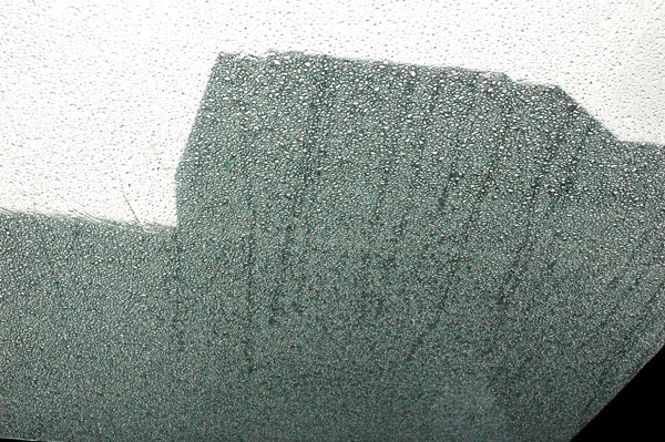
New_Museum_facade_rain.jpg
raindrops on the roof of the temporary tent at the entrance obscure the Bowery facade
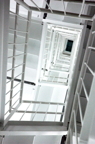

New_Museum_inside_stairs.jpg
each of the building's sets of stairs is a star, including this interior tower
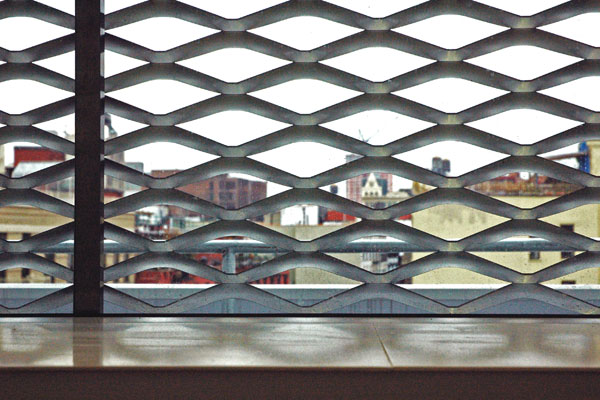

New_Museum_window_with_mesh.jpg
the aluminum mesh covering the facade shades this row of 4th-floor windows
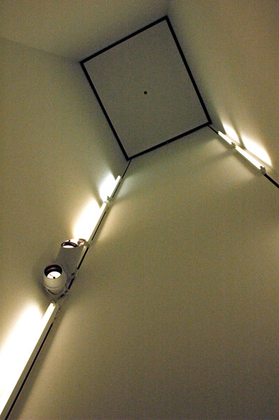

New_Museum_stair_niche.jpg
on the interior stair landing, looking up from inside a niche used for installations
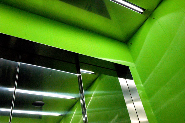

New_Museum_elevator.jpg
the larger elevator, a mobile color platform in the core of the tower, opens at either end
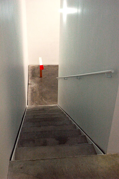

New_Museum_inside_staircase.jpg
the very cool interior staircase frames or provides access to several installations
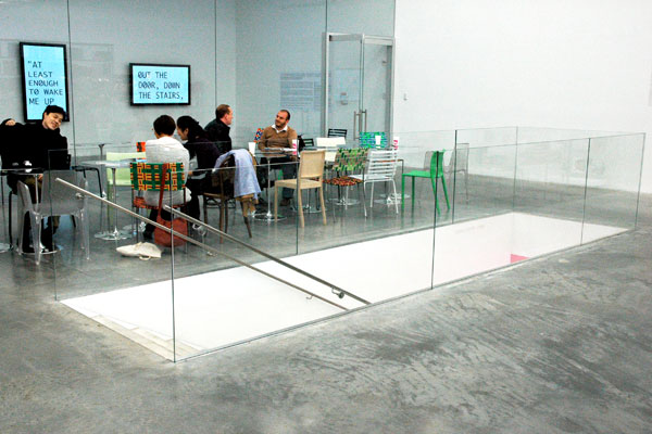

New_Museum_cafe_tables.jpg
the cafe was not operating, but the light, the vantage, and the chairs were welcoming
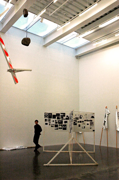

New_Museum_4th_floor_corner.jpg
a view of the balance achieved between a building and work it briefly shelters
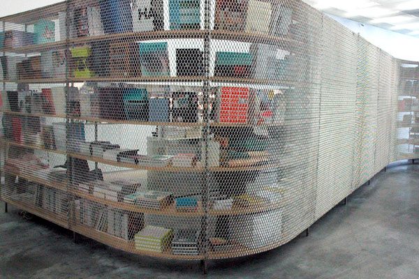

New_Museum_bookstore_wall.jpg
the outside curve of the bookstore wall on the south side of the ground floor


It was a thrill to welcome to the city this morning a splendid new house of art, the new New Museum. It stands on the Bowery on the Lower East Side, a neighborhood already changing rapidly but which still remains one of New York's most interesting.

I loved the Sejima + Nishizawa/SANAA building from the moment it was presented to us as a conception. That was in May of 2003. Construction began two years later and the Museum opens to the public December 1 [meanwhile, we're still looking at a big hole down at the World Trade Center site one mile southwest of the museum; always ask an artist, or arts person, if you want something done well]. Those who haven't already reserved a time slot for the marathon opening, a 30-hour window of opportunity which begins at noon on Saturday, will have to hold off until the initial excitement dies down. Their people say they've already given out the entire number of allotted timed tickets for those free hours of admission.

It's worth the wait. The building is as good inside as it is on the outside. There are several installations in various parts of the building, in addition to the major one. The three full-floor galleries are given over to the first wave of "Unmonumental: An Exhibition in Four Parts". It's a stunner.

It seems so very odd to be in a modern museum where the building itself is both very present (when presence is exciting and welcome), and discretely invisible (when invisibility is appropriate and appreciated). But what wonderful things fill these wonderful spaces! I was thrilled for to be able to experience truly contemporary art (almost emerging art) in a museum environment in New York for a change. In spite of what we're used to being told in this city and what we have finally come to expect, all Museums don't have to function only as warehouses for our authenticated treasures. The Smithsonian is not a proper model for the institutional treatment of the visual arts.

The founding director of the Museum of Modern Art, Alfred Barr, proposed to deaccession work the museum owned once it became 50 years old, in order to pay for the purchase of new work. Obviously MoMA has not followed through with this program. Whatever the merits of the arguments on either side, it is possible to argue that the increasing maturity of its vast treasures today has gradually caused MoMA to be distracted from its original purpose and lose its way as a leader or innovator in assembling and broadcasting the wonders of contemporary art. It's become increasingly difficult in recent decades to think of it as an institution able to lead in recognizing developments in the art world (if not actually the newest art itself) and for introducing it to and educating both a general public and arts institutions, presumably all with lesser talents and fewer resources.

We are told that the institution Marcia Tucker founded thirty years ago displays a deliberate paradox in its name, "New Museum", but the fact that its fans and even its critics have never really thought of it as a museum probably isn't much related to our disappointment with MoMA. Museums really are repositories, and we've always known that the New Museum functions more like a European Kunsthalle, way ahead of the old guys, but maybe only one step behind the kids working the best trailblazing and innovative galleries somewhere along the front lines.

May our New Museum never bury itself under an acquired stash, no matter how worthy (I've heard there are plans to begin maintaining a permanent collection for the first time), and may it never grow old.

_____


I expect to do a follow-up post with images of a few installations, and even the images above don't include all of my favorite things about the inside spaces of the building itself. I'm thinking of the neat little theater in the basement and the elegant penthouse space at the top, and the possibilities suggested by both; the beautiful stylized flowers on the tile walls of the basement restrooms; the tantalizing, open-plan bookstore; the glass-walled gallery located at the back of the ground floor and which is apparently able to isolate installations that include sound; the anticipation of the 5th-floor "Education Center" as an important international nexus for new art and new art forms; the beautiful floors; and over and over the architectural and profoundly urban pleasure of discovering an unexpected outside window, skylight or door.
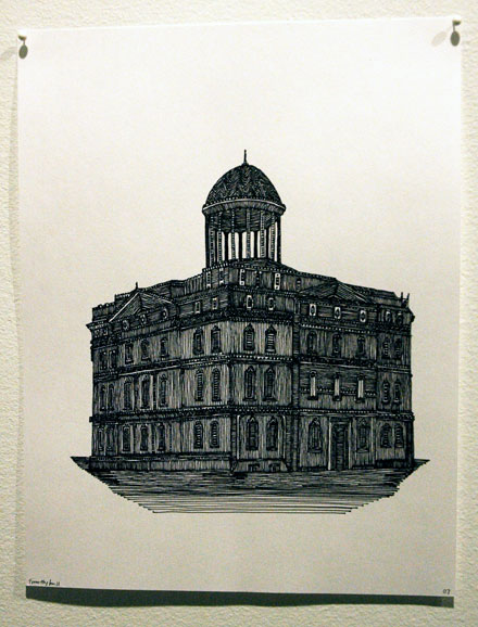
Hull_Timothy_untitled_cupola_building.jpg
Timothy Marvel Hull Untitled 2007 ink on paper 11" x 8.5" [installation view]


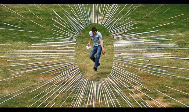
Jernigan_Tex_one_b.jpg
Tex Jernigan [one image, not in this show, from "One: Across America" (2006)]


Lauren Ross has curated a very neat group show, "Divine Find", inside a new space in SoHo. Yes, SoHo, and it's even northern SoHo. Er . . . it's actually just north of Houston, so technically it might be in NoSoHo. The artists are Timothy Marvel Hull, Tex Jernigan, Christopher Miner, Mariah Robertson and Peter Rostovsky, and the theme is described in the press release as "locating the sacred in the commonplace".

I'm pretty sure that phrase doesn't refer to the venue itself. The gallery Artspace Stonefox is no commonplace. Showing emerging art in a working office: It's a great concept, and I've seen it happen before, sometimes with mixed success. The curating must be sensitive to the art and the environment, as it is here, and even with the best wills and the finest curatorial resources it's not an innovation easily accomplished - or reproduced - since neither the appearance nor the routine of most office environments lends itself to the requirements of a gallery space. Cheers to the people of Stonefox for going out of their way to do it, for doing it right, and for playing such gracious and enthusiastic hosts. The architecture and design firm has set aside a significant portion of their office to create Stonefox Artspace. They describe it as a temporary project and exhibition space. A lot of artists and curators will be hoping that "temporary" only refers to the duration of individual shows.

This one continues until December 4th. Since it is an office, we shouldn't complain that (except by appointment) the hours are Monday through Friday only, from 12 to 6.

But a small note about the exhibition itself: If I leave wanting to run to my computer for more information about the artist or artists, a show has been a success, at least for me, and that goes for any art, including performance. This one more than qualifies, since a day later I'm still wanting more and frustrated with how little I can find on line. Christopher Miner is a good example: Try looking around yourself, and you'll see why I'm going to have to visit Mitchell-Innes & Nash.

I've learned to trust Lauren Ross.


[second image from Tex Jernigan]

Heide_Hatry_egg3.jpg
Heide Hatry Expectations IV, 2007 C-print


Since my Friday post about "Out of the Box" show at Elga Wimmer I've gone back to the desk and written a paragraph on each of the artists included in the installation:


Regina Jose Galindo's 47-minute video, "Piel" [skin], documents the artist striding very deliberately over the stones of Venice, beginning at a stone wall of a busy passage where she shears and completely shaves the hair from her body and scalp and removes all of her clothing. It ends simply, with very little drama, on a broad terrace at the edge of the Grand Canal. The performance requires the participation of both her cameraman and the many pedestrians we encounter along the way, most of them remarkably indifferent to her appearance. This piece, like many in this show, left me wondering what the effect might have been had the the artist been presenting to her collaborators a body less beautiful than the one we see here.


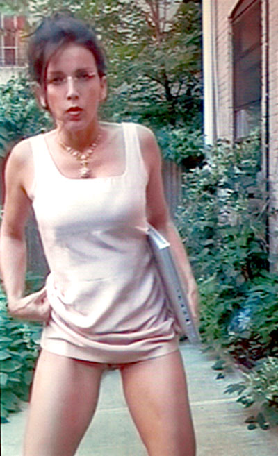
In the past Heide Hatry has repeatedly worked with another kind of epidermis, pigskin, and it's the one most closely related to the one we all share. In the video diptych she shows here however, which she has titled "Adaptations" [2 min 47 sec], she works with her own, and not much else. The work represents two very different, even extreme, responses to the fulfillment of the principle biological function of a woman's body, birth. We first see her naked in an leafy Eden of sorts, giving birth and immediately performing the role which society has traditionally demanded of one half of its members, that of nurturing mother. In the second segment another successful (and equally abbreviated) labor ends with a very different outcome for a young, smartly dressed professional carrying her MacBook out of that same jungle.


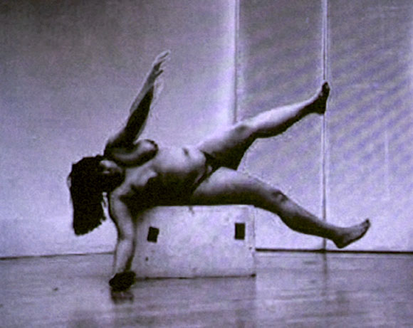
Sonia Khurana may first attract our attention because the proportions of her naked body represent something less than the modern ideal, but her art is what holds us, and it's the art which brings us back. "Bird" [3 min 20 sec] finds the artist in a number of excited dances magically eliciting imagery related to its title. The silence of the video and the gorgeous purple, satiny sheen and bleeding contrast of the picture is extremely attractive and a perfect instrument for this tender piece. Khurana's success in realizing her avian compulsion may be improbable, but we are first curious, then charmed, even solicitous, but finally we are captivated by the documentation of her efforts.


Carolee Schneemann is both the inspiration for and the grande dame among the artists in this show, and so perhaps that is why she is represented by two [more or less separate] pieces. The first is "Unexpectedly Research" (1992) something of a "story board" of laser prints and text representing performance work done in the twenty years after 1962. The more recent piece is the video, "Cave" (1995) [7 min 30 sec], projected high on a wall not visible until the visitor has completely entered the gallery. The sound dominates the room, and eventually the images themselves become inescapable, composed as they are of documentation of a 1995 group performance which included the artist and seven other nude women re-enacting her 1975 piece, "Interior Scroll", where she painted her body with mud slowly extracted a paper scroll from her vagina while reading from it.


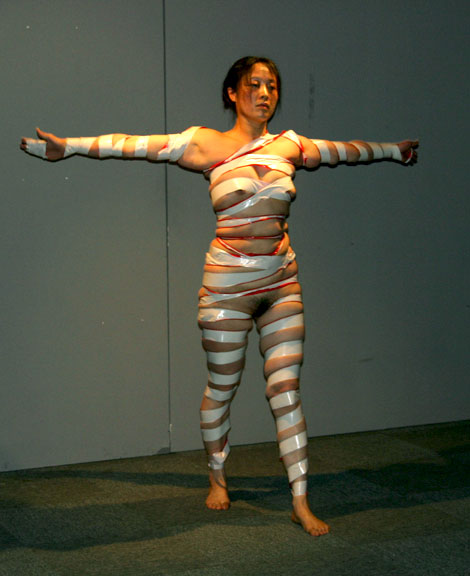
He Chengyao's has always used nakedness in her art, and her art has usually related to her personal experience of growing up in a Chinese society far less open to individuality than today. Whatever difficulties she had to overcome in a rural county were magnified by a nightmare which arose from the circumstances of He's birth. Her mother suffered a nervous breakdown and subsequent insanity brought on by community displeasure and a social and economic ostracism, but the family survived together. Her mother has been a part of most of He's work that I have been able to see on line. Her mother does not appear in the piece included here, "Broadcast Exercise" (2004) [5 min], but since its traditional Chinese exercise form relates to the conventions and solidarity of a rigid society as much as to the conflicting demands of attachment and independence, her mother is not really very far away.


Considering the richness, the tragedy and the hope represented by the modern history of her ancient homeland, it's no surprise that Minette Vari's identity as a South African is very much a part of her art, but "REM" is more than an evocation of that history. It's a gorgeous strip of animation with the wondrous feeling of the earliest form of "film", more "magic lantern" than modern, manipulated video. In a dreamy, continuous loop images representing the glorious and the horrible in the geography and culture of the South African experience float behind a cut-out of Vari herself, the proportions of her torso and limbs expanding and contracting in a luxurious weightlessness. The figure is that of the artist sleeping, hence the title. The poses and the magnificent bulk of her thighs suggest the heroes found on early Greek, red-figured pottery as much as images found in Bushman cave paintings.


[image from Heide Hatry]

Hatry_Heide_Adaptations_start.jpg
Heide Hatry Expectations 2007 [still from video]


sonia_khurana_Bird_on_side.jpg
Sonia Khurana Bird 2000 [still from silent, b&w video]


He_Chengyao_Broadcast_Exercise_arms_stretch.jpg
He Chengyao Broadcast Exercise 2004 [still from video]


I'd always felt very much an outsider when it came to art by women which might involve an assertive sexuality,. I confess this failing or inadequacy in spite of my natural inclination to welcome and embrace the unconventional or the anomalous - in art or almost anything else. Yes, I'm a guy, but while my neuroses may be those of a male, they are those of a queer male. Should that make it easier or more difficult to reach across the barrier? Could the circumstances of my pre-1960's dating experiences (dissembling in order to survive, but fearing any intimacy with women since it might call for performance) have allowed a healthy relationship to women's bodies even with the best will? Intimacy with a body matters, and heterosexuals and bisexuals may always get a head start in understanding gender - if not sex.

Whatever the answers, I humbly admit that the show currently installed at Elga Wimmer, of performance art influenced by Carolee Schneemann and other trailblazers, was a major breakthrough for me. "Out of the Box" was curated by Wimmer and Heide Hatry. I had wanted to visit the show because of my long experience with Wimmer's excellent program, because of my interest in anything related to Schnnemann, and because I was interested in Sonia Khurana, one of the artists. The exhibition, of both video and still images, is a small miracle, "small" only because of the physical limitations of the gallery's size. The artists are Regina José Galindo, Heide Hatry, Sonia Khurana, Carolee Schneemann, He Chengyao and Minette Vari. This small group includes women who began working in Latin America, Europe, Asia, North America, China and Africa, and it represents living artists of all ages.

They work with in very different materials and they communicate very different things, but all of the is courageous and tight; the art is breathtaking and ravishing; the statements are both incredibly intimate and extraordinarily public.


ADDENDUM:

See a subsequent post for more on the works themselves.


[images from Heide Hatry]

glitch_aesthetics.jpg
(this one's an aesthetic glitch)


I learned yesterday that my "comments" function had not been operating since we switched servers, but the glitch has now been repaired.

If you've tried to comment on something recently and felt shut out, please try again, or hang on and see if something else moves you down the road.


[image from Benjamin Fischer's "portfolio neuordnung"]

Griffith_Cable_Summer_Pile.jpg
Cable Griffith Summer Pile 2007 oil on paper 11" x 17" [Seattle-based blog: Cable Griffith]


Bromirski_Martin_Untitled_2.jpg
Martin Bromirski Untitled painting on canvas 8" x 16" [formerly Richmond-based, and now a New York State-based blog: anaba]


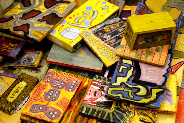
Fallon_and_Rosof_Useful_Paintings.jpg
Fallon and Rosof 48 Useful Paintings from the Useful Painting Series 2001-2006 (this is a random pile of small paintings on found wood scraps) [Philadelphia-based blog: roberta fallon and libby rosof's artblog]

Fallon_and_Rosof_detail_table_top.jpg
[detail, table from above]

Fallon_and_Rosof_detail_bottom.jpg
[detail, table upturned]


Bloggers do it on line - and some do it in studios too.

These folks don't just blog about Art; they're making some of that stuff themselves. There are some real treasures at "The Blogger Show", installed at Agni Gallery in the East Village through January 12. Unfortunately I can only show a very few of them here.

The show was organized by John Morris and Pittsburgh's Digging Pit Gallery. It's actually a joint venture with Panza Gallery in Millvale, Pennsylvania. A list of the thirty or so artist/bloggers from around the country who are represented in the New York edition, together with the names of their blogs, can be found on the show's own site, which is actually a blog itself. Looking at the art they produce it would seem they have nothing in common but their blogging, but there's also an enormous, shared enthusiasm for other people's work, something which couldn't be missed when I met many of them at the New York opening earlier this month.

free_speech.jpg
cover of a 1909 pamphlet created to protect the right of free speech at a time Emma Goldman was being prevented from speaking


How often does the NYPD have to be reminded about the First Amendment?

Two days ago all charges which the police had brought against the Reverend Billy for reciting the First Amendment to officers harassing Critical Mass cyclists in Union Square on June 29th were dropped.

New York's guardians of [certain kinds of] law and order have once again failed to have their behavior upheld by the courts. Fortunately this time it was not the soft tissue of a citizen victim that bore the injury, but the tissue of the civil liberties each one of us shares. The escalating, accumulative record of police misconduct like this, regularly authorized and protected by Departmental and civilian municipal authorities, assaults our Constitutional protections and it may some day effect a mortal wound.

The NYTimes article by Anemona Hartocollis barely hints at what should have been a huge embarassment for the arresting officers and those who had handed them their assignment:

The Manhattan district attorney’s office quietly dropped its prosecution today of Reverend Billy, a street performer accused of harassing police officers by reciting the First Amendment at a rally in Union Square Park.

Prosecutors said today that they deliberately allowed the case to be dismissed by failing to meet a court-ordered deadline to file papers explaining why the arrest of Reverend Billy, whose real name is William Talen, was justified.

“Sometimes not making a decision is a good decision,” one prosecutor said.

Norman Siegel, Billy's lawyer, let the Times know that the incident wouldn't end there.

He said he would file a federal lawsuit against the city and the Police Department charging false arrest, malicious prosecution and violation of Mr. Talen’s free-speech rights.

“We call this trial by inconvenience,” Mr. Talen said, adding that between the two cases he had been required to appear in court six times and spend three nights in jail.

“There are a number of questions,” Mr. Siegel said. “Who ordered the arrest? Why put him through the system when he should get a desk appearance ticket? Who made the decision to take five months before getting the case dismissed?”

He called the case “a classic example of government abuse of power.”

The hundreds of plaintiffs suing the city and the Hudson River Park Trust over the dangerous condition of the holding pens in which they were dumped following their arrests during the 2004 Republican Convention are experiencing their own continuing abuse and hardship. A article written by Chris Lombardi, "Pier 57 cops also exposed to toxins during 2004 RNC", which appeared in a recent issue of Chelsea Now, is interesting for many of its revelations. In it Lombard reports:

Right now, the suits are still at the deposition stage, with the 500-plus plaintiffs spending days at the federal courthouse downtown.

“They’re keeping them for eight hours at a time, sometimes,” said [Environmental Justice Law Project] co-founder Martin Stolar.

Eternal vigilance is the price of freedom, but do we have to pay for despotism too?


[image from the Emma Goldman papers, sunsite.berkeley.edu]

NO CAMERAS!


Barry and I had decided to stop by receptions at only two or possibly three galleries last night. At one point during the evening a friend of ours asked if we had seen the show at Claire Oliver. He had liked work by the artists (AES+F) he had seen elsewhere earlier this year. We told him we hadn't been there. I wasn't even aware there was an opening at Claire Oliver, mostly* because the gallery doesn't usually show work that would attract us, and when it comes to receptions (only), we usually end up going to those where we know the artist, the gallerist or where we expect to know some of the crowd (even then, a return visit is usually necessary to see the art itself).

Not long after our conversation with our friend we realized we were passing by Claire Oliver's space on the way to our next stop so we decided to check it out. A minute or two after entering the front door we were in a room on the lower level watching a video. It seemed to us it would be the nucleus of the show's photographic images upstairs, so we had decided to start there. Seconds after I snapped a still image of the projection with my camera a gentleman stepped up to me, from I'm not sure where, to inform me that photography was not permitted. I turned around and we both went back upstairs. There I handed my card to the two women at the desk and asked them to give it to the director informing she or he that I was an enthusiastic fan of the arts, and a committed art blogger, but I had no interest in visiting, broadcasting or reviewing shows where photography was prohibited to anyone.

If this post is more strongly worded than most of my art entries, it's because it's not about a particular artist (collaborative) or a particular gallery, but because I feel very strongly about ensuring and increasing the public's access and enlarging its connection to art, and issues involving cameras and photography are very much a part of this discussion and my activism. It's always about control, just as it is when the controllers are outside the white box.

Claire Oliver has been added to a list of galleries whose shows I will neither discuss on this site, nor visit personally, because they maintain camera prohibitions. Shows will also not be recorded in ArtCal if the editors know there is a camera prohibition. There are some galleries which maintain prohibitions that are selective or vague, making avoidance more complicated and imperfect, but leaving the principle and its effect no less crucial. This list is subject to change, and above all we will welcome news which will enable us to remove names.

This is the annotated list at the moment:

303 Gallery (one show)
Gagosian (one show)
Capla Kesting
Jonathan LeVine
Pace on West 22nd Street
Paul Kasmin (vague)
Claire Oliver


*
Only once has the gallery's name ever shown up on either of our blogs before. The story of our experience then might help account for our shared lack of enthusiasm for Claire Oliver. Oddly, it has a connection (almost certainly a coincidence) with last night's incident. Nearly four years ago we found ourselves in the gallery's old space on 20th Street during an earlier show by the same artists. This is from Barry's post on December 7, 2003:

On 20th Street we tried to see AES+F's King of the Forest at Claire Oliver, but I didn't feel like spending much time with the work, given the reception from the gallery guy working there. We had come in from the snow to check out the show, and given that it's a highly conceptual show, it seemed reasonable to ask to see the press release or checklist. His response? "Sorry, my friend. The show's coming down today, and we've given out all of the materials." Ugh. No wonder sometimes people want to go into galleries and say, "Oy, shopgirl!"


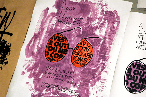
Weiner_Show_Hurst_poster.jpg
detail of a selection of Andrew Hurst's posters for the show


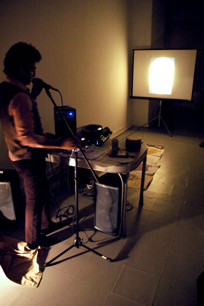
Weiner_Lawrence_Andrew_Hurst_performance.jpg
a moment during Hurst's sound and slide show performance, created specifically for the opening


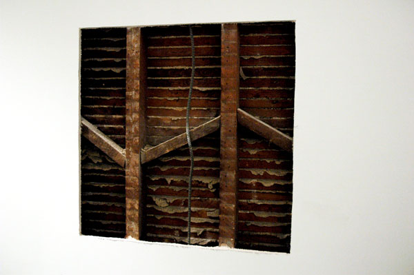
Weiner_Lawrence_A_Re-Creation.jpg
a re-creation of a piece referencing painting, which Weiner first exhibited in New York in 1968


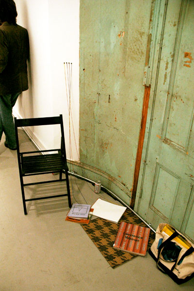
Weiner_Lawrence_Reading_Room.jpg
one of several reading room areas reserved for further study of Lawrence's work


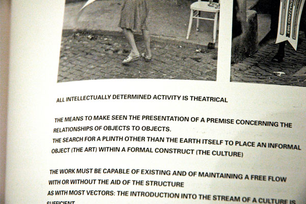
Weiner_Lawrence_the_open_book.jpg
holding the camera in my right hand, I picked up a book with my left and it opened here


Weiner_Lawrence_Aphorism.jpg
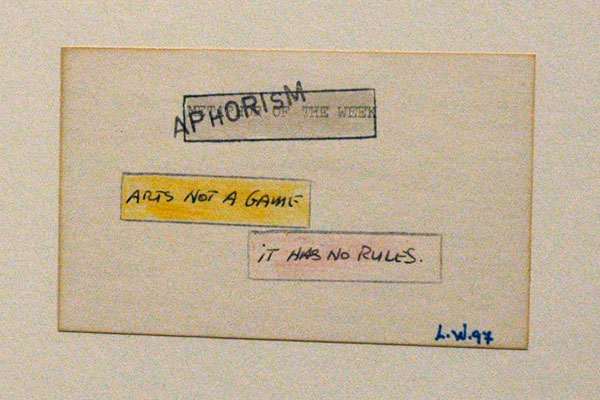
a Weiner text piece, reading, "Aphorism of the Week: Art is not a game, it has no rules" (1997), the medium being rubber stamp, with colored pencil, pen and paint on paper 4" x 6" [installation view]


"A Lawrence Weiner Salon" at Pocket Utopia may be one of the coolest shows in the city right now, not just because it was launched by Austin Thomas, and not because I still can't figure out what's going on in there. I've tripped over this modern icon for years, and the enigmatic promise of his work never disappoints. While I've always been convinced he's the real thing, I don't mind admitting that I should have some spent time in the several comfortable "Reading Rooms" scattered about the gallery this month.

All l dare offer here are some images snapped before the opening got too crowded, and this excerpt from the press release:

Pocket Utopia is pleased to organize an experimental salon of conceptual art's key figure Lawrence Weiner. The salon will feature a reading room, a re-creation ("A 36" x 36" Removal to the Lathing or Support Wall of Plaster or Wallboard From a Wall," 1968) and a text piece. Weiner has long pursued inquiries into language and art-making and posits a radical redefinition of the artist/viewer relationship and the very nature of the artwork. Here too, the venue or gallery and its relationship to the artist also gets redefined.


ADDENDUM: In related news from inside today's NYTimes, Roberta Smith (who almost never ventures into Brooklyn's high-yielding art fields these days) writes about the Weiner exhibition which just opened at the Whitney: "Be grateful, then, for Lawrence Weiner's mind-stretching 40-year retrospective at the Whitney Museum of American Art, which is respite, wake-up call and purification rite all in one. It should be required viewing for anyone interested in today's art, especially people who frequent contemporary art auctions." She ends her review:

Driven by the joy of language and quite a bit of humor, Mr. Weiner's ebullient work asks tough questions about who makes or owns art, where it can occur and how long it lasts. It reminds us that while art and money may have been inextricably entwined throughout most of history, art's real value is not measured in strings of zeros, high-priced materials or bravura skill, but in communication, experience, economy of means (the true beauty) and, yes, the inspired disturbance of all status quos.

It also affirms that art ultimately triggers some kind of transcendence that can only be completed by the viewer. Mr. Weiner has elevated Robert Rauschenberg's famous dictum - to the effect that "this is art if I say so" - to the more inclusive "this is art if you think so." His polymorphous efforts create situations in which such thoughts feel not only natural, they feel like our own.

Ooooh.


One more reason to head for hot and friendly Bushwick this week: Thomas has declared this Saturday afternoon "Social Saturday at Pocket Utopia". The gallery's two artists in residence [not named] will be "receiving" from 4 to 6 pm, and the curious are invited to meet and discuss their continuing work. The announcement also mentions something about a "beeramid".

Levenson_Dan_Little_Switzerland_two_photos.jpg
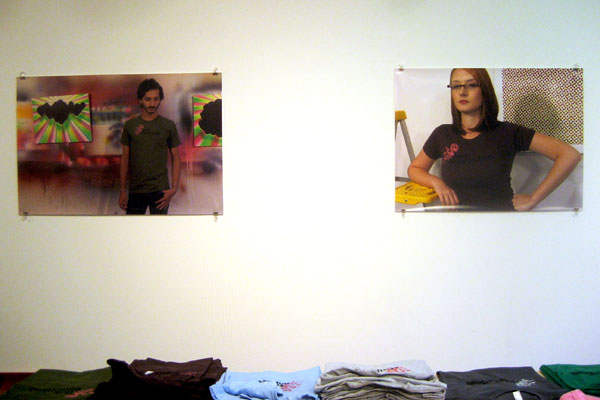
images of two fictive young Swiss artists hanging above the t-shirt and thong table


Levenson_Dan_Little_Switzerland_table.jpg
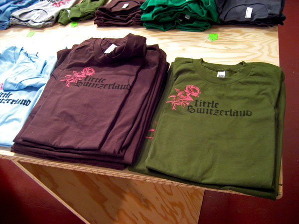
a detail of the t-shirt display, showing the gallery's unforgettable logo


What does an excellent young artist do when he wants to stretch his wings and diversify his brand or just investigate other tracks, and at the same time exercise his previously-tested and proven performance skills? Dan Levenson decided to open a shop, er . . . gallery.

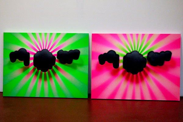
Levenson was already known for his very smart, beautiful and bright, pop/torquey/Neo-Geo/black hole/bleeding-edge/perspectived, acrylic confections. I mean all of that in the very best sense: I've really liked everything I've seen him do. He's also initiated some very cool conceptual projects [see FrEE MoMA!]. This fall the artist turned his studio at the Elizabeth Foundation [EFA] into an imaginary Berlin art boutique representing young Swiss (we probably don't have to ask why "Swiss") art and its accoutrements.

The invitation Levenson sent out to his open studio installation, "Little Switzerland" reads as follows:

A Switzerland of the Mind

For three days this week, a Swiss art gallery will open its doors in Manhattan. Little Switzerland is a Berlin-based art gallery representing a roster of eight emerging Swiss artists. None of this would be unusual except for the fact that the gallery doesnÂ’t really exist, and the artists are all the fictional creation of one (American) artist: Dan Levenson.

This year Little Switzerland will present large-scale color photographs showing several of the gallery artists at work in their ZĂĽrich studios and modeling the new line of Little Switzerland branded apparel featuring the galleryÂ’s distinctive logo. Little Switzerland apparel will be on sale for those whoÂ’d like to become a part of this conceptual project.

-Hans-Ruedi Girschweiler, ZĂĽrich

What visitors found when they arrived in Suite 506 was the artist's conceptual project itself. Dressed minimally in commercial-looking photographs of the loft-like gallery's eight artists posed inside their tidy studios as well as several examples of their paintings, executed in eight different styles (all ghosted by Levenson), the installation also included a stylish modern table and a chic industrial-pipe wheeled hanging rack, where various kinds and sizes of clothing and drinking vessels bearing the Little Switzerland brand - which always appears in German Fraktur - were displayed and offered for sale.

I really liked the photographs, enjoying the invented world each represented. I can also say that at least some of the paintings and drawings their creator attributes to his fictional artists could stand on their own, without help from the conceit carved by their Gepetto. Check the site. I wonder whether and where his experience with them might take Levenson from here? Oh yes, there were also some super examples of the very latest in Levenson's primary and continuing series of paintings, the more recent of them incorporating elements of stylized, slinky highway markers (or star tracks?).

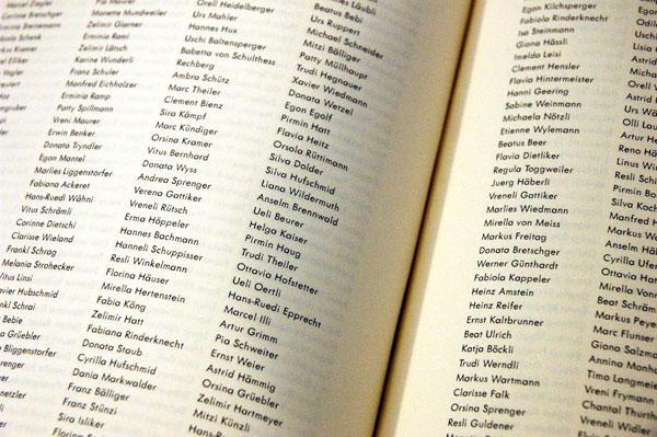
One of my favorite things was a thick, black, generic, fabric-bound artist-published book, "SWISS ARTISTS". Inside there were 650 pages, each running four columns of full names printed in small type (not arranged alphabetically, so not very Swiss, it would seem). The given names were from a book of Helvetian baby names; the family names were taken from the Zurich phone book. I think I heard that there were no repeats, but I know I was told that Filip Noterdaeme bought a copy. Now Noterdaeme's partner Daniel Isengart reads to him from the book every night before they retire. Even without a sensitivity to sound, to Dada and surrealism, this is poetry.


Levenson_Dan_two_paintings.jpg
two of the artist's own recent paintings


Levenson_Dan_Swiss_Artists_book.jpg
the opened name book, "SWISS ARTISTS"


[first two images from Barry]

Yayoi_Kusama_ATM.jpg
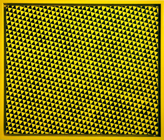
a small Yayoi Kusama painting from the mid-sixties (less than 2' square)


Khurana_Sonia_Lone_Women.jpg
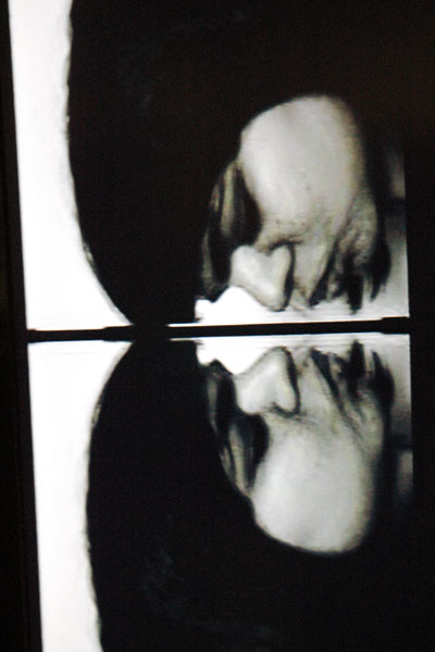
Sonia Khurana Lone Women Don't Lie 1999 video [large detail of still from installation]


Mekhala_Bahl_Gallery_Espace.jpg
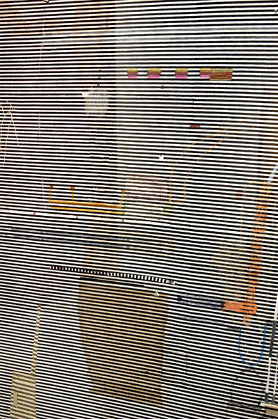
Mekhala Bahl Ramp and Slide acrylic, ink and collage on printed canvas 60" x 60.5" [large detail, including reflections on plexiglas]


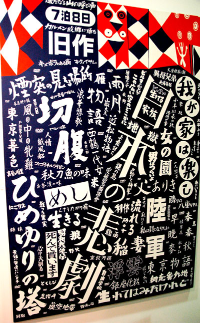
Junya_Koike_Japanese_Tragedy.jpg
Junya Koike Japanese Movie/Japanese Tragedy 2006 (approximately 5' high) [large detail of installation]

Junya_Koike_Yae-chan.jpg
Junya Koike Japanese Movie/Yae-chan, the girl next door and TANGE Sazen 2006 (approximately 1.5' x 2')

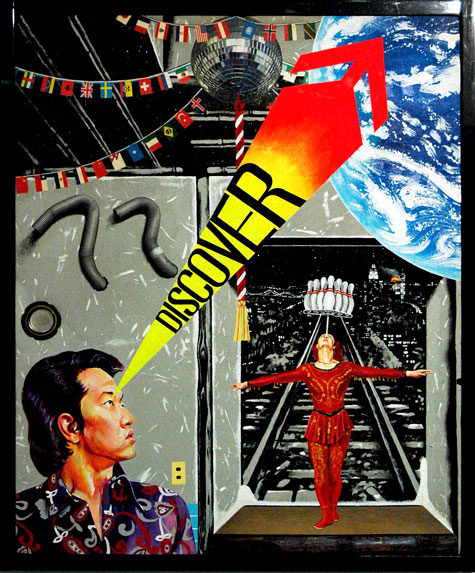
Junya_Koike_Discover.jpg
Junya Koike "DISCOVER JAPAN" 4 2001 (approximately 2' square)


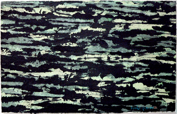
Young-Sup_Han_green_Chosun.jpg
work on paper by Young-Sup Han (approximately 3' wide)


I want to see everything, because my interests are pretty broad, but I'm getting better at "filtering" the work I engage with when visiting large art fairs. Even in the outside world I've always been able to make myself pretty much blind to anything visual that doesn't please me (unless I decide I have to look). For an arguably-too-sensitive guy huddled inside this pretty tawdry and often incredibly shoddy modern American civilization, I think it stems largely from an instinct for aesthetic survival. When it comes to the specific environment within art exhibitions, or even the pattern of a long afternoon going from one gallery to another, it's more a simple matter of the triage required by calendar-keeping and blogging obligations.

My visit to the Asian Contemporary Art Fair is a good example of what I'm talking about. I really don't remember much about the bad stuff, but in this post I'm sharing a few of the more memorable things I did come back with.

The attractive booth of Bill Brady's ATM gallery (New York) near the entrance had the dazzling piece by Yayoi Kusama shown above. I remember first being introduced to Op Art in 1963 by an artist friend studying in Munich while I was there myself under a DAAD fellowship. It was very exciting, and it was also like being a privileged initiate in a new cult. Now over forty years later I have to say this piece looks better than anything I saw then or since. It's an alien life form which positively shimmers inside its handsome yellow box.

Gallery Espace in New Delhi was to me one of the best exhibitors in the show, if not the best. My favorite works were the videos and video stills of Sonia Khurana* (Barry and I both love this artist), the paintings of Mekhala Bahl, and the photographs of Ravi Agarwal.

Junya Koike was represented by Tokyo's Gallery Yamaguchi. The large graphics of "Japanese Movie/Japanese Tragedy" was what first attracted me, but the smaller pieces with film and invented images are just as successful.

The Seoul-based gallery Chosun had a few very beautiful paper abstractions by Young-Sup Han. I was as least as much interested to two smaller monochromatic pieces; I'm not showing them here only because they were hung very high and my photographs were disappointing.

Among the other works I remember well were a very impressive Mannerist Wei Dong in the Goedhuis booth (New York, London, Beijing); u-fan Lee's delicate drawings at Jean Art (Seoul) and Wool Ga-Choi's delightful small oils, each titled "for enjoy play", also at Jean Art; the intense, compulsive beauties of Anil Revri's canvases at Sundaram Tagore (New York); and Li Luming's small, gray Richter-ish paintings at Alexander Ochs (Berlin and Beijing).

And then there was the "Simulasian" exhibition, a very interesting show within the show, curated by Eric C. Shimer and Lilly Wei. There I saw Ataro Satu's large paper drawing installation (courtesy of Mehr Midtown), Ran Hwang's huge pink Buddhist wall sculpture (courtesy of 2 X 13 Gallery), Chitra Ganesh's wonderfully-disturbing mixed-medium-on-board pink and blue goddess (courtesy of Thomas Erben), some more Yayoi Kusama, and much more.

Oh, a reminder to those who can take advantage of it, tomorrow is the last day of the fair. It's open from 11 to 5, and on this day it's totally free.

And an editor's note: Assembling this post would have been much easier, and the information more complete, had I been able to take home a catalog Thursday night. They had run out by the time we left; we were told they would put one in the mail, but that was no help in the meantime. I thank my hard-working digital camera for its excellent note-taking skills almost every day of the week, but it can only record what the label tells it - and that's if there's a label.


*
Khurana will be part of what is sure to be a fascinating show at Elga Wimmer opening on Tuesday in Chelsea. "Out of the Box: Body Related Performance Art After Carolee Schneemann" includes work by Schneemann, Heide Hatry, He Cheng Yao, Minnette Vari, Regina José Galindo and Khurana.

Guantanamo_saffron.jpg


This post is part of a series begun on May 21, 2007, which will continue until the U.S. concentration camps at Guantanamo Bay and elsewhere around the world have been razed.


Two things this time around: First, we haven't been screaming about Guantanamo for five years only to watch painfully as this miserable concentration camp is broken up and its internee victims removed and dispersed among any number of new facilities established inside the U.S. border, fresh black holes even less open to our own conscience and the world's scrutiny than their notorious progenitor. Second, today is the eighty-ninth anniversary of the armistice which ended the Great War; it would be nice if we could believe our never-ending supply of old men in suits and brass had learned anything at all in the interim.

[fabric color swatch, otherwise unrelated to Guantanamo, from froggtoggs]

ACAF_server_Lu_Peng.jpg
Lu Peng showed up everywhere, but this particular painting was holed up in the VIP room


We were at the preview reception of the Asian Contemporary Art Fair last night. As a veteran of just about every similar event held in New York over the last ten years I think I may say with some authority that this one is more than worthy of an excursion to Pier 92.

Right now I don't have the time to go into even some of what I thought were the highlights (we were with family today and then decided to run off to Williamsburg tonight), but since the show exists only through Monday, I wanted to get the word out. We saw lots of really good work, both old (well, at most a few decades old) and new, and I think it means something that we spent almost four hours there without expecting to, particularly as we had hoped to fulfill two other obligations that same evening. We didn't make either.
The work looked great, the entire fair had a very good vibe last night (no "attitude") and the whole thing is very well run. Admission, by the way, is only five dollars for students and seniors, and Monday is free for everyone.

ACAF_speakers_platform.jpg
from his lofty "Watchtower"performance artist Cai Qing's signs alternately warned us of the coming Asian invasion


ACAF_conversation.jpg
gallerist and fans converse at the booth of Gallery Yamaguchi


ACAF_Hiroshi_Sunairi.jpg
distinguished artist and teacher Hiroshi Sunairi greets admirer

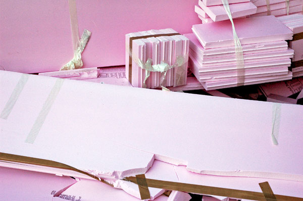
pink_trash.jpg
untitled (R-Value) 2007

Riley_Duke_cat_vitrine.jpg
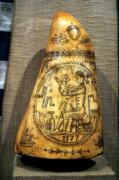
Duke Riley Burgees attributed to seditious faction of Marblehead Militia 2007 [detail of vitrine displaying items salvaged from the vessel, including "Tooth of giant sperm whale believed to have been engraved by Davis"]


Riley_Duke_diver_love.jpg
Duke Riley After the Battle of Brooklyn 2007 ink on canary paper 87" x 86" [detail of installation]


Riley_Duke_submarine_yard.jpg
Duke Riley Curtains for the Free World 2007 ink on canary paper 74" x 111" [detail of installation]


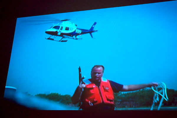
Riley_Duke_NYPD_gun_video_still.jpg
[video still from installation, showing armed NYPD harbor unit capturing The Acorn at sea]


Riley_Duke_The_Acorn.jpg
Duke Riley The Acorn Submarine 2007 approximately 8' x 6' [installation view]

Riley_Duke_Acorn_cabin2.jpg
[detail of the The Acorn cabin seen through the lower porthole revealing ship's library, evidence of exhausted rum ration, and hull damage suffered during seizure of the vessel by the Coast Guard]

Riley_Duke_Acorn_book_detail.jpg
[detail of The Acorn cabin revealing ship's library]


By this time readers of this blog won't be surprised to hear that Barry and I were at Thursday's opening of Duke Riley's show at Magnan Projects, "After the Battle of Brooklyn: East River Incognita II".

This time we are treated to the story of the interrupted voyage "The Acorn". The gallery press release explains that Riley's gallery projects are presented in gallery spaces in museum-like settings, with "artifacts of questionable provenance and mock documentaries . . . presented alongside drawings and mosaics".

This exhibition, After the Battle of Brooklyn, revolves around historical obscurities that took place in New York during the American Revolutionary War. In addition to drawings, mosaics and videos, Riley constructed a replica of the first primitive Revolutionary War submarine (“The Turtle") that is propelled by a hand crank and submersible for up to 20 minutes. In 1776 George Washington’s Continental Army used these subs to target the British flagship The Eagle. Putting a contemporary spin on this idea, Riley launched his submarine (“The Acorn”) while the Queen Mary 2 was docked in the Brooklyn Harbor and captured the attention of the Coast Guard, NYPD and major newspapers.
Riley's art appeals, and succeeds in its appeal, on virtually every level. He shows a remarkable degree of comfort with both his materials and his subject, and he uses it to describe a very personal relationship to a mélange of regional geography and history, the twenty-first century's politics of disaster and absurdity, the inescapable claims and demands of the media (including a self-referential look at news coverage of his arrest with the "Acorn" submariner), the shape of our environment and the complexity and the complications of a contemporary community, a rich surviving mythology and a healthy and very graphic omnisexuality, all of these embedded in an infectious wit. That sounds like a lot of ground to cover, but it really is all there, and it's regularly delivered to us with enormous charm, in both visual and performance art forms.

Superficially each of these pieces may at first have the aspect of a homey, antique craft and the performances may look like stunts, but it's the art that survives our scrutiny and in the end his hand skills and his adventurous exploits are revealed to be only some of the many tools Riley recruits to create this vigorous body of very creative work.


Because of the nature of the exhibition and the relative narrowness of the museum/gallery, your humble correspondent has had to confine his visual documentation to detail images of some of the displays. He would like to assure the reader that the work handsomely rewards a much less abridged examination.

The installation continues through December 22.

Garfinkel_J_J_Myriad_Quay.jpg
J. J. Garfinkel Myriad Quay 2007 acrylic and oil on panel 45" x 48"


Garfinkel_J_J_Myriad_Quay_detail.jpg
[detail]


Garfinkel_J_J_Scribble_Terrace.jpg
J. J. Garfinkel Scribble Terrace 2007 acrylic and oil on panel 45" x 48"


Garfinkel_J_J_Clingman_Rope.jpg
J. J. Garfinkel Clingman Rope 2006 acrylic and oil on panel 30" x 24"


Although it took a few minutes of walking about the space and talking to Martin, probably the sweetest gallery dog in New York, I eventually became so taken with this work that I found it very difficult to leave. That doesn't happen very often, no matter how much I like a show.

Nine paintings by J. J. Garfinkel are currently installed at Hogar Collection in "View Sheds" the artist's first solo show with the gallery. Every one of them is terrific, with a very strong presence. They're two-dimensional, except for some closely-outlined fields of wavy-textured brushwork, but the viewer sees - and feels - more than just a surface. The combination of the artist's elegant pallet of colors, both muted and dazzling, the variety of his surface finishes, and his layering of images in combinations as disciplined as they are organic suggests nine fantastic miniature jeweled landscapes inside three-dimensional illuminated dioramas.

Because the exotic, sophisticated beauty of the paintings can't be isolated from Garfinkel's skill in representing their material properties, nothing can replace the experience of standing in front of them, but I'm hoping that these images, especially with the inclusion of one detail shot, will help account for my excitement.

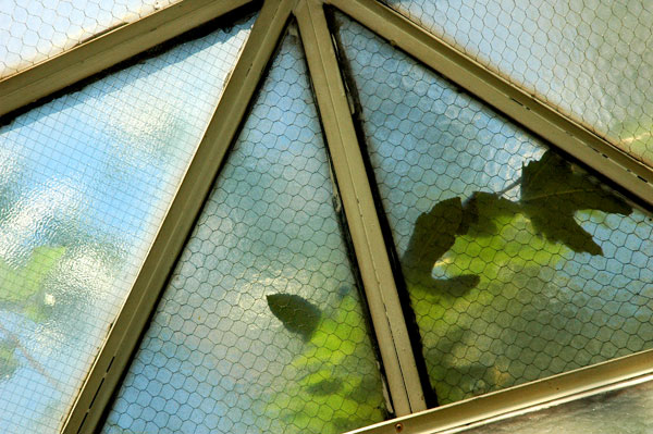
chicken_wire_glass_skylight.jpg
untitled (Mulberry branch) 2007


I've always liked this pyramid skylight in the ceiling of the smallest gallery at Dam, Stuhltrager, and on a beautiful Sunday afternoon one week ago it seemed more alive than ever.

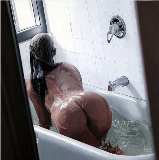
Stennett_Adam_girlintub2.jpg
Adam Stennett Girl in Bathtub 2007 oil on wood 48" x 48"

Stennett_Adam_girlinbathtub_detail2.jpg
[detail]


It's not just another pretty face. I'm having a hard time getting this painting out of my head. I can't explain it, especially since I'm just about one hundred percent gay. I know it's not just what Adam Stennett does with the illusion of polished chrome, of wetness and of water itself, because it's not just this painting that gets to me. While I was in 31 Grand last week I made an effort to capture only this particular work from among the four others in the artist's current show, each an image of a beautiful woman swigging from a bottle of Tussin DM cough formula as if it were some kind of candy cocaine, but I now find its siblings at least as compelling. Go to the 31 Grand site to see what I mean, and if you are able, get to the gallery before November 10.

And what happened to the cute little rodents so prominent in Stennett's earlier work?

The gallery press release explains:

With this show he continues his exploration of the intimate dramas of the everyday, and the precarious balance of awareness and oblivion. His subject matter has evolved—the adventurous mice that had been his trademark are now replaced by images of girls poised precariously near turbulent water and various medicinal products put to queasy, off-label uses.
I don't think photorealism has ever looked so seductive, but I'm almost as excited about the abstract beauty which shows up in a closeup image.

Oh, my own photo image of the complete painting couldn't come close to the perfection of the gallery's own jpeg, which I ended up using here. I scuttled my own photo and settled for showing only the detail.

Stennett also has a short video in the room at the rear of the gallery. It's quite strange, and quite wonderful.


Stennet_Adam_harmfulvideostill10opti.jpg
Adam Stennett Harmful or Fatal if Swallowed 2007 video [still]


[first and third images from 31 Grand]

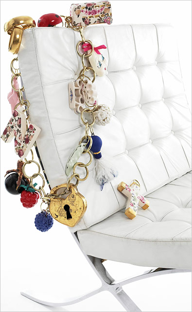
charm_bracelet_for_chair.jpg
FINISHING TOUCH The giant charm bracelet by Nicola Malkin, a designer and ceramicist, is typically displayed on chairs, large tables or bedposts, as at the J. Roaman furnishings store in East Hampton, N.Y.


I don't think anything could better express the empty hideous aesthetic which is companion to our new age of robber baronry than this image of monied, store-bought style which succeeds so perfectly in evoking the late Victorian, Philistine monstrosities of the last one.

The NYTimes article in yesterday's "Home & Garden" section begins:

At J. Roaman, a home furnishings store in East Hampton, N.Y., a painted white iron bed wears a giant charm bracelet over its left head post. The bracelet isn’t there because the bed wants for visual interest; it’s already enveloped in a brightly colored quilt by Lisa Corti, a Milanese designer, and topped with four pillows, five throw pillows and a bolster. The reason for the jewelry, according to Judi Roaman, a former fashion retailer who opened the store in May, is that furniture, like any carefully curated outfit, should express its owner’s personality. “Accessories make the bed into who you want her to be,” she explained.
I thought at first it must certainly be a satire. While it certainly is, it's not intentional.

I can only hope this is the beginning of the end.


[image and unexpurgated caption from the Times]

  • home

This page is an archive of entries from November 2007 listed from newest to oldest.

previous archive: October 2007

next archive: December 2007