Culture: January 2005 Archives

Some highlights from a weekend of visits to galleries in Chelsea and Williamsburg:
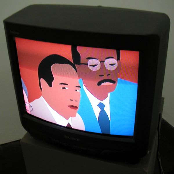

EzawaKotaSimpson.jpg
Kota Ezawa The Simpson Verdict 2001 DVD still in installation view

Murray Guy (unfortunately the site hasn't been updated) has a very smart group show, "in words and pictures," which includes several of the gallery's own artists. The wrapper refers to the common thread of various dramatic texts, whether printed or spoken, which runs through the two exhibition spaces.
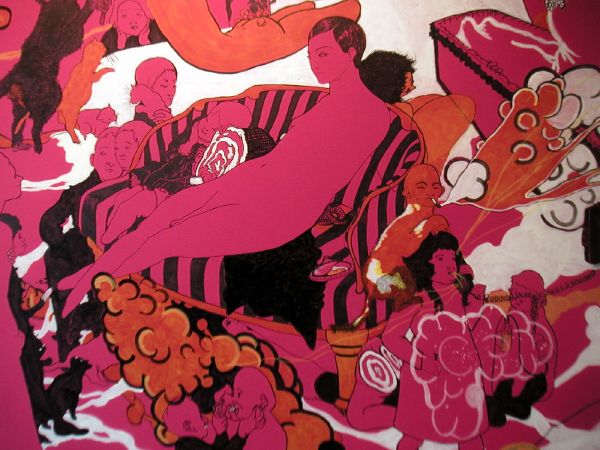

ShishkinHamInspector.jpg
Dasha Shishkin Ham Inspector 2005 acrylic and marker on wall dimensions variable [pretty large - ed.] detail
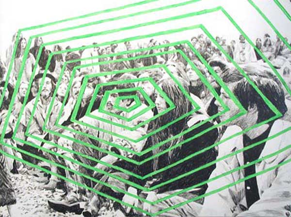
PareTogethergallery.jpg
Mike Paré Together We Can Do This 2002 graphite and egg tempera on paper 22" x 30"

Cohan and Leslie
has quietly become more and more a gallery which just can't be ignored. The current show. "Much Madness is Divinest Sense," is a knockout, distinguished by work both subtle and definitely not-so-subtle.
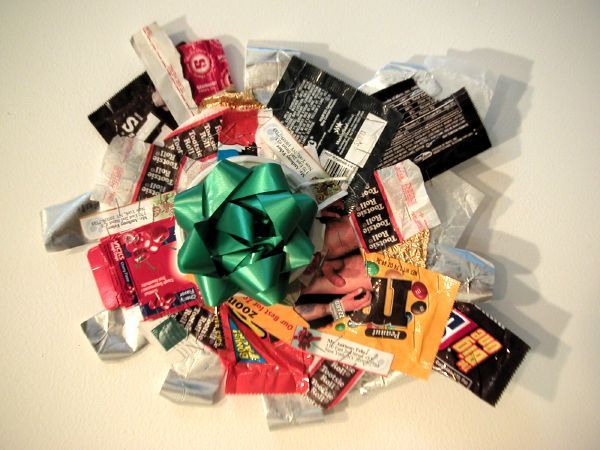

FeherGreen.jpg
Tony Feher Super Happy Special Group II (Green Bow) 2004 mixed media 11.5" x 13" installation view

D'Amelio Terras has hit something of a jackpot with "One-Armed Bandit," which uses the conceit of the eponymous gaming robot to feature work by Polly Apfelbaum, Tony Feher and Joanne Greenbaum, three of the gallery's artists. Once again I found it hard to look at anything else when Feher has is showing his stuff.

DoeDonme.jpg
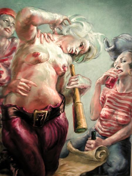
Don Doe Three Friends 2004 oil on linen 60" x 48" large detail

Oliver Kamm (Gallery 5BE)
is showing the work of Don Doe. Don't let the scary drama of the images in (any) reproduction put you off. If you get up to the second floor of the gallery you'll find these outrageous pirates have real staying power. The effect is somewhere between Rubens and Mad Magazine, with the Antwerp master holding the balance. When you get there, look at those gorgeous highlights, especially on the prominent gelatinous telescopes.

WoodmanBettyAztec.jpg
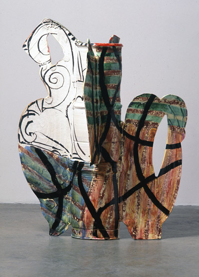
Betty Woodman Aztec Vase #1 (V.B) 2004 glazed earthenware, epoxy resin, lacquer and paint 35" x 28" x 20"

Max Protetch
is showing new work by the magnificent sculptor Betty Woodman. Nothing I can show here can do justice to the quality of what you will see in the gallery. I think this is the best work she has ever shown, and the timing is perfect, since I understand the Metropolitan has scheduled an important retrospective for 2006.

HydeJames.jpg
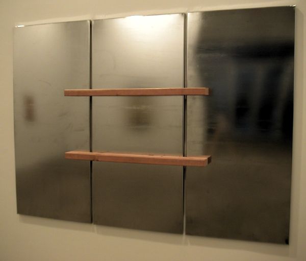
James Hyde Equivalent 2004 wood on chromed steel 49" x 68" x 4.5" installation view

BerwickLonesome.jpg
Rachel Berwick Lonesome George 2005 still from video in installation


Brent Sikkema
is showing James Hyde in the space recently vacated by American Fine Arts, thus doubling the gallery's exhibition area. Hyde continues to confound whatever boundary might still exist between painting and sculpture, and he always does it with a smile. With her own sculptural installations in the space to the west, Rachel Berwick and Lonesome George encourage the sober contemplation of great loss.

Spangler.jpg
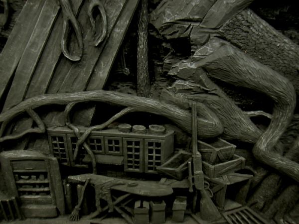
Aaron Spangler The Sniper's Home 2004-2005 carved maple, black gesso, graphite 32" x 36" x 4" detail
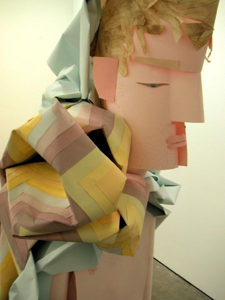
JohnsonRyanGhosting.jpg
Ryan Johnson Ghosting 2004 paper, acrylic paint, epoxy, color-aid, matte medium, aluminum rod, wire 74" x 22" x 22" detail of installation

The Zach Feuer Gallery opened two shows on Saturday. Zach mentioned to us that it was his "war show." At first I didn't understand what he meant. Sure, there was violence in the imagery shown by both of these artists, but it seemed to be pretty much a homemade violence. Then I managed to remember that in democracies wars are always homemade by definition. So there we are.

Aaron Spangler shows elaborate faux-naive carved-wood dioramas which have been totally blackened, suggesting, at least to me, monumental bronze castings. They reward a thorough inspection, both for their details and their larger significance.

In the gallery's other space Ryan Johnson has assembled three amazing sculptures composed largely of colored paper. At least two of these painfully frail and incredibly exacting forms describe the fragmentation of physical time.
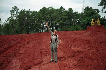

LamsonIrvingPointingtoGod.jpg
William Lamson Irving Pointing to God 2003 digital C-print 24" x 36"

Pierogi 2000 is presenting large photographs by William Lamson in the smaller gallery space. I've seen examples of Lamson's work one at a time in various venues for a year or more. My early interest is reinforced by this strong show of images of what can still best be described as the American heartland. Lamson's camera seems to love this world, even if it refuses to accept it on its terms alone.


THE SOUTHFIRST SECTION HAS BEEN UPDATED AND CORRECTED [February 3]
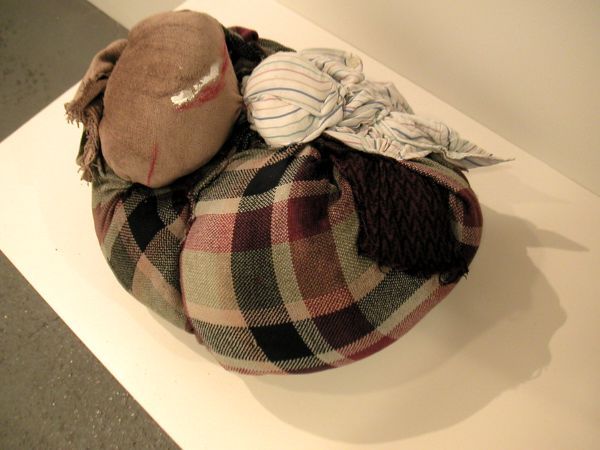
Takatalargersculpture.jpg
Ellen Takata Sleeper 2005 fabric sculpture, aproximately 20" x 14" x 11"

At Southfirst Maika Pollack and Florian Altenburg are showing paintings and drawings by Rebecca Bird and new sculpture and watercolors by Ellen Takata.

When I first posted this item there was very little information available about either artist, on the site or in the gallery, but I was intrigued by a number of small, soft works by Takata, a larger example of which appears in the image above. Maika had been suffering both from the flu and her exceptional absence from this excellent gallery - and its data manufactory - but today (Thursday) she wrote that she is now fully recovered. The show can be seen until February 13.

Excerpts from Maika's intriguing notes on these sculptures:

[The show, "Winter Indoors," is named] for an artist’s book by Takata that features the adventures of a sock cat and an ex-samurai in a New England home during the wintertime coupled with haikus . . . .

Ellen Takata’s soft sculpture figures are small creatures conjured from scraps of fabric taken from the artist’s own closet. The Scholar’s Rocks refer to the Chinese meditation tool and status symbol of the literari; other sculptures resemble animals (“Octopus on Rock,” “Fox,” Spiderbaby”) or human-ish figures (“Aristocrat,” “Topknot,” “Ghost”). These gently animate things seem to refer to the Shinto belief that nature is littered with small gods; they might be the population of a child’s winter toy chest, or a collection of imaginary companions made real. A series of eight companion watercolors evoke natural scenes and creatures. The exhibition seems to create a family of slight, somewhat ephemeral beings.
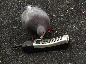

dilillo.jpg
Lisa DiLillo This Call May be Monitored 2004 still from video installation

Finally, I confess to being more charmed than ever by repeated visits to Lisa DiLillo's sensitive little video, "This Call May Be Monitored," currently installed at Momenta Art. Barry and I had first seen it at Fish Tank Gallery last summer where we thought we had the basic conceit down, but it was during the opening reception so we missed much of the audio. It's those recorded sounds which really put the piece over the top.


[Paré image from Chan and Leslie; Woodman image from Max Protetch; Berwick image from Brent SIikkema; Lamson image from Pierogi 200; DiLillo image from Momenta Art]
Beeoff.jpg
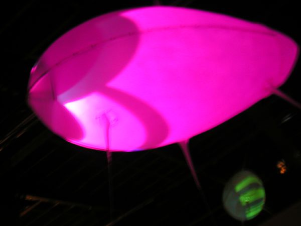
Beeoff Tentacle TransatlanticReverb 2004-2005 installation detail

neuroTransmitter.jpg
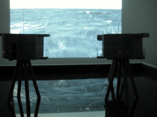
neuroTransmitter Offshore 2004-2005 installation detail

Ghani3.jpg
Mariam Ghani Kabul: Constitutions 2003-2005 installation detail


I was a little scared. Would I understand it? What would I say to those smart people? It seemed to be very much about technology, and I'm barely able to function as a basic blogger, even with my partner/webmaster's kind and regular ministrations. But Barry really thought we should go, and I have to admit I thought that even this klutz really shouldn't miss tonight's reception at EYEBEAM.

The event was described as an evening of tours and talks with the artists of their current installation, "Work In Process." It turned out to be great fun, and it really was a revelation. Maybe our first exposure to the six projects wouldn't have been so worthwhile without the extra help of the artists' guidance, but I know I'm going back, whether or not they'll be there next time. You don't really have to know much about what's going on behind the curtain.

The works were all beautiful, but if some were less so in what many would call a conventional sense there were great compensations in the success of some very original concepts.

Jenny Marketou uses a tiny spotter camera suspended from a red balloon to confound a world fettered by the machinery of surveillance. NeuroTransmitter investigates the history of extra-territorialism and its popular voices. The Swedish collaborative Beeoff creates tethered overhead sculptures lit beautifully from within by projectors which communicate with each other over the internet. Bec Stupak has installed her own beautiful and wacky three-dimensional concept of a DVD zine with the collaboration of more traditional paper zine artists; here technology is totally in the sevice of creative and exceptional individualities. KnoWear's attractive and very minimal installation was disturbing for its dramatization of the ineluctable personal impact of a corporate futureworld. The unfolding of a more elementally-human contemporary world, specifically the complex process of building a national constitution documented in Mariam Ghani's space brought tears of joy to my eyes; I found it almost impossible to step away from the wizardry which had recreated Kabul's 2003-2004 Loyal Jirga in a former garage on 21st Street last night.


For more information on the work of the six artists or collectives in residence who contribute to this show, see the exhibition link on the EYEBEAM site.

Gwon4F.jpg
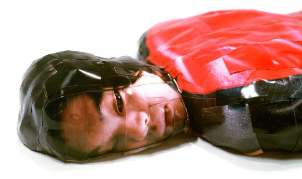
Gwon, O-Sang On the languishment of 340 pieces 2000 C-prints, mixed media 79" x 25.5" x 12"


Los Angeles's 4-F gallery (unfortunately the site hasn't been updated for quite a while) has opened a solo show, "Deodorant Type & The Flat," of work by Seoul-based artist Gwon, O-sang.

I originally knew nothing more than what the press release told me and I'm on the other side of the country (of the world?), but the image at the top of this post has haunted me since I first saw it one week ago. I don't know much more now, but the only other work I'd seen then definitely didn't discourage my interest. I've included it below.

Some clues from the gallery's scented statement:

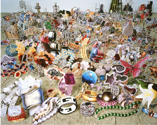
[The show] will consist of floor-bound sculpture that embodies his notion of deodorizing photography's historical odor by filtering it through the third dimension, and large-scale photographs (jewelry, watches, cosmetics) taken from advertisements that have been collaged in real space and re-photographed to flatten the viewing field
There's a peek at his studio here, via crazyseoul.


Gwoncollage4F.jpg
Gwon, O-sang The Flat 6 2004 Lambda Print mounted on Sintra with UV laminate 71" x 90"


[images from 4-F]

As I indicated he might, Barry has now done a post explaining what Luke Murphy actually does to create his computer art and enthusing about its wonderful painterly animation.

A lot of artists are working with technology and art, but I don't think that many of them pull off using the strengths of technology, such as writing a program which then generates the art (possibly in random ways like a high-tech bow to John Cage), rather than just using it as a useful animation or painting tool. I think Luke Murphy does pull off that feat. The works are engaging and beautiful, plus there is an intelligence to them that one can appreciate.
In a subsequent post he has some good words specifically addressed to the artist's very accessible web site.

SterlingGeometricStudy.jpg
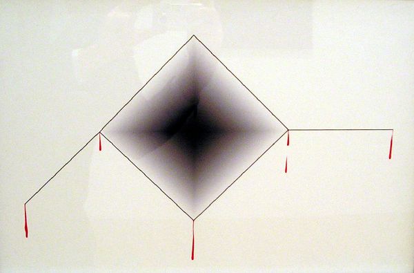
Sterling Ruby Geometric Study 2005 inkjet print with red pen on paper 13" x 19"

Sterlingblack.jpg
Sterling Ruby 90-Degree-Cryer 2004 Lambda print mounted with sintra and plexiglas 20" x 25"


I've seen Sterling Ruby's work in Foxy Production's rooms before, and it pulls me in every time. I can't explain why. Even once inside, there seem to be so many questions unanswered; in fact I think that includes most of the questions, but you can tell he's very serious about asking. While I admit his investigations are of a kind which wouldn't occur to me, or perhaps to most any viewer, they manage to give his unique aesthetic an extraordinary intensity just for their being posed.

Yeah, I really like them.

One caution: The two images above don't manage to do justice to the actual work, on view in the gallery as part of a very good small group show, "Geo," until February 12.


[both images from Foxy Production]

ScherJuliaSecurity.jpg
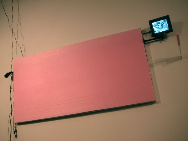
Julia Scher Security Landscape of the Year 2004 metal, monitor, Styrofoam, camera, knife, string, metal frame 24" x 47.75" (dimensions vary with installation) installation view


In spite of their other, more social pleasures, opening receptions are never a good time to see a gallery or museum show, so I will have to suspend most of my usual (innoxious) judgments about the new Artists Space exhibition, "Log Cabin." The name of the show is a reference to the scary national right-wing gay organization (and much-abused victim of unrequited elephant love), the Log Cabin Republicans, and it aims to examine the impact of reationary politics on representations of the queer experience and on the creative expression of queer artists.

Jeffrey Uslip, the young curator, has assembled an interesting group, and I'm delighted that it includes a number of names with which I'm totally unfamiliar.

But of course some were more than recognizable. I've written about Scott Treleaven several times in the past and I think I've watched the fluid development of his collage work almost from its very beginnings with a zine and a brilliant video. Because of that and because it is installed very smartly in a separate room in the Artists Space environment his contribution (which is actually something of a mini-retrospective, although that seems ludicrous, since the artist looks barely out of his teens) came together and really stood out, at least for me, even in the midst of the large enthusiastic crowds which came out of the cold on Tuesday, the night of the opening reception.

I will definitely go back for a better look at each of the other artists' work, much of which I confess was pretty baffling without enough room to see it or a proper scorecard. Among many other pieces only half-seen that night, I'm curious about Allison Smith's sculpture installation, "Flagging Stack Arms," Terence Koh's "29 seconds of attraction," K8 Hardy's "Trying to Talk," Paul Pfeiffer's video "Empire," which is described as of three-month duration, Julia Scher's "Security Landscape of the Year," and the very un-Republican imagery of Ken Gonzales-Day.

Andrew Solomon managed to garner two separate, modest-size spaces with two very different works, and he deserved both of them. We love Dave Burns! I hardly had more than a glimspe of the various video works spread throughout the rooms. Dean Sameshima's photographs are always sexy (even when they include no human figure) but that's always only where they start. Any show in which Glenn Ligon's work (here, one piece descibing four wonderful texts* on canvas) is among the most accessible is definitely worth some serious visiting time.


*
LigonGlennnut.jpg
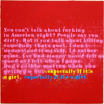
Glenn Ligon Especially If it's a Girl #1 2004 oil and acrylic on canvas 30" x 30" detail


the complete text of this section of the piece reads:

You can't talk about fucking
in America right? People say you
dirty. But if you talk about killing
somebody that's cool. I don't
understand it myself. I'd rather
come. I've had money never felt as
good as I felt when I came.
Don't nothing matter when you
getting a nut - especially if it's
a girl, especially if it's a girl.


Schwartzbirthday.jpg
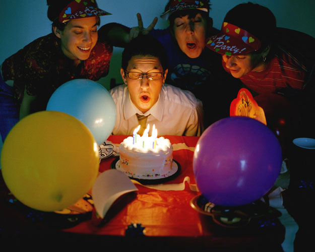
Evan Schwartz Birthday Party 2004 digital C-Print 30" x 24"

Schwartzbedphone.jpg
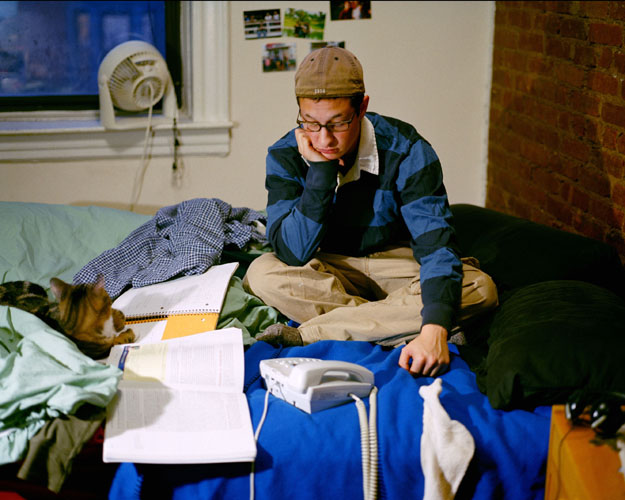
Evan Schwartz Waiting by the Phone 2004 digital C-Print 30" x 24"


Evan Schwartz has his first solo gallery show and it dazzles, with both the bold inventions of his art and the infectious joy (and sad frustrations) of a second puberty - this time the one he really wanted.

The Schroeder Romero press release explains:

Evan Schwartz was born in Chicago, Illinois, in 1982 under a different name and gender. His new photography series Reclaiming Puberty, is a maturing timeline about growing up as a girl into a man. Through this self-exploration of gender and sexuality, Schwartz painfully discovers that in order to become the man he's always wanted to be, he must go through the perils of adolescent boyhood first - after already experiencing adolescence as a girl.
The gallery installation follows chronologically her childhood and youth, documented in family photos, through a self-documentation of the courageous transformation process which permitted him the ordinary joys and frustrations recorded in the last images in the show, two of which are shown above.

Schwartz is currently a student of photography at Pratt Institute. I'm sure we will be seeing a lot more of his work, whatever form it may take.


Waughhandsdetail.jpg
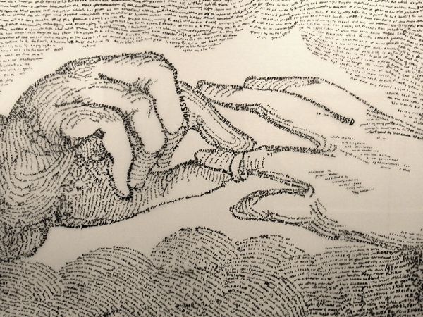
Michael Waugh Inaugural 2004 ink on mylar 36" x 78.5" detail


In the Project Gallery space Michael Waugh has installed a number of his text-drawn and text-painted works in [dis]honor of the frightening annointing process the nation will witness tomorrow on the capital steps. Waugh's images allude to homosexual desire and identity. They are immediately and profoundly beautiful, as they always are in his work, but their relationship to the historical phrases of which they are mostly composed is profoundly disturbing, especially in the reality of the perverted politics of today.


[images at the very top from Evan Schwartz]

Fosterdetail.jpg


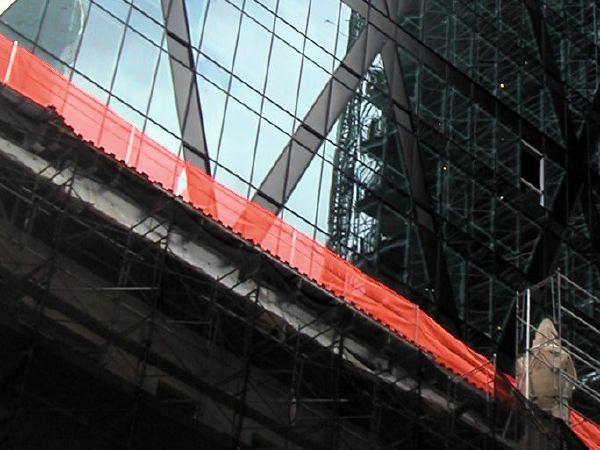
I hadn't noticed until recently that Sir Norman Foster's exciting project for completing the 1928 Hearst Building in midtown Manhattan includes a relatively small but significant salute, or nod, to the design of the art deco original.

In the photo above, note the chevron shapes on the stylized urns at the top of the surviving shell of the early building. These ornaments are repeated all along the parapet. Foster's tower rises above all this, and uses its diagonal device structurally, on an enormous scale.

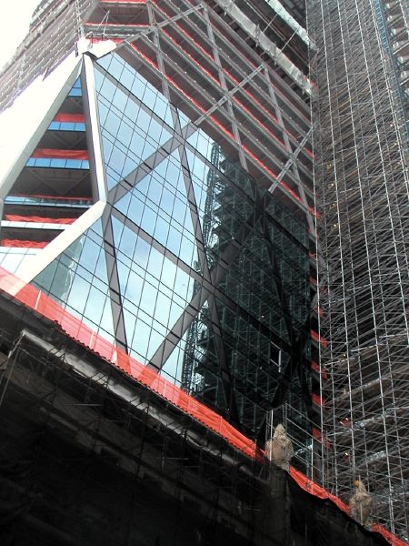
The photo below shows much of the current height of the massive new construction, and the top eight floors are still to be built. That is, otherwise imagined, there are still two layers of triangles or one full layer of X-bracing to go up beyond what you see on the street today. The completed building is going to look much larger than it appears in the architects' renderings.


Fosterfull.jpg

CoryNintendocartridge.jpg
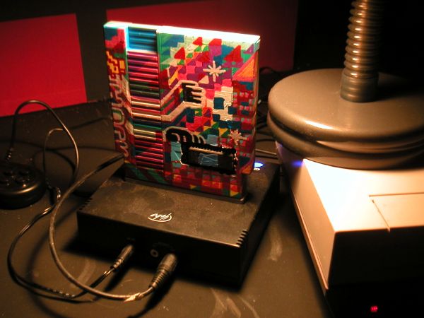
where the magic lives


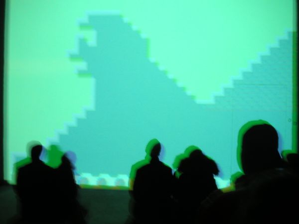
Last night's opening at Deitch was an almost ecstatically-happy sorta-rave made up mostly of artists and computer nerds. The output of this little machine, an altered vintage Nintendo cartridge, sitting on a black platform in the corner of the room, was what attracted the overflow crowd. The machine itself was the product of a particulary felicitous collaboration between Paper Rad and Cory Arcangel.

Tom Moody describes the work - in two posts.


CoryPaperRMario.jpg
impression of the scene of the "Super Mario Movie" projection, unfortunately minus even a hint of the great soundtrack

ArcangelTetris.jpg
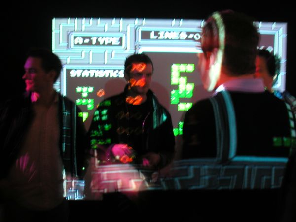
a view of some of the pleasures of the Cory Arcangel opening at Team Gallery last Thursday


He's a creative genius and a master with the modern tools he has chosen. Cory Arcangel is also one of the nicest, most likeable, winsome, and approachable people I've ever met. All of this just makes his genuine modesty pretty incredible.

His happy art (can I say that?) speaks for itself, and it will speak to just about anyone. In New York we've gotten used to thinking of Cory as our own, although beginning next week he will be showing work in Vienna, Salzburg, Zurich and London. Fortunately, both because of his fecundity and the nature of his chosen media, there will always be plenty to go around.

Arties in Europe should see the Galerie Lisa Ruyter site and click onto "project space" for information on his appearances.

Anyway, he'll be in our town for another few days. Enjoy the show which opened at Team Thursday night, "Welcome 2 my Homepage Artshow," and visit his collaboration with Paper Rad at Jeffrey Deitch in Soho anytime between tonight's opening (it's sure to be a wonderful zoo) and February 26, when it closes. The show at Deitch is called "Super Mario Movie."

Oh yeah, there's also a performance scheduled at the Swiss Institute - Contemporary Art on Tuesday, February 1, at 7pm, so our boy won't be staying long in Vienna.

On the screen in the image at the top is a projection of what the Team Gallery press release describes simply as "an absurdly slowed down version of Tetris®."

For more on the Team show, see Tom Moody's notes.

LendvaiThomasEdBarry
Thomas Lendvai's installation at Plus Ultra, as seen during the opening reception, with Ed Winkleman and Barry Hoggard showing as prairie dogs*


It's great fun, even if you couldn't be there for the cheer of the opening. Thomas Lendvai's plane of wooden joists has cut through the Plus Ultra space at a rakish angle, totalling re-configuring the white box and challenging the ordinary conventions of architectural space. There's nothing else in the gallery, but if you tried to add anything more than the bodies and faces of visitors attracted to this striking, minimal show (installed in one of the smartest galleries in the city) the room would be visually destroyed.

Fortunately, on the evening I stopped by those additions were all very beautiful.


* the analogy was Barry's, and it just popped out when he saw the image

TaylorJanice.jpg
Janice Taylor, one plate from the series, JustDesserts

MissingPeter.jpg

Peter Missing, handmade poster

BeckerCharlie.jpg
Charlie Becker, handmade action figures, from a series


There are few spaces where a show called "Represented by Retail" would be more appropriate. The non-profit art gallery/project space Cuchifritos occupies a conventional store unit at one end of a colorful and historical indoor market on the Lower East Side. [note for western downtowners: the Essex Market is something like Chelsea Market, but with a soul]

The exhibition, as described on the gallery site by its curator (and director of the gallery) Paul Clay, "Explores a new crop of artists who are represented as much through retail stores as by galleries." But don't jump to conclusions about crass commercialism or the quality of work offered directly to an open market. More from Cuchifritos:

Critics from this urban/street/corporate scene see contemporary artists as modifying their output to make it gallery-ready and collector-appropriate, which they see as no different from making art that is corporate-acceptable, as long as they feel the primary qualities of their work are still getting out into the world. Some see contemporary artists as simply cobranded with a gallery rather than a corporation, and like galleries, there are good and bad corporations to hook up with. The quest to maintain a level of integrity is the critical goal.

Cobranding of products is seen by many as a dilution of the art by corporate goals in sponsorship, but what is happening now can be read as the artification of commercial products. Viral transmission of art into the commercial product arena.

Making better things through art, every day.

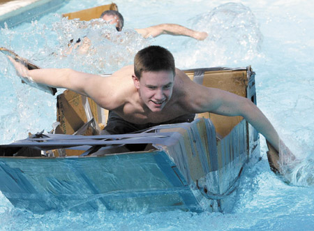
Cardboard-boat_UASA_SP03_4c.jpg


I love cardboard. It's warm, accessible, forgiving and versatile, and it comes in all sizes, colors and surfaces. It's also totally without pretension, even when it's pretty expensive. All these virtues describe the stuff before it's been worked, and sometimes the work really moves.

While one afternoon's experience doesn't suggest a school, as we were heading home last night I thought about the fact that in three gallery stops and one studio visit this humble material had been the basis for most of the art we had seen. Odd. Maybe it was only because all of the venues were very downtown, but it actually seemed very right.


[image from California State University Chico]

GrenierPatrick.jpg
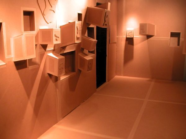
Patrick Grenier Make Room for Dada, Constructivism and Suprematism 2004 cardboard, ink, glue, metal, wood and paper 120" x 252" x 204" installation view of interior


It's a beautiful space, and it's in an alley much too interesting to be a part of the New York grid, but it is, and it looks like now there's going to be another reason to visit Freeman Alley besides Freeman's.

The gallery is Silo, and its current beautiful, very timely (but obscure?) show, "Wrestling With Architecture," is of work by Patrick Grenier. Grenier addresses the relationship between art and the spaces where art is made at home - or not. All of it seems to be about the Museum of Modern Art. I think he's just asking the questions, which is probably alright, since there are all kinds of answers out there.

MurphyLukePorno.jpg
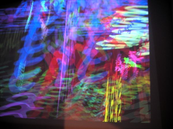
Luke Murphy Porno Painter/Eroloop 2004 file on disk, still from installation projection

MurphyLukeCascade.jpg
Luke Murphy Cascade 2004 file on disk, (slow-shutter) still from installation projection


I'm going to leave a discussion of this one to Barry; real computer genius is behind the art created by Luke Murphy which we saw at Canada this afternoon. I can only speak to the product, and it's really wonderful.

LidenKlara1.jpg

LidenKlara2.jpg

LidenKlara3.jpg

LidenKlara4.jpg

LidenKlara5.jpg

LidenKlara6.jpg

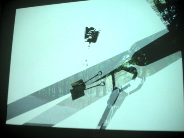
Klara Leiden Paralyzed 2003 video, 3 minutes, stills taken from installation


This is what keeps some of us going. The wonderful energy of a new gallery located where none have gone before, and the first exposure to an exciting new artist.

I left Reena Spaulings Fine Art this afternoon with a grin from here to there, and a bounce in a pair of feet which had been complaining about mistreatment until just before Barry and I entered the rough storefront space on the east end of Grand Street.

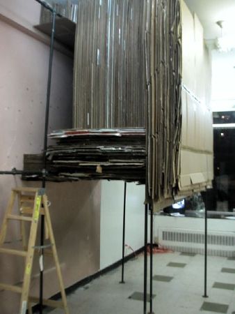
The centerpiece of the gallery installation was a site-specific installation which seems to define a sub-genre. Klara Liden builds imaginative natural habitats in the midst of hard urban realities, and here on the Lower East Side she has collected corrugated cardboard from both the immediate neighborhood and the basement of this old building in order to assemble a treehouse-like room on stilts within which she has mounted photographs documenting her scavenging for its construction.

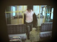
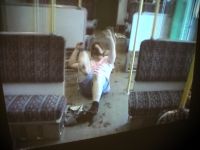
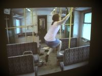
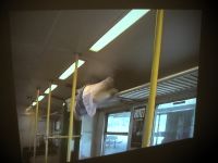
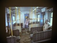
Two videos make up the remainder of the exhibition, and I have uploaded stills from one of them above. The young Swedish artist is shown madly and athletically dancing through a Stockholm subway car at night, shocking a number of other passengers, all of whom it seems would prefer to be able to ignore her. The soundtrack is by the Legendary Stardust Cowboy.

We are told that Liden has studied formally as an architect. We can see that she is a subversive architect. She is described in the press release as "a genius," and I wouldn't argue with that. "Before this show she invented a free postal system in Stockholm, made books with 'appropriated' outdoor advertising, and built an underground house on the banks of the River Spree." Each of these enterprises is beautifully recorded in simple books available in the gallery.

The show continues until January 31. Unfortunately there is no web site yet, but there is always ArtCal. Go talk to the nice people we found on Grand Street today.


Lidenhouse2.jpg
Klara Liden Benign 2004 cardboard, wood, steel, photographs, installation view of the structure, with ladder entrance

Lidenhouseview.jpg
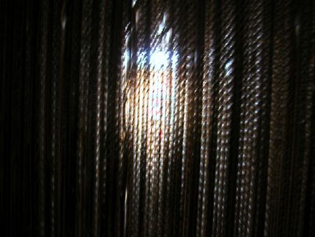
Klara Liden Benign 2004 cardboard, wood, steel, photographs, installation view from within the structure, through the corrugations

Cherubinisinglejug.jpg
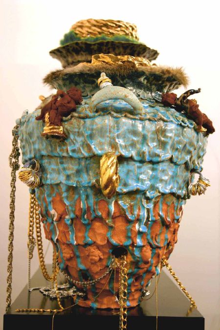
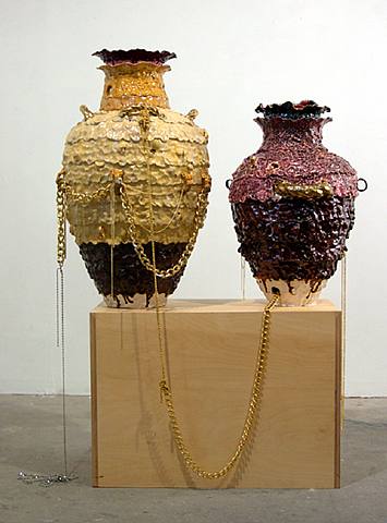
Nicole Cherubini G-Pot with a Rose 2004 stoneware, fake gold and silver silver jewelry, red rabbit fur, enamel 41" x 15.5" x 15.5"


I now have a jpeg of one of the Nicole Cherubini pieces which really is in the Caren Golden show, so I am showing it above, together with images below of work by two other artists seen in the same space.


morken_twi.jpg
Amy Morken Untitled 2004 graphite, colored pencil, pastel, oil stick 22" x 30"


humphrey_woods.jpg
Ryan Humphrey In the Woods 2004 acrylic on canvas 12" x 10"


The remaining artists shining in "The Twilife" are Emily Keegin, Emily Joyce, Dan Kopp, Evan Lintemans, Julie Nord, Elizabeth Olbert, Luis Coig Reyes and Andrew Sendor.


[images from Caren Golden Fine art]
Domenig
GÃŒnther Domenig, on the architect's imagination.


I love visiting the Austrian Cultural Forum building. Once you've greeted the very-New York concierge guy behind the desk inside the door of the narrow 24-story tower on 52nd Street, you could actually be in Wien. The two-year-old building designed by Raimund Abraham is that modern. And, yes, I really mean that about the city. The former capital of the Austro-Hungarian empire is no longer just old. Go see for yourself.

Anyway, back in New York, yesterday I stopped by the Forum's current exhibition, “GÃŒnther Domenig: Structures that Fit My Nature,” which unfortunately offers only a tantalizing and impressionistic glimpse of the work of the interesting Styrian architect GÃŒnther Domenig. The modest spaces which occupy four levels of the building are mostly devoted to just two projects, the Steinhaus in Steindorf, KÀrnten (Carinthia) and the Dokumentationszentrum (Documentation Center) in Nuremberg, and there is precious little guidance to those (the supply of the show's brochure had been exhausted long before I arrived).

The first structure is Domenig's own still-evolving dwelling and offices on the shores of a vacation lake, and the second is his striking deconsecration of the notorious Nazi Party Rally Grounds.

One of the most useful (and stylish) elements of the installation was the wall-size video screen interview with the architect (edited as a monolog spliced with photographs of his work) which occupied one of the rooms. I think it should be recommended viewing for anyone who wishes to understand where truly new architecture should start. I wish I had taken notes, but Domenig says something profound about the relationship between the architecture in the architect's head and the architecture which has to be constructed in the messy real world.

I loved the little wooden dock shown in the video; it seems to have made the transition.

The causes for his repeated exasperation, and his extraordinary perseverance in the face of enormous obstacles, helps to explain why we get almost no truly exciting buildings in New York these days. We have to insist on great patrons as well as great architects.


Domenigdrawing
the dream

[GÃŒnther Domenig STONEHAUS, Relations PPP 1987 pencil and color pencil, installation view]


ADDITIONAL PROGRAMS

The Cultural Forum has some more wonderful programming lined up over the next two months. First there will be an exhibition of figurative works by Austrian artists and others called "Slices of Life: Blueprints of the Self in Painting." It opens with a public reception on Tuesday, January 18, from 6 to 8pm. The artists include Amy Cutler, Plamen Dejanoff, Nicole Eisenman, Johanna Kandl, Elke Krystufek, Muntean/Rosenblum, Katrin Plavcak, Lisa Ruyter, Markus Schinwald, Ena Swansea, Nicola Tyson and Gregor Zivic. (I'm having fun trying to imagine which of these artists has a connection with Austria, especially if I imagine connections something other than that of birth.)

Beginning the next day there will be a number of chamber music, lieder concerts and film programs in the building's small, two-level jewel-box theatre. Somewhat exceptionally for this institution whose expressed mission (encouraging and describing the impact of the digital world on the arts and culture at large) has meant that it has hosted some very exciting new stuff, the January and February programs are limited to composed "classical" music, although they range, almost all somehow Austrian, from Haydn and Schubert through Mahler, Berg, Schulhoff and Krenek, to PÀrt and Kurtag.

I'll be there January 18, but I'm also going back for the music and the films. There's always the building too, and maybe I'll get further upstairs some day. I still haven't seen almost 20 of those tantalizing 24 stories.

CarenGoldenTwilife.jpg
installation view of works by Emily Keegin and Andrew Sendor at Caren Golden Gallery


Caren Golden has assembled a fascinating group show, "The Twilife," curated by Brit Shapiro. I'm not sure I understand the conceit which brought the work of these eleven artists together, but somehow it works.

Cherubinipots.jpg
Nicole Cherubini A Pair of G-Pots with Cherubs, Fur and Rope 2004 mixed media [work not in the current Caren Golden show]


There are no weak spots in the roster, but one of these artists really stands out, both for what I saw on West 23rd Street and for my personal history with the work.

Barry and I had first seen smart conceptual work by Nicole Cherubini when it was photo-based, but for a while she has been creating some pretty outrageous stoneware sculptures. I don't know for sure why it has taken me so long to "get" her fabulous ceramics, but they really took my breath away when I saw what she had contributed to this show.

I'm afraid my blindness had something to do with the stubborn native reserve I had thought I had overcome long ago, after years of embracing the exuberant expression of less retiring friends and strangers and especially after embracing the often extravagant art of my own times.

This surprises and embarasses the me I thought I had become.

Cherubini's art mocks the posturing of wealth characteristic of all civilizations, even if her pots could only have been created today. Every age displays its extravagance, but this one has not only rejected absolutely all restraint, it absolutely glories in the rejection.

I don't think this gorgeous, exuberant sculpture could have been done in the 80's, even in the East Village. In the few years since the dispersion of the world evoked in the current New Museum retrospective of a special time and place, our everyday world has gone so much farther than Arch Connelly or Rodney Alan Greenblat. Cherubini is simply claiming this current outrageous age for her art.


[first image from ArtNet, second image from Samson Projects LLC via ArtNet]

  • home

This page is an archive of entries in the Culture category from January 2005.

previous archive: Culture: December 2004

next archiveCulture: February 2005