Culture: August 2005 Archives

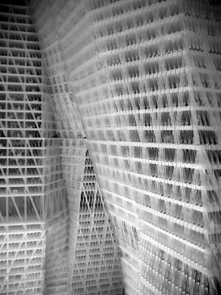
UnitedArchitectsWTC.jpg
United Architects World Trade Center Proposal Project 2002 Plexiglas [detail of installation]


It was my favorite when I saw it in a magnificent exhibition organized by and presented at Max Protetch now more than three years ago. It may have been the only proposal which looked like a work of art as much as it looked like it would actually work. I think that suggests great architecture. Apparently MoMA now agrees, since the model of the United Architects study for the site of the World Trade Center has entered the collection. [see the architects' site for more]

Yes, I know that in recent years, because of the stupidity and the chaos which has accompanied discussions since this structural model was first shown, and the banal or junky designs which have been advanced in its stead, I have argued for a big green lawn or, more recently, a grand pedestrian plaza.

But if build we must (this is still New York) my heart would still be with this gorgeous proposal, in spite of its size. It somehow remains the least monstrous, on account of its elegance and its irregularity. It may be the safest structure, because of its structural connectors and its multiple exits; and, oddly, it comes off as the most humanist, for its anthropomorphic shapes and the suggestion of an organic community within.

Every one of the extras which have been suggested or promised for the site since this model was built could fit within its mass. At this point I'm even willing to do without those two holy holes, although the United Architects design actually does contemplate keeping those areas clear and the combined segments of the building actually embrace them.

Also because this is New York however, this great proposal is likely to stay just where it is - a work of art.

Kannen2.jpg
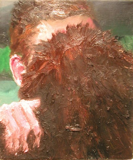
Chris Kannen Chris Making Out with Bigfoot 2005 oil on canvas 12" x 10" [large detail]


LambertEN.jpg
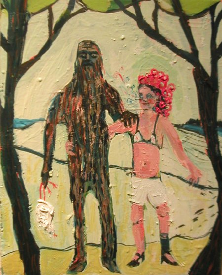
Emily Lambert They Called Him a Wildman 2005 acrylic on canvas 10" x 8" [large detail]


CainePeterSasquatch.jpg
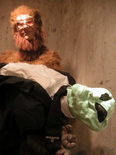
Peter Caine Untitled mixed media 8' x 5' x 4' [detail of animated installation]


McLaughlinTriciaNazca.jpg
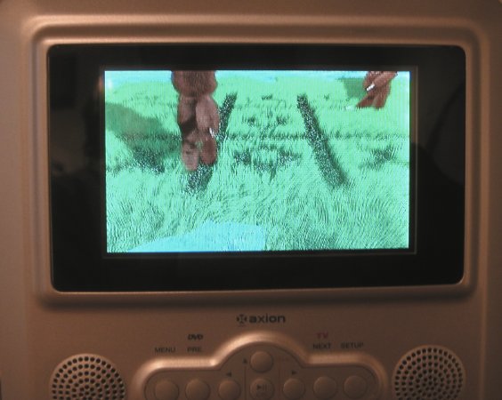
Tricia McLaughlin The Nazca Lines Explained 2005 2 min. animation [still in video installation]


Like so many of my species, I really would like to believe in these creatures, but the only thing I'm certain about right now is the quality and great fun of the group show at Sixtyseven gallery, "Sasquatch Society," devoted to Bigfoot, Yetis and other hominoids.

There's enough interest out there in stories about wilderness sightings of large, hair-covered, man-like animals to inspire dozens of young artists to jump at the chance to each produce one or more remarkable works illustrating our often quite intimate relationships with an elusive beast which remains stubbornly remote to [most of] us. The majority of the works in the show were created this year, but the fact that there was already a reserve of pieces which pre-dated the gallery's Sasquatch call suggests that interest in these stories was not just something induced for our summer amusement.

Campagnadetail.jpg
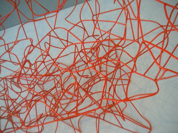
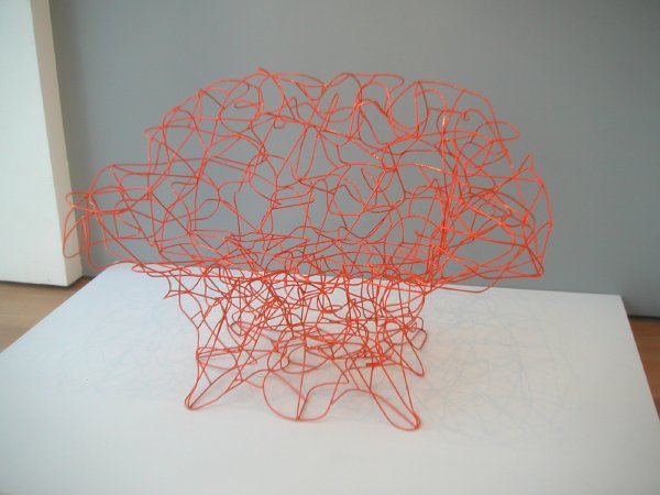
Fernando Campagna and Humberto Campagna Corallo Armchair 2004 steel wire and epoxy paint [detail of installation]


It's MoMA's new aquisition, not ours, but it sure is an exciting chair.

For a few seconds I fantisized that I'd found the perfect sculptural seating for our roof garden. Orange on green. Fantastic. It could accomodate two very good friends at once, but we'd probably have to commission a nice cushion or two and it would need a cover for bad weather. None of this is a problem however, since I'm sure we can't afford it anyway. This piece is handmade, and since according to the label it was donated to MoMA by its Chairman, billionaire Ron Lauder [presumably for the Architecture and Design Collection], even if it isn't unique it had to cost a bundle.


CampagnaFernando.jpg
Fernando Campagna and Humberto Campagna Corallo Armchair 2004 steel wire and epoxy paint [installation view]


Maybe if I could locate an old innerspring mattress . . . .

Thonet.jpg
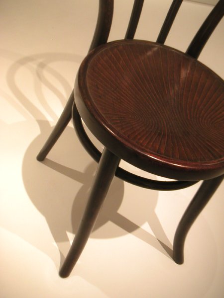
Gebrüder Thonet, company design Vienna Café Chair (no. 18) 1876 bent beech wood 33.5" x 17" x 20" [detail of installation]


One of my favorites in MoMA's Architecture and Design Collection is this simple chair.

Thonet patented the bentwood process, but their patent expired a few years before this chair was manufactured. D.G. Fischel Sohne was one of several Austrian firms ready to imitate their success with seductively-curved wood. Years ago, while acquiring modest colonial and federal Rhode Island furniture for my old house in Providence I managed to pick up a simple Fischel side chair very much like this Thonet for only a couple of dollars.

I appreciated its simple beauty from the beginning, but In Providence it had to wait upstairs in a small back storage room for years. In New York it has been able to join the very eclectic collection of stuff I've spread throughout our 1930's apartment. Now I admire its simple dignity every day, although I have to admit that it wouldn't have looked at all odd if I had mixed it with the skinny windsors in the little 1760's house from the start.

Cisitaliagrill.jpg
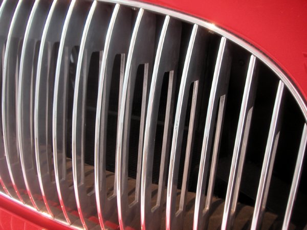
Pinin Farina Cisitalia 202 GT Car 1946 aluminum body 49" x 57 5/8" x 13' 2" [detail of installation]


I didn't expect to look for the Cisitalia again when I casually wandered into MoMA's Architecture and Design galleries earlier this week. I'd seen it many times before and in spite of my obsession with interesting automobiles I didn't think it could mean much to me any more.

Uh-uh.

I was particularly sensitive to industrial design that day because we recently decided we needed a new land phone and I had just been looking at the lamentable, no, painful choices available. This beautiful car was imagined and put together almost 60 years ago. Have we learned nothing since?

I'm not even going to dwell on the ugliness and gigantism of the SUVs, Town Cars and Ford taxis which confronted me as I left an art museum which has tried since 1932 to honor good, simple design in everyday objects created over the last 150 years or so.

I'm sticking my neck out a bit by bringing up the subject of this Museum collection in the first place. Many people still think a design gallery in an art museum is inappropriate in the first place, but I'm happy with the idea that we shouldn't be content with a world where art is only found hanging on walls or standing in public spaces.

There's also the subject of the [ethics?] of any kind of enthusiasm for the private automobile, especially in the twenty-first century, even if Americans don't have any real alternatives at the moment. In any event, when this car was built General Motors and the oil companies had barely begun their campaign to destroy public transportation, so the idea of a private pleasure vehicle did not carry the baggage it does today.

Incidently, this little Cisitalia has an engine smaller than that in my 1962 VW Beetle, but with more power, and it weighs about the same (1600 pounds). Hey, those power and weight figures are pretty much the same as those of a basic Smart. Now there's an original and almost perfect design for modern industry, and it too is now a part of the Collection. But, and no surprise here, we're not allowed to have it on our streets. Too pretty and too sensible, and it doesn't have a brutal line in its body.

But back to the old car and the new phone. The color of the sleek Italian antique on MoMA's third floor is a luscious red which could never be forgotten, much less ignored if you're anywhere near it. When I'm through with this post I'm going to plug in my new phone system. it's in a busy combination of a dull black and a grey pseudo-aluminum, and it looks like it will be almost too painfull to live with. Maybe I can cover it with a doily. But, really, it's not about color. The colors are only symptoms.

BarenboimRamallah.jpeg
playing for peace


In a project begun with the dream of his late friend Edward Said, Daniel Barenboim finally made it to Ramallah with his West-Eastern Divan Orchestra last night. Members of the orchestra, founded in 1998, come from Israel, Palestine, Syria, Lebanon, Egypt and Jordan.

The sound of Beethoven's Fifth Symphony drowned out the staccato of bullets on Sunday in the conflict-ridden Middle East as world-famous conductor Daniel Barenboim dazzled his Ramallah audience with both music and words.

Playing under the theme "Freedom for Palestine," Barenboim and his new West-Eastern Diwan [sic] orchestra were able to break all barriers and help an audience fatigued by strife to enjoy two hours of pure music from Beethoven and Mozart.

. . . .

The 1,200-seat auditorium of the Ramallah Cultural Center was packed with a Palestinian, international and even Israeli audience an hour before the baton was scheduled to drop. As the seats filled, hundreds others milled in the hallways and the aisles hoping to get a seat or just to be allowed to stay in standing room and listen to Barenboim and the orchestra.

The same audience stood for 15 minutes, enthusiastically clapping and yelling "bravo" after Barenboim concluded the performance, giving Palestinians in Ramallah a chance to forget the checkpoints, the occupation, the wall and everything that has made their lives void of spirit, as one member of the audience remarked after the concert.

Outside the auditorium, the reality for West Bank residents had not yet changed after the concert, as Barenboim hoping to achieve with his music and orchestra.

A few audience members had to leave early to get home before some checkpoints at entrances to Ramallah closed. Others who waited until the end and headed home after the concert had to stop in long lines of cars waiting at checkpoints to be able to reach their homes. Barenboim realized this reality, and this is why he brought his new orchestra to Ramallah.

"What I want to say to you," Barenboim told the audience after the orchestra finished playing, "I have already said in the music.

But it wasn't easy getting there.


[image from European Pressphoto via Taipei Times]


Michael Cambre's sketch of Ann Pibal's FLMNCO at PS1's show, "Greater New York 2005"


Five great new [color!] sketches have been added to the "Free the Art" gallery. I've also added a separate link to the on-line exhibition at the top left of my home page, to make it easier to locate.

All five of these drawings come from Michael Cambre. Yes, anyone can submit as many as she or he wishes. After all, this initiative is all about making other people's art visual, even if the process means that sketchers get their own images published - along with an appropriate link whenever I can find one.

You guys have five more weeks to visit the show in Queens with your sketch pads. There are still some 150 artists undocumented here. "Greater New York" closes September 26, when much of their art disappears from public view, perhaps indefinitely, and possibly forever.

Free the art!


For anyone only joining this conversation now, this "Free the Art" project is about helping to make visible hundreds of pieces of contemporary art to which the Museum of Modern Art seems to have been doing its best to limit viewing access. The works in the current show at PS1, which is MoMA's child, are not even listed, either at the museum itself or on its website; of course that also means there are no images on line either, and visitors are forbidden to photograph anything whatsoever. Oh yes, a big museum book has been promised, but it's not here now, and it's certainly not going to be free.

DiamondsOranges14.jpg
last night there was [sic] Diamonds and Oranges spilling onto 1st Avenue


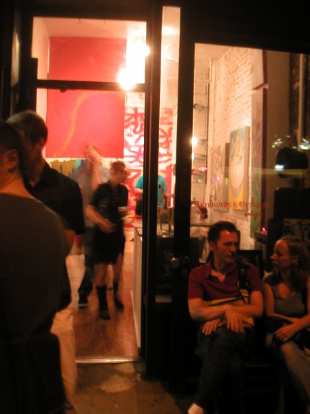
Yay! A new space has arrived in a neighborhood with a rich history in the visual arts, but which has been inexplicably gallery-challenged for years. Diamonds and Oranges first opened a door on 1st Avenue, between 9th and 10th Streets, only a few weeks ago. According to the artist/gallerist, Lyon Smith, the diamonds are the art and the oranges are a reference to the stock of the tiny bodega which previously occupied the small storefront.

The current show, which includes paintings by Smith, drawings and sculpture by Derick Melander and collages by Dug Rupp, opened just last night. The work is definitely worth a detour, and on the basis of what we found we both expect to be returning for every show.

In addition, all of this couldn't happen to nicer people, and here I'm talking about the residents of the neighborhood, the artists [well, I actually haven't met Rupp yet] and the good folks who will be stepping by this very promising room in the future.


MelanderD.jpg
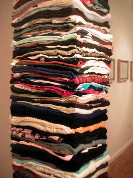
Derick Melander Where Do I Stop, Where Do You Begin (Female Stack) 2003 11' x 17" x 12" women's clothing [detail of installation]


In a statement which accompanies the show Melander says that he gathers, categorizes and folds "exorbitant amounts of ordinary clothing" to create large geometric configurations. And in lines found on his site he specifically describes the piece above:

The stacks extend from floor to ceiling and can be created for any size room. Clothing that is worn on top of other layers is placed at the bottom of the stacks, while clothing that is worn directly against the skin is placed at the top. In this way, the clothing relates to the way we layer the clothing we wear.

Once the clothing has been categorized, I allow patterns and texture combinations to occur by chance.

Don't miss his small maquette, assembled from Barbie and Ken's wardrobe, on the counter near the door. The full-size sculpture will be included in a show in New Jersey in November.

Barry has a post which includes an image of Melander's poetic sculpture, Wedge, which is also installed in this show.

seattlerheingold3.jpg
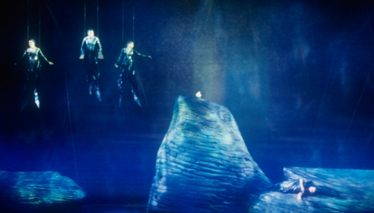
the Rhine maidens taunt Alberich [another cast, same harnesses]


What a trooper!

What an exciting diversion from the day job! How could you turn it down if the opportunity presented itself? And think of the stories for the grandchildren. Gina Lapinski saved the day for Wagner's "Das Rheingold" in Seattle on Monday by volunteering as a "fly-in" for one of the Rhine maidens.

The scene was the Seattle Opera at 4 p.m. Monday, only three hours before the curtain was to rise on a performance of "Das Rheingold" in the company's "Ring" cycle, running through Aug. 28. The mezzo-soprano Jennifer Hines, a New York City Opera regular who plays Flosshilde, one of the Rhine Daughters, called in, violently ill after eating fish at lunch. The first scene of this production calls for the three Daughters, behind a scrim and wearing a flying harness, to simulate swimming during a carefully choreographed 18 minutes (and after perhaps 100 hours of rehearsal) that takes them from 5 to 30 feet off the ground. To the rescue came Gina Lapinski, an associate director to Stephen Wadsworth and an assistant director at the Metropolitan Opera, who had been in charge of rehearsing the scene. The same size as Ms. Hines, she was able to wear her costume and harness, and after rehearsing once, perform before the audience. Speight Jenkins, general director of the Seattle Opera, said, "It was as though she had done the scene a hundred times." Sarah Heltzell sang the role from the pit, but Ms. Lapinski mouthed every word.
Huzzah!

Yeah, I spotted the story in the Times, [read the last two paragraphs] in the same box which announced, among other items, Madonna's riding accident, a nun protesting the filming of "The Da Vinci Code," and the sighting of a mechanical Loch Ness Monster.


[image from operajaponica]

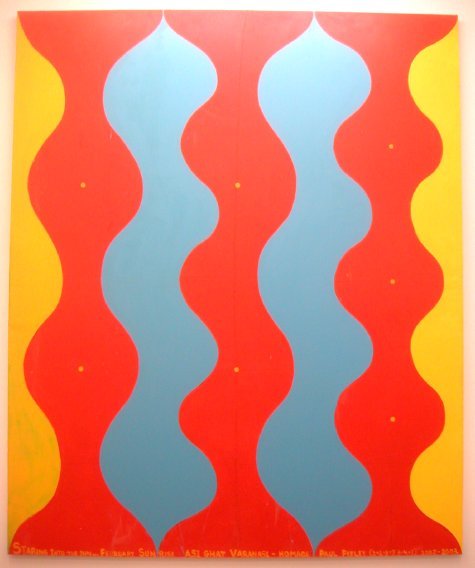
MartinChrisStaringI.jpg
Chris Martin Staring Into the Sun 2002-2003 oil paint on canvas 143" x 118" [installation view]


Chris Martin is represented by two large works in the current group show, "Meditative," at Feature Inc., where they occupy the southwest gallery space by themselves. No, they don't occupy but rather explode from that space, they are so spectacular. I can't meditate, and I'm not a "believer" in anything - except art - but his time I'm pretty sure I can detect something besides paint in Martin's work.

Maybe I'm a bit in tune because of my own connection to India: Painted on the bottom of this piece is an inscription which begins with the title and then continues, ". . . February Sunrise Asi Ghat Varanasi - Homage Paul Feeley (2 + 2 + 3 = 7, 3 + 4 = 7)"

I really liked the anonymous minimalist tantric paintings from that subcontinent which both conceptually and physically introduce the show, Tom Friedman's delicate white paper folds, and, while apparently not by design part of "Meditation," the very sympathetic and remarkable sculpture, "Quietly Oscillating," by David Moreno installed above the stairs from the primary gallery.

The other artists in the main exhibition are Alex Grey, Jeri Felix, Mette Madsen and Josh Podoll.

All of the art will be on vacation for two weeks after this coming Friday, but the show can be seen for two more weeks after Labor Day.

SaundersMatt.jpg
detail view of gallery installation, showing Matt Saunders's Mario Montez contemplated by Jack Smith's Yolanda La Pinguina


New gallery! Well, it's new here. But, anyway, it looks like this one's gonna be really, really good.

Grimm|Rosenfeld has had a significant presence in Munich since way back last year, but the current show on 25th Street, "Founders Day," is only their second in New York, and it's very impressive.

We missed Kiki & Herb's opening bang last month, and because of that poor judgment we'll probably be kicking ourselves forever, but we finally made it to a much quieter gallery this afternoon. And it's a full week before the end of the current exhibition! The show is brilliantly curated, and beautifully installed, by the artist Jonathan Berger. It's both a tribute to Jack Smith (the "founder") and a platform for an understanding of the continuing impact of his pioneering work today in virtually every art and performance medium. The press release describes the show as "an idiosyncratic, iconoclastic and a little bit worshipful look at artists making use of any and all available materials to create worlds that respond to personal obsessions, ideals and dreams."

Check that statement for some good bits on each of the remaining artists and works included in the show: Paula Court (stills from Reza Abdoh's "Quotations"), James Hampton (monumental millenium sculpture), Peter Hujar (Ethyl Eichelberger as Nefertiti), Athanasius Kircher (diagrams of the workings of the universe), Louis Klahr (animated film materials), and Katherina Sieverding and Klaus Mettig (Jack Smith Photographs).

Thanks, Jack.

Damn, we hardly knew ya when.


SmithJack.jpg
Jack Smith Yolanda La Pinguina ca. 1974 mixed media 22" x 10" x 30" (does not include stanchions) [detail of installation]


DavisVaginal.jpg
Vaginal Davis Dames Égarées: Je Veux Acheter Vos Visages 2001 mixed media [mostly make-up] on tag board, dimensions variable [detail of installation]


Shishkin.jpg
Dasha Shishkin Untitled 2005 mixed media on canvas, approx. 78" x 161" [detail of installationon ceiling]


FrankoB2.jpg
Franko B Untitled (metal sidepanel with cutlouts) 1997 metal and felt 28" x 32" x 4" [installation view]


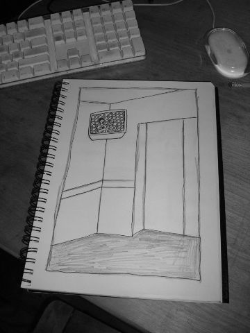
Cory Arcangel and Frankie Martin video, 414-3-RAVE-95, sketched by M. River


Earlier this week I invited artists to submit sketches of the works in the Greater New York 2005 show at PS1, since the museum does not allow photography of any kind, and because there are few images available on the lousy flash web site.

I think of it as a modest step in a campaign to free the visual arts from the darkness to which they are too often committed by their custodians. We're starting with PS1/MoMA.

Barry has set up a gallery for the images, and we've just put up the first submission, by M. River, a drawing of Frankie Martin and Cory Arcangel's video shown on a monitor in the big elevator.

I haven't yet come up with a snappy name for the artist call, or the gallery, so if anyone has a suggestion I'd be pleased to hear it.

I certainly didn't start the discussion of camera policy in museums, and I don't expect to be there when it ends, but I feel very strongly about access. This quote from his editorial, "On Camera Policies in Privately Owned Public Spaces." on Thomas Hawk's Digital Connection basically reflects my own frustration:

I feel that not only is it bad business for [public museums] to prohibit or impede photography but that it is morally wrong. The whole point of a museum is to open up the arts and sciences to as broad an audience as possible. The San Francisco MOMA should be as interested in sharing itÂ’s [sic] collection with someone in a village in China who will never make it to San Francisco in their lifetime as they are to the patrons that pay the cover charge at the door. They should be enouraging, not discouraging, the widest possible public viewing and distribution of their content and collection.

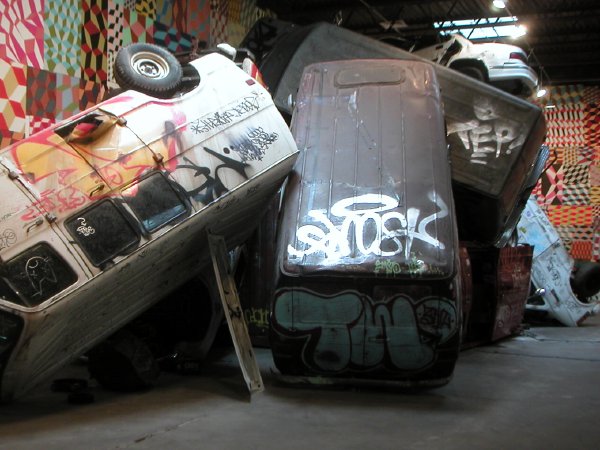
McGeecars.jpg
it gets better, but no bigger, than this


McGeelooartist.jpg
mechanical loo artist at work


McGeegeo.jpg
neo neo geo?


McGeeartiststack.jpg
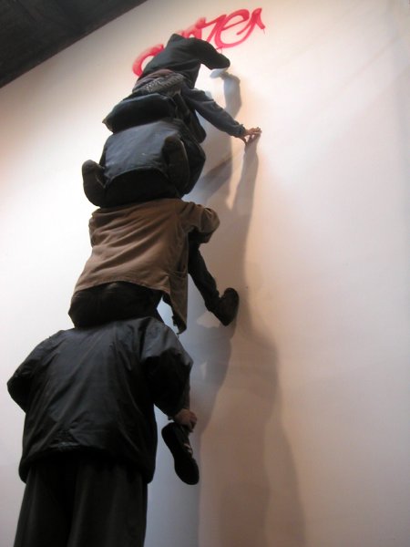
getting it all together for art


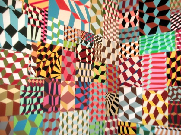
Barry McGee's installation at Deitch, which is around the corner and down the street from Swoon's, was well lighted by skylights yesterday, and there was lots of room to go around, so the camera and I had a ball. But while the show was very entertaining, in a guy-kid, hazardous amusement park kind of way, I went away feeling that not much had really happened.

But it was fun. A bit too lifeless at first, it got better when the huge space filled up with people while we were there.

I almost giggled at the auto junkyard which confronts you after you enter the gallery through an overturned van truck, I liked the massive expanse of geo stuff, I did shiver a bit when I stepped into the very realistic messy loo, and I was amused by the animated figures. I confess the ubiquitous painted sad-eyed men never really got to me before, so I wasn't disappointed to find they had been somewhat eclipsed in this installation, even if I'm not sure by what.

Both artists work with and in the street, but while McGee's sources are apparently much more specifically the world of outcasts and his materials are very real, it's Swoon's paper creations which evoke a truly visceral response to a city usually hidden from most of us.

Swoon.jpg
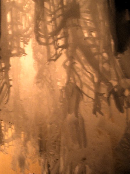
view of an untitled section of an installation by Swoon at Deitch


It's a terrific show, and to think I almost missed most of it. Barry and I were at Swoon's opening over a month ago, but the crowd and the heat discouraged us from even trying to get into the main gallery that night. Since then we had been putting off going back to Soho until we might line up more shows to see on the same trip. I had even resigned myself to missing the larger installation altogether [there was all that hype, and I was ready to persuade myself that what I saw of her work on the streets was probably superior to anything she'd put in a gallery].

Wrong.

We finally made it back downtown yesterday and I'm very glad we did. This work is on another plane altogether. It's a really great show. She's created a brilliant environment. It's like walking through a surreal, silent, film noir set! Unfortunately I can't give you much to look at this time. It's pretty dark in there, so my little camera balked at my suggestions. Barry however was able to pull off a couple of great images. But if you can make it to Grand Street, don't be satisfied with these two dimensions. You should walk through those paper streets yourself.

revolutionarywithblock.jpg


This revolutionary [paint on panel] was spotted attached to the same wall as the arrow and the penis. The paving stone she's hurling in anger would have made a better weapon than the large granite blocks of Wooster Street below her.

Real revolutions have been made in France, not here; I don't suppose we can blame that on the size of our paving blocks however.

grafittiWoosteratGrand.jpg
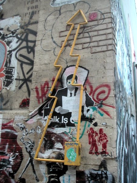
it starts with the realistic electrical box (complete with pull-switch) in the lower right corner, and it points toward a pudgy paper penis person pasted above it by another artist


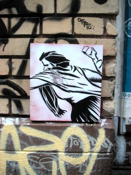
The building walls across from Deitch Projects on Wooster Street must be among the most coveted (canvases?) in the city for street art, even rivaling what Williamsburg can throw into the competition. They're very busy, with a changing exhibition of work in many materials and on almost every scale, but there are even more major diversions inside this summer.

This afternoon after I photographed this wall we visited first the Barry McGee installation down the street and then that of Swoon around the corner.

Soho can still look street smart, even off the street. Of course it helps if you're able to drag a good chunk of the street into the gallery, as Jeffrey Deitch and his artists do in both spaces [including a pile of a dozen or so wrecked vehicles inside the gallery on Wooster].

Hey, is that Playdough outlining the mortar near the top of the pic?

sketchingartists3.jpg
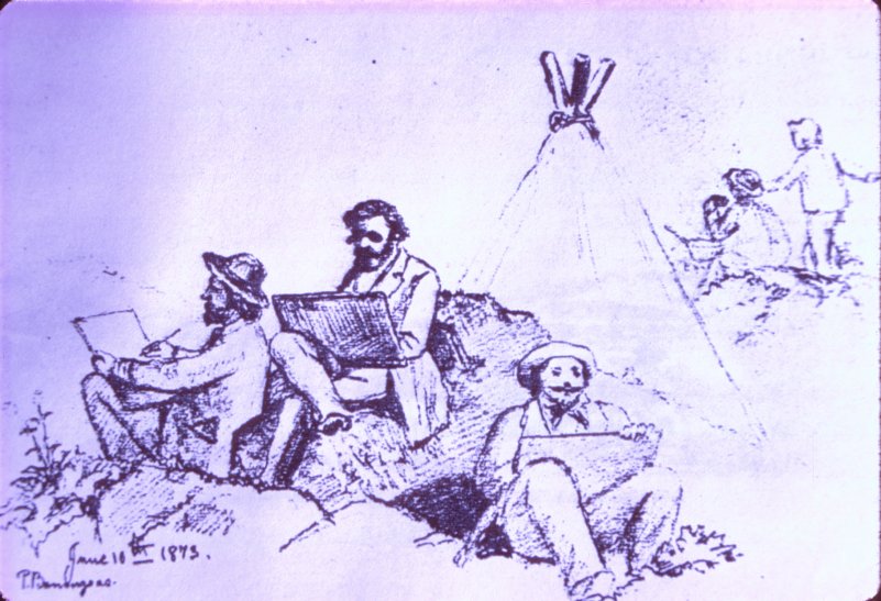
Peter Baumgras (1827-1903) Three Artists Sketching (1873) pencil on paper 8.5" x 10.75"


Ladies and gentlemen, a reader has written in to comment [see the first one on my crabby PS1 post], that I should send out a call for sketchers and then post their images on this site.

Yes!

It's a wonderful idea. Here's the deal:

Michael Cambre (a wonderful artist who's done some competitive sketching in his time) suggested that people be assigned an artist's work in the Greater New York show, but I don't know how to go about that without seeing who's raising their hand. I'm thinking we should just leave it up to the field out there to choose subjects, and then watch what comes in.

So I want to encourage anyone who's interested in using her or his own skills to show the world what the MoMA team is keeping partially under wraps to get out to PS1 and send me a jpeg or two. If this works, I'll show anything decent that comes in on a gallery I'll set up here for the purpose.

With each piece sketched, please include the name of the artist and the title.

I'm thinking we should encourage creativity as much as realism, just to keep it more interesting for everyone, but the idea should still be to describe another artist's work.


[image from The College of the Siskiyous]

blackoutcurtain.jpg
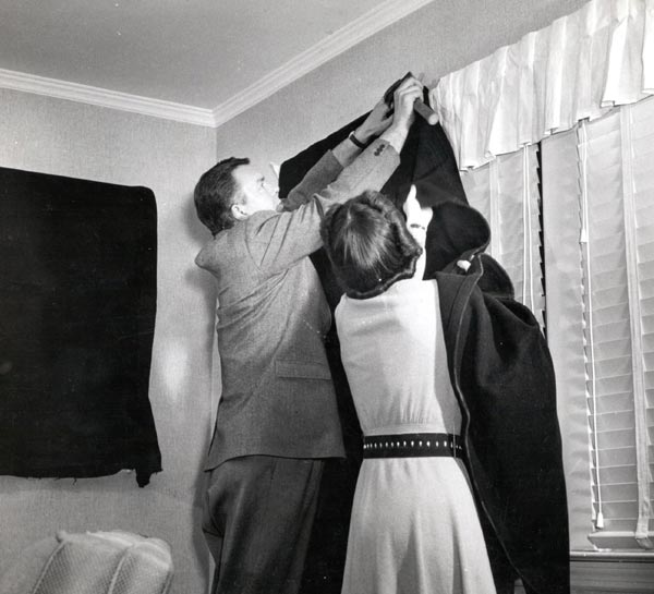
on some very rare occasions blackouts might be a good thing*


But, even when they aren't iniquitous, others are just plain stupid.

Barry writes that I'll probably be doing a post about our return visit to PS1's Greater New York 2005 show, but I don't know how I can do that without images.

There are no documented pictures on the institution's website [okay, there's a silly slideshow/teaser of a dozen or so works, but no information and the images can't be uploaded], and photography is not allowed in the galleries. My site can't function without pictures, and besides, they're called the visual arts, aren't they?

So, we did have a nice afternoon, but I don't have anything for you on this show. In a way, as I'm writing this, it almost seems like we were never there. I'm sorry.

The Museum of Modern Art owns PS1, and MoMA directors are about as jealous of the firm's image and perogatives as global capitalists seated in the country's fattest corporate board rooms are of theirs. Within the arts business/community, this museum is notorious for its insensitivity and its reluctance to recognize media credentials. Reflecting its lamentable growing irrelevance in times we still call "Modern" the Museum of Modern Art has assumed a posture which refuses to recognize that arts bloggers today exist as a part of media.

So just forget about a press pass. The 53rd Street Brahmins don't even deign to reply to inquiries. Knowing I had nothing to lose, and thinking that things might be more relaxed in their farm team operation, I tried yesterday once again to photograph a work of art on display in their Long Island City galleries. I was told, once again, that photography wasn't allowed. No surprise, but in fact it wasn't even permitted to photograph the painted tin ceiling. I know. I tried that too, and was firmly chastened for the attempt.

The museum was almost empty, I had no intention or interest in using supplemental flash, my miniature digital camera is perfectly silent, the images it captures can't possibly be mistaken for original works, and there can be no question that any picture would be used commercially.

The only consequences of my being permitted to use a camera would have been, first, your enjoyment of the images of works neither created nor owned by MoMA; second, an internet record of the work, which might in fact be permanent; and third, some modest assistance to MoMA's marketing campaign - without any inconvenience, and with absolutely no cost, to the museum.

So we eventually left PS1 and went north to Socrates Sculpture Park, where cameras run free, even if they're just having fun. See my next post.


*
the caption to this vintage WWII photograph reads, "A couple nails a blackout curtain over the window"


[image from VIRGINIA FIGHTS]

PS1wallsconce.jpg
is it a "make-do"?


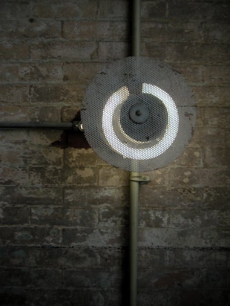
I spotted this wall sconce in a stairwell at PS1 this afternoon, and I thought it was an rigged one-off. Then I found another, virtually identical to this one. What does it mean? They looked like they had been improvised from electrical boxes, round flourescent tubes and circular, drill-punched and white-painted metal grills snatched from some abandoned machinery.

There wasn't a curatorial label in sight.

Excellent lighting solutions for a museum fashioned out of an old school which has barely been renovated, these pieces represent almost perfect design.

subwayrailing.jpg
still looking good


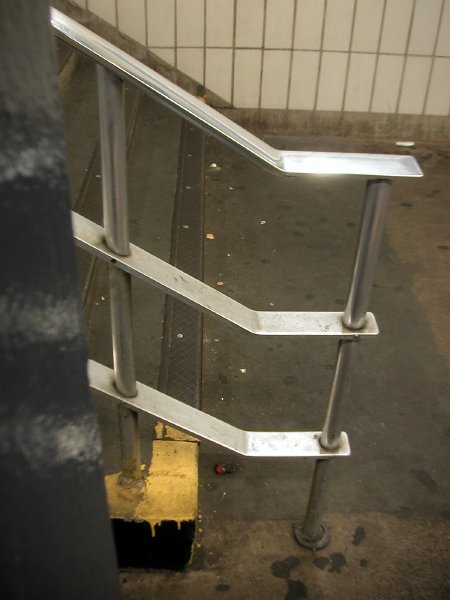
I'm thinking it's a design from the 1950's, but someone out there probably knows for sure. In any event, my point is to show how beautiful it is. Look at the stuff the MTA has installed in our stations ever since and you'll begin to appreciate what we were once able to do with public money.

I took this picture of a common subway stairs railing the other day while waiting for a train. Something about the light and the many straight lines attracted my interest at the time, but when I saw the image at home I decided there wasn't really any thing in it.

Today, while I was looking for another picture I came across it again and this time I thought a bit more about the design of the metal. It's beautiful, it's clean, and it's very functional. I was going to write: "Don't look at the mess surrounding the stainless steel (aluminum?); just admire the design of the thing." But part of the success of this bit of subway furniture is its ability to survive in a pretty tough environment.

And give us some joy while doing so.

UPDATE: post now includes lots of links
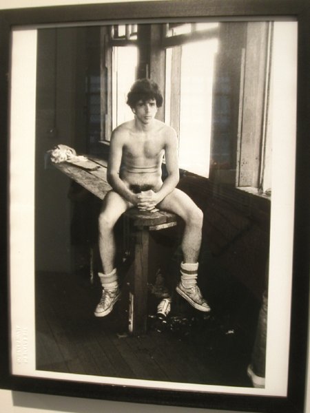


Alvin Baltrop Moment: NYC West Side Piers one of several images 1975-1986, printed 2005, gelatin silver prints 11" x 14" [detail of installation]


"Homomuseum? I didn't know there was one!" answered a friend when I suggested he join us on a visit to the current show at Exit Art. The exhibition bears the title, "Homomuseum: Heroes and Moments," and I was using the more catchy name, hoping it would attract a young homo's immediate attention. It didn't work. Only a movie would do it for him that day.

Maybe there's a story there, but I don't want to read too much into his indifference last Saturday. He and his partner had been to two great cultural museums the day before. And besides, Barry and I were ourselves only then heading up 10th Avenue, at least ten weeks after the show opened. And we know some of the artists, and we had been hearing about it for months.

Characteristicaly, we arrived on what was originally supposed to be its last day, but now this very moving and beautiful show has been extended until Friday, August 19. This temporary reprieve also has its sad side, since it serves as a reminder that in New York, and indeed in this entire country, there is no permanent Homomuseum on the order of Berlin's twenty-year old Schwules Museum.

Like the Berlin museum, this show is about history, but it's considerably less parochial than the institution which inherited the legend of the pioneering German researcher and cultural guardian Magnus Hirschfeld. This is what we should expect from the city which effectively functions as the world's capital these days. The New York show is an account which stretches from the immediate past back until, well, ancient history. It actually starts in the mists of pre-history with an image of two female Bonobo apes pleasuring each other under the inquisitive gaze of a young son, moves through the fourth century before the Christian era to a sculpture installation depicting Alexander lying beneath his lover Hephaestion [the medium: suspended empty U.S. military shell cases], and continues to our own moment with projected images of AA Bronson and a description of the opening night performances by black male diva songstresses.

Exit Art's assignment for this installation is distinctive from any other homo museum in one major repect: The exhibits are created by artists. Twenty-seven lesbian, gay, bisexual and transgender artists have created very personal conceptual portraits of queer heroes who have influenced culture, or of works which they feel strongly represent important moments in queer history. These are the "heroes and moments" of the show's title.

Just to give an idea of the range of the work displayed, some of the exhibits not represented in the images below are James Bidgood and his hero Tony Duquette, ak burns and his hero Jack Smith, Geoffrey Hendricks and Sur Rodney (Sur) and their heroes and moment, "Homosexuals burned in the Middle Ages," Derek Jackson's and his heroes "Diva Songstresses," Marget Long and her hero Mercedes McCambridge, James Morrison and his hero Felix Gonzalez-Torres, and Phillip Ward and his hero Quentin Crisp.

Okay, how do we get a real, dedicated museum? We could argue forever about what should be its function or its mission, but surely by now we should be able to find the people to run it and the bucks to fund it. After all, we weren't born yesterday.


Baltropcouple.jpg
Alvin Baltrop Moment: NYC West Side Piers one of several images 1975-1986, printed 2005, gelatin silver prints 11" x 14" [detail of installation]


ClaryChrisAA.jpg
Christopher Clary Hero: AA Bronson
"AA Bronson (My Healer)" 2005 slide show installation [view of installation still]


ForestJPMineo.jpg
JP Forest Hero: Sal Mineo
"Sal Mineo" 2005 mixed media 18" x 24" x 78" [large detail of installation]


KrachAaronfloor.jpg
Aaron Krach Hero: The dance floor
"DANCEFLOOR" 2005 Plexiglas 12' x 12' [detail of installation]


OlsenRuneBonobo.jpg
Rune Olsen Hero: The Bonobo Ape
"Hear Me Roar" 2004 Sharpie markers on tape, blue mannequin eyes, newpaper and wire 29" x 52" x 46" [large detail of installation]


Rosa-OrtiAlexz.jpg
Milton Rosa-Ortiz Hero: Alexander the Great
"The Sacred Band in Elysium" 2005 casings, monofilament, glass seed beads 204" x 96" x 108" [detail of installation]


StromMaryEllennudes.jpg
Mary Ellen Strom Hero: Gustave Courbet's "The Sleepers"
"Nude No. 5, Eleanor Dubinsky and Melanie Maar" 2004 video installation [still from installation]


See Barry for more.
Zimmermanphotocollage.jpg


Zimmerman4photos.jpg


These are two mixed-medium works by Bryan Zimmerman currently installed in the show, "Begging a Proper Donnybrook," at Archibald Arts. The image at the top is a detail.

By now it's pretty clear that both Barry and James think a great deal of Zimmerman's work, and not just because it doesn't seem to owe its intelligence, its sensibility or its aesthetic to anybody or anything.

We're also not going to ignore Archibald Arts, now that we have an idea of what we've been missing. Saturday was our first visit, I'm almost embarrassed to admit, and Anthony Archibald's space has been open for twelve years!

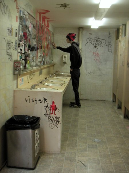
Bushterrorist.jpg


[North 4th Street, Williamsburg, on Sunday]

wbggrafittin3rdst.jpg


[detail of the huge mural on the south side of Williamsburg's North 4th Street, west of Bedford]

  • home

This page is an archive of entries in the Culture category from August 2005.

previous archive: Culture: July 2005

next archiveCulture: September 2005