Culture: November 2004 Archives

LinzyKalud.JPG
Kalup Linzy, still from Ride to Da Club (2002) 5 minute dvd


The title of the show is "MOMMY, I'M! NOT! AN! ANIMAL!" The Sex Pistols? Even after seeing the installation at CAPSULE gallery, I'm not sure how it computes. If there was a press release on the desk, I guess I forgot to pick one up. I've decided I can do without the information for now, since even unenlightened by anyone's notes I think it's a damned good collection. The curator is the brilliant and very generous artist Andrew Gunther.*

You won't find much of anything on the gallery's website, so you'll have to take these pictures and/or my word for it. Oh, yes, there is this short blurb on re-title.com:

Curated by artist Andrew Guenther, the show explores the idea of influence through semi-autobiographical work -- paintings made of tar, a transcendental preparation room, a portrait of Eleanor Roosevelt made of yarn and sculpey with bobcat eyes, a flag monument in honor of those who have lost their lives in the battle for the environment, letter enigmas, a primal rock and psychedelic ink journeys that pit nature against nurture. Two of the artists in the exhibition are tattoo artists, who mark the world around them through people wearing their work. At the opening, video artist Kalup Linzy will lip synch in drag as Labisha (The Diva), in a hyperbolic homage based on the soap opera of everyday life.
I have to go back, but my fancy was immediately attracted by an incredible Kalup Linzy video from which the still at the top of this post is excerpted, the entire backroom installation by Justin Samson and Muffy Brandt, the two shiny packing tape-like abstractions of Mathew Abbott, and Joseph Ari Aloi's fourteen gorgeous, almost compulsive, doodle-like (meant in the very best way) drawings massed on the east wall.

But I'm really, really sorry I missed that performance the opening night.


Samson:Brandt1.JPG
Justin Samson and Muffy Brandt Astral Projections, Aural Protection, and Transcendental Preparation (2004) in mixed media, found objects, painted wood, detail of installation


*see Perry Rubenstein's artist list, and click on Andrew Guenther; or check out the installation images on Brooklyn Fire Proof's site

VioletteBanks.jpg
Banks Violette, detail installation view of anthem (to future suicide), untitled (disappear) and hate them (single stage), moving from the rear to the front in this image


Ooooo. Another black and white show. But they never seem to be boring. For those who live in a world of color, what could be more abstract (read, "challenging") than black and white? TEAM [I love the gallery's motto inside their site description: "Team Gallery, a commerical art gallery dealing in work by emerging artists and the fringe of contemporary culture"] is currently showing, "the ice age," a show which includes work by Muntean/Rosenblum, Guillaume Pinard and Banks Violette.

All black and white, but not so easily read all over. I like that. The gallery's largest room is occupied by three large, severe, abstract sculptures, and one exquisite five-panel piece, "sunset (Ithaca)," comprising graphite drawings on paper. All of this is by Violette. While the work of the other artists shown in rooms and on walls which surround that space may offer a touch more of an anchor in what many call "reality," in the end each of these also ends up spinning its elegant concept into more obscure realms.

There are two beautiful video-based works, by the collaborative Muntean/Rosenblum and by Pinard, occupying the two rooms in the rear. "Never Facts that Tell," the Viennese collaborative's digital projection of a great world emptied and reduced to an enormous landfill would be achingly beautiful even without the music which accompanies its hooded figures, excerpts from Vivaldi's 1726 opera, "Il Farnace."

The imagery in Pinaud's projection, "Monk," essentially a static Flash animation, is also fortunate in its soundtrack, this time almost fully abstracted.

Pinaud's drawings take over every other wall in the gallery. Although they might be described as cartoons, they remind us that the genre didn't begin, and won't end, with Disney or Merrie Melodies. These are some very heavy images; they don't try for cute and cuddly.


[image from TEAM Gallery]

FisherKim2.JPG
Kim Fisher Corundum (Saphire Gray Scale) (2004) oil on linen 84" x 68"


FisherKim.JPG
Kim Fisher Padparadscha 40 (2004) oil on linen 90" x 71"


Minimalism, a little ragged on the edges - and sometimes elsewhere. I liked the small show of large paintings by Kim Fisher at John Connelly, much more than I was prepared to. I thought I wanted to resist their appeal, I guess because it seemed too easy, but these abstractions really stick.

All my life I've been obsessed with minimalism, beginning well over 50 years ago (even before I jumped at the chance to simplify further the already-pretty-simple face of a gift watch after its disastrous encounter with too much moisture). The only thing which has changed is my ability to live with and eventually totally embrace the imperfection, messiness and glorious complexity of the world whose perceived ugliness drove me to the minimalist camp to begin with. Fisher's work seems to have survived the same odyssey.

FisherMorgan.JPG
our own moment on the [silent] screen, included here in an installation view of Morgan Fisher's Silent 1.33:1 (2004) mirrored glass


Just in time for the holiday movie crush, Greene Naftali has installed a show for people who aren't content with the passive conventions of film buffery. The first solo exhibition of work by Morgan Fisher first brings the viewer onto the screen itself and then invites him or her, now as audience, to think about the norms of the visual devices which allow us to through read a film's story.

The Angelika just can't do this sort of thing.

From the gallery's press release:

Fisher will present an installation of inscribed mirrors as well as a 16mm film titled ( ). The mirrors are in the proportions of motion picture images ranging from those of the silent period to the present, with the name and ratio of each format sand-blasted onto the surface. The film, titled ( ), appropriates black and white and color footage to create a non-narrative sequence of chance juxtapositions.

lawlerlouiseunk.JPG
Louise Lawler, detail view of installation


A visit today to the Metro Pictures show, "Looking Forward," was an excellent tonic after the somewhat over-the-top week which saw the opening of the new MoMA.

Lawler's subject, and obsession, remains the ordinariness of the awesome, specifically, the low materials of the high mysteries which end up in our great shrines and temples of art. On 24th Street today her installation described works of art, mostly iconic, as they appear while in the process of some kind of transition - images the unannointed acolyte never sees. But she is not a mere documentarian. Her art leaves us with an understanding of both the processes and the products of the institutions which elevate these works, and which their formal display could never provide.

Besides, her own processes and products are themselves as beautiful as they are smart.


lawlerlouise.jpg
Louise Lawler Big (2002-2003) cibachrome mounted on museum box 52.8" x 46.5"


[image at the top undocumented for now; second image from Metro Pictures]

tresricheNovember.jpg
Limborg brothers Les très riches heures du Duc de Berry: Novembre (1412-16)


Barry has now set up ArtCal, a way-cool art openings/events calendar, and it's linked on the left side of both his site and mine, where it's easily downloaded and printed.

It is a very subjective list of gallery shows up in New York at any given moment, and right now it includes, also subjectively, information about shows which open in the next few days. Still to follow will be the iCal and RSS feeds, offering even more convenience to art fans who want to plan ahead.


[image from The Web Gallery of Art]

[EDITING CONTINUED, WITH AN ADDENDUM, MID-DAY NOVEMBER 17]

Hammons.JPG
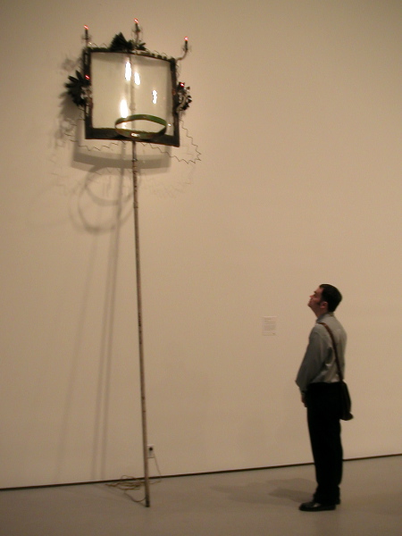
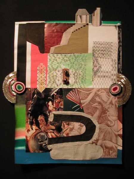
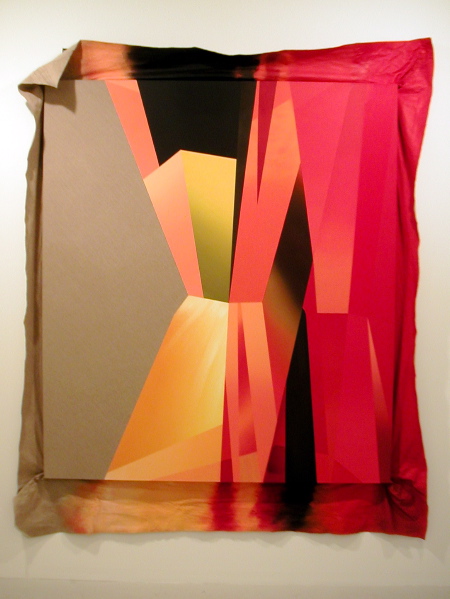
one of my favorite "discoveries" today: David Hammons's High Falutin' (1990) in the Contemporary galleries, with Barry contemplating its delights


We were there about two and a half hours, had a few croissants, a sip of coffee and a bit of mineral water (there were a number of white linen-covered catering stations, and even small tables and chairs, always within easy reach throughout the six floors of galleries) on our Members visit to the "new" Museum of Modern Art this afternoon.

I liked the easy access to refreshments and the contemplative moments which went along with enjoying them while we could hang out in the gallery spaces, but all of that will disappear after this week. What will remain are the new museum spaces and yes, a few restaurants (not yet opened) which will be assigned their own rooms.

There's more space.


MoMAskylight.JPG
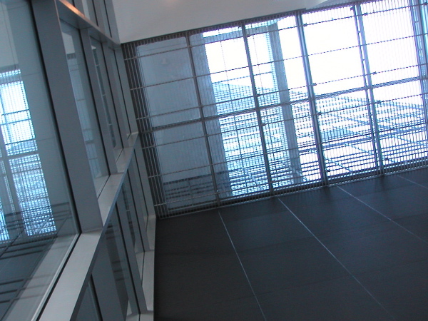
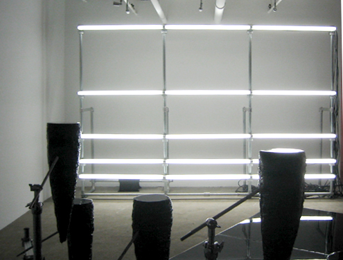
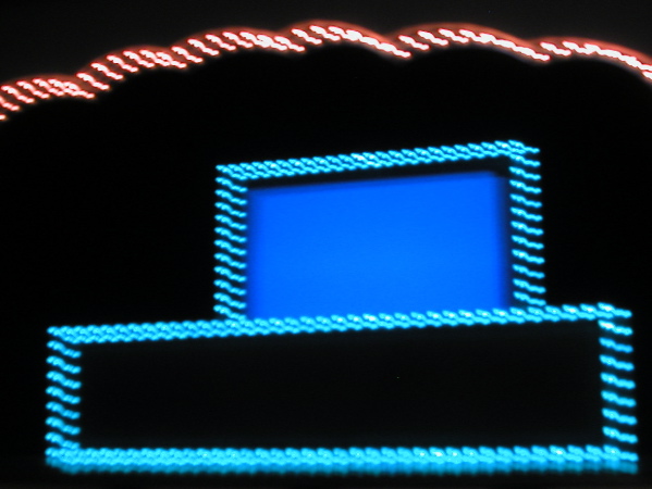
skylight, with lots of lines


There's also more natural light, more views, of the stuff both inside and outside. The building is still sandwiched between 53rd and 54th Street west of 5th Avenue, but it's now spread out on a much wider footprint. The facade of the original 1939 building has been uncovered/restored and at least one of its interior spaces is still recognizable in the S-curve of a stair landing and its black terrazzo staircase. The old main entrance however, with its curved stainless steel marquee, will now serve an elegant restaurant, "The Modern," and not happy pilgrims entering New York's oldest major shrine to modernism.


MoMA1939entrance.JPG
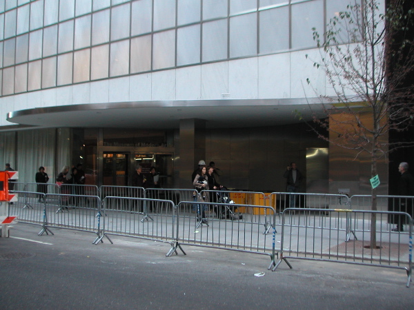
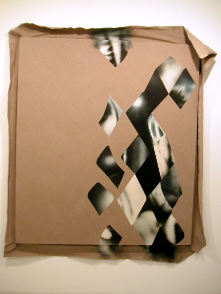
the 1939 entrance, soon to be a restaurant


There are lots of neat lines (all of them very crisp indeed) including a few very good sightlines. But no, contrary to the hype, neither the lines nor the idea of the architecture itself really disappears, even in those rooms where the art is hung comfortably cheek by jowl.

That architecture looks, well, old-fashioned. Eeegads!

Why do we have to spend half a billion dollars to construct a new building which nobody is supposed to notice? Why should it cost $425,000,000 in order to seem not of our own time, not too contemporary, just because we need more room to display more modern art, some of which as I understand it, is still supposed to be contemporary art, art of our own time? Actually, maybe the trustees wanted to build something which could be identified with the chronological mid-point of the collection as it now exists, the art and architecture of the "median era," but if that is the case, why not acquire a real mid-twentieth-century building and refit its interior to display the magnificent collection of the Modern in a context with real integrity?

This evening Barry recalled the extraordinary success of the conversions for modern museum spaces we had seen in Vienna. We have the equivalent of the Austrian Imperial stables right here; there are buildings all over New York begging to be brought back to life. I'm afraid this new architectural mediocrity, no matter how much its details are described as exquisite, will turn out to be at least a little embarassing for a city which used to know how to do these things so well.

The building we got is awfully Park Avenue - 50's and 60's Park Avenue - and so it is without the integrity which is the minimum which we should expect of a building which reflects its own time. I went to the new MoMA today after reading the previews written by those who are supposed to have the educated and aesthetic judgement which can critique as complicated a project as that just completed in Midtown. I told a number of people that I expected to be delighted, okay, at least clearly pleased, even if I did not expect to be overwhelmed.

But after experiencing the architecture first hand, doing for the Museum what it is supposed to do, I simply don't have any strong feelings at all. I'm not used to being without any aesthetic sentiments, perhaps most of all when it comes to architecture, so I'm not certain, but right now I think I'm just indifferent to this building.

I really don't know what to say. I feel post-coital without ever having enjoyed a coital.


freeart.JPG
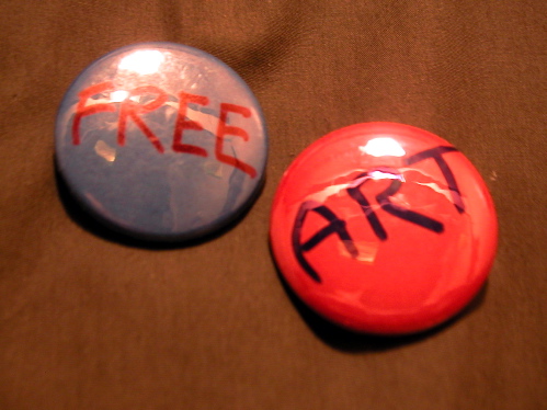
my own little protest buttons went virtually unnoticed, except by one of the caterers, who agreed with their message enthusiastically and spoke movingly of the burden the price presented for "working class" families


If I'm indifferent about the building at the moment, I'm left with one at least one strong impression, even if it's one which I brought with me when I left for the Museum today. The $20 admission fee is appalling, if not just plain immoral. All of the arguments about the price have been raised better and more dramatically elsewhere than I can here, but the fact remains that the exclusivity represented by the decision to raise the fee to a level which makes regular access to modern art almost inaccessible to just about anyone not already more or less in the club is simply unconscionable.

In the end I did leave with one negative impression I hadn't brought into the building with me, and I don't think it's a criticism which should shake the Olympians in the trustees room. In fact, accomodating it would please just about everyone: There just aren't enough benches in the middle of those huge rooms. If it's worth looking at, it's worth looking at for a while, and that sometimes means sitting with it for a bit, especially after spending that twenty dollars.


Rosenquist.JPG
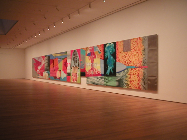
On the sixth floor only the James Rosenquist gets to rest


But go look for yourself, and when you've saved up some more money, go back again. It's a clean, well-lighted space. They haven't wrecked the art; in fact most of it looks better than ever, so some people will be happy enough. I'll be back too, especially since Members don't pay per visit, but yesterday's experience mostly makes me just want to go back to visiting the often-struggling little private and public gallery spaces I've been haunting all along. I hope to see you there too.

running throughChelsea.JPG
seen on the south side of West 24th Street, Saturday at 6 pm


We hit a number of Chelsea galleries this afternoon, but we were both more more relaxed, and better dressed for the weather, than this gentleman.


Woj:stonesweep2.JPG
David Wojnarowicz untitled (1988-89) collage on masonite 39" x 32" detail


David could make the stones weep, but he could also make them scream. Last night we were welcomed by PPOW and Poets House to a tribute to the artist and writer David Wojnarowicz, who died of AIDS complications in 1992. The evening was scheduled for one of the last days of the gallery's current show, "Out of Silence: Artworks with Original Text by David Wojnarowicz." Five writers, artists and activists read from his texts or delivered original work inspired by his art and his rage.

For someone who had met David and who had been familiar with and in awe of his power for twenty years, the most surprising thing about the evening was the description and engagement of the overflow crowd; most of the people in the room were too young to have known the man whose memory brought them together last night.

The young novelist and poet Douglas A. Martin read an excerpt from Wojnarowicz's powerful memoir, "Close to the Knives," the scene where the artist/poet describes an erotic encounter with a stranger inside his "salesman station wagon" parked off a deserted road somewhere in Arizona. This was more of a performance than a reading. David was in the room.


Woj:DouglasAMartin.JPG
Douglas A. Martin inside David Wojnarowicz


His former lover, Tom Rauffenbart, reminded many in the room that David was not just an angry man. A child who loved life of all kinds, he never shut down an extraordinary curiosity which began very early. One of the works on display in the room was a black and white photographic print showing an obviously homemade biological specimen (certainly not dead from David's hand) in a jar on a windowsill. There was a text within the image, small white print in the lower right corner:

When I was a kid I went into the backyard and tried to
dig a hole to China with a shovel and a bucket. After an
entire afternoon I hadn't even left New Jersey
For more on David and the evening, see Bloggy.

Reno.JPG


We spotted this wonderful, much-used Toyota last night while walking to the E train Spring Street stop. I had already taken this shot before I walked around the side of the car and saw the door emblazoned with a large "Citizen Reno" sign. Of course!

Inside on the dashboard was a small stack of her DVD, "Rebel Without a Pause." Is our hero tempting the culturally and politically savvy thief, or just advertising?

TroyRichardscandywindow.JPG
Troy Richards, This Light You Speak Of (2004) installation view of site-specific installation: Jolly-Ranchers, Plexiglas and resin 108" x 51" [QMA reception revelers faintly visible below]


We absolutely did get out to the Queens Museum of Art (QMA) last Sunday for the opening of the Queens International 2004. It was almost five when we got there, so we were pretty busy for the next hour. Most everyone in the very interesting crowd was pretty laid back, so we must have looked pretty intense as we made our way through galleries showing the art of some 50 or more Queens-based artists. Even so we managed to talk to a number of them while they hung out near their work.

There is nothing of the provinces, the "outer boroughs," about this show - except maybe for the incredible ethnic diversity of the artists included - a heterogeneity which frequently shows up even in the compound heritage of one individual. The name of the show, "Queens International," is a salute to that diversity. Any city in the country would be proud of the quality of the art represented. It's a first-rate show, a first-rate New York show.

Some of my favorites:

Haeri Yoo's wall of childlike drawings which almost mask her sophisticated humanism

Cui Fei's enormous, but so delicate, sculptural evocation of Chinese caligraphy employing grape vine tendrils

Chris Dorland's use of World's Fair pavilions to comment in his paintings on our utopian dreams - and follies

Aissa Deebi's photographic documentary of exile, using a shisha cafe in Astoria as his canvas

Matt Ducklo's sort-of-photojounalist suburban grotesques (especially the Kentucky shopping center/cemetary/mountain range combo)

Pascal Jalabert's heroic paper-tape bridges in electric colors

Kurt Lightner's magical mylar cut-out collages (and ink drawing)

Nava Lubelski's abstract canvases, which she stains and then adorns with needlepoint to almost electric effect

Troy Richards's bold candy windows (see above)

Earl Howard's sound sculpture installed in the Whitney-size elevator

Shin Il Kim's animated video whimsical profundities

Minshik shin's totally wonderful and sincere "American Dream" video

Because of the crowds and because of our limited time, we missed our chance to see most of the video art, so the list above is even more imperfect than usual.


[link to Haeri Yoo images was added June 6, 2005]

Harounset.JPG
Wednesday, the stage at the New York State Theater, before the lights darkened


We went to New York City Opera Wednesday night to see Charles Wuorinen's new opera based on a short novel by Salmon Rushdie, "Haroun and the Sea of Stories."

Almost totally bummed because of the national disasters reported over the previous 24 hours, we really weren't expecting to be greatly amused. According to the reviews we had read we would find a delightful story seriously handicapped by its dependence upon the composer's complex 12-tone techniques.

We both loved it on every level, for each of its elements.

We knew the story and it really is delightful. It's definitely not simply a children's story, although there were plenty of smart New York kids there with their parents. It was written while Rushdie was forced to hide from the mortal threat of the fatwa directed against him because of his writings. The book is a fable about free expression. It's as fresh as tomorrow morning's bread. In Act II the evil Khattam-Shud complains about the limits of his dark authority, singing,

Inside every single story
There lies a world, a story world,
That I cannot rule ar all.
It is beyond my control . . .
It spoils everything!
The libretto by the poet James Fenton, necessarily more condensed than the book, did so with great success, tightly playing with the pleasure of words both real and imagined, in delightful groups strung together and wound around or threaded through each other.

I admit that serial music holds no terrors for me and under normal circumstances I would have been delighted to be looking forward to a live performance of an entire opera using its forms. We have a large wall cabinet stacked with the sadness of 12-tone opera sound-only recordings, their visuals unfulfilled. I was surprised and delighted to find that Wuorinen's score was a perfect foil for the story, the singers and the glorious sights unfolding on the stage.

And what sights they were! In their totally uninhibited color and movement, and with imagination not bound to any reality or even to the usual conventions of fantasy, the sets and costumes fulfilled the promise of the story. I don't think I've ever seen anything more delightful on a stage, opera or otherwise. I'm not normally sighted shrieking in glee from a seat in Linclon Center.

Election? What election?

There are still three more performances, one tomorrow afternoon and one in the evening on Tuesday and on Thursday.

Despite the Sun.jpg
Yuh-Shioh Wong Despite the Sun (2004) pigment, oil, styrofoam, concrete, MDF 14" x 12"

Being Invisible.jpg
Yuh-Shioh Wong Being Invisible (2004) oil, styrofoam, concrete, MDF 36" x 27"


I told myself while at the opening on October 23rd that I really had to stop reporting on so many Foxy Production shows (they're very, very good), since it looks like I'm virtually living on the sixth floor above 27th Street.

But that same evening, just before my almost-resolution, I had asked for some JPEG images of Yuh-Shioh Wong's work (one of three artists included in the current show), and they just arrived today. Now there was just no way I wasn't going to share these wonderful sculptural paintings with others.

Barry and I had first seen her work as drawings at *sixtyseven when that gallery (now simply sixtyseven) was still in Williamsburg and we thought they were terrific, but we had missed what photographs document must have been an extraordinary installation at the excellent ATM Gallery in the East Village.

The prominent three-dimensional physicality, the robust surface textures, and the lusty colors describe what are totally winsome shapes, but there are hints that something just a little more disturbing is working itself out here.

This page is an archive of entries in the Culture category from November 2004.

previous archive: Culture: October 2004

next archiveCulture: December 2004