Culture: March 2006 Archives

SanfordTomTriumph.jpg
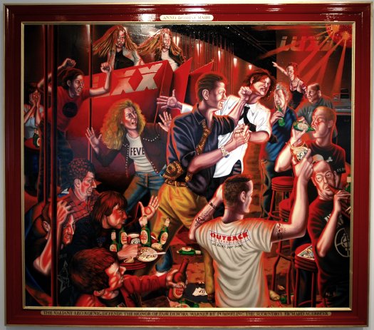
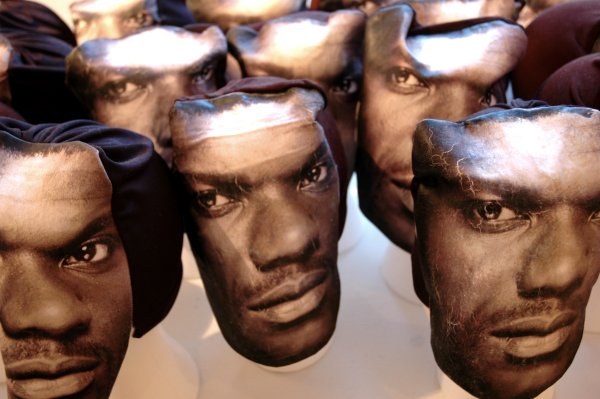
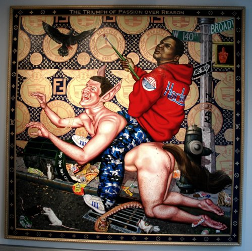
Tom Sanford The Triumph of Passion over Reason 2006 oil/acrylic on canvas 119.5" x 119" [installation view, with thumbnail detail*]


We had first seen his work at 31 Grand in Williamsburg several years ago. Today Tom Sanford continues his celebrity odyssey in paintings and drawings installed at Leo Koenig. In his first show in the 23rd Street gallery, it appear that Koenig himself may be replacing Tupac as his muse.

The press release is a big help here. Excerpt:

The experience of viewing these paintings are somewhat like watching a car wreck. One simply cannot turn away, yet the image burned into one's consciousness is undeniably disturbing. It is this attraction/repulsion that is the impetus for Sanford's work and reflects the artist's ambivalent relationship to the culture he not only depicts, but of which he is also an avid consumer.


SanfordTomMarbury.jpg
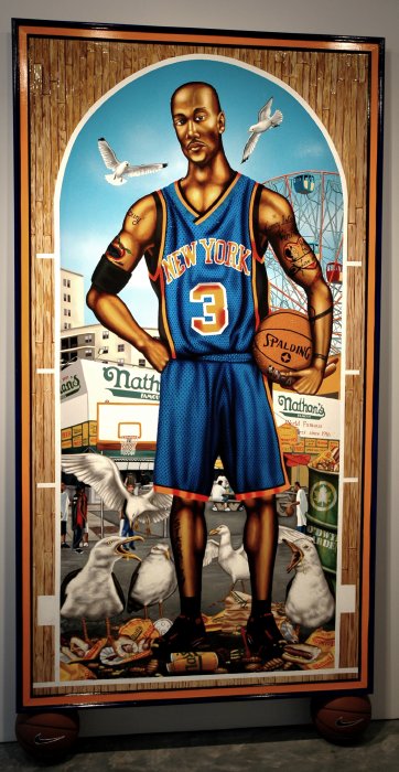
Tom Sanford Stephan Marbury 2005 oil/acrylic on wood with basketballs 89" x 50" [installation view]


SanfordTomFollowBoys.jpg
Tom Sanford Follow the Boys 2005 oil/acrylic on wood 74" x 84" [installation view]


The faux metal plates at the top and bottom of the frame around the image above read, respectively: "ANNO DOMINI MMIII" and THE VALIANT LEO KOENIG DEFENDS THE HONOR OF FAIR DEBORA WARNER BY PUMMELING THE SCOUNDREL RICHARD ACERBEEK"


*
SanfordTomTriumphdetail.jpg
"Triumph" detail

SarabiaEduardoGuadalajara.jpg
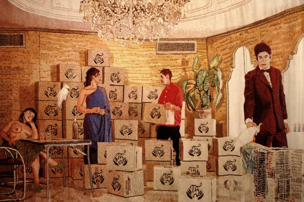
Eduardo Sarabia Guadalajara (country) 2005-2006 hand-woven wool tapestry 94" x 124" [large detail of installation]


SarabiaEduardovasesboxes.jpg
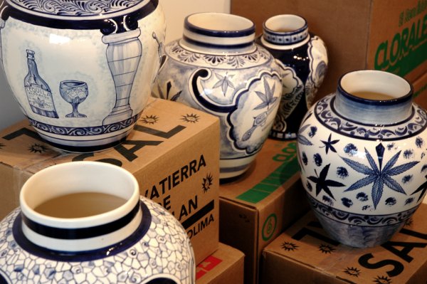
Eduardo Sarabia A thin line between love and hate 2005 hand painted ceramic vases and silkscreen boxes, dimensions variable, each unique [detail of installation]


I think these images from the current I-20 show can just about speak [very well] for themselves, but it may be useful to know that Eduardo Sarabia, although born and raised in Los Angeles, has lived in Guadalajara since 2003. The press release continues:

Eduardo Sarabia is highly influenced by the intricate poetics of the black market and northern Mexican folklore. His current work creates romantic visual narratives in regards to illegal matter, fine arts and commerce.
The gallery's new space with its huge wall of windows along 23rd Street is perfectly designed for a show which addresses our relationship to the seductions of things, especially the exotic.

MetroMall2.jpg
a noble experiment


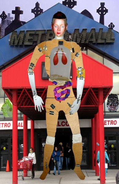
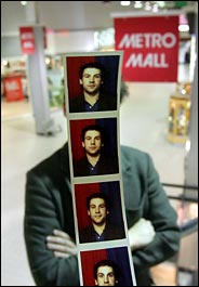
A Queens shopping center has cancelled Saturday's Metro Mall Art and Science Fair which had been organized by Jacques Louis Vidal.

The young artist had planned a very imaginative sculpture/event along with 26 other artists and inventors to be held in what is apparently by any measure an under-utilized hall of commerce. He described his contribution as a "surrealist county fair", but the Mall suddenly put the kibosh on all their plans this afternoon because of its displeasure with an article which appeared in the NYTimes this morning. The Mall management thought the piece was "disgusting" for its reference to the number of the mall's store tenants which had closed, and while they apparently have no quarrel with Vidal himself, the decision was made that they would have nothing to do with the subject of the article. No Fair.

Ah, the power of the press, re-imagined. Or, better (worse?), unimagined.


[image from Vidal's Metro Mall event site, where it appears squeezed into a different proportion]

VidalJacquesMallphotos.jpg
Vidal's multiple exposure


We're going to the mall on Saturday. It will be my very first visit, since the day I exited a highway in Victorville, California looking for a place to pee, to a representative example of Middle America's substitute for the urban experience.

I won't just be looking for the sanitary facilities at Dress Barn this time. Instead, it's going to be all about art.

Jacques Louis Vidal is creating a sculpture/event he describes as a "surrealist county fair" at the Metro Mall in Queens this Saturday. I don't think anyone who manages to get out there is going to be disappointed, regardless of the degree of her or his familiarity with the form or the place.

Somebody's PR gods have been working overtime: Timely supplementing the young artist's own wacky event website, the NYTimes has both a story and a picture in today's METRO section. An excerpt:

On Saturday, which is April Fools' Day, Mr. Vidal is staging a public art spectacle there. "The mall creates this absurd space where all is equal," he said.

Inventors, artists and hobbyists will joust, in the form of double-sided posters ("the anti-painting: can't hang it on the wall") and trifold cardboard sculptures. Among the curiosities: "The chewing gum brain," a drawing of a pink wad and a collection of watch ads that all tell the same time. There will be an exhibit on a quasi religion based on the link between art and science.

"People will be making volcanoes erupt all day," Mr. Vidal said, referring to a series of planned miniature baking-soda-and-vinegar catastrophes. Mentos and diet soda, he added, work too.


[image by James Estrin from the NYTimes]

AraoPaoloCabinetfun.jpg
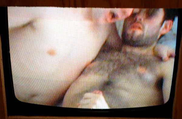
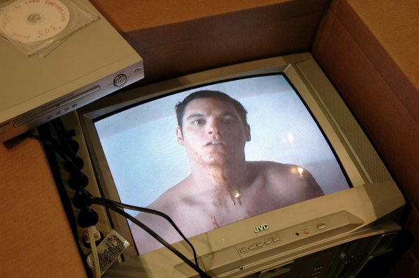
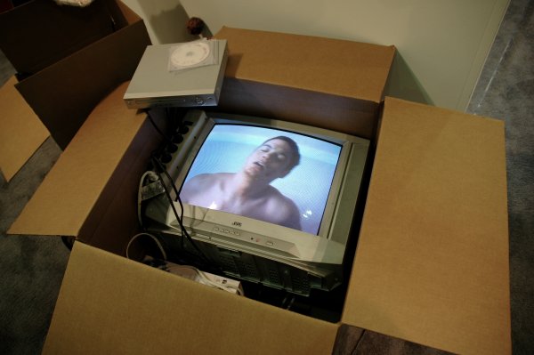
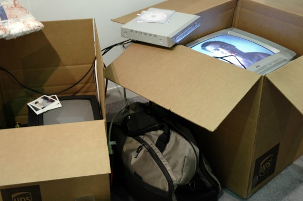
Paolo Arao and John Miserendino Cabinet 2006 tube televisions, DVD players, plywood, screw, flashe paint, blue extension cord [detail of installation with still from DVD]


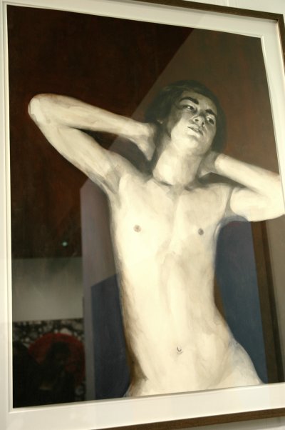
It's like walking into a wonderful playhouse populated by four very good, gentle friends. But the installation and the images might just possibly be even more beautiful than the party itself.

Jeff Bailey has installed in his gallery (or has seen installed) "Intermission", a delightful mix of photographs and drawings surrounding a sculpture of a very unBabel-ish tower. It's basically Paolo Arao's show, but together all of his images document a weekend road trip which included the artist John Miserendino and two other very good friends, Patrick and Dennis.

John and Paolo and Patrick and Dennis went on a weekend road trip to the Catskills. The drive took far longer than they'd thought it would, but despite various mishaps along the way they had a good time. By the time they arrived at the cottage, all four were faint with hunger. Of course, restaurants are scarce and close early in small Catskill towns, so they cooked what they could find at the Stewart's convenience store in the next town over. The meal came out marvelously. Microwave pizza, ice cold beer, and even a six-pack of Smirnoff Ice!

The four decided to have a party. They sang songs and danced and drank and got very drunk.

Innocent affections are rarely represented with such grace as they are here. You'll probably wish you went to the Catskills with them, as I certainly did, but this gallery show offers something almost more satisfactory.

Until now I'd only seen Arao's works on paper.

As the low lighting made documentation virtually impossible last Saturday, I've gone to the gallery site itself to upload one of the drawings.


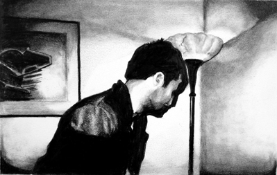
AraoPaoloPatrick.jpg
Paolo Arao Patrick with Lamp 2006 graphite on paper [dimensions not given] [large detail]


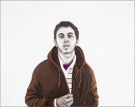
And I've uploaded below an image of one of the works which I think I had seen last year in the back of the gallery.


AraoPaoloTed.jpg
Paolo Arao Untitled (Ted) 2005 oil, flashe and charcoal on panel 11" x 14"


[the two lower images from Jeff Bailey Gallery]

ProbstMurrayGuy.jpg
Barbara Probst Exposure #11A: N.Y.C., Duane & Church, 06.10.02, 3:07 p.m. 2002 Ultrachrome ink on cotton paper, 2 parts: 16" x 23.5" each


It's so simple, but so very beautiful. This was just one of the multiple-image pieces Barbara Probst showed at Murray Guy earlier this month. Her process is only slightly more complex than it appears to be, but rarely is the result so delicate as it is here.

From the press release:

In Barbara Probst’s photographs, the subject of the work becomes the photographic moment of exposure itself. Using a radio-controlled release system, she simultaneously triggers the shutters of several cameras pointed at the same scene from various viewpoints. The resulting sequences of images suspend time and stretch out the split second.


[image from Murray Guy]

BannerFionainstallation.jpg
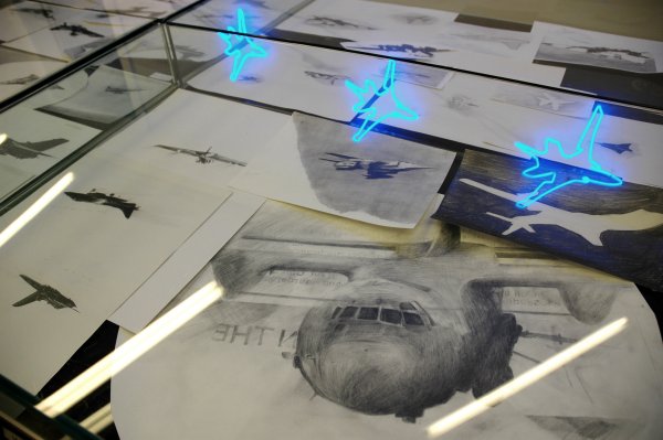
Fiona Banner [detail of installation, including various graphite drawings on paper and the reflection of the set of three neon sculptures, Backfire (a force of nature)]


As difficult as it may be to add superlatives to what this bookstore already means to the arts community, Printed Matter is making itself even more indispensable every time it integrates the work of a new artist into the corners of its wonderful shop on 10th Avenue.

Right now AA Bronson and his collaborators are sheltering Fiona Banner's installation, "All the World's Fighter Planes".

The work is striking and very smart. But as I think about the terrible, very dispensable inspiration for this work and the real-world scale of the monsters which appear here only in small representations*, I think I'm going to be sick again.

While there are sculptures, drawings, text works, source materials, a window installation and posters, appropriately for a bookstore it all starts with a matter of print.

The book, All the World's Fighter Planes 2006, is a compilation of found newspaper images representing every type of fighter aircraft currently in commission anywhere in the world. The name of each plane is listed on the front and back covers, 170 in all. The book compiles newspaper clippings of each of the different aircraft models. The clippings (as well as the aircraft) come in a variety of shapes and sizes, both small and large, some cut following the contours of the planes, others ripped carelessly from their source, some scattered haphazardly across the open pages, others in full page close-up.


*
with the single exception of this actual cutout from a trainer/fighter plane:

BannerFionaProvost.jpg
Fiona Banner Nature Painting 2006 cut metal section of Jet Provost 28.5" x 58" [installation view]

HumphreySnowmen.jpg
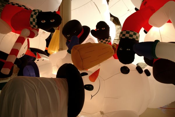
David Humphrey [detail of installation, "Snowman in Love"]


David Humphrey said goodbye to his "Snowman in Love" at Triple Candie last night, and we were there to watch as fifteen dancing and very physically-engaged, recently-retired holiday airbags were rapidly reduced to sad nylon sacks* when their lifeline compressor was switched off.

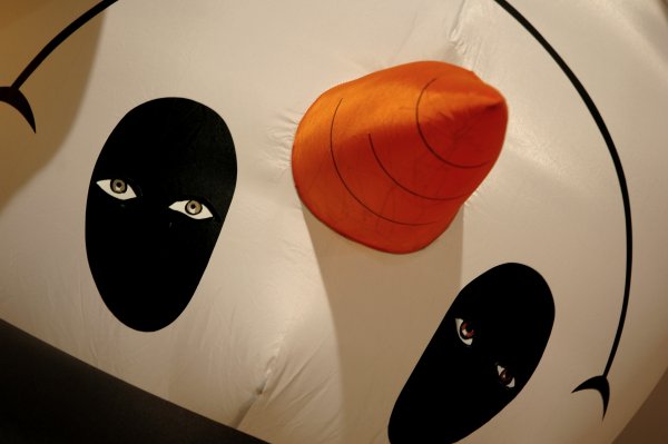
The work was a challenge to photograph as an instalaltion but a delightful subject for abstraction in closeup.


HumphreySnowmanface.jpg
mug

HumphreySnowmanrear.jpg
bum


*
Humphreysnowmendeflated.jpg
post-party

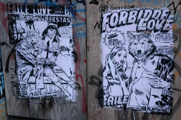
FaileLove.jpg


Faile is a more-than-conventionally-stealthy street art collaborative whose work is typically spotted first in the corner of an eye. This sighting was in Williamsburg, on Wythe Street I believe.

Donovanbig2.jpg
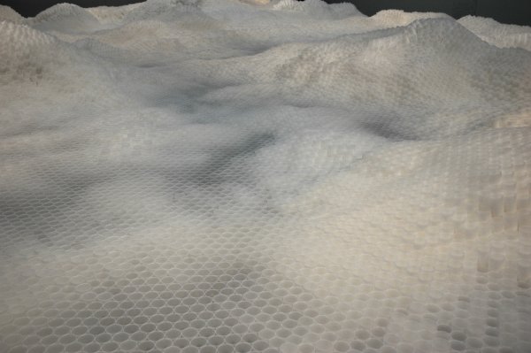
Tara Donovan Untitled (Plastic Cups) 2006 plastic cups, installation dimensions variable, approximately 5' x 50' x 60' [large detail of installation]


Pace Wildenstein is showing Tara Donovan's remarkable 'landscape' installation of stacked plastic cups in the space on 22nd Street once identified as an annex to the DIA Foundation.

Plastic cups. You have to be there.


Donovanmedium.jpg
(closer)

Donovansmall.jpg
(closest)

LinnJudySmithMappl.jpg
(when they looked like siblings)


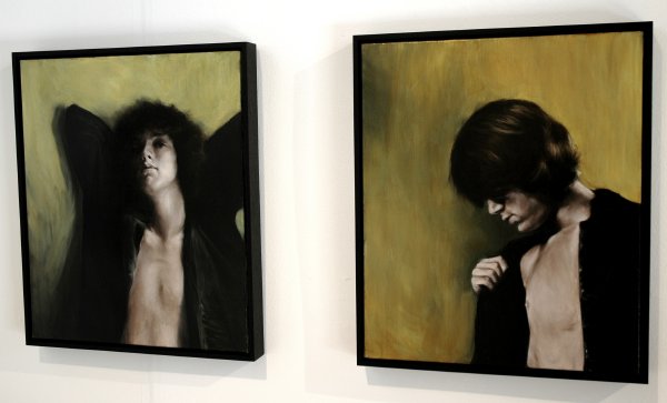
(although only one of them could have passed as an angel)


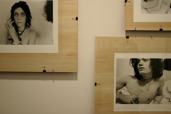
The tiny Envoy gallery has currently has a show, "(Un)masked", which includes the work of three artists or artist-collaboratives, Crackerfarm, George Duncan and Judy Linn.

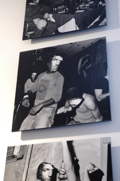
The two wonderful silver gelatin prints shown above in a detail of the gallery's installation are Judy Linn's A saint in any form and Robert Mapplethorpe in bed at the Chelsea #2, both from the 1970's, while her friends Patti Smith and Robert Mapplethorpe were living together in the Chelsea Hotel.


LinnJudyMapplethorpe.jpg
Judy Linn Robert cloud head 1969 gelatin silver print [large detail from installation]

Foxyjurgensen.jpg
Foxy Production [installation view of the gallery show, with a large detail of Jacob Dahl Jürgensen's Untitled Construction in the foreground]


HannonAbbyssinum.jpg
Frank Hannon Abbyssinium 2006 archival inkjet on brown paper bags, collage, ink, spraypaint [installation view]


Noonanuntitled06.jpg
David Noonan Untitled 2006 silkscreen on linen, framed 30" x 22" [installation view]


It may only be coincidence, but Foxy Production's three-artist show, which also opened last night, seems at least somewhat related to that of Jacob Dyrenforth's installation at Wallspace next door.

The Foxy press release describes the untitled show as:

. . . recent work by Frank Hannon, Jacob Dahl Jürgensen and David Noonan, three London-based artists who examine interconnections between memory, performance, and ritual. Making the known seem uncanny, they mix references and genres to explore how common practices and codes can determine notions of self.
I think this is what I may most look forward to in an encounter with any of the arts: I like the fact that the mind is always challenged by [especially new] art, or art by the mind. The result is that the most ordinary things never look or sound the same but also even the most ordinary idea is never unchallenged, even if I don't always know how this is being done.

At Wallspace right now we may see the extraordinary made more ordinary; at Foxy, the ordinary is made more weird. Or is it actually the other way around? No, let's see, it seems to be going both ways at both shows, which means that I may not understand the process inside either. Still, within the eight walls of these two galleries the physical results are stunning.

Dyrenforthinstallation.jpg
Jacob Dyrenforth [installation view, including large details of Stand-In for Ceremony in the foreground and Three in One on the wall]


DyrenforthWaco.jpg
Jacob Dyrenforth The Compound 2006 graphite on paper 22" x 30" [installation view]


Cultural heroes, cults, sensational news stories and fantasies are only starting points in Jacob Dyrenforth's show at Wallspace which opened last night. The idea seems to be the subjective or layered reality of both the images we encounter and those we create ourselves, especially when we turn them into fetishes.

The artist's medium is sculpture, drawing, video, prints and sound.

The images alone are worth a visit, and the conceit of Dyrenforth's attractive installation could not be more relevant in a world which is as indifferent to or confused about the arguments of truth as ours.

Spinnerei2.jpg
before Pierogi


No, Pierogi 2000, the pioneering Williamsburg gallery is actually only opening up a second space. Brooklyn and the island to the west can breathe a sigh of relief.

It's interesting that it's Leipzig [in the Spinnerei] rather than Berlin. I mean, the U.S. considers the German capital so important that as far back as ten months ago we had already decided to inaugurate direct service from New York. Who knows when it will be Leipzig's turn? Once he lands at Tegel, Joe's going to have to switch to a train to get to his new provincial annex.

Okay, just kidding. I know Leipzig is very important. It's got history and trade fairs and I understand it now has a new school, and I think anything which makes the German eastern lands more interesting than they already are is a very good thing.

By the way, I only found out about this exciting new development while Barry and I were visiting our local space yesterday. I heard someone being told that Joe [Amrhein] was in Leipzig. That would have been enough to attract my interest, but on the way out I picked up a card which clearly indicated there were suddenly two Pierogi's.

Now I have questions. Will there be a flat file? Is it for Germans? Why does its first show feature two New York artists? And finally, if Germany actually does need a real American gallery, doesn't America need a real German gallery?


[image from Spinnerei]

EnrightDiptych1.jpg
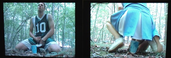
Brock Enright and Ivan Hurzeler [large detail of diptych still from installation]


Now that I have your attention I can talk up the incredible Brock Enright show installed at Cynthia Broan this month.

When I wrote a post a few days ago about his piece at the Armory Show I didn't know that his 29th Street presence was almost a solo effort and not part of a large group show: The gallery's announcement gives equal billing to Enright, Ivan Hurzeler and each of their dozens of collaborators. This is delightfully democratic and generous, but slightly misleading.

Every one of these intrepid souls deserves a medal, but it looks like Enright himself comes out of the experience with a new direction and quite possibly an entirely new genre of art. I couldn't begin to give it a name but I'm sure it will acquire one even if it isn't emulated.

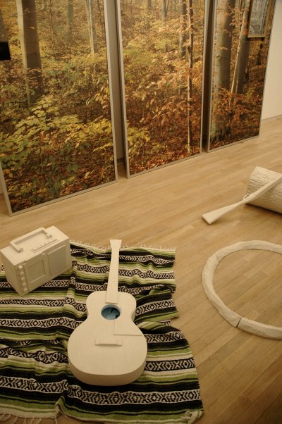
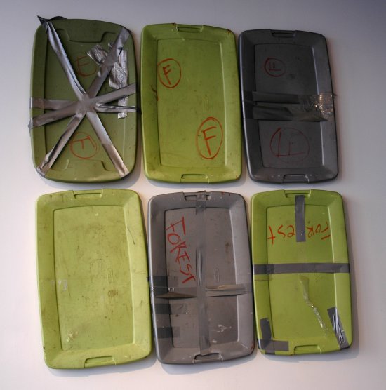
The gallery includes an installation of the detritus of a five-day camping-trip-out-of-purgatory - if not hell - which took place last summer within a rather heavenly-looking park located barely outside of the city. Yes, of course it rained. The chaotic mix of youth, sex, sports, natural beauty, bodily functions and survival is alternately, or simultaneously, horrible and delicious for the observer who can survive its assault on his or her own personal demons. Ah, playing with food; who doesn't remember the thrills?

Let's just say it's not "Midsummer Night's Dream" but I am thinking about Shakespeare as I'm writing this. I mean, we can't expect faeries in the forest of Pound Ridge, so, hey, . . . maybe?


EnrightForesttops.jpg


The large collection of messy relics is dominated by sports and cheerleader uniforms and their paraphernalia, as well as empty beer cans and food packets, but a select few pieces are assembled into some striking, almost traditional floor or wall-mounted sculptures.


Enrightmarshmallows.jpg

Some certainly less traditional than others.


EnrightForestmess.jpg

There are two videos, one a diptych, plus a short loop on a TV which sits in the midst of trash carted back from the campsite.


Enrightletter2.jpg

A letter pinned to a side wall is almost totally inconspicuous. It's something like a bread-and-butter note from one member of the weekend tribe all the others, addressing each separately in short gushing tributes, some rememberances more intimate than others. The signature at the bottom has been scratched out.

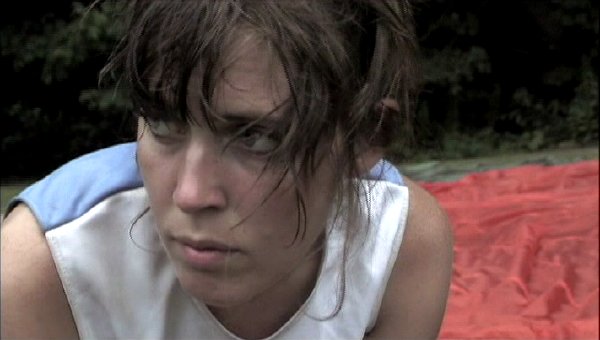
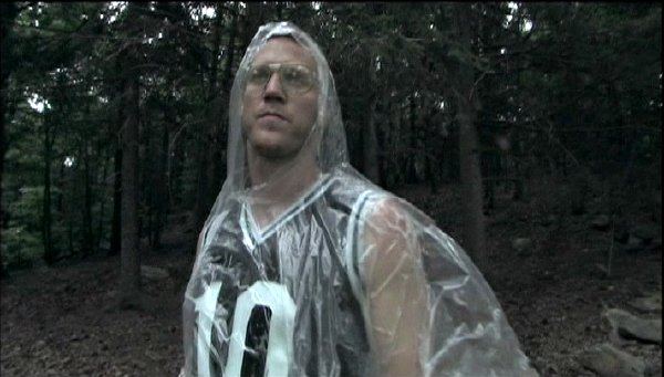
Finally there's [the] "Forest" itself. It's a 50-minute film running continuously behind a curtain in the rear of the gallery. It's described as a collaborative project by Enright and Hurzeler and it's a stunner, but the large cast (see the press release) was clearly not just reciting lines and standing on chalk marks. Thanks, guys.


Forestgirl.jpg

Forestboy.jpg


[the two stills from "Forest" are captured from a DVD]

There are few issues more important to our own survival and that of the entire world than the state of Israel and the war in Iraq. In two consecutive issues this month The Nation's contributors offer enlightenment in these areas to even the most knowledgeable reader.

I usually skip the many articles which only reflect what I already know or suspect, but I couldn't do without those which highlight this magazine's ability to reliably report or sensibly argue what what I'm unlikely to find anywhere else. These two fill that description in spades.

Unfortunately only one of these two particular reads are available on line, but you're depriving yourself, The Nation, and the nation if you aren't already a subscriber.

An excerpt from Tom Engelhardt's"Can You Say 'Permanent Bases'?", which is not on line:

To this day, those Little Americas [at least four "super-bases"] remain at the secret heart of "reconstruction" policy in Iraq. As long as [Halliburton] keeps building them, there can be no genuine withdrawal. Despite recent press visits, our super-bases remain in policy silence. The Bush Administration does not discuss them (other than to deny their permanence). No plans for them are debated in Congress. The opposition Democrats generally ignore them.

An excerpt from Philip Weiss's "Why These Tickets are Too Hot for New York", which is available on the magazine's website:

As George Hunka, author of the theater blog Superfluities, says [about New York Theatre Workshop's cancellation of the play, "My Name is Rachel Corrie"], "This is far too important an issue for everyone to paper it over again, with everyone shaking hands for a New York Times photographer. It's an extraordinarily rare picture of the ways that New York cultural institutions make their decisions about what to produce."

Hunka doesn't use the J-word. Jen Marlowe does. A Jewish activist with Rachelswords.org (which is staging a reading of Corrie's words on March 22 with the Corrie parents present), she says, "I don't want to say the Jewish community is monolithic. It isn't. But among many American Jews who are very progressive and fight deeply for many social justice issues, there's a knee-jerk reflexive reaction that happens around issues related to Israel."

AlbaEliamasks.jpg
Elia Alba Masks 2005 photocopy transfer on muslin [view of installation]


AlbaElia3.jpg
Elia Alba Muscle Boy 2006 C-print mounted on Sintra (from the series "Larry Levan Live!") [installation view, including portions of two other works by the artist]


[continuing images from the Longwood show]

MarclayChristian.jpg
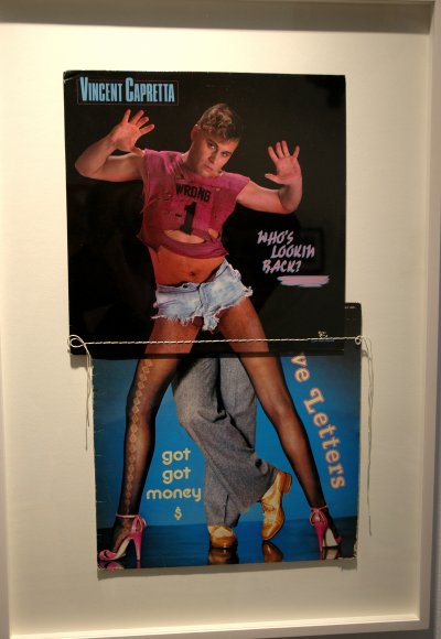
Christian Marclay Who's Looking Back (from the series "Body Mix") 1992 two record covers and cotton thread [installation view]


[continuing images from the Longwood show]

EnrightBrockStartMe1.jpg

EnrightBrockStartMe2.jpg

EnrightBrockStartMe3.jpg

Brock Enright's Start Me [three large details of installation]


London's Vilma Gold gallery showed this wonderful installation by young New Yorker Brock Enright. I believe it helps to know that the video artist is relatively notorious for his intense concept, and execution, of paid abductions of willing clients.

NovarroIvan2.jpg
Iván Navarro Backstage 2005 [detail of installation]


Roebling Hall showed this very electric sculpture by Iván Navarro at the Armory.

I love shiny pictures.

erwinolaf.jpg
Erwin Olaf [unidentified video still]


The somewhat outrageous Erwin Olaf appeared in the booth of the Paris gallery Magda Danysz. I regret I have no notes and no idea where this video goes but the little that I saw fascinated me.

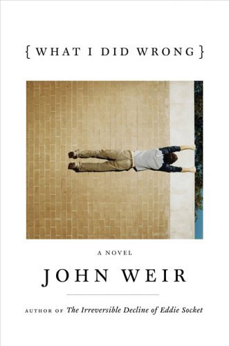
WeirJohnWhatIDidWrong.jpg


John Weir has a new book. It's been a while, and although I can't say I've been able to hold my breath all these years, I admit that I'm almost surprised that it won't be called "Mr. Novel". That's the form of address, John jokes, which many of his friends have used to describe the long-awaited successor to "The Irreversible Decline of Eddie Socket".

if you know John, the actual title bears its own promise. It's "What I did Wrong" and it will be published by Viking Press on March 27.

The book is already on the top of my reading stack, even though I can't see it yet.

Yes, there will be New York readings. I can vouch for John's natural comic talents and I'll probably be at the first event at the very least. This comes from someone who tries to avoid the form like the pest - unless its John Weir or Gore Vidal.

Monday March 27 at 7 PM
Half King
West 23rd Street between 10th and 11th Aves
Manhattan

Wednesday March 29 7 PM
Barnes & Noble
6th Avenue and West 22nd Street
Manhattan

Friday March 31 8 PM
[with two other authors]
The Lucky Cat
245 Grand Street between Driggs and Roebling
Williamsburg, Brooklyn


[image of cover from Viking via Amazon]

Nothing is so unworthy of a civilized nation as allowing itself to be governed without opposition by an irresponsible clique that has yielded to base instinct. It is certain that today every honest German is ashamed of his government. Who among us has any conception of the dimensions of shame that will befall us and our children when one day the veil has fallen from our eyes and the most horrible of crimes - crimes that infinitely outdistance every human measure - reach the light of day? If the German people are already so corrupted and spiritually crushed that they do not raise a hand, frivolously trusting in a questionable faith in lawful order of history; if they surrender man's highest principle, that which raises him above all other God's creatures, his free will; if they abandon the will to take decisive action and turn the wheel of history and thus subject it to their own rational decision; if they are so devoid of all individuality, have already gone so far along the road toward turning into a spiritless and cowardly mass - then, yes, they deserve their downfall.

- from the first leaflet of the White Rose


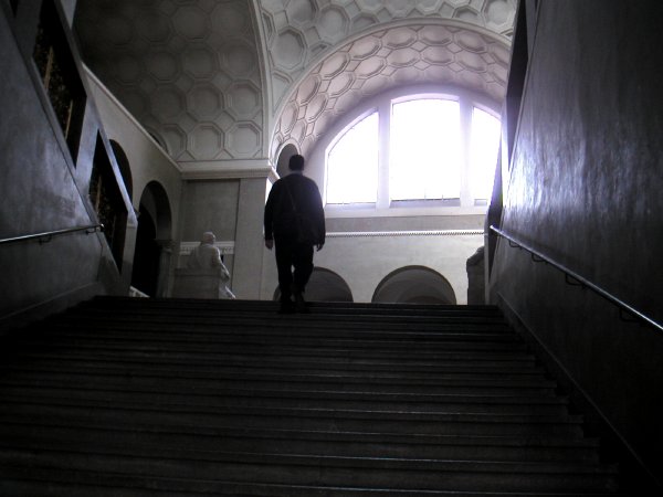
MunichUnistairs.jpg
Barry climbing the stairs of the light court in Friedrich von Gärtner's 1840 main building of Munich's Ludwig-Maximilians-Universität*


The German film "Sophie Scholl-The Final Days" will be at the Film Forum at least through next Thursday. I don't have to draw too much of an analogy here (it will come naturally enough to anyone who sees the movie), but it should not be missed by anyone sensitive to what is going on around us today.

Sure, we don't yet have a provocation equal to that which created the White Rose inside wartime Nazi Germany, but today the almost non-existent opposition to the current regime in Washington is still embarassingly out of proportion to the evil it represents.

Even without official government controls our press is dead, and even though they haven't been put in a camp as a threat to the state, the Democrats have been voting Republican for years. Both "estates" have been doing the work of the regime unbidden, giving it an apparance of legitimacy it would otherwise lack entirely.

In Germany sixty-three years ago political opposition was punishable with death. At the university in Munich a handful of courageous students and one professor decided that even the record of their resistance was worth such a sentence. They had few illusions that their work might bring down the governement or impact it in any significant way.

Today in the U.S. we haven't yet been complicit in the death of millions, although such big numbers are totally irrelevant to a single grieving mother or child. Our own political murders are real enough already. But are any of us be able to match the morality and the courage of Sophie Scholl and her friends? The overwhelming evidence of the extraordinary extent of our cooperation with this deadly, pathological White House gang, or at best our indifference, lethargy and even our incompetence as its opponents on any level, appears to give us an answer.


*
In 2002 Barry and I visited the university, where I had spent some time in the early 60's. I lived on Willi-Graf-Straße. This image shows the central hall where Hans and Sophie Scholl stacked most of their leaflets and strew the remainder over the railing onto the floor below.


[the text at the top was taken from The Shoah Education Project]

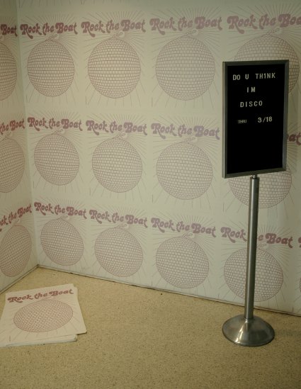
DoYouThinkImDisco.jpg
[the view inside the entrance to the show, with Carrie Moyer's 2005 "Rock the Boat" silkscreen installed on the wall]


We visited a show at the Longwood Arts Project at Hostos this afternoon, just in time to tell about it before it closes on Saturday.

Because of the name, "Do You Think I'm Disco", I expected it would be interesting and a lot of fun, but I wasn't prepared for the quality of the work.

The exhibition, curated by the gallery's director, Edwin Ramoran, is described as the first survey of its kind to focus on the impact of the dance music culture of the 70's on contemporary art. To be honest, thirty years ago I was totally distracted by the ecstatic dancing, the drugs and the sex. It was all very, very good. Somehow I missed the art.

I got another chance today, to at least see what the culture had wrought, and anyone else who can make it to the Grand Concourse in the next couple of days can do the same. I really recommend stopping in. I want to upload some more images in the next day or so, but since the show is about to end I wanted to get the word out tonight.

By the time I got to The Bronx I had forgotten what the list of artists had looked like when we first heard about the show weeks ago. I really respect the fact that the art comes from older artists with a reputation and the very young and unexhibited, but most of the conversation inside the gallery was dominated by the generation in the middle. Only because Barry and I get around so much were we able to recognize a good number of them, but interestingly almost none of the works themselves were familiar.

Holland Cotter reviewed the installation early in February. An excerpt:

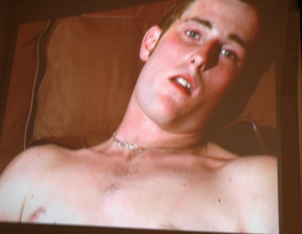
On the subject of gender, Larissa Bates, Christian Marclay, Edwina White, Megan Whitmarsh and the team of Jayson Keeling and Kalup Linzy have intriguingly varied things to say. And if queer culture is the show's lingua franca, it takes many forms, with references to erotica (paintings by Boris Torres); H.I.V. and AIDS (a fine film by Derek Jackson and a conceptual piece by Iván Monforte that offers free H.I.V.-testing at the gallery); and spirituality.

This last element finds a voice in one of the exhibition highlights, Mr. Monforte's short film titled ''And I'm Telling You,'' in which a terrific gay gospel singer, Marcellus Ari, delivers an a cappella rendition of a love song from ''Dreamgirls.'' Written to be sung by a woman to a man, the song is almost absurdly passionate; it leaves Mr. Ari vocally and emotionally exposed. And when he's finished, he seems momentarily dazed as if pondering what he has just done.

A couple of teasers:


CollinsPhilTheLouderYouScream.jpg
Phil Collins The louder you scream, the faster we go 2005 video [still from video installation]


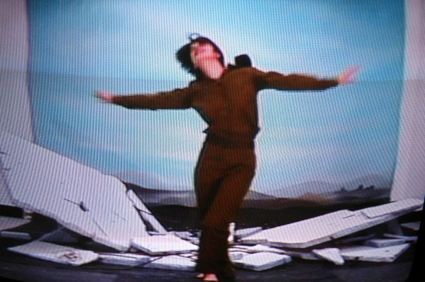
WegnerShirleyRuins.jpg
Shirley Wegner Soldier Dancing on Ruins 2005 DVD [still from video installation]

PPaulArmory.jpg
Paul P. Untitled 2006 watercolor on paper 27.5" x 20" [large detail of installation]

PPaulArmorydetail.jpg


Paul P. was represented during last week's fairs by at least two galleries on nearly opposite sides of the earth. The image above, shown here with a pop-up detail, appeared at the Armory show in the booth of Galerie Thaddeus Ropac (Paris and Salzburg), the two paintings below were shown at LA ART by Marc Selwyn Fine Art (Los Angeles).

P.PaulLAA.jpg
Paul P. [details unavailable]


I've written about Paul P. before, so I don't have to go on here about how much I like his work. Besides, these images speak for themselves, especially if you know the source of the artist's inspiration.

MylesScottMeat.jpg
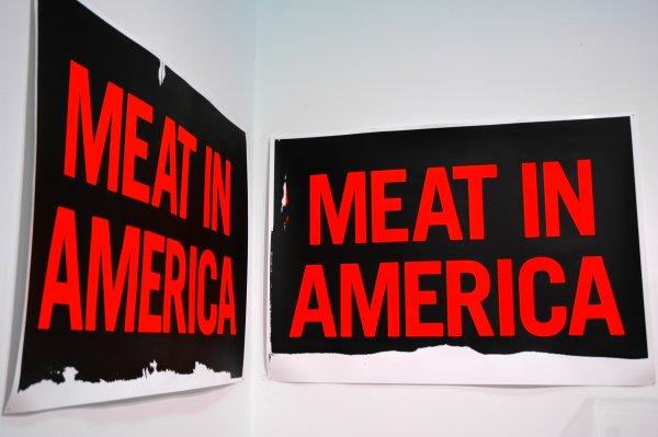
Scott Myles Meat in America 2005 unique silkscreen on paper 28" x 40.25" each of two parts [large detail of installation]


Glasgow's very hot The Modern Institute showed Scott Myles at the Armory.

AnMyLe.jpg


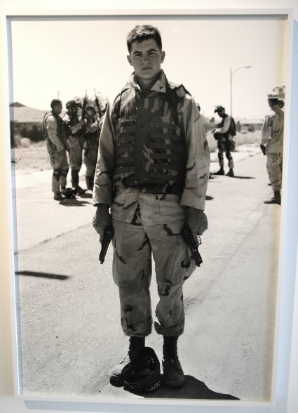
This awesome work by An-My Le was shown at the Armory by Murray Guy.

I can't add anything.

KrachAaron8.jpg
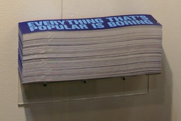
Aaron Krach Indestructible Artifact #8 (Fatigue) 2006 bumper sticker [installation view]


KrachAaron2a.jpg
Aaron Krach [two photographs otherwise unidentified]


DCKT showed work by author and artist Aaron Krach in their booth at Pulse. I like the toys, but the bumper sticker attracted a lot of attention.

Krach has moved his studio into the window of Exit Art for the show, "The Studio Visit", where he may be visited by appointment [[email protected]].

Huang1.jpg

Huang2.jpg

Huang3.jpg

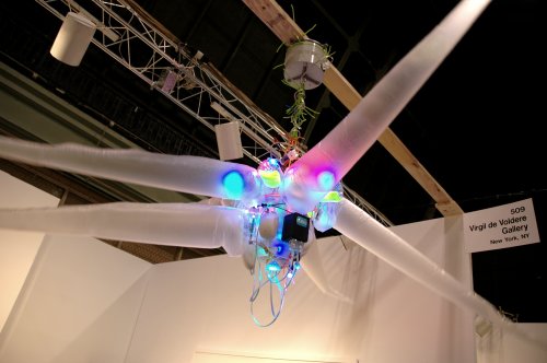
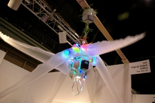
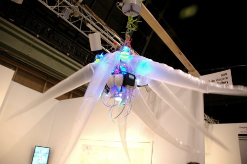
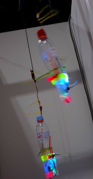
Shih Chieh Huang Rise and Fall of Civilization 2006 mixed media, dimensions variable in time and space [three views of installation]


Shih Chieh Huang's beautiful kinetic sculpture dominated Virgil de Voldère's booth at Pulse, and that's quite an accomplishment, since this dynamic young gallery's choices always seem to deliver both surprise and delight - if not simple amazement.

The artist was also represented by a smaller but equally lively piece suspended behind a partition, this one driven by two small computer fans:

HuangShihChiehfans.jpg


In this week's Village Voice R.C. Baker's mini-review of Huang's show in the gallery space (ends Saturday) manages to describe what the proverbial "mixed media" means this time:

Awash in black light and bristling with wires and cable ties, robotic creatures spring to life when motion and light sensors—some of the latter suction-cupped to huge blinking eyes on video screens—trigger computer fans that fill flaccid plastic tubes with air, creating wriggling tentacles and flapping wings. More fans, hung from the ceiling, and random radio scans add to the sensory overload of this Taiwanese-born artist’s techno-geek fun house.

JacobsJoeren.jpg
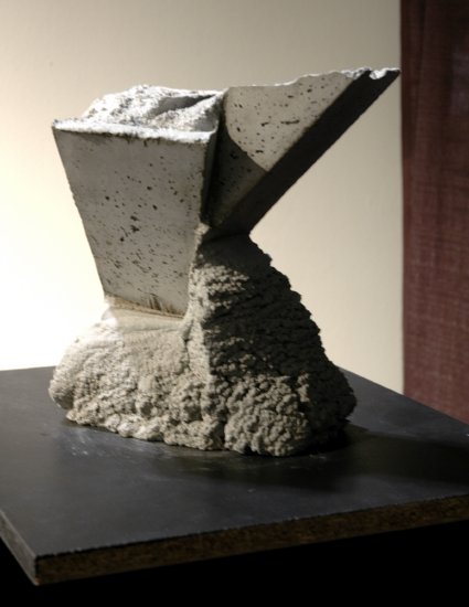
Jacobs Jeroen Ka De We 2005 sculpture in concrete 12.25" x 11.75" x 10.25 [installation view]


I've decided I'm a sucker for concrete sculpture, and not just when it's a real building, but the pieces by the Dutch artist Jacobs Jeroen displayed by Berlin's Galerie Magnus Müller at Pulse make my weakness easy to explain.

EnglishSimonpiggyback.jpg


EnglishSimongroup.jpg


A fascinating booth, good people, great chocolate, and Simon English drawings. A great way to end our visit to Scope Saturday night, inside the Zürich gallery with the wonderful name and the great facade, Römerapotheke.

Bought the book; maybe a small drawing next time.

KusteraCarterAGraib.jpg


The world unfortunately continues to grind out a rich load of subjects for Carter Kustera's singular art. This piece, exhibited by Atlanta's Solomon Projects at Scope, pretends to offer fashion advice, but it's really about the fashion of violence. Unfortunately the text is not legible in this picture, but you can use your imagination if you check out one an earlier, New York show, and this excerpt from the Atlanta gallery's press release:

At once poignant and witty, "Fabulous Anger" is a provocative body of work that explores the commodification of violence. Combining image and text in a format familiar to advertising -- the fashion layout -- Kustera takes a critical look at the way violence is presented through the media.

RieckJascolor.jpg
James Rieck Something Special 2006 oil on canvas 82" x 74" [installation view]


Lyons Weir Gallery
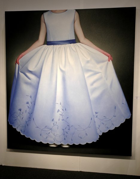
showed something new from James Rieck at Pulse, a luscious color version of his party dress oils.

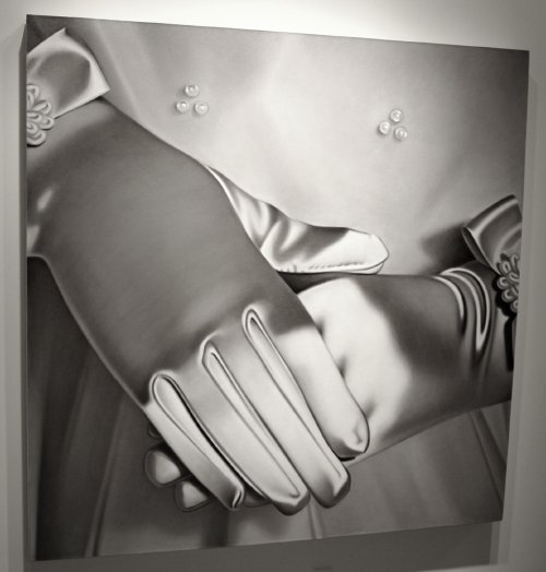
While visiting the gallery itself several days before the fair, I had shot this image of one of his pieces in the beautiful solo show* which closed last weekend:

RieckJamesb:w.jpg
James Rieck Girl's Satin Gloves (2) 2006 oil on canvas 63" x 63" [installation view]


*
the paintings both shine and glisten when seen in person, but in the meantime there are great images on the gallery website

Pokorny2.jpg
Melissa Pokorny Drag (Double Goer) 2005 MDF, laminates, polyurethane resins, polar fleece and fabric 38" x 41" x 74" [installation view]

Pokorny1.jpg
Melissa Pokorny You and Me and Bird Shit 2005 MDF, laminates, polyurethane resins, bogus bricks, fabric 33" x 28" x 49" [installation view]


Oh yes! But I think my favorite is the piece on the artist's home page.

Prominent highlights of the Fountain fair across the highway from Armory were Melissa Pokorny's two wonderful/weird sculptures on the floor just inside the door. They were part of The Front Room's contribution.

Pokorny was part of the gallery's January/February group show.

From her site:

Forget meaning. This work functions like some sort of homemade cultural probe. Think of a kid poking a stick into swamp water and removing it to see what lies beneath. Pokorny's creative imagination seems to work that way.

People have a hard time imagining living with Pokorny's sculpture, but in a sense we all do already.

— Kenneth Baker


HawkinsonTimBikeSpin.jpg
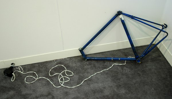
Tim Hawkinson Bike Spin 2004 [view of installation]


But it still rolls, er, spins.

This was just about the very first work I saw at my initial stop during a long weekend of art fairs. What looks like just another stripped bike frame is actually a complex, moving (in both senses) sculpture. Every section of the frame is geared to turn continuously and silently, in a direction opposite from its neighbor.

I saw Tim Hawkinson's sad, defiant piece in a corner of one of the rooms of the Pace Wildenstein booth at the press preview of the Armory Show.

MapplethorpeStarGoldB.jpg
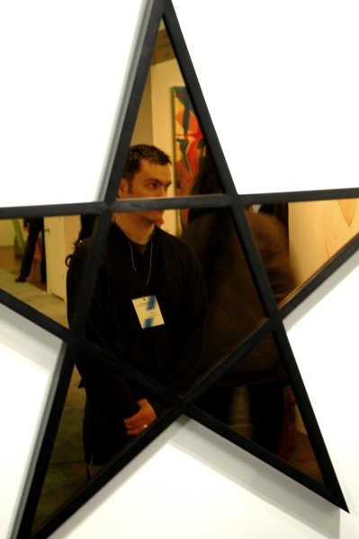
Robert Mapplethorpe Star (gold) 1983 stained wood and gold mirror 47" x 49" [large detail of installation, including reflection]


STAR


I've always preferred Mapplethorpe's 1980's cold, minimal sculptural work, with or without the photographs, to anything else he ever did, and now I can say that he would never have been able improve on a "Star (gold)" which managed to include Barry, seen here in the Alison Jacques Gallery booth at the Armory show.

RoweHeatherclear.jpg
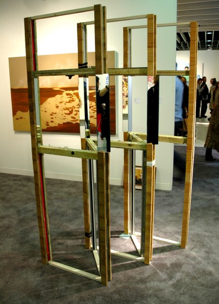
Heather Rowe Untitled (screen #1) 2006 metal studs, wood, tape and glass 42" x 28" x 82" [installation view]


Dynamite. Couldn't walk away. Don't know why. Want to know where it's going now. Can I visit?

Heather Rowe
's sculpture in the middle of the D'Amelio Terras booth attracted almost everyone's attention.


RoweHeatherguys.jpg
untitled and friends

BrennerBirgit1.jpg


Eigen + Art Berlin showed drawings by the German artist Birgit Brenner at Armory. I felt like I was barely shown the tip of a very large iceberg; I'd like to see more. I would also like to have shown more here, but the light was difficult.

FishmanLRockandRuinsdetail.jpg
Louise Fishman Rock and Ruins 2005 oil on linen 60" x 70" [detail*]


FishmanLArtofLosing.jpg
Louise Fishman The Arto of Losing 2003 oil on linen 80" x 60" [view of installation]


FishmanLMoonInMySky.jpg
Louise Fishman The Moon in My Sky 2005 oil on canvas 56" x 46.5"


I don't suppose anyone would think I could be objective about the art of Louise Fishman if they knew my connection with the artist, but if it meant having to give up that connection I wouldn't really want to be in a position where I could be objective.

I do love her work, but I'm obliged to make this disclosure:

A friend told us around five years ago that a real artist (we understood "painter") had bought the beautiful apartment across the hall from us. We were delighted, especially since this would be virtually a first in our building, even though it may house 200 people. This is Chelsea, after all, so we had never really expected artist neighbors.

I confess that at first Barry and I didn't know who she was, even after we were told her name about a week or two later. While "Louise Fishman" sounded pretty familiar, even though we had generally been immersing ourselves in the work of emerging artists, neither of us could pull up an image in our heads. We ran to a search engine where we were very excited to find that we really liked what we saw. It was also clear that she was very well known and respected, so we should have been pretty embarassed about our ignorance. In fact, that just made us a little more shy than we would otherwise have been once she moved in.

We came to know her even before we had actually seen her work other than in reproduction. In her case the difference is staggering and for any one interested in grown-up painting her shows remain one of the best arguments against depending upon the image of the thing rather than the thing itself.

Oh yes, about the no-regret-for-subjectivity thing: Louise is a truly great artist, but she is also a great intellect, an activist, a good heart, dynamite company and a wonderful friend and neighbor. Barry and I wouldn't have the pleasure of most of those things if we knew only her art.

Her current solo exhibition is at Cheim & Read right now. Of course it's a beauty, but you don't have to take my word for it; it continues until March 25.


*
FishmanLRockandRuins.jpg
Rock and Ruins
[click for full image]

RobertJimmyprint.jpg
Jimmy Robert Untitled 2005 15.75" x 15.75" print [view of installation]


RobertJimmymixed.jpg
Jimmy Robert Untitled 2005 mixed media [view of installation]


The Amsterdam gallery Diana Stigter showed beautiful work at the Armory by the young French (Guadaloupe) artist and performer Jimmy Robert.

and with Rhona Hoffman at the Armory

WileyKWillem.jpg
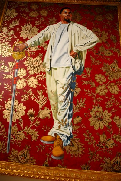
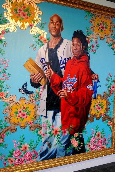
Kehinde Wiley Willem van Huythuysen 2006 oil and enamel on canvas 8' x 6' [large detail of installation]


Gosh, he just gets better. This magnificent painting was offered by Roberts and Tilton at LA ART. Two days earlier I had seen the equally impressive dual portrait below at the Armory, with Rhona Hoffman.


WileyKAlNic.jpg
Kehinde Wiley Albert and Nikolaus Rubens, the Artist's Son 2006 oil and enamel on canvas 106" x 95" x 4.5" framed [large detail of installation]

VidalJLplaneman.jpg
Jacques Louis Vidal Hurricane Machine 2004 digital video [still from video installation]

VidalJLsuit.jpg\
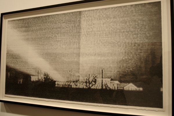
Jacques Louis Vidal Tower of Light 2004 digital video [still from video installation]

VidalJLAirFilter.jpg
Jacques Louis Vidal Air Filter 2004 digital video [still from video installation]


At Scope this week D.C.'s Curator's Office gallery exhibited some delightful 3-4 minute videos by Jacques Louis Vidal, along with one very good drawing. For the performance videos think of a slightly more serious John Bock collaborating with an almost wacky Chris Burden.


VidalJLdrawing.jpg
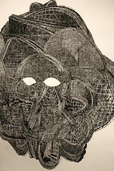
Jacques Louis Vidal Coaster Face 2005 watercolor on paper [large detail]

VidalJLdrawingdetail.jpg
Coaster Face [detail]

THE NEW YORK ART SHOWS


If the Armory Show was the slightly stuffy grown-up, Pulse was the younger sibling who wanted to be liked as much as respected, and Scope was the sassy kid who decided to ignore the rules.

Fountain was the scrappy youngster from the other side of town (the other sided of the tracks?) who just refused to accept being written off, and LA ART was the interesing visiting cousin.

DiVA is like that brilliant but weird family member no one knew quite what to do with.

You won't find any "fair" rating system here; there was good work everywhere this week, and each of the venues displayed its share of clunkers.

Starting tonight or tomorrow, what I will do, until I run out of steam, is upload images in no particular order from each of these shows, excepting DIVA. Unfortunately while we really enjoyed it last year we didn't plan well enough to get downtown before the digital and video fair closed tonight. I'll try to include at least some basic details for each artist's work, but there probably won't be much more.

KaneCarol

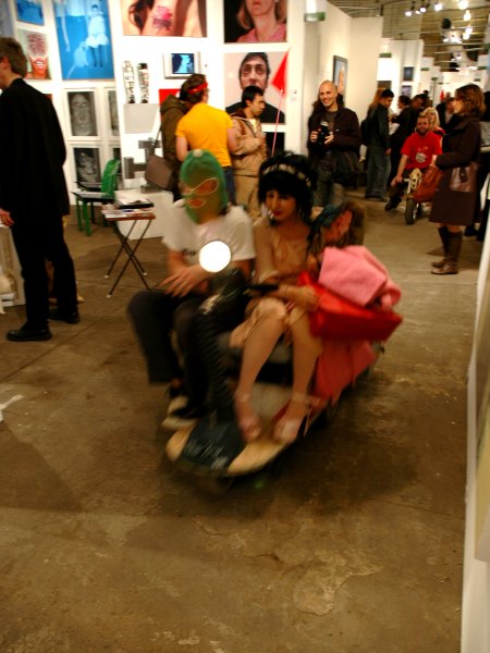
Scopescootertour.jpg

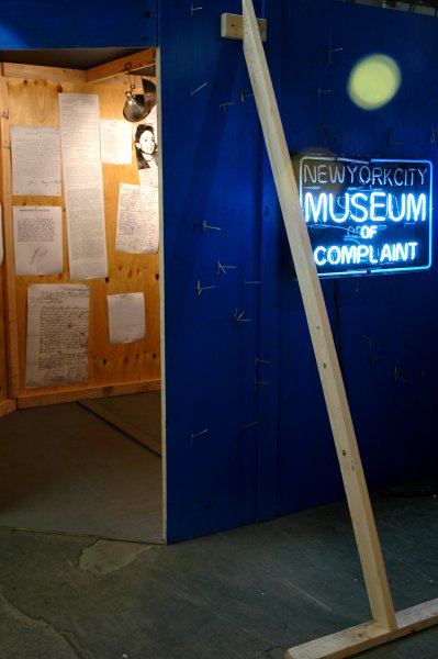
ScopeMuseumofComplaint.jpg


[details on these images to follow soon]


Not to take away anything from the other "major" art fairs going on in New York this weekend, but if you're only going to hit one of the shows, make it Scope New York.

We saw great stuff at the Armory Show and at Pulse, and our encounter with the outsider assembly, or Salon de Refuse, Fountain will make it very hard to ever look at an art fair in the same way again, but for three full hours we both had so much fun in the big colorful maze on 11th Avenue that we decided we'll have to go back.

The art fair thing had begun to feel like work until we walked into Scope, where absolutely everyone was smiling - when they weren't actually laughing. The whole show is hugely entertaining. I can't begin to explain why, especially since the organizers have been plagued with so many headaches and threats to its survival.

We still have to visit DiVA and LA ART, and we hope to make it to Williamsburg tomorrow night, but I think I could retire for a few days with a smile on my face if I were to break a leg first.

GoldmanCharlesinstallation.jpg


Art is elitist only for those who say it is.

This was what the Artists Space installation of several Charles Goldman pieces looked like yesterday afternoon during the press and privileged-collector preview for the Armory Show. Since there was still some tidying-up to be done by pier workers before the 5 pm VIP reception, some members of the works' interested public were part of neither constituency.

Since we've been pretty diligent about making all six or so fairs in the few days available, I haven't had time to do any posting yet. But soon.

MinterMarilyn23rdstreet.jpg
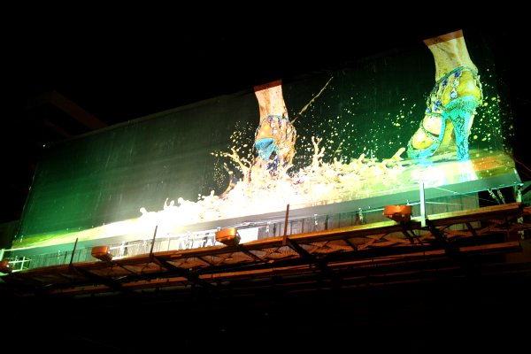
Marilyn Minter Splish Spash and Runs 2005 billboard [view of installation]


This is a shot of one of four huge billboards installed in Chelsea by Creative Time as a tribute to the wonderful New York photographer and painter Marilyn Minter.

ArmoryShowcreds.jpg


Now I'm ready for my close-ups. But please let me stay behind the camera.

7WTC2Holzer.jpg
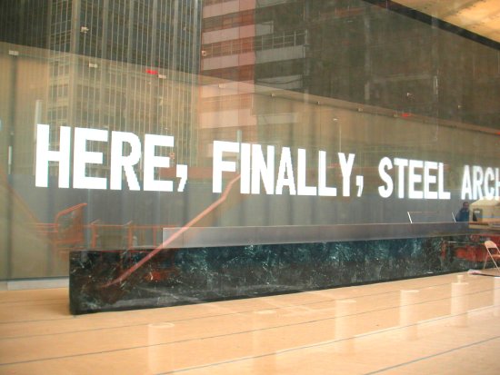
Le Corbusier* via Jenny Holzer via Larry Silverstein


Speaking of large works of art [from my March 4 post: "...the Whitney rooms are devoted almost exclusively to large works; almost everything can be seen easily from a distance."], Jenny Holzer is completing the installation of a 65-foot-wide, 14-foot-high wall sculpture of moving text commissioned for the lobby of the new 7 World Trade Center. I was downtown this afternoon so I sneaked what looks here like a spy camera shot while I stood in the midst of the construction machinery outside the building shielding my little Minolta.

In an upbeat report in the NYTimes this morning we are told, "Though the artwork resides in the lobby, it is already visible several blocks away."

That even beats the Biennial's "Peace Tower" installed in the dry moat below the Whitney's front windows.

I think it will look fine, perhaps even very, very fine. At least from a distance the Childs building seems to be an improvement over the old 7 WTC, even if much of its virtue may be tied to its glassy near invisibility. I worked in the old fortress for years, and even with a lobby stocked with decent, large-scale late twentieth-century art I shuddered every time I had to walk to or from the elevators. The Lichtenstein, the Held, the Nevelson and the Bleckner [all destroyed] were all basically add-ons inside that pompous and brutally cold corporate control center lobby.

Today's article describes some of the process of the collaboration between the artist, architect David Childs and developer Larry Silverstein. While it clearly won't be one of Holzer's more provocative projects (the texts which had to be cleared by Silverstein, will apparently be as close to sweetness and light as Manhattan ever gets), we may still be able to hope for more later on: "I hope to feed it again," Ms. Holzer said. "It would be nice to keep it alive."

For the sake of all of us, I wish her success.


*
the complete quote reads:

The George Washington Bridge over the Hudson is the most beautiful bridge in the world. Made of cables and steel beams, it gleams in the sky like a reversed arch. It is blessed. It is the only seat of grace in the disordered city. It is painted an aluminum color and, between water and sky, you see nothing but the bent cord supported by two steel towers. When your car moves up the ramp, the two towers rise so high that it brings you happiness; their structure is so pure, so resolute, so regular that here, finally, steel architecture seems to laugh… The second tower is very far away; innumerable vertical cables, gleaming across the sky, are suspended from the magisterial curve that swings down and then up. The rose-colored towers of New York appear, a vision whose harshness is mitigated by distance.


7WTChighside.jpg
the new 7 WTC: very clean, but nothing new


[it was Barry who drew the connection between what I had written earlier about the Biennial and this project when I mentioned the Times story at the breakfast table]

I've uploaded below some two dozen images of work from this year's Whitney Biennial, but I'm not suggesting they represent anything but a sampling of the work in the show, especially since I'm not going to include any notes.

Some of these works appear here mostly because I liked the image I was able to capture, even if it may be little more than an abstraction. For instance, by description alone any still from a film or video is an abstraction. A certain number of the choices were favored both for the image and the work, but I have no illusions about representing the artist's creation.

Oh yes, the Whitney has the its own images, but honestly, I haven't looked at the site. For the purposes of this blog, as usual, I just can't resist trying to show original images of original work.


ColenDanHS.jpg
Dan Colen


BradfordMarklighter.jpg
Mark Bradford


WardNari.jpg
Nari Ward


PeaceTower.jpg
Marc di Suvero, Rirkrit Tiravanija, and others


WolfsonJordantitle.jpg
[complete title of Jordan Wolfson's video installation]


WolfsonJordanDictator.jpg
Jordan Wolfson


DonnellyTrisha.jpg
Trisha Donnelly


AngerBabylon.jpg
Kenneth Anger


O'RourkeJimplane.jpg

O'RourkeJim(right).jpg
Jim O'Rourke [two details]


KoetherJutta.jpg
Jutta Koether


ParrinoSteven.jpg
Steven Parrino


GrafDeva.jpg
Deva Graf


TribeKerryWrong.jpg
Kerry Tribe [in the Wrong Gallery installation]


WojnarowiczDavidKid.jpg
David Wojnarowicz [in the Wrong Gallery installation]


EzawaKota.jpg
Kota Ezawa


Caligula.jpg
Franceco Vezzoli


CoupdeclatKateMoss.jpg
Coup d'Eclat


Coupd'Eclat.jpg
[label for the Coup d'Eclat installation]


Oursleretalvideo.jpg
Tony Oursler, with Dan Graham, Rodney Graham, Laurent P. Berger, and Japanther


SnowMichaelSheeploop.jpg
Michael Snow


SullivanBilly.jpg
Billy Sullivan


DeepDishRealFace.jpg
Deep Dish TV ["The Real Face of Occupation"]


I did say this was just a press preview. As we left the Museum we looked for Aaron Young's work outside on the sidewalk, but it seems there had been some delay in its completion. Another bicyclist had locked his own machine to the designated bike rack located outside the Whitney's front door, holding up Young's installation. Just as we first spotted the still-incomplete piece, the artist returned to continue its assembly. The artist and the curators anticipate that once it is attached to the rack the shiny locked bike will gradually disappear during the term of the Biennial.


YoungAaronbike.jpg Aaron Young

OkiishiKenWoj.jpg
Ken Okiishi "David Wojnarowicz" in "New York" 1999 DVD [still from video installation]


O'GradyLorraineRenaissance.jpg
Lorraine O'Grady The Renaissance Man is Back in Business (The New York Times, Sunday, September 25, 1977) xerox from newspaper collage/poem [detail of installation]


We slipped into the opening reception for "Between the Lines" at Daniel Reich's Temp. Space this afternoon, and in fact the party continues while I'm posting this back in the apartment.

Nick Mauss has curated a group show which is definitely worth a detour. In addition to these and other pieces by Ken Okiishi and Lorraine O'Grady, there is work by Charles Henri Ford, Tariq Alvi, Daniel McDonald, Kianja Strobert and Paulina Olowska.

I've often talked about the need for interesting alternative spaces in the midst of all the shininess in West Chelsea, and this hot "temporary" space (the prevision is even in the name) definitely works. It's also in my beloved and not-so-shiny Chelsea Hotel, so at least for me it's not even out of the way.

It's back. But is it too much art after all? Or maybe we should just be asking if we're taking it too seriously.

We should at least be grateful for the grace of the extra year indicated by the "bi" in "biennial". An annual would just be too much for more than the organizers (although it might bring the pressure down a notch or two for a lot of people). The Whitney Museum's regular survey of American art can't help being a pretty stressful experience for those who take their art seriously.

Barry and I were at the press preview on Tuesday afternoon. It was difficult sorting through hundreds of works in just three hours, especially for me since I was lugging a bulky camera, but at least we had some decent sightlines. I understand that at the guest preview on the following night scenesters and VIP's were more easily spotted than the art.

Umm. I'm sorry but I'm not sure what's wrong. It's taken almost five days to do this post. Why am I still trying to avoid it, and why am I going to be so unhappy about what I end up with? Am I really such a contrarian (or Frondeur) that if you were to drop me into the middle of any big pile of art I knew had been assembled by one agent for a specific event, regardless of the merit of its parts or the whole, I'd be compelled to put up some serious resistance? Or is there something fundamentally off about the concept of a quasi-competition in the arts to begin with? I have a private horror of institutional competition in any faculty, but I suspect that if I have a problem with the Whitney salon and any similar phenomenon the source lies inside both my own baggage and that of the institution.

The unveiling of the Biennial suggests a theatrical opening night, only this one is stretched over two or three days. But this only describes the Museum's arrangements; the artists in most cases have already presented their work to some kind of public, so perhaps for them the Biennial is more like some an Academy Awards nomination. As a spectator I find the overall effect is not unlike that of an old-fashioned TV variety show, and that's not an attractive analogy.

But I'm not saying the 2006 version is a disappointment. There's no question that this show certainly feels different. I like different.

This is probably an unnecessary observation, but I think it's very important that there's a complete change of curators and curatorial approaches every two years. It keeps things interesting and it clears the stage each time. No one has to look back, even if it's an inevitable temptation. Whatever the criticisms of a show in one year, there's always next [bi-]year.

During my first hour wandering about on Tueday I was really excited by the possibilities for the afternoon, based both on what I had already heard about the eccentricities of some of the works chosen and what the rooms themselves appeared to show about the curators' very open, even unorthodox approach to locating artists to include in their survey.

My enthusiasm waned during the next couple of hours.

Of course there was a lot of good work, but I was surprised by what I thought of as the ordinariness, the banality of some of it. Although unlike two years ago most of the artists were quite new to me, as I continued through the rooms my initial excitement just wasn't being refueled by what I was seeing. As I'm writing this I'm able to bring up very few memorable images in my head, although I can't underestimate the impact of my press-preview sensory overkill.

In the end I don't think any of us are better off coming to art in big stacks. It's really not the way either new or classical work should normally be encountered. We can't always expect to come upon art on our streets or in our buildings, so those of us who want more have to visit galleries and museums. The insatiable will join the potentially-creative anarchy of the art fair [multiplied for enthusiasts over and over in next week's scary schedule in New York]. The Biennial tries to help us by introducing an intelligence and a perspective, but ultimately we must all be our own curators every day.

Go see it. But don't try to make it through with only one visit. In the end, if you're bored it'll be your own fault.

And when you need a break, there's next week's schedule, its temptations captured for enthusiasts in the words of ArtFagCity, "The Next Two Weeks in Art: Like Drinking So Much You Puke and Then Immediately Going Back to the Bar for More". See Paige West's ArtAddict for details.


Some notes:

I agree with Barry's observations about the Biennial posted a few days ago, but I'll add a few of my own:

1.) The definition of "art" has been stretched into the wings of our daily experience of creativity in this Biennial, and this can only be a very good thing. When I was growing up art meant simply painting and, to a lesser degree, sculpture. Drawing was mostly about studies for painting or sculpture, and photography was a hobby or craft.

2.) The 2006 show demonstrates little interest in painting or drawing. When either medium does show up it's invariably upstaged by a sexy sculpture installed in the center of the room.

3.) I've seen a huge amount of small-scale work in drawing, painting, collage and photography in visits to studios and galleries over the last few years, but the Whitney rooms are devoted almost exclusively to large works; almost everything can be seen easily from a distance.

4.) The artists represented this year have their studios located all over the country and well beyond, perhaps making this the least provincial of the Whitney biennials.

5.) I wasn't counting, but it seemed to me that once again women are definitely under-represented, even though so many of the artists are very young. Oddly, in the introductory remarks one of the two curators, pointing out that this was the first show to have one male and one female working together in selecting the work to be included, joked that this made it something of a "bisexual biennial". It's becoming more and more difficult to explain away a disproportion not substantiated by any measure of the quality of new work being done today.
  • home

This page is an archive of entries in the Culture category from March 2006.
previous archive: Culture: February 2006

next archiveCulture: April 2006