Culture: August 2007 Archives

ArtCal_screen.jpg


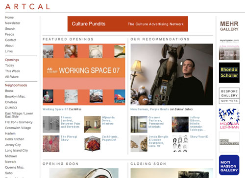
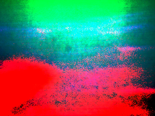
As the chief says, "we're still working on a few features and tweaking the design", but the new ArtCal site is now live. By next week at this time, with the opening of New York's vigorous fall gallery season, the nearly three-year-old site will be displaying more shows than ever before, but sorting them out will be easier than ever before. Some additional features have been added, and there will be more to come.

Go see for yourself.

The clean design is by Michael Mandiberg.

LovettCodagnone_work_play
Lovett/Codagnone All Work No Play 2007 vinyl lettering and mirror [installation view with detail reflection of two bloggers]


Barry and I were both very happy to be able to get to a Participant show this summer, since the gallery had to abandon its previous home on Rivington Street earlier this year. "Office Party" was the title of the gallery's very cool installation in its temporary quarters at Rental [check the link for press on the gallery itself and the press release for "Office Party"]. The show closed August 19, but we're hoping to hear soon about the new permanent address of this vital Downtown non-profit space.

The artists represented this summer, all addressing the idea of work or workplace, were Eric Heist, Lovett/Codagnone. DIana Punter, and Børre Sæthre. In the project room there were additional pieces on the theme by Stephen Andrews, Matthew Antezzo, Michel Auder, Lutz Bacher, Robert Boyd, Kathe Burkhart, Robin Graubard, Michael Lazarus, Virgil Marti, Laura Parnes, Luther Price, Adam Putnam, and Shellburne Thurber.


The gallery concept represented by Rental, now in both Los Angeles and New York, is an interesting and one welcome on both coasts. It helps to answer a genuine need for broadcasting the work of emerging artists in new milieaux, one which is almost never addressed otherwise.

This is Roberta Smith writing in the NYTimes May 25:

Rental, the latest addition to the expanding Lower East Side gallery scene, is the first one to have the light and views -- if not the interior design -- of a Chelsea space, thanks to its location on the sixth floor of a corner building with big windows. But that is not its distinguishing characteristic: true to its name, and like its predecessor in Los Angeles, Rental is for rent to selected out-of-town dealers. The first Rental was founded in 2005 by Daniel Hug and Joel Mesler; the New York version has been set up by Mr. Mesler.

This could unsettle the gallery scene's home-away balance of power in interesting ways. Dealers who give artists their first shows elsewhere will not necessarily have to hand them over to New York galleries to obtain exposure here. They can do the work, walk the walk and talk the spiel themselves.

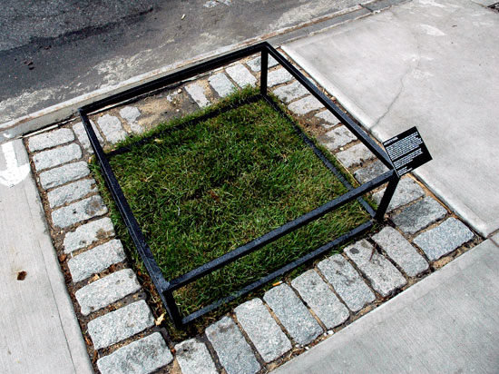
Kaplan_Scot_park.jpg
Scot Kaplan Artist's Park 2007 mixed media, dimensions potentially variable [installation view]

Kaplan_Scot_park_detail.jpg
[detail]


We can never have too much park - or too many artists - and an "artist's park" sounds like a good thing to me, even if it's smaller than a nightstand. I came upon this piece by Scot Kaplan on the south side of West 24 Street while bouncing from one gallery to the next two days ago. Maybe it's also some kind of homage to the Beuys basalt pieces two blocks south on 22 Street. The sod looks like it just got there, but I did spot a small piece of cellophane and one bird feather lying on the grass.

The galleryese verbiage in the caption below the photo is mostly my invention.

I really hope this thing's a permanent installation.

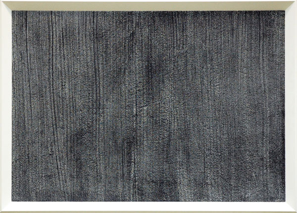
Kelly_Mike_Carpet_7.jpg
Mike Kelly Carpet 7 2003 acrylic on carpet, mounted on wood panel 46.25" x 64.25"


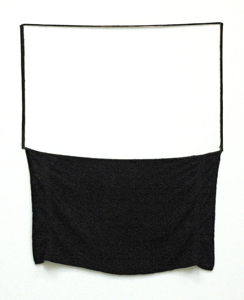
Lee_Paul_cotton_towel_ink.jpg
Paul Lee Untitled 2007 cotton towel and ink 46" x 41" [installation view]


Lambie_Jim_Y-Footo.jpg
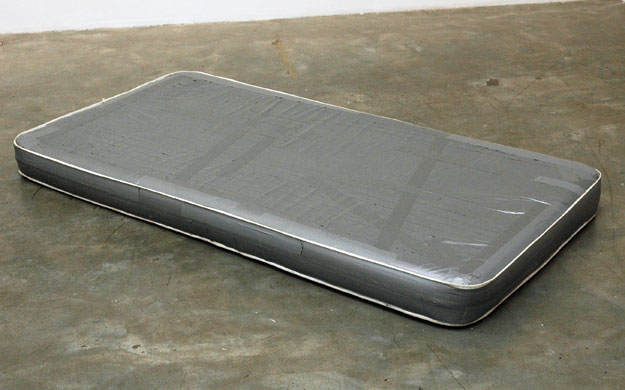
Jim Lambie Y-Footo 2002 mattress and silver vinyl tape 72" x 38" x 5" [installation view]


Bortolami's main space is devoted to "Substance & Surface", a group installation of work by a [baker's] dozen artists working here with monochromatic (and overwhelmingly colorless) non-traditional materials. The artists are Ghada Amer, John Armleder, Bozidar Brazda, Piero Golia, Thilo Heinzmann, Gregor Hildebrandt, Mike Kelley, Jim Lambie, Paul Lee, Glenn Ligon, Lovett/Codagnone, Daniel Joseph Martinez, Donald Sultan and Eric Wesley.

It's a beautiful show, beautifully installed. For this profane acolyte the experience may have ben a bit like what some people feel inside an austere house of worship.

Mogutin_Slava_Joey_2.jpg
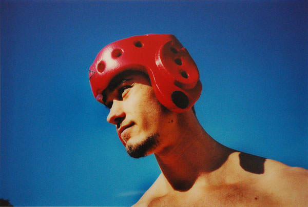
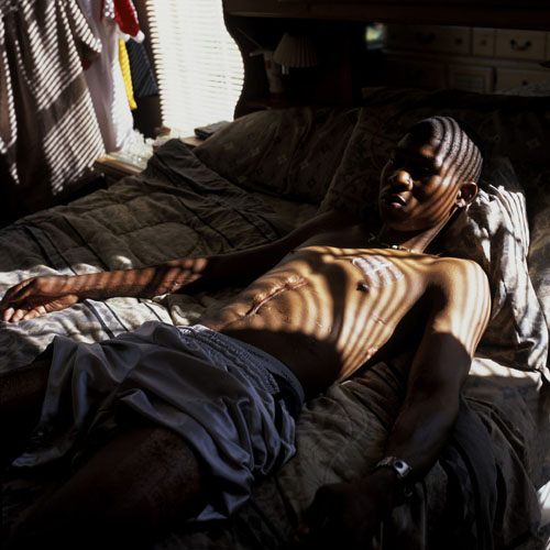
Slava Mogutin Joey San Francisco, 1999 archival C-print mounted on aluminum 30" x 20"


Mogutin_Slava_Yellow_Billboard.jpg
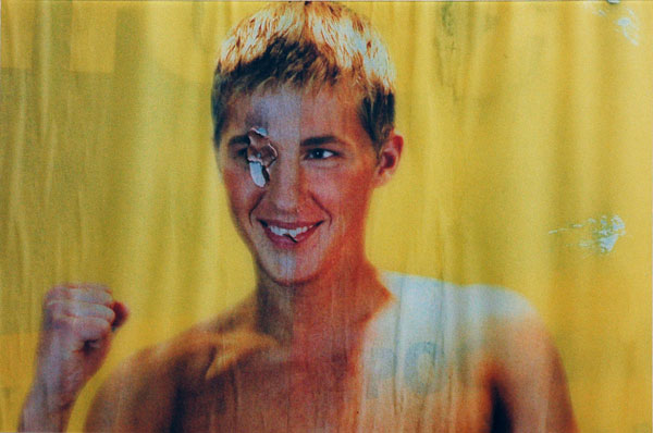
Slava Mogutin Yellow Billboard Moscow, 2004 archival C-print mounted on aluminum 30" x 20"


There's nothing about this installation on the gallery's site, so I'm not sure about its status or (perhaps more importantly for visitors) its dates. I'm referring to an intense show of some work by Slava Mogutin and Justin Beal which I saw in the small room at Bortolami almost two weeks ago. Since I'm unable to call to the gallery office at this time of night, I'm going to assume it will remain up until August 31, when the show in the larger space closes.*

These ten photographs by Mogutin, sweetly-badass Russian poet and American visual artist, were made over a period of the last seven or eight years. I've seen some of them before, but I enjoyed the intelligence, the humor, the sophistication, the intimacy, the eroticism and the beauty in all the work on those walls as much or more than I have ever enjoyed his art before - which is to say, a lot.

Unfortunately I missed capturing an image of either of Beal's elegant floor sculptures, but I'm looking forward to seeing more of this artist's work. The furniture-size pieces at Bortolomi are composed, as they often are, in a mostly-monochromatic construction with at least one transparent element and any number of other re-configured common objects.


*
UPDATE: The gallery has now told me that "back room" will be open until August 28.

Garnett_Joy_Storm.jpg
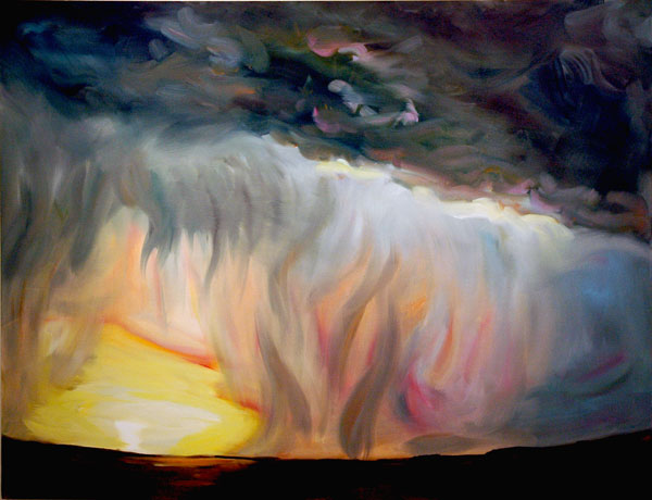
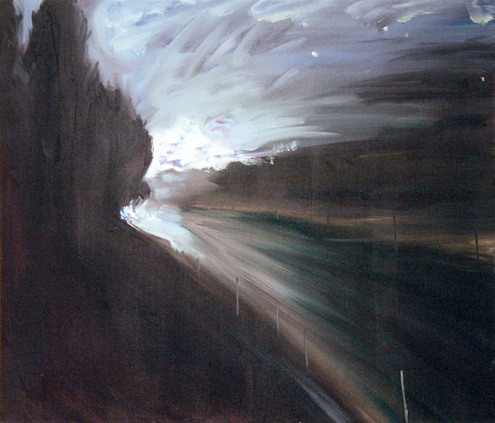
Joy Garnett Storm 2006 oil on canvas 60" x 78"


Garnett_joy_Road.jpg
Joy Garnett Road 2007 oil on canvas 30" x 35"


Regular readers of this blog already know how much Barry and I think of the prolific and innovative painter Joy Garnett, who continues to re-invent and re-ignite the found contemporary pictorial world. Garnett has two oil paintings in "Greener Pastures, Permanent Midnight", a beautiful small group show at Moti Hasson which continues until September 1. They're both terrific, but the smaller and darker work, "Road", is equally as dazzling as the larger and more fiery, "Storm".

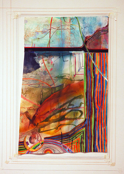
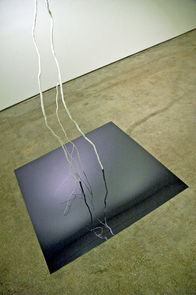
The other artists in this spare installation, curated by Ingrid Chu, are Dike Blair, Franklin Evans, Emilie Halpern, and Katie Holten. Each of them would warrant a good look for their individual merits, but I only have images of two more pieces here.


Evans_Franklin_Origins.jpg
Franklin Evans FF originsoflove02 2006 ink and watercolor on paper 20" x 13" [installation view]


Halpern_Emilie_Lightning_4.jpg
Emilie Halpern Lightning #4 2006 thermoplastic, aluminum wire and mirrored acrylic 75" x 113" x 40" [large detail of installation]

nina_berman_sam_ross.jpg

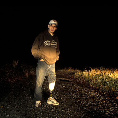
Spc. Sam Ross

21 years old, 82nd Airborne, was wounded May 18, 2003 in Baghdad when a bomb blew up during a munitions disposal operation, leaving him blinded and an amputee. After many, surgeries, Ross was sent home to western Pennsylvania where he lives alone in a trailer, in one of the poorest counties in the state.

Photographed October 19, 2003 in the woods near his trailer in Dunbar Township, Pennsylvania.

"I lost my leg just below the knee. Lost my eyesight. I have shrapnel in pretty much every part of my body. Got my finger blown off. It don't work right. I had a hole blown through my right leg. You know, not really anything major. I get headaches. And my left ear, it don't work either."

"I don't have any regrets. It was the best experience of my life."


nina_berman_tyson_johnson.jpg

Cpl. Tyson Johnson III

22 years old, 205th Military Intelligence Brigade, was wounded September 20, 2003 in a mortar attack on the Abu Ghraib prison. He suffered massive internal injuries and is 100 percent disabled.

Photographed May 6, 2004 at his home in Prichard, Alabama.

"Most of my friends they were losing it out there. They would do anything to get out of there, do anything. I had one of my guys, he used to tell me, 'My wife just had my son. I can't wait to get home and see him.' And you know, he died out there. He sure did and I have to think about that everyday."

"I got a bonus in the National Guards for joining the Army. Now I've got to pay the bonus back and it's $2999. The Guard wants it back. It's on my credit that I owe them that. I'm burning on the inside. I'm burning."


There is nothing like this "summer show" anywhere in the city, if not the entire country.

Jen Bekman's current exhibition, "Purple Hearts" neither seeks nor requires an introduction. You may already have seen the book, but walk into the gallery's very neat pocket space on Spring Street on the Lower East Side before this deceptively-quiet installation closes on August 30. You will leave speechless, if not gasping for breath, while trying to understand how we got to this, and where do we go from here?

Nina Berman began this powerful body of work several years ago . Unfortunately her young portrait subjects had beaten her to it.


The gallery has scheduled a book-signing, reception and talk with the artist on Wednesday, August 29 from 6 to 8pm. Because of the gallery's small size, those who are interested in attending, or in reserving a book, are asked to rsvp [[email protected]]


[images from Jen Bekman]

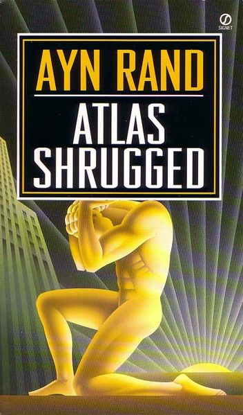
Rand_Ayn_Atlas_shrugged_cover.jpg
skyscrapers have very complex lives


I've just read that the name of the sub-contracting company in charge of the demolition at the Deutsche Bank building is the John Galt Corporation. Who is John Galt? I immediately recognized the intriguing literary/political reference within the firm's name, and, regardless of what we eventually learn about the ultimate responsibility for the death of two firemen this week, the connection is likely to continue the fictional character's complex association with corporate greed and laissez-faire capitalism .


ADDENDA: I've turned up these few bits on the John Galt Corporation by searching Google and its cached links:

The firm is located at 3900 Webster Avenue in The Bronx [718-654-5300]; its principals are former executives of the Safeway Environmental Corp., a firm with its own history of problems; Galt's work at the Deutsche Bank site was already causing injury and incurring fines before this week; and finally, World Trade Center-area neighbors had expressed serious concerns about the firm's qualifications since early last year.


[image from wikipedia]

Sullivan_Billy_Christian_3.jpg
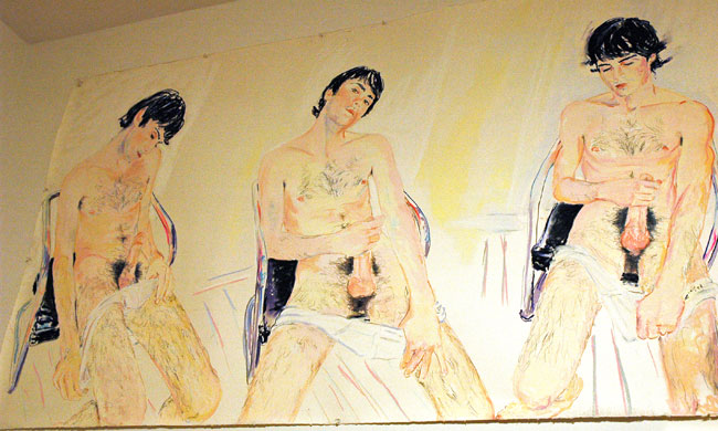
Billy Sullivan Christian 3 2004 pastel on paper 45" x 78" [large detail of installation]


Steiner_A.-_L._Swift_Path.jpg
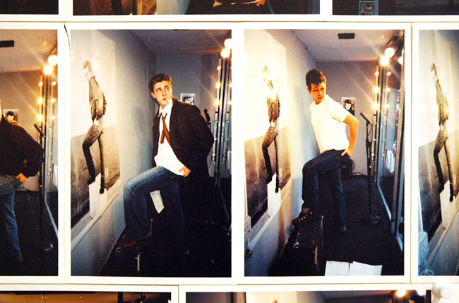
A.L. Steiner Swift Path to Glory (James Dean auditions) 2003, 25 4" x 6" prints [detail of installation]


Maku_Sakura.jpg
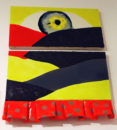
Sakura Maku Akira [no date] oil on canvas in 2 parts 39.5" x 30" (installed) [installation view]


Humphrey_David_Wrestlers.jpg
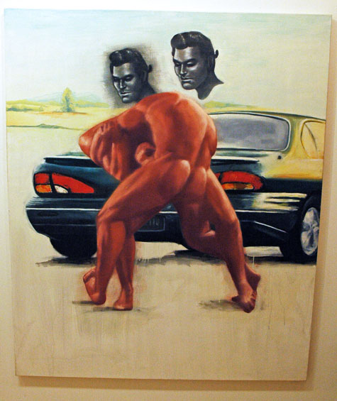
David Humphrey Wrestlers 1997 oil on canvas 72" x 60" [installation view]


Melyn_Sean_Pruning.jpg
Sean Mellyn Pruning 2006 ink on paper 21" x 25.5" [large detail of installation]


Boadwee_Keith_Breakfast.jpg
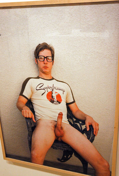
Keith Boadwee Breakfast in America 2007 digital inkjet print 30" x 40" [large detail of installation]


Marshall_Robert_Silly_Rabbit.jpg
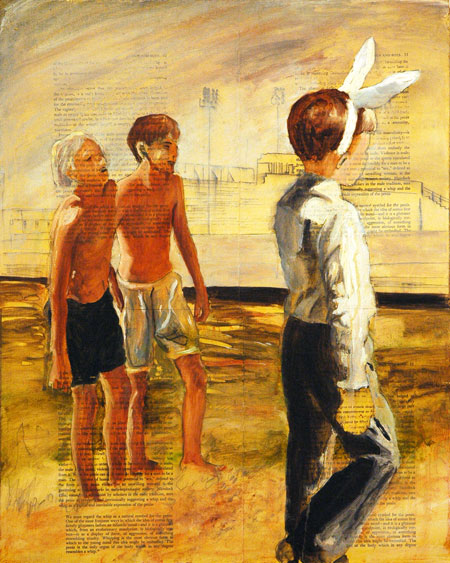
Robert Marshall Silly Rabbit #3 1993 oil on paper on masonite 20" x 16" [installation view]

Marshall_Robert_Silly_Rabbit_detail.jpg
[detail]


With "NeoIntegrity", curated by gallery artist Keith Mayerson, Derek Eller must come close to setting a record for the number of people represented in a single group show. In this case the salon-hung catalog comes in at just under 200, but the works really do share a connection, an adherence to "The NeoIntegrity Manifesto", as expressed in a remarkably percipient checklist which accompanies the exhibition:

1. Art should be reflective of the artist who made it, and the culture in which it is produced.

2. Art is aesthetic, and whether ugly, beautiful, or sublime, it should be interesting to look at and/or think about.

3. Art is not necessarily commodity, and commodity is not the reason to produce or appreciate art.

4. Art is about ideas, the progression of ideas, the agency of the artist to have ideas, the communication by the artist to the world of their ideas because agency and ideas are important and what art is.

5. Art communicates via its own internal language, and by the language the viewer brings to a work of art. But this language is not entirely textually based, and being an aesthetic object (or image[s], idea[s], comic, or happening[s]), the work communicates in such a way to be transcendent beyond language, and traditional constructs of textually based ideology. Therefore the work of art remains a deep communication between artist and viewer, and withholds the possibility of the sublime.

6. Art is rather than tells, it is about itself; it shows itself to be about what it is rather than being an illustration of what it isn't.

7. Art is important because it reminds us that we are human, and ultimately, that is its function.

8. Art can be, and should be sublime, in that it is able to produce images directly from the mind and imagination of the artist, producing tangible realities from the fertile imaginings of the conscious and unconscious of the artist, triggering responses from the same in the viewer via form and light and color, that transcends language and received ways of looking at things, that, while ideological, comes closest to directly communicating from one animal to another in the most broad, base, but considered aesthetic language possible.

9. Art should be alive, have a life of its own, transgress intended meaning or hand or wit of the artist in that it arranges, via form, light, color, and space, other worlds that are optical and transmit cognitive reactions in the mind of the viewer that cause an ineffable schism between belief and reality that cause the work as to appear to be breathing life.

10. Art can indeed be windows onto other worlds, windows into the soul, able to capture dream space/time unlike any other medium because they are produced by the mind, gesture, hand and intellect of the artist, who consciously or unconsciously cannot hope to ultimately control the meaning, interpretation, or event described by the hand and mind of the unconscious.

11. Art should be experienced: a good work of art cannot be successfully reproduced or explained, indeed, that is ultimately the only reason art is important in the age of corporate commodity culture: it has an aura that cannot be contained-it is a result of a peculiar man-made alchemy that comes closest to recreating the soul.

I've shown at the top a few of the striking images among so many, many others in this show, and I've taken the liberty of including with them some of the more outrageous of the lot - because I can, but also because outrageousness seems, properly, to set a good part of the tone for the whole exhibition.

The installation continues on West 27th Street through this Friday.

Greenpoint_Federal.jpg

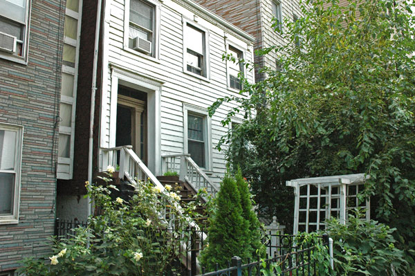
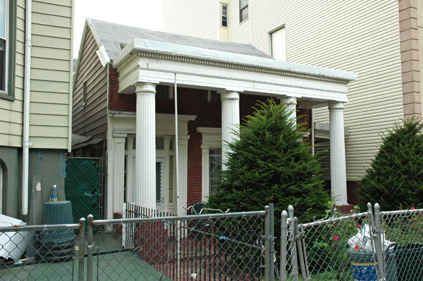
Its neighbor's roses and its own arbor gate standing at the edge of the sidewalk are homey touches for this unreconstructed wooden Federal house on Green Street in Greenpoint. The house is built in exactly the same form as the typical urban row house but in fact, apart from late excrescences on either side, it's actually free-standing. It's probably a relic from the second quarter of the nineteenth century.


Greenpont_Greek_Revival.jpg

The almost-hidden eyebrow windows, the heavy flat moldings around the door and windows and the elegant porch columns express the period of this small Greek Revival house on Huron Street, one block south of the house shown above. I wonder however about the absence of a pediment, and the fluting on those Tuscan columns is a rather peculiar touch for the era. The house may in fact be older than its 1830's or 1840's fancy dress; I don't know how to explain the fluting.

Both of these survivors are located only a short distance from the original eastern shoreline of the East River, with Midtown Manhattan on the other side. In the nineteenth century this waterfront was an important site for shipbuilding and its related trades.

Hesidence_Daniel.jpg
Daniel Hesidence Untitled (1 7 7 9 /pedestrians) oil on canvas 96" x 84"


Kwartler_Alex.jpg
Alex Kwartler Untitled (Still Life) 2007 oil on canvas 24" x 21"


Moyer_Carrie_Dark_Tonic.jpg
Carrie Moyer Dark Tonic 2007 acrylic, glitter on canvas 40" x 28"


John Connelly Presents some "late Liberties" this summer, a show of recent abstractions organized by artist and curator Augusto Arbizo in collaboration with Connelly himself. It's worth a trip, but this gallery always is. Again, only two days left. I don't have time to do more than put up a few images here, but I thought, better a picture or two than a late report with some words.

CORRECTION [of earlier correction]: the gallery will not be open this Saturday after all

Wilkinson_Konitz.jpg
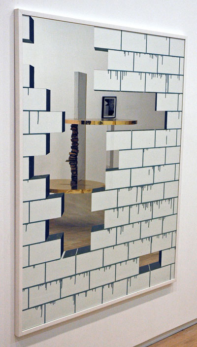
Michael Wilkinson Wall 2005 acrylic on mirror, frame 59.25" x 49.25" [installation view, with Alice Könitz's "Double Take" and Nathan Hylden's "6.22.07" in the reflection]


Konitz_Alice_Banana_Peel.jpg
Alice Könitz Banana-Peel-Rug 2007 acrylic felt 81" x 56" [installation view]


I was already a fan of the work of Richard Aldrich and Alice Könitz, but based on what I saw last Friday I'm now just as enthusiastic about Los Angeles-based Nathan Hylden and Glaswegian Michael WIlkinson, the other two artists in the elegant current installation at Wallspace, "Laying Bricks". Writer and critic Michael Ned Holte is the curator.

The show is a beauty, but it will be there for just two more days.

Dee_Flora_1.jpg


Dee_Flora_2.jpg


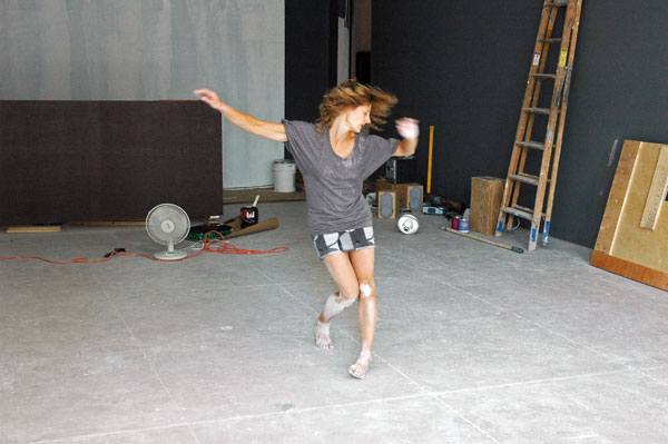
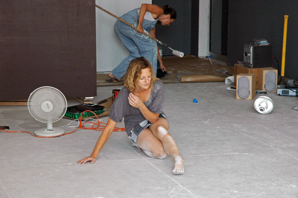
Barry and I walked over to Elizabeth Dee this afternoon to catch part of an all-day performance by Felicia Ballos and Flora Weigman. It was today's segment of "Carte Blanche", the gallery's August-long program of video and performance art curated variously by gallery artists, the gallery director, guest artists, or guest curators.

The images shown above are of a section of Weigman's improvisational dance solo. Her movement totally energized the bare exhibition space while it was in the process of being returned to clean, white-box gallery mode (hands-on-paint-roller gallery director Jennie Moore can be seen in the wings). Accompanying her performance was the raw machine-music of Wolf Eyes, their CD "Burned Mind", from Sub Pop.

Ballos told me later that she had been turned onto Wolf Eyes by Steven Parrino.

For another image, including a link to a slide show with dozens more, see Bloggy.

Tomorrow's program includes a talk by Drew Heitzler, artist, curator and Champion Fine Art co-founder, now the co-owner of the Culver City bar, Mandrake. Heitzler's performance is titled “I’m Not an Alcoholic,” and in it he is expected to address the history of artist-run bars. The fun, including "beer with friends", starts at 6:30.

Gaudi_nave.jpg


I used to think, "Gaudi", eccentric, interesting, even beautiful, but a dead end.

But then, was/is El Greco a dead end?

I actually knew virtually nothing about Gaudi when I first visited Barcelona 45 years ago and found myself straddling my bike outside the construction fence below the unfinished towers of the Sagrada Familia. Everything was locked-up tight (there seemed to be nothing more than what I was looking at, in any event) and I already understood that this project's fate was uncertain at best. I had been told by other travelers my age whom I had met along my route that summer in Europe that if I was going to go to gloomy (yeah, after all this was only 1961) Barcelona this architectural monument to Catalan modernisme or European expressionism was absolutely not to be missed.

I have to remind myself as I write this that before arriving in Europe that May I was still totally infatuated with the purity and minimalism of the International Style. As far as I had been concerned no architecture or design that had preceded it was of any interest except as history, and real history had ended about the time Victoria ascended the British throne in 1837.

I do remember that, a couple of decades after the end of the Spanish Civil War, Gaudi's dark pile on the outskirts of Barcelona looked very weird, but even then, before the real start of the Sixties, I was thinking weird was a compliment. This scruffy facade without a building clearly bore some resemblance to Gothic cathedral models, but the multiple, siamesed towers looked like a monstrous mutation, and their rough, jagged, natural details and screwy hollowness suggested a severely-neglected maintenance program. They were pretty scary. There was no tourist brochure. I really didn't get it, but it felt important.

This spring I went back. The construction project had been re-started years ago and now there's a realistic expectation that the building will actually be completed in 20 (or maybe 80) more.

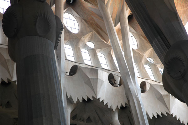
I was able to get inside this time (this time there was an inside). I had done some homework since 1961, but even had I been a really lazy student I couldn't have been less excited about it on my second visit than I was. I'm going to leave any description up to the images I've posted here, but I will say that I have never seen anything like it and don't expect I or anyone else ever will. Hmmm, wait. Santiago Calatrava's name suddenly came into my head as I typed that. I'm not an unequivocal fan of his art, but even if there may be a link between his work and that of the Catalonian master (and no dead end after all?) it's unlikely Calatrava will ever have a commission which would match his skills as well as the Barcelona basilica did Gaudi's.

But there is still that other thing, what I now have to describe as the darker side of Gaudi. I'm only going on the basis of information easily available to anyone, but I realize my emphasis may present a picture of the man not familiar to most. I'm writing about the less admirable parts of Gaudi's story as someone who admits he is able to love and appreciate Richard Wagner's operas as among the very greatest accomplishments in Western music even while he is completely familiar with and fully disgusted by much of the composer's personal and professional life. Gaudi was a great artist, but he was also a fundamentalist, right-wing Christian who would almost certainly have supported Franco during the civil war which began ten years after his death.

The architect had taken over construction responsibilities for the shrine/basilica in 1883, when he was 31. The project, whose ominous formal name is "Temple Expiatori de la Sagrada Família" [Expiatory Church of the Holy Family], had been proposed years before by the Asociación Espiritual de Devotos de San José [Spiritual Association of Devotees of St. Joseph], a reactionary devotional Catholic movement whose objective was to fight the modern industrial liberal world and its accompanying social changes and to bring about the triumph of the Catholic Church in Spain and elsewhere. The architect appears to have been very comfortable with that mission.

Gaudi also appears to have been an elitist, at least in so far as his professional practice was concerned. Elsewhere in Europe early in the last century architects were routinely inspired to design projects for the benefit of the public, even if their bills were being covered by private commissions. Gaudi built only mansions, private parks, and the high-end luxury condos of his day. His patrons were wealthy private citizens. This architect didn't do affordable housing or public accommodations of any kind.

In the early years of the 20th century his contemporaries on the Left, including many artists, Spanish or otherwise, seem to have loathed the aging genius, even beyond his death in 1926. Years before that he had turned more and more inward and religious, abandoning all secular projects and devoting himself exclusively to work on the Sagrada Familia.

Even unfinished that edifice, which was conceived in the 19th century, is magnificent in every way. But it remains Catholic, perhaps even Catholic with a vengeance, in the midst of the population of this very unobservant nation and at the threshold of the 21st century. As we were leaving the sanctuary at the end of the afternoon this spring, from the side in the corner I heard the sound of a general rosary devotion. That day it was protected from visitors like us by high temporary walls. After experiencing the larger, glorious, purely aesthetic wonders of this place for an hour or more it was strangely disconcerting. Were they dreaming about reversing the last two hundred years?

My own wish would be to see this extraordinary building become a living monument to the survival of the creative human spirit. It should be possible for all people to approach and cherish it equally, sharing it generously, without a parochial consciousness. A transcendent place for music or poetry, surely. Best to hold the Hail Marys.


These thumbnails are all images of the Sagrada Familia:

Gaudi_basketwork.jpg


Gaudi_skyline.jpg

Gaudi_steeples.jpg

Gaudi_window.jpg

Gaudi_door.jpg

Gaudi_tiles.jpg

Gaudi_ceiling.jpg

Gaudi_portals.jpg

Gaudi_detail.jpg

Gaudi_trumpets.jpg

Gaudi_palm.jpg

Gaudi_crucifixion.jpg

Gauddi_angel.jpg

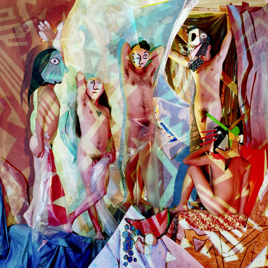
Bruce_HIgh_Quality_Bachelors_of_Avignon.jpg
Bruce High Quality Foundation Bachelors of Avignon*


Bruce_High_Quality_Beuys_attack.jpg
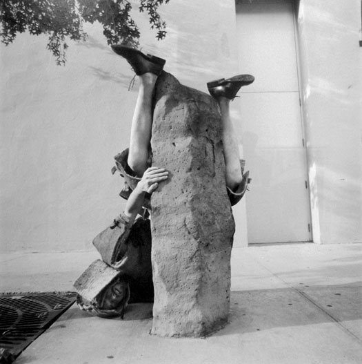
Bruce High Quality Foundation Joseph Beuys, from the "Sculpture Tackle" series


In spite of some serious temptations which might have gotten ourselves to Bushwick weeks ago Barry and I didn't get to the Bruce High Quality Foundation installation in the group's large storefront on Broadway until this past Monday. Energetic and creative young artists doing funny things, bouncing off every manner of cultural icon or shibboleth along the way. What's not to love? The words "irreverent" and "political" should be in there somewhere. I'm on it. Only sorry that it took me so long.

On the homepage of the three-year-old collaborative's website there's a motto which reads: "Professional Challenges. Amateur Solutions". And for a description of mission there's this: "The Bruce High Quality Foundation was created to foster an alternative to everything"

An incomplete list of their projects, past, present or continuing, but arranged in no particular order, may explain a little more. You might have already come across one or more of these but not not been able to make out the infectious pattern:

  • local waters smallcraft pursuit of Robert Smithson's Floating Island by one of the Cristo's saffron "Gates"
  • a film centered on the Art Basel Miami trade show, conjuring both Marx and Jean-Luc Godard
  • a commemoration of 100 years of Picasso's "Les Demoiselles d'Avignon" with artists' living sculpture [image above was not manipulated]
  • a series of "sculpture tackle" performances around the city complete with target-specific costumes
  • a WTC ground zero hero fast food concession cart intervention offering customers a "Manwich"
  • an audition for Jeffrey Deitch's Artstar reality television show by Bruce High Quality himself
  • a construction of a full-size soapbox derby car for a run down the Guggenheim's spiral ramp
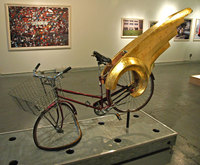
  • a bike fountain for Brooklyn Museum's Feminist wing with its own gold wing, broken wheel, faucet seat and wire laundry basket
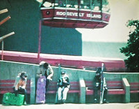
  • a steaming midsummer hot-chocolate break by bundled-up skiers and snowboarders at the Roosevelt Island gondola terminal
  • a living sculpture riff on Géricault's "The Wreck of the Medusa" below the Williamsburg Bridge

Still, you probably have to have been to the studio or been witness to at least one of the projects, or else done some traipsing through the links or their own site, YouTube or elsewhere to fill out the picture enough to penetrate the enigma of BHQF. I was the perfect fan candidate, and it took a while even for me to get it (I'm not sure what I would have been able to make of Picasso's first leaps into cubism without being able to go to the internet back in 1907).

The exhibition is titled "RENT STRIKE! & Other Activist Jingles from the Crypt of Bruce High Quality" and I'm told it can still be visited by appointment through the end of this week. Email the studio at [email protected], but if you end up missing this show, I'm sure there will be plenty of excitement going forward; it doesn't look like they're going to disappear.

I was interested in knowing something about the people within the group, including their rough numbers, and I did suspect they would be rough, so I asked a member to tell me more. I learned that just now most are guys, and I was told that five of them currently share the Brooklyn studio. "Bruce" then continued:

But we are always trying to cast a wider net, and steer clear of core membership. Our thinking about the Bruce High Quality Foundation has revolved more around growing it up and getting it to a level where it totally dwarfs our individual efforts than the Beatles model. We would like there to be offices all over the world, outposts for the Bruce High Quality Foundation, and maybe people to take over the operations for us when we all die. I would say the Bruce High Quality Foundation numbers between 5 and 5000. It should be more like a movement than a rock band.

*
the original, whose birthday is celebrated this year, belongs to MoMA:

demoiselles-davignon.jpg


The images at the top of this post, of photographs framed and on the walls in the current installation, are JPEGS furnished by Bruce High Quality. I was able to capture a few shots of my own while we were there on Monday, and I'm arranging them here as large thumbnails:

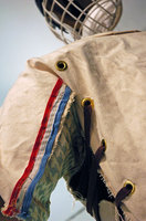
Bruce_tackle_suit.jpg
sculpture tackle suit installation detail

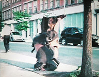
Bruce_Beuys.jpg
large detail of Beuys sculpture tackle video still

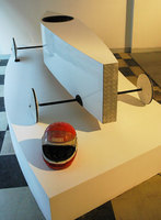
Bruce_soapbox.jpg
Guggenheim soapbox car installation

Bruce_gondola.jpg
large detail of summer winter-sports lift station video still

Bruce_fountain.jpg
installation view of Feminist wing winged fountain sculpture


[first two images from brucehighquality; the thumbnail image of Picasso's painting from fernando lobo]

Smith_Lisa_red_yellow.jpg


Smith_Lisa_ju_ju_be.jpg


Exceedingly luscious. These two images were part of Lisa Smith's installation in the photography gallery at last Thursday's School of Visual Arts Open Studios event.

Sadan_Hagar_table_top.jpg


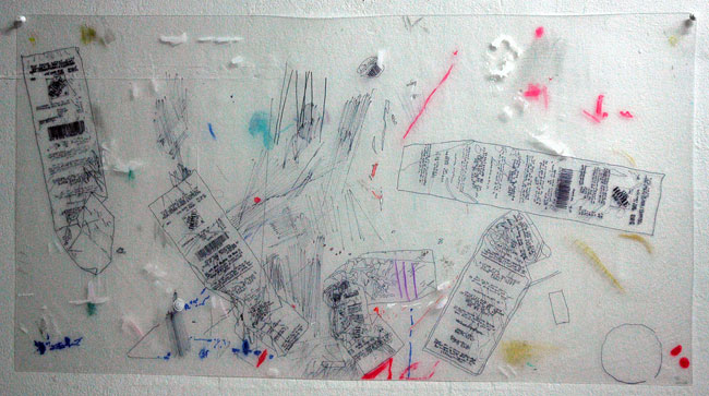
I think the heat inside the SVA Open Studios event was wearing down my stamina by the time I came across Hagar Sadan's art on Thursday. I captured only this one image, but I remember liking the rest of the work a lot. Much of it had been assembled from recycled plastic bags. This particular piece didn't really resemble anything else in her two spaces, but certainly represented the artist's creative energy and perhaps an inability to take an ordinary break like other, ordinary people. The images here have been drawn on plastic, tracing simple items which were lying on a workbench in her studio.

Page_Steve_three.jpg

Page_Steve_red.jpg

Page_Steve_blue.jpg


The beautiful work of Steve Page seen at the SVA Open Studios reception is an example of why these visits to student exhibitions can be so exciting for enthusiasts, even those who are able to regularly make the rounds of the less well-known galleries.

In addition, while we were in Page's space, thanks to the familiarity of the school's "Summer Residence Faculty" professor-cum-godfather David Gibson with the artist's work, we were able to see the progression from those pieces which marked the beginning of this summer residency. Very different from the pieces seen above, they were rawly-dramatic on their own terms.

Tovar_Luis_wall.jpg

Tovar_Luis_drawing.jpg

Tovar_Luis_lightbox.jpg

Tovar_Luis_tent.jpg


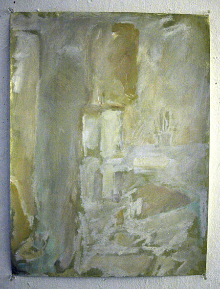
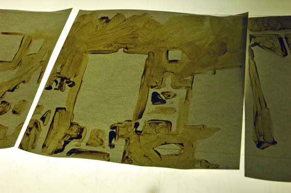
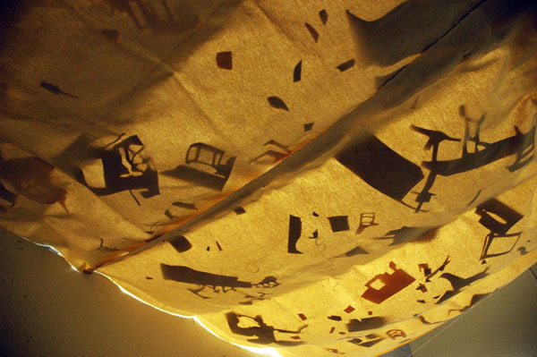
Luis Tovar's drawings at the School of Visual Arts Open Studios event were mostly almost-abstract renderings of negative space, specifically the spaces of his own studio and those of the other artists in the school's loft building on 21st Street. These works on paper were expressive, charged, and gorgeous, whether "tiled" over an entire wall, pinned individually on another, arrayed on a light box or resting playfully on a cloth suspended from the ceiling.

Harris_Joshua_Allen_detail.jpg
Joshua Allen Harris, detail of the work on the left in the thumbnail below

Harris_Joshua_Allen_two.jpg
[full view of two drawings]


Harris_Joshua_Allen_group.jpg
Joshua Allen Harris, studio wall detail


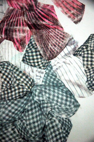
My camera was angry with me for making it take pictures in the near-darkness at the SVA Open Studios on Thursday night. My apologies to Mr. Nikon and to my visitors for these bluish shots, but I thought the work was too interesting to let them lie fallow in my computer. The shapes and colors on these graceful works on paper by Joshua Allen Harris were made by laboriously rubbing the ink off of portions of images found on fresh newspapers (collected at dawn or even earlier, I was told, before their ink dries completely). The artist may also have incorporated some collage elements, but I don't think there is any conventional drawing on any of these pieces.

The work is exquisite, and unlike anything I've ever seen, but it evokes for me images in a large personal history of other charms and beauties.

Shuldiner_Gabriel_Unavoidable_Destiny.jpg
Gabriel Shuldiner An Unavoidable Destiny 2007 modified acrylic polymer, pigment, latex house paint, alkyd resin, gesso and casein resin, overall dimensions variable, approx. 48" x 96" x 1" [installation view]


Shuldiner_Gabriel_Site_And_Context.jpg
Gabriel Shuldiner Site And Context (Part I) 2007 modified acrylic polymer, pigment, enamel house paint, gesso, Enamelac, rust, dirt and alkyd resin on canvas on mounted wood panels, overall dimensions variable, approx. 40" x 30" x 6" [installation view]

Shuldiner_Gabriel_Site_And_Context_detail.jpg
[detail]


Schuldiner_Gabriel_Until_Repetition.jpg
Gabriel Shuldiner Until Repetition Becomes Endurance 2007 modified acrylic polymer, pigment, gesso, reus and alkyd resin on canvas on mounted wood, overall dimensions variable, approximately 19.5" x 19.5" x 3" [installation view]


Barry and I stopped by the open studios and exhibition of the Summer Art Residency of the School of Visual Arts on Thursday evening. This particular edition was an especially exciting one, judging at least partly from the fact that although it was a warm and humid evening (even warmer and more humid inside the building on 21st Street) we ended staying much longer than we expected.

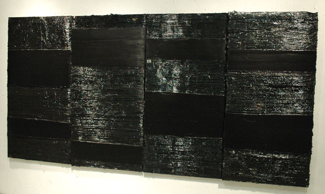
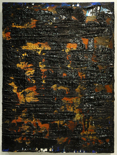
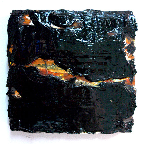
As we had met Gabriel Shuldiner before and had seen some of his earlier work, we were not coming upon it totally blind. Shuldiner is very attracted to what he describes as the "power, authority and brillance" in the color black, even if he usually manages to introduce glimpses of some of its components in his lusty paint-sculptures. He writes about his art:

My work is about process: both highly intuitive and mathematically considered. . . . .

I experiment with many different materials, and am fascinated by the contrast and dialogue between them. Unconventional implements, homemade tools and modified paints help to make each mark, gash, scratch and chip as intentional and vital as my brushstroke.

My paintings evolve over time and eventually function as compositional objects; their relationship to the wall, to their environment and to the viewer's position becomes an important and vital compositional element, as does the light it absorbs, reflects and scatters off the varied black pigments, creating further shades of grays and whites.

For more images and words, see Barry.

Most of the other artists were new to us and about them I have virtually no information other than names and images captured that night. I will be uploading mostly-undocumented photos of work by several of them later today or tomorrow.

Duke_under_arrest.jpg
under arrest


Riley_Duke_Acorn_arrest.jpg
securing the acorn


This story had legs from the start, sea legs. Barry and I were watching it on line as it grew all day yesterday, and apparently it's still going.

I would say that this late and abbreviated post were redundant except that I want to broadcast the respect for Duke Riley that we both share, and also to refer to our early immersion in the larger story of his remarkable art, including a wide-eyed visit to the first solo show at Magnan Projects in January last year. Then there was also the excitement of being able to share my own personal connection to and love for Rhode Island, the School of Design, Newport, and the little bicycle shop down my block on the corner of Brook Street, all sites associated with the still-unfolding story of the "Acorn" submersible project.

Don't miss the slide show or the video on the NYTimes site.

My favorite take on the reaction of our guardians of public safety to the artist's marine intervention? Libby and Roberta:
The Coast Guard and police didn't think Riley's floating bobber was so amusing and the boat was confiscated and he and his accomplices were charged with "marine mischief." Talk about hammering a fly! Nobody seems to have a sense of humor or whimsy anymore, especially when it comes to imaginative art outside the normal channels. Now that's a crime.


[images by Damon Winter from NYTimes slide show]

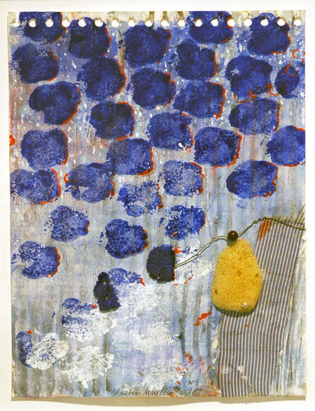
Mullin_Martin_Hydra.jpg
Martin Mullin Hydra 2006-2007 mixed media collage 11.75" x 9" [installation view]


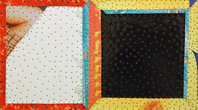
Berlant_Tony_24_Hours.jpg
Tony Berlant 24 Hours 2000 11.5" x20"


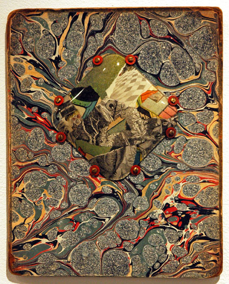
Warner_Robert_endpaper.jpg
Robert Warner Untitled 2007 flint glass and collage on book board 10.25" x 8.25" [installation view]

Warner_Robert_untitled_detail
[detail]


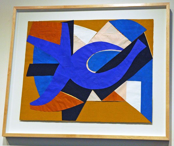
Bultman_Fritz_Wave.jpg
Fritz Bultman Waves and Others 1978 painted paper collage 16" x 20" [installation view]


Pavel Zoubok's current group show, "collage + abstraction", can described pretty much by its title alone. The works shown were created by 55 artists over most of the last 100 years. The oldest piece is Kurt Schwitters's tiny, 1921 "Lady in Red".

It's a rich collection, and in a visit to the gallery earlier this week I found the small and large beauties of these dozens of works arranged as they are in a handsome, rhythmic, salon-ish installation almost overwhelming. And it's all very elegant.

That last adjective however provokes me to ask mischievously whether something might be missing. There's nothing obviously outrageous going on here. Maybe that's only an over-stimulated today talking, looking for novelty, and in the interest of disclosure I should say right now that I like outrageous (note: Pavel Zoubok has often fed my appetite generously).
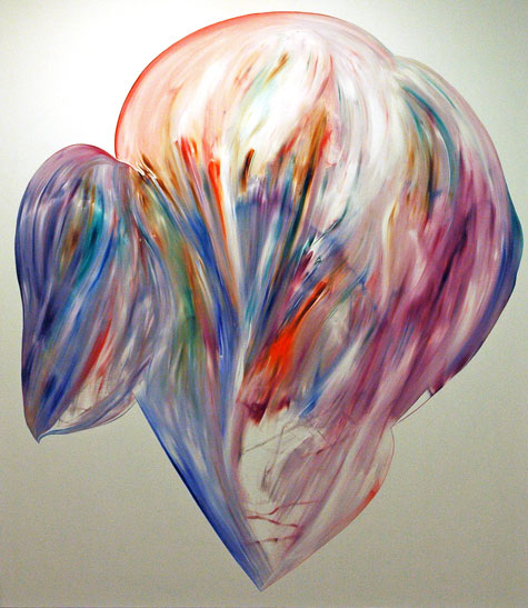
I definitely won't fault the gallerist/curator's aesthetic choices for this show, but in spite of my love for both abstraction and collage I think I regret the almost total absence of representational imagery in these works. Also, even if I can accept the restriction defined by the exhibition's title definition, and although some of the works employ stuff outside the collagist's conventional range of paper materials, maybe the components and, yes, the shapes of the collages selected could have been a bit less predictable. Stefan Saffer's "Fortress" and Robert Motherwell's "Celtic Air" are two of the very few pieces which do not subscribe to a presentation involving four right-angle corners, and Saffer's folded paper structure actually breathes totally free, managing to resist confinement in a frame of any kind, only barely able to rein in its third dimension.

But all this is small change when looking at the work itself. I went back to the gallery today, along with Barry and an artist friend. All three of us had a really hard time leaving.

Blake_Jeremy_reading_Ossie_Clark.jpg
Jeremy Blake Reading Ossie Clark 2003 video [still taken from November, 2003 installation]


Jeremy Blake is no longer no longer missing, but he is still very much missed. The picture above looks very different to me after the news of the last two weeks; it now suggests a brilliant, burning star.

I posted this short piece three and a half years ago, with another capture from "Ossie Clark".

[there are sensitive photos of Jeremy, and Jeremy with Theresa Duncan, on the Wikipedia entry]

  • home

This page is an archive of entries in the Culture category from August 2007.

previous archive: Culture: July 2007

next archiveCulture: September 2007