Culture: September 2007 Archives

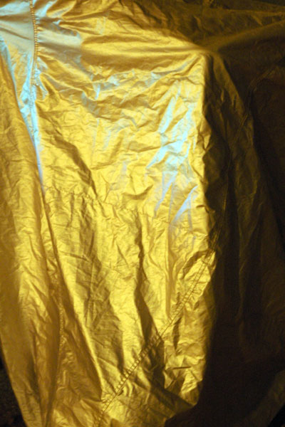
Stillwell_Mark_golden.jpg

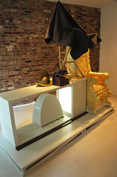
Stillwell_Mark_white.jpg
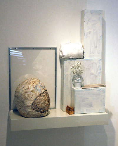
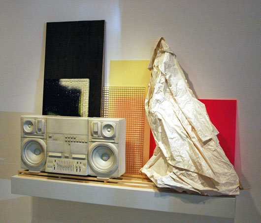
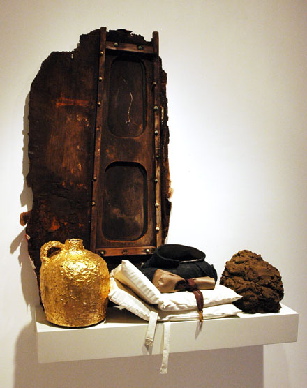
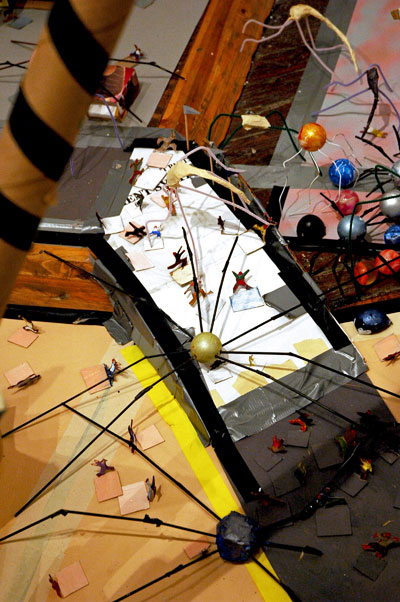
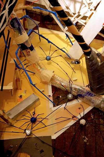
Mark Stillwell Super Defense Force [two details of the installation]


The current show at Front Room, Mark Stillwell's "Super Defense Force", seems like a perfect fit for the post 9/11 U.S. mindset. The theme runs something like terror as escapism (incorporating "escape" in every sense), except that the diorama inside the Williamsburg gallery space is both comical and thought-provoking; there is no comedy and no thinking inside the continuing fantasy world of "the war on terror".

The gallery describes the installation, which marks the artist's first solo show in its Williamsburg space, in this excerpt from the press release:

Stillwell, known for his room-sized installations of urban landscapes under figurative and literal siege, converts the gallery into an overwhelming cityscape installation overrun by gargantuan monsters. Stillwell uses painted and reclaimed packaging, byproducts of the over-consuming society he portrays, in this scene of terror. Crowds of paper cut-out citizens run screaming from the devastation and hostile creatures that are overtaking the city.

. . . . The Coney Island-like setting in "The Super Defense Force" is used to contrast apocalyptic anxieties, militarism, and the proliferation of luxury condos against a backdrop of carnival escapism.

On the gallery site itself there are a number of more helpful and seductive still images, and a video with a moving, monster's-eye view of the set.

MacDonald_Andrew_banner_white.jpg

MacDonald_Andrew_banner_color.jpg


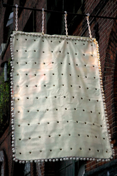
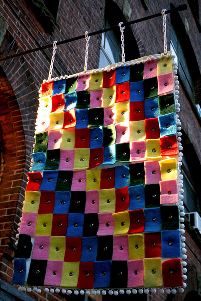
It seems everybody loves a banner, these days probably more than ever, and the Williamsburg gallery Front Room has been inspired by their popularity to commission works by a number of artists over the years. The current installation is by Andrew MacDonald.

I saw only the more minimal side of the piece as I entered the gallery to see the Mark Stillwell show, but I loved it. It suggested the warmth and elegance of a thick white heirloom quilt, but at the same time it obviously wasn't taking itself too seriously. Only on my way out did I see the other face, and in the late-afternoon light the colored curves of the grommeted squares seemed to be dancing inside the fringe of pom-poms they shared with the surface I had seen first.

It made me smile.

Horner_George_Skull.jpg
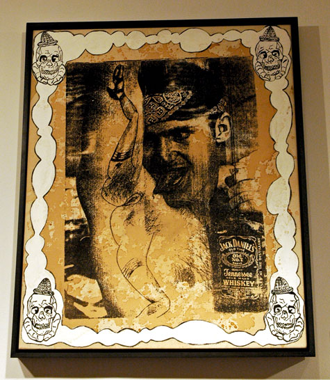
George Horner Skull 2006 acrylic, gesso, silkscreen ink and whiskey on canvas 35" x 29" [installation view]


Van_Slick_Valaire_Stop_Making_Eyes_.jpg
Valaire Van Slick
Stop making eyes at me,
I'll stop making eyes at you
And what it is that surprises me
is that I don't really want you to

2006 acrylic, industrial enamel, clear-coat and glitter on canvas 30" x 40"


TABOO%21_Tashjian_Stephen_Skull.jpg
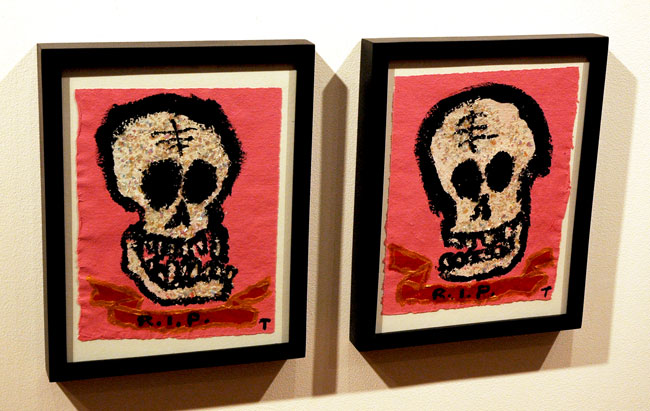
TABOO! Stephen Tashjian Skull #2 and Skull #1 each 2007 acrylic and iridescent glitter on handmade paper from India 12" x 9" [installation view]


Lopez-Rocha_Tomas_La_Flaca.jpg
Tomas Lopez-Rocha La Flaca 2007 mixed media on canvas 14" x 11"


Lopez-Rocha_Tomas_Dia_de_Muertos.jpg
Tomas Lopez-Rocha Dia de Muertos 2007 mixed media on canvas 14" x 11"


Under normal circumstances things skull-like hold absolutely no fascination for me, but Dinter Fine Art's current show, "Death & Love in Modern Times", manages to totally transcend the dry calcium props which enliven its macabre theme. The press release suggests I may be in the minority when it comes to interest in the subject of skeletons, so I should thank a lot of people besides Ingrid Dinter, the curator, for the mounting of this exciting collection.

The intense, more-or-less salon-hung exhibition is assembled from work by an extraordinary company of artists:

Michael Byron, Billy Copley, David Dupuis, Dan Fischer, Rico Gatson, Tomoo Gokita, Leon Golub, George Horner, Peter Hujar, Daniel Johnston, Dan McCleary, Kelly McCormick, Ana Mendieta, Tomas Lopez Rocha James Romberger, Julie Ryan, Phil Sims, Aaron Sinift, TABBOO! Stephen Tashjian, Marguerite Van Cook, Valaire Van Slyck, Mike Walton, Andy Warhol and Rob Wynne

Lujan_Jason_Selections.jpg
Jason Lujan Selections from the Native American Handbook 2005 paper, ink T-pins, variable dimensions [detail of installation]


Motta_Carlos_Black_and_White_Paintings.jpg
Carlos Motta SOA: Black and White Pain-tings I 2005-2006 book, 2 audio CDs, headphones, shelf 9" x 77" [detail of installation]


Bocchino_A_J_State_of_the_Union.jpgA. J. Bocchino State of the Union (1878-2006) 2007 marker on archival ink jet print 30" x 40" [detail of installation]


Page_Julia_Waiting.jpg
Julia Page Waiting for ( ) 2006 video installation, variable dimensions [installation view]


Estabrook_Mike_yllierO_lliB.jpg
Mike Estabrook yllier'O lliB 2005 DVD [large detail of installation]


I only had to see the the announcement for this show to know that I had to get out to Bushwick this month. I would normally try to see any show mounted by the folks at Nurture Art*, but the description of "Quote Unquote", which was curated by Yaelle Amir, made this one an absolute must. So last week Barry and I found ourselves at the opening itself, where it became almost immediately clear that I'd have to go back on a slow day - to listen to the audio that didn't make it over the noisy energy of the crowd.

The shiny illustrated color brochure which accompanies the show and addresses each piece separately is a terrific innovation [I'm told that a generous gift insures this will be a regular thing] and its text represents one of the best arguments I've ever seen for the convention of the gallery handout.

I've copied the leaflet's general lines on the installation, two introductory paragraphs and a concluding statement:

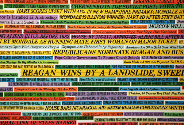
Language is an undoubtedly powerful medium that is utilized to both shape and manipulate our perception of reality. Stemming from this acknowledgment, "Quote Unquote" presents works by seven artists who deconstruct and re-contextualize text and speech originally employed to form a social-political statement. The foundation of these works is appropriated from various sources - newscast, popular literature, military records, newspaper- and molded into a new form with an intentional message.

As Language articulates our conception, opinion, and memory of our culture, a process of reevaluation necessarily unfolds as it is disassembled. Thus, by re-sampling text with social significance, and introducing their own interpretation into its rigid structure, the artists of Quote Unquote provide a window to new understandings of our social contract.

. . . .

Rather than rearranging the original language to the point of abstraction, these artists have strived [sic] to subvert its context while keeping its source evident. In so doing, they expose the manipulative tactics that are routinely employed via language by the media, politicians, military personnel, and cultural entrepreneurs. With a diligent methodical approach, humor, metaphor, and irony, they raise awareness to the underlying structure of the language that sculpts and embodies the essence of our very own collective identity.

I won't try to describe the meaning of any of the selection of images I've uploaded, and I don't pretend that without a visit to the gallery they can tell you anything more than that each the artists have an aesthetic which survives the intelligence of the work.

All right, I'll copy the gallery's description of just one of my favorite pieces:

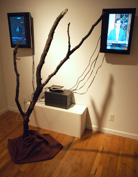
Julia Page's Waiting for ( ) (2006) combines the script from the final act of Samuel Beckett's play "Waiting for Godot," in which two vagrants sit by a skeletal tree talking, eating, arguing, making up, sleeping, and contemplating suicide, as they await the elusive Godot. In the final act, they decide to leave, yet neither one takes action. In her video, Page constructs the final sentences of the play from C-Span coverage of senate debates on the war in Iraq. Through this juxtaposition, she alludes to the futility of these debates, and the politicians' lack of initiative to resolve the Iraqi predicament.


*
At the opening someone from the gallery quipped about our making the show a recommended opening on ArtCal during the week before, "You give these two an award and you're friends for life!" We all chuckled at the trope, but in fact the two of us have been big fans of Nurture Art's program for years.

Northridge_Matthew_Feuer.jpg
Matthew Northridge Memorial to the Great Western Expo September 11 - October 20, 2007
[no other information available for this piece, shown here in an installation view]


I have to admit that among the changing installations in the Chelsea gallery area I look forward to most, with something like the same childish delight with which I once welcomed Tooth Fairy or Easter Bunny visits, are those to be found in Zach Feuer's window on 10th Avenue (the west side, between 25th and 26th Street). This modest space, which has been carved out of a former entryway, is currently occupied by a single wonderful piece by Matthew Northridge.

Capla_Kesting_blackout.jpg
Travis Lindquist [image protected here from viewers]


In Williamsburg last Friday evening Barry and I had just come from a reception and we had a little time to kill before the 7 o'clock hour when the galleries we had planned to visit would be opening their doors for this month's "Williamsburg Every Second".

We were in a festive mood.

We walked over to Capla Kesting to take a look at their Travis Lindquist show. I wasn't very interested in most of the work, but the relatively arcane historical references in some of the drawings arranged in an interesting way on the center wall induced me to take a closer look. I decided to capture a few images for consideration later. I had already taken several photographs when I was told by a woman who was apparently connected to the gallery that they had their own shots of the work and most of them were available on their own site. I started to explain that I liked to capture my own images for my artblog and I would have gone on to try to explain exactly why, but I was interrupted by some words to the effect that they have to "protect the copyright", and I was told that I would not be allowed to photograph the art.

I tried to at least explain what I had been doing and I reached for a card to introduce myself and my site, but neither she nor David Kesting, the Proprietor, would have any of it. Neither wanted to know who I was, but they definitely wanted me out. I told Barry, who had not been a part of any of this exchange, that I wanted to leave. As we turned to go Kesting yelled after us, "Don't come back, you hear?!"

I wouldn't think of it.

Also, to avoid some questions in the future, I should add here that since ArtCal is "The Opinionated New York Art Guide" and as it is the opinion of its editors that Capla Kesting Fine Art has chosen to restrict the public's visual access to visual art, the gallery will not be included in its listings from this date.

Fuchs_Manfred_red.jpg
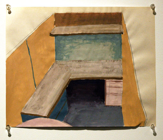
Manfred Fuchs Untitled 2002 12" x 16" mixed media on paper [installation view]


Marozik_Michelle_Office_Cubicle.jpg
Michelle Marozik Office Cubicle 2004 8.5" x11" [installation view]


Bristow_Bethany_Blue_and_Orange_2.jpg
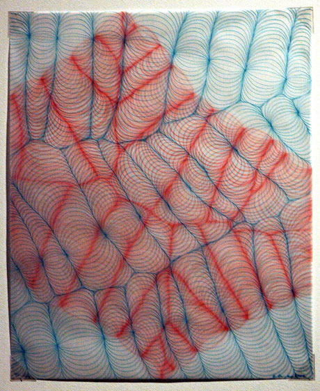
Bethany Bristow Blue and Orange Drawing 2002 ink on vellum [installation view]


Gerhard_Bill_Four_Day_Exposure.jpg
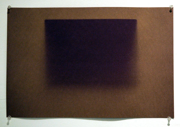
Bill Gerhard Four Day Exposure 2006 black paper 12" x 18" [installation view]


My last post was about a show at Pierogi; this one is about a show called "The Pierogi Show" and it's a very different thing.

The pioneering artist-run Williamsburg gallery currently devoted to a solo show of work by Jim Turok is known around the world as much for what is not hanging on its walls (meaning its extraordinary flat files) as for its ability to turn up, show and support great work while continuously serving as the vital heart of a community of artists. While most of Pierogi's files are still stowed on North 7 Street, Austin Thomas's "Pocket Utopia" has mounted a tribute to what Joe Amrhein, its founder, has accomplished and continues to accomplish. For the first official show in her space on Flushing Avenue, just five stops east of the Bedford stop on the L line, she has borrowed and hung pieces by 20 artists whose works on paper normally hang out in Amrhein's drawers.

On her lively gallery blog Thomas describes a selection process which had to somehow eliminate 98% of the material available:

The file has 900 artists in it, maybe more. I had to come up with some sort of structure to review it. Mike (husband) entered all 900 names into a spreadsheet, then we determined that 88 artists was a representative sample, so he had a computer program select 88 artists randomly. With a list containing the 88 artists in hand, I went looking through the files and guess what? I was still overwhelmed. I sat immobilized for weeks as the opening date of Pocket Utopia approached. Finally, I selected 20 artists from the 88 randomly selected artists because that's the number of artists that Pierogi showed in their first show at Four Walls.

My process might seem random, but I think that's how the art world works. Funny, the computer didn't select my name. I've had work in the Flatfile for about 10 years. I always try to put new and my best work in, and maybe that's why the 20 artists I chose are consistently good.


I'm amused that the presence of both random and curatorial elements in the story of how these particular works were drawn to Bushwick doesn't seem to me to be so different from that which artists also experience in the larger world, where some capricious combination of chance and merit determines whether work gets to be shown.

Thomas is right when she writes that the work is good, and some of it is very good indeed.

The complete list of artists in the exhibition:

Hildur Ásgeirsdóttir Jónsson
Clement Bagot
Claudia Barthoi
Lee Boroson
Bethany Bristow
David Brody
Tamar Cohen
Guy Corriero
Peggy Cyphers
Kate Drendel
Miriam Dym
Bruce Edelstein
clyde forth
Manfred Fuchs
Bill Gerhard
Fred Gutzeit
Michelle Ha
Theresa Hackett
Michelle Marozik
Mike Miga
Team Lump
Mika Yokobori

I'd like to add a couple more images, and a few words, on Bill Gerhard's work, on the excuse that one of the two pieces of his in the show presents the drama of an evolving site-specific installation. "Four Day Exposure" from 2006, and shown above, hangs on the left wall of the gallery, but "Window Aperture", is both a 2007 installation and a work in progress.

Gerhard uses the sun as a drawing tool, exposing black construction paper to form minimal shapes, in these cases simple rectangles The two thumbnail images below show the second work, first the face of the paper as it appeared at night from the sidewalk in front of the south-facing building and then the reverse side as visible from inside the gallery.


Gerhard_Bill_outside.jpg

Gerhard_Bill_inside.jpg

Torok_Jim_Don%27t_Forget_Who_You_Are.jpg
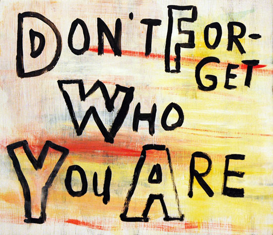
Jim Torok Don't Forget Who You Are 2007 acrylic on panel 12" x 14"


Torok_Jim_Do_Not_Be_Too_Afraid.jpg
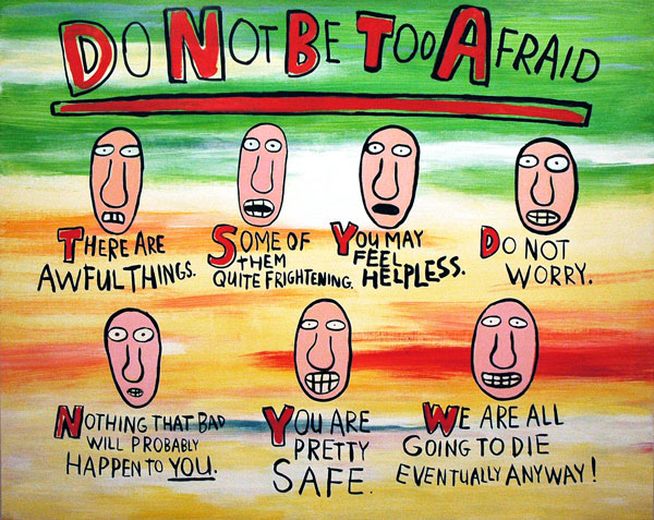
Jim Torok Do Not Be Too Afraid 2007 acrylic on panel 48" x 60"


Torok_Jim_abstraction.jpg
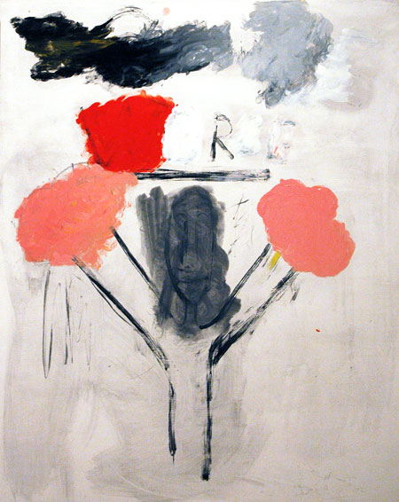
Jim Torok You Are Wrong 2007 acrylic on panel 48" x 37"


The image at the top is of the first painting you come to as you walk into the door of Jim Torok's show at Pierogi. Is it talking to its creator or to us? This small panel and the larger one I show below it relate to the artist's now very familiar style, work which has drawn in and seriously (or not so terribly seriously) amused many people for years.

I like the third image very much as well, but to find Torok working in abstraction was a total surprise to me.

There is a third chapter in this show with the simple title, "Recent Work". Apparently Torok had been doing similar work for some time, so I don't know why the almost photo-realist drawings and paintings in the gallery's smaller room were the biggest surprise of all, so much so that until I went back to the entrance and picked up a checklist I had assumed it represented a separate show by another artist.

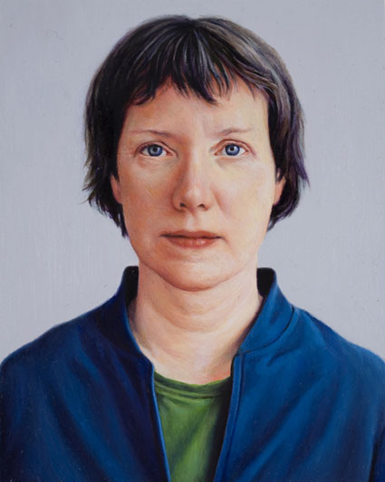
These small face essays (oil on panel or graphite on paper) are pretty amazing, for their skill, their extremely light touch and for including a degree of expression not usually found in formally-posed portraits. I can't really say why my camera and I didn't try to capture any of them. Maybe we were both a little intimidated.

Below is an image of one of those pieces, borrowed from the gallery site and uploaded to appear more or less life-size (on my laptop's screen at least).


Torok_Jim_Mary_.jpg
Jim Torok Mary Carlson 2007 oil on panel 2.5" x 2"


The artist and the gallery have prepared a bonus event for anyone who visits tonight, during WIlliamsburg's monthly party, "Art After Hours":

TorokLoTechEvite.jpg


["Mary Carlson" image from Pierogi; final image, uncredited otherwise, via Meredith Allen]


Chelsea_Symphony.JPG
supernal music between the altar and the first pew


Barry and I are big fans of the two-year-old Chelsea Symphony. It has little to do with allegiance to a home team, even if that's what got us into the little German Church around the corner the first time. There were also at least two other connections: One of our neighbors, Blair Lawhead, is a superb violinist who plays with the group and Louise Fishman, who also lives across the hall and had beaten us to a performance, has since lent an image of one of her magnificent paintings to animate the orchestra's posters. It seemed like everyone in the building, including the doormen and porters, knew about our local band of players before Barry and I heard them for the first time.

This summer, through the generosity of another neighbor, David Shear, a string quartet composed of musicians from the Orchestra was engaged to play as part of our annual garden party. Wow. Now that's a home team.

Since first attending a concert last summer, we've found it almost impossible to miss any of their appearances. Yes, they're that good; they're very good - but there's even more to like.

I started out in the Midwest a long time ago with a passion for serious music almost from the very beginning. I've now lived and traveled over much of the world, during which time I've enjoyed some magnificent orchestras I've attended (with pleasure, but often with too much wincing) more than most people's share of performances by smaller, less professional ensembles. When I'm home I'm surrounded by thousands of LPs and CDs, for the most part "classical" recordings of music stretching from ancient Greece to the day before yesterday. They are mostly professional ensembles and the majority are on commercial labels.

But to be in a modest-sized hall with this Mozart-sized company of well-rehearsed, enthusiastic and gifted young artists lifts the spirit in ways an orchestra like the New York Philharmonic never can. Yes, tears will happen. And perhaps to top it off, there's at least one piece of new music in each program - take that, Lincoln Center and Carnegie Hall programmers!

If New York has more living composers than there are music programs open to them, there are also far more great musicians and conductors than there are seats or podiums available in the orchestras. Some of these composers and performers still believe in symphonic music and some of them are stubborn enough and creative enough to take things into their own hands and do something about it. Some of them have founded, or found a home in, the Chelsea Symphony.

I highly recommend this concert experience, regardless of what your previous commitment to classical music may be, even if doing so might make it harder for me to ever find a seat again only a dozen feet from the conductor.

This is an excerpt from the Wikipedia entry for the Chelsea Symphony:

The Chelsea Symphony is an orchestra noted for its uniquely fluid hierarchy. Based in New York City, The Chelsea Symphony's members rotate as the ensemble’s own conductors, composers, and soloists. Each season, every conductor conducts a complete symphonic program with the group; each composer has a new work performed by the full orchestra; and every soloist performs a featured piece with the entire ensemble. The Chelsea Symphony gives most of its concerts at the German Church of St. Paul's.

There will be performances this Saturday at 8 and Sunday at 3, in St. Paul's Church at 315 W 22 Street (just west of 8 Avenue).

Saturday at 8:
Debussy Prelude to the Afternoon of the Faun (Don Lawhead conducting)
Haydn Cello Concerto in D Major (Mark Seto conducting, Michael Haas, cello)
Wagner Siegfried Idyll (Geoff Robson conducting)
Mozart Symphony 29 (Geoff Robson conducting)

Sunday at 3:
Strauss Concerto No. 1 for Horn (Mark Seto conducting, Katherine Smith, horn)
Wieniawski Fantasia on themes from Gounod's Faust (Mark Seto conducting, Hanna Lachert, violin)
Wagner Siegfried Idyll (Geoff Robson conducting)
Mozart Symphony 29 (Geoff Robson conducting)


[image from Wikipedia]

library_books_Wichita.jpg
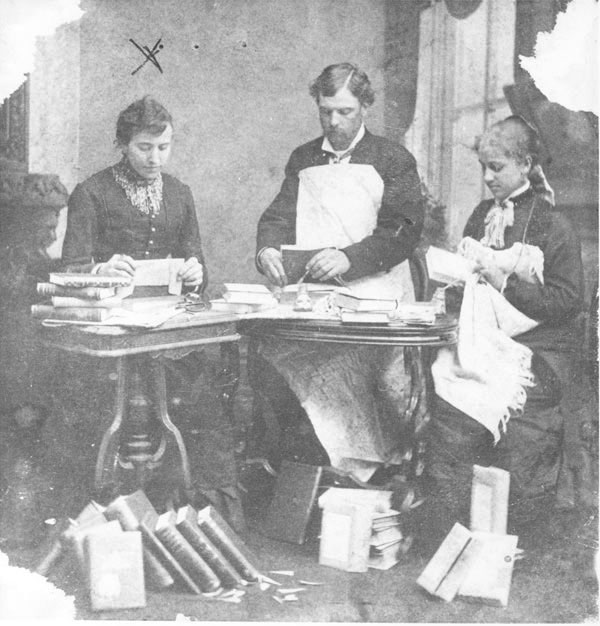
"Del Baldwin, Tence Massey and Anna Pope are preparing library books for circulation."


Barry and I will be participating with Leah Stuhltrager as jurors in a benefit for the Greenpoint branch of the Brooklyn Public Library on Saturday. The event is being organized by Aileen Tat with the generous help of many others, including the artists donating work.

We love Greenpoint, and we love libraries. And I love this photograph.

Barry and I think the three of us will be awarding a prize or prizes to some of the artists represented in the sale. As Barry writes on his own site, "Show up and be shocked to see us outside before 2pm!"

In a totally baffling development which seems designed to frustrate all the volunteers involved in this project, the BPL central marketing department has told us that as bloggers the following information is all we are permitted to post:

The Greenpoint 100: Friends of the Greenpoint Library Artists' Benefit

Saturday, September 15, 2007
11:00 am to 2:30 pm

At the Greenpoint Library
107 Norman Ave. @ Leonard St.
Brooklyn, NY 11222

For more information please call the library at 718-349-8504 or
email [email protected]


[1878 image by unknown photographer, along with supplied caption, from wichitaphotos.org]

McKean_Michael_Jones_Astronomers.jpg
Michael Jones McKean The Astronomers' Ecstasy As They See Solidarity Between Forms 2007 100" x 108" x 44" [large detail of installation]

McKean_Astronomers_detail.jpg
[detail]


McKean_Michael_Jones_Allegory_of_Rule.jpg
Michael Jones McKean The Allegory of Rule and the Geometry of Wind 2007 36" x 49" x 15" [large detail of installation]

McKean_Allegory_detail.jpg
{detail]


McKean_Michael_Jones_Freeing_of_Cosmonaut.jpg
Michael Jones McKean The Freeing of Cosmonaut Volynov and Pitcher Gooden's Song 2007 42" x 36" x 12" [installation view]

McKean_Cosmonaut_detail.jpg
[detail]


McKean_Michael_Jones_Our_Age_of_Brass.jpg
Michael Jones McKean Our Age of Brass and Ghosts 2007 53" x64" x16" [installation view]

McKean_Our_Age_detail.jpg
[detail]


McKean_Michael_Jones_Ornament_of_Fire.jpg
Michael Jones McKean The Ancients 2007 52" x42" x 13" [installation view]

McKean_Michael_Jones_Ornament_detail.jpg
[detail]


Stephen Lichty was the first to introduce Barry and me to Michael Jones McKean's art. I was excited by the images the artist/curator was able to show to us this summer, and later I did a little more internet searching on my own. I read a bit (but, deliberately, not much) about what McKean was doing, and I listened to an interview on line. Now I was really anxious to see the work in person.

We heard that Clayton Sean Horton's gallery Sunday was going to have an exhibition of his work first thing this fall, and I couldn't wait to see it, although I knew I'd miss the opening. I even thought to myself that the scheduling conflict might not be so unfortunate, since I could assume the reception would be crowded and I was familiar with both the modest size of the gallery and the grand scale of much of McKean's work.

In fact I wondered how Sunday was going to be able to show anything at all substantial of the artist's work, even without the additional squeeze threat of an opening night, in the show which came to be called, "The Discipline of Astronomy and Wind".

We visited the gallery and met McKean himself a few days after the exhibition opened. I needn't have worried about my chances of seeing full installations, and remarkably everything there is from 2007. After entering the space we introduced ourselves and then for a while we just walked around and between the five large-ish pieces Horton and McKean had placed so cunningly in two beautiful white rooms.

At the beginning I was certain that I would shortly want some kind of briefing from the artist, since both the materials and their arrangements seemed so alien and abstract, but within a few minutes, I turned to McKean with a wide grin and said, "I don't think I have to ask you anything." So much had already been communicated by the pieces themselves, with a little help from their titles, a rich, evocative list of their materials*, and my own pocket full of history, that no more guidance was necessary. Throughout the nearly 80 minutes [yes!] we spent with it, and even to this moment, the work has continued to speak for itself.

These pieces, each of them mounted on an integral platform resting on the ground or projecting from the wall, are gorgeous, full-dimensional "collage sculptures" in a lavish tapestry of shapes, colors and textures incorporating materials both found and fabricated by the artist. The superb craftsmanship (in all kinds of materials and skills) with which he realizes the incredibly-elegant contours of many of their elements distinguishes McKean's work from much of the sculpture being shown today which may also incorporate ordinary, found materials.

But it's ultimately his aesthetic, combined with a humanism which enables each of his projects to serve as something like an avatar of our relationship to the hopes, dreams and failures of our freaky civilization and the wonderful and mad heroes it regularly churns out, that makes this art so honest, so brilliant, and so unforgettable.


I hope my posting of all these images doesn't look a bit excessive, but not everyone who sees this entry is going to be able to visit Eldridge Street in the next month. Also, I can't recommend McKean's own site enough, for those who want to see more.

There's also this from Grand Arts in Kansas City, and an interview with Public Radio KUHF.


*
see the checklist, available at the gallery, but not on line
Alvarez_D-L_Occasion_to_be_Denounced_2.jpg
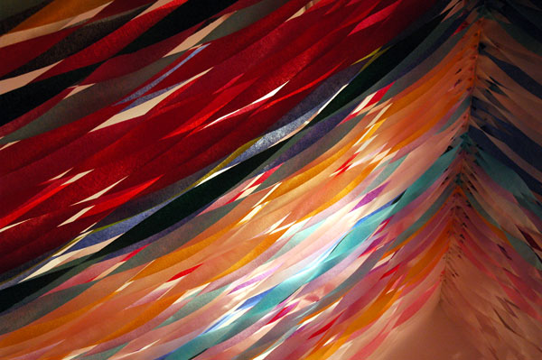
D-L ALvarez Occasion to be Denounced 2007 crepe paper installation, dimensions variable [large detail of installation]


Alvarez_D-L_Something_to_Cry_About.jpg
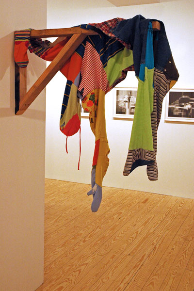
D-L ALvarez Something to Cry About 2007 children's clothing, dimensions variable [large detail of installation, with detail of "The Closet" behind]


D-L Alvarez is showing five very dissimilar new works in the Berlin-based American's latest solo show at Derek Eller, "Parents' Day".

It's an elegant installation of beautiful objects. At the opening reception they each managed to evoke for this visitor personal memories independent of the artist's own allusions: My imagination couldn't wait to run with the show's title, and with the nearly-total abstractions of a large series of pencil drawings with the title, "The Closet". An excerpt from the press release however, read after seeing the work, sheds some light on where the artist himself is on the two pieces which dominate the images seen above:

Beginning with the show's title and the piece, Occasion to be Denounced (2007), Alvarez sets the tone of celebrating a special occasion. Made entirely of crepe paper, Occasion to be Denounced (2007) underlines the fragility of such situations. Celebration in the genre of slasher films is a common motif, implemented in the titles of films such as Happy Birthday to Me, Mother's Day, and Silent Night Deadly Night. The later was controversial for depicting a killer in a Santa suit, which brings to light another common theme of the genre: that the killer's identity, including often his or her gender, is almost always disguised.

The costumes that Alvarez provides in Something to Cry About (2007) might well belong to the Mom and Dad of Parents' Day. They are cheery in appearance, but also completely concealing: each of the two uniforms having been sewn from several of children's clothes.

The statement ends with a reference to the artist's inspiration for the show:
Alvarez is less interested in the spectacle of crime as in the cultural history crime forges. A truly American genre, slasher films of the 70s and 80s connected to already existing cultural drifts. They reflect the violation of innocence exemplified by the transition that took place at the end of the sixties when paranoia replaced free love
I've come this far with absolutely no interest in slasher films (I'm not even sure I ever really enjoyed (is that the right word?) Hitchcock's textbook classic, "Psycho", but if I would hope to learn more about the genre, I now know to whom I would turn. I've always had a great respect for Alvarez's intelligence and imaginative insight, so I also know I could learn much from the artist who could create this show about an era, and a "transition", which was very much my own.

Lendvai_Thomas_Between.jpg
detail of Thomas Lendvai's site-specific sculpture, "Between Pain and Boredom"


I doubt that any gallery installation in the city rewarded visitors with as much fun on Thursday night as that of Thomas Lendvai at Winkleman.

It was a hit opening night. Everyone left smiling, and there were images all over the blogosphere the next day. To understand what we're all talking about, you really had to be in the gallery, but not only that, you had to enter into the construction itself. Of course the production continues for another month, so there are still plenty of chances to check it out. Bring friends; the performance is even better with a crowd.

And make sure you let you eye and your head follow all the artist's elegant swoopy planes through and beyond the gallery walls themselves.

de_balincourt_rock.jpg
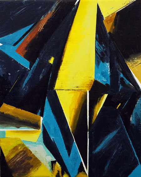
Jules de Balincourt Untitled 2007 oil and enamel on panel 27 ” x 34 ”


de_Balincourt_Jules_Cycles_of_Morning_and_Dying.jpg
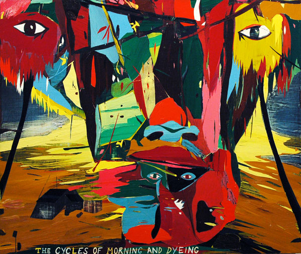
Jules de Balincourt Cycles of Morning and Dyeing 2007 oil on panel 32" x 38"


de_Balincourt_Jules_Remembering.jpg
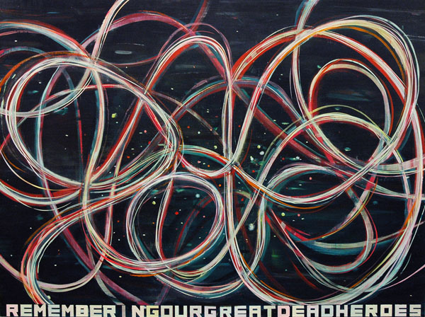
Jules de Balincourt Remembering Our Great Dead Heroes 2007 oil on panel 36" x 48"


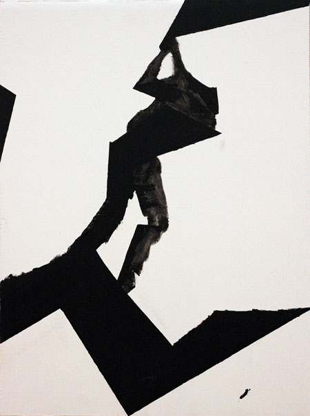
The huge crowds at the fall gallery opening receptions will make my comments about the work being shown somewhat equivocal at times, and Jules de Balincourt's exhibition at Zach Feuer, "Unknowing Man's Nature", is the first example. I've really liked the artist's work since first seeing it in the gallery's early, rudimentary office space not long before the artist's first show, and Barry and I are delighted we were once able to afford the painting we saw then. We brought it home to enjoy and it's provoked us every day since.

I suppose that since I'd already seen so much of his work I thought I should be prepared for a surprise this time. Maybe it's just me, but I was expecting, well, that I'd see work I hadn't expected. So once I got into the gallery I guess I may have been slightly disappointed not to have to stretch a bit more. Still, it was a packed opening, and subtlety always has a hard time competing with a general merriment, so I'm definitely going to have to approach these paintings again, this time with the distraction of fewer friends and strangers.

But as I going over the several images I'd gathered last night I have to say that they look very good on their own terms, and I'm thinking: They're going to grow.

I confess I'm already very fond of the first painting I show at the top.


NOTE: I woke up this morning, Saturday, thinking about one of the images I had uploaded above; I've now substituted "Remembering Our Great Dead Heroes" for "Not Yet Titled" because I was unhappy with the quality of my photograph of the latter]

Donegan_Cheryl_Hard_Night.jpg
Cheryl Donegan The Hard Night 2007 water-based oil on cardboard 20" x 16"


Donegan_Cheryl_Greatness_is.jpg
Cheryl Donegan Greatness is 1/3 2007 water-based oil on cardboard 24" x 18"


Donegan_Cheryl_gold.jpg
Cheryl Donegan Luxury Dust (Gold) 2007 gold tape on cardboard 25" x 18"


Oliver Kamm opened his fall lineup of shows with "Luxury Dust", an exhibition of paintings by Cheryl Donegan.

I was really looking forward to this show, and I loved it. [sorry for the brevity, but I'm going to try to be very economical with my time and texts for a while if I'm to even begin posting as many images as I would like during the current frenzy of openings, especially since even on the busiest weekend of the art year I still can't keep from doing angry political posts]

Hope_Shane_Chromosome_More.jpg
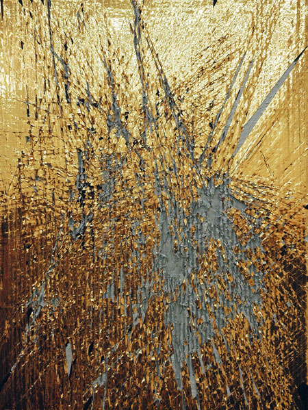
Shane Hope Chromosome More Clipped Graphite on Atomolecularly Manufactured Cell-ecular Unfolded Docking Decoy Proteins vs. Microbially Scribbled Scriptable Ornamentally Challenged Secondary Structures and Superstring Art, molecules, 2030


Hope_Shane_color_detail.jpg
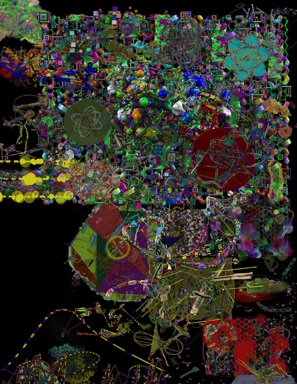
Shane Hope Infomorphic Animolecular Flowchart Food Chain of Event Horizons "cause whats the pointing the Anywayfinding Thanatophiliacamouflage Decoy Decay Rights in a Switchable Habitat that is an Untitled Molecular Assemblage No. -1/3.33", molecules, year 203_ [detail]

Hope_Shane_Infomorphic_etc.jpg
[full view]


Hope_Shane_Folk_Laptop_red.jpg
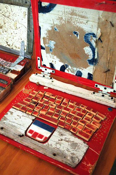
Shane Hope Folk Computronium Laptop No. n+2.22…, paint and salvage, actual size, 1776 [large detail of installation]
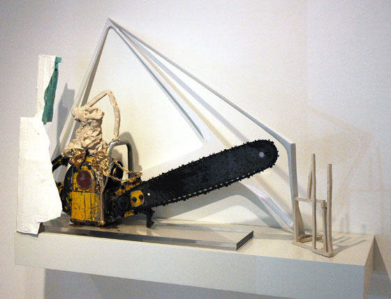

Hope_Trent_round_drawing_site.jpg
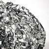
Shane Hope Goo(f) Ball No π, dark matter demarcations on lesser dimensional bits of tree, year wheneverafter

Hope_Shane_round_drawing_detail.jpg
[detail]


Hope_Shane_Kute_Kiddies.jpg
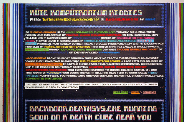
Shane Hope Kate Kompatronium Kiddies (study) So glowing-growign up in metaprogrammiable mindsplaces thinkin' on nueral interfackes like explosions of fractal phaser phalange-paintings in tiny canonical crystilline light-wave strokes of perv'd-predictive meshes of manchild-in-the-middle hacks. They've lived throuhg loads o simmable/searchable/switchable Compile-A-Child packages. Most rarely bother trying to build presingularity earthy ergodynamic profiles of neural scatter-state vectors that which cant fit inside a skull anymore. xNeural-R-Us brand add-on pluggend hairports disperse thought bubble halo-dust of morningstar memory-ghosts of exerternalized brane-brains

Hack-hopping proxy teleport servers, there aint no tracin three-year-olds anymore cause they leave-take blanks into public panopticon powder & lace little blobjects of Kill-Fill-Flow-Follow to unfold inexplicable malfunction peripheries. Commuication wit them requires cautiously accepting location-cached coordinate content advertisments/indicators that have been rumored to induce halting states. Oh, and they can stop Unaugs from doing things at will and also tend to draw/build thingamajigs, morph-feral-fog-fabbed into ominous skinless things, all broken angelic-like bio-beastie battlebots.

And better beware of the Biot Babies. Any sufficiently advanced baby talk is indistingquishable from incantations.

outsourced oil on canvas, 72″ X 72″, Posted Two Thousand Sixty Whenever After [large detail of installation]


They're beautiful. But I'm thinking right now, maybe I can get away with not being able to come up with any intelligent comments on these works on the argument that their titles already occupy so much screen space. Naw, I'm just going to have to admit that my real reticence comes from having been totally humbled by the awesome intelligence and fertile imagination of the artist himself.

We visited Shane Hope's studio last month at the suggestion of Stephen Lichty, who has been appointed director of Project Gentili, a new Italian Kunsthalle opening this fall in Prato, outside Florence. The artist will be the space's featured artist in November. I'm going to be very sorry to miss that show.

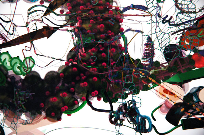
His art is described by Hope himself as "outsider biotech", and I suppose the lengthy titles shown above (up to 13 lines) might be more useful to those who weren't as stuck in the liberal arts at school as I was. It's a pretty intense body of work, exhibited in a number of mediums, and the artist's passion suggests a mind and a way of life off of any grid of which I'm aware (I was told by Lichty that Hope has mastered his personal off-road BC wheel). I noticed a more conventional [?] model leaning near the door on our way out of his studio.
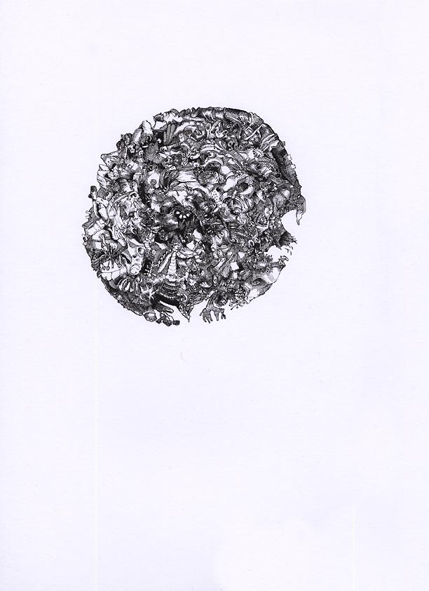
Although their images are significantly computer-generated, many of the more striking pieces are directed with a hand and a mind inspired by fictive extensions of extraordinarily-complicated scientific concepts. Hope's work is describing a future married to his own imagination, and I'm staggered by the beauty - and the terror - of both the design and its implications.


ADDENDA: This description of the molecular drawings is from Marisa Olson, who was writing about Hope's representation in Rhizome's installation at Scope NY in the spring of last year:

Shane Hope's drawings involve molecular modeling systemscollections of techniques to model or mimic the behavior of moleculesin a process whereby the three-dimensional architecture of molecules is interpreted (or predicted), visually represented, and manipulated.


[first and fifth images from outsider biotech]

bike_bag_night.jpg
untitled (seams) 2007


homage to Dan

  • home

This page is an archive of entries in the Culture category from September 2007.

previous archive: Culture: August 2007

next archiveCulture: October 2007