Culture: May 2008 Archives

ACT_UP_NIH.jpg
we were never alone*


CORRECTION: I've corrected the text for screening location


ACT UP veteran Deb Levine is viewing the entire ACT UP Oral History Project videos from start to finish in a performance project she calls "ENDURING ACT UP". She is inviting us to join her.

Levine has been working on her PhD. in Performance Studies at NYU and is writing about ACT UP for her dissertation. She says she's focusing on one aspect in particular:

. . . how collectively people took care of each other during meetings, demonstrations, in committees and affinity groups, and especially as members became ill. I am most interested in the ways in which those relationships became an ethical and political practice - a topic that is not often foregrounded in other histories of the organization.

While she has been watching the interviews recorded by the Oral History Project, which was undertaken by Sarah Schulman and Jim Hubbard, and I assume she's been through them all, she says that what she is missing is the opportunity to turn around and discuss what appears on the screen with others who witnessed and were a part of the phenomenon of this remarkable band of AIDS activists in the 80's and 90's.

The screenings began this morning at 10 at 721 Broadway on the 6th floor, room 613. They will continue through June 15. For a complete schedule and more information, go to the project's web site.


*
the image is from the ACT UP protest at the National Institutes of Health [NIH] in May, 1990, when we “stormed the NIH” to protest the slow pace of research; things picked up a bit later (the troublemaker seen in the foreground is Brian Keith Jackson)


[Donna Binder image from NIH library - yes, the NIH!, and the site has much more about medical activism]

Anthony_Pontius_End_In_Flight_2.jpg
Anthony Pontius there is an end in flight 2008 oil and ink on panel 32" x 36"


Anthony_Pontius_Ill-Fated_March.jpg
Anthony Pontius the ill-fated march of a plouged jogger 2007 oil and ink on panel 30" x 36"


It was gorgeous, and now its gone, but 31 Grand's recent how of work by Anthony Pontius, "Why on Earth?" isn't forgotten, at least here.

The press release tells us that Pontius examines "the importance of the human connection to history and nature.

By recontextualizing historical imagery, stories and concepts in the world of now , he presents a new narrative that is familiar yet the full meaning is not immediately accessible. Employing a mix of past and present techniques, he forms these new arrangements; using classical clarity to define a specific part of a story and at the same time abstraction to complete or destroy the formation of the work. The finished painting is a proclamation of something new and not easily defined, realizing that history and memory are not clear or concise, but the consequences of interpretation.
I've loaded this post with a few images taken in the gallery, but I have to explain both the presence and the appearance of the one just below.


Anthony_Pontius_April_Fool.jpg
Anthony Pontius the april fool 2006 oil on paper 4" diameter [large detail of framed paper]


I don't think this tiny "the april fool" was a part of the show proper, but I fell in love with it immediately. It was hanging near the desk, and its dark colors and shapes were framed behind a piece of glass. A photograph seemed almost impossible, but I gave it a try and snapped the piece from an acute angle, thinking the most I could do with the image would be to remind myself of its charm once I returned home.

This afternoon I decided to play around with it on Photoshop (where my skills are actually pretty abysmal). I managed to bring some life back into the very dark image and I even returned it to its neat circular shape. Now that I'm pointing it out you'll see some blurring on the right edge of the drawing. It's caused by either a narrow depth of field or, more likely, the stress of my converting its shape from the oval the camera left me. In any event, I think that what you can see is a fairly good representation of the beauty which caught my eye that day.


Related: "No New Tale to Tell " at new 31 Grand [scroll down]

Bushwick_color.jpg
untitled (chain links) 2008


Despite its lively diversity, Bushwick isn't always as colorful as this "palette" sighted next to a building which houses a number of artist studios near the Morgan stop.

Oh, and in spite of its appearance to the contrary, the painted board is actually in perfect focus.

Catherine_Bernhardt_Silver_Gold.jpg
Katherine Bernhardt Silver on Gold 2008 acrylic on canvas 96" x 72"


Katherine Bernhardt's loose-limbed and painted-face of a show at CANADA, with the can't-miss-it title, "Kate, Gisele, Agyness, Natalia, Kanye, George & Simon" (George and Simon? I think I missed them) is only up for three more days. The gallery says she's been

. . . hosting a month-long sleepover party at CANADA with her favorite people and we are all invited. Fashion models, rappers and pop legends populate Bernhardt's paintings in dizzying displays of weightlessness and celebrity, all painted in a colorfully loose style on huge canvasses.
These paintings are expressionist sketches, only they're done with hardware store brushes and (unblended?) paint. They're also terrific abstractions.

I may not be the best or intended audience, because I'm absolutely terrible with celebrity rags and a lot of pop culture, but I thought Bernhardt's stuff was great.

Go visit. It's CANADA, so you probably know you want to.


Catherine_Bernhardt_Triangles_and_Stars_2.jpg
Katherine Bernhardt Triangles and Stars and Legs and Peace 2008 acrylic on canvas 96" x 102"

pinktriangle.jpg
only part of the story


Berlin's memorial to the thousands of homosexuals who were variously persecuted, tortured or murdered by the Nazi regime was dedicated yesterday. The official name of this German parliament commission, Denkmal für die im Nationalsozialismus verfolgten Homosexuellen [National Memorial for the Homosexual Victims of the Nazi Regime], may be formidable, but the structure itself is incredibly simple and ineffably moving in its sylvan setting within the Tiergarten, Berlin's central park.

Positioned close to the iconic Reichstag Building, not far from the buried ruins of Adolf Hitler's concrete bunker and across the street from the German capital's very different but equally-astonishing Holocaust Memorial, the new memorial was designed by Elmgreen & Dragset, Danish-born Michael Elmgreen and Norwegian-born Ingar Dragset. The artists, who are based in Berlin, used the block shape, gray color and slight tilt of the individual steles of Peter Eisenman's masterpiece for part of its inspiration, but a small video screen embedded in a recess on one side of this somewhat larger slab will portray a one and a half minute film loop by director Thomas Vinterberg of either two men or two women kissing. In the background of the figures in the videos, which were created before construction began, can be seen the same trees which surround the memorial as built.

Near the end of a very short article in the NYTimes today: "On hand for the unveiling was Berlin's openly gay mayor, Klaus Wowereit, but no survivors." The short article goes on to explain that Pierre Seel, who was the last known survivor of the camps, died in 2005.

As a queer man who first heard about this project in the mid-nineties when it was being proposed, and having now seen images of the powerful monument that these two wonderful artists have created, I'm unable to think of this work as a memorial only to the German and European victims of 1933-1945. Many homos who were not murdered but were imprisoned by the Nazis remained incarcerated in the new Germany long after the war. Homosexuality remained illegal in the Bonn Republic until 1969 and was only formally decriminalized in 1994.

Of course queers have been persecuted everywhere on the planet for thousands of years, but especially during the last few decades some societies have managed to grow up. They now recognize and protect the rights of all their members, while nowhere in the Western world do queer men, women and children remain more abused today, both by law and society, than they do in the U.S.

Berlin's newest monument can be a memorial to all homos hunted in the past. Let it also be a foil for those who would hunt us still.


Berlin_homo_victims_monument.jpg
the protective glass in front of the video screen reflects viewers and surroundings


Note, and more: As the ambient landscaping is still immature, I haven't included an image here of the structure or "pavilion" in its environment. This link to the memorial's own site [currently in German only, but with a pretty exhaustive list of links in many languages]; and there's an AP video below, recorded on the grounds of the memorial during grounds cleanup, with a short statement from the artists:


[image at the top from andrejkoymasky; image of memorial's screen by Johannes Eisele from Reuters via Yahoo!]

Sarah_Chuldenko_Love_and_Rockets.jpg
Sarah Chuldenko Love and Rockets 2008 oil an enamel 7' x 5'


It was at Fake Estate, so it was physically one of the smallest shows in New York this spring, but the impact of the work Sarah Chuldenko showed in this broom-closet of a space was not minor in any sense. The show was called "Casualties of Beauty", and although it closed on Saturday, I'm sure we'll soon be seeing this artist again.

Some of her squishy images may verge on the off-putting, but I think it's a good sign that the latest painting seems to be the most successful of all of them. Without losing her quirky organic vocabulary, Chuldenko has managed to open a very different conversation with "Love and Rockets". The work is no less mysterious for the clues she may be providing us inside the disturbing beauty of the chaos she has created; the artist has only added more complexity to the language of the earlier pieces.

If not quite put off, we remain a little disturbed.

Christopher_Brooks_Untitled_1999_3.jpg
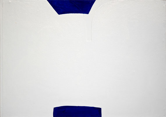
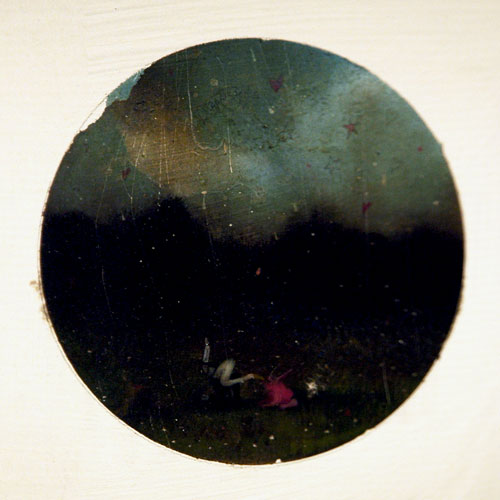
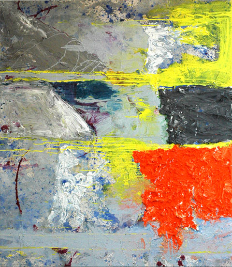
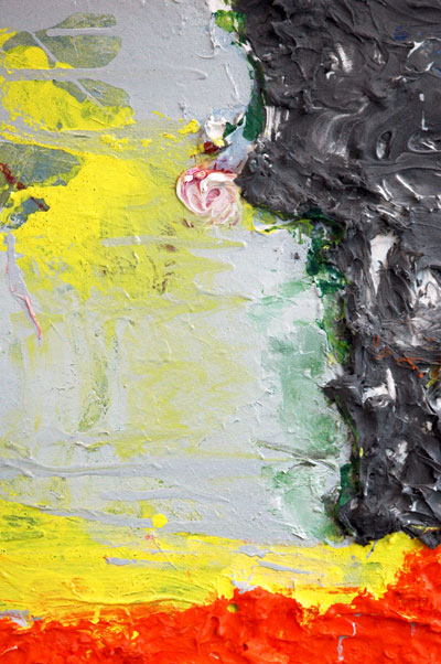
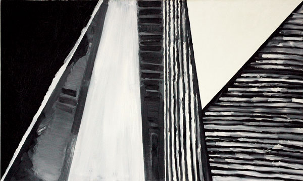
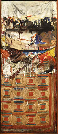
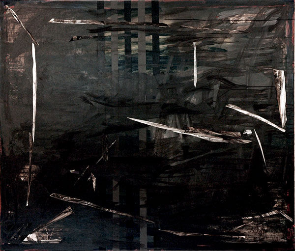
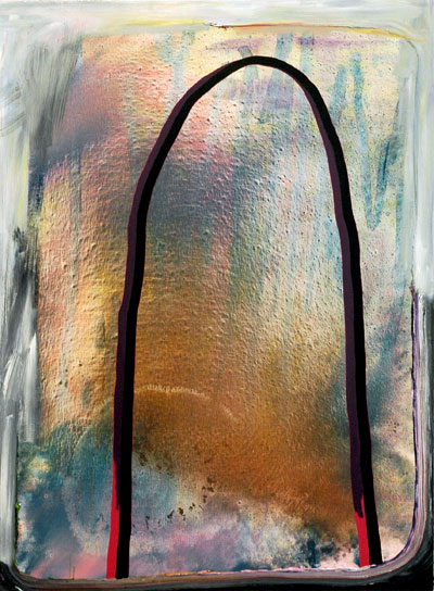
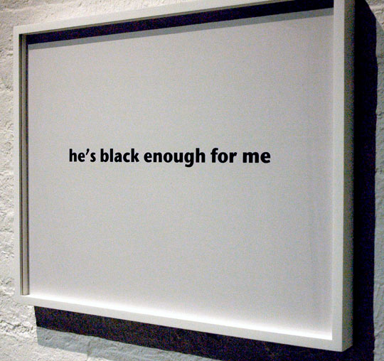
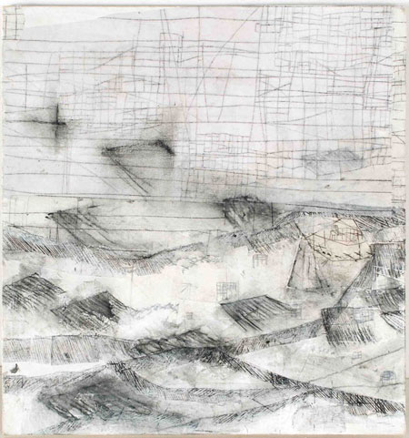
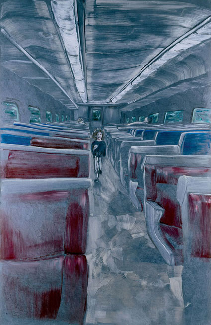
Christopher Brooks Untitled 1999 enamel on canvas and board 17" x 24" x 2"

Christopher_Brooks_Untitled_1999_detail_3.jpg
[detail]


Christopher_Brooks_How_To_Lose.jpg
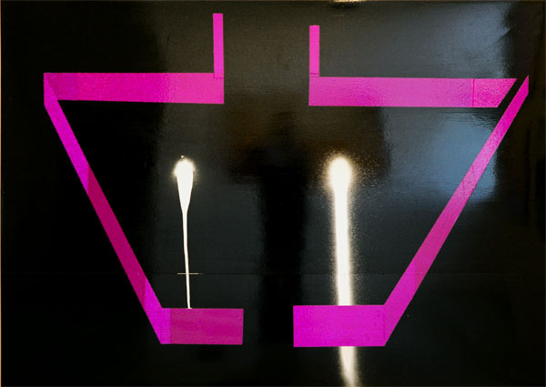
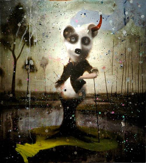
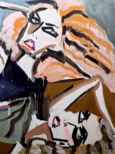
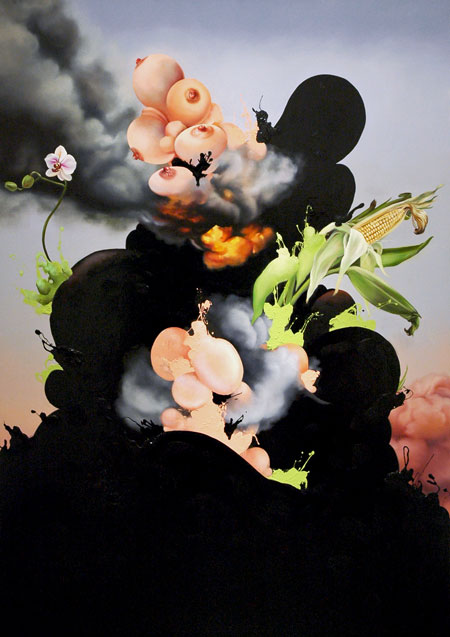
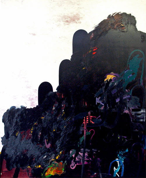
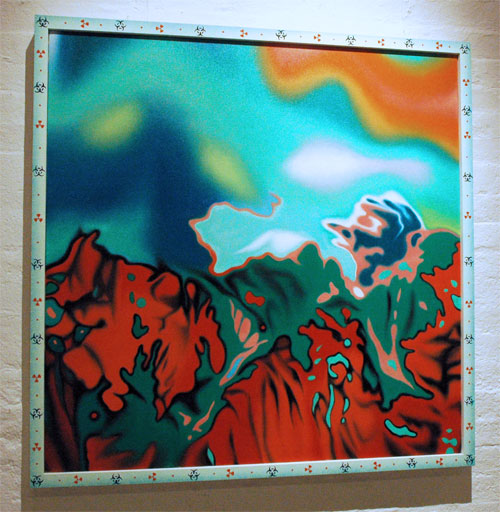
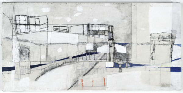
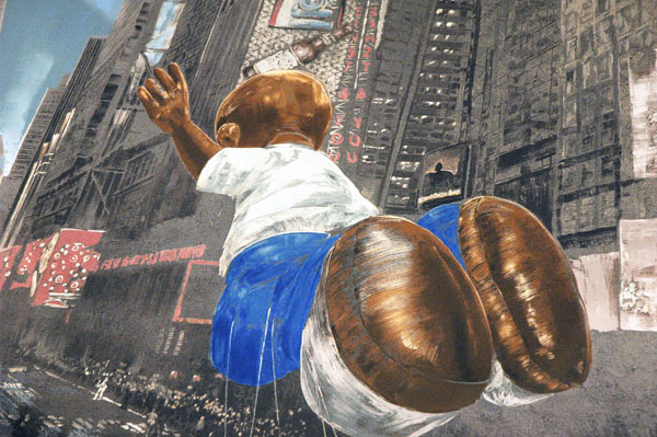
Christopher Brooks How to Lose 10 lb (easily) 2008 enamel and spray paint on masonite 5' x 7'


Christopher_Brooks_The_Land_That_Time_Forgot.jpg
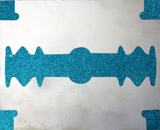
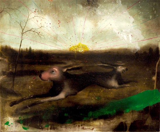
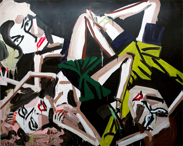
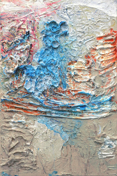
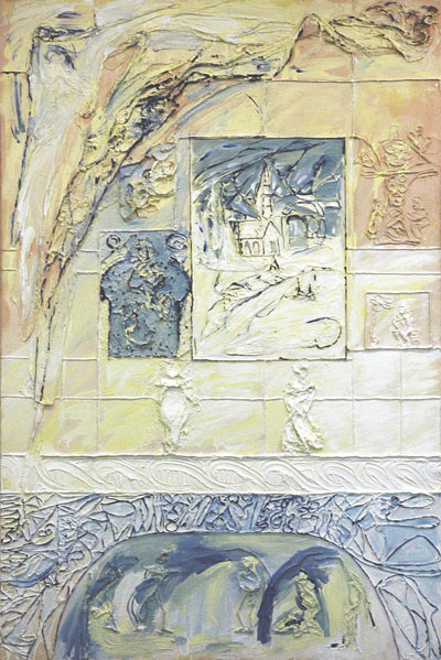
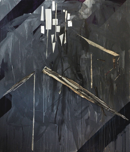
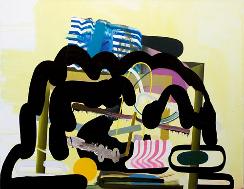
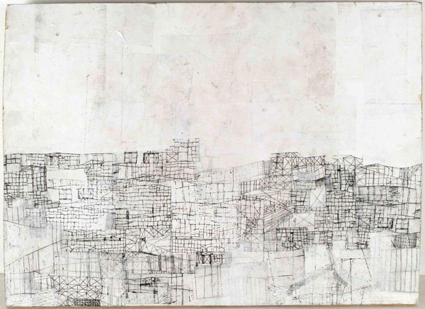
Christopher Brooks The Land That Time Forgot 2006 enamel and glitter paper on masonite 16.75" x 20.75"


I can never get much information on the artist Christopher Brooks when I try looking on line. He did unfortunately pick a name which makes a web search very difficult, but still I'd expect to find him surfacing more often than he does by now. I did manage to find this, but only by looking through my paper file on the artist.

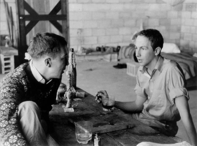
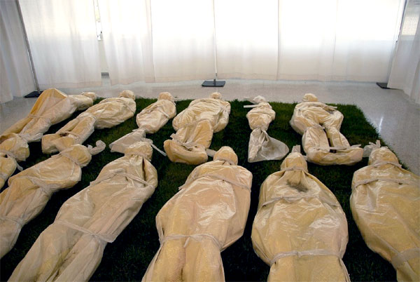
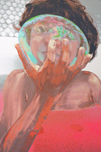
Brooks first came to my attention in a group show in Brooklyn curated by Lithgow Osborne in 1997. The artist and gallery owner Rupert Goldsworthy presented solo exhibitions of the artist's work in his eponymous Chelsea space in 1998, again early in 1999 and then finally in 2000. In the first of those three shows, reviewed here by Elizabeth Kley, half of the gallery space was devoted to some large, very handsome but rather odd C-prints of the artist fully obscured and personally abstracted inside an inflated black rubber fetish suit.

I still have the notes from the 1998 show's press release, and this small excerpt tells us something about Brooks's work as he conceived of it at least up to the late 90's:

Christopher Brooks will present a series of paintings and photographic work addressing the theme of the 'institutition'. Invoking modernist establishments such as the asylum, hospital, clinic, prison and museum [!], the hard-edged geometry and institutional colors simultaneously invite and reject the human content they propose.
Ah, restraint or control. A collaged white and blue painting we found a little over a year later, which without this hint of kink would be as inscrutable as the photographs in that show, remains one of our favorites today; it occupies an honored place in the parlor, on what would be the prime television wall in regular homes. Barry and I were surprised and delighted to secure this untitled 1999 work by Brooks at the New Museum Benefit Art Auction of that year.

That painting and our two other purchases of the day were and remain good company, for we also went home with a terrific John Bock collage and a Roe Etheridge C-print we're still nuts about. We were and still are impecunious collectors, but we really liked the cause (and Marcia Tucker still at the helm) and I guess we were feeling pretty flush. We were also very, very lucky: All the works together barely cost us $1000, and of course all three bids were below market even then. It's been our experience and it remains our prescription: Benefits benefit everyone.

I confess to having had one tiny regret at the time: Unlike most of the other paintings by Brooks which I had seen by up to then (all of which were much larger, and each would have been way beyond our budget as a gallery purchase) the piece we adopted didn't have any tiny, weird cartoon stickers on its surface.

Last week we saw two beautiful and very shiny new paintings by Brooks in an interesting group show in Chelsea, the gallery Massimo Audiello's "C’mon shake it!—ah ah Check it!—ooh ooh". Thanks to their efforts we now have a workable bio for this elusive artist.

Finally, only a few nights ago we managed to be incredibly lucky in our draw at the Momenta Art benefit; Barry's number was pulled out of the raffle bag first, meaning we were able to go home with the work we had put at the top of our long list (we had 45 other choices written down, just in case we were going to be near the end). We were dazed and more than excited to get another Brooks painting, but judging from its reaction I think most of the room may have been fairly nonplussed.

We're obviously biased, but we think we should have been seeing more of this artist already, and I wouldn't be surprised to find stuff happening soon.

I just realized the mere existence of this post might look like part of a personal agenda. All I can say is that we have works by a truly huge number of artists. Neither Barry nor I could possibly avoid writing about some of them at sometime, but we've never sold a thing and we don't intend to. These two Brooks paintings aren't going anywhere; we're expecting Brooks will.


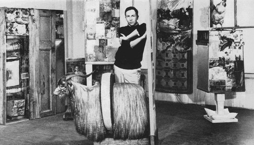
UPDATE: I guess I didn't look hard enough a couple days ago. While searching today for something related to this post I put another combination of words into my search engine and - voilà! - I found Brooks's own site. It has a wonderful store of images of work as far back as 1996.

Dona_Nelson_Line_Street.jpg
Dona Nelson Line Street 2007 acrylic and acrylic mediums on canvas 79" x 70"

Dona_Nelson_Line-Street_detail.jpg
[detail]


Dona_Nelson_Hag%27s_Song.jpg
Dona Nelson Hag's Song 2008 cheesecloth and acrylic mediums on canvas 30.25" x 20"


Dona_Nelson_B%26W.jpg
Dona Nelson No Title 1977 oil on canvas 24" x 40"


Dona_Nelson_My_Home_IV.jpg
Dona Nelson My Home IV 2001 cheesecloth and acrylic mediums on canvas 90" x 60"


I'm thinking Dona Nelson's work is looking better and better, but I'm sure the reasons are simple: I'm seeing more and more of it and Thomas Erben is such a great curator. Like the last show he mounted for the artist this one is something of a closely-edited mini-retrospective. The current installation, "in situ: paintings 1973 - present", remains on 26th Street through May 31.

Momenta_2008_raffle1.jpg
just four of the works available at the Momenta Art raffle


Momenta_auction_Olav_Westphalen.jpg
an Olav Westphalen acrylic on paper, one of the works being auctioned


Tomorrow night is the Momenta Art annual benefit party, which includes a raffle and a live auction. The event will be in Manhattan, at White Columns (320 West 13th Street, entrance on Horatio Street). The live auction starts at 5pm. The raffle begins at 7.

This artist-run non-profit space is absolutely as good as they come; they totally deserve and definitely can use our support, and after having stopped by today I can't say enough about the curatorial quality of the art available to those who will be able to rise to the occasion.

A $225 ticket gets two people in for free food and drink, and you get to go home with a work of art as well!

The number of tickets is limited by the number of works available (approximately 140), and as of this writing at least, there are still slots available. Go on line here to get one or more tickets, or call the gallery at 718-218-8058.

To attend the party and auction without participating in the raffle, entrance for two is $100 and tickets can be purchased here.

Even if you can't make it to the scene inside the White Columns space, where the works are now on display all day tomorrow and where the event is being held, you can still order tickets and arrange for a proxy to make your selection from among the items in the raffle.


[image from Momenta Art]

rauschenberg_bed.jpg
Robert Rauschenberg Bed 1955 mixed mediums 75" x 32" x 8"


Yes, the great man was queer. I had thought I made it pretty clear in my own post on March 14, but today I note that Tyler Green's Modern Art Notes has gone and shoved it down the prissy throats of both members of the "regular" media and the art world's own sophisticated pundits. Almost all of them seem not to have ever noticed, or, much more likely, were convinced it was too shameful a condition with which they could risk frightening the horses - or asses.

Green's post, "Hetero-normalizing Robert Rauschenberg", is totally on target, and bursting with links to his references and sources (there's even a link to his links on the subject).

Bravo, Tyler!


[image from MoMA]

hello_bon_jour_large_detail.jpg


super_hero.jpg


fisted-beauty.jpg


Sean_Bell_recruitment_poster.jpg


I may never be able to ignore a street or subway poster again; I might not even feel I have to bring a book with me when I head for the train. It seems there's a current (and possibly snowballing) genre of street art which involves the alteration of commercial posters by making them into collages assembled from their own materials or paper cut from neighboring posters.

They're potentially so much more elegant than the Sharpie alterations we've been seeing on these boards for years, even if they have to sacrifice that form's occasional textual sophistication.

I spotted these examples and a number of others all near and inside the Morgan stop of the L train late Tuesday. The first image represents almost the complete framed poster as I found it, fully obscured or removed and converted into a rather delicate friendly greeting. The second two are details of separate works, but the third shows every square inch of a framed advertisement which has been converted into some serious political commentary.

This stuff can be quite beautiful, lots of fun or very provocative, and sometimes all at once. I called it "slash art" when I saw it this week, although this name probably plays into the hands of the police, who must already be pretty serious antagonists for these artists. "Cutups" or "cutup art" would seem to work too, but the form seems to have already acquired the moniker "mashup" while I wasn't paying attention.

More examples, from Poster Boy, here.

Arthur_Russell_Matt_Wolf_08.jpg

Matt_Wolf_turntable_07.jpg
two stills from "Wild Combination"


I saw the New York premier of Matt Wolf's first feature-length film, "Wild Combination", at the Kitchen last night. It's an amazing documentary on the life and music of Arthur Russell, the innovative downtown musical composer/performer who just couldn't stand still and wouldn't be pinned down, even for his own visions of his art.

Unable to be really understood by most of his contemporaries, perhaps partly because of his own inadequacy with conventional communication, Russel's cross-cultural and cross-disciplinary music never had a large audience, before his early death from AIDS complications in 1992. But twenty years later his music sounds as modern as today - or tomorrow. It now appears to be moving from an honored place in the memory of his fans and collaborators (and on thousands of reels on dusty storage locker shelves) into something like cult status among a new generation of listeners and artists which, like Russell, routinely ignores the false separation of genres and thrives on the offspring of musical cross-fertilization.

Wolf, an artist and filmmaker barely in his mid-twenties now, began his career in 2002 with "Golden Gums". It was the first in a series of three relatively short experimental films, the others being "Smalltown Boys" in 2003 and "I Feel Love" in 2004. Their subjects were, in order, the young auteur's own plaster dental cast offered to boyfriend as love token, a young teenage girl who seems to be the daughter of David Wojnarowicz, and the strange story of Andrew Cunanan's hotel maid's sudden celebrity. Only after "Wild Combination" could I imagine that each of these might be its own unique and perverse twist of the traditional documentary form. I'm not sure however if I might be able to read this into the filmmaker's history only because his latest creation is clearly a documentary. But it's certainly much more; it's an imposing accomplishment and an exceptionally beautiful film in which one artist's demonstrated imagination and fancy is directed toward showing the compelling musical beauty created by another.

But it doesn't really matter, since all of these works do very well standing on their own. I only know for sure that I'll be looking forward to wherever Wolf decides to go next.

"Wild Combination" will be screened elsewhere in New York later this year.

The Kitchen has organized a tribute to the music of Arthur Russell this weekend with performances tonight and tomorrow. The blurb on Time Out New York's site includes this on the performances:

On records such as 1986’s World of Echo and the posthumous Another Thought, Russell married joyous pop to muted, inward reflection. But this “Buddhist bubblegum” (much of which has been reissued this decade by Audika) will make up just a fraction of this three-day program, which also offers a rare chance to hear his large ensemble instrumental pieces played live. On Friday, Russell colleague Bill Ruyle conducts “Tower of Meaning,” a minimalist work for brass and strings. Saturday will find Ruyle, trombonist Peter Zummo and bassist Ernie Brooks participating in “The Singing Tractors,” an ensemble trance work that incorporates improvisation.


Here's an Amazon widget which will let you sample some of his music:


More:

John Schaefer's WNYC Soundcheck program interview with Matt Wolf

Sascha Frere-Jones writing about Russell in The New Yorker in 2004

Andy Beta's piece on Wolf's film in the current The Village Voice

Audika Records Arthur Russell catalog

Amazon's Arthur Russell listings

Schedule of festival screenings


[images, the first from "Terrace of Unintelligibility" by Phil Niblock, courtesy of Audika Records, are both stills from the film and courtesy of Matt Wolf]

Joyce_Kim_One_or_Two_Things.jpg
Joyce Kim One or Two Things 2008 acrylic and acrylic foil on canvas 72" x 84"


Joyce_Kim_Gently_Strike_on_White.jpg
Joyce Kim Gently Strike on White 2008 acrylic and acrylic foil on canvas 84" x 72"


Joyce Kim was showing some great paintings at the Marie Walsh Sharpe Foundation's Space Program open studios late last month. When Barry and I walked in we were surprised to get a partial preview of what I'm certain must be a very impressive show at Thierry Goldberg. We haven't yet visited it, but I'd have already made it a must just to see Jonathan Hartshorn's contribution.

I'm shocked that these two images reveal so much. The camera seems to want to show us everything at once. While I was actually in the space most of the detail you see here wasn't immediately apparent, in spite of the fact that these canvases were hanging in a south-facing room with strong natural afternoon light. Sometimes I can't say it enough: If you can, go see these pieces yourself. Let them reveal their subtleties at their own speed.

bobjap2_2.jpg
Jasper Johns and Robert Rauschenberg (1954)


Hot.

I couldn't think of anything I might be able to add to the encomiums which have followed Monday's announcement of the death of Robert Rauschenberg. Then this morning I saw and read the NYTimes obituary in the print edition. While growing up, and even for many years later, I remember seeing pictures of a beautiful young man whose work was more than capable of shaking up a post-war art world already conditioned to, maybe even bored by change. the Times, like too many other media sources in the last few days, showed us only pictures of an older artist, and many photographs I've been seeing portrayed a Rauschenberg weakened and partially paralyzed by a stroke.

Although he remained handsome and productive all his life, it was in the early years of his career that he produced most of the innovations for which he is now known and revered. I thought that we should all be able to see now what the strong, vital artist who changed so much of the world we inhabit today looked like while the revolution was underway. He was once very young and almost painfully beautiful, but he was never old.

The photograph here is of the artist relaxing in a studio with Jasper Johns. It was taken probably in the late 50s, the period in which they lived together downtown in various lofts around Coenties Slip and Pearl Street (the neighborhood of my own first New York home 25 years later). It's interesting, although not surprising, that in his long obituary for Rauschenberg published in today's Times print edition Michael Kimmelman describes their personal ties in "genteel" terms more familiar to readers of fifty years ago than to us today:

The intimacy of their relationship over the next years, a consuming subject for later biographers and historians, coincided with the production by the two of them of some of the most groundbreaking works of postwar art.
For a little more candor, see Jonathan Katz.


Related:

Rauschenberg

"bobrauschenbergamerica" in tears

Paul Lee at Audiello

Lawrence Weiner at Pocket Utopia


UPDATE: Shortly after I did this post I found this wonderful early image on Newsday's site:

Rauschenberg_Newsday.jpg
Robert Rauschenberg in his New York studio in 1958


[top image, a photograph by Rachel Rosenthal, from mettaartlove; added image from Newsday]

Eric_Sall_three.jpg


Eric_Sall_two.jpg


Eric_Sall_one.jpg


Eric Sall's solo show of paintings at ATM Gallery closed a few days ago. Barry reported that he really liked them, when he returned from a visit to the gallery on which I couldn't accompany him. The day I went over to 27th Street by myself I had to come home unexpectedly early and didn't get to the show. Then unfortunately I never made it back, but having since seen what Sall was showing inside his space at LMCC open studios two weeks ago I know what Barry was talking about.

The paintings are dazzling, and being able to talk to the artist in his studio, almost in the midst of his process, may have made up for what I had missed earlier. I hope I'm sharing at least some of their beauty by being able to broadcast these images from this site.

The relative sizes of these three works are, in the order they are shown, medium, rather large and pretty small.

After a night's sleep and especially after reading this morning what others who have read my post of yesterday are saying about the subject of artistic censorship and our relationship to the world, I realized that what I wrote just wasn't really in my voice. Although I suppose not everyone would agree, I think I was way too concerned with being gentle to everyone and everything: Uncharacteristically, I didn't make my own position clear on issues about which I have very strong opinions.

While this next section looks like a partial creed, maybe I should just call it a small glossary, even if it won't be arranged alphabetically.

GOVERNMENT: [okay, I know the word is missing from yesterday's post, but that's part of what I mean] I abhor everything the current administration in Washington stands for. I also believe that its enablers in the other two branches of government share equal responsibility for its domestic and foreign crimes, and that the corrupted system which has brought us to this juncture is an abomination we may not survive.

CENSORSHIP: I believe that censorship is a substitution for thought, and is its mortal enemy.

CHILDREN: I argue that children should be educated and protected through the active engagement of all adults, and not by a passive, dumb curriculum of barricades or screens.

LBIF: I am aware that simple-minded, do-good arts organizations can sometimes do as much harm as they do good. Sorry.

FOUNDATION FOR CONTEMPORARY ARTS: I probably couldn't say enough about the good they do.

TRANSFORMATION: I regret that when it comes to the public presentation of their work artists are not always free to determine either its site or the manner in which is presented.

SUSAN DESSEL'S SCULPTURE: I affirm that the artist Susan Dessel has a great mind and a soul which is its equal, and that her work, "OUR BACKYARD: A Cautionary Tale", is a powerful human statement and an exceptional work of art (even if I still can't decide whether it might suffer or thrive from the remarkable gentleness of the title attached to it by its gentle creator).

I am angry, yes, but especially after reading reactions to this story from other bloggers and those who write comments, I am also optimistic about the future of art, perhaps even socially-engaged art.

I mourn the fact that this country has virtually no use for artists and thinkers, so I'm still gravely pessimistic about the future of our polity.

burma.bodies.jpg
this too is our backyard


In the twenty-first century the entire world really has become our "backyard" and along with its beauty and energy, there is also much unnecessary misery and death everywhere in that yard. Provincial fears and mindless censorship cannot reconstruct fences around the familiar, confined spaces which now open onto a much larger world, nor can they make the misery and death go away.

Susan Dessel's sculpture, "OUR BACKYARD: A Cautionary Tale" has been censored by its current host, the Long Beach Island Foundation for Arts & Sciences [LBIF]. She had been invited to participate in its current Artist Residency and Retreat Exhibition, titled "ART CONCEIVED SINCE SEPTEMBER 11". Support from the Foundation for Contemporary Arts (NYC) made Dessel's participation in this exhibit possible. On the eve of the show's May 3rd opening LBIF Interim Executive Director Chris Seiz told the artist that he had been advised by some LBIF members that they found the piece “offensive” and were considering ending their support of foundation. In the hours prior to the opening Dessel's installation was walled off from the rest of the gallery. Visitors who now wish to see the concealed work must first step across signage warning that them that the piece may upset or offend.

The artist has released a statement:

"OUR BACKYARD: A Cautionary Tale" was an opportunity for me to re-imagine the world as I understand it: our shared backyard. Despite the expression of dispiriting conditions found in my work, underlying it is a robust sense of hope that it might encourage viewers to consider their own role in transforming the community - local and global - through their actions and inaction.
Dessel describes LIBFÂ’s transformation of the piece as having turned the artist's fundamental intention on its head, since it now represents our containment and continual isolation from the outside world.

This profoundly moving large-scale work was first seen at a show Barry and I curated at Williamsburg's Dam, Stuhltrager Gallery in September, 2006. It was a site-specific installation which the artist described as a response to wide-spread images of violent death in many parts of the world. The work has been fundamentally altered with the decision to wall it in during the current show in New Jersey. Dessel sees the LIBF's restriction of her expression as an artist as raising the new and separate issue of the role we permit art in our society generally.

It 2006 was installed in the "backyard" of the gallery in Brooklyn. There were no warnings posted, and it managed to attract more positive attention from visitors and press (both old and new media) than any other work in the group show.

The picture at the top of this entry was taken only a few days ago. It is not an image of a sculpture. Nor were any of the other horrific news images we have seen in our lifetimes from New Orleans, Jonestown, Haiti, and Cambodia, from Lebanon, Israel and Palestine, from Sarajevo, Darfur, Argentina, Sudan and Rwanda, and of course from Afghanistan and Iraq. Dessel's "OUR BACKYARD" addresses our response to all of these tragedies and too many more, perhaps with the hope that if it helps us to engage in their reality with a shared humanity the world might do a little better going forward. I cannot begin to understand how people accustomed to viewing the horrors presented on what passes for ordinary entertainment on large and small screens today could possibly be upset or offended by twelve carefully-assembled shapes wrapped in sandbag tarp and lying on fresh sod.

I'd like to think we could do better, but the kind of censorship being exercised by a gallery in southern New Jersey this month is hardly unique even in the art world, and it's certainly of a piece with the bowdlerization which has been standard media practice in this country for decades. It's no wonder we continue to do so little to help prevent or ameliorate, and in fact contribute so much ourselves to creating, the catastrophes which litter our global backyard.

The Long Beach Island Foundation for Arts & Sciences is celebrating its sixtieth anniversary. I can't know the motives behind its censorship of Susan Dessel's art, but it's unfortunate that so many of us will have first come to know the LBIF not for patronage of arts or science but for institutional behavior not worthy of an amateur craft club in Colorado Springs, and at this juncture that analogy may do a disservice to the city popularly considered the most radically "conservative" in the nation.

The images which appear below show Dessel's installation before the curtained wall was in place, after it was installed, the sign at the entrance to the curtain baffle, and finally what it looked like inside the enclosure.


Susan_Dessel_LBIF_open_.jpg

Susan_Dessel_LBIF_curtained.jpg

Susan_Dessel_LBIF_signage.jpg

Susan_Dessel_LBIF_inside.jpg


[Burma image from European Pressphoto Agency via NYTimes; remaining images courtesy of the artist]

all-seeing_eye.gif
all eyes


In spite of the power of my day-to-day fancies, sometimes I'm reminded that the art world is not all sweetness and light, especially when power or money is involved. There are definitely some real Grinches out there, but I'd like to hope that eventually they'll all sled back to Whoville.

I'm talking about people behind this business of camera bans. I've been arguing and demonstrating against photo prohibitions on this blog and elsewhere for years. I think I've seen and heard just about everything on the subject, but I'm finding it incredibly difficult to stomach the latest photo-ban nuttiness coming from 303 Gallery. On Wednesday Barry received an email from artist/blogger Mark Barry which included an email Mark had received from someone at 303 asking him to remove from his Flickr set two images he had taken of work by one of the artists the gallery represents in New York. The two-year-old photos were taken during the press preview for the 2006 Armory show. Barry posted this item on Bloggy yesterday. Today it's all over the art blog world and the comments are still coming.

There are some terrific arguments in defense of the right to the non-intrusive use of cameras in galleries and museums, but my favorite to this moment is the one which comes closest to my personal understanding of what I and many others are doing when we use cameras in these places. Juana B. Riquena made this comment this morning on C-Monster's post:

When I go into a gallery, I want my readers to see what I see. That’s why I’m writing my blog. If it were just a matter of J-pegs, I could write “Thomas Nozkowski, Pace Wildenstein Gallery,” and provide a link.

Also, shooting a show is part of the thinking process. I’m connecting the dots visually and verbally. I want to be able to get up close for a detail or shoot two paintings that are in a particularly interesting visual conversation.

Journalists and bloggers work in different ways. When I worked as a paid journalist, I had the luxury of planning a day’s worth of gallery visits, calling from my office, and then going to the galleries. As an unpaid (but no less serious) blogger, I don’t have that luxury. I’m a working artist who fits in visits to the galleries. I don’t have an assistant or a secretary. I do it all myself.

I do understand and appreciate a gallery’s need to protect its artists and images, but bloggers–whose reach is far greater than the average print journalist, if only because the posts remain viable in the blogosphere pretty much forever–offer far greater long-term coverage. The art fairs recognize this and issue press passes to bloggers. Some of the galleries understand and permit pictures. I’m at the point where if I can’t get permission to shoot, I’m not reporting on the event.

I would like to go beyond galleries and museums and assert here that were it possible for me to capture photographs of live concerts and performances without either audience or performers being distracted (and without interfering with my own experience of the work) I would do it in an instant and the best images would appear on this site. In the meantime, if this blog continues to concern itself (beyond the occasional perfervid political distraction) almost exclusively with the visual arts, to the relative neglect of everything else I cherish, meaning work from emerging artists in theatre, music, dance and performance, it's because on this picture screen it's the visual arts and only the visual arts that I can represent visually.

"I want my readers to see what I see."


*
303 Gallery was already on the list of galleries Barry and I maintain which prohibit photography. We will not announce or review shows which these galleries host on either our blogs or on ArtCal.


[image from freemasonry.bcy.ca]

Disarmory_velvet_rope.jpg
attendant

Disarmory_Dan_Levenson.jpg
art dealer


Disarmory art fair, the child of the dBfoundation, "dedicated to creating and fostering ephemeral edifices and intangible structures", had the potential for being the most fun (and genially provocative) experience of the entire New York art fair week this past March. The all-weekend party/exhibition was inspired by the original Armory Show, installed inside the 69th Regiment Armory building in New York City in 1913, for which the huge, annual New York fair, "The Armory Show" (now ten years old) was named.

A number of events teasing the arts and political establishment were scheduled both on and off premises during the three days in which Disarmory was installed at the venue on Mulberry Street (there was even a handsome, zesty newspaper) but Barry and I could only visit it on one evening. We did manage a thorough tour of the heart of the show, an curtained installation of work by ten contemporary artists, each of whom was inspired by one particular early 20th-century antecedent exhibited in the original Armory. We were eventually able to access the gallery precinct itself, overcoming the faux-barrier presented by the classic haughty guardian of the velvet ropes. Inside we spotted another poseur, a faux-diffident, conservatively-suited, make-believe "art dealer" (in fact the righteous artist Dan Levenson) perched on an elevated platform.

Meanwhile, much further uptown the fair which began in 1994 inside the slightly tatty guest rooms of the old Grammercy Park Hotel, and then moved to the historic site of the 1913 show, where it picked up its current name, sat fat and prosperous in its current incarnation on the Hudson River piers which hosted transatlantic luxury liners through much of the century which followed America's legendary introduction to modern art. During the art trade shows of this past March only Disarmory seemed to remember the party which started it all.

The artists we saw "disarming" early 20th-century monuments were Aaisha, Joan Banach, Madeline Djerejian, Jacob Dyrenforth, Peter Gerakaris, Sarah Oppenheimer, Tom Russotti, Aaron Sinift, Suzanne Treister and Treva Wurmfeld.


Aaron_Sinift_Duchamp.jpg
Aaron Sinift revisits George Duchamp's "Nude Descending a Staircase"


Madeline_Djerejian_Renoir.jpg
Madeline Djerejian addresses Renoir's "Algerian Girl"


Peter_Gerarkis_Tucker.jpg
Peter Gerarkis's impression of impressionist Allen Tucker's "Mount Aberdeen"


Sarah_Oppenheimer_Modernism_disarmed.jpg
Sarah Oppenheimer's work disarms the modernist statuary in a photograph of the original Armory show installation

Sarah_Oppenheimer_Modernism_disarmed_detail.jpg
[detail]

Goedde_replacement-study_lowres.jpg
Beka Goedde Replacement (study) 2008 etching, pencil on panel 10" x 9.5"


Goedde_resettle-study_lowres.jpg
Beka Goedde Resettle (study) 2008 etching on panel 18" x 13"


Goedde_watershed_collection-copy.jpg
Beka Goedde Watershed collection 2007 paper and pencil on canvas 6" x 12"


Goedde_for_the_destruction_of_sucessive_suns_lowres.jpg
Beka Goedde For the destruction of successive suns 2007 plaster gauze, etching,
pencil, gouache on panel 28.5" x 31.5"


Thinking they looked just as mysterious and almost as tactile as cuneform texts on stone and still as delicate as the lines of an early Chinese landscape scroll, a collection of Beka Goedde's stunning etchings pulled me into Glowlab's space at the Bridge Art Fair last month.

I had already made this allusion to texture or touch, first in my mind then and just now in the rough draft of this entry, before I actually took a look at the gallery site. There I read that as an undergraduate at Columbia Goedde had concentrated on Behavioral Neuroscience and Philosophy. The note further explains:

Her thesis work focused on the sense of touch, specifically a non-dualist way of conceiving of the space of oneÂ’s body and the space surrounding oneself, on both a phenomenal and neurophysiological level.
Wherever it comes from, the work is really beautiful, and it just keeps on going on, in space and, it seems, even in time.

Some of the drawings are very small, but these are no less complex or seductive than the larger pieces; in fact they seem even more so. I like the more abstract pieces, and that's what I'm showing above, but abstraction here seems to be no more than a light gloss; these elegant etchings feel barely any remove from whatever material things may have inspired them - or not.

There are more images here on the gallery site.


[images from Glowlab]

Ena_Swansea_One_serigraph.jpg
Ena Swansea One 2007 color serigraph 39.5" x 29.5" [large detail]


Ena_Swansea_Three_serigraph.jpg
Ena Swansea Three 2007 color serigraph 29.5" x 39.5" [large detail]


Andre Schlechtriem
showed some beautiful work by Ena Swansea at Volta. The oil and graphite paintings were very beautiful, but I think I was even more excited about the large-scale serigraph print portfolio, "4 Seasons".

Because of light problems inside the space at the fair I don't have a decent image of my own documenting any painting from the show. All of this gorgeous stuff has to be seen in person to be properly appreciated, but still I wanted to show a painting here too so I looked on line for a good copy of a work I found particularly interesting. Swansea's mammoth study, "Theory of Relativity", fills the bill very nicely, even if it is from a few years back and wasn't at Volta.


Ena_Swansea_Theory_of_Relativity_3.jpg
Ena Swansea Theory of Relativity 2004 oil and graphite on linen 120" x 98"


[third image from Saatchi]

Adrian_Williams_ALBATROSS_ADO_2.jpg
Adrian Williams ALBATROSS ADO 2008 16mm celluloid silent film [large detail of video still from installation accompanied by performance]


Rarely have I been so totally engaged in a work of art as I was with Adrian Williams's "Albatross ADO" shown by Voges + Partner at the Volta fair last month. And the materials were so simple: A film was projected in softly-faded colors onto a wall in a partitioned space otherwise empty except for some unattended string instruments. The ten-minute picture was shot during a visit Williams and an artist friend made to Patagonia in 2006. In it a small house is seen being carted through the town of Ushuaia as two men perched on the roof use a broomstick to lift cables and wires, clearing the way for the structure's passage. There are a few spectators along the hilly route and two dog buddies make several appearances in the road. That's it.

Of course no small part of the work's impact was the fact that every hour on the hour the projection was accompanied by a small string ensemble of young musicians playing some very elegant atonal music in live performance.

The title of the musical piece was not provided. It may share a title with the visual element and I confess I don't know whether they exist independently. The composer was Theodor Köhler and the performers were Christoph Klein and Alma Deller on violas, Friedmar Deller on string bass.

The effect I describe might be difficult to reproduce in a collector's home (although what a wonderful thing to contemplate), or for that matter inside even a very well-endowed museum, perhaps demonstrating the artist's lack of interest in art which ends up as a commodity, sometimes even in spite of itself. A look at the gallery site and at the small pamphlet I was able to take home on this very musical visual artist's work would later confirm this impression. In addition I was pretty impressed that any gallery would present this ethereal performance inside a Midtown trade show, even if it was one of the more high-minded of the batch of fairs which arrived in New York this spring.

My Googling today taught me also that Williams may love birds as much as Barry and I do.

We stood or sat for two performances. There were a lot of young people crowded inside that space during both. Yay!


Adrian_Williams_detail.jpg
[large detail of video still from installation]

This page is an archive of entries in the Culture category from May 2008.

previous archive: Culture: April 2008

next archiveCulture: June 2008