March 2007 Archives

Gran_Fury_tshirt5.jpg


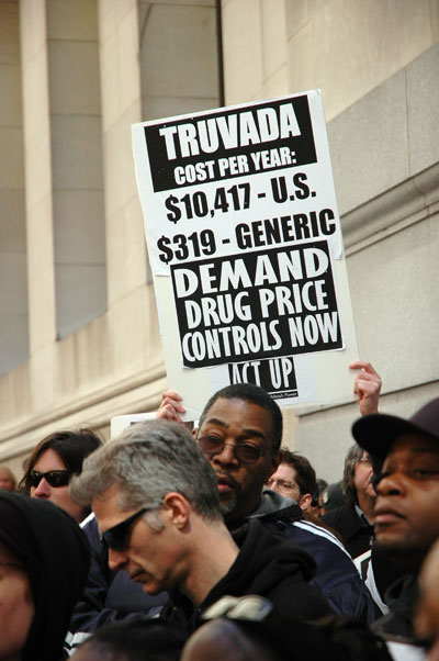
This t-shirt was designed by the legendary activist artist collective Gran Fury 17 years ago.

Today South Africa has national health care.

A lot of people still think they can do something to help drag our own country into the [twentieth] century. Some of them know they have to ACT UP to get there. But activists also know how to party, and sometimes a little cash is needed to help make a stink, so ACT UP is throwing a $20 celebration/benefit bash this evening, and everyone is welcome.

The doors of Manhattan's LGBT Center at 208 West 13th Street (just west of 7th Avenue) will open at 7 pm. The program will start at 8 or 8:30 and will feature readings/performances by Pulitzer-prize winning author Michael Cunningham, the notorious Church Ladies for Choice, Mark Hannay (formerly of the Hot Peaches), and fabulous downtown performance artist Penny Arcade. The evening ends with a dance party that goes until midnight.


[image via ACT UP]

ACT_UP_Barry.jpg
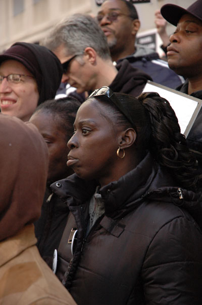
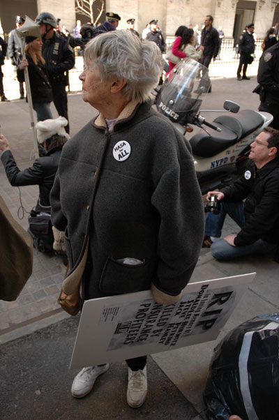
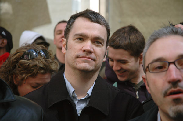
Barry, in the crowd listening to speakers across from the Stock Exchange yesterday

ACT_UP_faces_sign.jpg
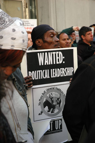
across from the Stock Exchange yesterday


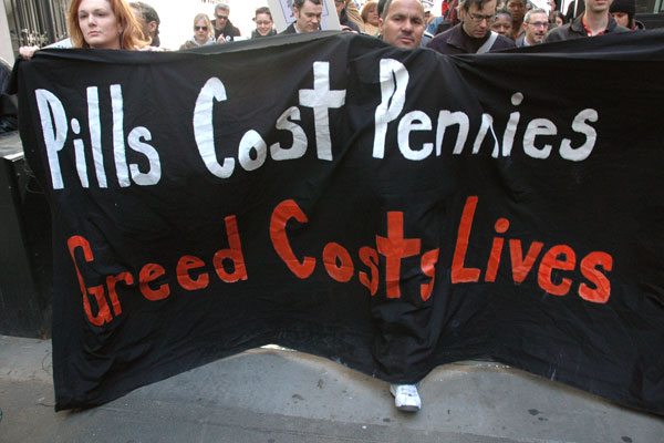
If yesterday's ACT UP twentieth-anniversary action demonstrated anything, it was the coalition's own renewal, and its transformation from an AIDS activist group once largely made up of young middle-class queer white males into one devoted to the this country's larger, evolving healthcare crisis and composed of a much broader community of people who have realized we are all directly affected by both AIDS and a medical system completely inadequate to address it or other health needs.

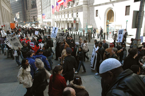
In New York yesterday every age group and every community in this hugely-diverse city appeared to be represented in the crowd which gathered in and around the Wall Street area. They hurled chants at a powerful corporate medical, insurance and political establishment, reached out in conversations to regular passersby, they brandished both printed and hand-lettered signs addressing an aloof, fortress-minded establishment, and they carried or dragged with them some 50 bulky black body-bag props as they wound through the narrow downtown streets in a band of roughly a thousand souls. At the site of the bull statue near Bowling Green some 30 people were arrested for civil disobedience while lying down in the street amongst those bags.

The NYTimes did not consider the event worthy of a single word or image. See See Andy Humm in Gay City News for the best account of the day.

The new ACT UP appears determined to be only the nucleus [or perhaps, this still being ACT UP, really only the trigger] for re-igniting an enormous popular movement, coinciding with the run-up to the 2008 election, directed toward finally securing this nation's adoption of a single-payer healthcare system after something like one hundred years of broken dreams and promises.

What follows are a few scenes from the struggle as renewed just yesterday.


ACT_UP_face.jpg

ACT-UP_pills-greed.jpg

ACT-UP-man.jpg

ACT_UP_Wall_St.jpg

ACT-UP_lady.jpg

ACT-UP_first_action.JPG
going back for more, 20 years later


Apparently as a nation we can accept throwing away something like half a trillion dollars (and counting), and very likely some 700,000 lives, on a remote elective war whose only accomplishment was a second term for the regime of the biggest Big Brother we've ever had, but we [or at least our media and our elected representatives] still think a single-payer healthcare system means handing over too much power to government.

ACT UP has always supported a single-payer health care system, and its members have always understood the role of war in thwarting its achievement. Tomorrow morning, Thursday, at 11:30 this remarkable and unfortunately still indispensable activist group of stalwarts will be marching on and in Wall Street to mark its twentieth anniversary and the beginning of its campaign to make access to healthcare for all, including single-payer insurance and drug price controls, a major issue throughout the 2008 election campaigns.

Anyone who is able to make it is welcome to join us as we gather for the march at 11 am. We will be stepping off from the Federal Building downtown, on the east side of Broadway at Worth Street, just above Chambers Street.

Twenty years on, the press will no longer be labelling us all "homosexuals", as did the NYTimes in its coverage of the first action, shown in the image above, although it was exactly that powerful picture and its caption which sucked me into the group. As far as tomorrow is concerned, while it should be assumed that only those who have decided to commit some form of civil disobedience could be arrested, there is less certainty about that than there ever was in our present terrifying, and terror-stuck, political climate.

I'm bringing my camera, for surveillance purposes.

An editorial in the current issue of The Nation is an excellent tribute* to the historic accomplishment of ACT UP and a reminder that neither the role nor the actors have yet disappeared. Excerpting the last three paragraphs of the editorial:

During the years that followed, ACT UP stormed the National Institutes of Health, the FDA and the Centers for Disease Control to protest their shortcomings. On the local level, Catholic dioceses and boards of education were targeted for blocking HIV information in public schools; city governments for failing to provide care and housing; jails and prisons for setting up segregation units. Some ACT UPers set up guerrilla needle-exchange programs; others staked out the entrances to junior highs to distribute condoms directly to students. Just as essentially, ACT UP members became self-taught experts in such arcane fields as virology and patent law and in so doing rewrote the patient-doctor relationship and helped put the idea of universal healthcare--now favored by a majority of Americans--on the political map.

Along the way, ACT UP borrowed strategies from other radical movements: antinuke protesters for techniques on civil disobedience, antiapartheid campaigners for bringing political funerals to the streets. Many of its tactics--videotaping demonstrations as protection against police brutality, coordinated but autonomous affinity group actions--have become standard fare in the global justice movement, as has ACT UP's deeply democratic tradition.

ACT UP is now a shadow of its former self, but its alums have gone on to found Health Gap, a driving force for global treatment access; the Treatment Action Group, which continues to push the AIDS research agenda; and Housing Works, which has won housing for thousands of New York City's HIV-­positive homeless. And true to form, the organization will mark its twentieth anniversary with a march on Wall Street March 29 to demand single-payer healthcare for all.


*
including a candid apology for the progressive journal's own historic neglect: "Though barely noticed in the pages of this publication, ACT UP would revolutionize AIDS research and treatment, as well as inject new life into the gay movement and infuse the tactic of direct action with its own style of theatrical militancy."


[image from actupny]

Martin_Frankie_right_detail.jpg
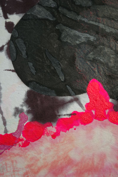
Frankie Martin the (rainbow) stinker 2006 fabric and acrylic paint 82" x 50" [detail from installation]

Martin_Frankie_right_2.jpg
[installation view]


I visited "in your dreamz", Frankie Martin's first solo show at CANADA twice, a luxury I unfortunately don't allow myself often. I liked it the first time; I loved it the second.

I can't remember the last time I saw a tie-dyed painting.

Martin has always had tons of fun with her art, and fortunately she lets us all in on it. This show was no exception, especially as it involved madly-conceived, energetically-executed and weirdly-disposed drawings, videos, music, installations, sculptures, assemblages and, well, . . . painting. The two large paintings on the west wall of the gallery stuck out, mostly because they were just so darn beautiful. And then I noticed the tie-dyed fabrics, the sparkle dust and the subject matter itself, and I was transported back into the cool wit embodied in the ambience created by the rest of the show.

Kohlrabi_land_mines.jpg
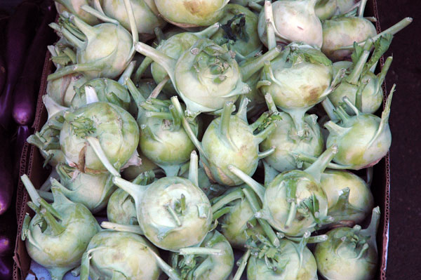
untitled (kohlrabi) 2007


I confess I'm more shy about taking pictures of food stalls in Chinatown than I am about taking pictures of art in galleries, so I did this one on the run yesterday, between gallery stops. I also had to poke between real customers. It's not cropped, and the fact that it came out at all was a big smiley surprise.

Davinci-mona-lisa-1503-06.jpg
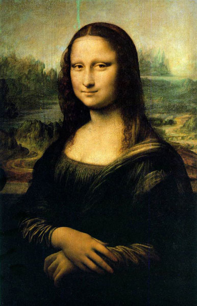
not without its replicas - and its history


I think the most sensible (and succinct) take on the question of visually recording visual art is contained in the second paragraph of a short comment submitted on my original post by the artist-blogger Hungry Hyena:

"As you suggest in the last paragraph, I think most artists would want the image to be passed along to the institution requesting it.

Furthermore, once the work leaves the studio, it has its own life, and random photos of the piece are just one more piece of that history."


By the way, many thanks to Ed Winkleman for his post taking up the subject raised here this past week about restrictions on the public's use of cameras in museums and galleries.

I couldn't help noticing however that Ed's entry manged to attract five or six times the number of comments mine did. Now I'm pressing tongue firmly in cheek here: If jealousy were not enough reason to be concerned about my colleague's readers' healthy response, perhaps, borrowing the spirit of the restrictive photo policies adopted by some of the most respectable cultural institutions in America, I should regret not having posted a preemptive do-not-record notice, or (reflecting the opinion of some of our more gentle readers on the subject of photographic captures) at least not having insisted that bloggers entering my site ask permission of the person sitting behind the screen before running away with copies of my proprietary posts.


[image from Georgetown University]

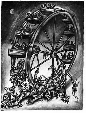
Coe_Sue_Wheel_of_War.jpg
Sue Coe Wheel of War 2004 mixed media drawing on board 12.5" x 8.5"


WASHINGTON (Reuters) - The U.S. House of Representatives on Friday defied President George W. Bush, voting to impose a September 1, 2008, deadline for withdrawing all American combat troops from Iraq.

Ummm, . . . .

Am I supposed to get excited? Did you see that end date? Almost five months after the Congressional election which was essentially a referendum to end the Iraq war House Democrats were finally able to rouse themselves from their criminal political lethargy long enough to (almost) agree on a resolution which (sorta) says we should withdraw (note: it says "combat troops") by September 1, 2008. That "deadline" is almost two years after the election and five and a half years after this disastrous war of aggression began. Not surprisingly, there are all kinds of ifs and buts in the agreement, and apparently nothing has to be done this year, so Bush can continue to send additional troops.

Anything can happen when this Executive gets to make the decisions for another eighteen months; think of the all the things he/it could engineer to make support for a continuation, even an escalation of this war entirely likely.

In any event, the White House has already said Bush will veto such a bill should the Senate manage to cooperate with the House resolution and one finds its way to his desk.

By the end of this year, if not sooner, the war will belong to the Democrats as much as the Republicans, and I'll wager that since the oil and permanent bases secured by this Administration now belong to both parties we're never going to leave Iraq.

I used to think the only solution was the impeachment of both the President and VIce-President, followed by their successful criminal prosecution. Now I'm thinking that even that unlikely (but not inconceivable) scenario probably wouldn't change anything at all in the Middle East.


[image from artnet courtesy of Galerie St. Etienne]

invisible.jpg
invisible art [large detail]


This is a true story (only the names have been withheld, for considerations of privacy and copyright):

A young artist is chosen to be in a group show at a respectable small non-profit space.

An appreciative and enthusiastic art blogger captures an image of the artist's work installed in that space and publishes it on his site.

On a return visit to the space months later the blogger is told by people in charge that photographs are not allowed at any time.

The blogger ceases to photograph any artists' work in that space.

Two years after the image of the young artist's work appeared on the blogger's site a major museum in another city writes to him asking if it could have permission to use it in publicity materials being prepared prior to a solo show it has scheduled of the artist's work, since there is no other photograph of the piece available.

The blogger suspects that the piece itself may no longer physically exist, thus explaining the importance of his photograph.

What does the blogger do in this case, and in the larger scheme of things, what does this scenario say about our cultural institutions' photography restrictions generally?


[invisible image from alpinebutterfly]

Sterrett_Sabyna_Flood.jpg
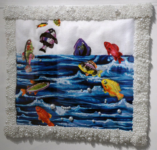
Sabyna Sterrett Flood 1979 faux pearls, fabric and thread 19.5" x 22" (25.5" x 28" in plexiglas box) [installation view]

McClelland_Suzanne_Coming_t.jpg
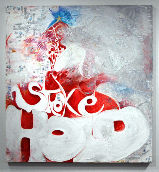
Suzanne McClelland Coming to a Head 2007 oil on linen 60" x 56" [installtion view]

Gibbs_Lauren_Free_Love.jpg
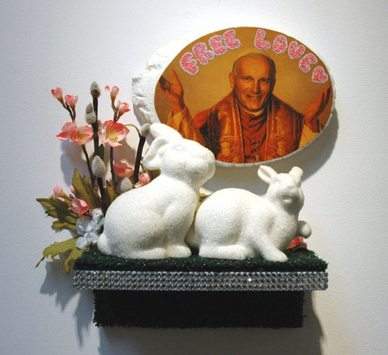
Lauren Gibbs Free Love 2006 ceramic, silk flowers, diamond dustwood, astroturf, acrylic, rhinestones 15" x 17" x 7" [installation view]


Cynthia Broan's show of feminist art, bearing one of the season's more delightfully ambiguous titles, "What F Word?", closed last Saturday, but some of the work included there (much, much more than what I'm showing here) deserves another shout.

I would say this is especially true because of its contrast (or harmony?) with a guy show (masculine art?) running concurrently just two streets south of her 29th Street space. [but more on that in the next post]

The work in the Cynthia Broan installation, which included, if I'm counting right, 33 artists or collaborators and twice as many pieces, spanned the last 45 years. I'd call that slice of time the years which will always have to be considered heavily touched by the 60's, even if that amazing decade's social innovations and political progressiveness has sadly been largely reversed. The arts thankfully somehow escaped that numbing and conservative fate which has ever been attached to an aging population.

It was wonderful to see firsthand so much revolutionary work from many years ago, but one of the most remarkable things about this show was the difficulty in dating the pieces without a scorecard. Sabyna Sterrett's pristine, plastic-boxed pillow sham could have been made yesterday, and some of the newest work, at least partly because it employed found or organic materials which already showed physical age, looked like it could have been around for decades. Moreover, since many of the issues and obstacles facing women artists today are little changed from 1962, it just wasn't that easy dating the work on the basis of its substance.

I left the gallery thinking I would like to have felt something more of the presence of the curator, the artist Carol Cole Levin, but the cast was certainly terrific. In alphabetical order they were: Ghada Amer & Reza Farkhondeh, Janet Biggs, Phyllis Bramson, Carol Cole, Patricia Cronin, Nancy Davidson, Lesley Dill, Diane Edison, Susan Paul Firestone, Dana Frankfort, Lauren Gibbes, Gina Gibson, Kate Gilmore, Nancy Grossman, Jane Hammond, Rajkamal Kahlon, Robin Kahn, Deborah Kass, Suzanne McClelland, Beverly McIver, Ulrike Mueller, Barbara Nessim, Shay Nowick, Brenda Oelbaum, Lesley Patterson-Marx, Elaine Reichek, Beatrice Schall, Rachel Selekman, Lowery Stokes Sims, Anita Steckel, Sabyna Sterrett, Jennifer Viola and May Wilson.

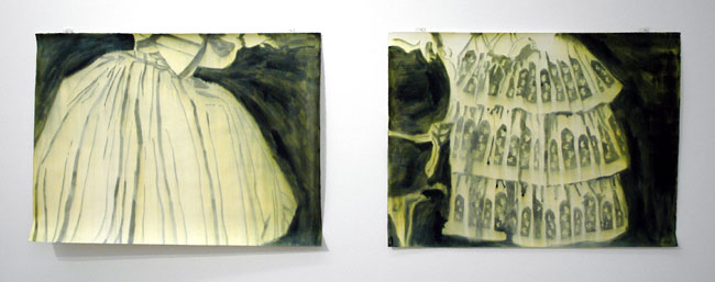
von_Brandenburg_Ulla_Jupe.jpg
Ulla von Brandenburg Jupe 1 and Jupe 2 2006 ink on paper, diptych 22" x 30" each [installation view]


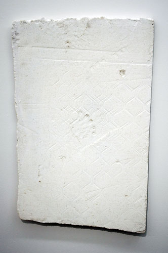
Armanious_Hany_Unrealistic.jpg
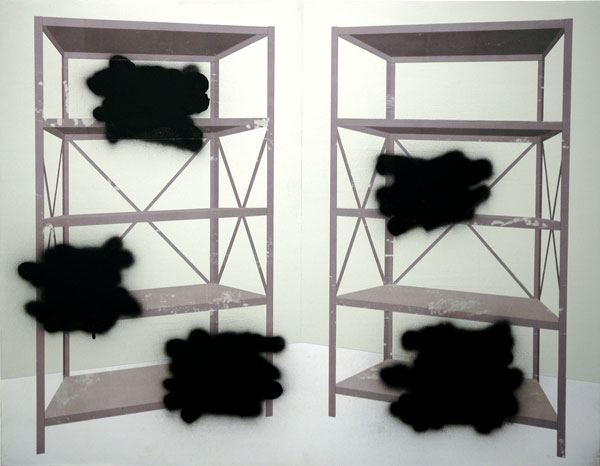
Hany Armanious Unrealistic 2007 cast Polyurethane 37" x 24" [installation view]


Sometimes a group show just looks right, although the curatorial theme may be elusive - sometimes even after a look at a press release. That probably says more about this visitor than the curator's efforts, since I have a habit of using gallery texts more as "instruction sheets" (for difficult work) than guides.

With our without extra help, Foxy Production's current show, titled "Surface Wave", does it for me. Both the installation and the individual works are first-rate. I realize that my statement about theme comes from someone whose apartment "group show" betrays no recognizable thesis either, but I'd also like to think that the choices Barry and I make are just as unmistakably idiosyncratic in their own modest way as those regularly exhibited so brilliantly on this stretch of West 27 Street are for the directors Michael Gillespie and John Thomson.
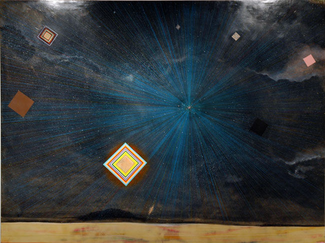
It's a small group this time: The artists are Hany Armanious, Matthias Bitzer, Louisa Minkin and Ulla von Brandenburg. They are represented by ten elegant works on four walls.


Lambert_Jesse_stud_blue.jpg
Jesse Lambert Soft Shelled Vehicles 2007 acrylic on canvas 38" x 48"


Lambert_Jesse_stud_blured.jpg
Jesse Lambert Tropical Shale Shatter #1 2007 35" x 35 "


Lambert_Jesse_stud_mustard.jpg
Jesse Lambert Segments and Broken Tubes 2006 32" x 44"


Barry and I first saw Jesse Lambert's work when he was included in a small group show curated by the excellent Lauren Ross at White Columns in the fall of 2004. We were very fortunate to be able to be part of a reception where each of the invited artists described her or his work and we were particularly charmed by his gentle presentation, by the simple ordinariness of his [almost-abstract] subjects and by his explanation of the color combinations he had chosen (basically, as I recall it, Lambert tries for the most unlikely, most improbable or most difficult combinations possible).

It may only be coincidence but today the artist's subjects are even more closely related to his palette than ever before: Lambert has been scouring volumes of esoteric printed biology material for both information and inspiration. Most if not all of the latest paintings now incorporate the shapes of micro-organisms which are not the least bit restrained about calling attention to themselves when subjected to the lens of a scientific instrument. Lambert brings this world closer to the rest of us with these luscious acrylics (and these gorgeous gouache drawings as well).
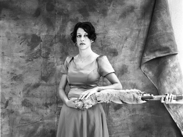

Lambert_Jesse_studioview.jpg
[studio corner]


Last December at the Wagmag benefit in Williamsburg we were delighted that his generosity to the Williamsburg art community helped to make one of his paintings our own, and two weeks after that we found ourselves in his Long Island City studio because we had decided to see and learn more about what he is doing now. The images of these rich garden carpets which I show here came back with me from Queens, but there is much more on his site, including a visual chronicle of his work showing how it has developed over six years.

Lambert is currently in a small group show, "BROOKLYN ABSTRACT", at [email protected] Trading in Williamsburg, where he is represented by two terrific and quite recent canvases. (this large space on North 8th Street has recently been very nicely cleaned-up and now looks like a proper European Kunsthalle)

Begien_Cathy_See_Begiaen.jpg
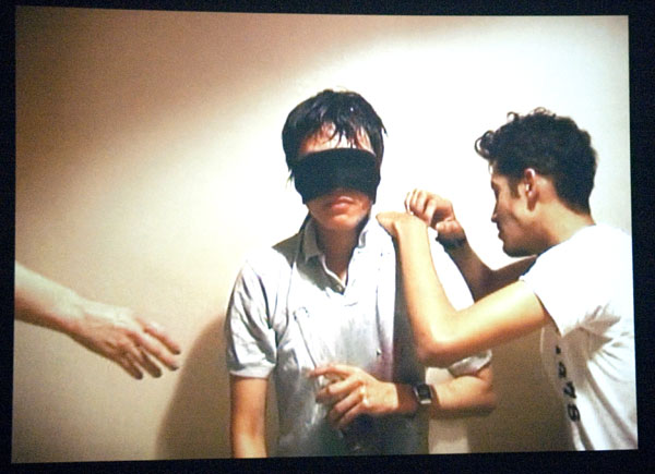
Cathy Begien Black Out 2004 single-channel video, audio on DVD [still from installation]


Begien_Cathy_Vietnam_restau.jpg
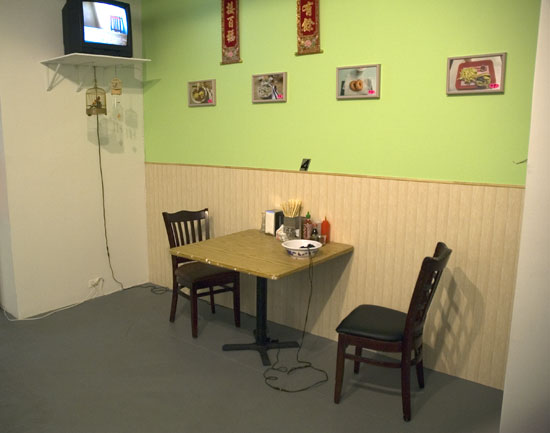
Cathy Bergien My Favorites 2004 single-channel video, audio on DVD [large detail of installation including artist's props]


We did make it a top pick on ArtCal, and everyone seems to love it. The show runs for only one more day, so at least some of you still have a chance to see Cathy Begien's terrific work at Winkleman Gallery.

A description of two of the artist's three installations excerpted from the gallery's press release:

In turns hilarious and devastating, ["Black Out"] features the artist (blindfolded and seated facing the viewer) retelling of a heavy night on the town with her friends. The narrative is delivered rather monotonously as several people continuously hand her drinks, cigarettes, and other props, acting out the evening's excesses. As the story grows ever more messy, however, the stark set and low-budget production values serve to balance the overwhelming heartache of the episode's climax, offering the viewer a rare, but safe, window into a raw, exquisitely sincere sentimentality.

In the second installation, Begien recreates the interior of a home-style Vietnamese restaurant as the setting for her video of her continuously eating her favorite foods. The obsessiveness suggested by her systematically eating meal after meal stands in stark and funny contrast to the cheesy furniture and menu photos of the referenced eatery.

Gober_Robert_Blanket-Sample.jpg
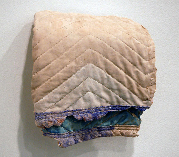
Robert Gober Blanket Sample 1 2006 gypsum polymer and watercolor 10" x 9" x 3.25" [installation view]


The show is now gone, and in the end I only saw the 22nd Street space, but this image, which was not shown or mentioned on the gallery site, is the one which remains with me. Matthew Marks showed spare installations of sculpture and drawings by Robert Gober in a show which closed March 10.

If I may paraphrase the press release, Gober's work continues to render our vulnerabilities visible, referencing a shared history which is within living memory, and always employing a very American vernacular.

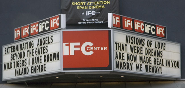
IFC_marquee.jpg


In this image of the Waverly Theater (now the IFC Center) marquee, as seen from across the street yesterday afternoon, it's not immediately apparent that motorists, approaching from the left on this one-way street, got to see only the feature titles/first stanza; pedestrians could enjoy the entire poem.

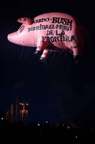
Pink_Floyd_pig_Bush_2.jpg
(PIG BUSH, DEMOLISH THE BORDER WALL) reads the message on the side of the big pink pig aloft during the Roger Waters concert in Mexico City on March 6, two days before his Bush visit warm-up performance in Bogota


Bush's imperial entourage dropped into Bogota yesterday, but the presidential visit to what the media describes as the administration's strongest South American ally was cut short because of security concerns. The President, who had traveled to and from a private stage set downtown in a 55-car motorcade which was preceded by an additional, 12-car phony/decoy motorcade, fled the country after staying little more than six hours. Oh, should I mention here that I've read that on this trip, and apparently on every trip, our president apparently has access to Marine One (perhaps shipped in the hold of a jumbo cargo jet)? Pretty soon we're talking real money.

The idea of the visit had been to give a morale boost to a government dogged by a scandal involving its association with drug traffickers and brutal right-wing paramilitary death squads . Bush's meeting with Alvaro Uribe Velez in the presidential palace on Sunday brought out some 2000 protesters (and 20,000 police and heavily armed troops). On Friday, in a concert in the same city (presumably, traveling sans motorcades) former Pink Floyd frontman Roger Waters introduced the subject of the huge amounts of U.S. money which maintains and corrupts the Columbian regime (Colombia receives more U.S. aid than any country outside the Middle East and Afghanistan). The band's legendary helium-filled pink pig hovered above the stage, this time bearing the legend:

EL PATRÓN BUSH VISITA EL RANCHO DE COLOMBIA
(PATRON BUSH VISITS HIS COLOMBIAN RANCH)


Sigh. Do we have any idea of what we look like?

Are the Americans who voted for this regime noticing that from the very beginning of his term in office Bush has been unable to appear or speak in public except before military or invited audiences, and that this is also true on the rare occasions he travels abroad, even when he is a guest of a government described as closely-allied to our government? What does this say about Bush, and what does this say about us?

Do those same Americans believe that all those "foreigners" hate us personally, and not just the selfish and exclusive policies of our government? If we continue to choose governments like this one I have no doubt that eventually, as very fortunate people who represent ourselves as part of a democratic system, we will come to be despised by the world as individuals, and very rightly so.


[image of Fernando Aceves and Marco Peláez from laJornada]

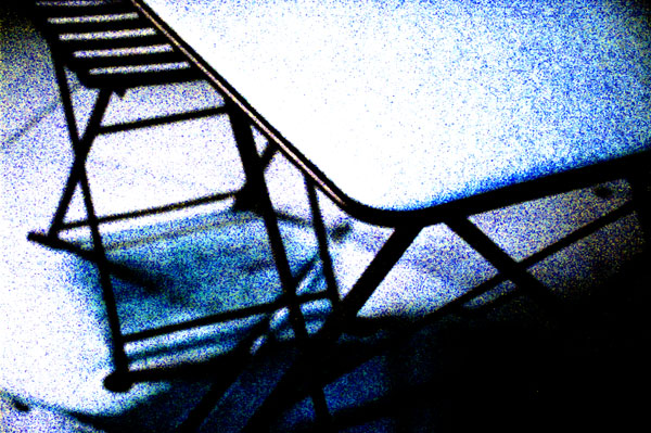
snow_on_table.jpg
untitled (night snow) 2007

UPDATE: a description of the painting's material specifics, furnished by the gallery, has now been added below the image and the comment from Caryn Coleman includes a general description of Robertson's works in series


Robertson_Chad_bluewindows.jpg
Chad Robertson Mash Up 3 2007 oil on paper 21" x 30" (25" x 33" framed)


Several entries back I wrote about Heather Cantrell's work in the L.A. gallery Sixspace's booth at Pulse and referred in passing to the work of Chad Robertson. This will probably be my last post on the February New York art fairs, but I really thought I should upload this image before wrapping things up, since I don't see it anywhere else, even on the gallery's own site. I'm assuming it's a very recent painting, but because at the time I was so distracted talking to artists, gallerists and friends (with some overlapping there) and, yes, with scanning a certain amount of art as well, I didn't manage to get the specifics on this medium-sized, somewhat apocalyptic-looking canvas.
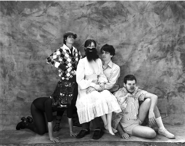
ODell_Shaun_Song.jpg
Shaun O'Dell Song of 60 Million Buffalo Ghosts 2006 gouache on paper 29" x 69" [installation view]

ODell_Shaun_Song_detail.jpg
[detail]


Houston's Inman Gallery showed this awesome large drawing by San Francisco-based artist Shaun O'Dell in their booth at Pulse. For a number of reasons, a few I suppose not directly related to the art itself, I found it very difficult to walk away.

Blasco_Elena_Pequeno_Univ_d.jpg
Elena Blasco Pequeño Universo 2007 mixed media on acetate sheets 39.5" x 58.25" [detail of installation]

Blasco_Elena_Pequeno_Univ.jpg
[full installation view]


Madrid's Galerie Fúcares showed this gorgeous collage by Elena Blasco at Pulse.

Krach_Aaron_worksite.jpg
Aaron Krach Houston Street, New York 2 2006 digital C-print mounted on Plexiglas 30" x 40" (31" x 41" framed) [installation view]


DCKT showed this large, very beautiful and totally New York-ish abstract by Aaron Krach in their booth at Pulse.

Duncan_Jeff_Seriously.jpg
Chris Duncan Seriously, It's Dark Out 2006 India ink, latex paint, gouache, wood putty, marker, graphite, colored pencil on panel 71.75" x 96" [installation view]


First, I have to apologize for the highlights at the top of this image, but when you're perched inside an historic armory dedicated to a noble citizen militia neither a gallery nor a photographer can entirely control of the ambient lighting. Fortunately the beauty of this large painting by Chris Duncan is evident even with lighting that is less than ideal.

Jeff Bailey showed this grand painting at Pulse. There are a many more images of the artist's work on the gallery's site.

Cantrell_Heather_lostvalentine.jpg
Heather Cantrell A Valentine 2006 ink-jet print on silver rag paper 18" x 24"

Cantrell_Heather_circusfamily.jpg
Heather Cantrell Circus Family 2006 ink-jet print on silver rag paper 24 x 30"


L.A.'s Sixspace had another great booth at Pulse New York this year, including new work by Chad Robertson, gouaches by Kozyndan and some drawings by Wendy Heldmann, but I thought these photographs by Heather Cantrell were especially remarkable, even before I learned anything about the artist or the work.

I enjoyed relying on my own imagination and associations, but the gallery supplies some context with this excerpt from a press release which introduced the artist's solo show last fall:

Heather Cantrell has continuously explored issues of family, tribes, cults, subcultures, and the historical (both worldly and personal) as a way to parallel metaphors with states of realism and folklore. Influenced by the portraits, photography, and painting at the end of the 19th century, she continues her exploration in Century's End by utilizing staged scenes of her "community" (mainly artist friends, mentors, and musicians) to create a body of work that deals with the polarities of fact and fable.


[images from Sixspace]

Pagk_Paul_Lexicon.jpg
Paul Pagk Lexicon Series #60 2006 oil tempera on linen 26" x 25" [installation view]


Pagk_Paul_blue.jpg
Paul Pagk Lexicon Series #16 2004-05 oil tempera on linen 24" x 25" [installation view]


Moti Hasson was showing a number of gallery artists in their booth at the Scope fair, but as Paul Pagk hasn't yet shown up on these pages and I haven't yet seen his current solo show in the gallery, I was anxious to show these two paintings now.

I have however seen enough of his work elsewhere to confirm that they are always even more beautiful than these images suggest.

Swain_Tony_Stuck_Cuts.jpg
Tony Swain Stuck Cuts 2006 acrylic on newpaper 26.5" x 25.25" [installation view]


Glasgow's The Modern Institute showed this handsome drawing by the artist and musician Tony Swain (Hassle Hound) in their booth at the Armory.

Swain is one of the six artists chosen to represent Scotland at the Venice Biennale this year.

Ohno_Satoshi_1.jpg

Ohon_Satoshi_2.jpg


As I'm admiring these Satoshi Ohno images (from the artist's "acid garden" and "prism" series), and several other pictures of his work which I am not uploading here, I'm reminded of the hazards, at least for the visitor, of a crowded art fair booth, and especially a busy one. Tokyo's Tomio Koyama Gallery had a large number of pieces by Ohno at the Armory last month, and while the installation succeeded in attracting a lot of attention in the midst of the serious competition arrayed over these several acres of concrete, sometimes a good drawing or painting just needs to be left [more] alone*.

I apologize for the lack of documentation on the drawings. The fault is at least partly my distraction and my haste.

If the installation of which they were a small part was a little overwhelming, I have to admit these two images aren't really going to be enough to represent a good artist, even in their poor capacity as reproductions of three good drawings. So maybe we should think of each of these shows as essentially just another market fair in an important market town. Certainly one totally appropriate approach would then be for those who rent the stalls to show us everything they've got; we can sort out the fresh produce for ourselves, until we drop from fatigue.


*
don't ask me why this doesn't apply to the salon-hung, and definitely-not-for-profit walls of our apartment, but my answer would probably be not much different from that which a for-profit gallery might advance: leaving more luxurious areas of white space would mean having to hide that much other good talent under a bushel basket

Sonnenschein_Eliezer_Book.jpg
Eliezer Sonnenschein By the Book 2007 oil on wood 31.5" x 47.25" [installation view]


A number of exciting artists, including Israelis whose work isn't seen nearly enough on this side of the Atlantic, could be found at the Armory once again this year in the booth of Sommer Contemporary. Among the pieces shown by the Tel Aviv gallery's director, Irit Mayer-Sommer, was this beautiful painting by Eliezer Sonnenschein, whose work had first excited me in 2004, when it was part of Sommer's invitational at Lehman Maupin, and who I remember as someone whose output is not easily compartmentalized.

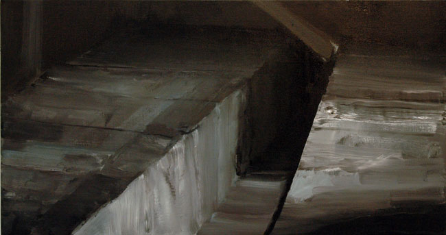
Ghenie_Adrian_Fragile.jpg
Adrian Ghenie Fragile 2007 oil on canvas 19.75" x 37.5"


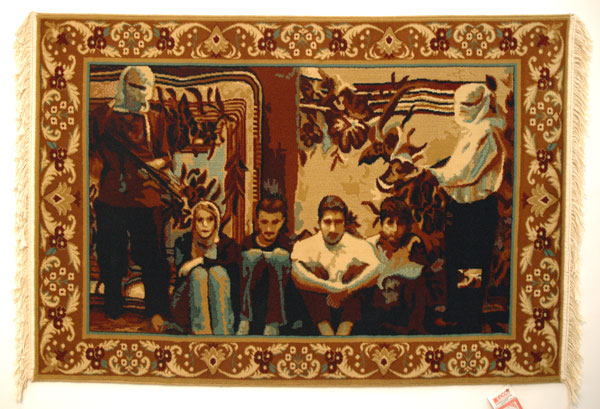
Pogacean_Cristi_Abduction.jpg
Cristi Pogăcean The Abduction from the Seraglio 2006 woolen carpet, manufactured 43.25" x 70" [installation view]


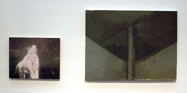
Man_Victor_two_pieces.jpg
Victor Man none 2006 oil on canvas on board 10.5" x 13.25"; Victor Man mmm, remember anthia, nick? 2004-2006 oil on canvas 18" x 23.5" [installation view]


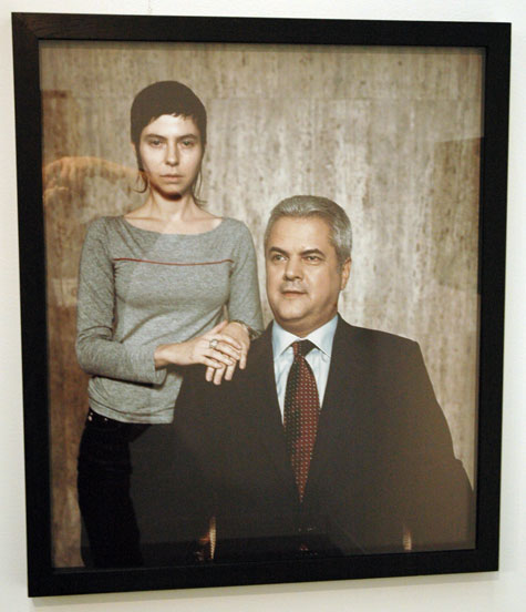
Croitoru_Alexandra_PM.jpg
Alexandra Croitoru Untitled (Prime Minister) 2004 lambda print 31.5" x 26.5" [installation view]


For me one of the most pleasant surprises at the Armory was the presence of galeria Plan B, an 18-month-old Romanian gallery making its first appearance at the show this year. In fact when the owners and directors originally formed the gallery they installed themselves not in that nation's capital, Bucharest, which might have seemed the obvious choice, but in an elegant old building in Cluj, the provincial capital of Transylvania. All six of the artists which project director Mihal Pop showed here are themselves Romanian.

Romania, with its natural links to both the Latin West and the Greek, Slavic or even Islamic worlds, can boast of a much more sophisticated history and culture than even the most informed Americans would ever imagine, especially since even in its modern history most of it was hidden from or ignored by the capitalist West for almost fifty years. It's good to be reminded of what we (and much of Romania) have missed, and to be made aware that nothing now prevents this nation and its people from adding its own strength and cultured genius to Europe and a larger, vibrant contemporary art world becoming increasingly less geographically limited.

All of the work shown in Plan B's booth here last month was very, very good, even if I can only show a few images here. The artists were Alexandra Croitoru, Adrian Ghenie, Victor Man, Ciprian Mureşan, Cristi Pogăcean and Gabriela Vanga.

von_Lieshout_Erik.jpg
Erik van Lieshout drawings [detail of wall installation]


The Antwerp gallery Stella Lohaus, appearing at the Armory for the first time, devoted their entire booth to the drawings of a single artist, Erik van Lieshout, who is increasingly known in Europe for his ambitious installations.

It was an excellent move, for the work is very good, and being also very striking (not always a corollary) it managed to attract considerable attention even without the larger bells and whistles of which van Lieshout seems more than capable. This shot of a part of one wall of the gallery's booth is necessarily a very inadequate representation of the artist's New York installation, and it's totally incapable of even suggesting this native Brabants artist's complexity.

Kielar_Anya_dots.jpg
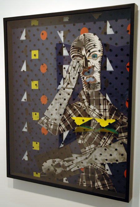
Anya Kielar Untitled 2007 mixed media 39.5" x 31.5" [installation view]

Kielar_Anya_clown.jpg
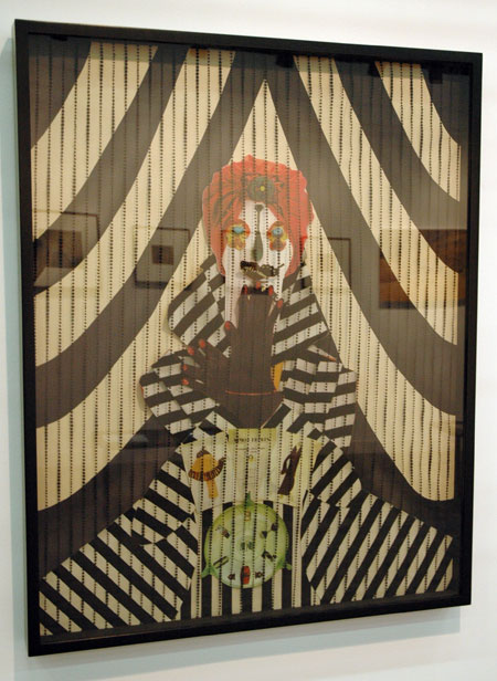
Anya Kielar, Untitled 2007 mixed media 39.5" x 31.5" [installation view]


Daniel Reich was showing these two wonderful scrim-layered collage pieces by the young New York artist Anya Kielar at the Armory.

Small note: These works, by an artist known as much for her sculpture, have such a physical presence themselves that I was slightly surprised to discover, as I copied their sizes from the gallery list just now, that a third dimension was not included.

Hoeller_Carsten_teardrop.jpg
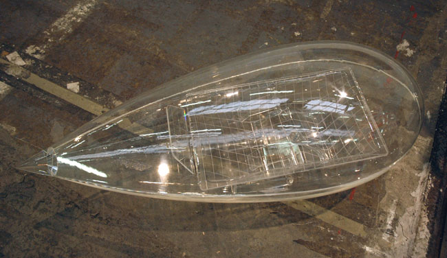
Carsten Höller Kabine 2003-2007 acrylic glass 54" x 18" x 21" [installation view]


Casey Kaplan had this seductive piece by Carsten Höller lying on the floor outside the gallery's Armory booth, just waiting for this blogger nut, with his obsession about minimalist transportation designs, to pass by and scoop it up - metaphorically, of course. I love this piece, but I probably cannot account for my passion in art terms alone.

For those who can't quite make it out in this picture, inside the teardrop-shaped capsule there is the suggestion of a perfectly-reclined seat awaiting its lone time-and-space passenger/operator.

Zucker_Kevin.jpg

This austerely-handsome, if baffling, piece by Kevin Zucker was in the Greenberg Van Doren booth at the Armory. Unfortunately I passed without getting any details, but its a medium-sized painting of, I'm surmising here, acrylic (and transfers?) on canvas.

Morris_Rebecca_Untitled.jpg
Rebecca Morris Untitled (#03-07) 2007 17.25" x 14" [installation view]


Berlin's Galerie Barbara Weiss showed this small exquisite Rebecca Morris painting in their booth at the Armory.

There are more images of Morris's work on the Berlin gallery site and on Google, but while looking (unsuccessfully) for the artist's own website, I realized where I had last seen her work. Go to the "Abstract" link in this entry for images of her work in a Mitchell-Innes & Nash show of just a few months ago.

Amanious_Hany_sandpaper.jpg
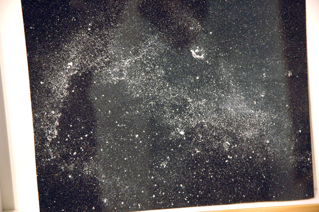
Hany Armanious Wall Rubbing #1 2007 clogged sandpaper 8.5" x 10.5" (12" x 16" framed) [large detail of installation]


Foxy Production showed several small, ethereal drawings by Hany Armanious in their booth at the Armory [large detail of one shown here]. The artist alters simple pieces of black sandpaper (emery paper?) by carefully orchestrating their contact with white wall surfaces. The result resembles a photographic image of a distant galaxy, but with an anomalous textural life inhabiting its surface. Each piece rests near the plexi on the bottom of a deep fillet inside its frame, and then leans back on the mat; they are as much sculptural objects as drawings.

Armanious is currently in a small group show at the gallery, titled "Surface Wave". It opened February 25, but I haven't yet seen what looks like very interesting work from artists new even to this gallery of new artists.

Johnson_Butt_Qualb.jpg
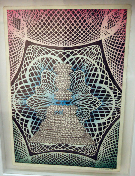
Butt Johnson Qualb tenah Maksour 2006-2007 ballpoint pen on paper 16.5" x 23" [installation view]


Johnson_Butt_Scientific.jpg
Butt Johnson Another Study for Scientific Creationism 2006 ink on paper 11.75" x 8.5" [installation view]


CRG displayed stunning booths at both ADAA and Armory. At the latter, a powerful group of incredibly delicate drawings by Butt Johnson were among the highlights of the entire fair for me.

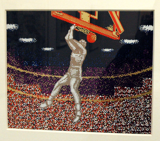
Even without the problem of reflections on the plexi, this work is difficult to show in reproduction but I'm going to risk uploading one more image. The picture below is a rough approximation of the artist's exquisite foil piece, in an edition just completed. If you're looking at the real work it has more of the presence of an enameled miniature than a stamped print:


Johnson_Butt_Slam_Dunk.jpg
Butt Johnson Slam Dunk '87 2007 7-color hotstamp foil and 3-color enamel screenprint on 4-ply museum board 15.5" x 18" [installation view]

Robert_Jimmy_1a.jpg
Jimmy Robert Untitled 2006 archival print 35.5" x 27.5" [installation view]


The Amsterdam gallery Diana Stigter was back at the Armory this year with more work by Jimmy Robert. I found myself attracted to this and another print the gallery was showing before I realized they were by the same artist I wrote about one year ago.

Tal_R_Zach.jpg


Continuing with entries showing images I've retained from the late February art fairs, at least until I run out of breath or get distracted elsewhere, this is a beautiful painting shown by Zach Feuer at The Armory Show. The work is by Tal R, an artist who refuses to be defined by any one style, or in fact by any number of styles.

mail.gif
stay connected


This blog will be five years old next month, having evolved from a series of emails I had started sending to friends six months earlier, almost immediately after September 11. Some of those folks asked me early on to continue letting them know whenever I did a new post.

In response to this modest demand I continued to maintain a dedicated email address group for the purpose, naming it "jimlog", and It's grown a bit since I started it, necessitating several re-configurations. At the end of every day on which I've done an entry I've manually assembled specific links to every separate item (anywhere from one to seven posts a day), generally giving each a new, fanciful or abstruse title to relieve the routine, and then clicked "send". At least I didn't have to burden a postman.

Until now. Jimlog is being modernized. My wonderful webmaster Barry has recently set up an automated system which will send an email to reader/viewers on any day I've logged one or more new entries. That one piece of electronic mail will include each separate post done that day, and each will appear instantly and exactly as it does on the site - in full color! The mailing will be sent at the end of the evening, New York time.

My old, manually-produced email list will be discontinued in a couple of weeks; if you are getting emails now and wish to continue getting notices of new posts, or if you wish to get notices for the first time, you will have to subscribe using the new system. The process is very simple:

Go to the sign-up box on the top left, enter your email address, click "subscribe", then verify your intention by typing the code you will see displayed.

Don't forget to look for the confirmation email, as you will have to respond to it in order to activate the subscription (note: the automated confirmation email may get diverted to your spam folder, depending on the nature of your email security system).


[image from Minnesota Historical Society]

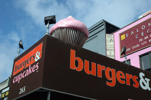
cupcake_pink_detail.jpg
going soon from your neighborhood


The giant, spinning, flood-lit pink cupcake perched above the curb on the top of an advertising canopy on West 23 Street has to be removed within 30 days. The city's Department of Transportation [DOT], which has the authority in these things as the safety guardian of our streets and sidewalks, has found that the owners' original permit for a conventional framed canopy expired in 2003 and that the mechanical structure appended to the awning the restaurant had built after 2003, is itself in violation of city statute.

I call it a victory for the public's common right to the streets. It represents official recognition that there are limits to what a business operating for profit can seize from the people, even if some individual members think a particular encroachment is cute.

I won't try to suggest that another winner here might be a decent respect for aesthetics, because New York bureaucracies are obviously not to be trusted with that kind of protection. What is to be regarded as seemly, or pretty in a huge city? I'm in love with the lively chaos of big metropolis at least as much as any of my neighbors, but New York is not Las Vegas and today's corporate Times Square is not a reasonable model for a neighborhood. A great city must enjoy playing with itself, but it must be allowed to reveal its history and its quieter comforts and beauties as much as its essential energy.


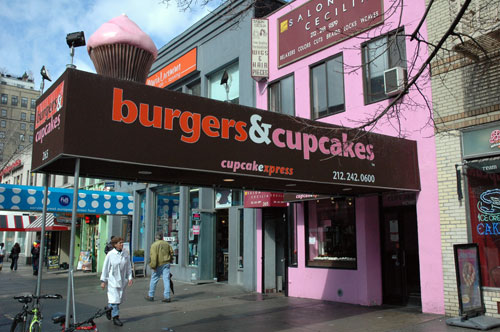
cupcake_pink.jpg
Pepto-Bismol pink


A personal note about Burgers & Cupcakes only partly related to issues of "taste": Even before the giant cupcake appeared late last fall I had thought the aesthetic choices made by this particular food-operation business were rather unwise, if not totally unbelieveable, for business reasons alone: Pepto-Bismol pink and wet-feces brown would not seem to be the obvious choice for a restaurant's advertising sign and interior decor.


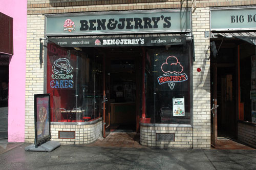
Ben%26Jerry_storefront.jpg
still curved after seventy years


And a note on both the historical and street context of the Pepto-Bismol building: This is one of several two-story "taxpayers" constructed on the site occupied by four early-nineteenth-century brownstones when I moved in next door twenty years ago. The landlord(s) of these once-handsome townhouses (converted eventually into rent-stabilized or rent-controlled apartments, with small stores on the ground floor) had deliberately neglected their upkeep and eventually succeeded in displacing the tenants in anticipation of some speculative boon which apparently never materialized. The buildings were then demolished and the lots left boarded up for a time, until the current structures, thrown together almost overnight with metal sticks, styrofoam and stucco, displaced hundreds of our neighborhood pigeons and untold generations of rats.

Today these jerry-built structures are an exceedingly awkward interruption of the streetscape of the north side of this Chelsea block. On their left is a large and quite handsome art-modern building (still a Woolworth store with a full lunch counter when I moved to the street, but currently a GAP branch, with a gym occupying the areas on the second floor which were originally devoted to professional offices). On the right is a large yellow-brick 1936 art deco apartment house (with eight very neat restored small storefronts on the street level. One of them is occupied by a Ben & Jerry's boasting the original curved glass windows and period metal moldings which can't be duplicated today. There is a restored fully-retractable awning mechanism in a pocket above the windows, and below them there are two reconstructed grilled openings ingeniously devised for ventilating the basement storage area).

This kind of love, intelligent attention, labor and sacrifice devoted here to enhancing the ambience of a cherished neighborhood in a city of eight or nine million people is of an entirely different order from the ignorance and indifference which produced the rotating pink cupcake and the several poor sheds of which it is such a part.


[thanks to Blog Chelsea for helping to keep the pink cupcake issue alive, and to Melanie La Rocca of Chris Quinn's office for doggedly pursuing the DOT about the status of my complaint]

  • home

This page is an archive of entries from March 2007 listed from newest to oldest.

previous archive: February 2007

next archive: April 2007